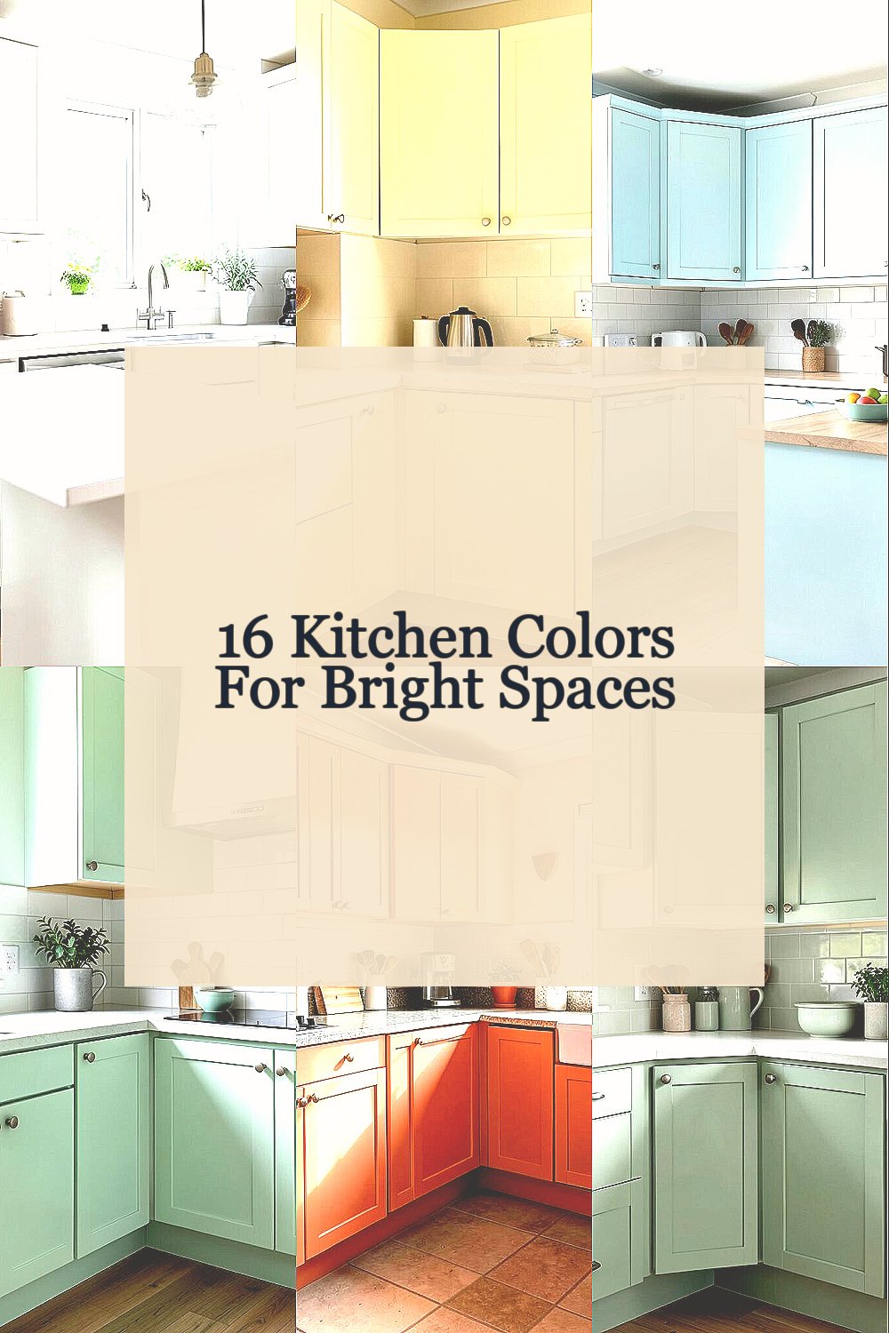
Some kitchens feel sleepy before the coffee even starts. The right color can wake the whole room up fast.
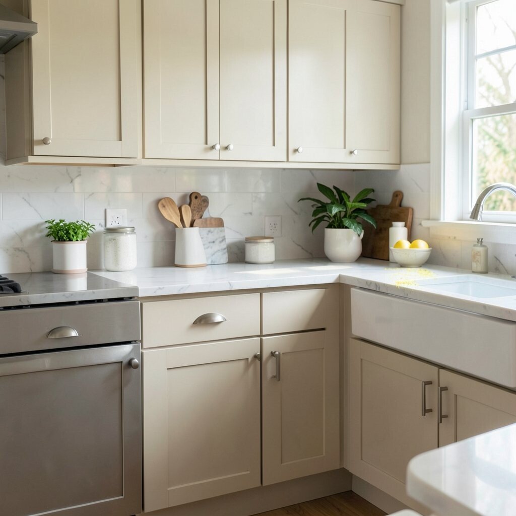
1. Crisp White
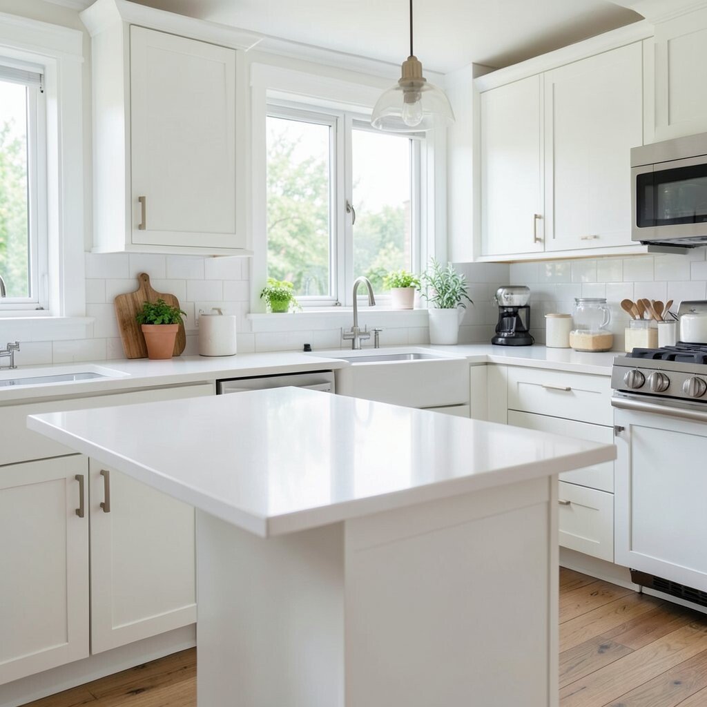
Crisp white makes a kitchen feel clean, open, and fresh. It bounces light around, so even a small room can feel bigger.
This shade works with almost any style, from farmhouse to modern. Pair it with wood stools, black handles, or brass lights for a look that feels personal. White paint is usually budget-friendly, and it gives you freedom to change decor later without repainting the whole room.
2. Soft Butter Yellow
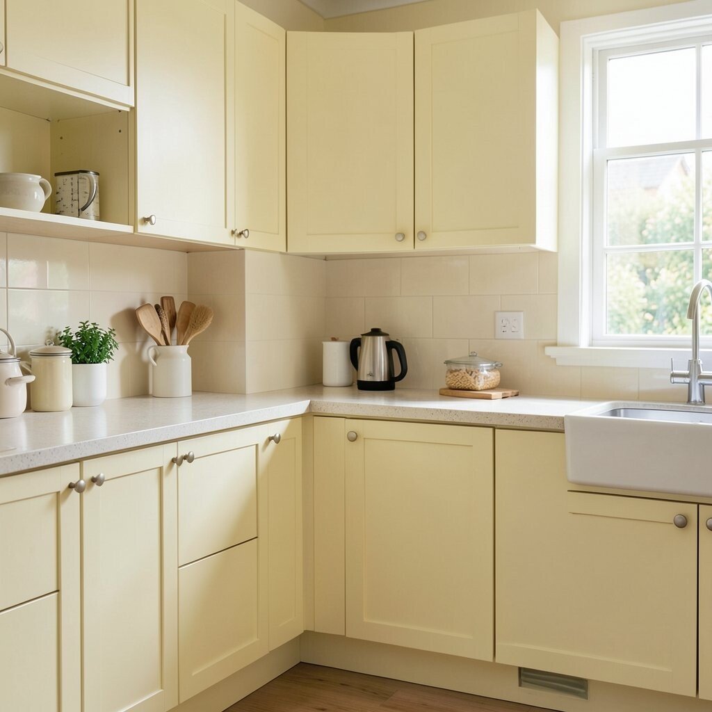
Soft butter yellow brings a warm glow that feels happy without shouting. It can make morning light look extra cheerful and cozy.
This color works well on walls, cabinets, or even a pantry door. It feels unique because it is bright, but still gentle enough for everyday use.
Try adding white trim or pale wood shelves to keep it light. If you want a trendy touch, use matte finishes instead of shiny ones for a softer, modern feel.
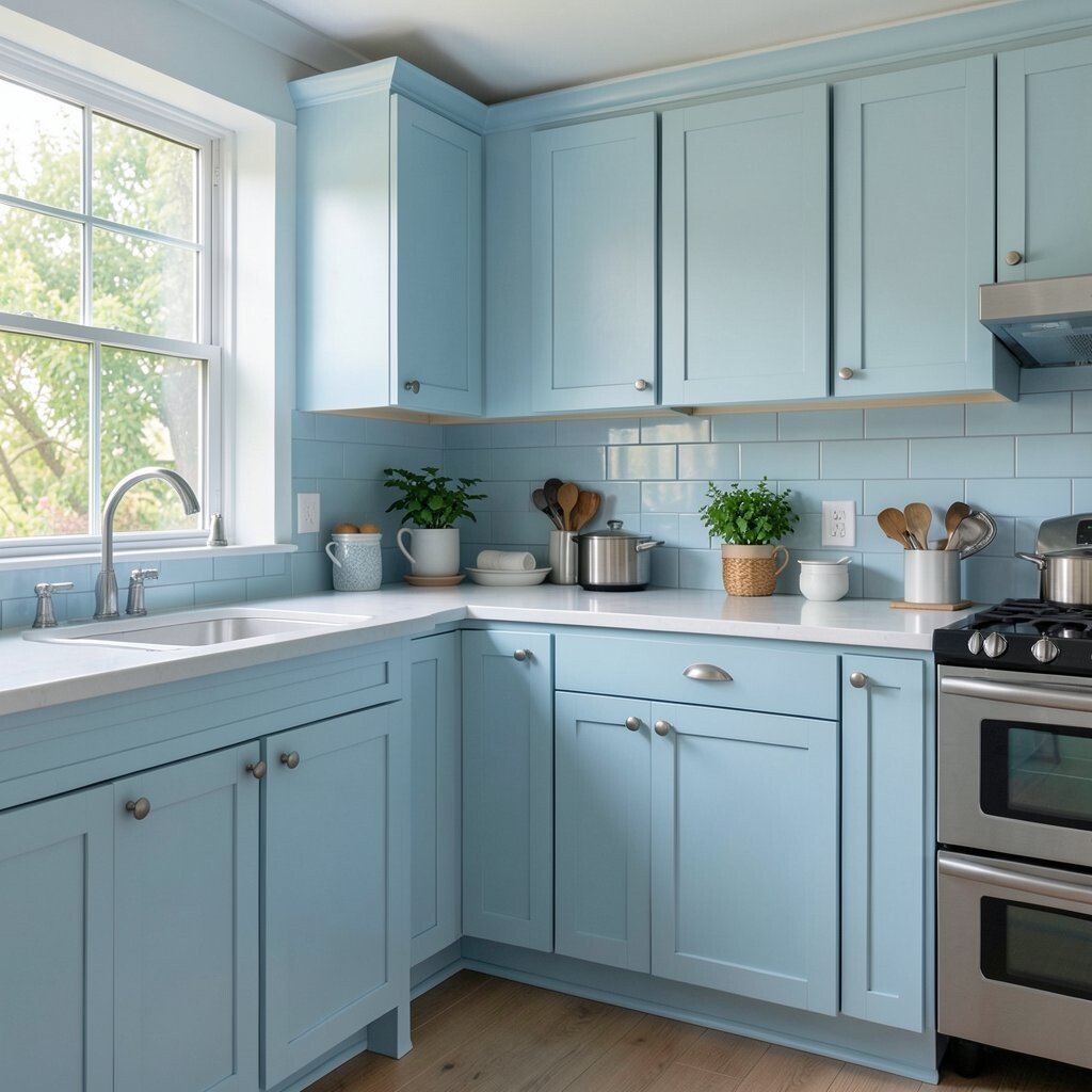
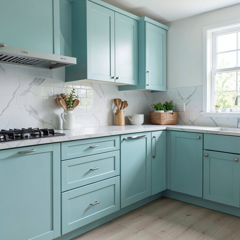
3. Pale Sky Blue
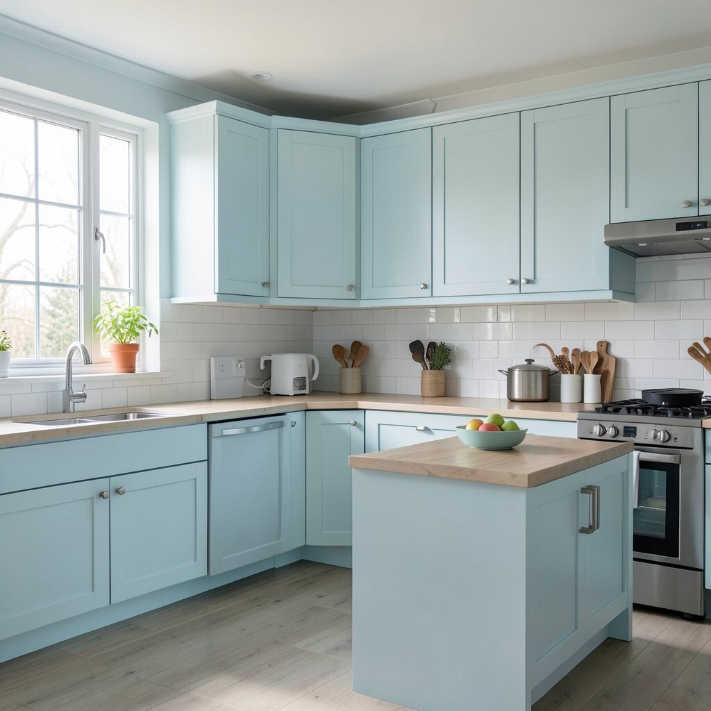
Pale sky blue gives a kitchen a calm, airy feel. It reminds people of clear weather and open space.
This shade looks lovely with white counters and silver hardware. It can help a busy kitchen feel less crowded and more peaceful.
Use it on lower cabinets for a fresh two-tone style, or paint just one wall for a small change. It is a smart choice if you want color without spending too much on a full makeover. Add woven baskets or light wood accents to keep it from feeling cold.
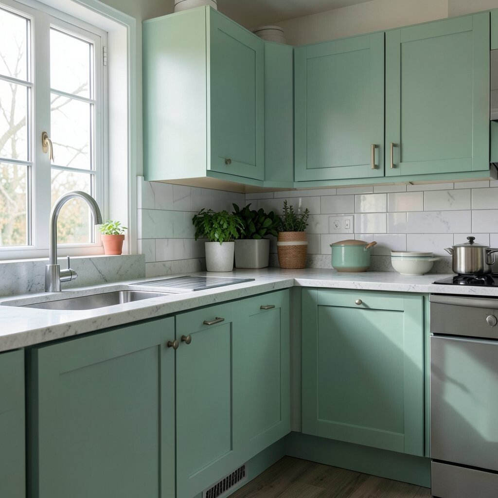
4. Mint Green
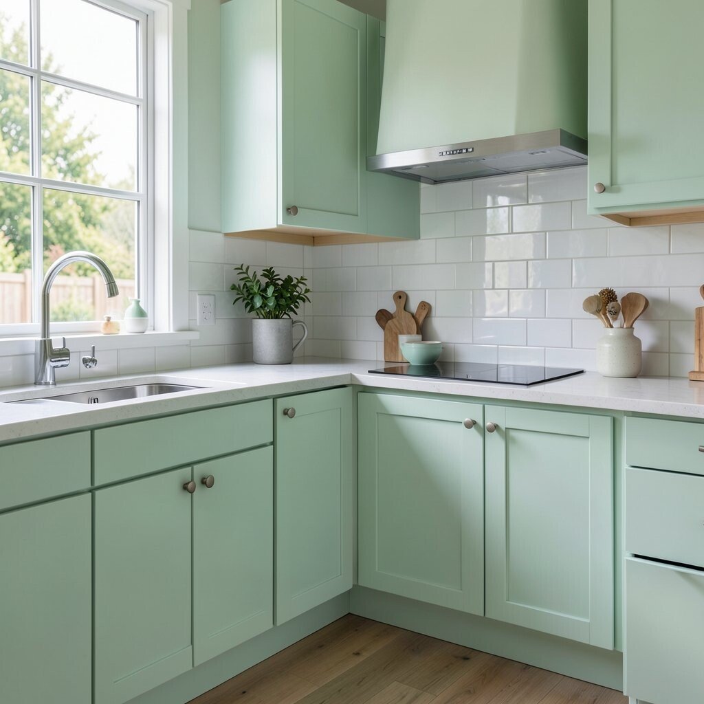
Mint green feels lively, cool, and clean all at once. It brings a soft pop of color that can make the room feel bright in a friendly way.
This shade is great for retro kitchens, cottage looks, or simple modern spaces. It stands out just enough to feel special without taking over the whole room.
Use mint on cabinets, a tile backsplash, or even a small island. It pairs well with white, cream, and brushed gold, which makes styling easy. If you want a low-cost update, mint accessories like stools or dishware can give the same cheerful effect.
5. Sunny Coral
Sunny coral adds a warm blush that feels playful and full of life. It can make a kitchen feel brighter even on cloudy days.
This color is a good pick for people who want something bold but still welcoming. It has a fresh, modern look that feels different from plain red or orange.
Try coral on an accent wall or inside open shelves for a fun surprise. It works well with white counters and natural wood, which helps balance the brightness. For a stylish look, use simple decor so the color stays the star.
6. Light Sage Green
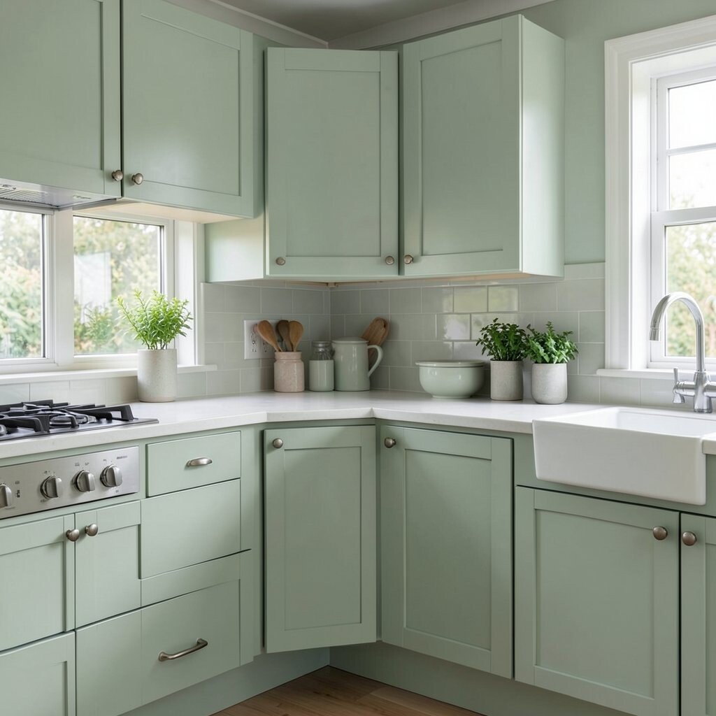
Light sage green brings a soft, earthy calm to the room. It feels bright, but also relaxed and easy on the eyes.
This color is popular in many new kitchen designs because it feels natural and timeless. It can make a space feel more homey without looking heavy.
Paint cabinets sage for a gentle update that still feels fresh. Add cream walls or pale stone to keep the room light and open. If you are watching costs, sage can work well on just one main piece, like a kitchen island, while the rest stays neutral.
7. Warm Peach
Warm peach gives a kitchen a soft glow that feels friendly and sweet. It can make walls look sun-kissed, which is lovely in a room that needs more life.
This shade is unique because it feels cheerful without being loud. It works well with white trim, tan wood, and simple black accents.
Use peach in a breakfast nook or on a small section of wall if you want to test the look first. It can be a low-cost way to bring warmth into a plain kitchen. For a modern style, choose pale peach instead of a bright orange tone.
8. Powder Blue
Powder blue gives a kitchen a soft, airy charm. It can make cabinets or walls feel light and easy to enjoy every day.
This color shines in spaces with lots of sun. It also works well in smaller kitchens because it keeps the room from feeling heavy.
Mix it with white shelves and silver fixtures for a clean look. If you want more character, add patterned tile or vintage-style knobs. Powder blue is a smart trend choice because it feels classic, yet still fresh.
For a simple update, use this color on one feature wall and keep the rest neutral. That can lower cost while still giving the kitchen a bright new mood.
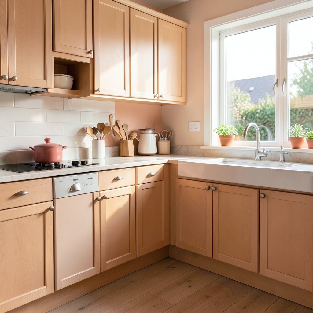
9. Buttercream Beige
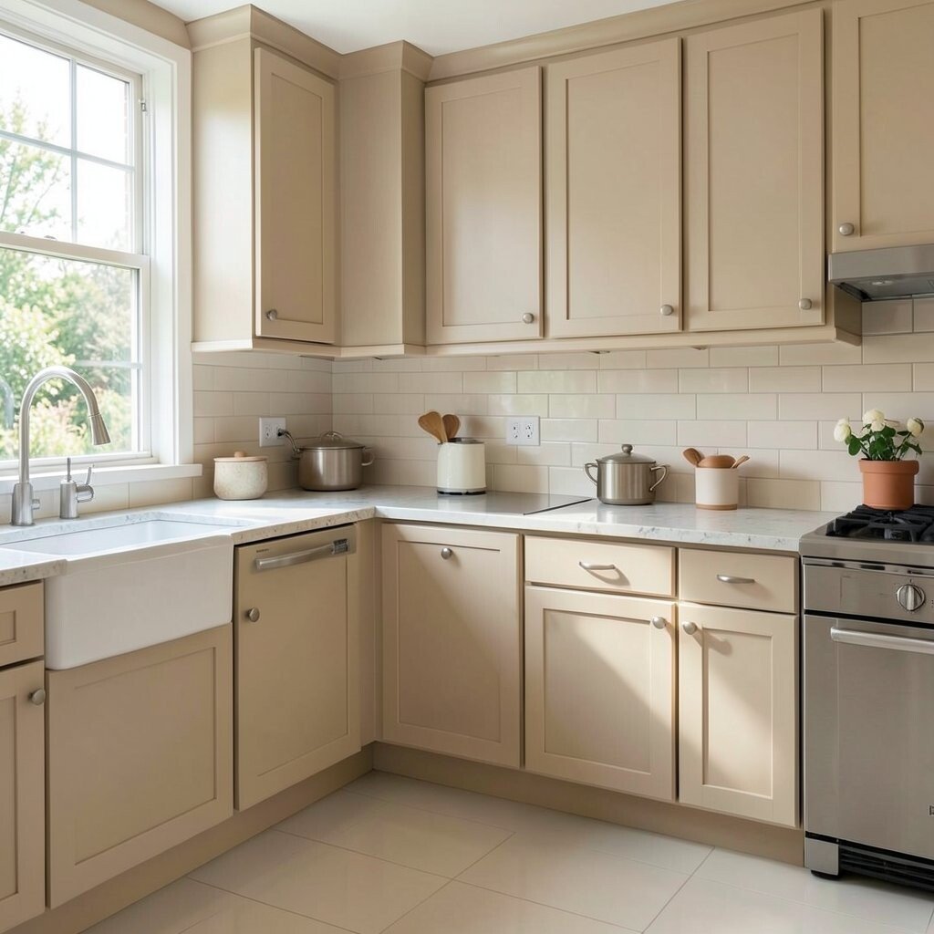
Buttercream beige is soft, warm, and easy to love. It gives a kitchen a bright feel without the sharpness of pure white.
This shade works well with almost any cabinet color, which makes it very flexible. It can help a room feel polished and calm at the same time.
Try it with natural wood, woven textures, or matte black hardware for a balanced look. It is a good choice if you want a color that will stay in style for a long time. Because it is gentle, you can change decor often without clashing.
10. Bold Teal
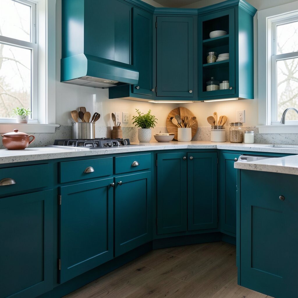
Bold teal brings strong energy and a rich, bright look. It can make a kitchen feel stylish and full of personality right away.
This color stands out in a way that feels fresh and modern. It looks great with white counters, warm brass, and even a bit of dark wood.
Use teal on an island or lower cabinets if you want drama without covering every wall. That can save money and still give the room a big visual change. If you like current trends, teal pairs well with simple shapes and clean lines.
11. Lemon Zest
Lemon zest is bright, happy, and hard to ignore. It brings a lively spark that can make cooking feel more fun.
This color works best in small amounts because it is so strong. A little goes a long way on chairs, shelves, or a single cabinet door.
Pair it with white walls and simple decor so the room stays balanced. It is a great choice if you want a playful kitchen that feels unique. For a lower-cost idea, use lemon-colored kitchen towels, canisters, or art before painting anything big.
In today’s kitchens, small bold touches are very popular because they feel fresh without a full remodel. That makes lemon zest a smart way to try color with less risk.
12. Pale Lavender
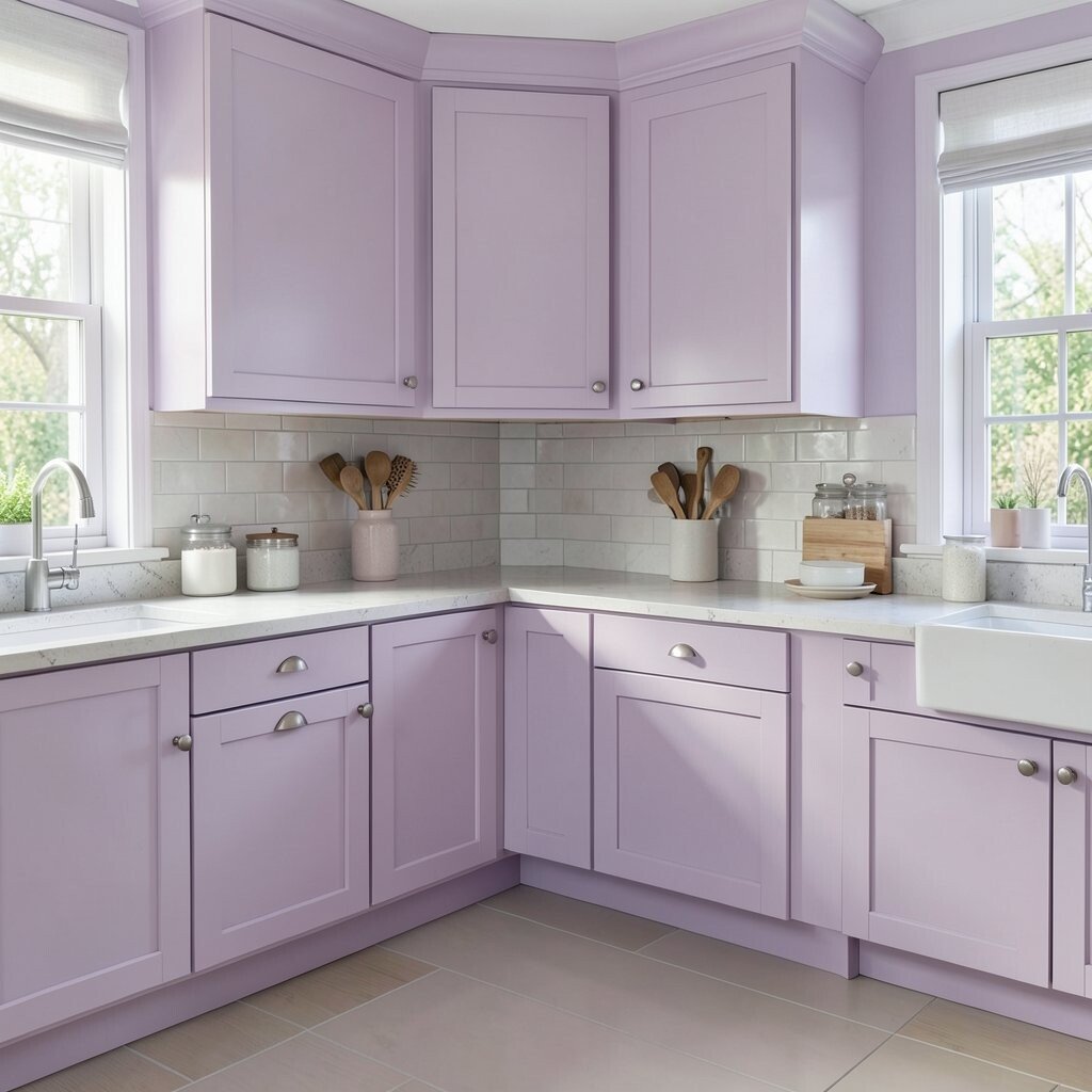
Pale lavender gives a kitchen a soft, dreamy glow. It feels light and special, like a calm morning with the windows open.
This shade can make a plain room feel more charming right away. It works well with white, gray, and silver pieces for a gentle finish.
Use lavender on walls, a backsplash, or even inside glass-front cabinets for a subtle surprise. It is a unique choice that still feels easy to live with. If you want a budget-friendly update, try lavender accents first and see how the room changes.
To keep it modern, choose clean lines and simple hardware. That helps the color feel fresh instead of too sweet.
13. Seafoam Green
Seafoam green feels cool, breezy, and bright. It can make a kitchen seem larger and more open, especially when the light hits it well.
This color has a soft coastal feel that many people love. It is different enough to stand out, but gentle enough for daily life.
Combine seafoam with white tile and pale wood for a clean, beachy look. It also looks nice with glass jars, woven trays, and simple plants. If you want to keep costs down, paint just the upper cabinets and leave the bottom half neutral.
14. Soft Gray with Warm Undertones
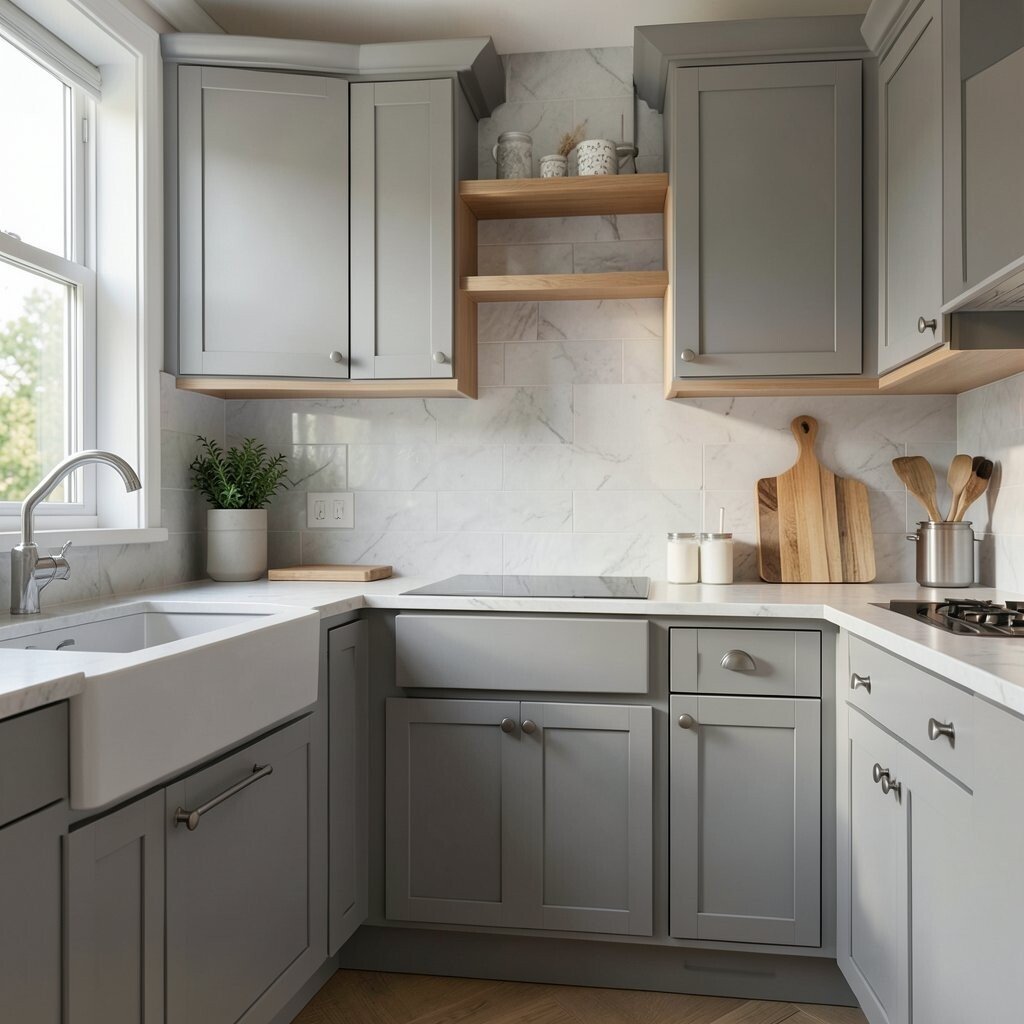
Soft gray with warm undertones keeps a kitchen bright without feeling cold. It gives the room a neat, modern look that still feels cozy.
This shade is a good base for almost any style. It lets colorful dishes, rugs, or art stand out without fighting for attention.
Try it with white trim and wood accents to add warmth. It is a helpful option if you want a color that will age well and stay useful through style changes. Many homeowners like it because it feels calm, but not plain.
For a low-cost refresh, this color can work on walls alone while cabinets stay the same. That makes it a smart pick for a quick update with a big payoff.
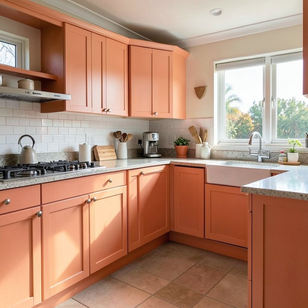
15. Terracotta Peach
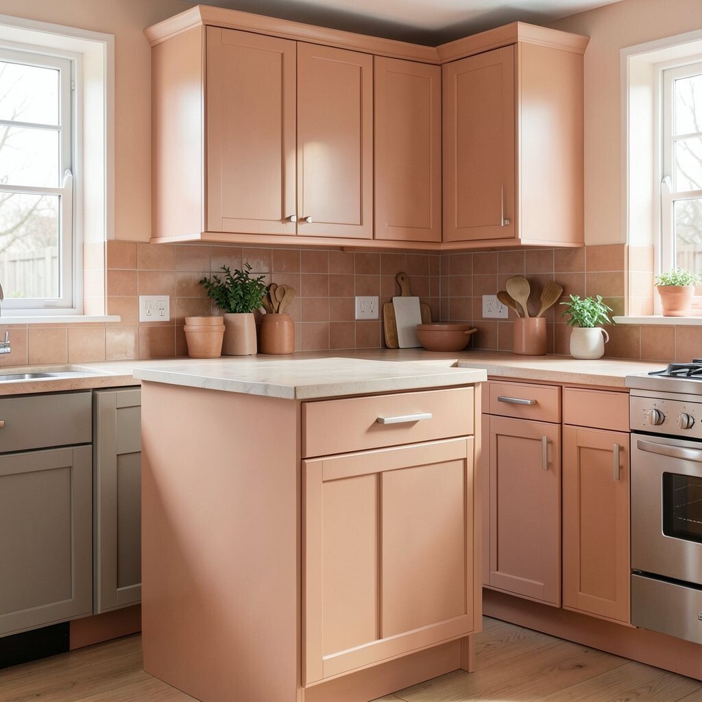
Terracotta peach brings warmth, charm, and a little earthy style. It can make a kitchen feel bright in a deeper, richer way than pastel shades.
This color is unique because it feels both sunny and grounded. It looks beautiful with cream cabinets, natural wood, and handmade-looking tile.
Use it on a backsplash wall or a kitchen nook to add instant character. It is a great way to make the space feel personal and lived in. If you want to follow current trends, pair it with simple, natural textures and soft curves.
16. Clean Aqua
Clean aqua adds a fresh splash that feels crisp and cheerful. It can wake up a kitchen and make it feel bright from the moment you walk in.
This shade works well in both modern and playful spaces. It looks lively with white, light gray, and shiny metal finishes.
Try aqua on a pantry door, island, or a set of stools for a fun accent. It is a good choice if you want color that feels fresh but not too heavy. For a smart budget move, use aqua in smaller spots first and build from there if you love the look.
Aqua also fits well with today’s love for light, happy kitchens. It gives the room a clean, upbeat feel that can make everyday tasks seem a little brighter.