Small kitchens can feel lively in a flash. Bright color can make them glow.
A smart palette can change how the room feels without changing the floor plan. The right mix can add cheer, style, and a little magic.
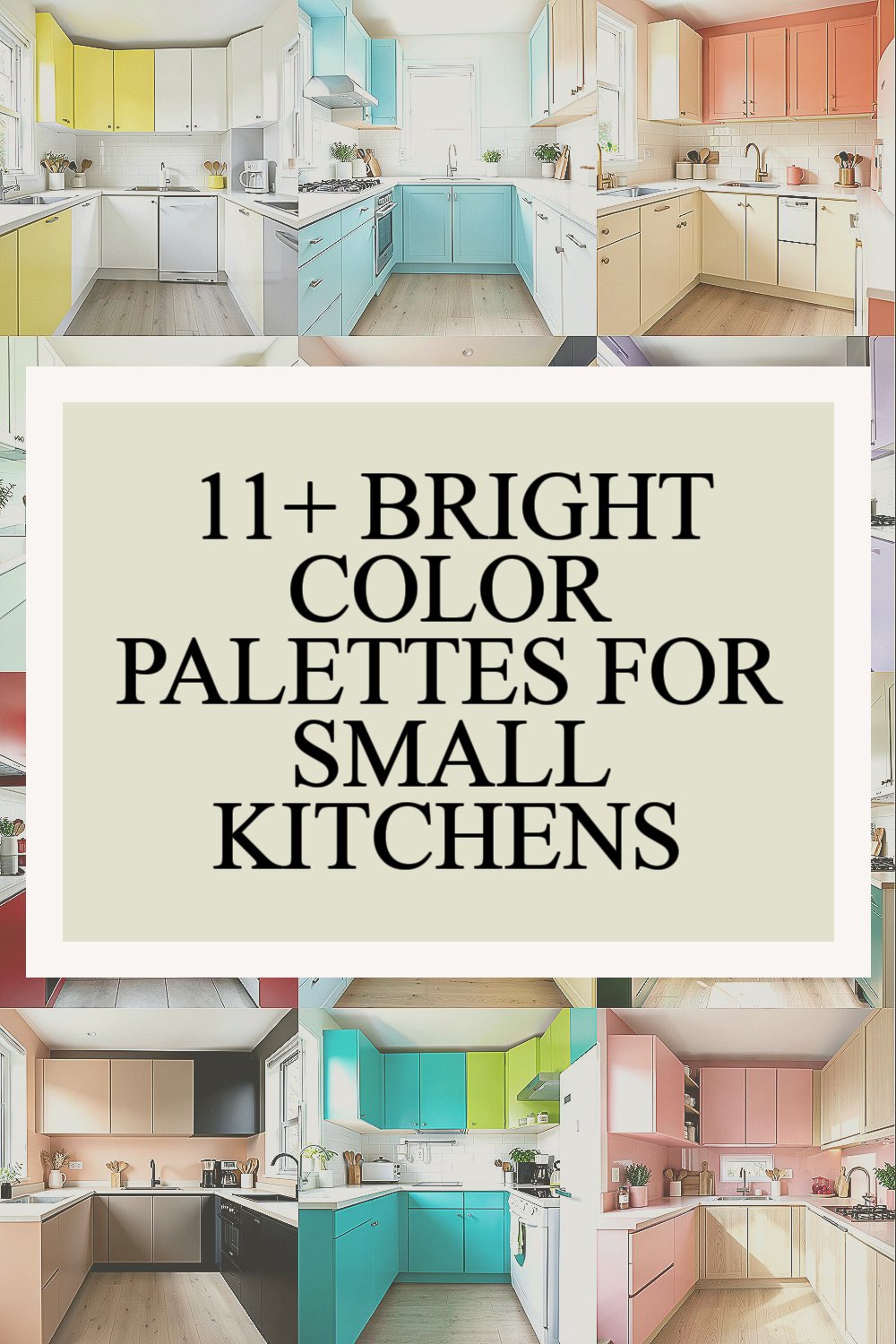
1. Lemon Yellow, White, and Soft Gray

Lemon yellow brings a sunny spark that makes a tiny kitchen feel awake and happy. White keeps the space clean and open, while soft gray calms the look so it does not feel too loud.
This mix works well on cabinets, walls, or even just a backsplash, so you can keep costs in check. If you want a fresh feel without a full makeover, paint one feature wall or swap in yellow stools, then add gray dish towels and white shelves for balance.
2. Aqua Blue, Crisp White, and Pale Wood

Aqua blue gives a breezy, beachy mood that feels light in a small room. Crisp white trims the edges, and pale wood adds warmth so the kitchen stays friendly instead of cold.
This palette looks great with open shelves, glass jars, and simple handles. It is a nice pick if you like a calm look with a bright twist, and it can stay budget-friendly when you use color on just a few key pieces.
Try aqua on lower cabinets and keep upper cabinets white for a lifted look. Add wood cutting boards, woven baskets, or a small stool to bring in texture and make the space feel more personal.
3. Coral, Cream, and Warm Brass

Coral gives a soft pop that feels cheerful, modern, and a little playful. Cream tones it down, while warm brass adds shine that makes the whole kitchen feel polished.
This palette is a strong fit for people who want color without a harsh edge. It can work on cabinet fronts, light fixtures, or even just a painted pantry door, which helps keep the price lower.
Brass drawer pulls and a coral runner can make the room feel pulled together fast. If you like current style trends, this combo fits the warm, cozy look that is popular in many small homes.
4. Mint Green and Bright White

Mint green feels fresh, clean, and easy on the eyes. Bright white gives it room to shine, so the kitchen looks open and neat.
This palette is lovely for tiny spaces because it can make the room feel airy and bright. It works well with simple tile, white dishes, and light counters, and it is often kind to the budget because mint paint can do a lot on its own.
5. Tangerine, Navy, and Pale Beige

Tangerine brings bold energy that wakes up a small kitchen right away. Navy adds depth, and pale beige keeps the palette grounded and warm.
This mix feels a bit more daring, so it is great for people who want a kitchen with personality. You can use tangerine in small doses, like bar stools or a kettle, and save money by keeping the larger surfaces neutral.
The contrast between bright orange and deep blue gives the room a stylish look that feels current. To make it your own, add art, patterned tea towels, or a colorful rug that repeats one of the shades.
6. Lavender, White, and Silver

Lavender gives a soft glow that feels sweet and calm in a tight space. White keeps the room open, and silver adds a cool, neat finish.
This palette is perfect if you want something light but not plain. It can look especially pretty on cabinets, jars, or a small breakfast nook, and silver hardware is often an easy update that does not cost too much.
Lavender walls with white shelves can make even a narrow kitchen feel more graceful. Add clear glass canisters and shiny utensils to keep the room bright and tidy.
7. Cherry Red, White, and Black

Cherry red brings strong energy and a fun diner-style charm. White keeps the look crisp, and black adds a sharp edge that makes the colors stand out.
This palette is bold, but it can work well in a small kitchen when used with care. A red toaster, black stools, or a white tile wall can give you the effect without a costly full redo.
The look feels lively and a little retro, which is a big reason many people love it. If you want a more personal touch, hang vintage prints or use red dishware on open shelves.
8. Sky Blue, Butter Yellow, and White

Sky blue makes the room feel open like a clear day. Butter yellow adds a soft sunny note, and white helps both colors stay light and cheerful.
This palette feels friendly and easy to live with, which makes it a smart choice for everyday kitchens. You can use it on painted cabinets, seat cushions, or even small appliances, and it works well when you want a happy look without spending a lot.
The mix is especially nice if your kitchen gets little natural light. Try matching the colors with simple glass pendants or light curtains to keep the space airy and bright.
9. Emerald Green and Warm White

Emerald green gives a rich, fresh look that feels full of life. Warm white softens the color and keeps the kitchen from feeling too dark.
This palette can make a small kitchen feel more upscale without needing a full remodel. It looks beautiful on lower cabinets, a single wall, or a tile backsplash, and you can save by using the deeper color in just one area.
Gold or brass accents can make the green look even richer. For a personal touch, add plants, wooden bowls, or patterned fabric that brings out the natural feel.
10. Peach, Taupe, and Matte Black

Peach brings a soft glow that feels warm and inviting. Taupe keeps things calm, and matte black gives the palette a modern finish.
This look is great for small kitchens that need warmth but still want a clean style. Peach on walls or seating can be a low-cost update, and black details like faucet hardware or lamp shades can make the design feel current.
The mix feels cozy without getting heavy, which is helpful in a tight room. If you want more personality, layer in textured towels, ceramic bowls, or a small piece of art with matching tones.
11. Turquoise, Lime, and White

Turquoise and lime make a kitchen feel bright, bold, and full of fun. White keeps the colors from taking over, so the room still feels open.
This palette is a great pick for people who like a playful, fresh style. It can work well in rental spaces too, since you can use color through small items like stools, mats, or storage bins instead of painting everything.
Because the shades are so lively, they fit well with today’s cheerful kitchen trends. Keep the rest of the room simple so the colors can do the talking, and choose one shade to repeat for a neat, planned look.
12. Raspberry, Soft Pink, and Light Oak

Raspberry gives a rich burst of color that feels bright and happy. Soft pink smooths the look, and light oak adds a natural touch that keeps the palette balanced.
This mix is pretty, warm, and full of charm, which makes it a lovely choice for a small kitchen with a cozy feel. It can be used on a painted island, chair cushions, or even just a few accessories, so it can stay friendly to your budget.
Light oak shelves or stools help the pink tones feel fresh instead of sugary. If you want the space to feel more like you, add family photos, handmade mugs, or a favorite vase that picks up the raspberry shade.