Color can wake up a plain idea in seconds. A small swatch can change the whole mood of a project.
1. Sunset Coral
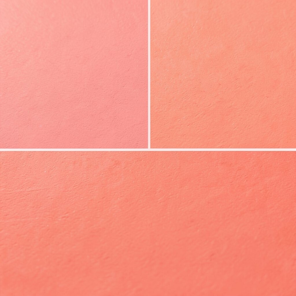
Sunset Coral feels warm, bright, and full of life. It looks like the sky right before evening, with a soft glow that pulls the eye in fast.
This shade works well for posters, social posts, room accents, and brand marks that need a friendly feel. It can make a design seem open and cheerful, and it pairs nicely with cream, sand, or pale blue. If you want a custom touch, try it with a matte finish for a calm look or a glossy finish for extra energy.
2. Deep Lagoon
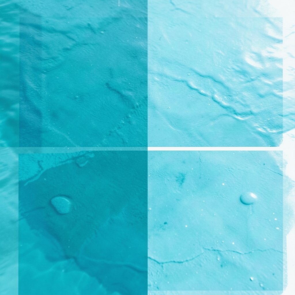
Deep Lagoon has a rich blue-green look that feels cool and calm. It brings to mind quiet water, shaded pools, and a slow, steady mood.
Use it when you want a design to feel steady and fresh. It can be a strong base color for websites, packaging, or wall art, and it stands out well beside white or gold.
If you are watching costs, this shade often works best as a main accent instead of a full-room color, which can save paint or print ink. Right now, deep jewel tones are popular because they feel bold without being loud. Add a touch of silver or soft gray for a polished style that still feels personal.
3. Lemon Cream
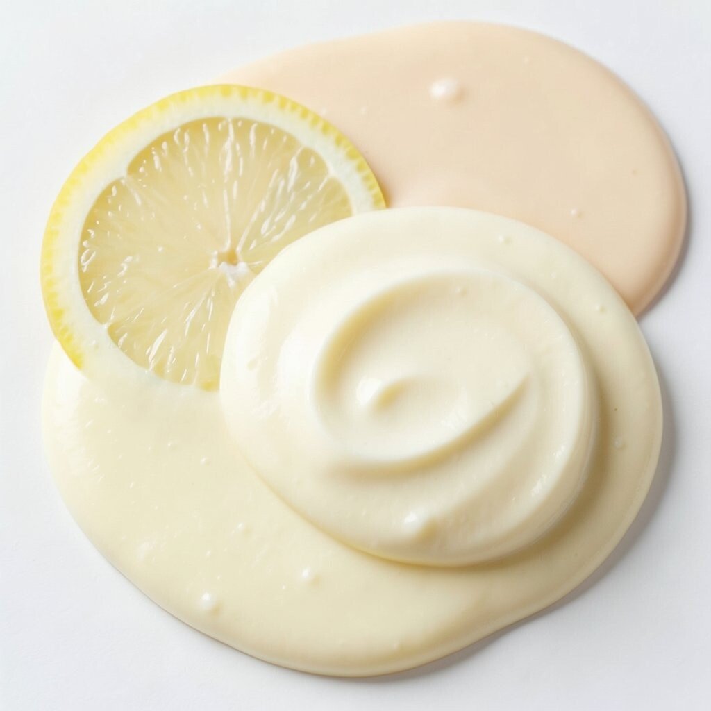
Lemon Cream is soft, sunny, and easy on the eyes. It gives a gentle burst of light without feeling too sharp.
This swatch can brighten menus, labels, notebooks, and kids’ art projects. It helps small spaces feel more open and can lift the mood of a page or a room.
Try it with warm brown, pale green, or dusty pink for a sweet and cozy mix. For a personal twist, use it in hand-drawn shapes or simple stripes so it feels playful. Since lighter shades often need more coats in paint, plan for a little extra material if you want a smooth finish.
4. Plum Velvet
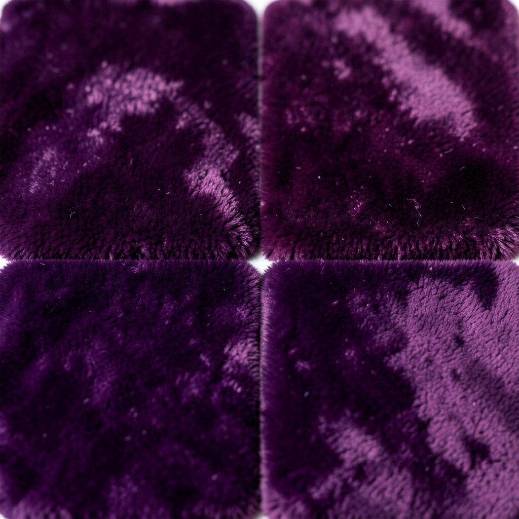
Plum Velvet looks deep, soft, and a little fancy. It has a rich purple tone that feels like folded fabric or ripe fruit in late summer.
This color is great for invitations, logos, and accent walls that need a touch of drama. It can make a piece feel more special, and it pairs well with blush, cream, or dark green.
5. Mint Mist
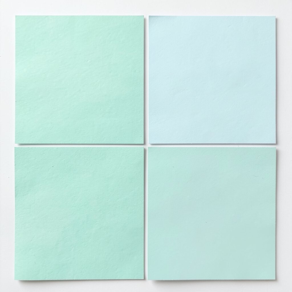
Mint Mist is light, fresh, and cool. It gives off a clean feeling that works well in both simple and lively designs.
Use it for packaging, app screens, bedroom decor, or craft projects that need a soft touch. It can make a space seem larger and a design seem lighter, which is helpful for small rooms or busy pages.
Mint shades are on trend because they feel calm and modern at the same time. If you want a more personal look, mix it with tiny shapes, thin lines, or a hand-lettered note. Budget-wise, it is an easy color to match with many other shades, so you may not need a full new palette.
6. Brick Ember
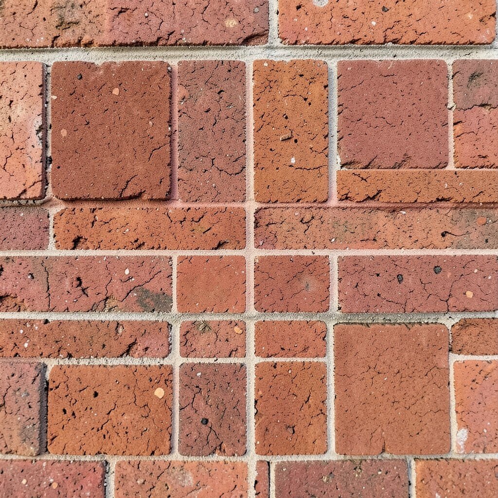
Brick Ember has a warm red-brown look that feels earthy and strong. It reminds people of clay walls, baked bricks, and cozy fires.
This swatch can give a project a grounded and handmade feel. It works well in logos, rustic decor, book covers, and art prints that need more weight.
Pair it with soft beige or deep olive for a balanced look. If you want a custom style, add rough textures or brush marks so the color feels even more alive. It can be a smart choice for cost planning too, since earthy tones often hide wear and small marks better than very light shades.
7. Cloud Gray
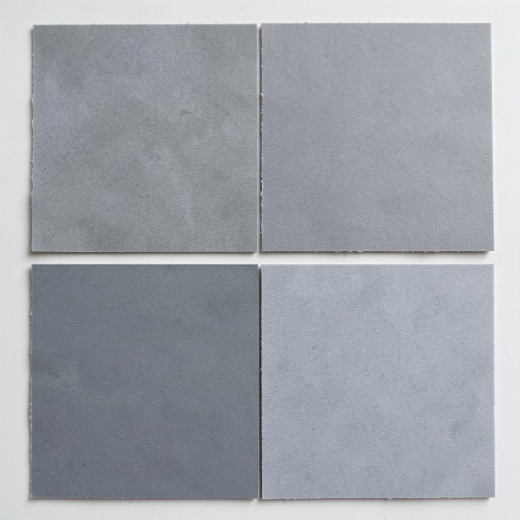
Cloud Gray is soft, smooth, and easy to use. It feels quiet, like a calm sky before rain.
This color gives other shades room to shine, which makes it useful in layouts, packaging, and interior spaces. It can calm a busy design and help bright colors stand out without fighting them.
Many modern designs use gray because it feels neat and simple. Try adding one bold accent, like coral or teal, to keep it from feeling too plain. For a personal touch, use different gray textures together so the final look has depth without extra cost.
8. Mango Pop
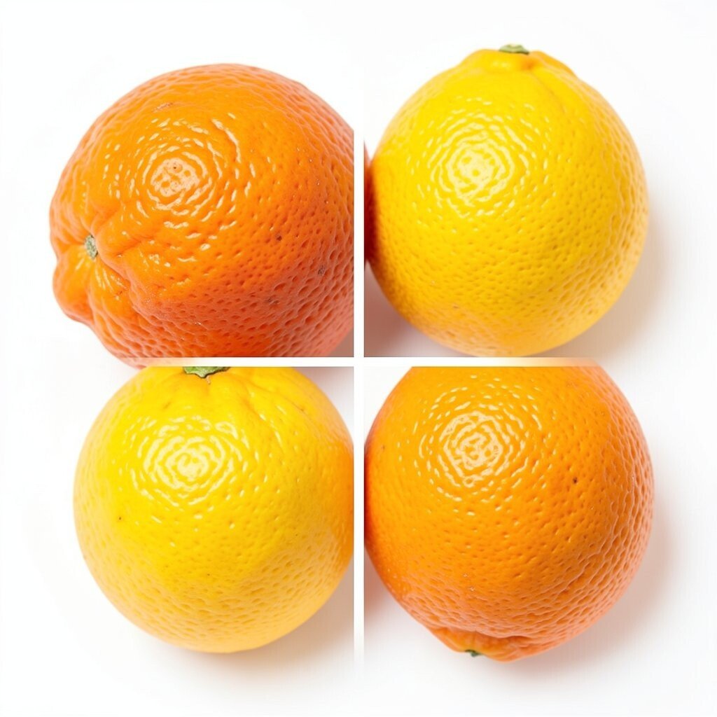
Mango Pop is bright, happy, and full of movement. It looks like fresh fruit and sunny afternoons rolled into one lively shade.
This swatch is a strong pick for party invites, youth brands, and creative ads that need attention fast. It can make a design feel fun and brave, and it works well with navy, white, or black.
Because it is so bold, use it in small amounts if you want a clean look. That can also help with cost, since accent use often needs less ink or paint than full coverage. To make it feel more personal, try hand-drawn icons or playful patterns around it.
9. Ocean Foam
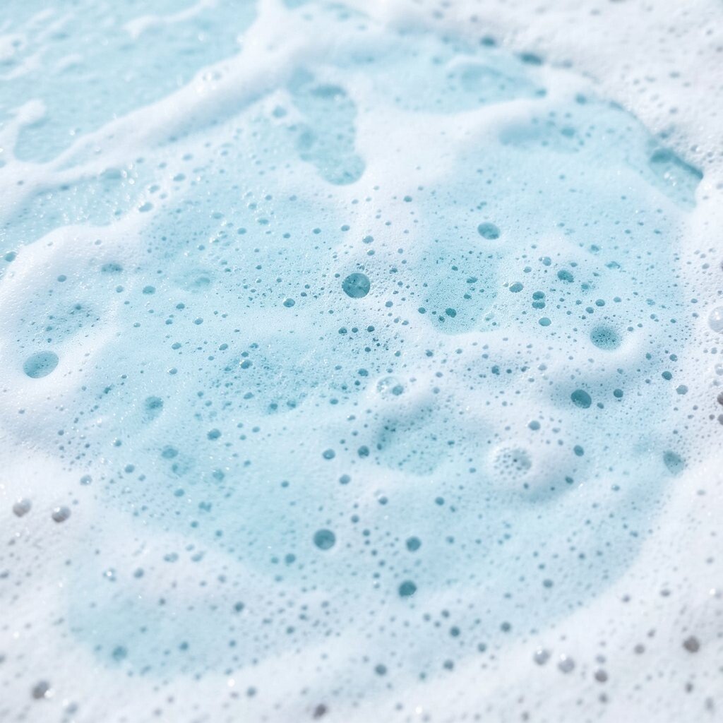
Ocean Foam feels airy, cool, and a little dreamy. It has the look of sea spray and pale water under morning light.
This swatch is great for wellness brands, calm bedrooms, and digital designs that need a fresh breath of color. It can make a page feel open and easy to read, especially when paired with white or soft blue.
Current style trends often favor watery shades because they feel clean and modern. You can make it your own by mixing in shell shapes, wave lines, or soft gradients. If you need to keep spending low, use it as a background shade and add a few richer accents on top.
10. Berry Jam
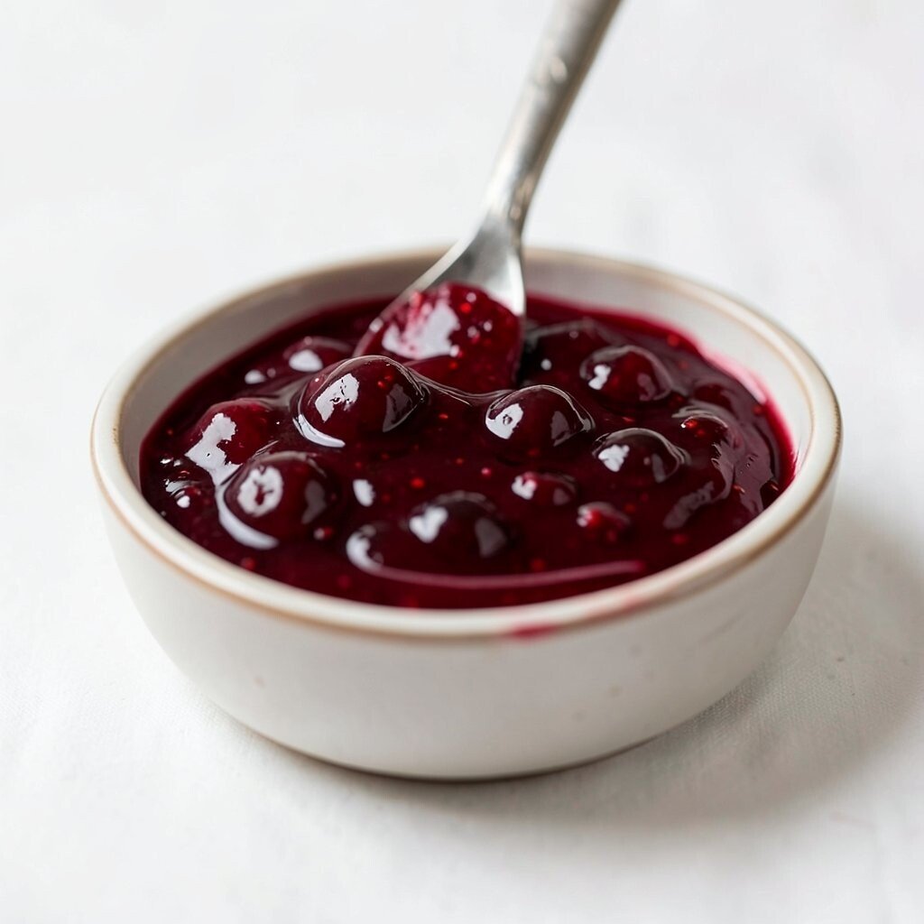
Berry Jam is sweet, deep, and full of color. It feels rich like fruit spread and lively like a summer treat.
This shade can give invitations, packaging, and art prints a bold and tasty look. It stands out well against cream, soft gray, or pale lavender, and it can make a design feel warm and bold at once.
For a custom style, pair it with tiny dots, floral shapes, or rounded letters. It is also a smart choice if you want a rich color without going too dark, since it still holds brightness. In print work, it can look luxurious without needing extra effects, which may help with cost.
11. Olive Fern
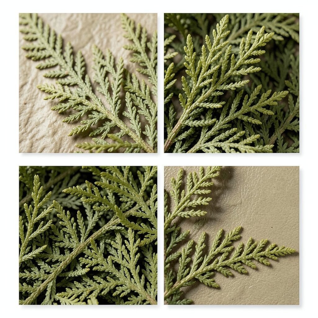
Olive Fern has a natural, leafy look that feels steady and calm. It brings to mind garden paths, herb leaves, and quiet outdoor spaces.
This swatch works well for eco-friendly brands, home goods, and layouts that need a grounded style. It can make a project feel healthy and honest, and it pairs nicely with tan, cream, or charcoal.
Try using it with plant drawings or simple nature icons for a personal touch. It fits current trends that favor earthy colors and simple living. Since it is easy to blend with many other tones, it can be a useful base color that keeps your palette flexible and budget-friendly.
12. Rose Dust
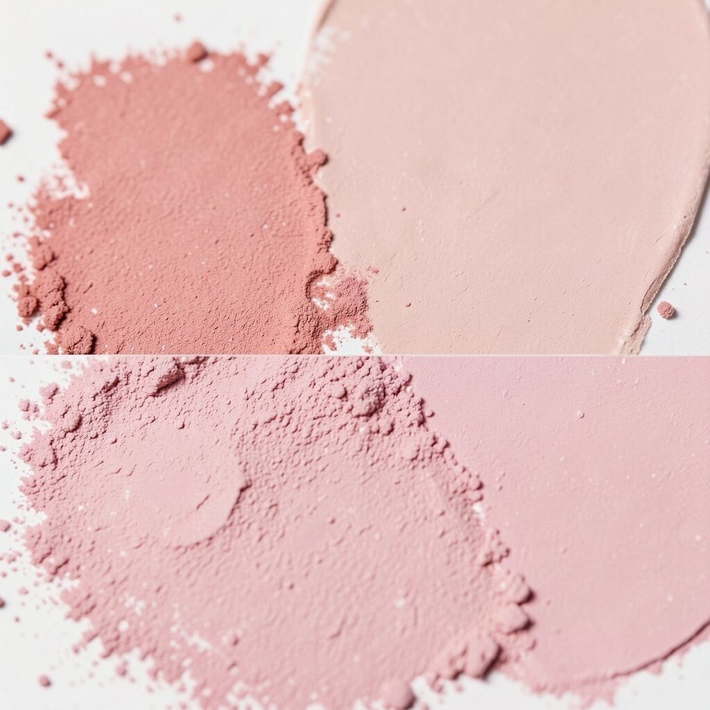
Rose Dust is soft, gentle, and a little romantic. It looks like faded petals and warm blush in soft light.
This color can make wedding pieces, bedroom decor, and beauty packaging feel sweet and calm. It adds charm without shouting, which makes it a nice choice for designs that need a tender mood.
Combine it with gold, ivory, or muted mauve for a pretty layered look. If you want it to feel more like you, add a handwritten note or a simple line drawing. Light pink tones can also be cost-friendly in decor because they often work well with many existing items.
13. Ink Navy
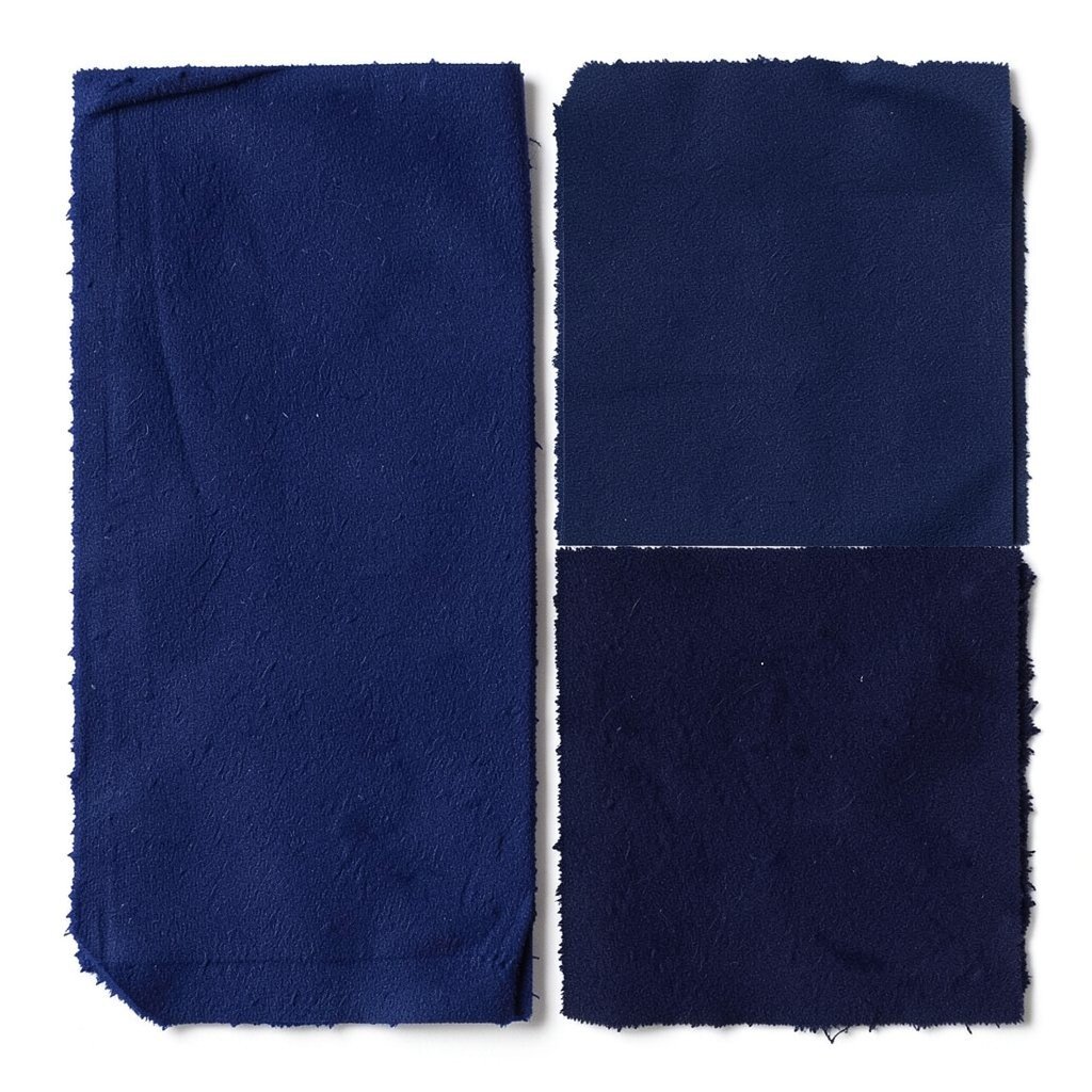
Ink Navy is dark, smooth, and classic. It feels strong like deep water and neat like fresh pen marks.
This swatch gives a design trust, focus, and a polished edge. It is useful for business cards, uniforms, websites, and any project that needs a clean and serious look.
Right now, deep navy is still a favorite because it feels modern but not trendy in a fast way. You can soften it with pale blue or brighten it with coral for a more personal mix. It often works well in small amounts too, which can help keep printing or decorating costs under control.
14. Peach Linen
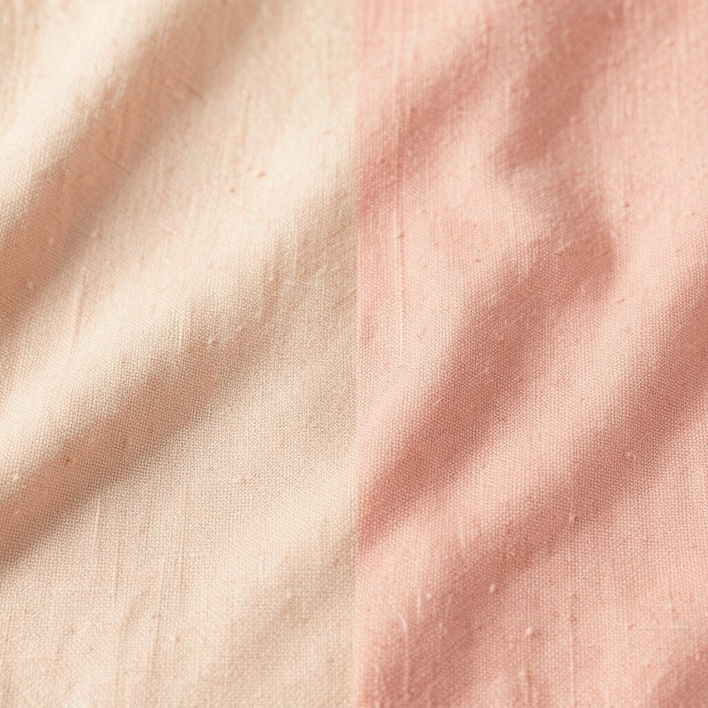
Peach Linen feels soft, warm, and friendly. It has the cozy look of fabric in sunlight and fresh fruit on a simple table.
This swatch is a nice pick for brand kits, home accents, and creative pages that need a gentle glow. It can make a space or design feel open and kind, and it pairs well with white, sage, or warm gray.
If you want to make it unique, try layering it with stitched textures, watercolor edges, or simple folk-style art. Peach tones are popular in modern design because they feel fresh without being too bright. They can also be a smart low-cost choice when you want warmth but do not want to add many extra colors.