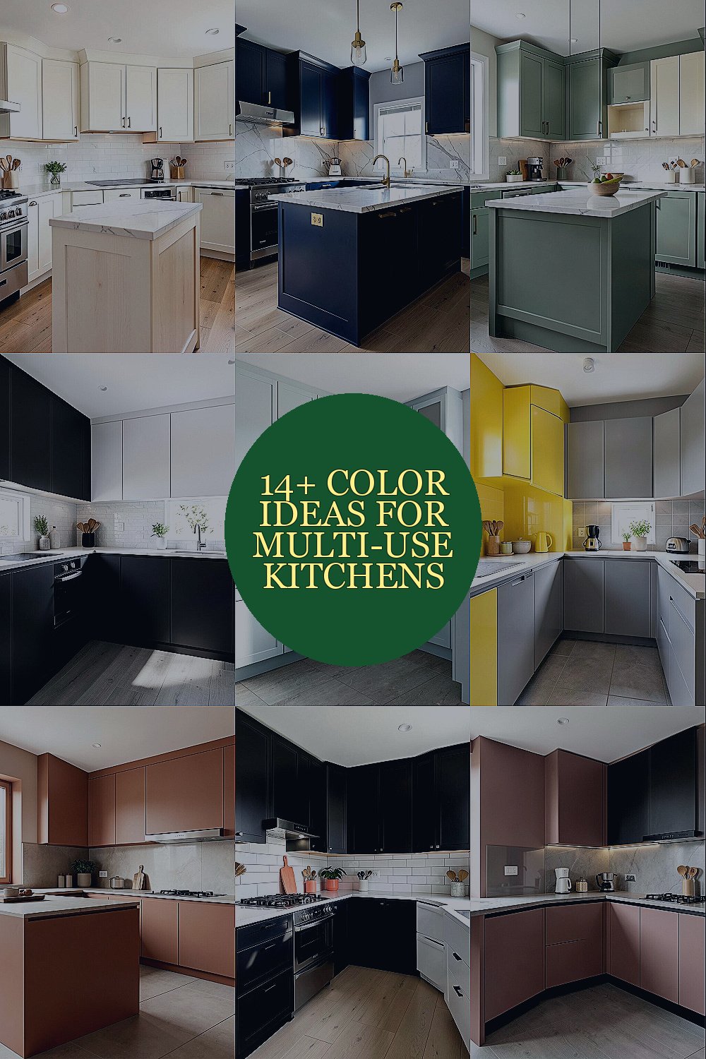
Kitchen spaces do a lot these days. Color can help them do even more.
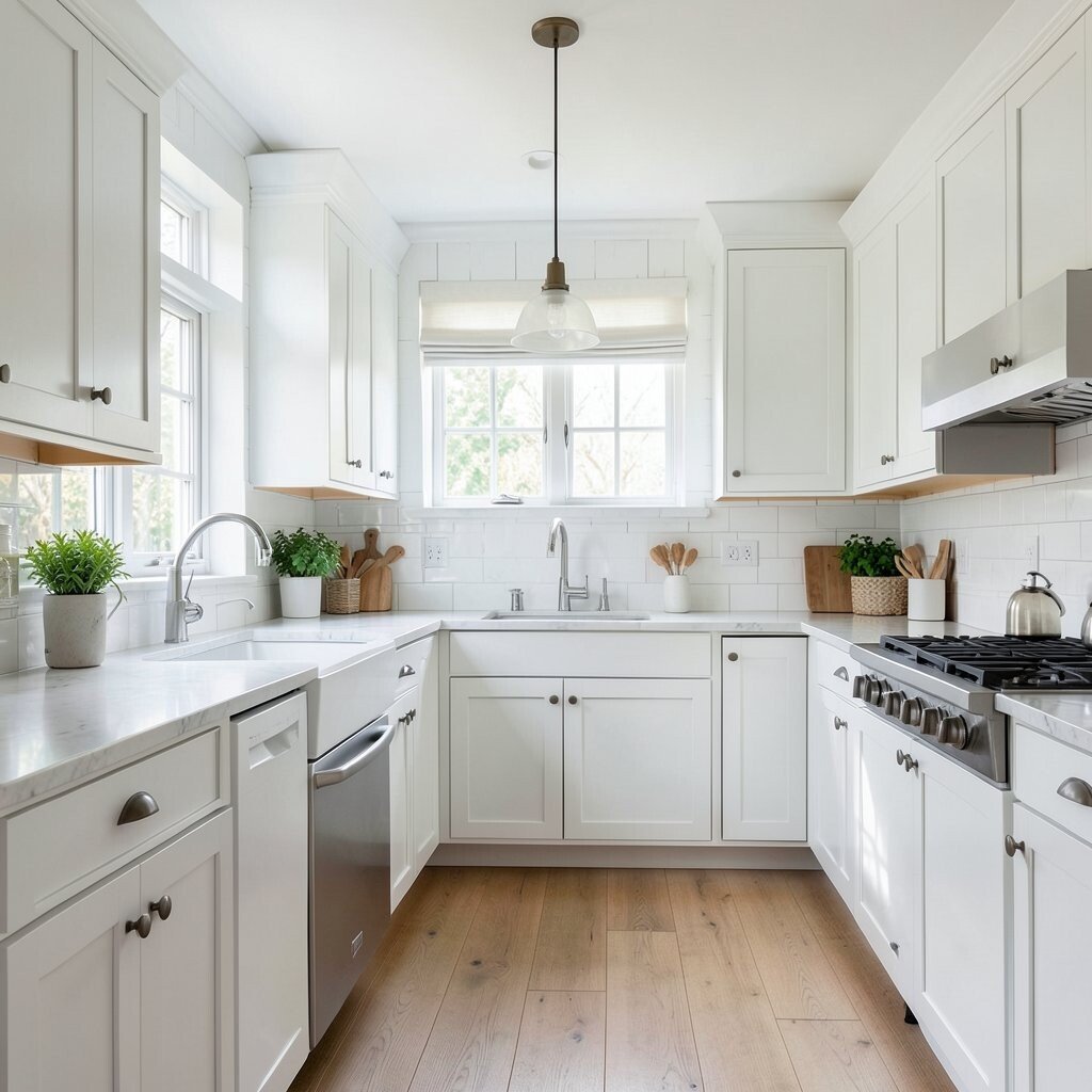
1. Soft White With Warm Wood Notes
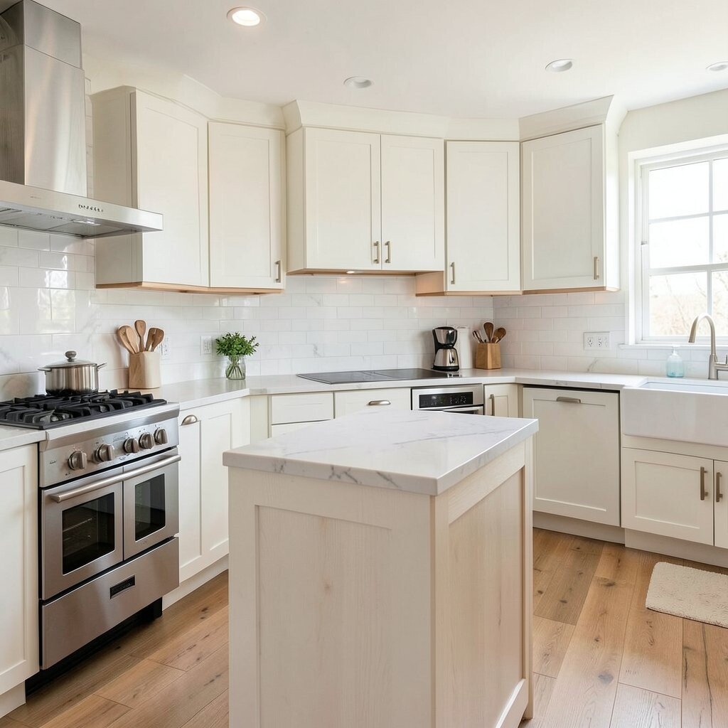
Soft white walls make a kitchen feel bright, open, and calm. Warm wood shelves or stools add a cozy touch that keeps the room from feeling plain.
This look works well in spaces that serve cooking, homework, and quick meals. It is a smart choice for small budgets because paint is often cheaper than big changes, and wood accents can be added little by little.
2. Deep Navy With Brass Touches
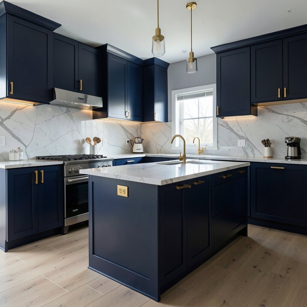
Deep navy cabinets create a rich, polished look that feels bold but still easy to live with. Brass pulls, lights, or faucet details bring in a shiny glow that lifts the whole room.
This color mix is great for kitchens that also act as gathering spots, since it feels neat and grown-up. If the room has strong sunlight, navy can balance the brightness and make the space feel grounded.
For a personal touch, use open shelves to show off white dishes, glass jars, or favorite cookbooks. Navy paint can be a mid-range cost choice, and swapping hardware is a simple way to get the look without a full remodel.
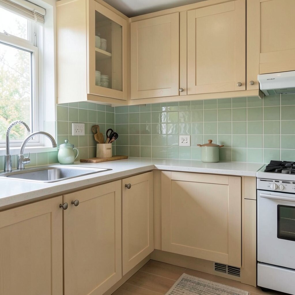
3. Sage Green With Cream Accents
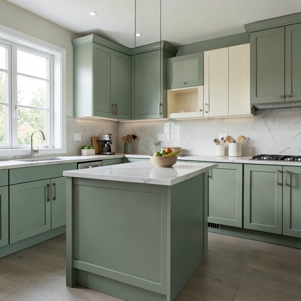
Sage green brings a soft, leafy feel that fits busy kitchen areas very well. Cream trim, counters, or chairs keep the room light and friendly.
This style feels fresh without being loud, so it works for cooking, chatting, and working from home. It also follows a current trend for nature-inspired colors that feel calm and easy on the eyes.
If you want more personality, add woven baskets, clay pots, or a small herb shelf. Sage paint is usually affordable, and it pairs well with many finishes, which helps keep future update costs lower.
4. Charcoal With Bright White Layers
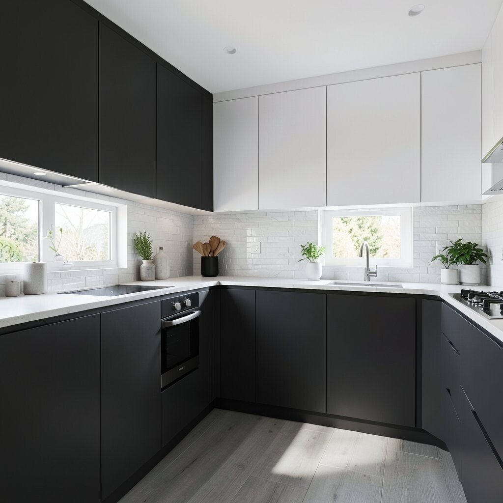
Charcoal cabinets or walls can make a kitchen look sleek and modern. Bright white counters, tile, or ceiling trim keep the room from feeling too dark.
This pairing is useful in multi-use areas because it hides everyday marks better than pale colors. It also gives a strong backdrop for art, plants, and colorful dishes, which makes the room feel lively.
To make it feel more personal, use warm bulbs and soft fabrics so the space stays welcoming. Charcoal can be a smart splurge on lower cabinets, while white paint on upper walls helps control cost.
5. Pale Blue With Natural Stone
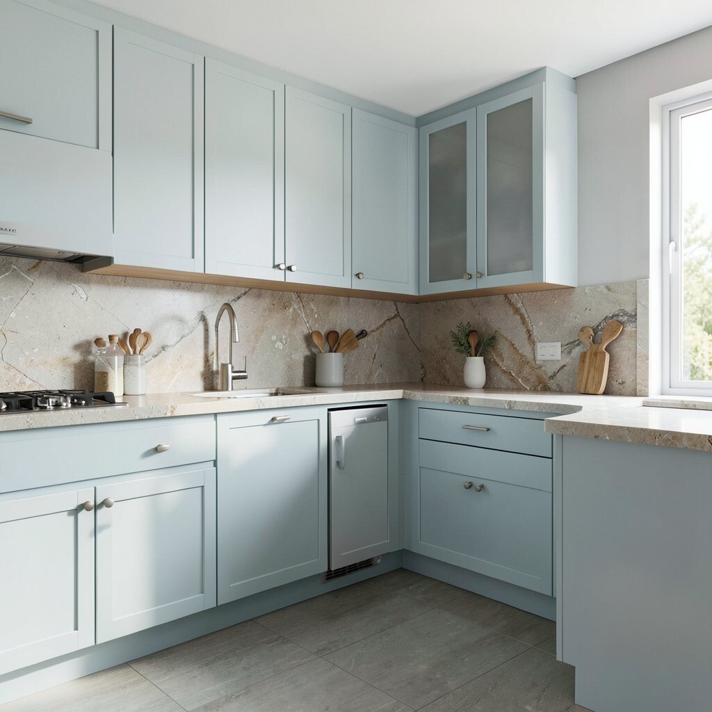
Pale blue adds a clean, airy mood that feels nice in a kitchen used by many people. Natural stone counters or backsplashes give the room a sturdy, earthy look that balances the softness.
This color choice is helpful when the kitchen must feel peaceful during busy mornings and lively evenings. It also fits a popular trend of mixing gentle colors with real materials for a layered, lived-in style.
Try adding silver or matte black fixtures for a simple modern touch. Pale blue paint is often budget friendly, and stone can be chosen in many price ranges, from basic to high-end.
6. Sunny Yellow With Crisp Gray
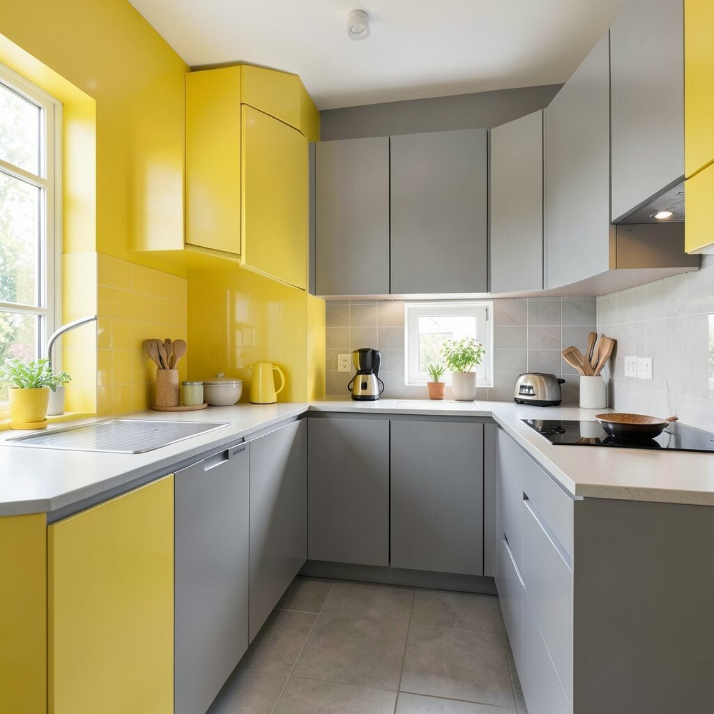
Sunny yellow can make a kitchen feel cheerful right away. Crisp gray keeps that brightness under control so the room still feels neat and balanced.
This mix is a strong pick for family spaces because it feels upbeat and friendly. It works well near breakfast corners, craft tables, or homework spots where a little energy is welcome.
For a custom feel, use yellow on a single wall, pantry door, or island base. Gray cabinets or flooring can help keep costs steady while still making the room look well planned.
7. Terracotta With Soft Beige
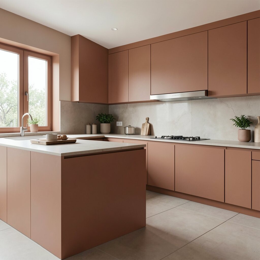
Terracotta brings a warm, sun-baked look that feels rich and welcoming. Soft beige keeps the color from becoming too heavy and helps the whole room feel relaxed.
This style is especially nice in kitchens that open into living or dining areas, since it creates a smooth, cozy flow. It also matches a current love for earthy shades that feel handmade and real.
Add pottery, linen towels, or rattan stools to make the color story feel complete. Terracotta can be used in paint, tile, or accessories, so you can choose a cost level that fits your plans.
8. Black and White With a Pop of Coral
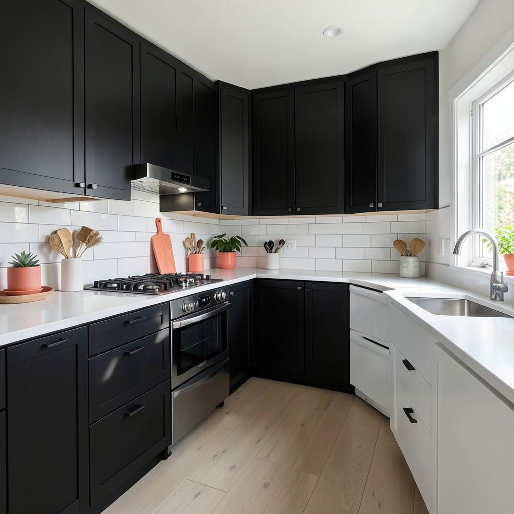
Black and white gives a kitchen a clean, sharp look that never feels boring. A small pop of coral, like a stool, vase, or pendant, adds a playful spark.
This is a great choice for multi-use spaces because the base colors stay classic while the accent keeps things fun. It also makes it easy to change the mood later by swapping the coral for another accent color.
Use coral in small pieces if you want a low-cost update that still feels fresh. A black and white base can handle daily wear well, which makes it practical for busy homes.
9. Dusty Rose With Matte Black Details
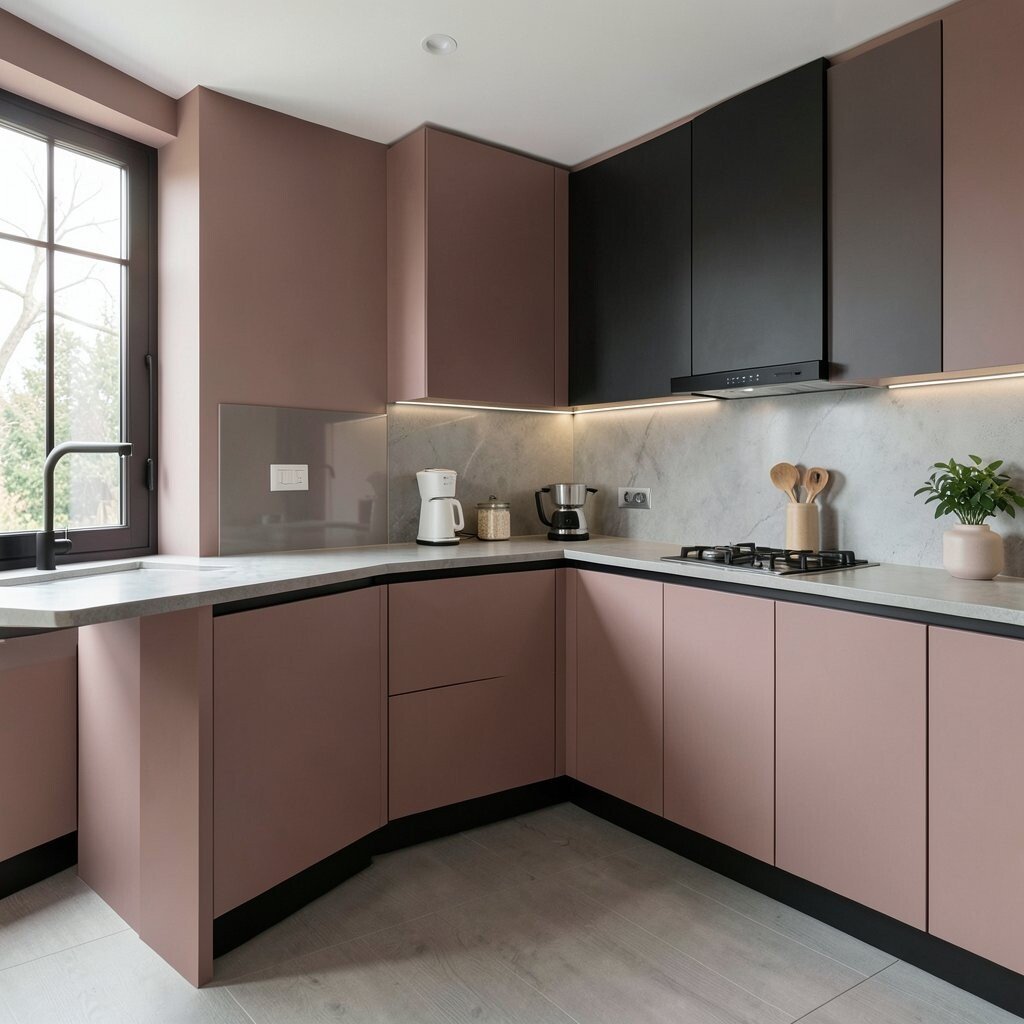
Dusty rose feels soft, warm, and a little unexpected in a kitchen. Matte black details give it shape and stop the room from looking too sweet.
This color pairing works well in shared spaces because it feels welcoming for both kids and adults. It also fits modern style trends that mix gentle colors with strong edges.
Try dusty rose on lower cabinets or a pantry nook for a subtle effect. Black handles and lights are often easy to find at many price points, so this look can be stylish without being costly.
10. Forest Green With Light Oak
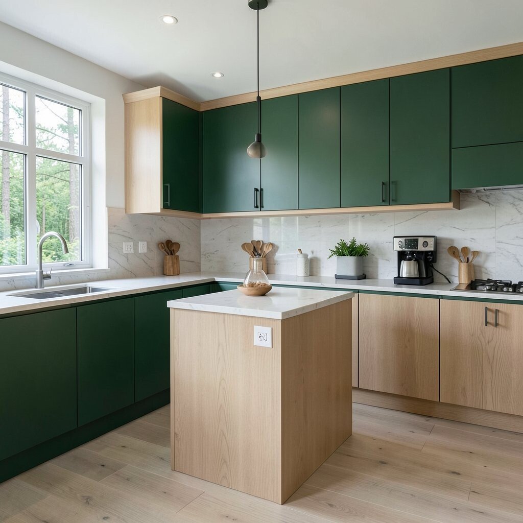
Forest green gives a kitchen a deep, nature-rich feel that looks full and calm. Light oak brings brightness and keeps the room from feeling too dark.
This combination is useful in kitchens that need to feel both stylish and sturdy. It makes a strong backdrop for cooking, serving, and even sitting with guests.
If you want a more personal look, add plants, woven placemats, or brass bowls. Forest green can feel like a bigger color choice, so using it on one main feature can help manage the budget.
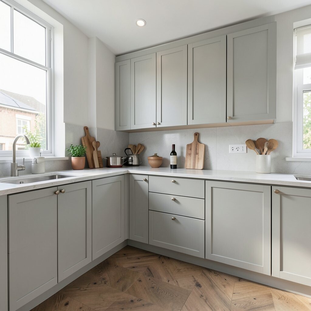
11. Cool Gray With Teal Accents
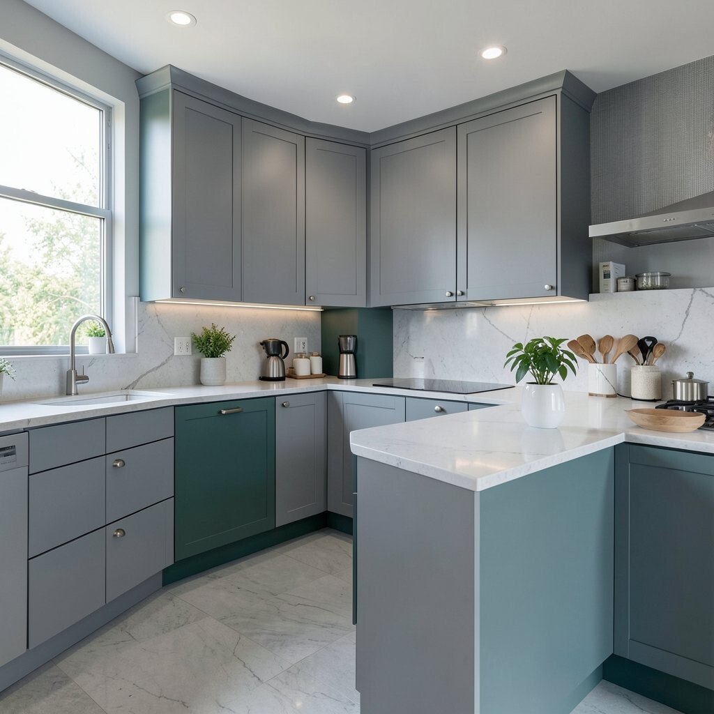
Cool gray creates a smooth, modern base that feels neat and easy to use. Teal accents add life and color without taking over the whole room.
This pairing is handy in multi-use kitchens because it feels calm during busy tasks and still looks fun for guests. It also works well with glass, metal, and white surfaces, which makes styling simple.
For a custom touch, use teal on bar stools, dish towels, or a small appliance. Gray paint and basic decor pieces can keep costs lower while still giving the room a polished feel.
12. Buttercream With Soft Green Tile
Buttercream walls or cabinets make a kitchen glow in a gentle way. Soft green tile adds a fresh note that feels light and cheerful.
This look is lovely in spaces that need to feel friendly for cooking, reading, and hanging out. It also echoes a current trend for vintage-inspired colors that feel warm and comforting.
Use simple wood cutting boards and cream dishes to keep the palette calm. Tile can be a bigger expense, so using it in a small area like a backsplash can give you style without a huge cost.
13. Plum With Pale Gray
Plum gives a kitchen a deep, rich mood that feels special right away. Pale gray softens the look and helps the room stay bright enough for daily use.
This color mix is a smart choice for kitchens that double as evening hangout spots. It feels a little dramatic, which can make the space seem more personal and memorable.
Try plum on an island or one wall if you want a bold feature without repainting everything. Pale gray is usually easy to match, and that can help keep the rest of the design flexible and budget friendly.
14. Aqua With Whitewashed Surfaces
Aqua brings a fresh, lively feel that can wake up a kitchen fast. Whitewashed cabinets, shelves, or wood panels keep the look soft and open.
This style is great for homes that want a light, breezy mood in a busy shared room. It also works well near windows, since natural light makes aqua feel even brighter and more playful.
Add glass jars, pale ceramics, or beachy textures for a personal touch. Aqua paint can be a fun lower-cost update, and whitewashed finishes often give older pieces a new life.
15. Greige With Colorful Open Shelving
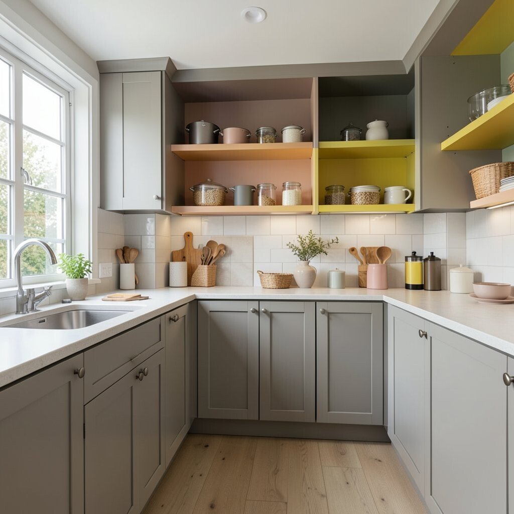
Greige gives a kitchen a calm, modern base that sits between gray and beige. Colorful open shelving brings in personality through dishes, books, plants, or storage bins.
This approach is ideal for multi-use spaces because the main color stays easy to live with while the shelves can change with the seasons. It also supports a popular trend toward flexible design that feels collected instead of overly matched.
Use your favorite colors in small groups so the shelves still look neat. Greige paint is often a safe budget pick, and open shelving can be added in simple steps as time and money allow.