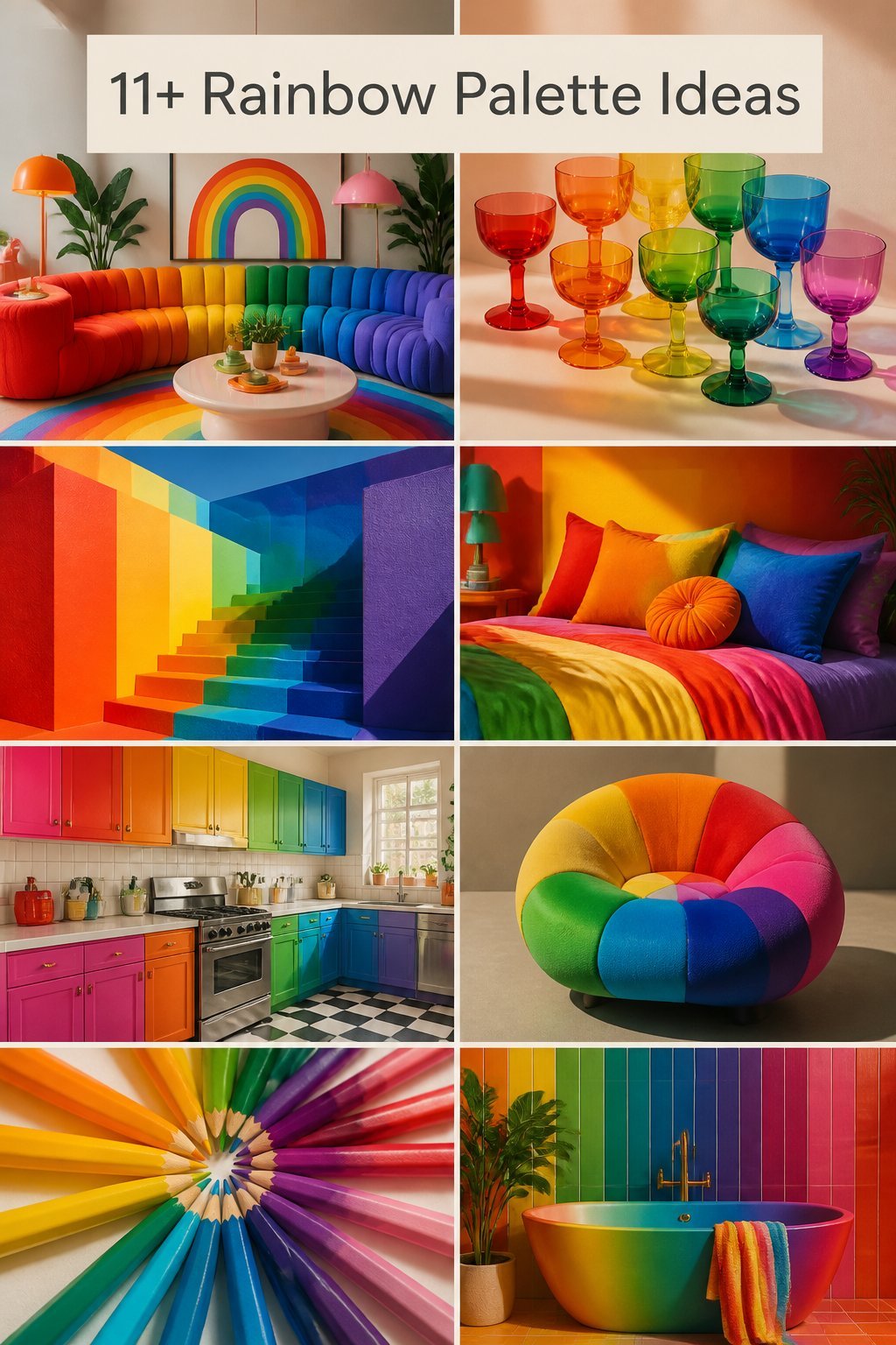
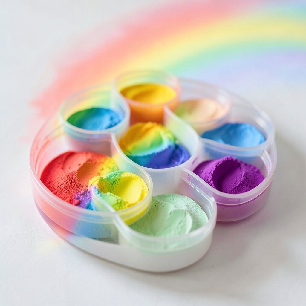
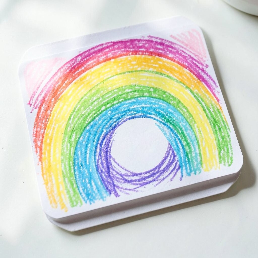
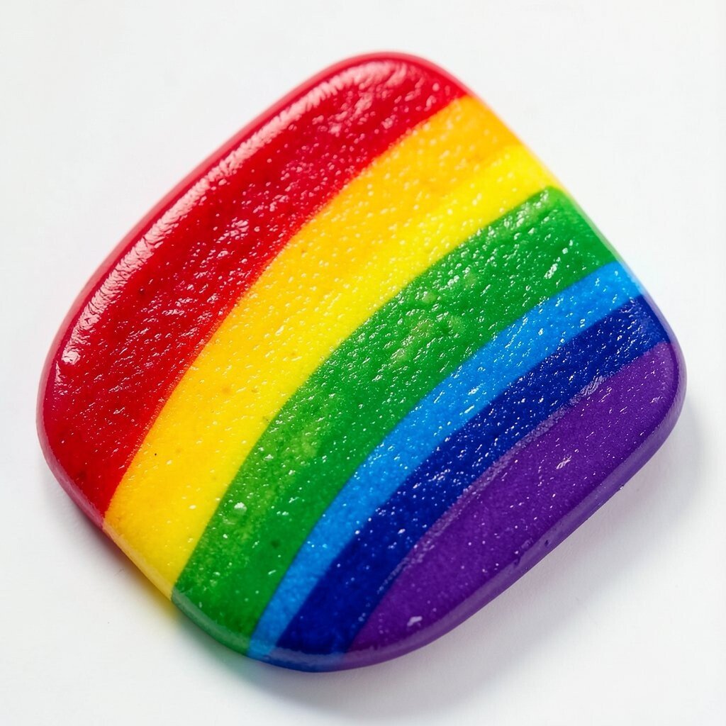
Rainbow colors can wake up a page in a blink. A bright palette can make simple art feel full of joy.
1. Soft Rainbow Washes
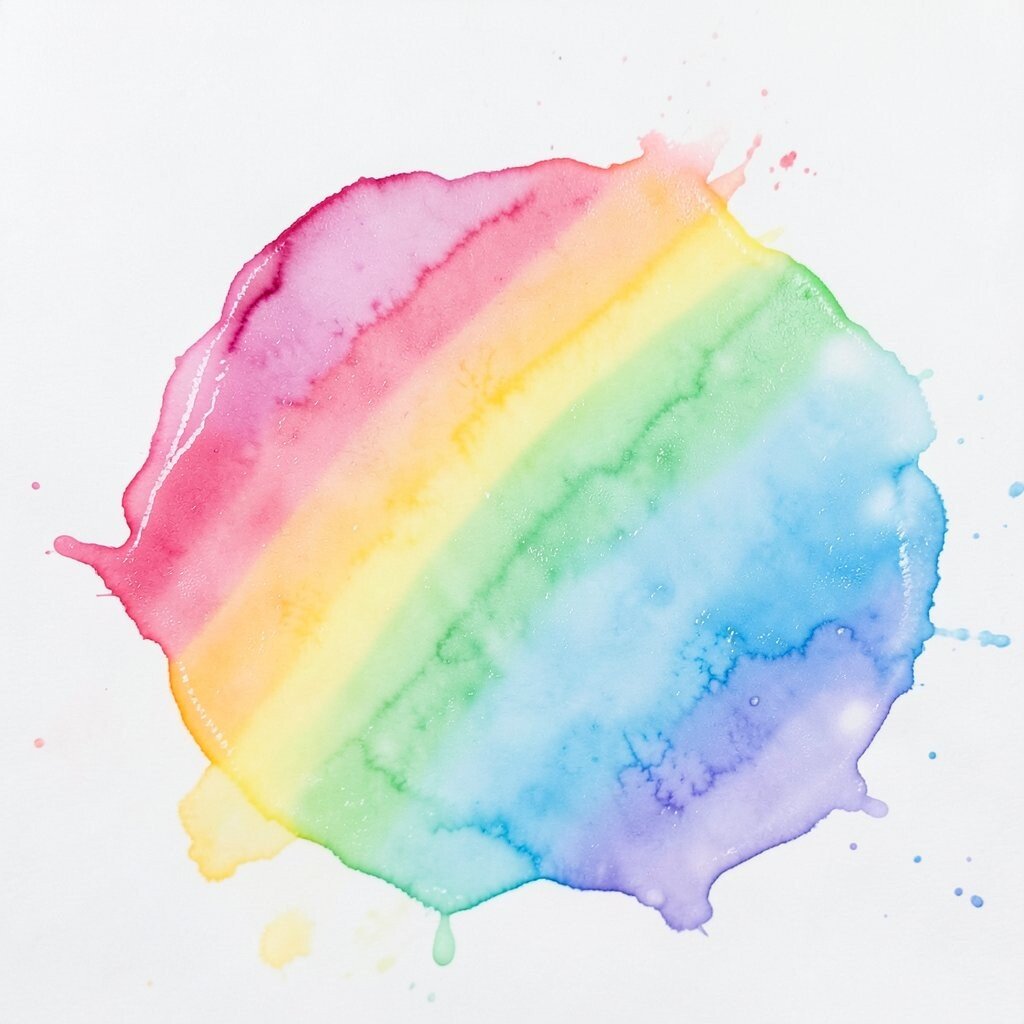
Soft rainbow washes bring a dreamy glow to your art. The colors blend like sunrise sky and make a gentle, happy mood.
This style works well for backgrounds, cards, and journal pages. It is easy on the eyes and gives you a calm place to add words or shapes. Watercolor paint is a low-cost pick, and even student sets can do a lovely job. Try mixing each color with extra water so the look stays light and airy.
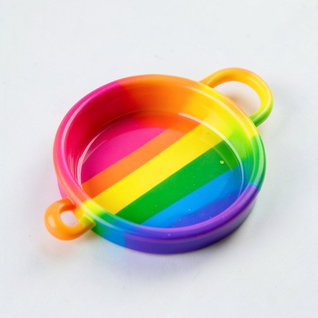
2. Bold Candy Stripe Rainbow
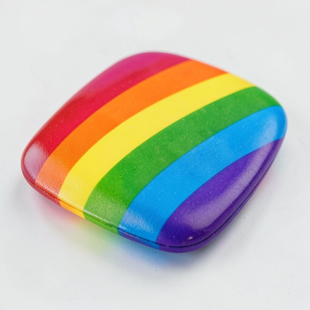
Bold candy stripes make art feel loud, fun, and full of energy. The strong bands of color stand out fast and pull the eye right in.
This idea is great for posters, scrapbook pages, and playful prints. It also helps when you want a neat design that still feels bright. You can use markers, acrylic paint, or colored tape, and tape can save time if you want clean lines. Add your own twist by making some stripes wide and others thin.
Many artists like this look because it feels cheerful and easy to read. It can also fit current trends in bold graphic art and bright room decor. If you want a personal touch, choose one favorite color to repeat at the top and bottom.
3. Rainbow Pastel Clouds

Pastel rainbow clouds look soft, sweet, and a little magical. The pale colors float together like cotton candy in the sky.
This palette is a good choice for dreamy art, nursery decor, and cute greeting cards. It makes space feel gentle and friendly without becoming too loud. Use chalk, colored pencils, or light paint to keep the shades soft. If you want a special feel, add tiny stars or sparkles between the clouds.
Pastels are often kind to the wallet because many sets include these shades already. They also work well in trend-forward art that feels light and modern. You can make the palette more personal by choosing cooler pastels for a calm mood or warmer ones for a cozy feel.
4. Neon Rainbow Pop
Neon rainbow colors shine like a party sign on a dark street. They give art a wild, electric feel that is hard to ignore.
This palette works well for game art, stickers, and bold wall pieces. It can make simple shapes look exciting with very little extra effort. Neon markers and gel pens are handy, and they usually cost less than big paint sets. For the best pop, place neon colors beside black or deep navy.
5. Rainbow Fruit Basket Palette
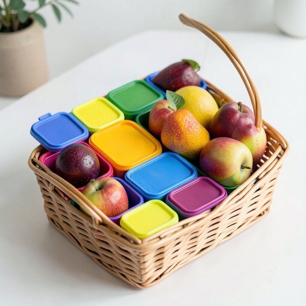
This palette borrows colors from fruit and makes art look fresh and tasty. Think strawberry red, orange peel, lemon yellow, lime green, blueberry blue, and grape purple.
It is a fun pick for food art, market posters, and summer crafts. The colors feel friendly and bright, so they can make a scene feel alive right away. You can use colored pencils, crayons, or paint, and each tool gives a different look. Try naming each color after a fruit to help you remember your favorite mix.
This idea is unique because it ties color to real life in a simple way. It can also be budget-friendly if you use basic school supplies. To make it your own, swap in peach, kiwi, or plum tones when you want a softer or richer feel.
6. Rainbow Sunset Glow
Sunset rainbow colors can make art feel warm and full of wonder. The blend of pink, orange, gold, and violet looks like the sky at the end of a long day.
This palette is lovely for landscapes, silhouettes, and dreamy abstract pieces. It gives a strong sense of mood without needing many extra details. Acrylic paint works well here, and small tubes can last a long time if you use them with care. A good tip is to layer the lighter colors first and then add the deeper tones on top.
Artists like this palette because it feels rich but still easy to use. It fits current trends in cozy home art and sunset-inspired prints. For a personal touch, make the sky more peachy, more purple, or more fiery based on your own taste.
It also pairs well with gold pen or glitter accents if you want extra shine. Those small touches can make the whole piece feel special without much cost. A few bright highlights can turn a simple sunset scene into something memorable.
7. Rainbow Doodle Mix
Rainbow doodle art is playful and full of little surprises. Each color can mark a new shape, line, or tiny character.
This palette is perfect for sketchbooks, notes, and fun borders. It helps your page feel busy in a good way, and it can make practice time feel less serious. Fine-tip markers are a smart buy because they are easy to control and often not too expensive. To keep the page neat, pick a color order and repeat it across the whole drawing.
You can personalize the look by adding hearts, stars, leaves, or smiley faces in your own style. A mix of sharp and soft shapes makes the page feel lively. This trend is popular in bullet journals and handmade stationery, so it can help your work feel fresh.
8. Jewel-Tone Rainbow
Jewel-tone rainbow colors feel rich, deep, and classy. Emerald, sapphire, ruby, amethyst, and gold can make art look fancy right away.
This palette is a strong fit for holiday art, elegant cards, and dramatic patterns. It gives more depth than bright primary colors, so it can feel grown-up while still being colorful. Metallic pens and paints can add shine, and you can often find small sets at fair prices. If you want the colors to glow, use a dark background behind them.
Jewel tones are a nice choice when you want something unique but not too loud. They also match current trends in luxe decor and rich digital art. To make the palette yours, pick one gem color to lead the group and let the others support it.
9. Rainbow Beach Boardwalk
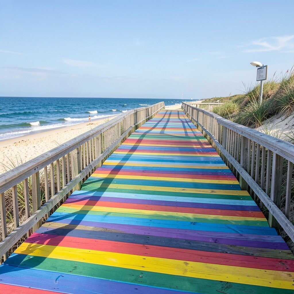
Beach boardwalk rainbow colors feel sunny, salty, and full of summer fun. The mix of aqua, coral, sand, yellow, and seafoam can make art feel breezy.
This idea works well for travel pages, vacation art, and cheerful signs. It gives a fresh look that can remind people of waves, shells, and warm wood planks. You can use paint, crayons, or collage paper, and collage can be a low-cost way to build texture. Try adding tiny stripe patterns or shell shapes to bring the theme to life.
The palette is easy to personalize with your favorite seaside memories. Maybe you want more blue for ocean calm or more coral for a sunset feel. That kind of choice makes the art feel close to home.
It also fits current trends in coastal decor and relaxed summer crafts. The colors are bright without being harsh, so they work in many rooms. A little white space can help the whole piece feel open and airy.
10. Rainbow Garden Bloom
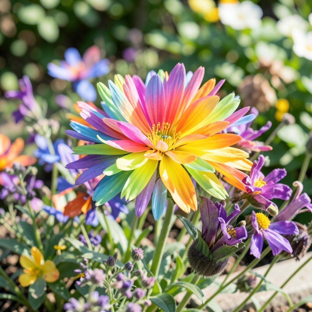
Rainbow garden colors look like flowers opening in a sunny yard. Petal pink, leaf green, butter yellow, sky blue, and violet can make art feel alive.
This palette is great for nature scenes, floral patterns, and handmade gifts. It feels cheerful and soft at the same time, which makes it easy to love. Colored pencils are a good budget pick for petals and leaves because they allow careful shading. Try mixing flower shapes of different sizes so the page does not feel flat.
You can make the palette more unique by giving each flower its own color group. That small change can turn a simple page into a bright garden story. Many artists enjoy this style because it works well in current botanical trends and spring-themed art.
11. Rainbow Candy Shop
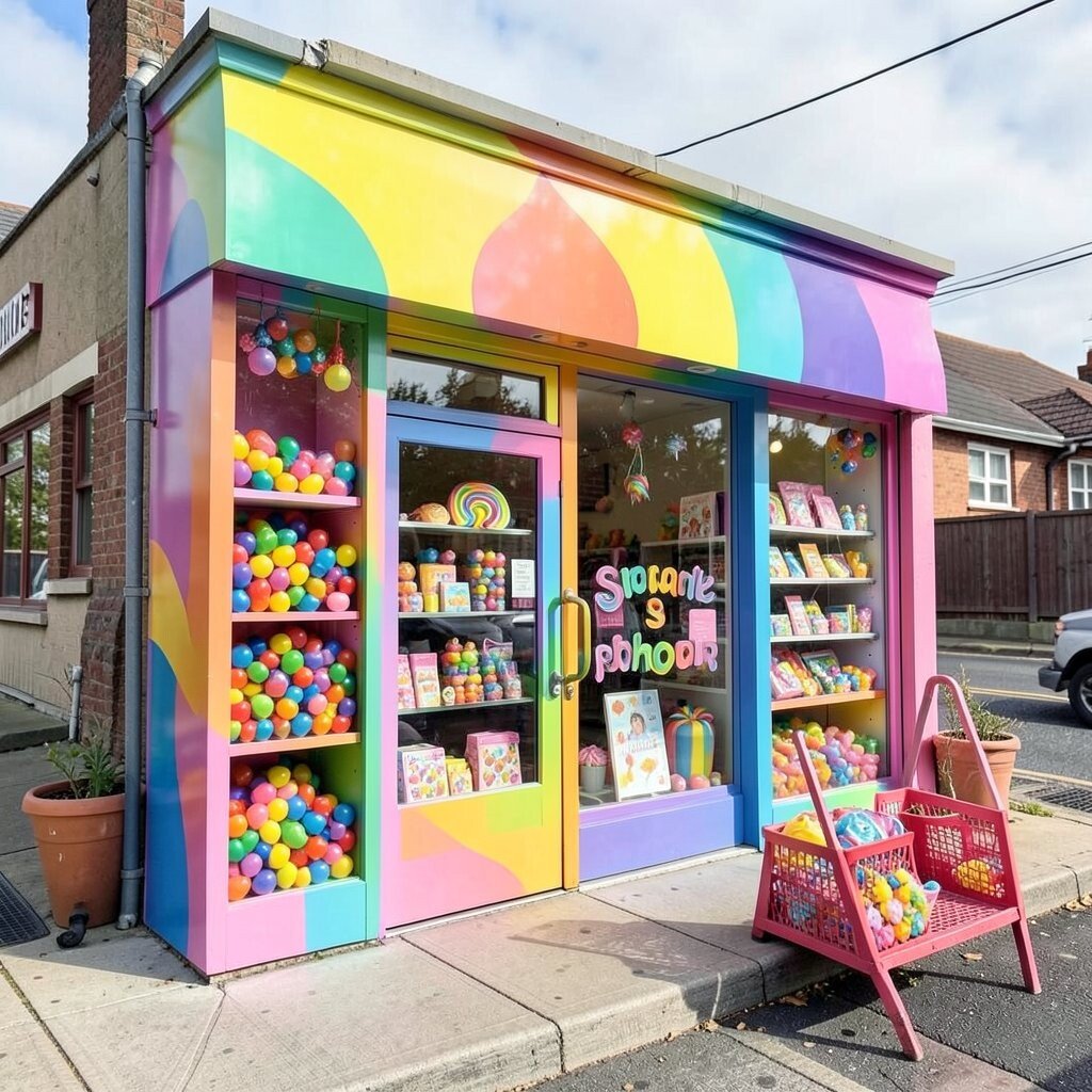
Rainbow candy shop colors look sweet, shiny, and full of fun. Bright pink, mint, lemon, lilac, and cherry red can make art feel like a treat.
This palette is a great match for stickers, party art, and cute packaging ideas. It can make even a simple drawing seem playful and fresh. Gel pens, markers, and craft paint all work well, and small sets are often easy on the budget. For extra charm, add glossy highlights that look like candy wrappers.
Personal touches matter a lot here, since each person has a different favorite treat color. You might repeat mint for a cool feel or use extra pink for a sweeter look. This palette stays popular because it feels joyful and easy to share online.
12. Rainbow Night Sky
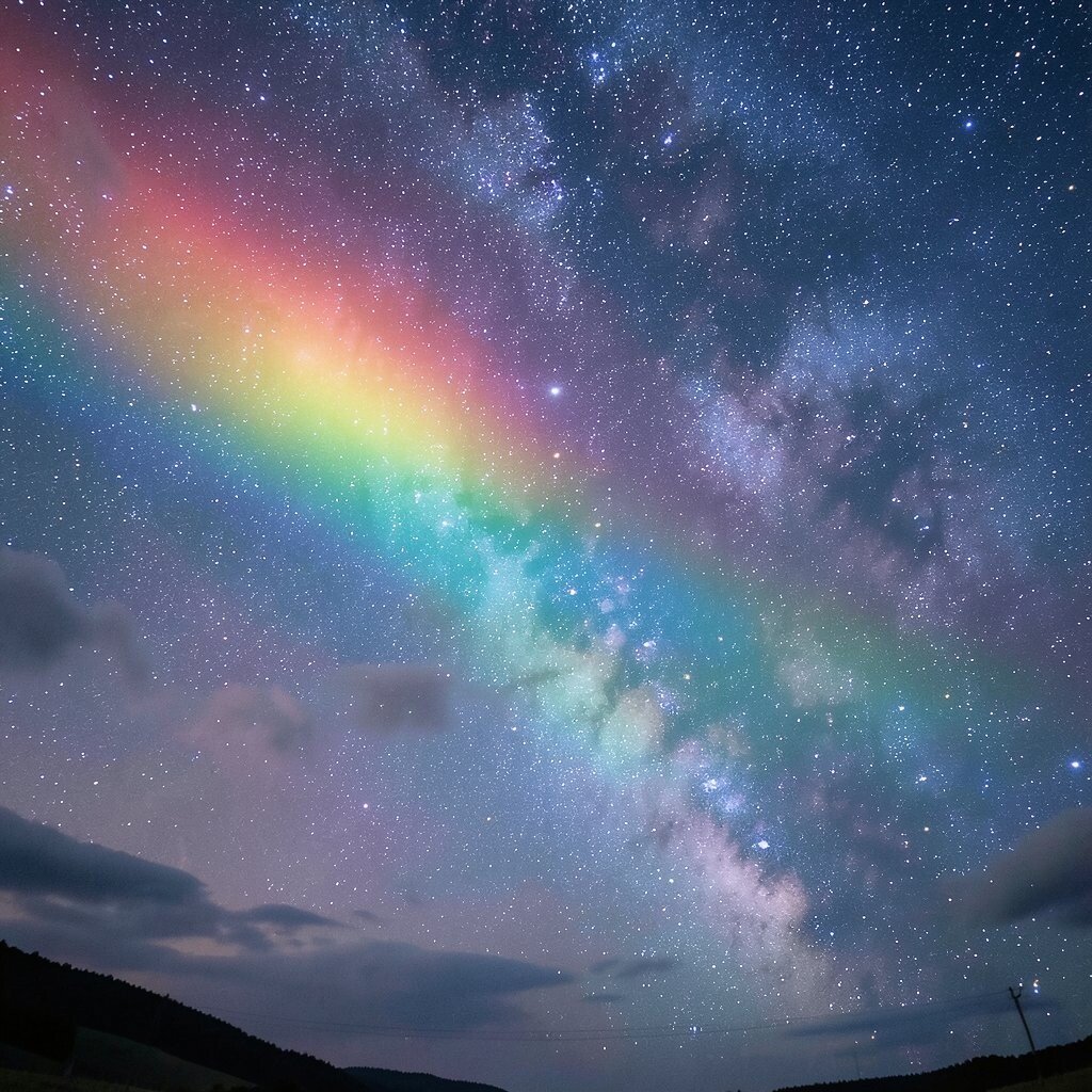
Rainbow night sky art blends dark blues and purples with bright rainbow stars. The contrast makes the colors shine like lights in the dark.
This palette is ideal for dreamy scenes, space art, and magical bookmarks. It gives a big visual punch while still feeling calm and mysterious. Dark paper can be a smart choice because it makes bright pens and paints stand out fast. If you want to save money, try using one dark sheet and a few bright tools instead of a full set of supplies.
You can make the palette your own by adding moons, constellations, or glowing planets. That gives the art a personal story and makes it feel special. Current art trends often use dark backgrounds with vivid highlights, so this look feels fresh and modern.
A tiny bit of silver or white can make the whole page sparkle. Those small marks help the rainbow colors feel even brighter. The result is bold, pretty, and easy to remember.