
Color can wake up a room in a single afternoon. A fresh palette can make everyday spaces feel cheerful and alive.
1. Sunny Citrus Glow
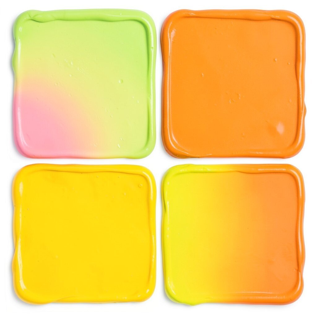
Sunny citrus shades bring the feeling of fresh juice, warm light, and happy mornings into a room. Think lemon yellow, soft tangerine, and a touch of creamy white for balance.
This palette works well in kitchens, breakfast nooks, and entryways because it feels bright without being too heavy. It can make small spaces seem more open, and it pairs nicely with light wood, woven baskets, and simple white trim.
2. Ocean Breeze Blues
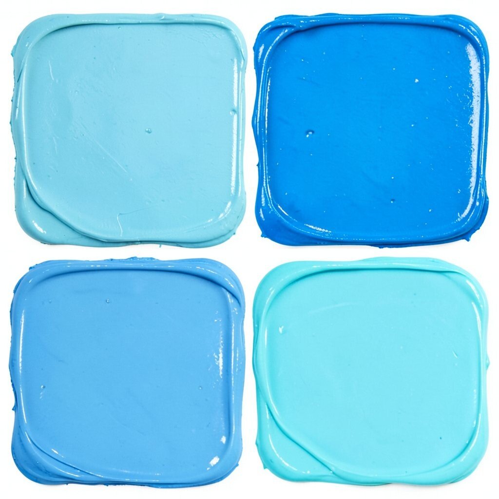
Ocean breeze colors feel cool, calm, and full of clean energy. Soft aqua, sea glass blue, and deep teal create a layered look that feels fresh and easy to live with.
This palette is a smart choice for bedrooms, bathrooms, and reading corners because it brings a peaceful mood. It also fits many styles, from coastal homes to modern apartments, and it looks lovely with silver accents or sandy beige fabrics.
For a personal touch, add a painted stripe, a blue accent chair, or a set of framed beach prints. Paint quality matters here, since richer blues can need extra coats, so it helps to budget for good primer and a smooth finish.
3. Berry Pop Mix
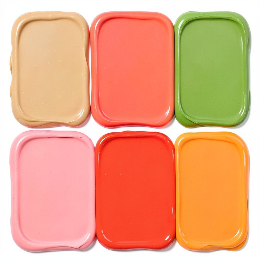
Berry shades add a playful burst of color that feels bold but still cozy. Raspberry, plum, and soft blush can turn a plain wall into something full of personality.
This palette is great for living rooms, creative studios, and kids’ spaces because it feels lively and warm. It stands out best when paired with cream, warm gray, or even a little gold for shine.
If you want the room to feel less intense, use berry on one wall and keep the rest light. A few small pieces, like pillow covers or lamps, can carry the same mood without a big paint bill.
Berry tones are also on trend in many homes right now because they feel rich and welcoming. They give a space a stylish look while still feeling friendly and easy to enjoy.
4. Tropical Leaf Greens
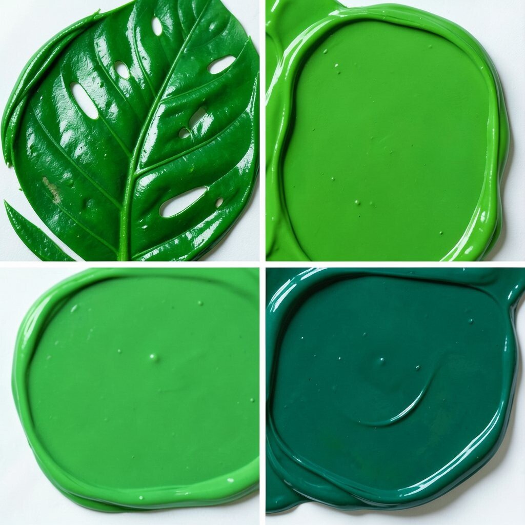
Leaf greens bring a fresh, garden-like feeling indoors. Lime, fern, and deep jungle green can make a space feel full of life and movement.
This palette works especially well in sunrooms, dining rooms, and home offices because it feels energizing and natural. It pairs well with rattan, black metal, and warm white walls for a balanced look.
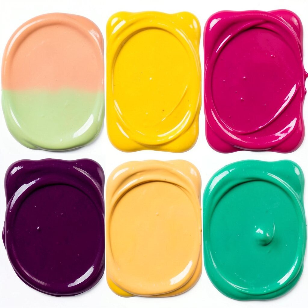
5. Coral Sunrise Blend
Coral sunrise shades feel warm, upbeat, and soft at the same time. Coral, peach, and apricot can give a room a gentle glow that feels cheerful all day long.
This palette is a good fit for nurseries, guest rooms, and cozy sitting areas because it feels welcoming. It also works with both modern and vintage furniture, which makes it easy to style.
Try coral on a feature wall, then repeat the color in art, throw blankets, or pottery for a pulled-together look. If you want a lower-cost update, paint just the trim, shelves, or a small alcove instead of the full room.
6. Electric Sunset
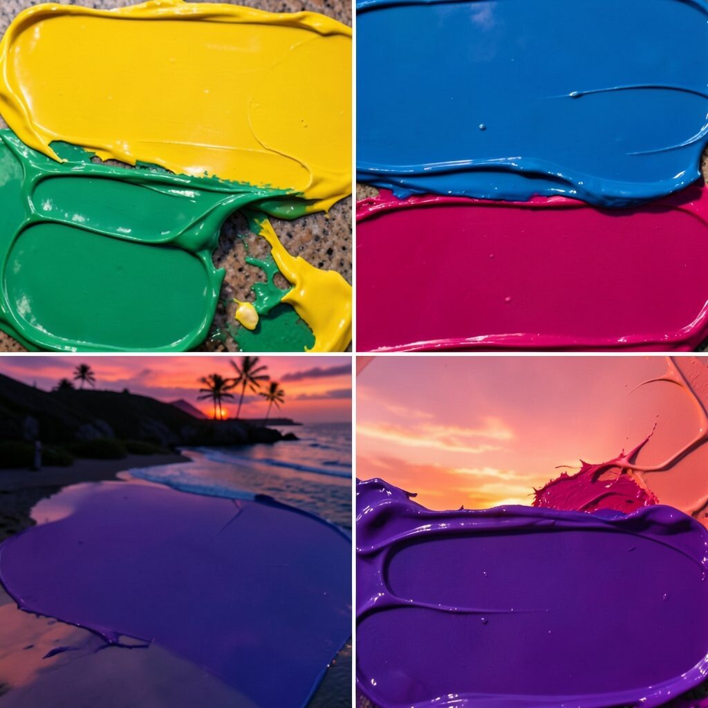
Electric sunset colors bring drama in the best way. Hot pink, bright orange, and golden amber can make a room feel exciting and full of energy.
This palette is perfect for creative spaces, game rooms, and bold living areas where you want a strong style statement. It works best when balanced with crisp white, matte black, or light neutral furniture so the colors can shine.
Because these shades are strong, a little goes a long way, which helps keep costs under control. You can also use removable décor, like painted side tables or canvas art, if you want the look without a full repaint.
Many people love this kind of palette now because it feels fun and brave. It can make a plain room feel like a place where ideas and good moods show up fast.
7. Lavender Cloud Pairing
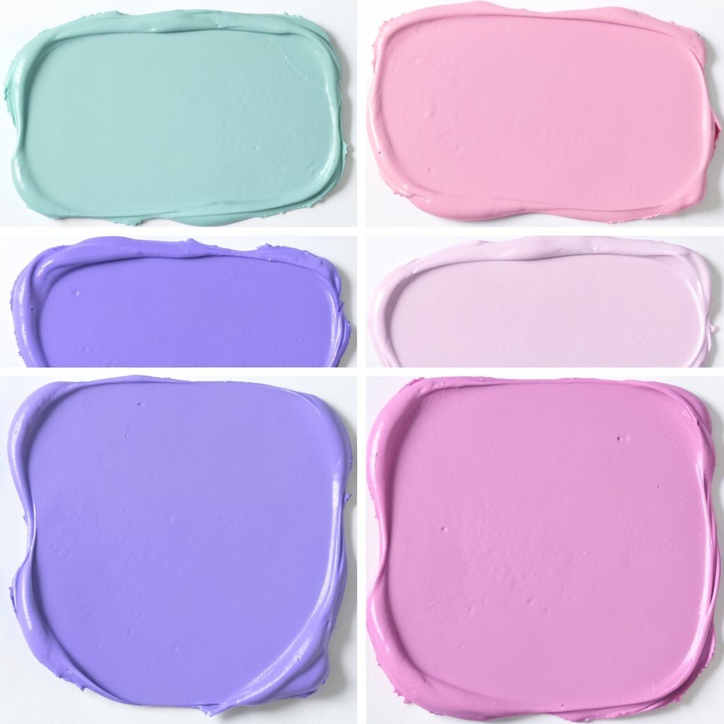
Lavender cloud colors feel soft, dreamy, and just a little magical. Pale lavender, misty gray, and white create a gentle palette that looks calm and tidy.
This choice is lovely for bedrooms, bathrooms, and quiet corners where rest matters most. It also works well with glass, brushed nickel, and pale wood, which keeps the space light and airy.
For a more personal feel, add floral art, a soft rug, or a painted headboard in a deeper purple shade. This palette is often budget-friendly because lighter colors can cover well and may need less paint than darker, tricky tones.
Lavender is a nice pick if you want something pretty but not too loud. It gives a room charm without taking away the peaceful feeling.
8. Mango and Mint
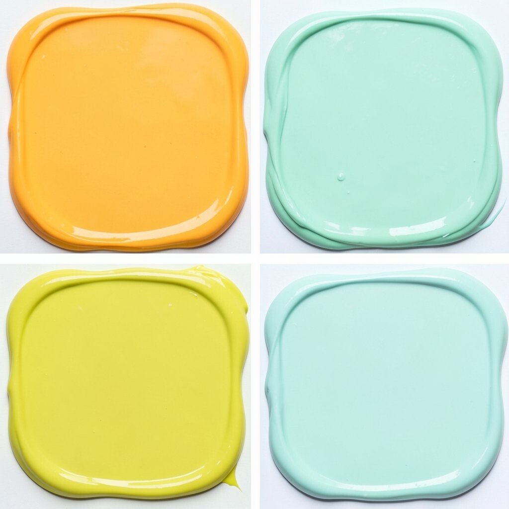
Mango and mint make a playful color duo that feels fresh and surprising. The warm mango shade adds cheer, while mint brings a cool, clean balance.
This palette is great for kitchens, craft rooms, and family spaces because it feels lively and friendly. It also works well in smaller rooms since the mint helps soften the brightness of the mango.
Use one color as the main wall shade and the other as an accent on chairs, shelves, or door frames. If you are watching your budget, paint only a few key pieces and keep the rest of the room simple.
This mix fits modern color trends that favor happy, bold combinations. It can make your home feel current while still staying easy to live with every day.
9. Jewel Tone Charm
Jewel tones bring rich color and a cozy sense of luxury. Emerald, sapphire, and amethyst can make a room feel deep, polished, and full of character.
This palette works well in dining rooms, libraries, and formal living spaces because it creates a strong and elegant mood. It also looks beautiful with velvet, brass, dark wood, and soft lighting.
If you want a softer version, choose one jewel tone and mix it with cream or taupe. That approach can lower costs too, since you may only need one feature wall and a few matching accents to make the room feel complete.
Jewel tones are a smart choice if you want your space to feel special. They bring a rich look that still feels warm and inviting, not stiff or cold.
10. Pastel Candy Shop
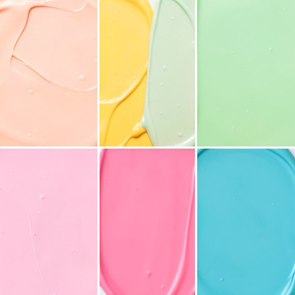
Pastel candy colors feel sweet, light, and full of charm. Baby blue, soft pink, buttercream, and mint can make a room feel happy in a gentle way.
This palette is lovely for nurseries, craft rooms, and sunny bedrooms because it feels playful without being too bold. It also works well with white furniture and simple shapes, which keeps the room from feeling crowded.
To make it more personal, mix in handmade art, colorful books, or a patchwork pillow. Pastels are often a good money-saving choice because they can brighten a room fast and may work well over existing light-colored walls.
Many homes use pastel shades now in a softer, grown-up style. That makes the look feel fresh, sweet, and easy to enjoy for a long time.
11. Firelight Neutrals
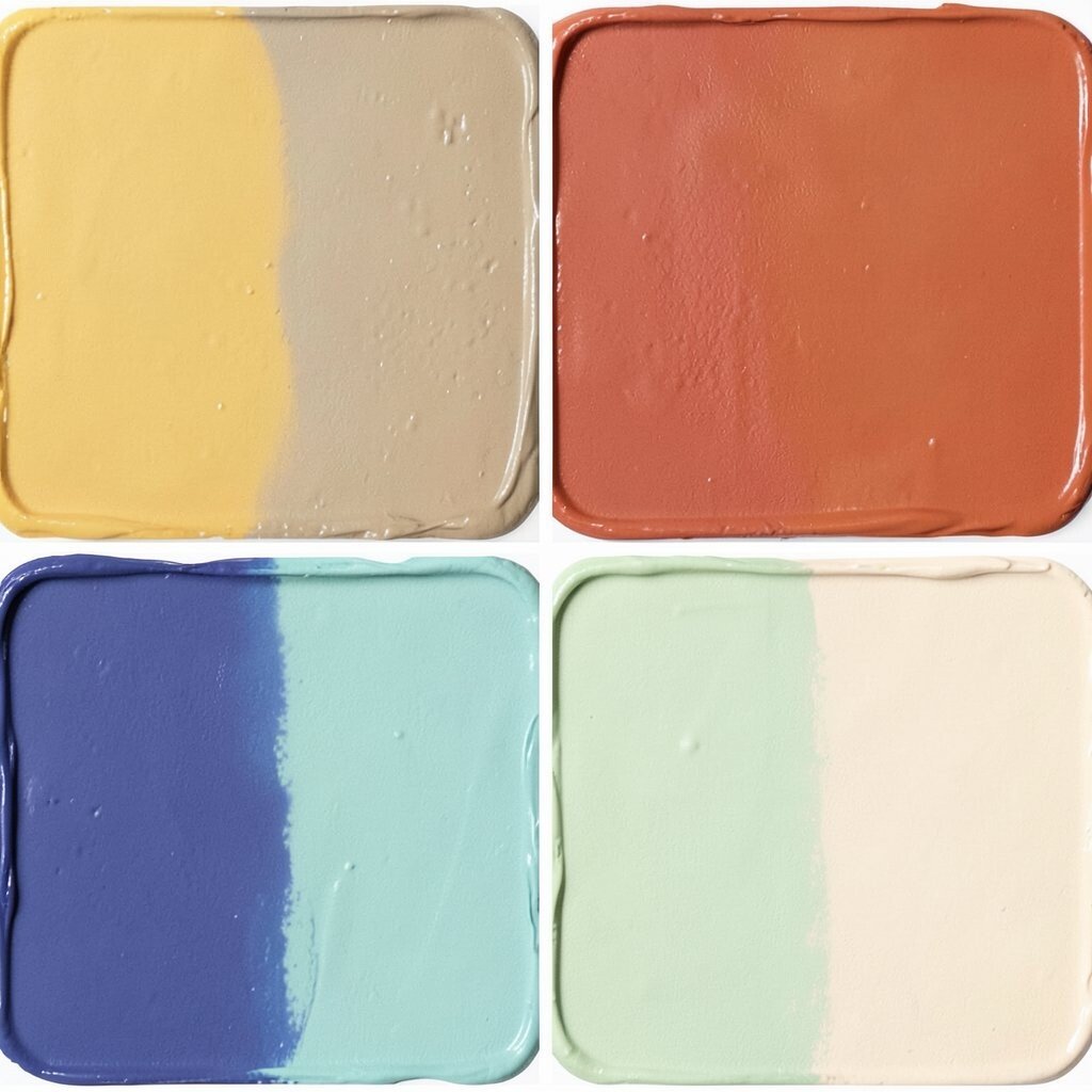
Firelight neutrals are warm, glowing shades that feel calm but not plain. Think camel, terracotta, soft beige, and dusty clay mixed together for a cozy and sun-kissed look.
This palette is ideal for family rooms, halls, and bedrooms because it creates comfort and warmth. It also pairs well with linen, leather, and wood, which helps a room feel grounded and welcoming.
If you want a stronger look, add one deeper accent like rust or chocolate brown in pillows or a painted niche. The palette can be budget-friendly because these shades often hide scuffs well, so walls may stay looking nice longer.
Firelight neutrals suit people who want color without too much brightness. They make a space feel calm, stylish, and easy to live in every day.
12. Rainbow Accent Flow
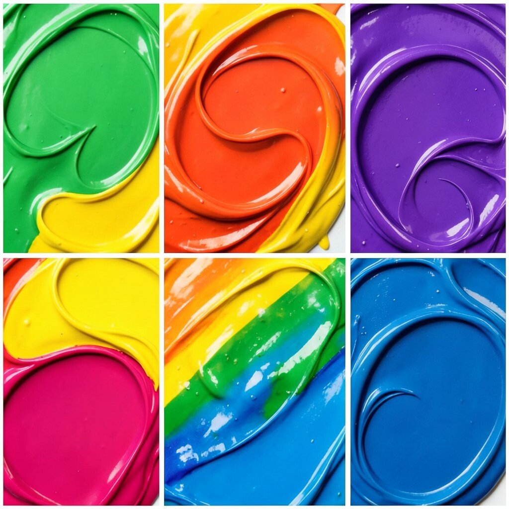
Rainbow accent flow is a joyful way to use many colors without making a room feel messy. The trick is to choose one soft base, then add small pops of red, blue, green, yellow, and pink in a planned way.
This palette shines in playrooms, studios, and shared spaces where energy and creativity matter. It can help a room feel more personal, and it gives you room to change things over time without repainting everything.
Start with a light wall color, then bring in color through art, storage bins, pillows, and painted furniture. This approach can save money because small décor pieces are often cheaper than a full room repaint, and they are easy to swap later.
Rainbow accents are especially popular in homes that want a happy, modern look. They make a space feel lively while still giving you control over how bold the final result feels.