Warm colors can make a kitchen feel like a hug. The right mix can turn plain walls and cabinets into a space that feels calm and welcoming.
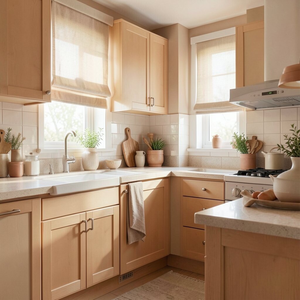
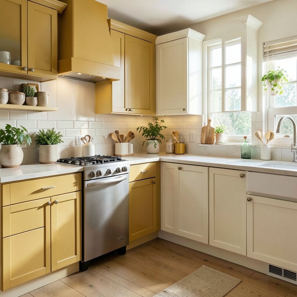
1. Buttery Cream and Soft Honey
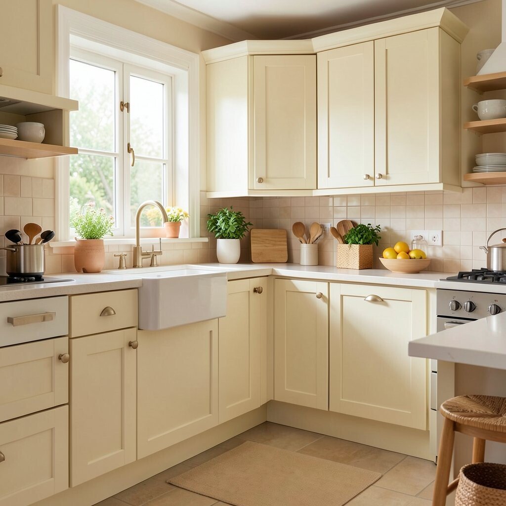
Buttery cream and soft honey make a kitchen glow in a gentle way. The look feels sunny, smooth, and easy to live with.
This palette works well on cabinets, walls, or open shelves, and it pairs nicely with wood floors and brass pulls. It can also make a small kitchen feel brighter without looking cold, which is a big win for busy homes. If you want a low-cost update, paint is often the easiest place to start, and even one warm wall can shift the whole mood.
2. Terracotta and Warm White
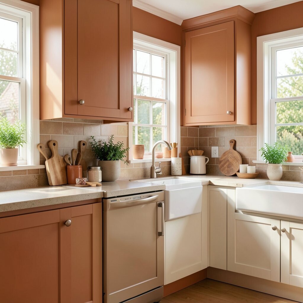
Terracotta brings a rich clay feel that feels earthy and full of life. Warm white keeps it soft and stops the room from feeling too dark.
Together, they create a cozy look that feels both modern and timeless. This mix is great for backsplashes, painted islands, and pottery displays, and it works especially well with natural stone and woven textures.
If you like a handmade style, terracotta dishes and jars can add charm without a big spend. You can also use this palette in small touches, like tea towels or seat cushions, if you want to test the mood first. Many people love this color story because it feels current and still has a classic, lived-in feel.
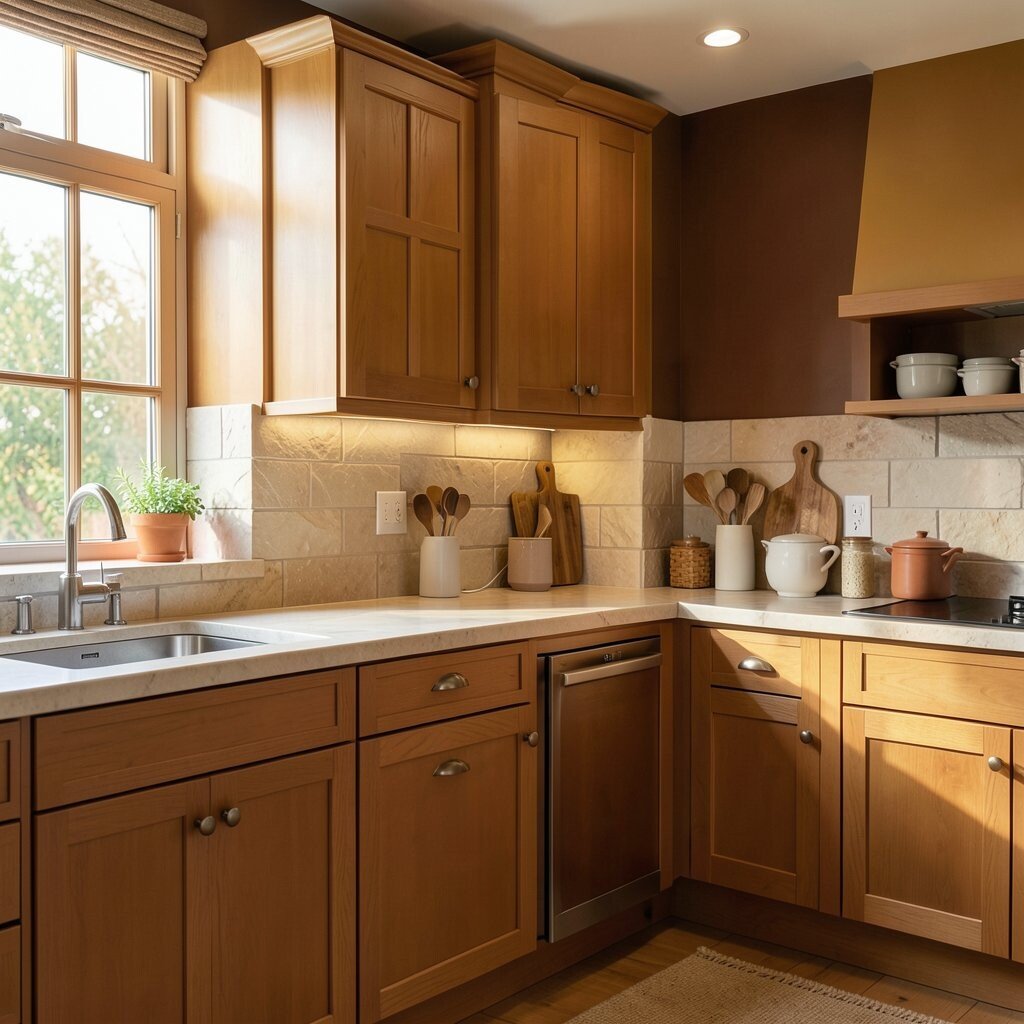
3. Cinnamon, Sand, and Walnut
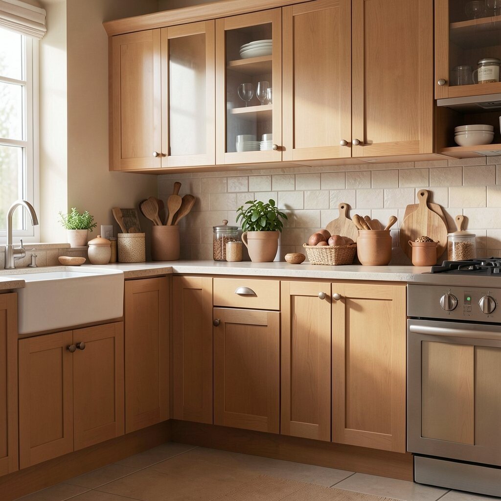
Cinnamon adds spice, while sand keeps the look calm and soft. Walnut brings in depth, making the whole kitchen feel grounded and warm.
This palette is a strong fit for wood cabinets and butcher block counters. It gives the room a rich, layered look that feels cozy in every season.
Try mixing matte finishes with a few smooth details so the space does not feel flat. If your budget is tight, you can lean on smaller items like stools, cutting boards, and curtain panels to get the same warm feeling. A few plants can also bring life to the earthy tones and make the room feel fresh.
For a personal touch, add family photos in simple wood frames or display bowls you already love. The result feels unique because it looks collected, not copied.
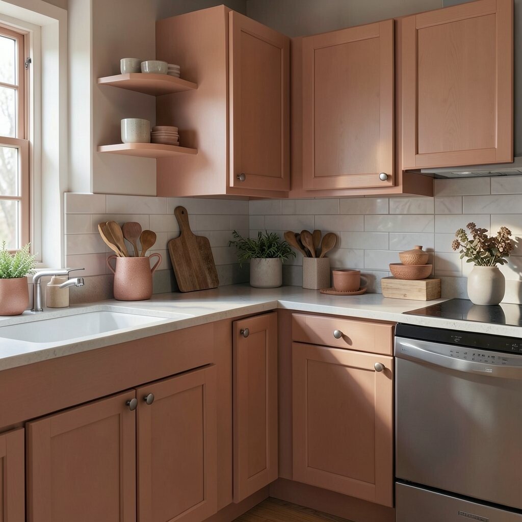
4. Peach, Clay, and Pale Oak
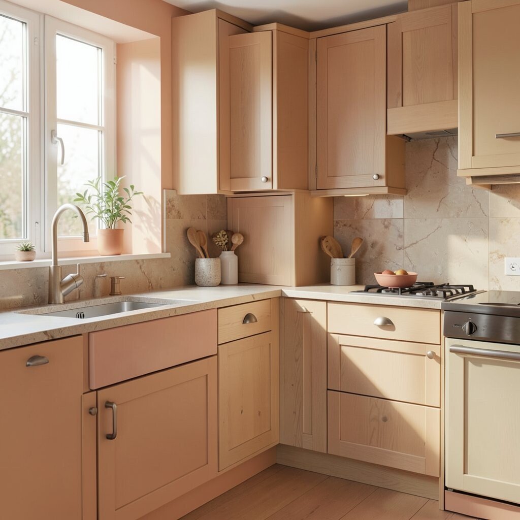
Peach gives a soft glow that feels cheerful without being loud. Clay and pale oak add a calm, natural base that keeps the palette balanced.
This combination is lovely in kitchens with lots of daylight, since the colors seem to change during the day. It can make breakfast corners feel extra sweet and inviting.
Use peach on walls or as an accent color, then bring in clay through pottery, rugs, or tile. Pale oak furniture or trim keeps the whole room feeling light and airy. If you want a trend-friendly look, this palette fits the soft, warm style many homes are using right now.
5. Spiced Taupe and Copper
Spiced taupe feels smooth and cozy, almost like a warm sweater for the room. Copper adds shine and a bit of drama that catches the eye right away.
This pairing looks beautiful with dark wood, cream tile, or even black accents. It gives the kitchen a polished feel while still staying welcoming.
Copper lights, handles, or a simple fruit bowl can make a small but strong statement. If full copper pieces are too costly, try copper-toned finishes or just one standout item to keep the budget in check. You can also make the palette your own by adding patterned towels or a runner with soft rust tones.
6. Apricot, Beige, and Natural Linen
Apricot brings a soft, fruity warmth that feels bright and friendly. Beige and linen keep the look relaxed, neat, and easy to match.
This palette is perfect for kitchens that should feel clean but not sterile. It works well with simple dishes, light wood, and woven baskets.
Because the colors are gentle, they are easy to layer without making the room feel busy. That means you can update the look slowly, using affordable pieces like chair pads, tablecloths, and tea towels. A few ceramic pieces in matching tones can tie everything together in a way that feels calm and thoughtful.
If you want a more personal style, mix in one or two handmade items from a local market. Those little details help the space feel warm and one of a kind.
7. Rust Red and Soft Sand
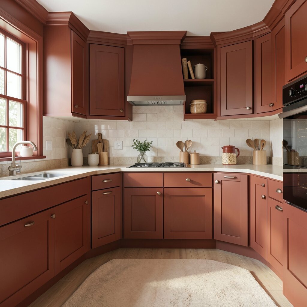
Rust red brings strong warmth and a bit of old-world charm. Soft sand balances it out so the room stays welcoming instead of heavy.
This palette works especially well in kitchens with brick, wood beams, or vintage-style details. It gives the space a cozy, gathered look that feels full of character.
Try rust on a single wall, a rug, or bar stools if you want color without a big commitment. Sand-colored cabinets or counters can keep the room feeling open and bright. Since bold paint can be an easy budget fix, this palette is a good choice for renters or anyone who wants a big style change with less cost.
To make it feel current, add simple black fixtures or clean-lined lighting. That mix of rustic and modern keeps the kitchen from feeling stuck in one style.
8. Golden Mustard and Creamy Ivory
Golden mustard adds a happy, sunlit feeling to the kitchen. Creamy ivory softens the look and makes the color feel more polished.
This pair can make even a plain room feel lively and warm. It is a smart choice if you want cozy energy without using dark shades.
Mustard works well in small doses, like on stools, art, or a painted pantry door. Ivory walls or cabinets help the room stay bright and open, which is helpful in kitchens with less natural light. If you are watching your budget, start with fabric pieces or small decor before painting larger surfaces.
For a personal touch, add vintage glassware or a patterned runner with tiny warm details. Those pieces help the palette feel playful and lived-in.
9. Brick, Oatmeal, and Dark Wood
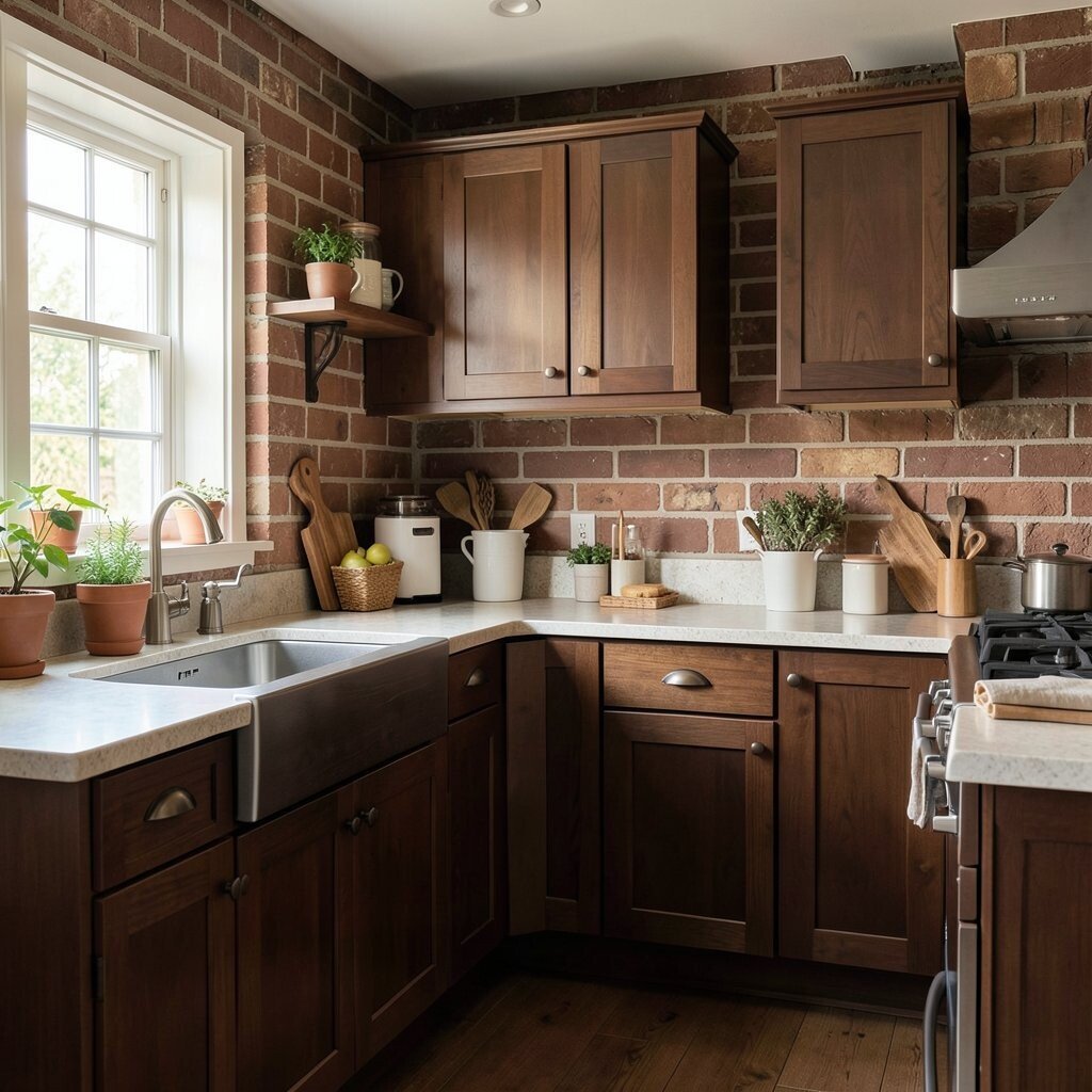
Brick tones bring a strong, cozy feel that reminds people of old bakeries and hearths. Oatmeal and dark wood keep the room soft, rich, and balanced.
This palette feels sturdy and classic, which makes it great for family kitchens. It also hides everyday wear well, so it can be practical as well as pretty.
Use brick colors in tile, paint, or even accessories if you want a subtle nod to the look. Oatmeal textiles and dark wood shelves can make the kitchen feel layered and warm without much fuss. Many current kitchens are leaning into this kind of natural, grounded style because it feels calm and real.
If you want to keep costs down, focus on textiles and small decor first. A few changes can give the room a cozy story without a full remodel.
10. Rose Clay and Warm Gray
Rose clay gives a soft blush that feels gentle and stylish. Warm gray keeps it from feeling too sweet and adds a modern edge.
This palette is great for people who want warmth with a little bit of polish. It can make the kitchen feel fresh, calm, and a bit romantic.
Try rose clay on a backsplash wall, then use warm gray on cabinets or counters. The mix feels unique because it is softer than bright pink but warmer than plain gray. If you want a low-cost update, paint and new hardware can go a long way with this color story.
Add personal touches like framed recipes, pale pink mugs, or a woven basket of fresh fruit. These small items help the room feel sweet without getting too themed.
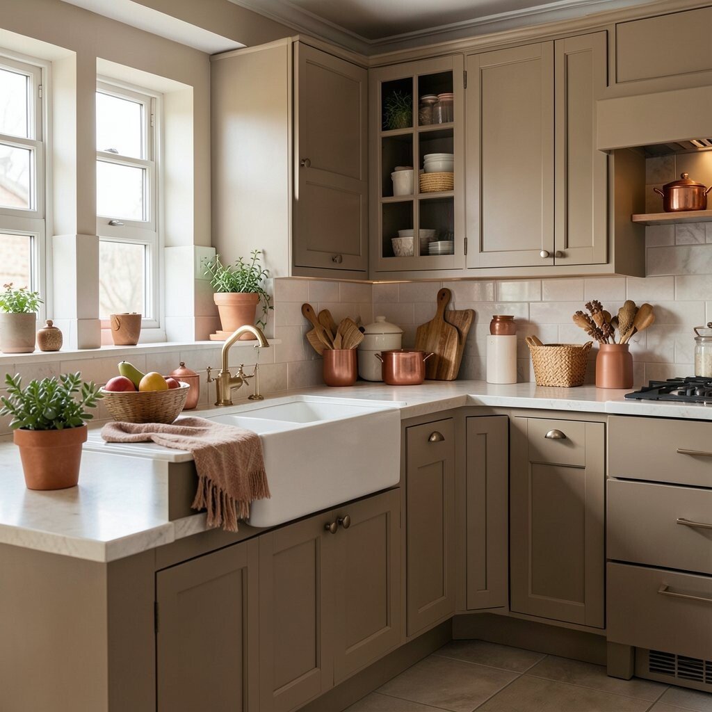
11. Amber, Mocha, and Pale Stone
Amber gives the kitchen a deep, glowing warmth that feels rich and inviting. Mocha and pale stone help the palette stay smooth and easy on the eyes.
This look is perfect for kitchens that should feel cozy in the evening and bright enough during the day. It brings a sense of comfort that works well for cooking, chatting, and late-night snacks.
Amber accents can show up in glass jars, pendant lights, or even a tinted vase on the counter. Mocha cabinets or shelves add depth, while pale stone counters or walls keep the space from feeling too heavy. Because the palette has both dark and light parts, it feels balanced and flexible for many home styles.
If you want to personalize it, use family heirlooms or travel finds in warm brown tones. Those pieces make the kitchen feel special in a way store-bought decor cannot.
12. Caramel, Sage, and Toasted Almond

Caramel makes a kitchen feel sweet, warm, and rich. Sage adds a soft green note, while toasted almond brings a smooth finish that feels calm.
This palette stands out because it blends warm and fresh tones in one easy look. It feels cozy, but it still has a clean and modern edge.
Use caramel in wood tones or leather-style stools, then bring in sage through wall color, dishware, or plants. Toasted almond cabinets or tile can keep the room light and friendly, which is helpful if you want warmth without going too dark. This palette is also nice for people who like a nature-inspired style that feels current and easy to live with.
To make it your own, add handmade ceramics, soft curtains, or a patterned rug with tiny hints of green. Those details help the kitchen feel warm, personal, and ready for everyday life.