Silence can look stylish when every space has a job. Simple layouts still feel exciting when you plan them like a story.
Here are minimalist layout concepts you can use right away, with small tweaks that make them yours.
1. The Center Stage Grid
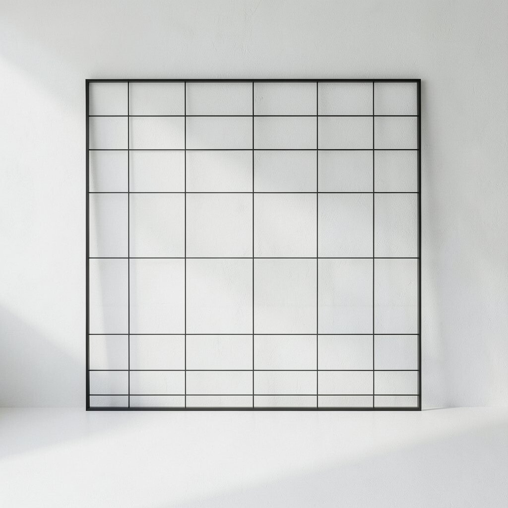
You place the main focus in the middle, like a small stage waiting for a spotlight. Around it, everything else stays calm and organized with gentle spacing and clean lines.
The benefit is clear: your eye knows exactly where to go first, and the rest supports that choice. You also get a tidy look without needing many decorative elements.
To make it feel unique, try a single bold card in the center, then add two small supporting blocks on the sides. Use one accent color only, and let the rest be soft neutrals. If you work on a website, keep text short near the center and save the longer details for below.
For tips, start by sketching a box for the main content and measure its width in plain terms. Then set consistent margins so the layout feels stable. For cost considerations, grids are often free to build with common design tools, and templates can help you move fast.
2. The Edge Whisper Layout

Instead of putting content in the center, you hug it to the edges. Think of a layout where headlines sit near one side and details float in the quiet space.
This helps your design feel modern and roomy, because negative space becomes the main character. It can also guide readers in a smooth path, like following a calm breeze.
Make it personal by choosing one edge to “own.” For example, place the title on the left and keep the rest aligned to the left as well, or do the same on the right for a different mood. Use subtle borders or hairline dividers to separate sections without heavy boxes.
3. The Vertical Timeline Stack
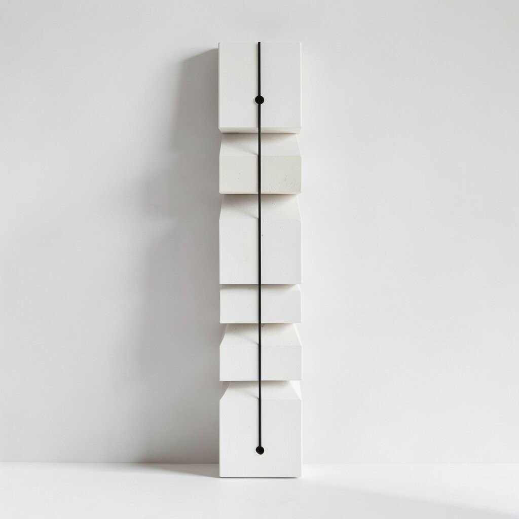
A vertical timeline turns your content into a neat line of moments. Each step looks like a small panel, with a thin line or dotted markers showing the order.
The benefit is that people can scan quickly and still feel guided. It also makes your page feel organized even when you have lots of ideas.
For a visual style, keep each step simple: a small icon, a short title, and one or two lines of support. Then leave a bit of breathing room between steps so the page never feels crowded.
To keep it unique, pick a theme and repeat it lightly, like using rounded rectangles for a friendly vibe or sharp angles for a bold vibe. Personalization can be as easy as swapping the icon set for your own symbols. If you’re building something like a portfolio, use real project stages and label them in your voice.
4. The Breathing Margins Composition

You design the layout around large margins, like giving every element its own quiet room. Instead of stuffing content, you let whitespace create the rhythm.
Readers often enjoy this because it feels easy on the eyes. It also boosts clarity since fewer items fight for attention.
Try this tip: keep headings slightly smaller than you expect, then give them plenty of space above and below. Personalize by using one gentle pattern, like faint dots in the background, but keep it very light. For cost, using whitespace and basic typography is usually low-cost, and it works on almost any platform.
For current trends, more designers are using roomy layouts to match the “slow design” feel. It signals confidence and calm, especially on mobile screens where scrolling can be tiring.
5. The Asymmetry With Rules
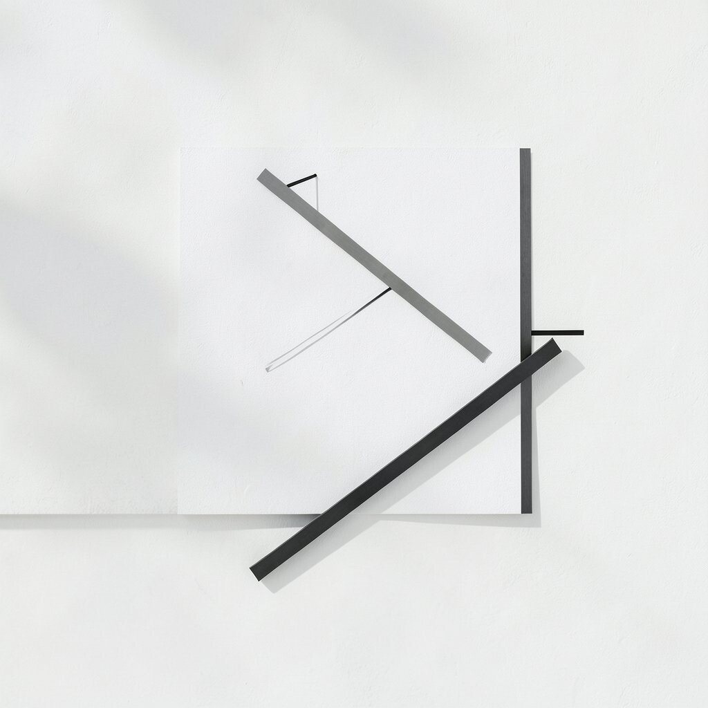
You place elements at different sizes and heights, but you keep rules. For instance, you can align edges to an invisible grid while still making the layout feel lively.
This style stays interesting without becoming messy. The benefit is that it feels fresh, and your content still stays readable.
Make it unique by pairing one large image with several smaller text blocks, or one tall card with two short ones. Then repeat the same spacing steps, so everything looks intentional.
To personalize, choose an asymmetry that matches your brand mood. If your brand is playful, use softer corners and curved shapes. If it’s sleek, use straight lines and crisp alignment.
6. The One-Palette System

You pick one main color palette and stick to it across the whole layout. Even better, choose one accent color and let everything else stay neutral.
The benefit is consistency, so your work looks put-together fast. It also makes it easier to design new sections later.
To see the visual effect, imagine a layout where links glow slightly and buttons stand out without shouting. Use the accent color for just three roles, like headings, call-to-action buttons, and small highlights.
For personalization, create a “signature shade” by adjusting brightness. Try making the accent slightly muted so it feels classy rather than loud. Cost is low because you only need a few color samples and consistent styling.
Current trends lean toward simple color logic, not complicated gradients. Clean palettes with clear roles are showing up in many modern interfaces and portfolios.
7. The Card-Lite Layout
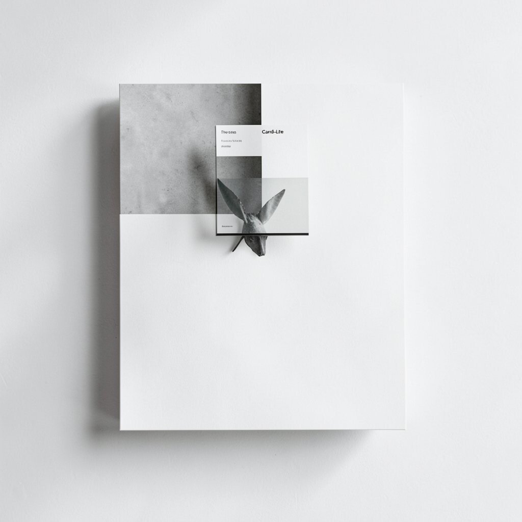
Your page uses cards, but not the heavy kind. Think of very light cards that are barely outlined, like paper tiles sitting on a desk.
This benefits scanning because each item feels separate, yet the look stays minimalist. It also helps your design handle different content sizes without chaos.
Make it unique by using only one card shape, such as rounded corners, and keeping shadows extremely soft. Tip: set the same padding inside every card so the layout feels uniform.
Personalize by changing the card headers style, like using uppercase letters for one section and sentence case for another. If you have limited budget, card-lite designs are easy to build with simple CSS and don’t need special assets.
8. The Big Title, Small Details Approach

Here the headline takes over, while details stay small and tidy. You keep the body text calm and you use short lines to avoid long reading blocks.
This approach gives a bold first impression. It also helps people find the main message quickly.
Try a visual trick: place the headline near the top, then follow with a short list of three items. Each list item can include a tiny icon and one short sentence, so your information stays punchy.
For personalization, write your headings in your own style. If you like friendly language, use it. If you like formal tone, keep it clean.
9. The Ripples of Content Layout

You start with one clear idea, then the rest forms gentle ripples around it. It feels like an echo, where later sections look related but still distinct.
This gives your page a sense of flow, and it makes visitors feel guided. The benefit is that you can cover many topics while keeping them connected.
To create the ripple look, group related items with the same small spacing and the same heading style. Then separate groups with a slightly bigger gap so people can tell where one wave ends.
Personalize by adding a small “story note” line under each group, like “What this means for you.” That one phrase can make the layout feel caring.
10. The Minimal Hero With Subtle Motion

You design a hero section that is simple but not boring. Use one image, one headline, and one clear button, then keep the rest quiet.
The benefit is that it loads fast and still feels modern. A subtle motion cue, like a gentle fade or tiny slide, can make the page feel alive without clutter.
For a visual description, picture a calm background with a centered or left-aligned headline. The button stands out with a clear shape, and the image looks crisp but not over-edited.
To personalize, choose imagery that matches your audience’s mood. If your audience loves nature, use simple landscapes. If they love tech, use clean desk photos or abstract shapes.
Cost considerations are good here because you can use free stock photos or your own images. Small animation settings can be built with common tools, so you don’t need a big budget to get a polished feel.
11. The Quiet FAQ Panel Pattern
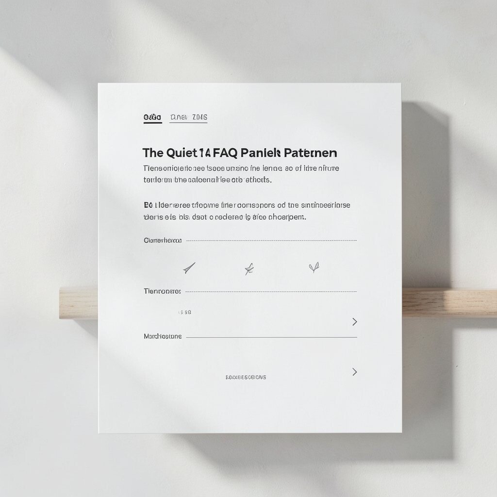
You turn questions into a set of neat panels that stay calm. Each question is a clean row, and the answer appears only when needed.
This benefits busy readers because they can skip what they already know. It also keeps your page from looking cluttered.
Make it unique by choosing one consistent style for the question lines, like bold text with a small plus icon. Then use the same answer spacing every time so it feels orderly.
Personalization tip: write your answers in the same voice you use when you talk to a friend. That keeps the layout human even when it’s minimalist.
For cost, FAQ patterns can often be done with simple widgets. You can also start manually with basic HTML and later upgrade if needed.
12. The Split Screen With Purpose

You use two sides, but each side has a job. One side holds a visual, and the other side holds the message, so visitors instantly understand the structure.
This layout is great because it balances attention and makes the page feel planned. The benefit is that people don’t have to guess where the important info is.
To make it unique, place the image slightly lower than the text, or use a thin divider line instead of a thick border. Tip: keep the text side slightly wider if reading matters more, or make it equal if you want a more gallery feel.
Personalize by changing the type of visual, like turning product shots into minimal silhouettes or using simple icons instead of photos. For cost, you can use one strong image and let it do the heavy lifting.
13. The Typography-First Layout

You let fonts and text styles create the design. Instead of relying on many images, you use size, weight, and spacing to build the look.
The benefit is that it stays flexible on any screen. It also helps your message stay clear, because your content is the focus.
For visual description, imagine a layout where headings are bold and spaced wide, while body text is lighter and neatly aligned. Lists can use small bullet points or even check marks to keep things tidy.
To personalize, combine two fonts that share a personality, like pairing a clean sans with a gentle serif for contrast. Keep line length short enough for easy reading, especially on mobile.
Cost considerations are strong here since you may only need web-safe fonts or one font download. Current trends often favor typographic hierarchy over heavy decoration.
14. The Build-Your-Own Module System
You create a set of small modules that you can reuse across your page. Each module is simple: a header block, an image card, a quote section, or a feature row.
The benefit is speed, because once your modules are ready, you can mix and match without redesigning from scratch. It also gives your work a consistent feel even as you add new ideas.
For a visual description, picture a page made of neat blocks that all share the same spacing rules. The module edges line up so the entire design looks calm and intentional.
Personalization ideas are easy here: swap icons, change module order, and adjust background shades slightly for each section. Tip: keep one rule constant, like the same border radius, so the page still looks “from you.”
Cost considerations are usually friendly since modules can be created with basic components in many tools. For current trends, reusable modules and design systems are popular because they help teams stay consistent and move faster.
When you finish, do a quick check: see if the page reads well without images, then add visuals back in slowly. That small habit keeps your minimalist style strong and your message clear.