Old colors can make a kitchen feel warm and full of story. A fresh coat in the right shade can bring that charm home.
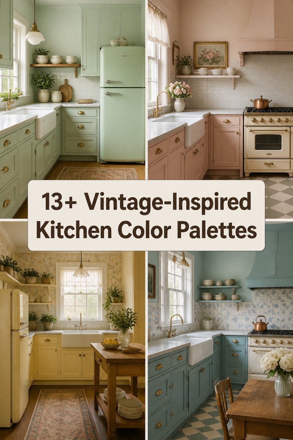
1. Soft Cream and Sage Green

Soft cream walls with sage green cabinets create a calm, old-world kitchen that feels easy to live in. The look is gentle, clean, and cozy all at once.
This palette works well in small kitchens because the light cream opens the room while sage adds just enough color to keep it interesting. It pairs nicely with brass knobs, open shelves, and wood cutting boards for a lived-in feel. If you want a personal touch, try adding patterned curtains or a vintage rug with tiny green details.
2. Butter Yellow and Warm White

Butter yellow brings a sunny glow that feels cheerful without being too bright. Warm white keeps the space soft and makes the yellow look friendly instead of loud.
This pairing is a great choice for kitchens that need more light, since pale yellow can make dark corners feel brighter. It is also a good fit for budget updates because paint alone can change the whole mood of the room. For a custom look, add old enamel dishes, glass jars, or a simple checkered tablecloth.
Many people like this palette because it feels happy and homey in a way that never gets old. It works well with wood floors, white tile, and black hardware, which helps the room feel balanced. If you want a little more charm, choose a yellow with a creamy undertone instead of a sharp lemon shade.
3. Dusty Blue and White

Dusty blue and white make a kitchen feel fresh, calm, and a little bit coastal. The soft blue has a vintage feel that can remind people of old china, painted cabinets, and sunny farmhouse rooms.
This palette is easy to style with silver pulls, marble counters, or simple beadboard walls. It also gives you a lot of room to play with decor, since both colors act like a quiet backdrop. For a more personal feel, add woven baskets, a blue-and-white pitcher, or framed family recipes.
Cost can stay friendly if you use blue on the lower cabinets and keep the upper areas white. That mix saves paint while still giving the kitchen a strong style. Right now, many homeowners like this look because it feels classic but still light and airy.
4. Mint Green and Pale Gray

Mint green can make a kitchen feel sweet, fresh, and a little playful. Pale gray softens the look so it stays grown-up and easy on the eyes.
This palette shines in kitchens with lots of natural light, where the mint can feel bright without becoming too bold. It looks lovely with chrome handles, white tile, and simple glass light fixtures. If you want your kitchen to feel more personal, add pastel canisters, a retro clock, or a few potted herbs on the sill.
5. Terracotta and Cream

Terracotta gives a kitchen a warm, earthy glow that feels rich and welcoming. Cream helps soften the color so the room still feels open and bright.
This pairing works well for people who want a vintage look with a little more depth than pastel shades can give. It can also hide small marks better than very pale walls, which is helpful in busy kitchens. To keep costs in check, use terracotta on one wall or on lower cabinets and let cream do the rest.
The style feels unique because it brings in a handmade, sun-baked look that stands out from common gray kitchens. It pairs beautifully with wood shelves, clay pots, and woven seat cushions. If you like a cozy mood, add warm lighting and a few antique copper pieces.
6. Powder Blue and Buttercream

Powder blue and buttercream create a gentle kitchen that feels like a sweet memory. The colors are soft enough for daily life but still pretty enough to make the room feel special.
This palette is great for cabinets, since the blue can go on the base units and the buttercream can brighten the walls. The mix gives a nice vintage nod without feeling too themed or too busy. You can make it your own with floral tea towels, glass knobs, or a painted hutch in a matching shade.
It is also a smart choice if you want a look that stays fresh through changing trends. Soft blues and warm creams have lasting appeal and work with many kinds of flooring. If your budget is tight, even a painted island in powder blue can bring this style to life.
7. Olive Green and Ivory

Olive green and ivory make a kitchen feel grounded, calm, and a little bit elegant. The olive tone brings old-fashioned charm, while ivory keeps everything light and easy.
This palette works well with wood counters, stone backsplashes, and vintage-style lighting. It can feel more mature than sage, which makes it a nice pick for people who want a deeper color story. For a personal touch, add framed botanical prints, ceramic bowls, or a striped runner in soft earth tones.
Because olive is rich, it can make basic materials look more expensive than they are. That is helpful if you want a high-end feel without a huge remodel cost. Many current kitchens are leaning toward earthy shades like this because they feel warm and natural.
8. Coral and White

Coral adds a lively, retro spark that can make a kitchen feel cheerful right away. White keeps the look clean so the coral does not take over the room.
This palette is a fun pick for people who want something more playful than classic pastels. It can work on a backsplash, a small island, or even just painted stools if you want a smaller change. To make it feel personal, add vintage tins, fruit bowls, or art with soft pink and orange tones.
Coral is also a smart way to refresh an older kitchen without changing every surface. A few painted accents can give the space a whole new mood for less money. If you want the color to feel less bold, choose a dusty coral rather than a bright candy tone.
9. Robin’s Egg Blue and Soft Beige

Robin’s egg blue brings a pretty, old-fashioned charm that feels light and airy. Soft beige grounds the palette and makes it feel warm instead of chilly.
This combination works especially well in kitchens with vintage cabinets, curved hardware, or classic tile floors. It gives the room a sweet and relaxed look that feels friendly the moment you walk in. You can personalize it with wicker baskets, a beige linen curtain, or a few blue glass bottles on display.
For cost savings, use the blue on smaller areas like the pantry door or island face. That keeps the design simple while still giving the kitchen a strong vintage note. The palette is also easy to update later, since beige and blue both play nicely with many other colors.
10. Plum and Antique White

Plum gives a kitchen a rich, moody style that feels full of character. Antique white softens the strong color and keeps the room from feeling too dark.
This palette is a good fit for larger kitchens or spaces with plenty of windows, since the deep plum needs some light to shine. It feels unique because it borrows from old dining rooms and classic painted furniture. If you want to make it your own, add glass-front cabinets, brass accents, or a vintage-style chandelier.
The look can feel fancy without needing fancy materials, which helps with renovation budgets. A plum island or pantry wall can create a big effect with a small amount of paint. Today, deep jewel tones are popular, and plum gives you that trend in a softer, more timeless way.
11. Pale Peach and Warm Gray

Pale peach gives a kitchen a soft glow that feels sweet and welcoming. Warm gray keeps the palette steady and helps the peach feel more polished.
This mix is lovely in kitchens that need a little warmth without going too bright or too dark. It can make a space feel friendly for family meals and slow weekend mornings. To make it personal, add copper pans, peach-toned dish towels, or a small gallery wall with old family photos.
It is a flexible palette that works with both modern and vintage pieces, which makes decorating easier. You can keep the cost low by using peach in details like bar stools or trim instead of painting every wall. The result feels soft, current, and easy to enjoy every day.
12. Charcoal and Buttermilk

Charcoal adds a bold vintage edge that feels strong and stylish. Buttermilk lightens the mood so the kitchen stays warm and inviting.
This palette is great for people who want contrast and a little drama without losing comfort. The dark color can frame cabinets or an island, while the lighter shade keeps the room from feeling heavy. Add a personal touch with old metal signs, pale wood stools, or patterned tiles that echo the two main colors.
It can be a smart choice for renovation value because dark lower cabinets often hide scuffs and wear. That means the kitchen can stay looking good with less upkeep. Many fresh kitchen designs use dark-and-light contrast right now, and this vintage version feels more timeless than trendy.
13. Seafoam and Sand

Seafoam and sand create a breezy kitchen that feels relaxed and a little nostalgic. The colors remind people of old beach cottages, painted porch furniture, and soft summer mornings.
This palette is ideal if you want your kitchen to feel light but not plain. Seafoam adds a gentle color wash, while sand keeps the room warm and natural. For a custom look, add shell-toned dishes, light wood shelves, or a woven pendant light above the table.
It can be a budget-friendly style because both colors work well on walls, cabinets, and smaller decor pieces. You do not need a full remodel to make the palette shine. If your home already has a lot of natural textures, this color mix will fit right in.
14. Burgundy and Soft Taupe

Burgundy brings deep vintage charm that feels cozy and full of personality. Soft taupe balances the richness and keeps the kitchen from feeling too heavy.
This palette works well in kitchens that have old wood floors, classic trim, or traditional cabinet shapes. It feels special because it has the mood of an old country house or a well-loved family kitchen. To make it your own, add cream dishes, gold accents, or a tablecloth with tiny floral prints.
Since burgundy is strong, you can use it in a small dose and still get a big effect. That makes it a smart pick for people who want character without repainting everything. It also fits the current love for deeper, warmer colors that feel cozy in every season.