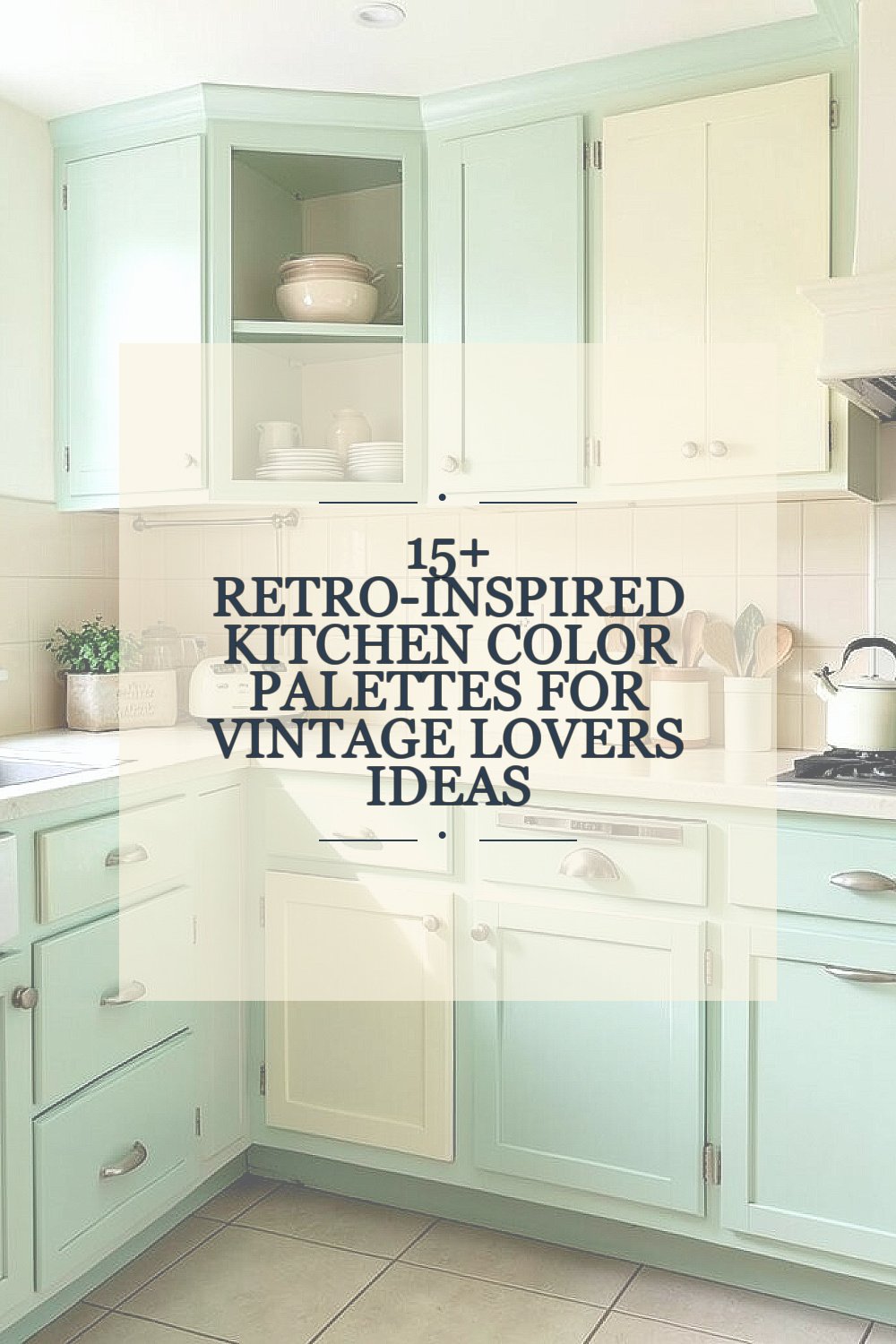
Old-school kitchens have a special kind of charm. Their colors can make a room feel warm, cheerful, and full of memory.
1. Mint Green and Cream

Mint green and cream make a kitchen feel light, fresh, and sweet. The soft green brings a happy vintage mood, while cream keeps the look calm and easy on the eyes.
This palette works well with checkered floors, open shelves, and shiny chrome touches. It is also a smart choice if you want a bright look without strong colors that feel too busy. For a personal touch, add glass jars, enamel bowls, or a mint tea kettle to pull the whole scene together.
2. Butter Yellow and White

Butter yellow and white give a kitchen a sunny, friendly glow. The mix feels cheerful in the morning and cozy at night.
This style can make a small kitchen seem bigger because the light colors reflect so well. It is a great fit for simple cabinets, porcelain sinks, and classic diner-style chairs. If you want to keep costs lower, start with paint and swap in yellow dish towels or a vintage lamp for extra charm.
Many vintage lovers like this palette because it feels timeless, not flashy. Add tiny black accents or brushed metal handles to keep the space from looking too soft.
3. Powder Blue and Pale Gray
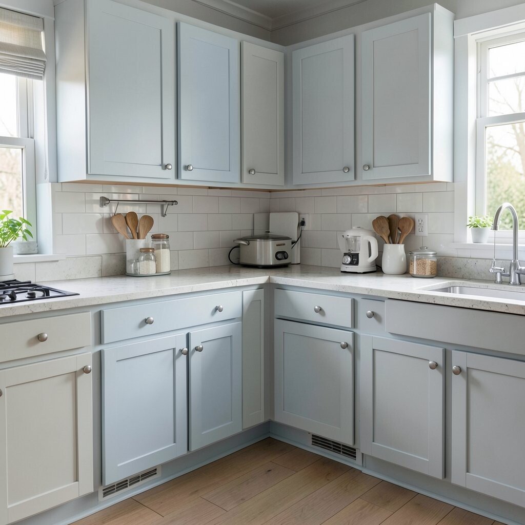
Powder blue and pale gray create a gentle, cool look that feels neat and peaceful. The blue adds a soft retro note, while gray gives it a modern edge.
This palette shines in kitchens with white tile, glass fronts, and simple wood stools. It is easy to match with silver tools, blue plates, and old-style canisters. For a more personal feel, try a framed family recipe or a blue enamel pan on display.
People often choose this color pair when they want vintage style without a loud look. It also works nicely in homes that already have lots of natural light.
4. Cherry Red and White
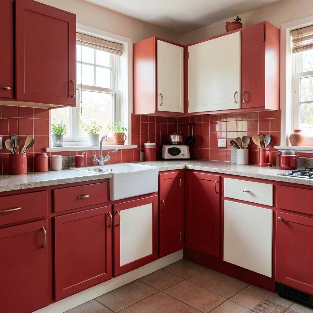
Cherry red and white bring instant energy into a kitchen. The look feels bold, happy, and full of diner-era fun.
This palette is perfect for people who want a space with personality right away. Red stools, white cabinets, and a glossy table can make the room feel playful and fresh. Since red is strong, you can save money by using it in just one or two key spots instead of everywhere.
5. Aqua and Warm Wood

Aqua and warm wood make a kitchen feel relaxed and beachy with a retro twist. The cool blue-green tone pairs beautifully with honey-colored cabinets and floors.
This combo is great for vintage fans who want color but not too much brightness. The wood helps the aqua feel grounded, while the aqua keeps the room lively. Add woven baskets, old glass bottles, or a ceramic fruit bowl for a homey touch.
Right now, many people like mixing colorful paint with natural wood because it feels both old and current. This palette is easy to personalize with brass pulls or handmade pottery.
6. Soft Pink and Charcoal

Soft pink and charcoal create a sweet but grown-up kitchen style. The pink feels gentle and pretty, while charcoal adds depth and makes the look feel strong.
This pairing works well with black-and-white tile, marble counters, and vintage glass lights. It can feel very unique because it blends charm with a little drama. If you are watching your budget, try painting just the island pink and keeping the rest neutral.
Small touches can make this color story feel even more special. Think rose mugs, dark frames, and old-fashioned canisters with clean lines.
7. Olive Green and Buttermilk

Olive green and buttermilk make a kitchen feel earthy, warm, and old-world. The olive shade adds depth, while the soft yellow-white keeps things bright.
This palette is lovely with wood cutting boards, woven mats, and brass details. It gives a space a cozy feeling that works well for both cooking and gathering. For a personal touch, hang herb bundles or display a few favorite cookbooks in matching tones.
It also feels right for current trends that lean toward natural colors and calming spaces. If you want to keep costs in check, use olive on lower cabinets and save buttermilk for the walls.
8. Coral and Aqua

Coral and aqua create a playful retro look that feels cheerful and a little unexpected. Together, they bring a sunny mood that can make even plain kitchens feel lively.
This palette is great for people who love color and want their kitchen to feel fun. It works especially well with white counters, shiny knobs, and patterned dishware. You can make it your own with coral stools, aqua jars, or a mix of both in small decor pieces.
Because the colors are bright, you do not need a lot of extras to make the room feel complete. A few bold accents can give you the vintage vibe without a large spend.
This choice also fits the current love for playful homes that feel personal instead of stiff. If you like a happy kitchen, this pair is hard to beat.
9. Sage Green and Antique White

Sage green and antique white give a kitchen a soft, calm look with quiet vintage beauty. The sage tone feels gentle and natural, while antique white keeps the room light and classic.
This color story suits farmhouse pieces, old china, and glass-front cupboards very well. It feels clean but still warm, which makes it easy to live with every day. If you want more personality, add hand-painted dishes, a lace curtain, or a floral rug.
Many homeowners love this palette because it feels peaceful and easy to match. It also works well if you plan to reuse older furniture or thrifted finds.
For cost savings, paint can do a lot here without needing big changes. Even a simple sage accent wall can shift the whole mood.
10. Teal and Brass
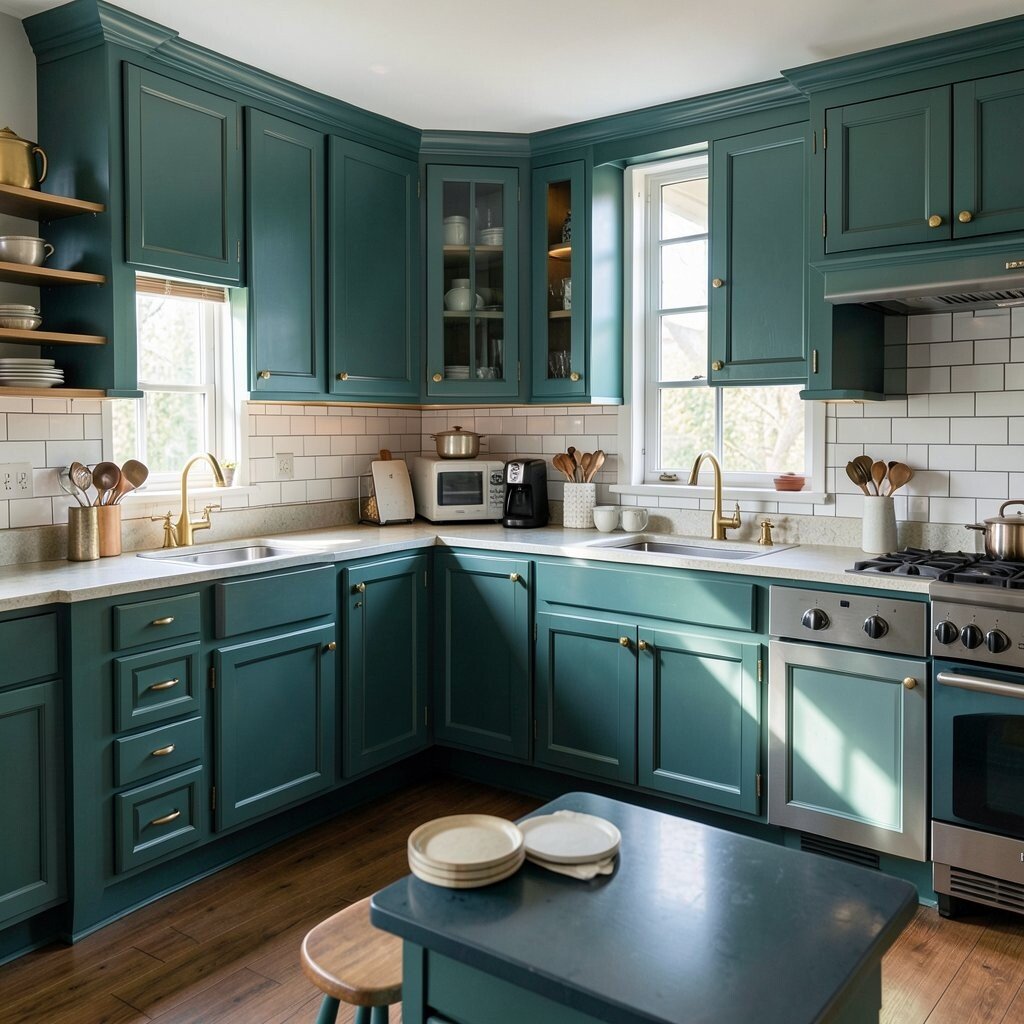
Teal and brass make a kitchen feel rich, stylish, and full of retro flair. The deep blue-green color gives strong character, and brass adds a warm glow.
This combo looks amazing with dark wood, glossy tile, and vintage-style lighting. It feels a little dramatic, yet still friendly enough for everyday use. To make it feel more like your own space, mix in brass bowls, teal canisters, or framed art with old patterns.
This palette has become popular again because it feels bold and elegant at the same time. If the look seems too strong, use teal on lower cabinets and keep upper walls soft.
You can also save money by using brass-look hardware instead of real brass pieces. The small shine goes a long way in a vintage kitchen.
11. Peach and Ivory

Peach and ivory make a kitchen feel warm, soft, and inviting. The peach brings a gentle glow, while ivory keeps the room smooth and bright.
This palette works well in kitchens with curved shapes, floral touches, and retro dishes. It feels sweet without being childish, which makes it a nice pick for vintage lovers who want a softer look. Add peach dish towels, ivory canisters, or a patterned valance to complete the mood.
It is also easy to use in small spaces because the colors are light and friendly. A few simple changes can make the whole room feel more cheerful.
12. Navy Blue and Buttery Beige

Navy blue and buttery beige create a classic kitchen with a strong vintage heart. The dark navy gives depth, and the beige softens it so the space stays warm.
This palette is excellent for cabinets, rugs, and wall paint that need to feel timeless. It can make hardware, glassware, and white dishes stand out in a lovely way. For a personal twist, add striped fabric, old clock faces, or a painted chair in a matching shade.
People often like this look because it feels polished without being cold. It is also a smart choice if you want colors that can stay stylish for years.
To keep spending down, use navy as an accent instead of covering the whole room. A navy island or pantry door can bring the style in with less work.
13. Goldenrod and White
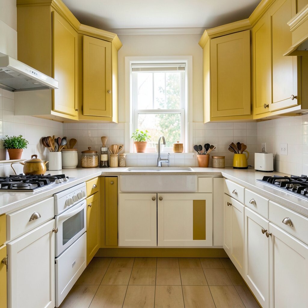
Goldenrod and white bring a bright, happy burst of retro energy into the kitchen. The yellow-gold tone feels cheerful and bold, while white helps it stay crisp.
This combination looks great with chrome stools, old-style stoves, and simple square tiles. It has a lively diner feel that works well for people who want a kitchen with spirit. To make it feel more personal, try a goldenrod runner, cheerful mugs, or a painted shelf edge.
Because goldenrod is strong, it looks best when balanced with plenty of white. That keeps the room from feeling too heavy or crowded.
This palette is also a fun way to follow the current love for bright nostalgic spaces. You can start small with one wall, then add more color later if you want.
14. Rose Dust and Olive

Rose dust and olive make a kitchen feel romantic, soft, and a little old-fashioned in the best way. The dusty pink has a vintage mood, and olive brings in a grounded natural note.
This mix works nicely with warm wood, brass accents, and glass lamps. It feels unique because it blends a floral feeling with an earthy one. You can personalize it with thrifted pitchers, faded prints, or fabric that has both tones together.
It is a good choice if you want something quieter than bright pink but still full of charm. The colors can make everyday tasks feel a little more special.
For lower cost, use these shades in textiles or wall art first. That gives you a preview before you commit to paint or new cabinets.
15. Burnt Orange and Cream

Burnt orange and cream give a kitchen a cozy, warm, mid-century feel. The orange adds depth and energy, while cream keeps the space soft and welcoming.
This palette looks lovely with walnut wood, vintage prints, and rounded furniture shapes. It feels bold but still easy to live with, especially if you want a kitchen that feels full of life. Add orange canisters, cream curtains, or a patterned rug to make the theme feel complete.
Many current interiors use warm earthy shades, so this palette feels fresh and classic at the same time. It also hides everyday wear a little better than pale colors alone.
16. Black, White, and Red

Black, white, and red bring a classic retro look that feels sharp and unforgettable. The black adds contrast, the white keeps it clean, and red gives the whole kitchen a fun kick.
This palette works beautifully with checkerboard floors, chrome details, and diner-style seating. It can feel glamorous or playful, depending on how much red you use. For a personal touch, add a red toaster, a black lamp, or framed black-and-white family photos.
This style is perfect for vintage lovers who want something iconic and easy to recognize. It also holds up well over time because the colors are so classic.
If you are thinking about cost, use red as the accent and keep the larger surfaces simple. That way, you get the bold retro feeling without a huge price tag.