Color sets the mood before anyone reads a word. The right palette can make your design feel like a friendly smile.
Use these palette ideas as ready-to-go starting points for posters, brands, websites, packaging, and even slides for class projects.
1. Warm Clay + Cream + Cobalt Pop
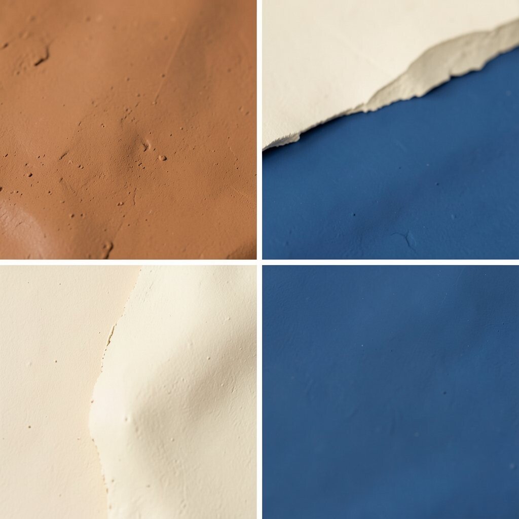
Picture soft terracotta walls paired with warm cream paper, then a bold cobalt accent like a tiny piece of sky. The contrast feels inviting and steady at the same time.
This palette helps your layout look human, not cold, which is great for lifestyle brands and handmade products. Try using clay for backgrounds, cream for text blocks, and cobalt for buttons or key icons.
You can personalize it by swapping cobalt for teal if you want a calmer vibe.
2. Sage Green + Butter Yellow + Charcoal
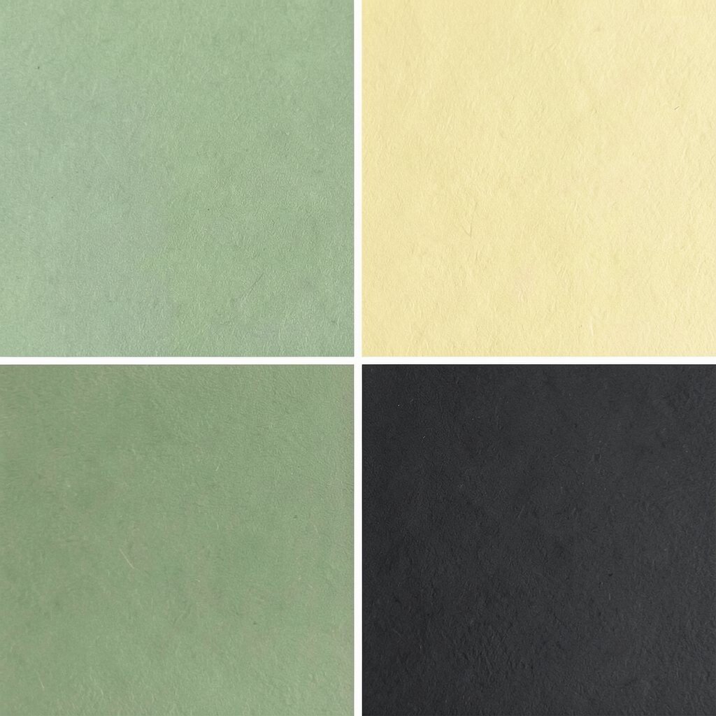
Imagine a garden path: muted sage leaves, butter-yellow highlights, and charcoal lines that keep everything crisp. It feels fresh, cozy, and easy on the eyes.
You’ll get strong readability because charcoal gives your text a clear edge. A big benefit is that this mix works well for both cards and screens.
For personalization, try adding a small “sun flare” gradient using a lighter yellow in headings.
Cost-wise, you can keep things budget-friendly by choosing one main green and one yellow, then using charcoal for most details. A current trend is using earthy greens with gentle sunshine accents for wellness and food designs.
3. Deep Navy + Metallic Rose + Off-White
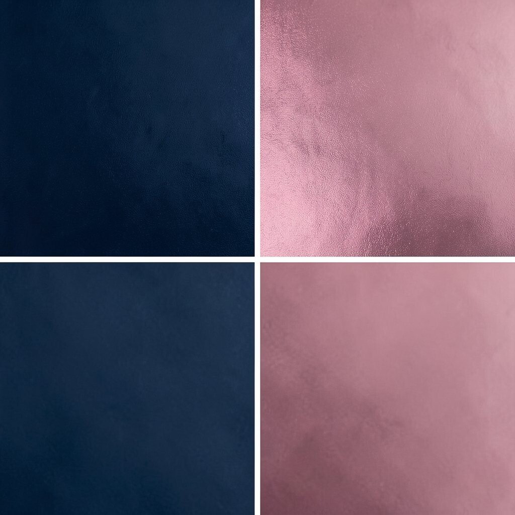
Think of a night sky with a soft rose glow, plus off-white highlights that look like clean stationery. This palette feels a little fancy without trying too hard.
Navy makes your design feel secure and trustworthy, which helps for finance, tech, and professional services. Rose metallic accents add energy and a modern touch.
Use off-white for body text and spacing so everything breathes.
To personalize, pick a rose tone that matches your logo, then limit it to icons, underlines, and small badges. If you need a trend-friendly look, consider using subtle shimmer effects in backgrounds rather than loud gradients.
For cost considerations, keep printing in mind: metallic colors can raise production costs, so you might mimic “metallic rose” with a normal pink plus a light highlight. On the web, the effect is cheap using gentle gradients and low-opacity overlays.
4. Forest Green + Sand + Creamy Beige
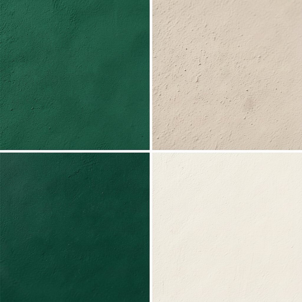
Close your eyes and picture a calm forest with warm sand underfoot, then creamy beige for smooth transitions. The result is grounding and comfortable.
This palette is great when you want people to feel relaxed and safe.
Use forest green for navigation bars, headlines, and key marks, while sand and beige can handle large backgrounds. You can personalize by adding a tiny accent color like rust or olive for a badge or “new” tag.
A simple tip: keep your typography high-contrast by using dark greens for text and lighter beiges for surfaces.
5. Sky Blue + White + Coral Accent
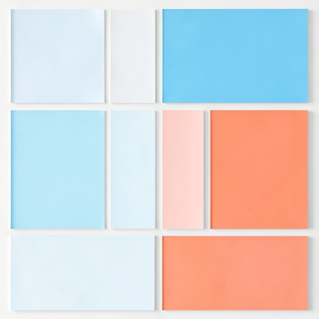
This palette looks like clear air: bright sky blue, lots of white space, and coral like a cheerful stripe. It feels bright and welcoming right away.
It’s perfect for events, children’s products, and friendly service brands.
The benefit here is speed: you can design quickly because white handles most backgrounds and sky blue sets a clean structure. Coral is best saved for call-to-action buttons so the eye knows where to go.
Personalize it by changing coral to salmon if you want a softer look.
For cost, print-friendly options are common because sky blue and coral are easy to match in many ink sets. A current trend is using “big airy white” layouts with a single warm accent for modern clarity.
6. Charcoal + Pale Gray + Lime Highlight
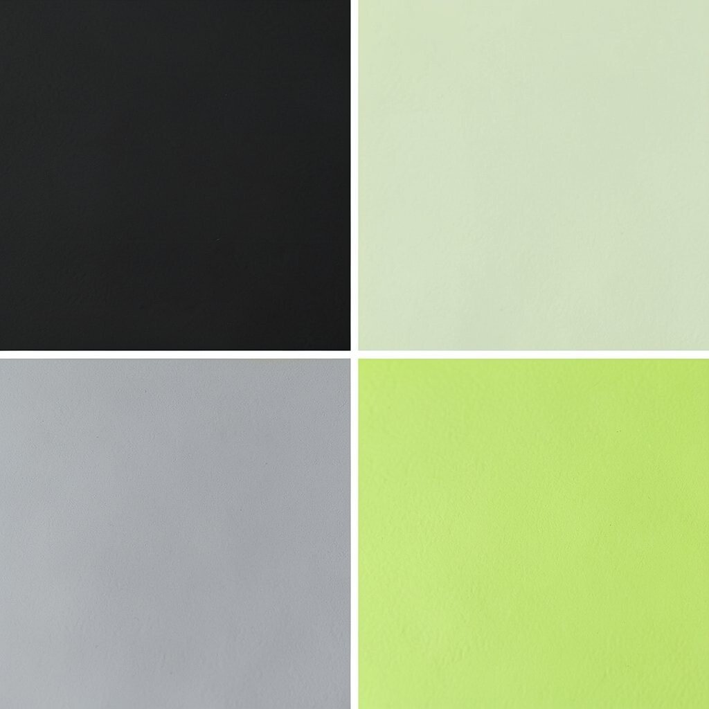
Picture a sleek notebook: charcoal text, pale gray panels, and a lime highlight that pops like a highlighter mark. The vibe is sharp, modern, and energetic.
This palette boosts usability because charcoal and gray keep contrast strong, even on small screens. Use lime only for the most important parts, like “sign up” buttons, focus rings, and chart points.
Personalize by adjusting the lime toward green-tea for a less intense look.
7. Plum + Warm Pink + Cream
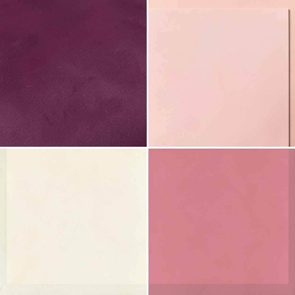
Imagine velvet curtains in a small theater: deep plum, warm pink accents, and soft cream for the seats. It feels romantic and bold, but still readable.
This mix works well for invitations, beauty branding, and creative portfolios. Plum creates weight, warm pink adds movement, and cream prevents the design from feeling heavy.
Try using plum for headers, cream for body background, and warm pink for icons or small dividers.
For personalization, keep the pink tone consistent with your brand voice, then add a tiny gradient in the hero image to feel more current. Cost-wise, this palette is friendly for printing because it usually uses standard colors, not special metallic inks.
8. Teal + Light Turquoise + Deep Brown
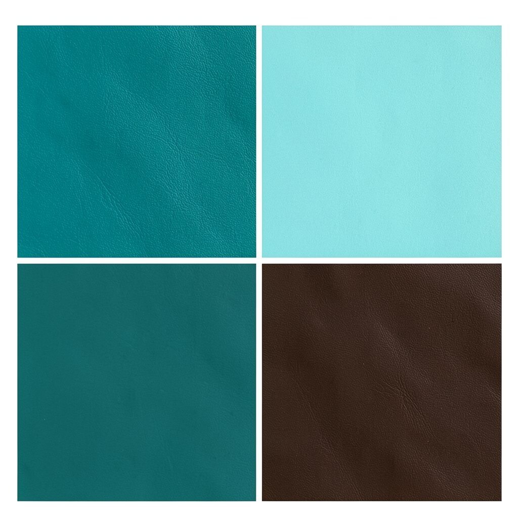
Think of ocean waves and sea glass: teal and light turquoise, grounded by a deep brown base. It looks calm, friendly, and naturally balanced.
The benefit is that teal tones feel fresh while deep brown gives your design a warm anchor. This helps your images look richer and your text stay clear.
Use deep brown for paragraphs and navigation links, and keep teal for backgrounds or headers.
For personalization, add patterns like small wave shapes behind images, using low-opacity turquoise. A trend you’ll see often is “quiet color” with a natural base, especially for eco-friendly and travel themes.
Cost considerations are simple: choose one teal and one turquoise, then reuse the brown across the layout. That approach reduces mistakes and helps any designer or print vendor match the colors consistently.
9. Butter Yellow + Navy + White Space
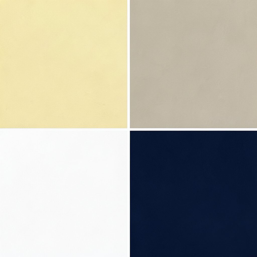
This palette is sunshine with structure: butter yellow for warmth, navy for strength, and plenty of white space for comfort. It feels upbeat and easy to scan.
You can use it for food menus, study guides, and cheerful product pages.
The big advantage is focus—navy makes your important items stand out, while yellow draws attention to the “wow” moments. Use navy for headings and buttons, and keep yellow for highlights like badges and small sections.
Personalize it by shifting butter yellow slightly warmer for a honey tone.
10. Monochrome Black + Milk White + Soft Silver
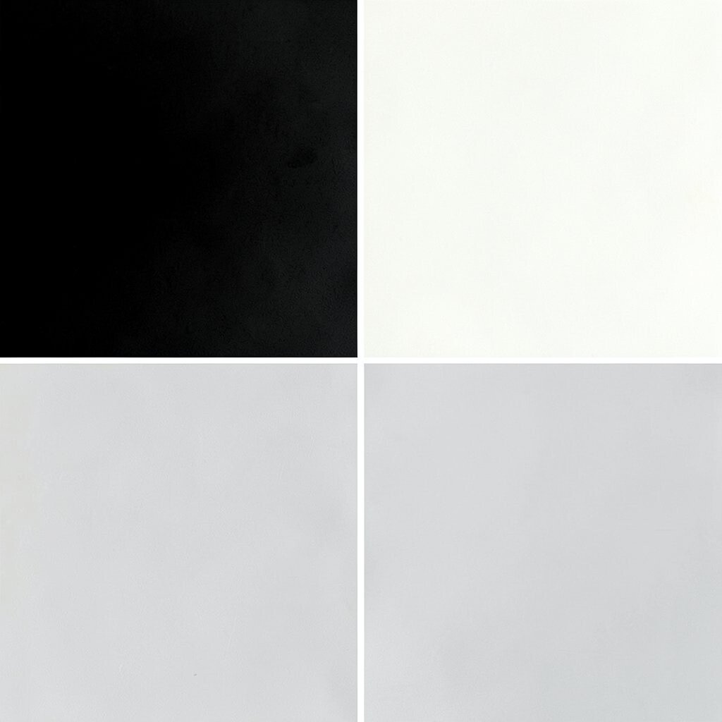
Picture a minimalist gallery wall: black and milk white with a soft silver sheen that adds elegance. It feels clean, modern, and confident.
This palette is perfect when your content needs to do the talking.
A major benefit is consistency—using one dark and one light color makes layouts predictable and polished. Silver accents can highlight dividers, small icons, or hover states without overpowering your message.
Personalize by adjusting the silver toward cool gray if your brand already uses cooler tones.
Cost-wise, this palette is often one of the easiest to print because you can keep it simple with near-black and near-white inks. A current trend is “quiet luxury” design, where small silver touches replace loud colors.
11. Coral Orange + Light Sand + Deep Teal
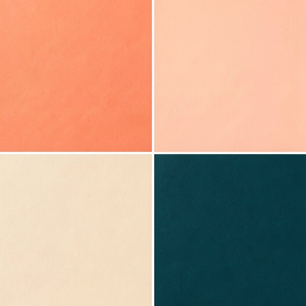
Imagine a sunset meeting a calm beach: coral orange, light sand, and deep teal for the finishing touch. It creates a lively, happy mood.
This palette helps your design feel energetic while still staying grounded with sand. Use deep teal for text and navigation, then coral orange for buttons and callouts.
Personalize by using coral in larger shapes if you want a more playful layout.
12. Rust + Cream + Charcoal Ink
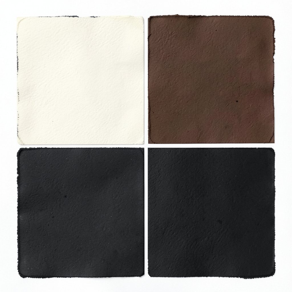
Picture handmade pottery: rust tones, cream backgrounds, and charcoal “ink” lines. It feels artsy, warm, and full of character.
Rust adds personality, while charcoal helps readability for headings and body text. Cream keeps everything soft, so the design doesn’t feel too sharp.
Try rust as the hero background with charcoal type on top for a strong contrast.
For personalization, pair rust with a thin line pattern, like light dots or grid marks behind images. If you’re printing, cost considerations are good because these tones are usually easy to source as standard inks.
A trend you’ll notice is craft-inspired branding that uses earthy colors and simple layouts.
13. Lavender + Mist Blue + Dark Orchid
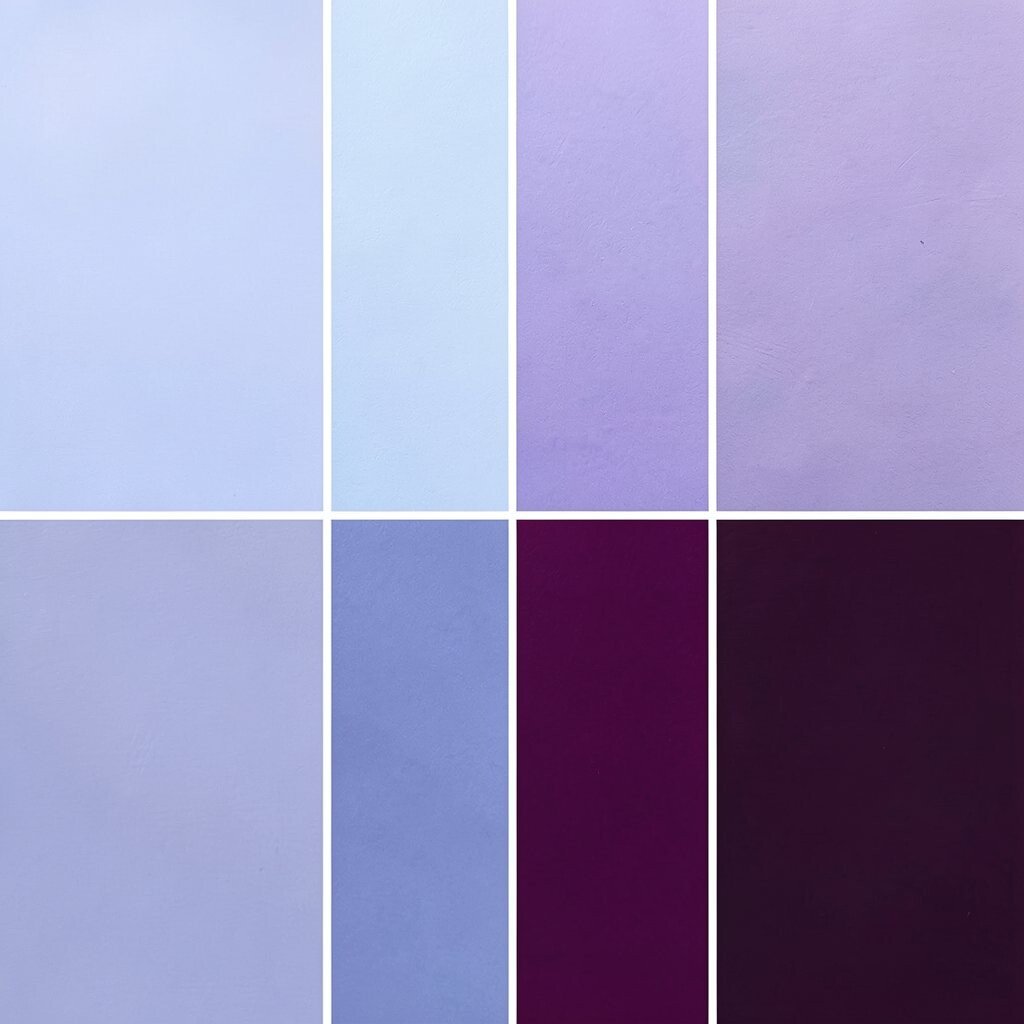
Think of dreamy skies at dusk: lavender and mist blue, with dark orchid acting like the night-time anchor. It’s gentle but still stylish.
This palette works well for wellness, beauty, and creative events where you want calm confidence. Mist blue gives a light feel, while orchid keeps things from looking washed out.
Use lavender for cards, mist blue for page backgrounds, and dark orchid for headlines and links.
Personalize by adding a subtle “glow” effect behind feature images, using very low opacity orchid. For tips, keep gradients soft, and don’t add too many accents—this palette already feels dreamy.
If your audience likes modern design, a gentle gradient will feel current.
Cost-wise, lighter colors can show wear in some print materials, so consider using thicker paper or higher-quality backgrounds. On screens, this palette is easy and cheap since you can create the misty look with simple gradients.
14. Aqua + Coral + Warm Gray
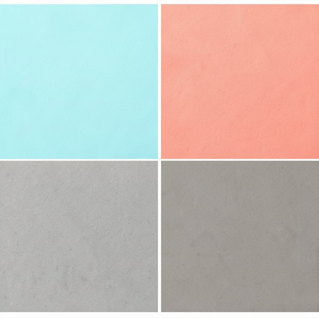
Imagine a summer flyer: aqua waves, coral accents, and warm gray panels that tie it all together. It’s bright without feeling messy.
This works for community events, product launches, and social posts.
Aqua and coral give you a fun rhythm, and warm gray helps text stay readable. Use warm gray for body copy areas, then reserve coral for buttons and important labels.
Personalize it by testing one background as a gradient from aqua to a lighter tint for extra energy.
15. Chocolate Brown + Honey Gold + Cream
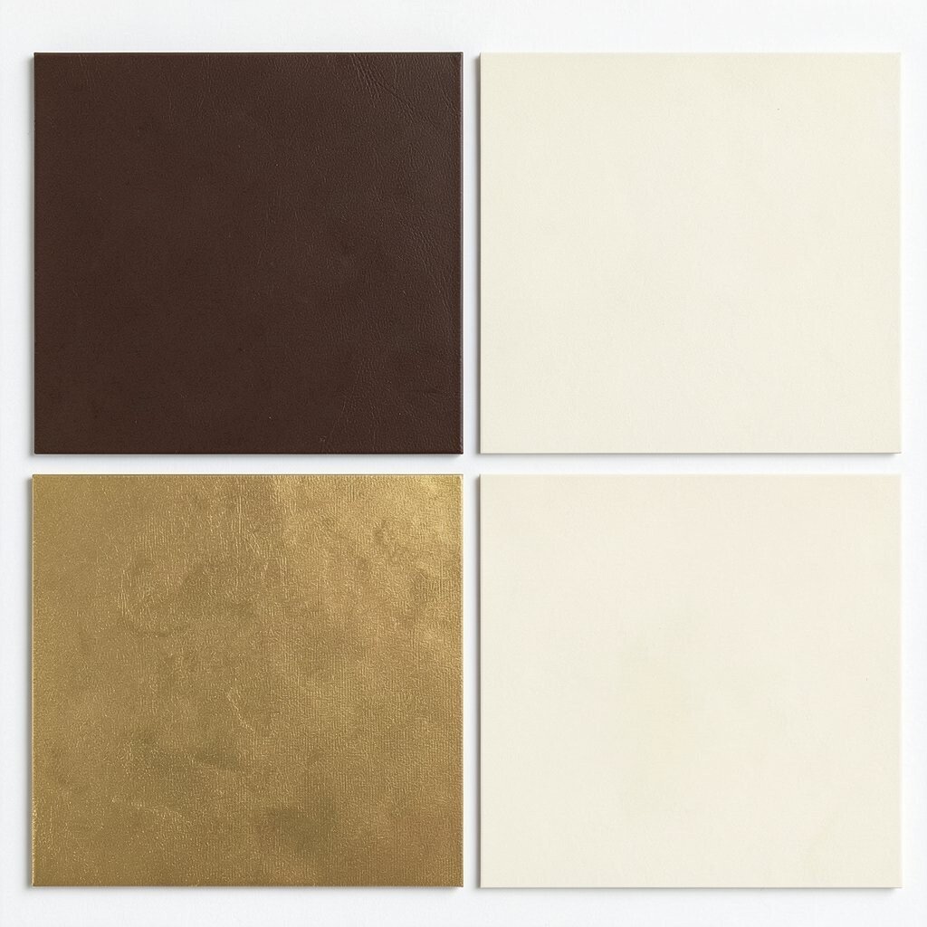
Picture a cozy café: deep chocolate, honey gold highlights, and creamy backgrounds. This palette feels delicious and welcoming.
It’s a great fit for food brands, bakery packaging, and warm home decor.
The benefit is a natural, appetizing look that makes people want to slow down. Brown gives grounding, honey gold adds a friendly glow, and cream keeps everything readable.
For personalization, add thin honey-colored lines around sections to mimic recipe pages.
Cost considerations are practical: brown and cream are usually easy to print, and honey gold can be handled as a standard yellow-orange ink. A current trend is “editorial food design,” where warm neutrals and small gold accents feel classy rather than flashy.
16. Cool Blue + Mint + Deep Black
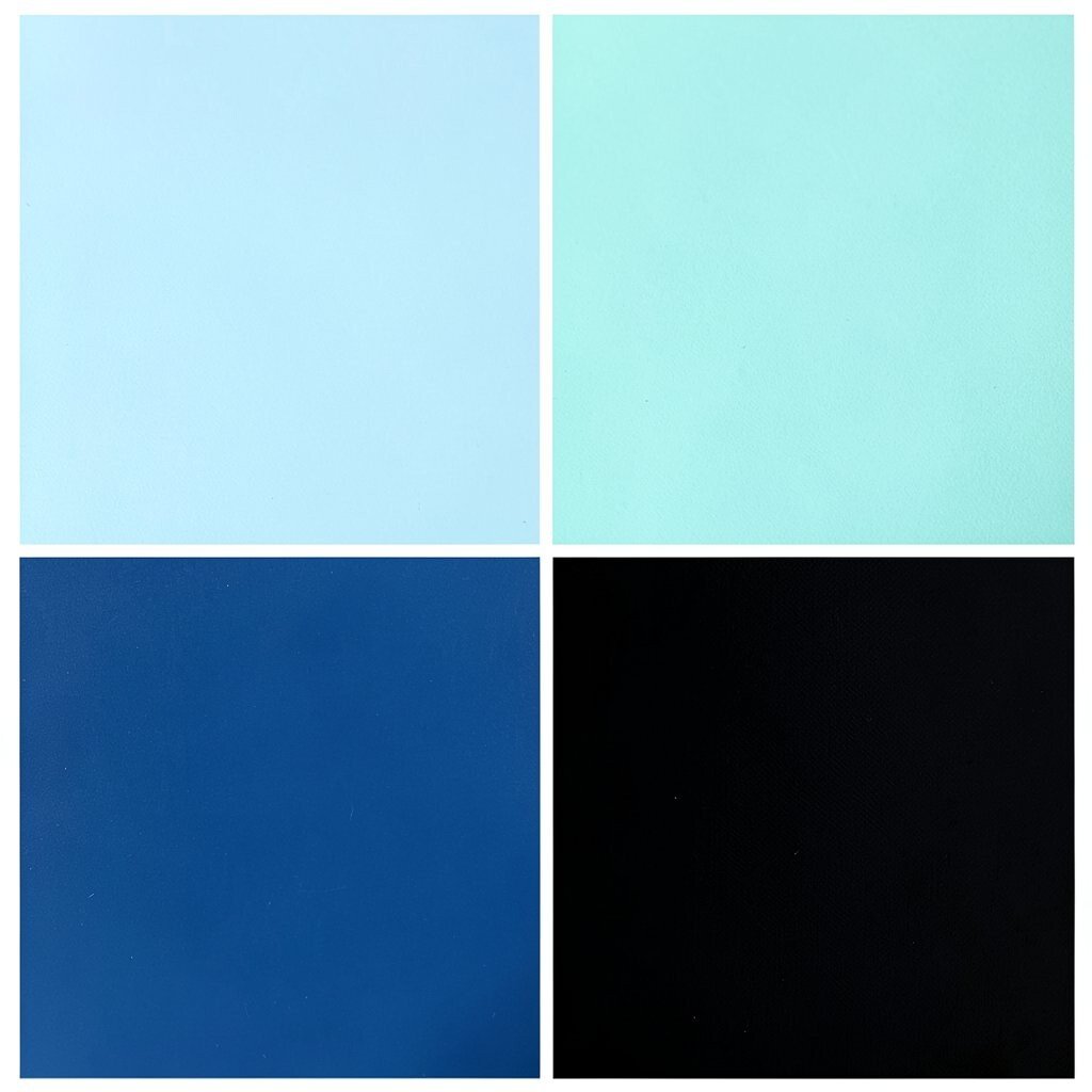
This palette looks crisp and fresh: cool blue for structure, mint for softness, and deep black for sharp headings. It feels like clean glass and bright air.
Deep black improves readability, especially for menus, dashboards, and product specs. Mint is perfect for small highlights, toggles, and icons, while blue can carry the main layout.
Personalize by making the mint slightly greener if you want a stronger “fresh” signal.
17. Coral Pink + Soft Peach + Navy Shadow
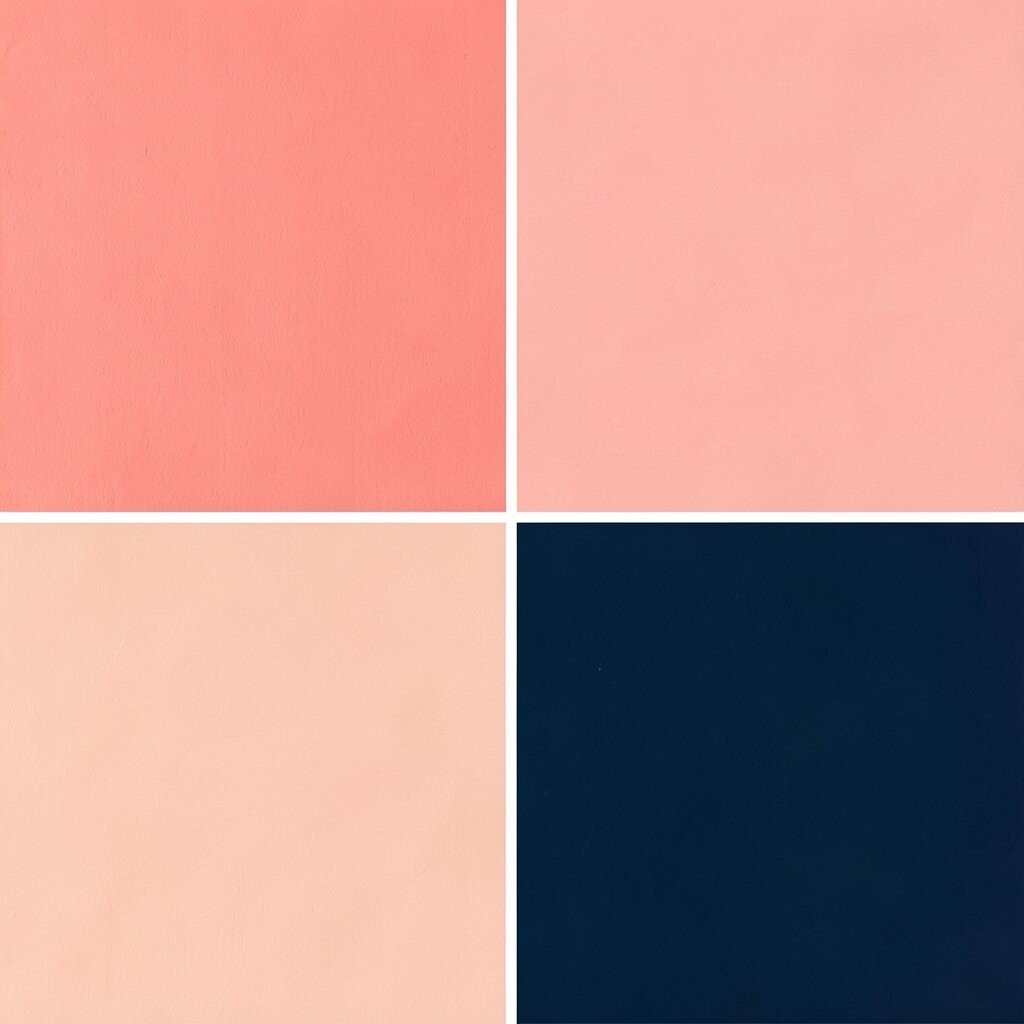
Imagine a gentle blush sunrise: coral pink and soft peach with a navy shadow tone for depth. It feels romantic, friendly, and smooth.
One big advantage is that the palette supports clear hierarchy—navy shadow works like a “stage” for text and cards. Use coral pink for buttons and headings, peach for large sections, and navy shadow for borders and links.
Personalize by adding a peach-to-coral gradient only in one main area so the design stays clean.
Cost considerations are manageable because you can keep the set small and reuse it across many pages. For current trends, soft coral blends are popular, especially with “glassmorphism-lite” effects like light shadows and rounded corners.
18. Emerald + Creamy Beige + Ink Green
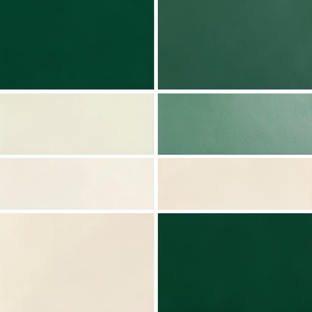
Picture a jewel box: emerald green with creamy beige and a darker ink green for contrast. It feels rich, polished, and bold.
Emerald gives you a luxurious mood, while beige keeps the page warm and readable. Ink green is perfect for body text, because it looks softer than pure black but still stays clear.
Try emerald for hero backgrounds, beige for panels, and ink green for typography.
Personalize by adding tiny leaf illustrations in a low-opacity beige tone so they don’t distract from reading. A trend you can borrow is “nature texture,” using subtle paper grain or soft botanical shapes behind images.
Keep texture light so it doesn’t fight your main content.
Cost-wise, emerald can vary between brands of ink, so test a small proof first if you’re printing. On the web, you’ll usually get consistent color using hex codes and the same gradient settings across elements.
19. Light Gray + Royal Purple + Bright Teal
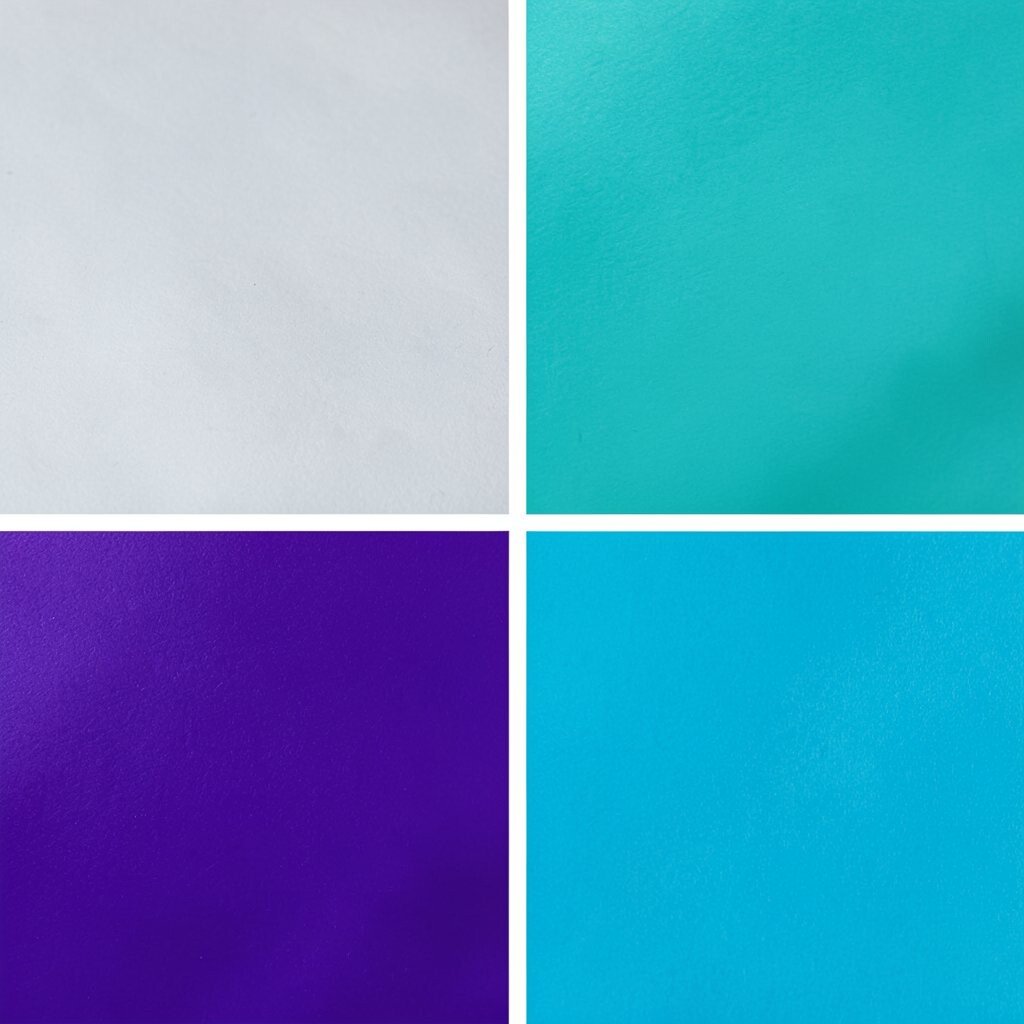
This palette feels like a tech badge: light gray as the calm base, royal purple for personality, and bright teal for the final pop. It’s fun, modern, and easy to style.
Great choices include landing pages and app interfaces.
The benefit is clear contrast between text and surfaces, so your content stays easy to read. Use light gray for backgrounds and layout grids, purple for headings, and teal for “next step” actions.
Personalize by making purple slightly more violet if your brand leans cool and playful.
20. Olive + Sky Gray + Pale Gold
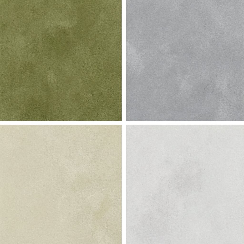
Think of a muted countryside map: olive for steadiness, sky gray for calm, and pale gold for gentle warmth. The look feels mature and thoughtful.
It works beautifully for documentaries, brands, and art prints.
This palette is unique because it avoids the most common bright combinations, so your design can feel instantly different. Olive and sky gray create a balanced, modern base, and pale gold helps highlight quotes and key info.
For personalization, use pale gold sparingly on dividers, small labels, and icon outlines.
Cost considerations are good since olive, gray, and pale gold are usually printable with standard processes. A current trend is “soft metallic energy” using light gold accents, which looks classy without overwhelming the layout.
Keep your typography clean and spacing generous for the best results.