Kitchen color can change the whole mood of a home. A smart paint choice can make a tired room feel fresh and full of life.
1. Soft White Before, Warm Cream After
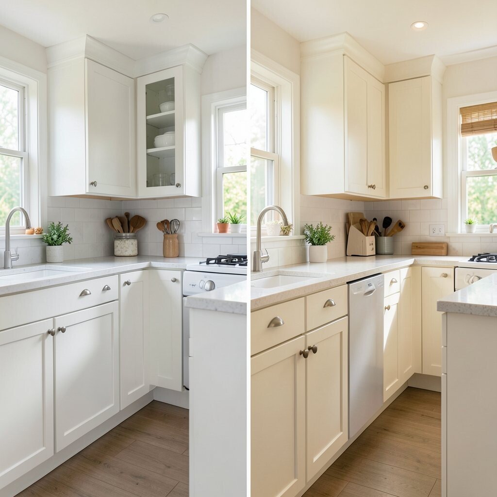
A kitchen that starts with flat white walls can feel a little cold and plain. After a switch to warm cream, the room looks softer, brighter, and more welcoming.
This color change works well with wood tables, brass handles, and woven baskets. It also hides small marks better than bright white, which helps in busy homes. If you want a cozy style, add beige curtains, pale rugs, or open shelves with clay dishes.
2. Dark Brown Before, Sage Green After
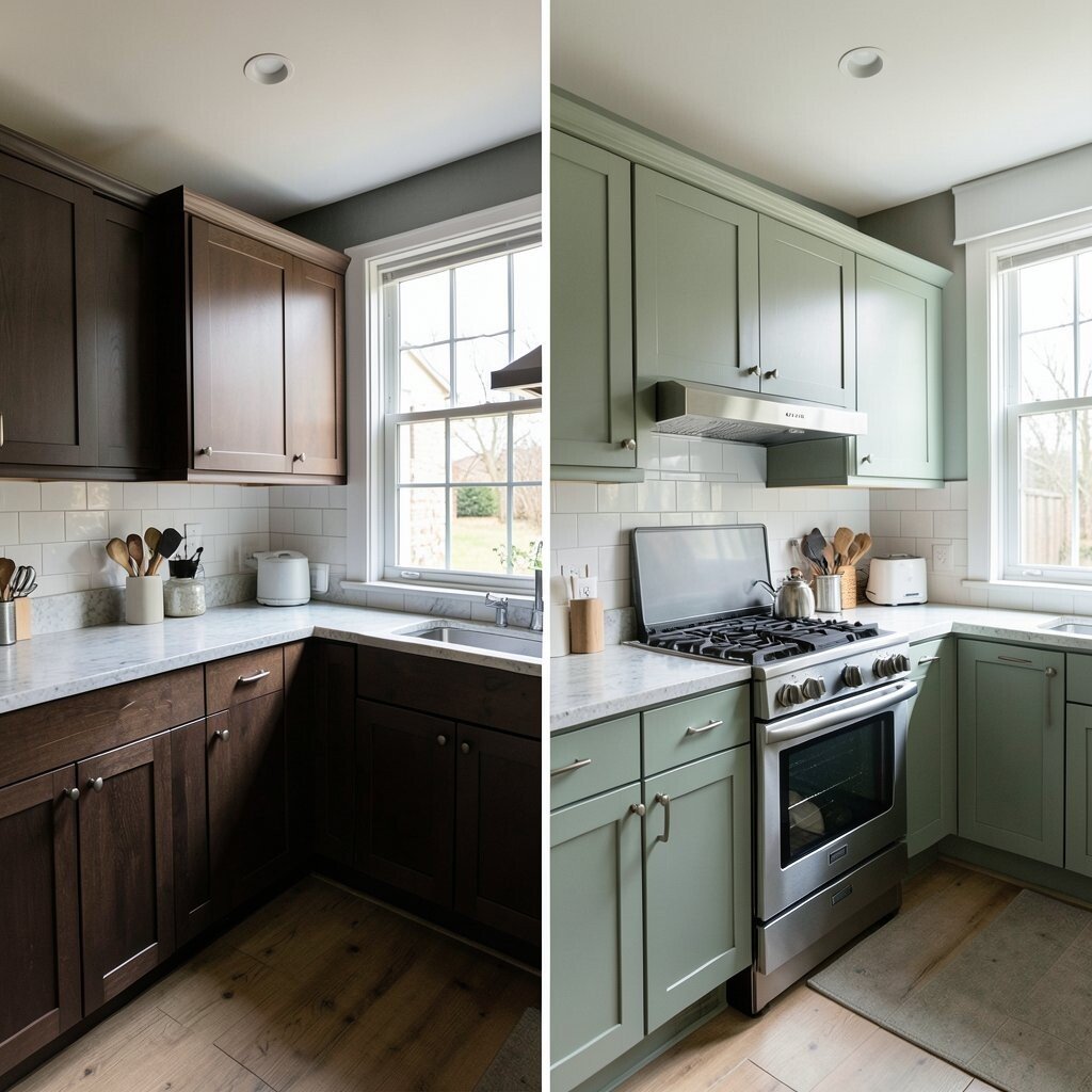
Dark brown cabinets can make a kitchen feel heavy and closed in. Sage green brings in a calm garden look that feels fresh and easy on the eyes.
The new color pairs nicely with white counters and black hardware. It is a good pick for people who want a trend-forward look without being too loud. Try adding small plants, light wood stools, or simple linen towels to make the color feel even more alive.
This change can also help a small kitchen feel less boxed in. If your room gets a lot of daylight, sage green can glow in a soft and pretty way.
3. Yellow Before, Deep Navy After
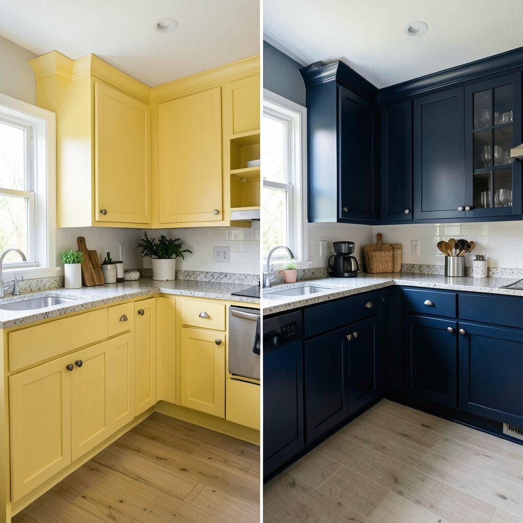
Bright yellow walls can feel cheerful at first, but they may start to seem too busy. Deep navy gives the kitchen a rich, modern look that feels calm and strong.
White trim and silver lights stand out nicely against navy. The dark shade can also make gold knobs and glass jars pop in a stylish way.
If you like a bold mood, this is a great choice for an accent wall or lower cabinets. Keep the rest of the room light so the space still feels open and friendly.
For a personal touch, add framed art, striped runners, or a red kettle for a fun color spark. Navy paint often costs the same as other colors, but the polished look can make the whole room feel more expensive.
4. Beige Before, Crisp Blue After

Plain beige can make a kitchen feel safe, but it may also look dull. Crisp blue wakes up the space and gives it a clean, airy feeling like a bright morning.
This shade works well with white cabinets and shiny tile. It can also make a narrow kitchen feel wider and more open.
5. Red Before, Muted Olive After
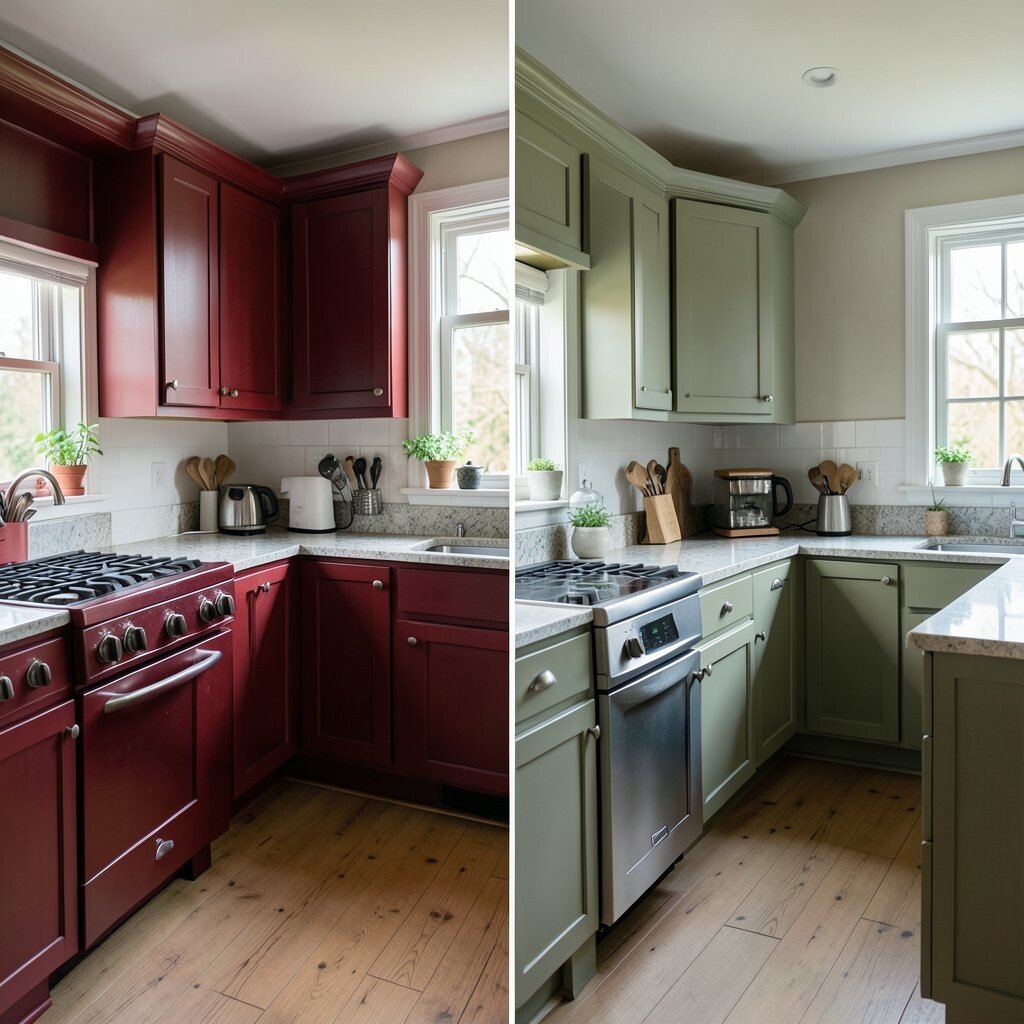
Strong red walls can be exciting, yet they may also feel too loud for daily life. Muted olive calms the room and brings in a natural, grounded look.
Olive works well with wood cutting boards, cream dishes, and matte black lights. It fits current earthy trends and gives the kitchen a warm, lived-in style.
You can make it personal with copper pans, terracotta pots, or a soft rug in a pattern you love. This color also tends to stay stylish for a long time, which makes it a smart pick if you do not want to repaint soon.
If your kitchen has a lot of sunlight, olive can look rich and soft at the same time. In a darker room, pair it with pale counters or open shelves to keep the space from feeling too heavy.
6. Gray Before, Pale Peach After
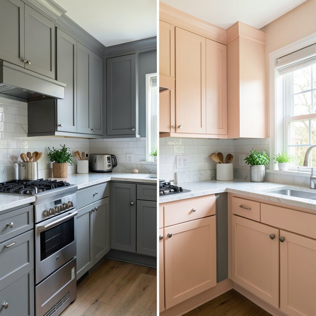
Cool gray can be neat, but it sometimes feels stiff and plain. Pale peach adds a gentle glow that makes the kitchen feel happy and friendly.
This color is lovely with white trim, brass pulls, and soft wood tones. It can make breakfast time feel warmer and more inviting.
For a fresh look, use peach on walls and keep cabinets white or light oak. If you want a sweet personal touch, try art with fruit, pink flowers, or a colorful tea set.
7. White Before, Charcoal After

All-white kitchens can feel bright, but they may also lack depth. Charcoal brings in a bold, modern edge that gives the room more personality.
This darker shade looks sharp with marble counters and shiny metal fixtures. It can also hide scuffs better than lighter paint, which is helpful near busy cooking spots.
To keep the room from feeling too dark, add open shelving, light floors, or a pale backsplash. A few warm touches, like wood stools or woven mats, can make the whole space feel balanced.
Charcoal is a strong trend for people who like a sleek style. It gives a kitchen a custom look without needing a full remodel.
8. Mint Before, Sunny Beige After
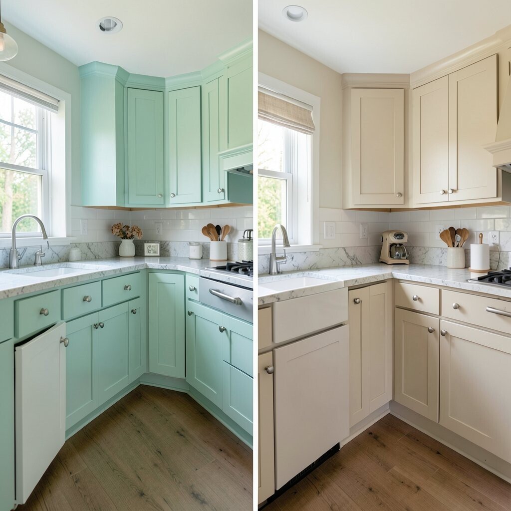
Mint green can feel playful, but some homes need a calmer mood. Sunny beige offers a soft, golden warmth that feels easy and timeless.
This change works well in family kitchens where the room needs to feel cozy all day. It also blends nicely with almost any cabinet color, from white to medium wood.
If you want the kitchen to feel brighter, use beige with warm bulbs and light curtains. Add your own style with patterned dishes, fresh herbs, or a colorful fruit bowl on the counter.
Because beige is so flexible, it can save money in the long run. You will not need to change the whole room when your taste shifts a little.
9. Black Before, Soft Taupe After
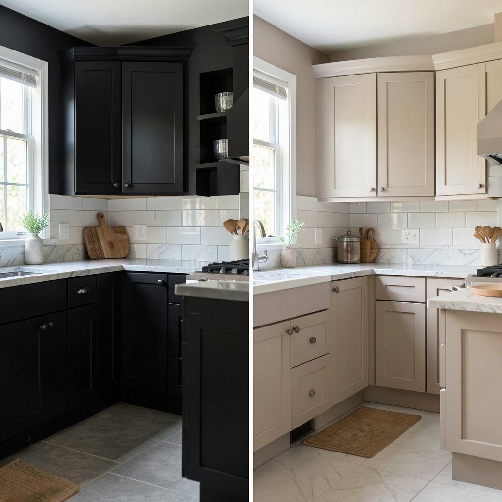
Black cabinets can look dramatic, but they may also make a room feel tight. Soft taupe gives the kitchen a relaxed, earthy look that feels easier to live with.
It works well with stone counters, wood floors, and brushed nickel handles. Taupe is also a smart choice if you want something stylish that still feels calm and simple.
Try adding cream dishware, framed recipes, or a small shelf of cookbooks to make the room feel personal. If you have a small kitchen, taupe can help it look more open than black while still feeling rich.
10. Orange Before, Cool Teal After
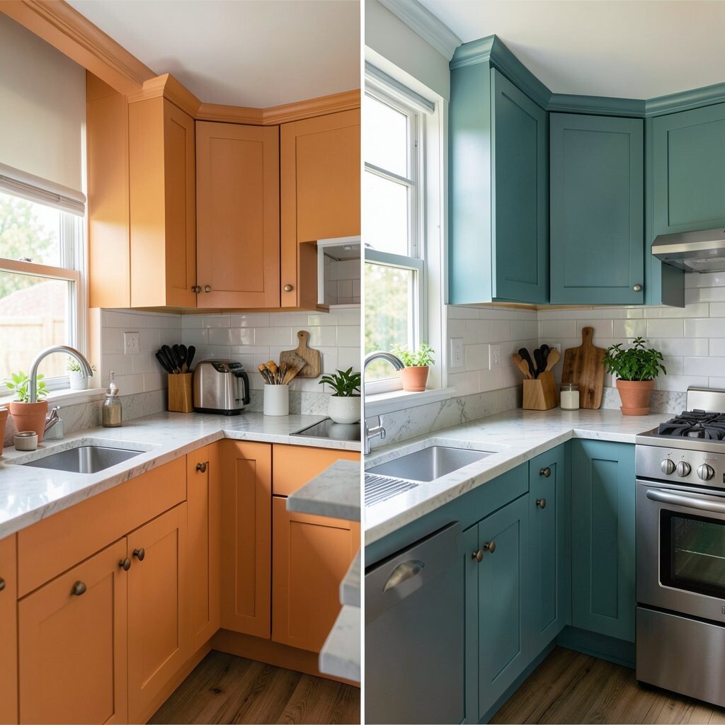
Bright orange can feel fun for a short time, but it may become too intense. Cool teal brings in a fresh, modern splash that feels lively without being too hot.
This color looks great with white cabinets and silver lights. It also gives the kitchen a playful style that stands out in a good way.
Teal works well on one wall, on lower cabinets, or around a breakfast nook. For a personal touch, add blue glass, patterned towels, or a vintage chair painted in a matching shade.
If you like current color trends, teal fits right in with jewel tones and bold accents. It can make everyday cooking feel a little more special.
11. Pale Green Before, Rich Terracotta After
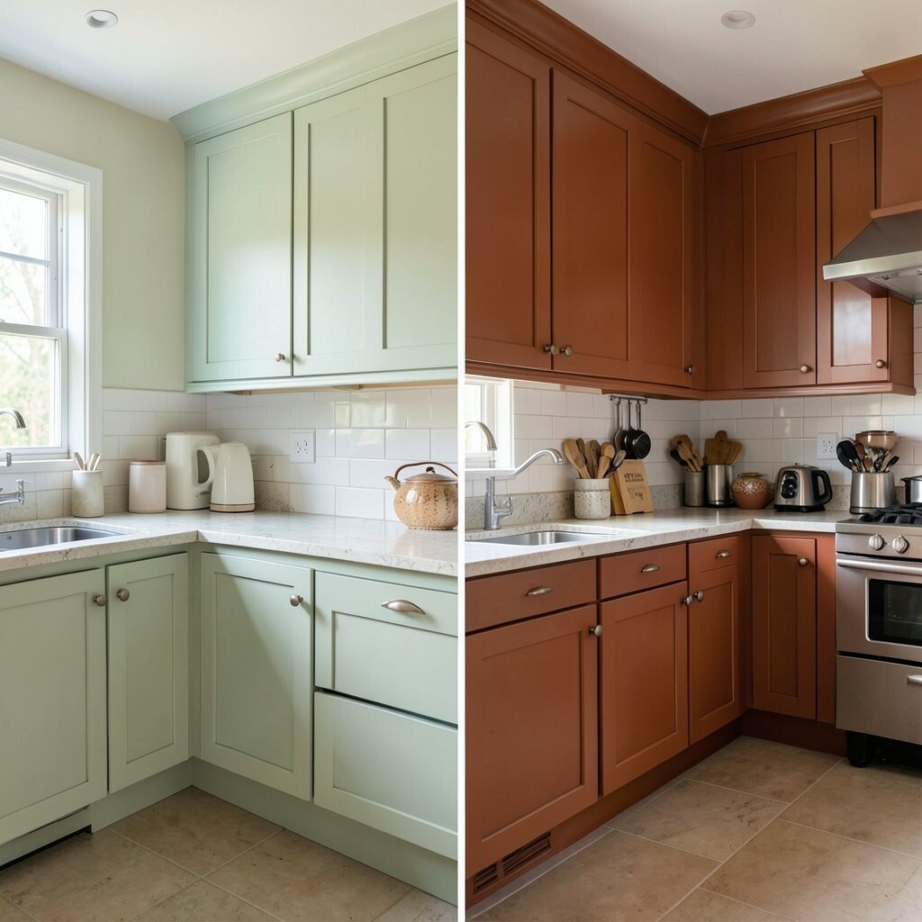
Pale green can feel soft, but it may not always give a room enough warmth. Rich terracotta adds a sunbaked look that feels earthy, cozy, and full of life.
This shade works beautifully with white tile, dark wood, and handmade pottery. It can make the kitchen feel like a warm gathering place for friends and family.
If your kitchen has simple cabinets, terracotta can make them look more custom and unique. Add plants, woven baskets, or a patterned runner to bring out the natural feel.
Cost-wise, paint is an easy way to get this rich look without buying new cabinets. It is a strong choice for anyone who wants a bold change that still feels welcoming.
12. Blue-Gray Before, Soft Butter Yellow After
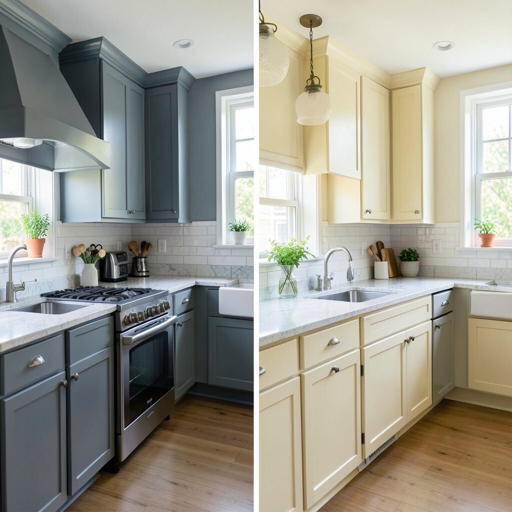
Blue-gray can feel quiet, but it may also seem a little chilly. Soft butter yellow brings in a sunny mood that makes the kitchen feel warm and cheerful.
This gentle shade works well with white trim and light wood counters. It also helps darker rooms feel brighter without using a loud color.
For a personal touch, add sunny dish towels, glass jars, or a small vase of flowers. Butter yellow is a sweet choice for cottage style, farmhouse style, or any home that needs more warmth.
If you want a low-risk color change, this is a friendly pick. It gives a fresh look while still staying soft enough for daily life.
13. Forest Green Before, Clean White After

Deep forest green can feel rich, but it may also make a kitchen look heavy if the room is small. Clean white opens everything up and gives the space a crisp, fresh start.
White reflects light well, so it is useful in kitchens that need a brighter mood. It also makes colorful dishes, wood stools, and metal fixtures stand out more clearly.
To keep white from feeling plain, use different textures like tile, wood, and fabric. You can also add your own style with colorful art, a painted island, or bold cabinet handles.
White is still a top trend because it works with almost any look. It may cost less than a full remodel and can make the whole home feel cleaner and bigger.
14. Purple Before, Warm Sand After

Bright purple can be fun, but it may not suit everyday cooking for everyone. Warm sand creates a soft, natural backdrop that feels calm and easy to enjoy.
This shade pairs well with white cabinets, tan rugs, and wood accents. It gives the kitchen a beachy, sunlit feel without looking too fancy or too plain.
If you like a personal touch, add shell-shaped bowls, woven placemats, or framed family photos. Warm sand is also easy to update later with new colors, which makes it a smart and flexible choice.
Because it is neutral, it can help keep decorating costs down. You can change small items around it instead of repainting the whole room again.
15. Brown Before, Fresh Aqua After
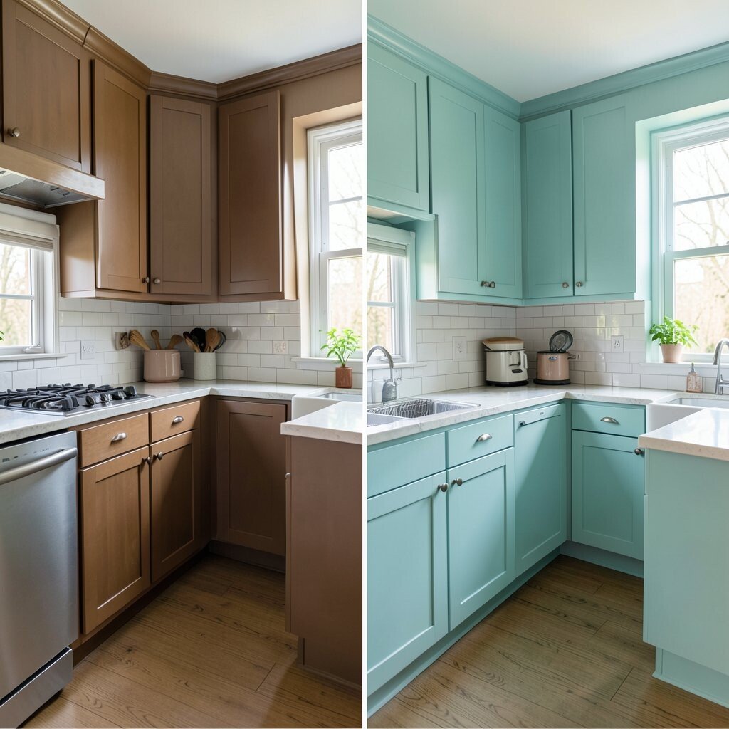
Heavy brown tones can make a kitchen feel old and dull. Fresh aqua gives the room a bright, happy energy that feels clean and full of light.
This color is great with white shelves, silver faucets, and pale floors. It brings a cool coastal feel that works well in both small and large kitchens.
For a more personal look, add striped towels, sea-glass bowls, or a painted chair in a matching shade. Aqua is a cheerful trend that can make the kitchen feel friendly the moment you walk in.
If you want a change that feels bold but still simple, this is a strong pick. It can refresh the room without needing costly new cabinets or major work.