
Your backsplash can change the whole mood of a kitchen. The right color makes the room feel calm, bright, bold, or warm.
Small color choices can have a big visual effect. A smart pick can also make cleaning feel easier and your space feel more personal.
1. Start With the Mood You Want
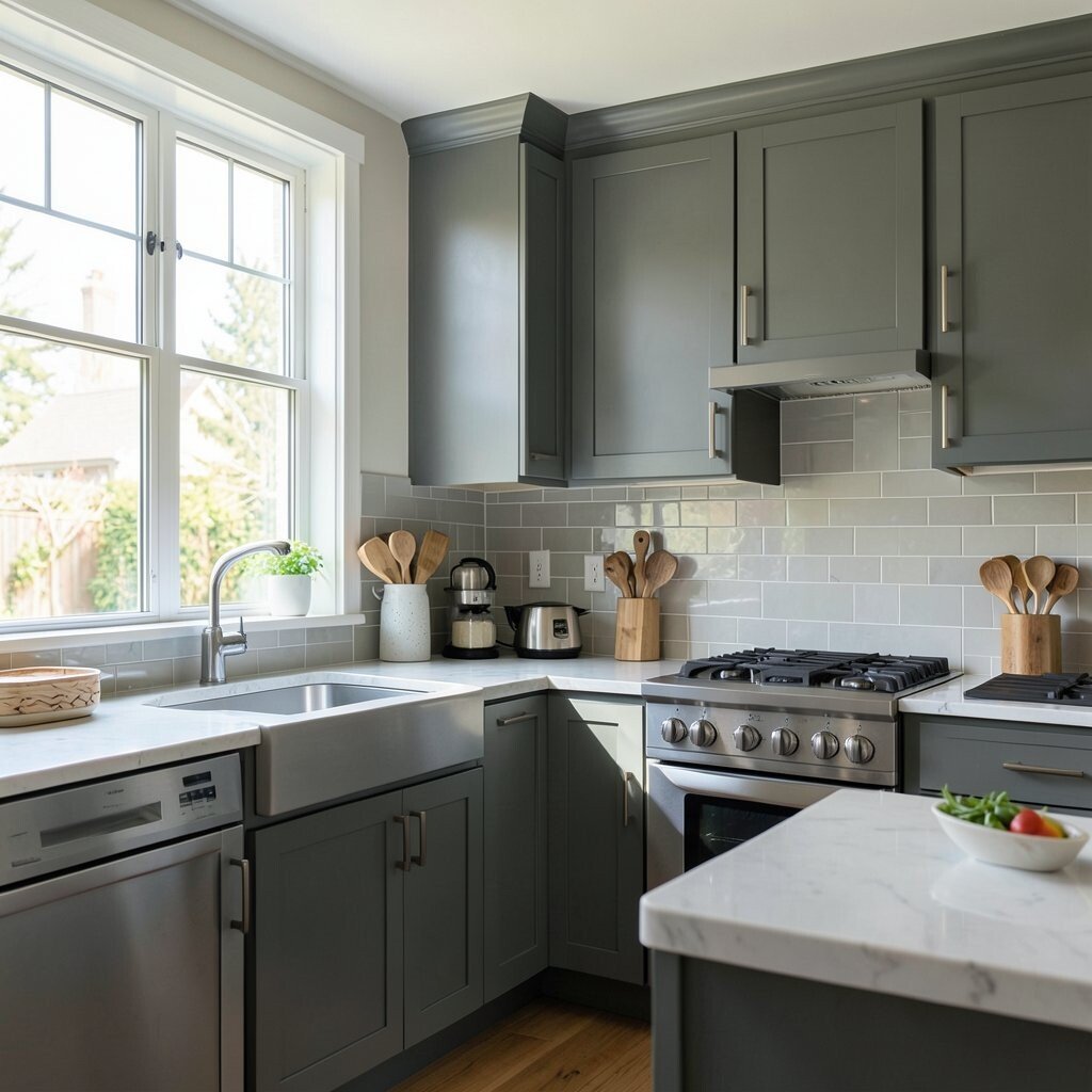
The first step is to think about how you want your kitchen to feel. Soft blues and creamy whites can feel quiet and airy, while deep greens or rich navy can feel cozy and strong.
Look at the room in the morning and at night to see how the light changes the color mood. If you want a calm space, choose gentle shades, and if you want more energy, pick brighter tones that pop. This is a simple way to make the backsplash feel like it truly belongs in your home.
2. Match the Cabinets Without Copying Them
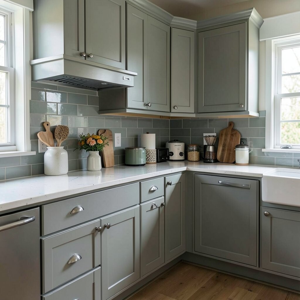
Your backsplash should work with your cabinets, not hide behind them. If your cabinets are white, you can add soft gray, pale blue, or even a bold patterned tile for a fresh look.
For wood cabinets, warm cream, sage, or muted terracotta can look rich and balanced. Try holding color samples next to the cabinet doors so you can see how the shades play together in real light. This helps you avoid a flat look and gives the kitchen more style.
Many people now like mixed tones instead of perfect matches, because that feels more modern and personal. A slightly different color can add depth without making the room feel busy. If your cabinet finish is expensive, a well-chosen backsplash can also help it stand out in a tasteful way.
3. Use Countertop Colors as Your Guide
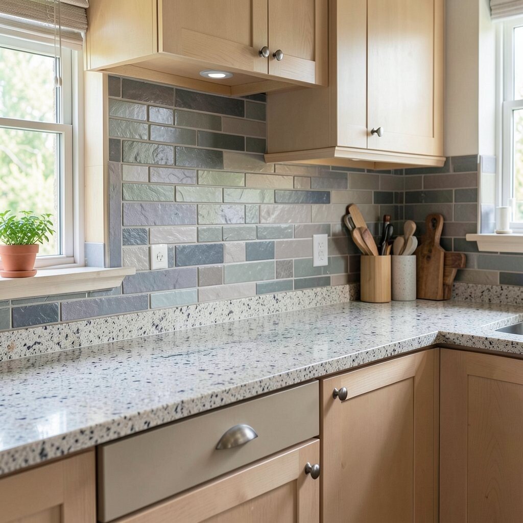
Countertops and backsplashes sit close together, so they need to look good as a pair. A busy stone counter often works best with a simple backsplash color, while a plain counter can handle more color or pattern.
Try to find one shade in the countertop and repeat it in the tile for a smooth look. If your counter has cool gray veins, a soft gray-blue backsplash can feel connected and neat. This trick keeps the kitchen from feeling too crowded.
It also helps with cost, because you can choose a simpler tile if the countertop already has a lot of visual interest. That can save money while still giving the room a polished style. For a custom feel, you can pick a tile with a handmade look that echoes the tiny color changes in the stone.
4. Think About Light Before You Pick
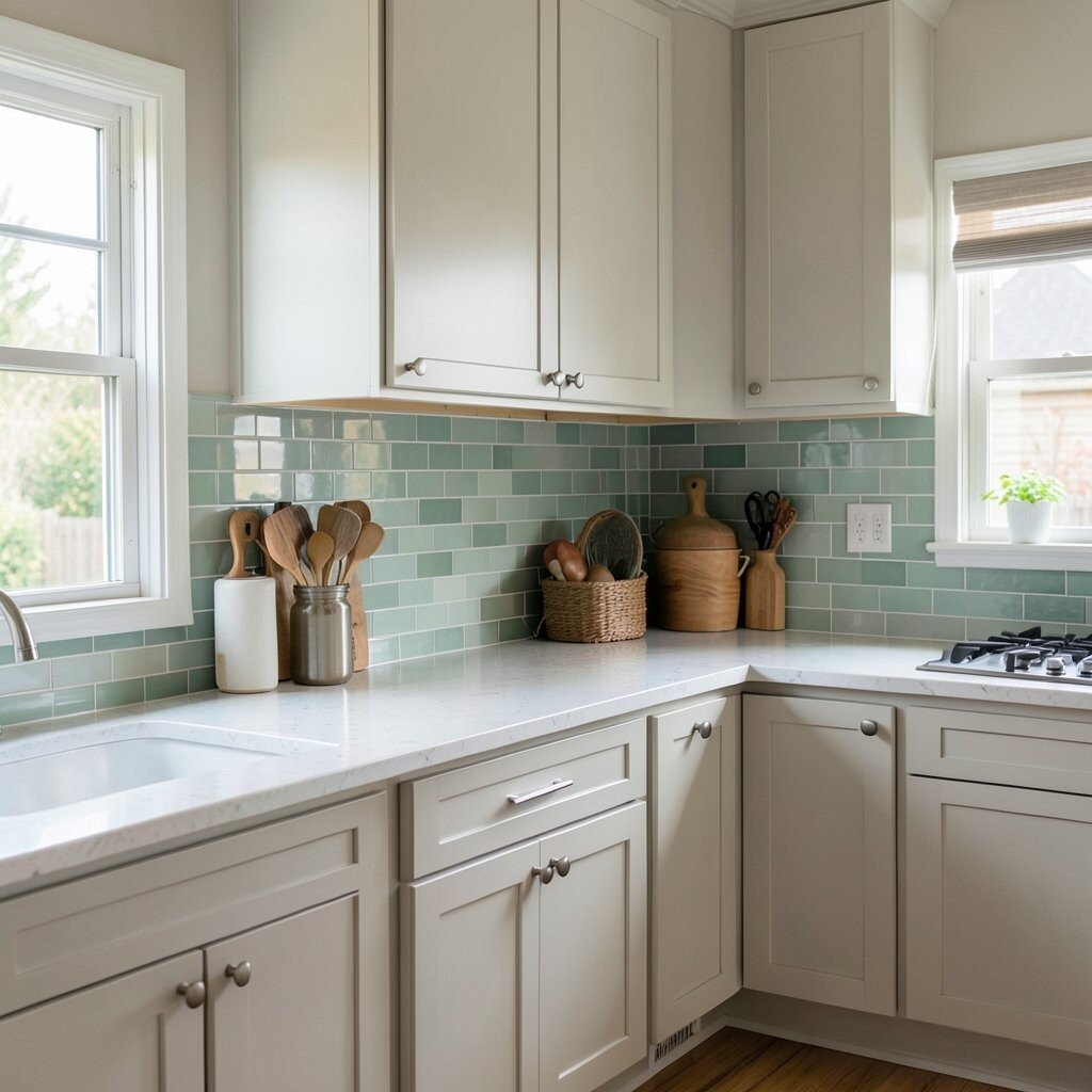
Light changes color more than most people expect. A pale yellow tile may look creamy in sunlight but turn dull under warm bulbs.
Check samples near your window, under cabinet lights, and at night with the room lights on. This gives you a better idea of how the backsplash will really look every day. A color that shines in your space will feel more cheerful and less risky.
5. Choose a Color That Makes Cleaning Look Easier
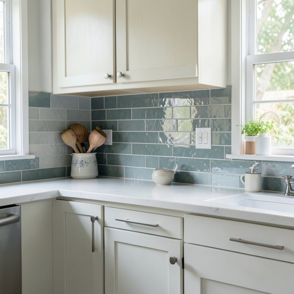
Some backsplash colors hide splashes better than others. Mid-tone shades like soft taupe, muted green, or gentle gray can be kinder to the eye when cooking messes happen.
Very light tile can show tomato sauce or coffee spots fast, while very dark tile may show dust and water marks. A color with a little movement or speckle can be practical and still pretty. This is a smart choice for busy kitchens where style needs to work hard.
If you cook a lot, think about how often you want to wipe the wall. A slightly textured tile or a glazed finish can help keep the surface looking fresh. That kind of choice can feel more useful than chasing a trendy color that is hard to live with.
6. Add a Pop of Color in a Small Way
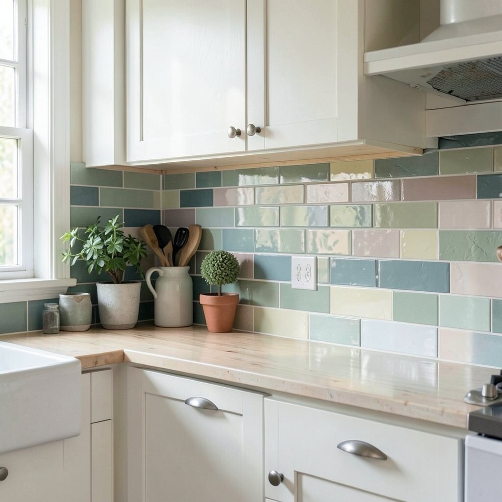
If you love color but fear it may be too much, start with a small backsplash area. A bright tile behind the stove or sink can create a fun focal point without taking over the room.
Bold teal, sunny mustard, or soft coral can bring life to a simple kitchen. Pair a pop color with calm cabinets and counters so the room still feels balanced. This gives you a playful look that still feels safe and easy to enjoy.
Many current kitchens use one strong accent instead of many loud colors. That keeps the design fresh and gives your space a custom feel. If you change decor often, this kind of backsplash can let you update the room later with less effort.
7. Use Neutrals for a Timeless Look
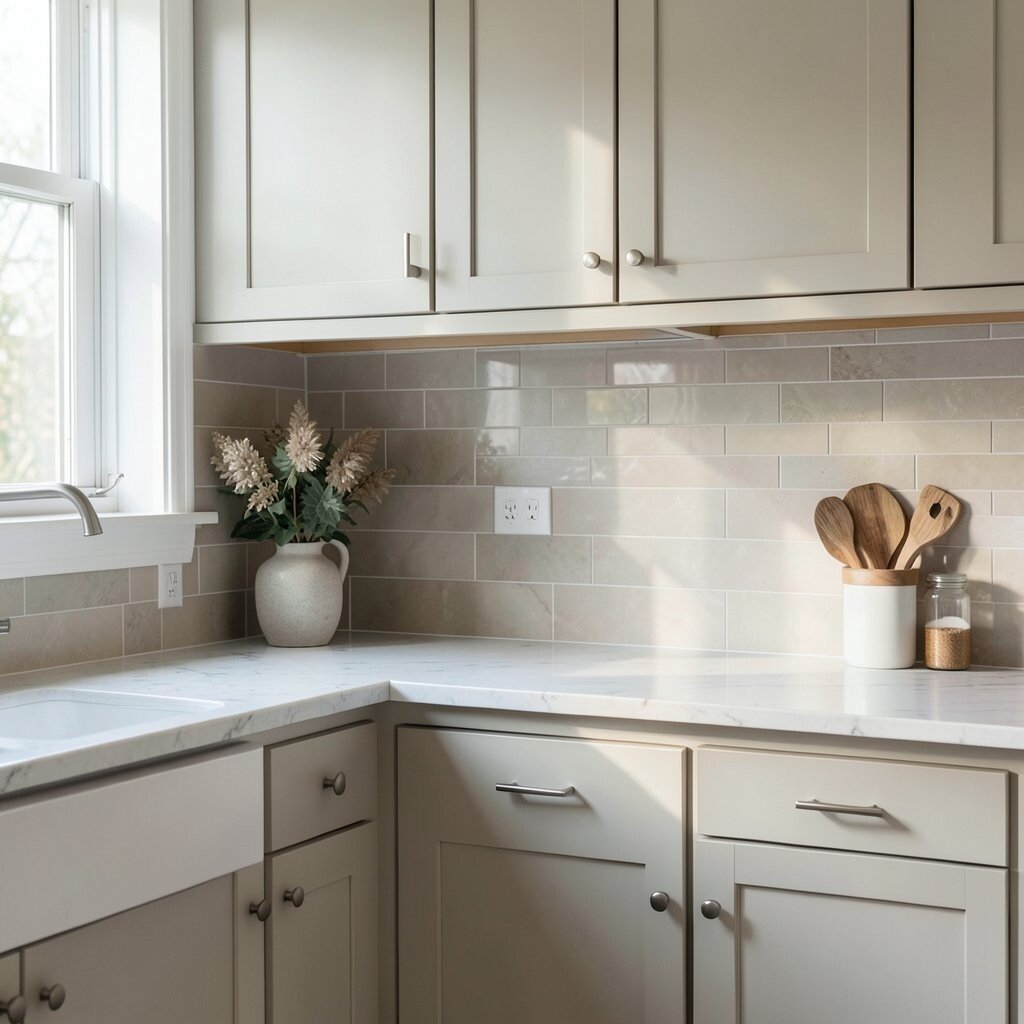
Neutral backsplash colors are popular because they age well. White, beige, gray, and soft greige can work with many styles, from farmhouse to modern.
These shades help the kitchen feel open and calm, especially in smaller rooms. They also give you more freedom to change rugs, stools, and dishes later. If you want a safe choice that still looks nice for years, neutrals are a strong option.
To keep a neutral backsplash from feeling plain, pick a tile with shape, shine, or texture. A simple subway tile in a handmade finish can look richer than a flat sheet of color. This is a good way to get style without spending too much.
8. Bring in Nature-Inspired Shades
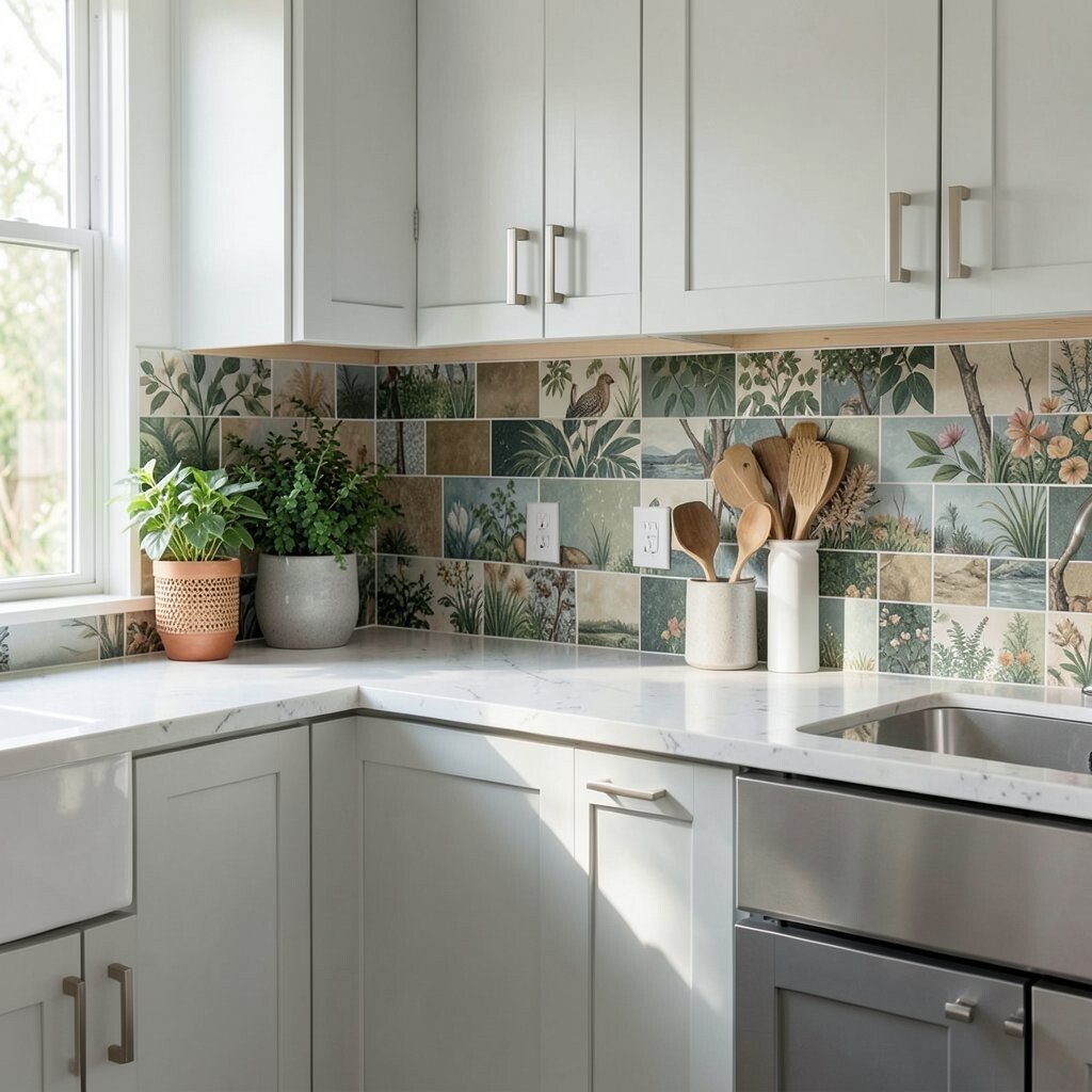
Colors from nature can make a kitchen feel soft and welcoming. Sage, clay, sand, stone, and pale sky blue all bring a calm outdoor feeling inside.
These shades work well with wood shelves, woven baskets, and plants. They also create a gentle backdrop that does not shout for attention. If you want a room that feels restful, nature colors can do that with very little effort.
Nature-inspired backsplashes are also a current trend because they feel warm and easy to live with. They can make even a simple kitchen look thoughtful and well planned. For a personal touch, choose a shade that reminds you of a favorite place, like the beach or the woods.
9. Try a High-Contrast Pairing
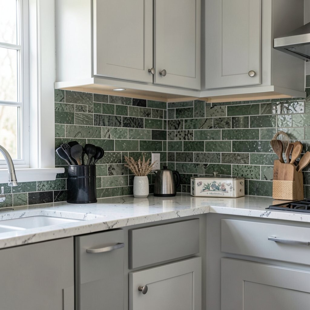
High contrast can make a kitchen look sharp and lively. A dark backsplash with light cabinets, or a light backsplash with dark cabinets, creates a clear and bold style.
This works especially well in rooms that need more visual drama. Black, charcoal, or deep navy tiles can make shiny hardware and pale counters stand out. The result feels crisp and modern without needing a lot of extra decor.
Contrast can also help define the kitchen area in an open floor plan. If your space connects to a living room, a strong backsplash color can set the kitchen apart in a neat way. Just be sure the finish and tile size fit your budget, since darker or special-order tiles can cost more.
10. Let Your Floor Help You Decide
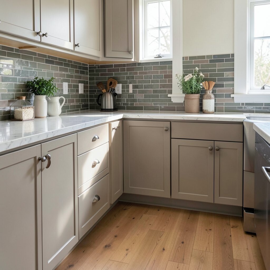
The floor is a big part of the color story in your kitchen. If the floor has warm tones, a cool backsplash can balance it, while a cool floor may look better with a warmer wall color.
Wood, stone, and patterned tile floors each bring their own mood. A backsplash that repeats one small floor color can make the whole room feel connected. This is a simple design trick that keeps the space from feeling random.
When the floor already has a lot going on, a quiet backsplash is often the best deal. It saves money by letting one part of the room do the heavy lifting. For a more personal look, you can still add interest through tile shape instead of color.
11. Use Color to Make the Room Feel Bigger
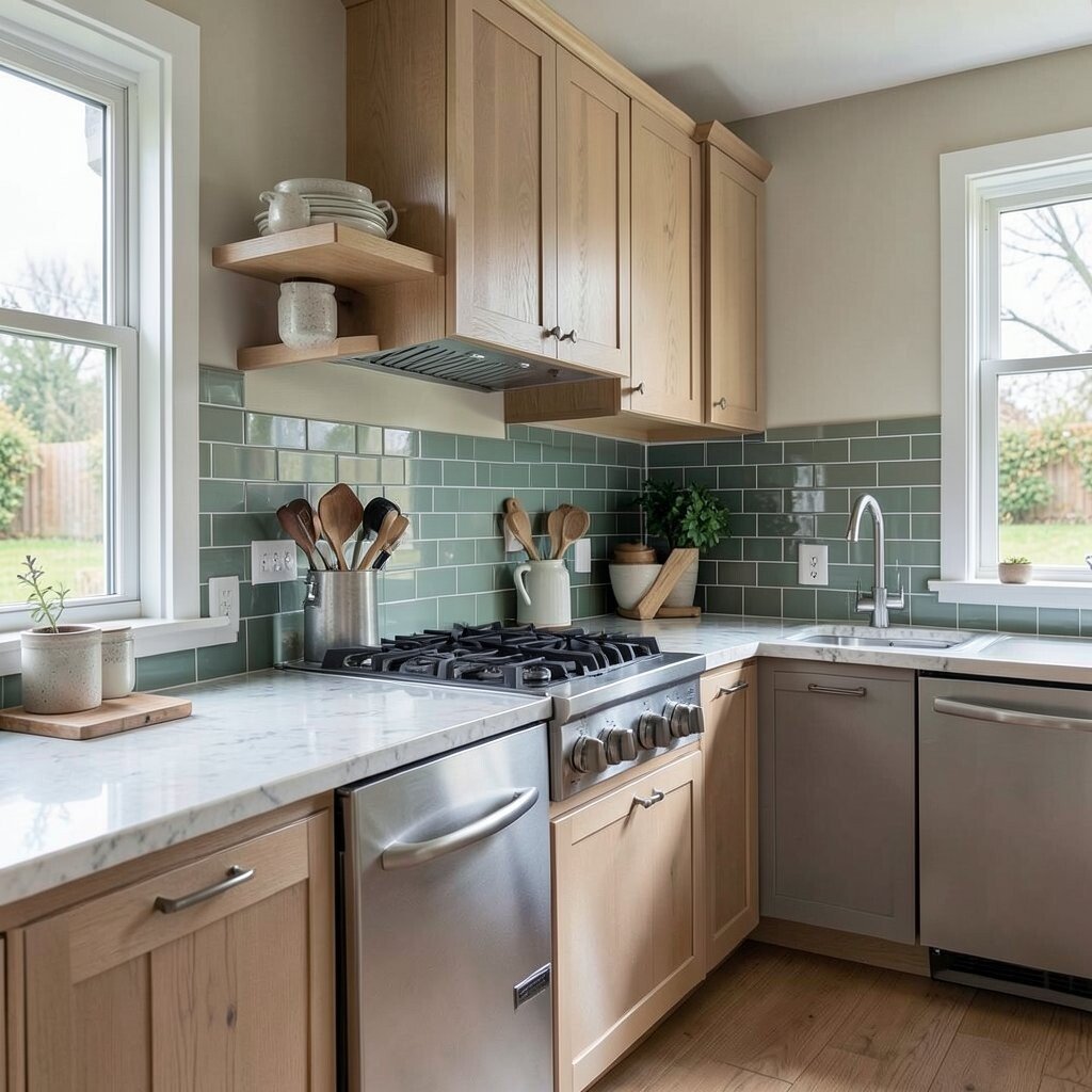
Light backsplash colors can help a small kitchen feel more open. Pale white, soft cream, and light gray reflect light and make walls seem farther away.
If your kitchen is narrow or dark, this can be a big help. Glossy tile can boost the effect because it bounces light around the room. A bright, airy backsplash can make daily cooking feel less cramped.
To keep the look from becoming too plain, add a little texture or a soft pattern. That gives the eye something nice to notice without closing in the space. This style is popular in smaller homes because it feels fresh and simple.
12. Pick a Color That Fits Your Style Story
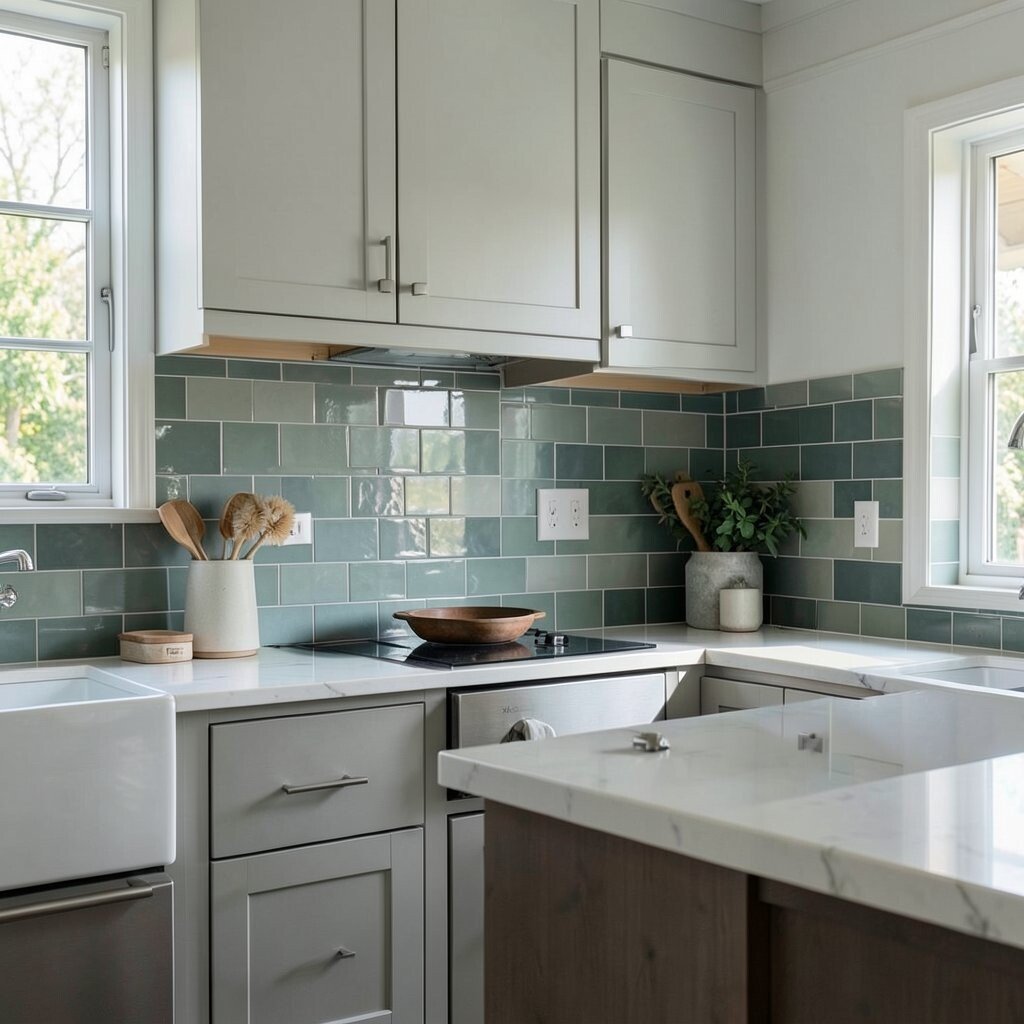
Your backsplash should feel like it belongs to your life, not just a showroom. If you like cozy and classic spaces, warm whites and gentle beige may fit you best.
For a more playful home, you might enjoy mint, blush, or a soft patterned tile with color in it. If you love a clean modern look, gray, black, or white with a slim grout line may feel right. The best choice is the one that makes you smile each time you walk in.
Think about the things you already own, like dishes, art, and even tea towels. A backsplash can tie those pieces together and make the kitchen feel more like you. That personal link is often worth more than chasing the newest trend.
13. Test Samples in Real Life
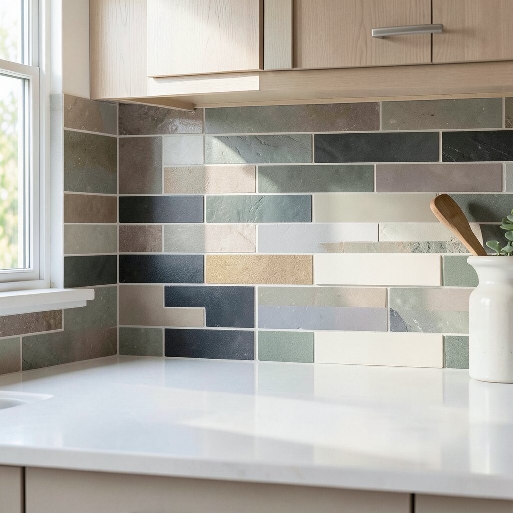
Small samples can look very different once they are on the wall. A color that seems soft in the store may look much brighter or darker at home.
Place samples near the stove, sink, and window so you can compare them all day. Move them around and look at them beside cabinets, counters, and floors. This helps you avoid expensive mistakes and gives you more confidence in your final pick.
Testing also helps you compare cost against style. A tile you love may be a little pricier, but if it works perfectly, it can be worth it. If the budget is tight, a sample test can help you find a lower-cost tile that still gives you the same mood.
14. Mix Color With Shape for a Custom Feel
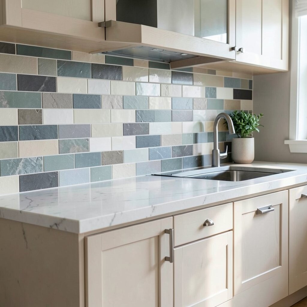
Color is important, but shape can make the backsplash even more special. A simple shade in a herringbone, scallop, or stacked pattern can look much more unique than plain tile.
This is a great way to add personality without using loud colors. Soft blue tile in a fish scale shape, for example, can feel whimsical and fresh. A warm white tile in a vertical stack can look clean and modern at the same time.
Shape changes can also help with cost, since you may be able to use a less expensive tile and still get a designer look. Many current kitchens use shape to bring in style while keeping color calm. If you want your backsplash to feel custom, this is one of the easiest paths to take.