The coast has a way of making everyday life feel lighter. Your countertops can do the same thing, room by room.
Below are vivid before-and-after style ideas that help you plan, budget, and personalize without stress.
-
1. Seashell Speckle Quartz: From Plain to Softly Sparkly
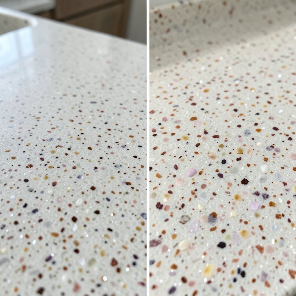
Seashell Speckle Quartz: From Plain to Softly Sparkly Before, the surface looked flat and a little dull in daylight. After, a seashell-speckled quartz brings tiny bright moments that feel like sun off water.
You get a clean coastal look with less fuss. Quartz is stain resistant, so coffee spills and food splashes do not cause panic. For personalization, ask for a pattern with more shell-like flecks around the sink area, so the shine shows where you need it most.
-
2. Driftwood Look Laminate: From Dark to Warm and Airy
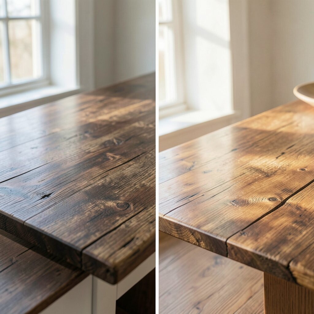
Driftwood Look Laminate: From Dark to Warm and Airy Before, the countertop had a heavy color that made the kitchen feel smaller. After, a driftwood-look laminate adds warm tones and a calm, beachy mood.
This option keeps the room cozy instead of cold. It also hides small everyday scuffs better than very glossy surfaces. If you want a personal twist, match the laminate grain direction with your cabinet lines so everything looks planned, not random.
For cost, laminate is usually easier on the budget than stone. Still, choose thicker edges and a quality edging strip for a more expensive look. Pair it with light hardware and a simple backsplash for a clean coastal finish.
-
3. White Marble-Style Stone: From Busy to Bright and Classic
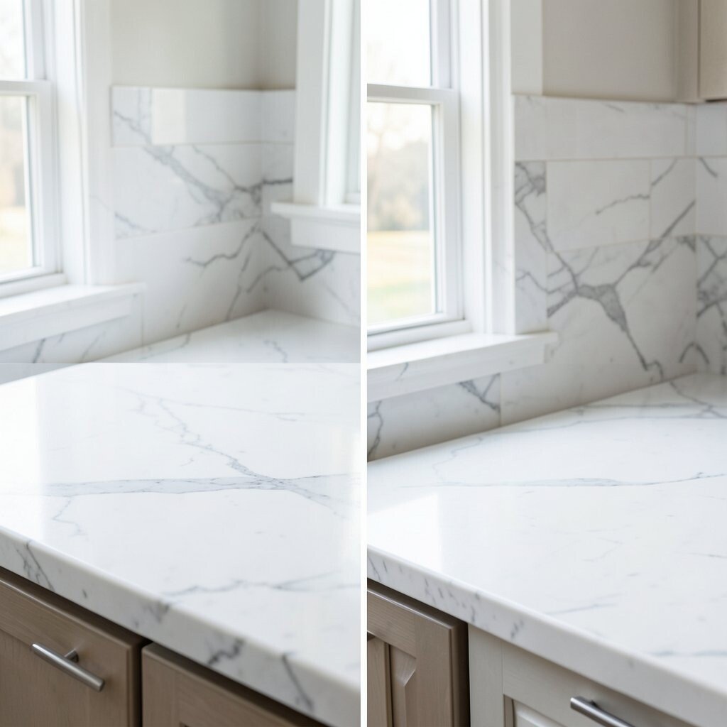
White Marble-Style Stone: From Busy to Bright and Classic Before, the counter had too many visual changes at once, like a noisy fabric. After, a marble-style surface with gentle gray veining calms the whole kitchen.
The benefit is that it looks coastal and timeless at the same time. You also get a bright work area that makes everything around it look crisp. Consider adding a thin blue or gray grout color in your backsplash to echo the subtle movement.
If you want uniqueness, choose a slab with a few bolder veins near the island. That way, your kitchen has a signature “moment” without overdoing it. Remember that marble-style options can vary in price, so ask about maintenance needs before you commit.
To keep costs steady, talk to your installer about using offcuts for small areas or an apron front. Small planning can make a big difference in the final bill.
-
4. Coastal Concrete Resin: From Cold to Softly Modern
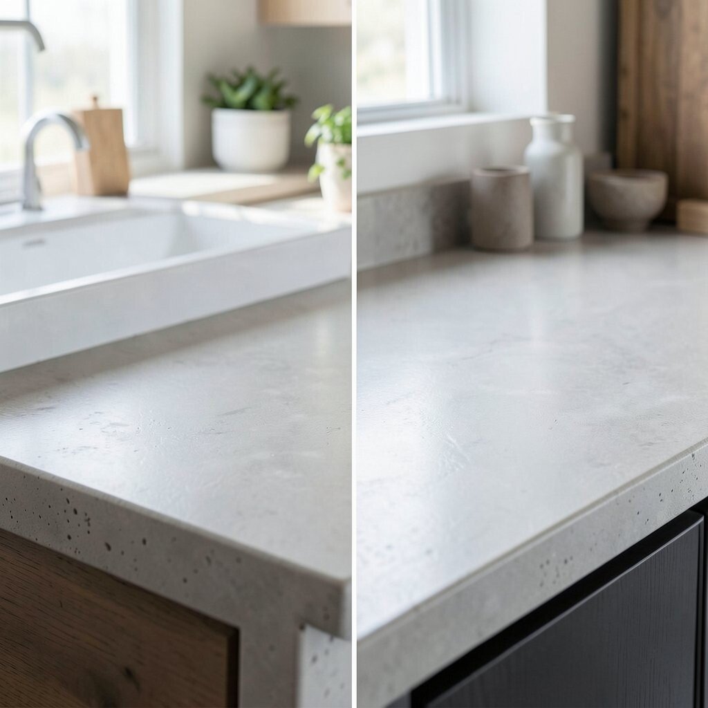
Coastal Concrete Resin: From Cold to Softly Modern Before, the countertop felt chilly and too industrial for a seaside vibe. After, a coastal concrete-style resin finish brings a smooth, modern look with sandy undertones.
This design is great if you like clean lines but still want the ocean feeling. It can also look more unique than common white stone. Ask your fabricator if they can add a faint speckle that resembles dried sand, which makes the surface feel more natural.
Cost considerations matter here because resin work can be custom. If you want to stay on budget, choose a uniform color rather than a highly mixed, dramatic blend. Pair the finish with matte cabinet paint in warm white for the best coastal harmony.
-
5. Ocean-Blue Quartz with Cloudy Veins: From Plain to Stunning
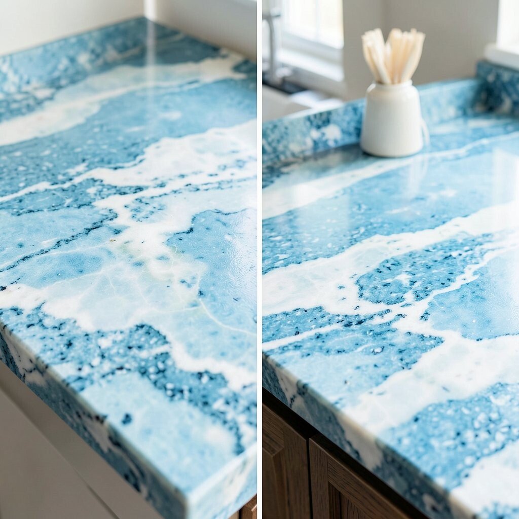
Ocean-Blue Quartz with Cloudy Veins: From Plain to Stunning Before, the kitchen lacked color, so it felt like it needed a spark. After, ocean-blue quartz with cloudy movement turns the countertop into a visible focal point.
This brings the benefit of instant coastal energy. The surface stays easy to care for, which helps if you cook often. For personalization, consider an island in the bold blue and keep the perimeter counter lighter for balance.
Budget-wise, colored quartz can cost more than basic whites, but it often gives more “wow” for the money. Ask if there are multiple shades in the same slab family, so you can choose the one that matches your cabinet paint exactly. Add simple beachy accessories—like a stoneware bowl—to make the look feel finished.
-
6. Sage Green Stone: From Harsh Contrast to Calm Coastal
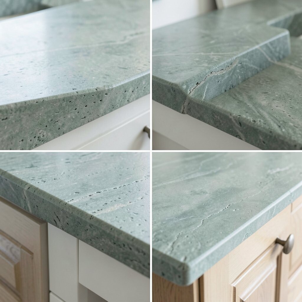
Sage Green Stone: From Harsh Contrast to Calm Coastal Before, the counter color fought with everything else and made the room look stressed. After, a sage green stone brings a gentle coastal calm that feels like a shaded dune.
The benefit is a relaxing palette that still looks fresh. Sage works well with natural wood and woven textures. If you want to personalize, choose a stone with subtle cream flecks, then add matching cream accents in your curtains or bar stools.
-
7. Saltwashed Marble Tile Top: From Basic to Handcrafted Charm
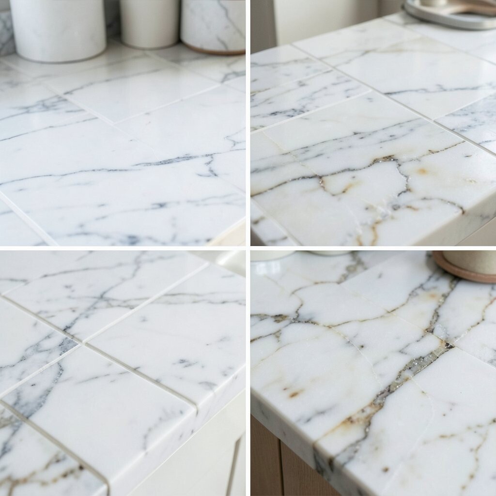
Saltwashed Marble Tile Top: From Basic to Handcrafted Charm Before, the surface was flat and forgettable, like it blended into the cabinets. After, a saltwashed marble-tile style top adds handcrafted charm and small coastal movement.
You can get a soft, layered look that feels like a boutique beach home. Tiles also let you mix small variations, which adds uniqueness. For tips, choose a grout color slightly darker than white, so it stays looking clean for longer.
If you want a personal touch, frame the sink area with a slightly different tile pattern, like a thin border. Cost can be lower than full slabs, but labor matters because tile work takes time. Plan for sealing needs too, especially if you choose a more porous tile style.
-
8. White Solid Surface with Briny Specks: From Outdated to Clean Beach Energy
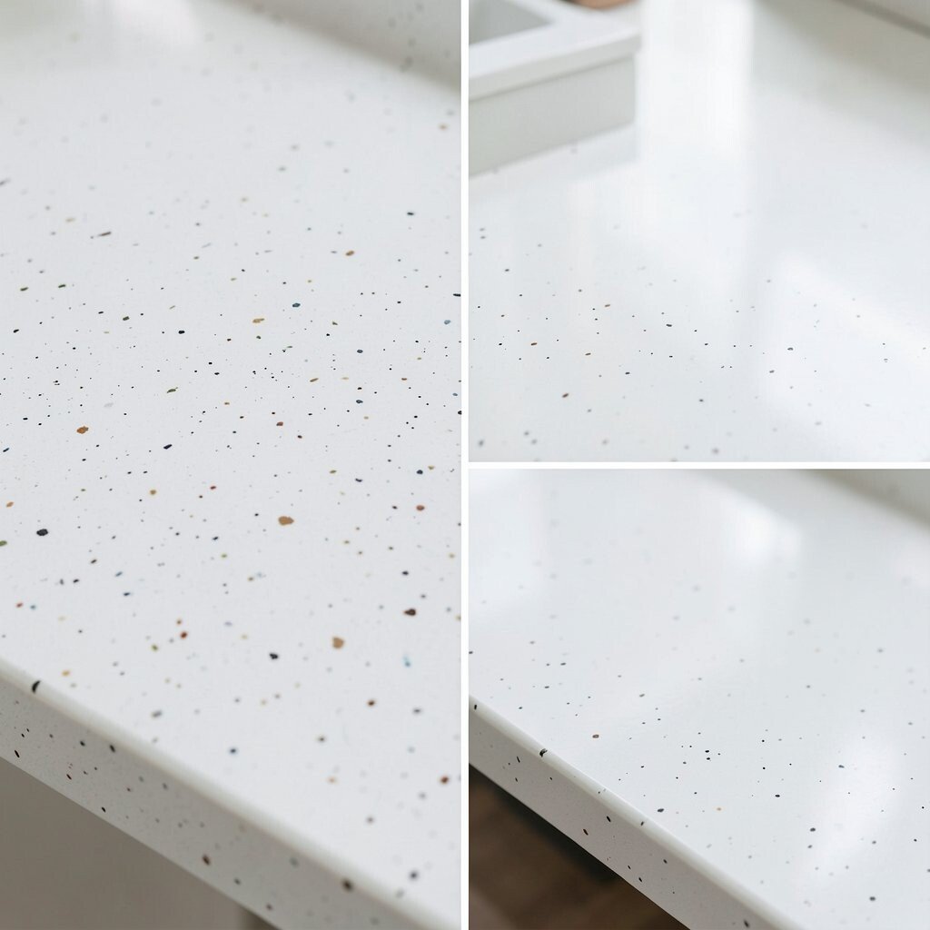
White Solid Surface with Briny Specks: From Outdated to Clean Beach Energy Before, your counter probably looked dated and a little too yellow under warm lights. After, a white solid-surface top with briny specks brings bright coastal energy without heavy veining.
The benefit is easy repair, since many solid surfaces can be fixed if you chip an edge. It also gives a smooth feel that is comfy for cooking and prepping. To personalize, keep the speckle pattern soft and choose a matching undermount sink for a continuous look.
This choice can be budget friendly compared with natural stone. Still, ask about edge options and thickness because those details affect the final feel. Pair it with brushed nickel faucets or a matte sea-glass handle color for a modern coastal style.
-
9. Sandstone-Inspired Quartz: From Dark Corners to Bright Comfort
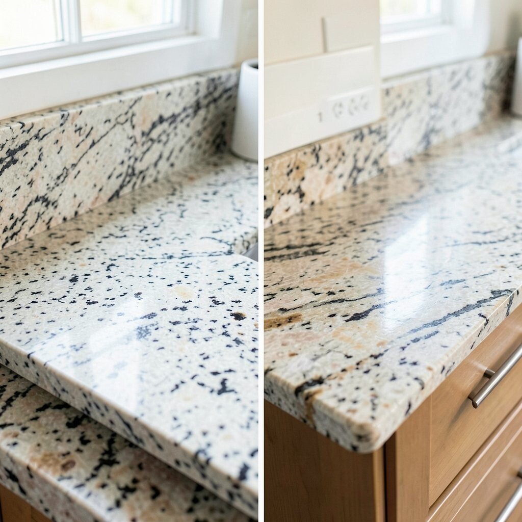
Sandstone-Inspired Quartz: From Dark Corners to Bright Comfort Before, the darker countertop made shadows gather near the edges. After, sandstone-inspired quartz softens those shadows and creates bright comfort.
You get warmth without orange overload, which helps coastal designs look grown-up. Sandstone patterns also hide tiny wear marks better than very high-gloss surfaces. For personalization, choose a quartz that has gentle gradients, so the island feels like a “sunset” moment.
Cost is often mid-range, especially because quartz can be easier to maintain than some stones. If you want to save, consider limiting the premium slab color to the island and using a simpler version for the main run. That strategy keeps your budget steady while still giving you a standout design.
-
10. Linen White with Subtle Blue Veining: From Flat to Light-Filled
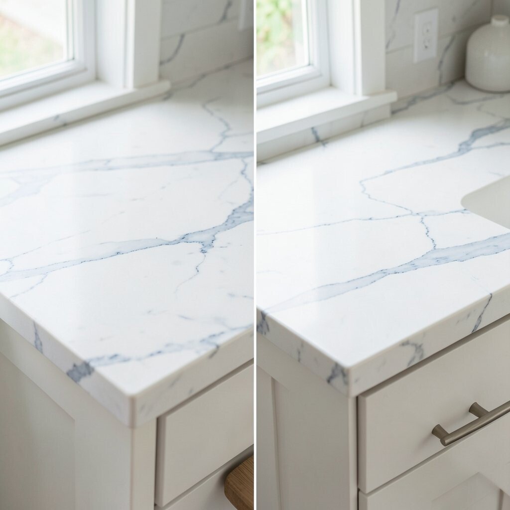
Linen White with Subtle Blue Veining: From Flat to Light-Filled Before, the countertop looked flat and did not reflect light well. After, linen white with subtle blue veining makes the whole space feel light-filled and breezy.
This design helps you get the coastal look without going too bold. It also pairs beautifully with pale wood floors and creamy cabinet paint. For personalization, ask for veining that lines up across the island, so it looks intentional.
When budgeting, ask for options in the same collection with slightly different pricing tiers. Often, you can get the same vibe with a more affordable pattern. Add a simple, textured backsplash—like a small tile with a satin finish—to bring in today’s coastal trend of “soft texture.”
-
11. Ocean Swirl Epoxy Resin Top: From Drab to Artistic
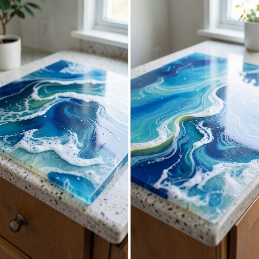
Ocean Swirl Epoxy Resin Top: From Drab to Artistic Before, the counter looked like it was made for no one’s personality. After, an ocean swirl epoxy design turns your kitchen into an art gallery with a sea-inspired rhythm.
The benefit is uniqueness that you cannot copy from a catalog. Resin can create waves, layered colors, and even a glassy look that feels like water. If you want tips, choose colors like seafoam and muted navy instead of bright neon, so it still looks elegant months later.
-
12. Weathered Gray Limestone Look: From Heavy to Airy Rustic
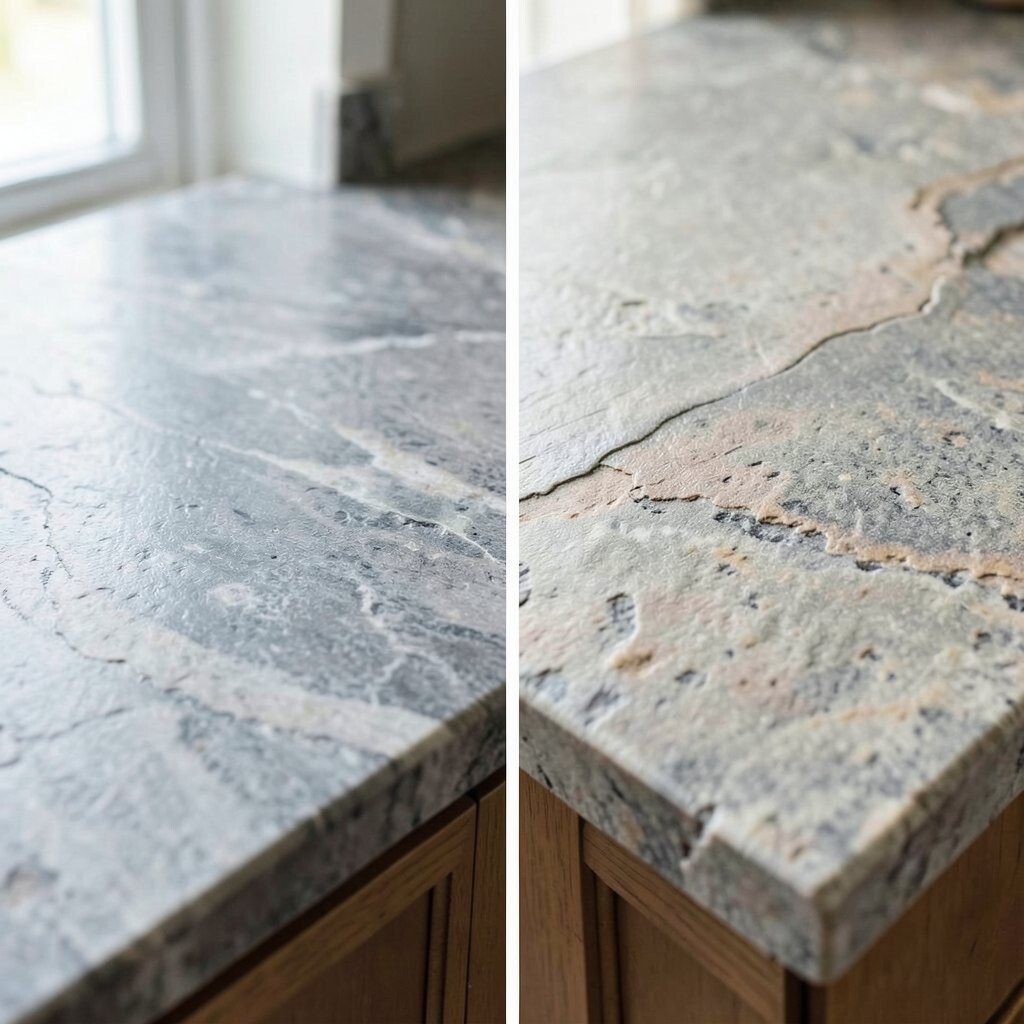
Weathered Gray Limestone Look: From Heavy to Airy Rustic Before, the countertop read heavy and formal, which made the room feel less welcoming. After, weathered gray limestone look creates an airy, coastal-rustic feel.
Limestone-style finishes add texture that looks natural and relaxed. It also works great in homes that mix modern and beach elements. For personalization, pair it with open shelving and natural fibers, like woven baskets, so the whole space feels cohesive.
Cost can vary because limestone styles may be slab-based or engineered. If you want to manage costs, consider an engineered version that gives the look while reducing maintenance demands. Also, talk to your installer about sealing, especially if the finish is more porous than quartz.
-
13. Sea Glass Green Glass-Blend Surface: From Old Beige to Fresh Color
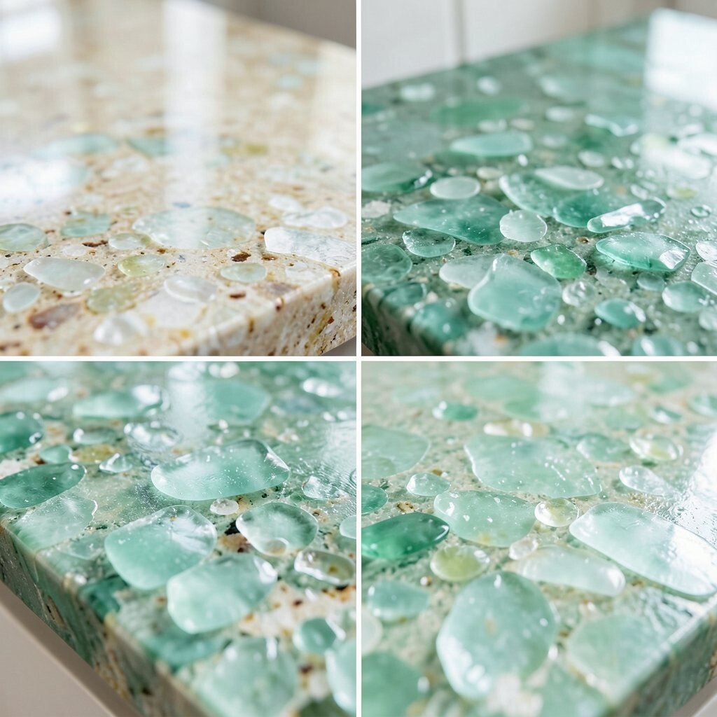
Sea Glass Green Glass-Blend Surface: From Old Beige to Fresh Color Before, a beige counter made everything look tired and muted. After, a sea glass green glass-blend surface adds a fresh pop while still feeling coastal and soothing.
The visual effect is like tiny sparkles in daylight, which makes kitchen moments feel special. Glass-blend surfaces can also be designed for a smoother, more comfortable feel than rougher textures. For uniqueness, ask for a blend that keeps most sparkle near the edges of the island for a soft “halo.”
Cost considerations are important because glass-blend options can run higher. If you want savings, use the specialty surface only on the island and keep the rest of the counter simpler. Add a matching backsplash tile with a similar green undertone to stay on-trend and polished.
-
14. White Terrazzo with Coastal Flecks: From One Note to Playful Depth
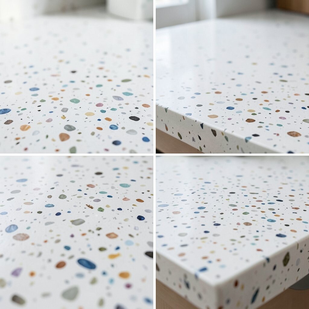
White Terrazzo with Coastal Flecks: From One Note to Playful Depth Before, the countertop was one solid shade that did not add any depth. After, white terrazzo with coastal flecks brings playful movement and a beach-inspired sparkle.
This trend is popular because it blends lots of small bits into a unified look. The benefit is that terrazzo can hide small scratches and daily wear better than some smooth stones. For personalization, pick flecks that match your decor, like creamy shells and soft gray waves.
-
15. Bright White with Soft Gray “Wave” Pattern: From Dated to Crisp
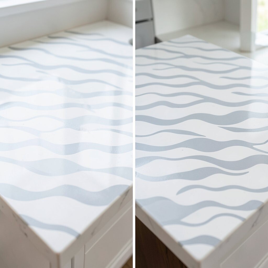
Bright White with Soft Gray “Wave” Pattern: From Dated to Crisp Before, the countertop had an older, darker pattern that competed with your decor. After, bright white with a soft gray wave pattern creates a crisp, airy coastal look.
This design helps your cabinets feel cleaner and your kitchen feel bigger. It also looks great in modern coastal spaces where you want less clutter. For tips, use simple accessories like a clear soap dispenser and one neutral tray, so the countertop remains the star.
Budget-wise, wave-pattern engineered stone can be more affordable than some premium natural stones. Still, request samples in the same lighting as your kitchen, since coastal kitchens often have strong natural light. Current trend: many homeowners are choosing “graphic softness,” which means clean lines plus gentle patterns like this one.
-
16. Coastal Off-White with Buttery Veins: From Stark to Rich and Cozy
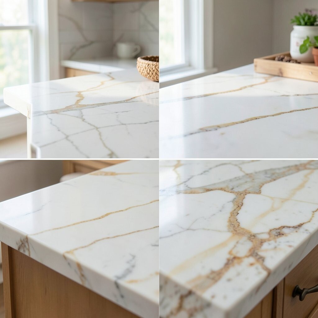
Coastal Off-White with Buttery Veins: From Stark to Rich and Cozy Before, the counter was too stark, so it made the room feel cold. After, an off-white design with buttery veins adds richness that still feels coastal and relaxed.
The benefit is comfort. Warm undertones help your kitchen feel like a calm shoreline house rather than a showroom. Personalize by choosing veining direction that follows the length of your island, giving the room a smooth flow.
-
17. Waterline Stripes Look: From Flat Fronts to “Seaside Story”
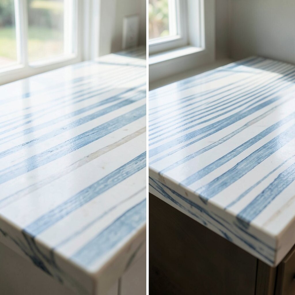
Waterline Stripes Look: From Flat Fronts to “Seaside Story” Before, the countertop had no story, so it felt like any other kitchen. After, a waterline stripes look creates a visual “shore” effect that feels fresh and fun.
This kind of design makes everyday tasks feel more enjoyable because your eye has something soothing to rest on. It also lets you show personality without adding bulky decor. For personalization, you can match the stripe rhythm to the cabinet layout, so it feels planned and not accidental.
Cost can be a little higher if the design needs special cutting and alignment. To keep spending under control, choose a more subtle stripe effect rather than dramatic contrast. Pair it with matte finishes on hardware and faucets to stay in style with today’s soft, coastal-modern look.
-
18. Drifted Sand Tone Concrete-Style: From Scratched to Seamless Comfort
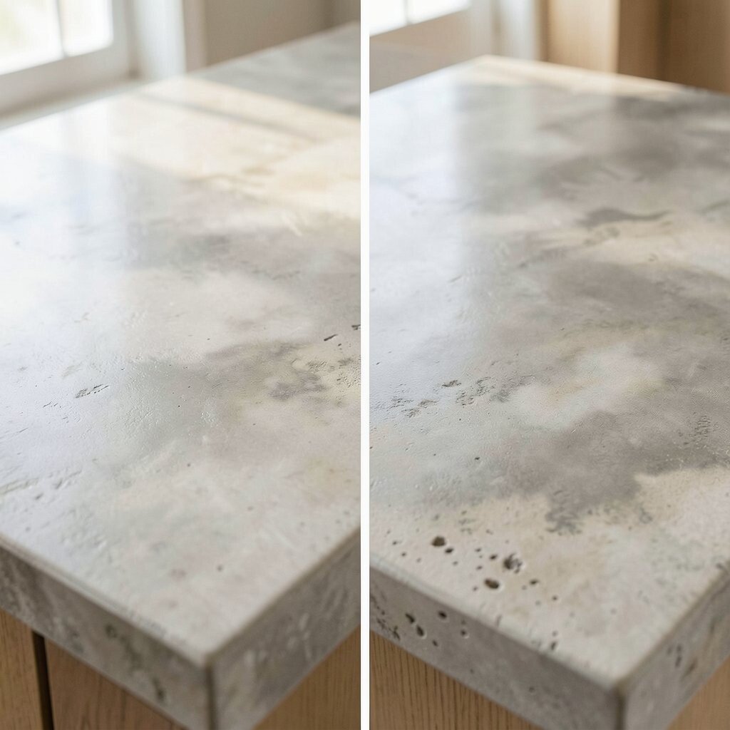
Drifted Sand Tone Concrete-Style: From Scratched to Seamless Comfort Before, your old countertop may have shown scratches and water marks more easily. After, a drifted sand tone concrete-style top gives a seamless, worn-in coastal vibe.
The benefit is that concrete-style finishes often hide imperfections well. They also pair nicely with wood, rattan, and open shelving, which are common coastal trends. For tips, choose a finish level that does not glare, especially if you have big windows that reflect light.
Cost considerations depend on whether it is engineered, cast, or resin-based. If you want to manage budget, ask about simpler edge profiles while keeping the main surface premium. Personalize by adding a lightly colored backsplash that echoes sand and seafoam, so the whole kitchen feels like one calm scene.
-
19. Coastal Mixed-Metal Edge + Light Stone: From Plain Edges to Boutique Details
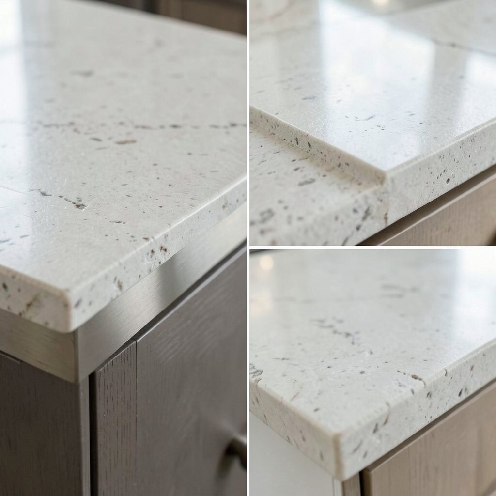
Coastal Mixed-Metal Edge + Light Stone: From Plain Edges to Boutique Details Before, the countertop looked good in the center but the edges felt plain and unfinished. After, a light coastal stone paired with a mixed-metal edge detail adds a boutique touch that feels custom.
The benefit is simple: details like an upgraded edge can make the whole kitchen look more expensive. This works great when you want coastal style but prefer a softer, elegant look rather than loud color. For personalization, choose an edge metal that matches your faucet finish, such as brushed nickel or warm bronze, so everything looks coordinated.
Budget-wise, edge upgrades are often easier to plan than changing the entire slab. Ask your installer for a few edge samples so you can feel the texture in person. Current trend: homeowners are leaning into “small luxury” details, like metal accents and textured backsplashes, to get that coastal home feel without major surprises.