
Your kitchen can look fun and fearless without feeling messy. The right graphic DIY plus statement lighting makes everything feel special fast.
These ideas mix bold patterns, smart lighting, and practical upgrades you can actually do.
-
1. Geometric Tile Look Backsplash With a Pendant Glow
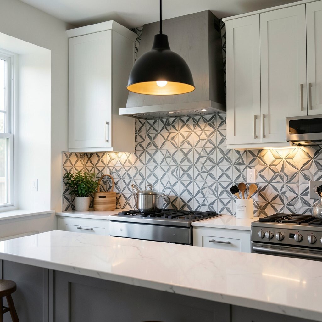
Geometric Tile Look Backsplash With a Pendant Glow Pick a bold geometric pattern that feels clean, like small squares or clean triangles. You can create the look with peel-and-stick tile sheets or paint stencils that match your cabinet colors.
When you turn on a warm pendant light above the counter, the lines look sharper and more “designed.” This DIY makes the backsplash feel like a focal point instead of a blank wall. Try spacing your pattern carefully and using a high-quality top coat if you go the paint route.
-
2. Black-and-White Peel-and-Place “Art Panel” Over the Sink
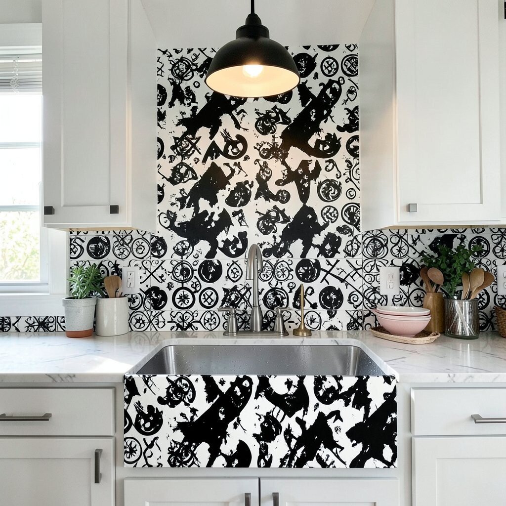
Black-and-White Peel-and-Place “Art Panel” Over the Sink Cover a section above the sink with a graphic panel pattern, like bold stripes or big dots. Use peel-and-place vinyl that is made for walls so it stays neat near splashes.
The benefit is instant style with low effort. Pair it with a single statement light, like a globe pendant in matte black, so the panel looks framed. For personalization, swap the dot pattern for your favorite sports team color or your favorite season palette.
Keep cost in mind by buying one panel at a time and cutting around outlets. If you want extra durability, seal the edges with a clear caulk line so water can’t sneak underneath.
-
3. Color-Blocked Counter Wall With a Slim, Bright Track Light
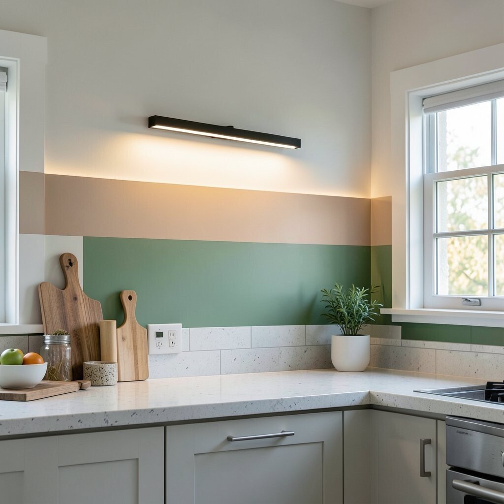
Color-Blocked Counter Wall With a Slim, Bright Track Light Try a color-blocked wall behind open shelving so it looks bold from every angle. Use painter’s tape to make straight stripes, then paint in two or three strong colors that match your dishes.
Track lighting is a great choice because you can aim the beams at art prints, bowls, or jars. That spotlight effect helps the colors pop and makes everyday items look curated. Plan your layout first by mocking it up with paper strips on the wall.
If your budget is tight, go with a smaller painted section and keep the rest simple. You can also use an inexpensive LED track kit and swap the bulb color to a warmer tone for a cozy feel.
To personalize, paint a tiny accent stripe in your favorite color at the top edge so it feels like a signature detail.
-
4. Mural-Style Pantry Door Decals With a Single Statement Sconce
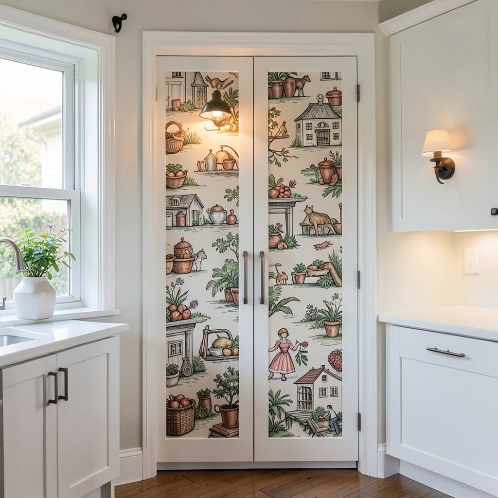
Mural-Style Pantry Door Decals With a Single Statement Sconce Choose a mural decal that looks like hand-drawn plants, kitchen herbs, or a retro market sign. Put it on a pantry door or tall cabinet so it feels like a real artwork.
For benefits, it hides fingerprints and minor scuffs while giving the room character. Add a statement sconce nearby so the decal looks even more lively in the evening. When applying, smooth slowly from the center to prevent bubbles and wrinkles.
-
5. Flour-Sack Stripe Shelf Liners Under a Warm Pendant
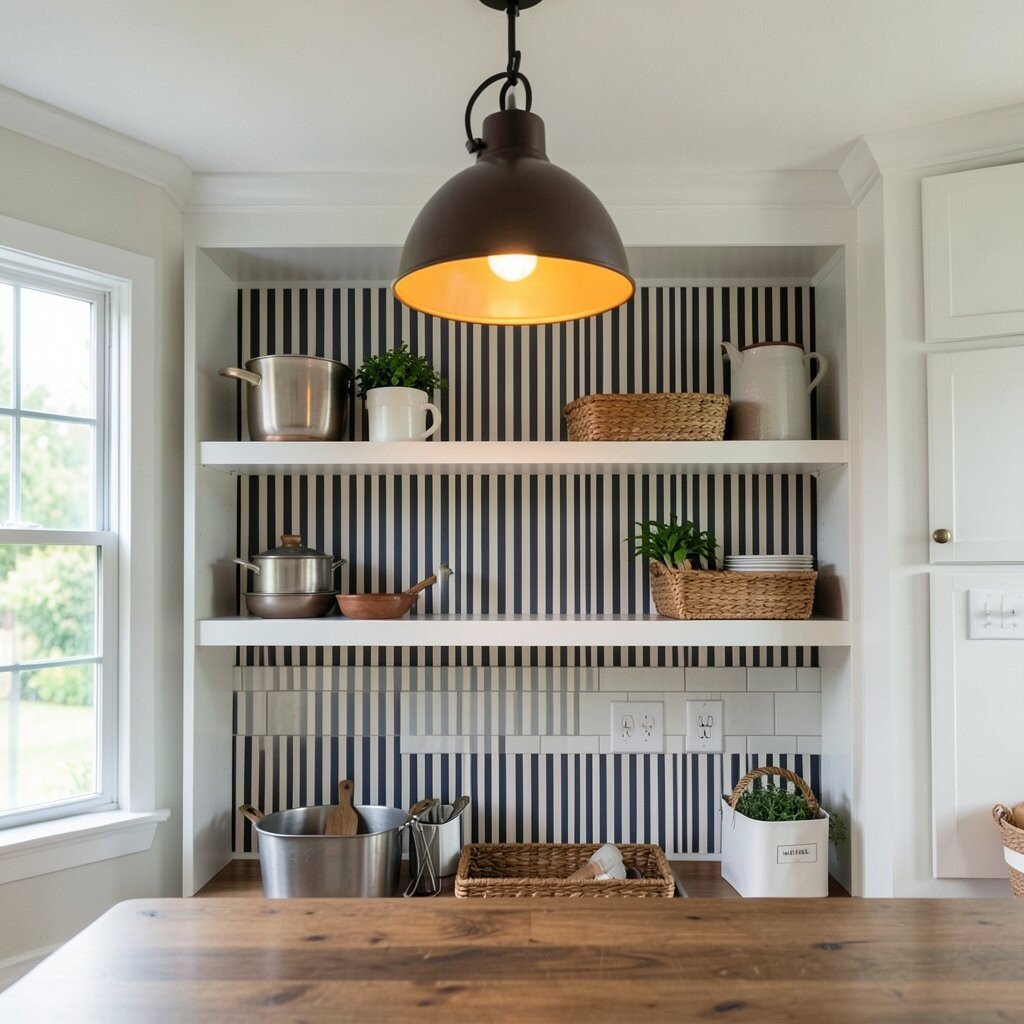
Flour-Sack Stripe Shelf Liners Under a Warm Pendant Line open shelves with shelf liners that have stripe patterns, like thin ticking stripes or classic nautical bands. It makes your jars and cookbooks look organized and stylish.
The uniqueness comes from how the stripes “move” as you fill the shelves. Use a pendant with a warm bulb so the shelf liner looks soft, not harsh. For tips, measure shelf width carefully and trim clean edges with a sharp craft knife.
Cost-wise, liners are usually cheaper than repainting and they refresh quickly. Personalize by choosing one stripe color that matches a favorite item, like a red mug or a blue dish set.
-
6. Bold Wallpaper Peel Patch for a Small Breakfast Nook Wall
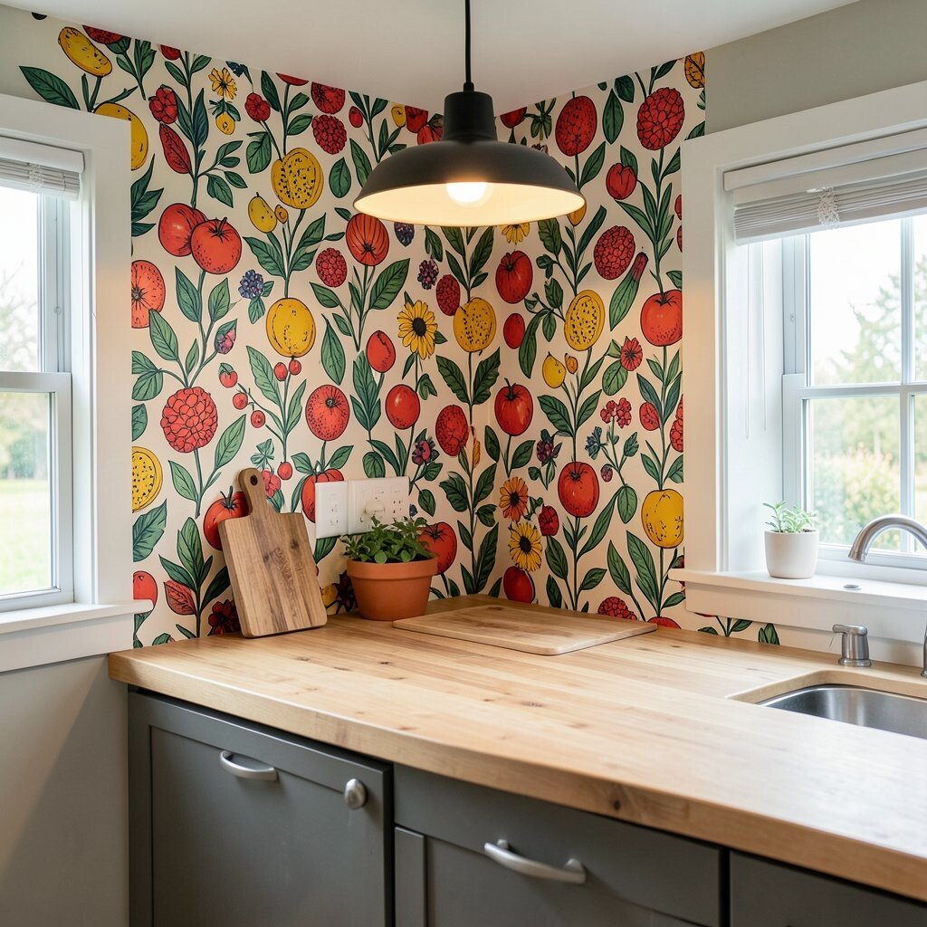
Bold Wallpaper Peel Patch for a Small Breakfast Nook Wall Pick a bold wallpaper pattern for just one wall section, like oversized leaves or strong arches. Use a peel-and-stick wallpaper so you can remove it if you change your mind later.
When paired with a statement ceiling light or a mini pendant, the pattern becomes a cozy stage for your breakfast routine. This upgrade boosts the “wow” factor without needing a full remodel. Make sure the wall is smooth, clean, and dry before you apply the first strip.
-
7. DIY Stenciled Spice Labels With a Bright Light Above the Jars
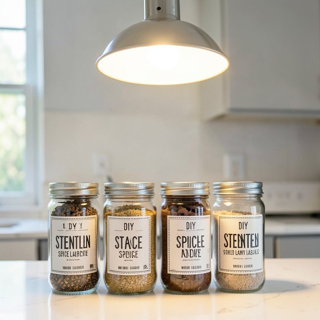
DIY Stenciled Spice Labels With a Bright Light Above the Jars Create a simple spice label system using stencils and paint markers. Make your labels match the jar style, using crisp fonts or fun retro icons.
With the right lighting, like a small under-cabinet LED or a direct bright pendant, the labels become easy to read and look like a designed shelf. This adds benefits for daily life since you can find spices fast. For personalization, use color-coded label stickers for sweet, savory, and baking.
Cost considerations are friendly because you need only stencils, labels, and a few jars. Keep it neat by using consistent spacing and sealing labels with clear tape for a clean shine.
-
8. Checkerboard Floor Decal Illusion With a Statement Lantern Pendant
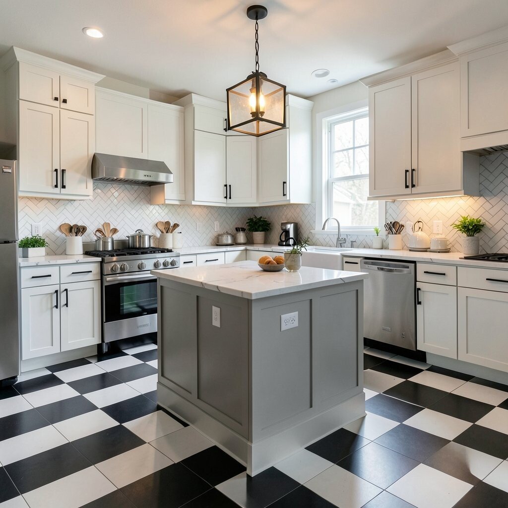
Checkerboard Floor Decal Illusion With a Statement Lantern Pendant If you can’t refinish floors, try a checkerboard floor decal in a small area, like under a rolling cart. Choose a high-contrast pattern, such as black-and-white, to keep it crisp.
Place a lantern-style pendant above the zone so the floor pattern feels intentional and bold. The benefit is visual depth, and it makes the space feel styled. Before you place decals, clean the floor well and let it fully dry so it sticks longer.
For uniqueness, mix sizes by doing smaller squares near the edge and larger squares closer to the center. That slight variation keeps it from feeling too flat.
To manage cost, buy only the amount you need and use the rest as a base for future mini projects like a small rug overlay.
-
9. Marble-Style Contact Paper Drawers With a Pendant That Reflects
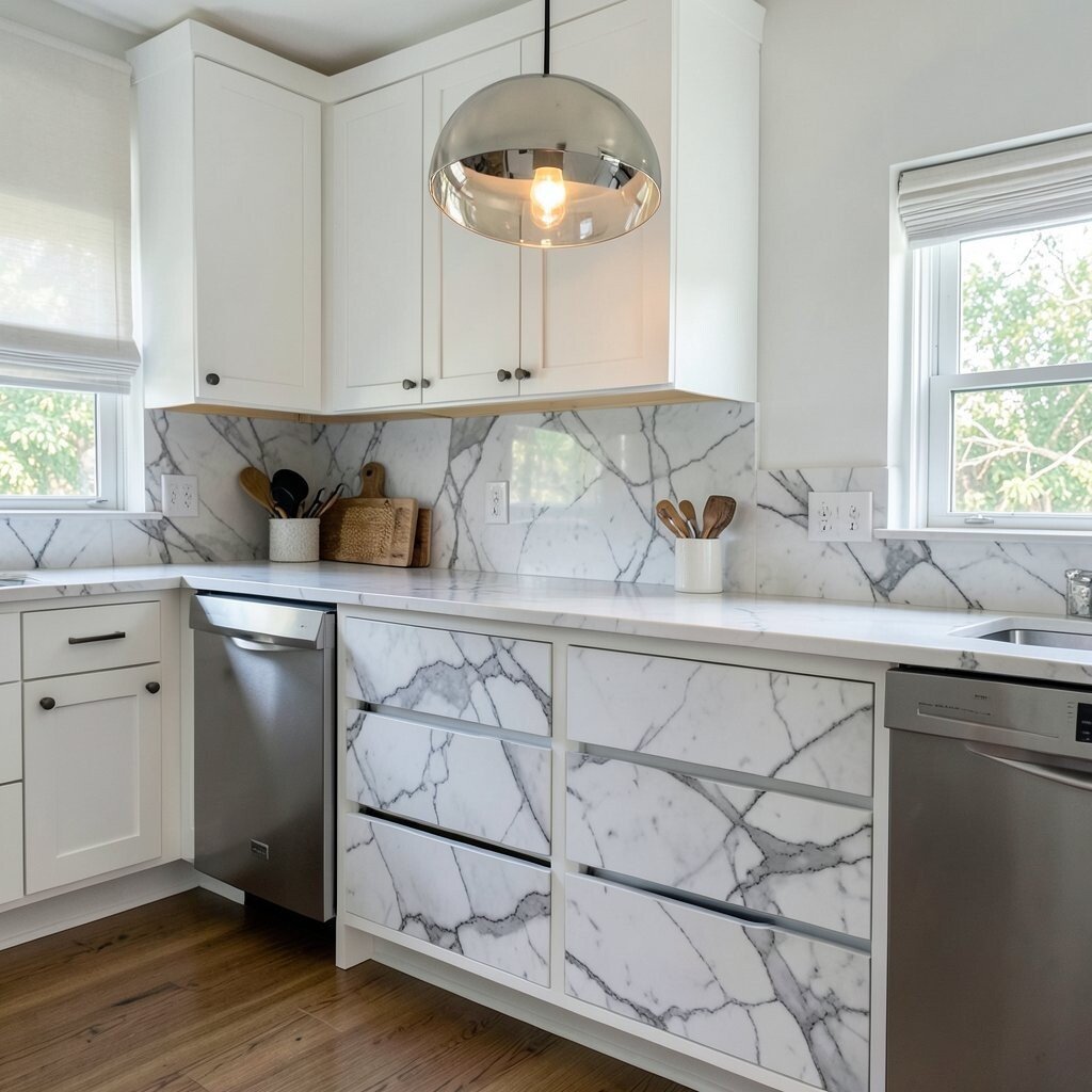
Marble-Style Contact Paper Drawers With a Pendant That Reflects Use marble-look contact paper inside drawers and cabinet fronts, focusing on the “hidden but pretty” spaces. You get a luxe look when you open doors and pull out utensils.
The benefits are huge for your daily routine because it makes searching easier and keeps things feeling fresh. Add a pendant or chandelier that throws a little light into the drawer area, so the marble texture shows up. For tips, press slowly and use a smoothing tool to prevent creases.
-
10. Retro Dot Runner Layout On a Wall-To-Wall Strip
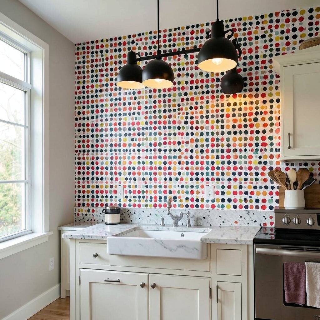
Retro Dot Runner Layout On a Wall-To-Wall Strip Create a retro dot strip on a wall near your coffee station. You can do this with dot stencils and paint, then seal it for easy wipe-down.
Dot patterns are fun, bold, and instantly recognizable, which makes the kitchen feel more like a styled set. Pair it with a warm pendant, like a brass or amber glass shade, for a vintage glow. For personalization, choose dot colors that match your mugs or toaster.
Cost is manageable because a small stencil set covers a lot of wall space. Make it extra neat by marking a level guide line and using a foam roller to reduce uneven paint texture.
-
11. Board-and-Batten Accent Wall With a Long Linear Pendant
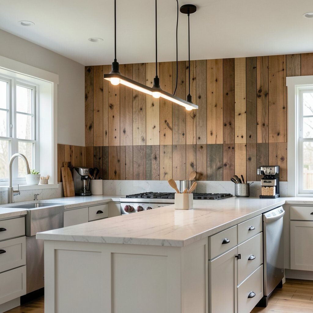
Board-and-Batten Accent Wall With a Long Linear Pendant Add a board-and-batten accent wall behind a dining nook or open shelves. You can build it with thin wood strips or even foam boards for a lighter DIY.
A linear pendant light works great here because it lines up with the wall rhythm and highlights the texture. That gives you a clean, modern feel without losing warmth. Keep the boards evenly spaced and use a level so the lines look straight.
-
12. DIY Signage Wall Using Painted Typography and Wall Hooks
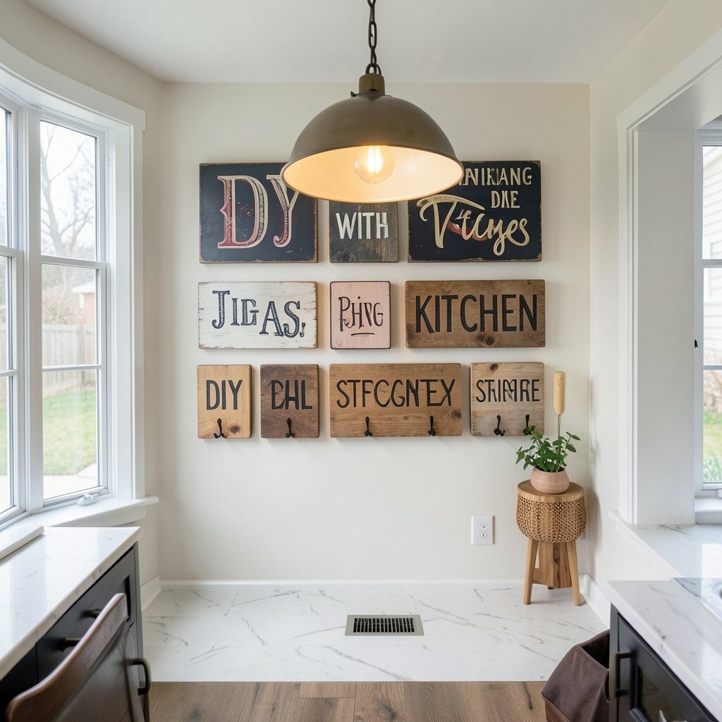
DIY Signage Wall Using Painted Typography and Wall Hooks Paint fun kitchen words on a small panel or directly on a wall section, like “COFFEE,” “SNACKS,” or “FAMILY.” Use stencils for smooth letters and add hooks underneath for hanging towels or utensils.
The benefit is that your kitchen feels organized and cheerful at the same time. Add statement lighting, like a black picture-style sconce, so the letters look crisp and readable. For personalization, add a small icon for each word, such as a lemon for “SNACKS” or a coffee bean for “COFFEE.”
Cost considerations are good because a small board, paint, and stencils are usually cheaper than buying framed art. For tips, let each letter dry before layering colors and use painter’s tape for sharp edges.
-
13. Bold Contact-Paper “Art Frames” Around a Photo or Print
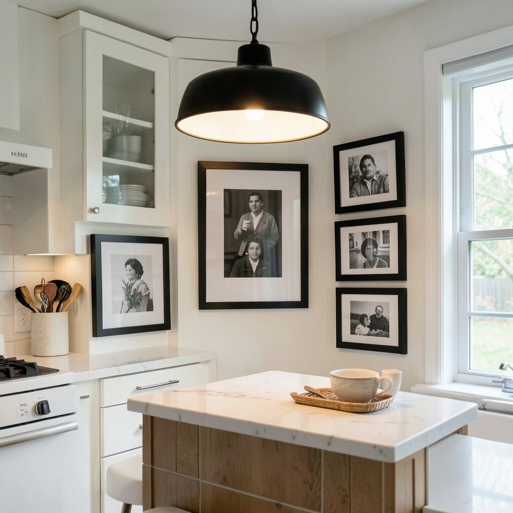
Bold Contact-Paper “Art Frames” Around a Photo or Print Create mini frame shapes using contact paper on the wall, then place a print inside each one. Choose a graphic style, like thick stripes or a bold color border, so it looks like a modern gallery wall.
Statement lighting helps a lot because it adds shadow and depth around the frames. Use a pendant or small track lights to point toward the print so the wall becomes a focal point. This DIY is unique because you can swap prints seasonally without repainting.
For tips, measure your frames so they line up with your cabinetry and keep consistent border thickness. If you want a polished look, use a level and smooth contact paper slowly with a credit card.
Budget-friendly note: you can print artwork at home or order inexpensive prints online and update them anytime. Personalize by using family recipes, handwritten notes, or your favorite cooking quotes.
-
14. Painted Geometric Wall Chart Behind the Stove With a Spotlight
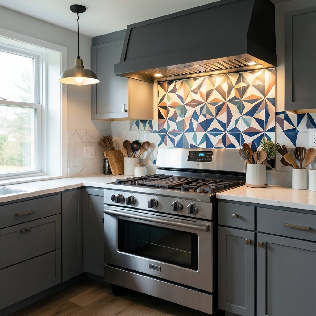
Painted Geometric Wall Chart Behind the Stove With a Spotlight Paint a geometric “kitchen chart” style background behind the stove area, like arrows, labels, or outline shapes. Keep the theme simple so the wall looks tidy, not busy.
The benefits include making the stove wall feel purposeful, and it also helps the room look designed. Add a spotlight or directional light above to highlight the wall pattern when the kitchen lights are off. Use heat-safe paint if you paint near the stove, and keep clearance for safe airflow.
-
15. DIY Stenciled Window Trim Accent With a Beaded Pendant
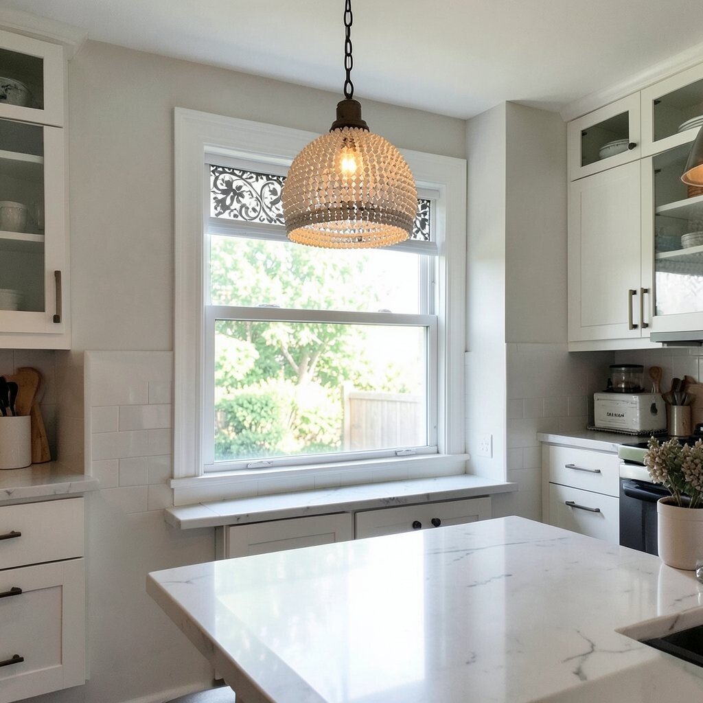
DIY Stenciled Window Trim Accent With a Beaded Pendant Add stencil patterns to window trim or the wall edge around your window. Choose a repeating design, like scallops or tiny stars, to make the frame feel decorated.
This kind of detail is unique because it catches the eye even when you’re not looking for it. Pair it with a beaded or textured pendant so the light sparkles and makes the trim look extra dimensional. For personalization, pick stencil colors that match your curtain fabric or kitchen textiles.
Cost is usually low since trim stencils cover small areas well. For tips, tape off the window edges carefully and clean brushes between color changes to avoid smudges.
-
16. Bold Countertop “Marble Swipe” Contact Paper With Underlight
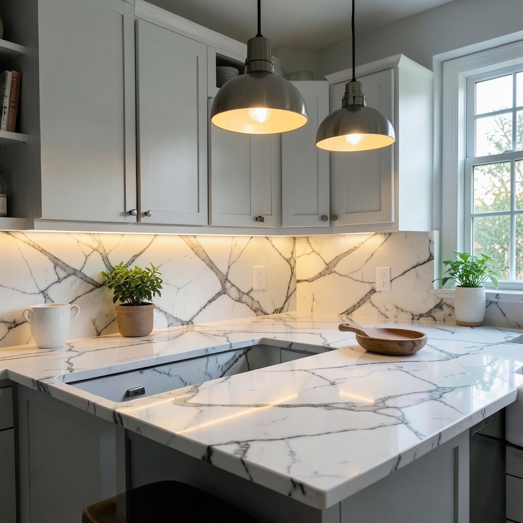
Bold Countertop “Marble Swipe” Contact Paper With Underlight Use marble-swipe style contact paper on a small counter section, like behind a coffee station or on a shelf-like ledge. The swirls make it look expensive, even if it is not.
The benefit is a quick refresh with minimal mess. Add underlight or a small statement task light so the swirls show their movement. Personalize by choosing marble colors that fit your palette, like warm white with soft gray or bold black with white.
-
17. Oversized Graphic Wall Clock Look With a Hanging Pendant
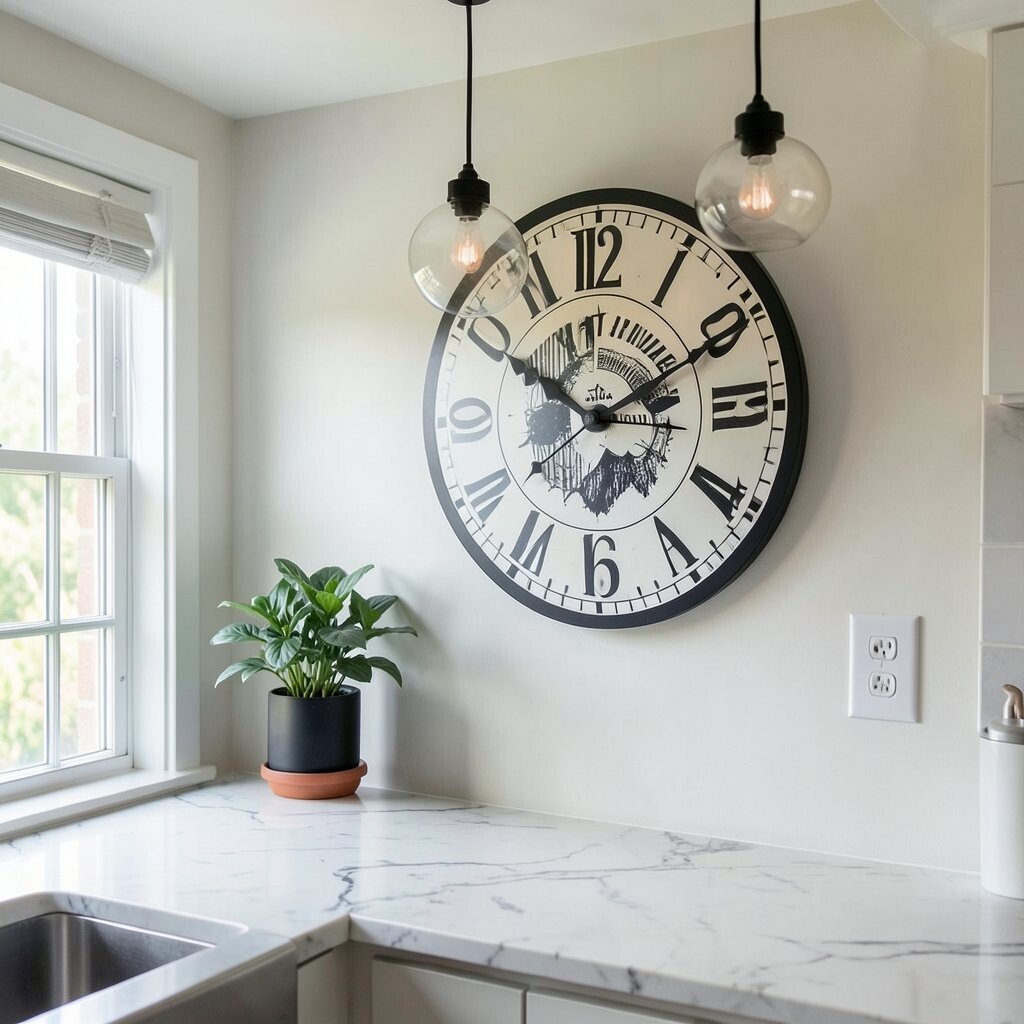
Oversized Graphic Wall Clock Look With a Hanging Pendant Create a faux oversized clock design using vinyl or paint on a wall, leaving the center for a real timepiece if you want. You can use ring shapes and tick marks to build the graphic look.
This makes your kitchen feel playful and intentional, especially when the clock rings line up with a pendant light. The statement lighting acts like a spotlight on the center, so the design becomes the “main character.” For tips, keep tick marks consistent and avoid placing it too high or too low for easy viewing.
Cost is reasonable because vinyl and paint are affordable compared to big art pieces. Personalize with a center color that matches your kitchen hardware, like brushed brass or matte black.
-
18. Remix Your Cabinet Hardware Layout With a Shadow-Catching Chandelier
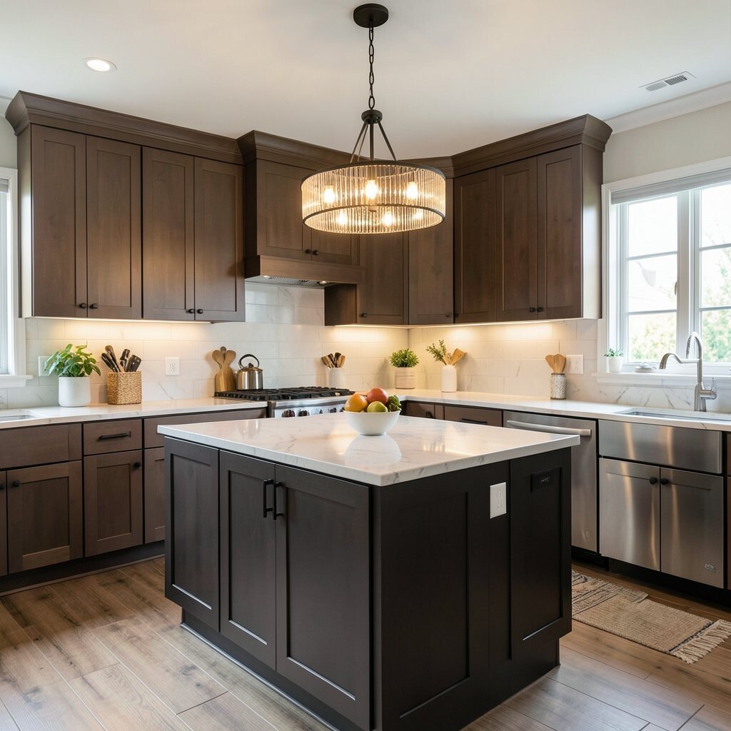
Remix Your Cabinet Hardware Layout With a Shadow-Catching Chandelier Update the visual rhythm of your cabinets by changing hardware placement or using a mix of pulls that match a graphic theme. You can also add graphic contact stripes to cabinet doors in a narrow layout.
When you add a chandelier or dramatic ceiling fixture, the hardware casts clean shadows that make the graphic feel even stronger. This is a real benefit because the kitchen looks more layered, not flat. For tips, measure carefully, mark holes lightly, and test your placement with tape before drilling.
Cost considerations depend on how much hardware you replace, so set a limit and start with the most used drawers. Personalize by matching the metal finish to your lighting, which helps everything look like it belongs together.