Big marks can feel scary, but they often make your work look more alive. When your hand commits, the page starts talking back.
Here are practical ways to add brighter energy, stronger focus, and a more personal style—without needing fancy tools or perfect plans.
1. Tap-Down Highlights With a Thick Brush
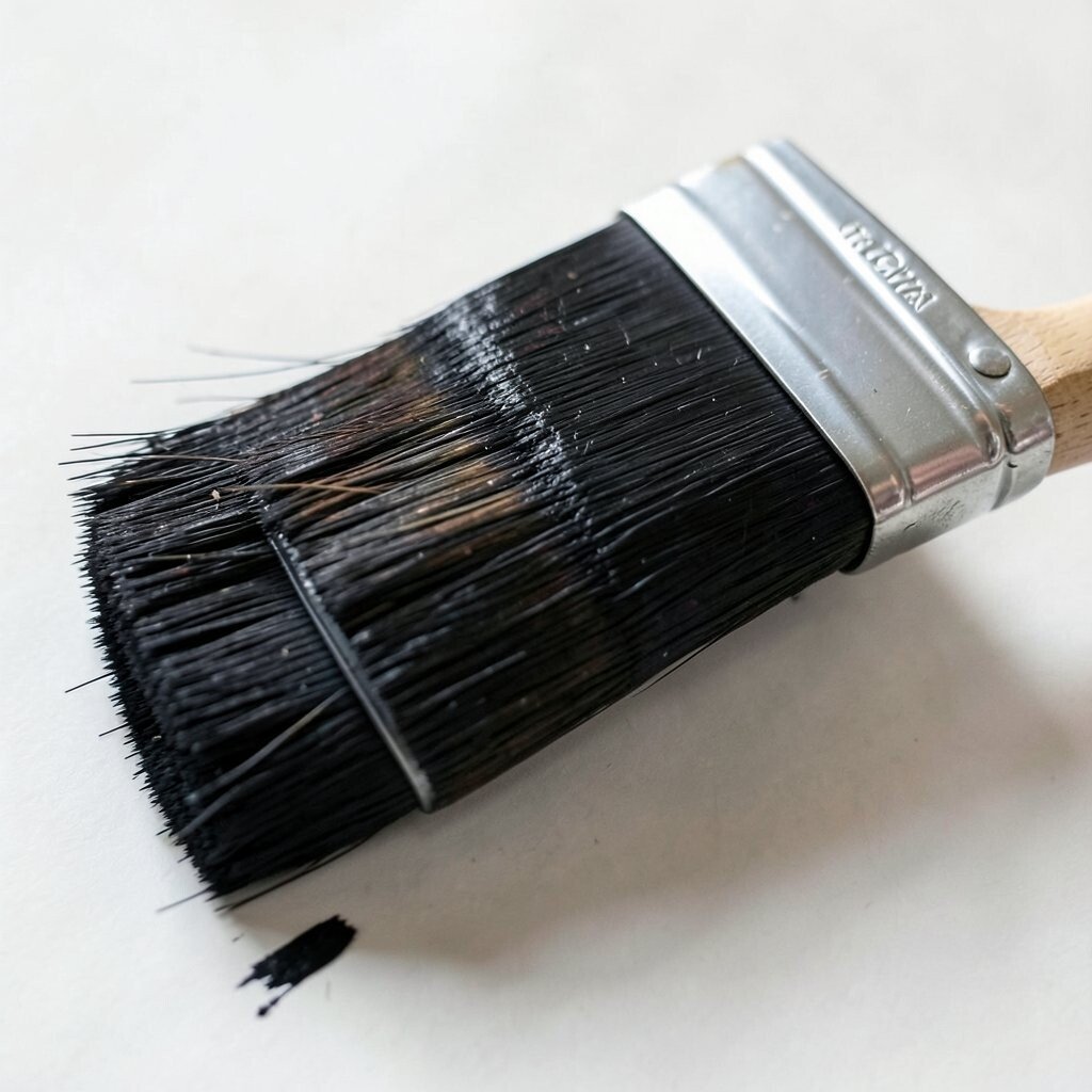
Use a stiff, medium or large brush and place bright paint with a gentle “tap-down” motion. You’ll see small, confident bumps of color that catch light and pull the eye.
This trick helps you create instant focus, especially near the face, fruit, or any main object.
Keep the highlight color a little lighter than you think you need. If your piece looks flat, add a few tap-down spots on the edges where light would naturally hit.
Try testing on scrap paper first, so you get a feel for how much paint will stay on the brush.
2. Sideways Swipe Shadows for Depth
Instead of carefully coloring every shadow, swipe sideways with a slightly darker shade. Let the stroke keep its shape, like a ribbon sliding across the page.
These bold shadows add depth fast and make the bright parts look even brighter.
To keep it from looking messy, limit the number of shadow zones. Pick one or two areas, then match the direction of your swipes to the form of the object.
A clean edge on one side plus a softer edge on the other often looks natural.
For cost, you can use acrylic, gouache, or even watered-down marker with thicker paper. Current trends favor expressive “gesture” marks, so visible strokes are welcome, not a mistake.
Personalize it by choosing shadow colors that match your mood, like teal for cool scenes or warm brown for cozy ones.
3. Staccato Dot Beats Along the Edges
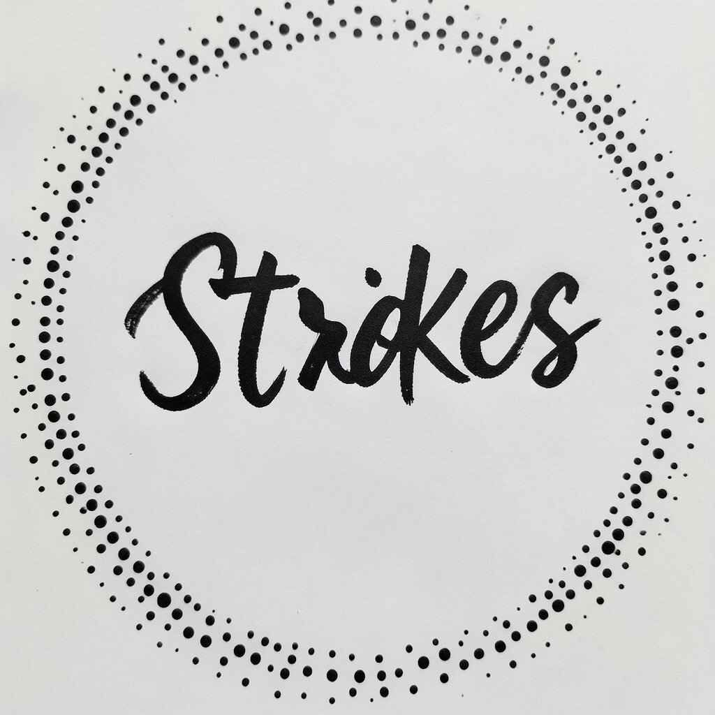
Load your brush with paint and press tiny dots along an edge. The line becomes a dotted rhythm, like music you can see.
This creates a playful border that gives your work a lively, crafted look.
Use brighter colors for the dots when you want more sparkle. If your art feels too serious, add dots in a contrasting hue, like a small burst of coral against green.
Keep your dots spaced so they guide the eye rather than block it.
For personalization, think about your story: add tiny dots like stars, seeds, or confetti. If you use watercolor, dry fully between layers to keep dots sharp.
For a budget option, even a toothpick or the end of a bamboo skewer can make dot details.
A tip: wipe the brush tip often so the dots stay crisp. You’ll notice your artwork starts to feel intentional in a very short time.
Try this near the focal point first, so the energy lands where it matters.
4. Big Curved “S” Strokes for Motion
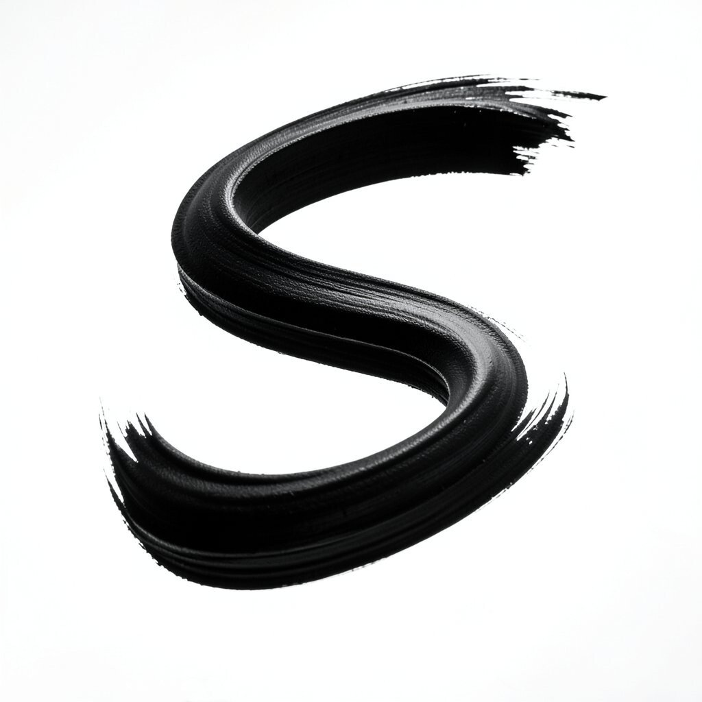
Draw a loose “S” curve across your subject using a thicker line. Let one end start bold and the other fade with lighter pressure.
This gives your piece movement, even if the subject is still.
Use the “S” stroke to suggest the flow of hair, fabric folds, tree branches, or ocean waves. When you follow the curve with smaller marks, the whole scene feels coordinated.
If you want a modern look, keep the curve visible instead of blending it away.
5. Color-Jump Glazes Over a Warm Base
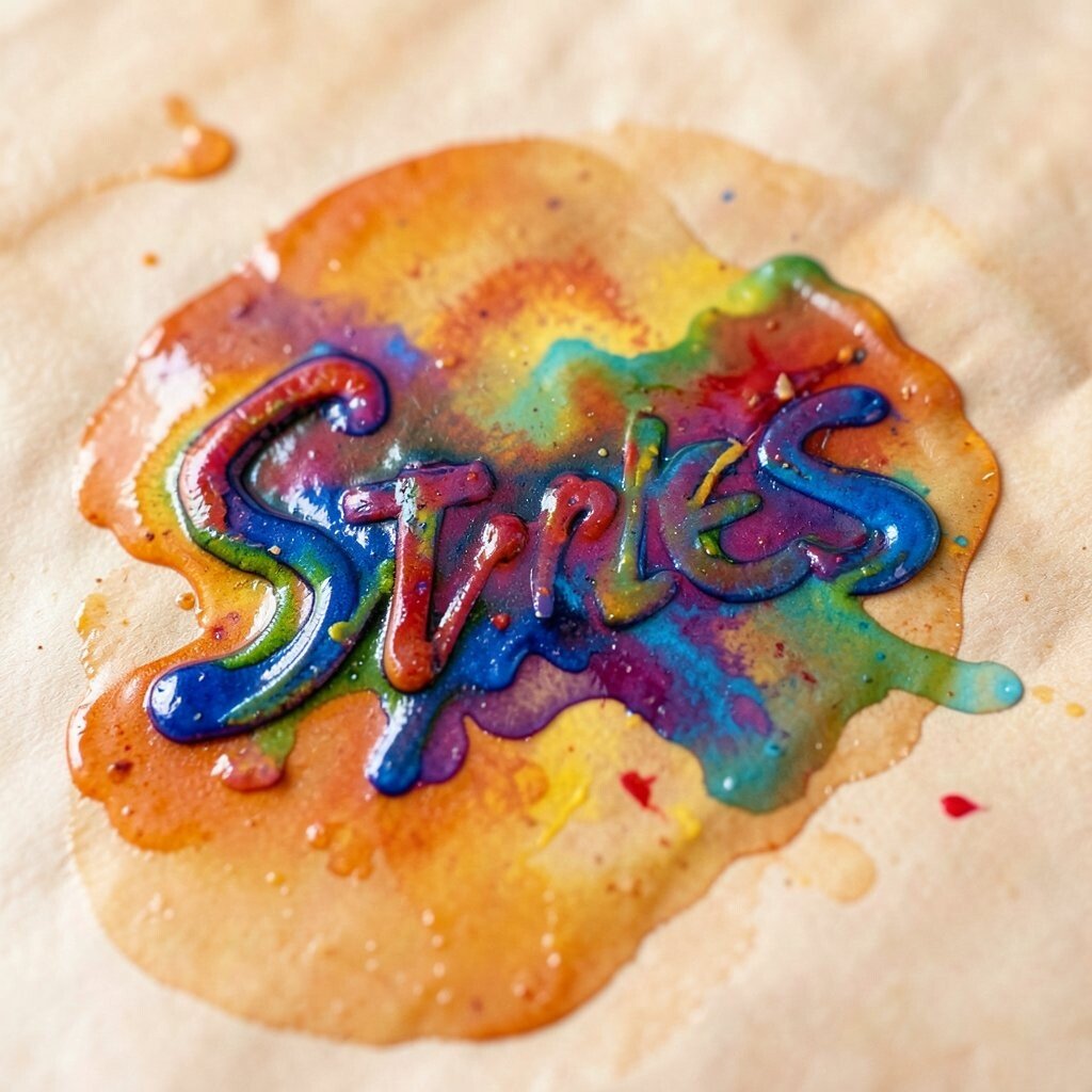
Start with a warm base, like soft peach or light ochre, then glaze bold transparent color on top. You’ll see the underlayer glow through the new color like stained glass.
This method makes bright colors look richer without needing thick paint.
Choose one glaze color and keep it consistent, such as bright teal, magenta, or bright sky blue. Apply it with broad strokes so you get gentle bands of color rather than tiny smudges.
The benefit is that the brightness looks smooth and clean.
Cost consideration: you can buy small tubes of glaze-ready paint, but you can also mix your own with acrylic medium or water-based varnish. Current trends love “layered color” effects, especially in mixed-media pieces.
Personalize it by glazing only the background or only the highlights, depending on where you want the glow to live.
6. Reverse-Wipe Texture With a Damp Cloth
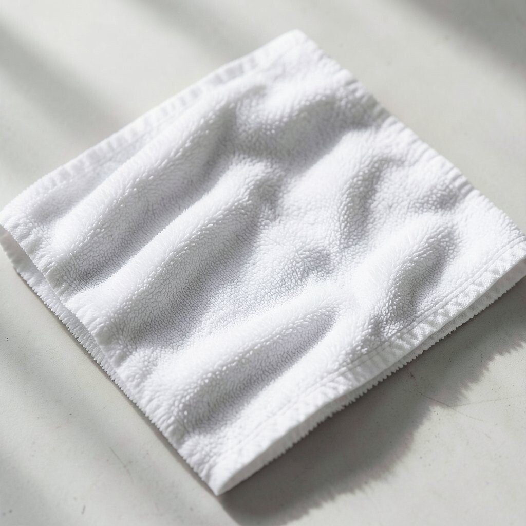
Paint a bold patch, then press a damp cloth lightly over it. You’ll see streaks and lifted areas that look like wind, sand, or scuffed stone.
This instantly adds texture and keeps your colors from looking flat.
Work quickly, because the paint should still be slightly workable for the wipe. Try it on a corner or behind the main subject first.
If you like surprises, keep wiping until you find the look that feels right.
For savings, a clean old T-shirt or paper towel works, and you don’t need special texture tools. A tip: wash your cloth often so colors don’t blend into muddy gray.
Personalize by wiping in one direction to match the scene, like horizontal for waves and vertical for rain.
7. Knife-Scrape Highlights for a Metallic Feel
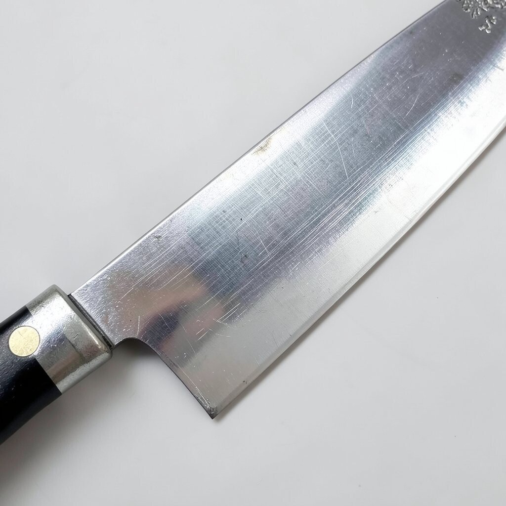
Use a palette knife or even a butter knife to scrape paint thinly across the surface. You’ll get bright ridges that look like light hitting metal.
This technique adds bold highlight shapes that feel dramatic and unique.
Try scraping after the paint dries slightly, so you can pull up clean lines. Keep the strokes short near the focal point, then longer elsewhere for rhythm.
This helps the eye travel smoothly through your composition.
Cost can stay low because you might already have a palette knife from crafts. Current trends often celebrate “hardware store” aesthetics, where bold texture shows up on purpose.
Personalize by using colored paint under the scrape, like a warm underlayer for sun highlights.
If the scrape feels too strong, do it over a darker underpainting. Then your highlights will feel bright instead of harsh.
Always protect your surface with scrap paper underneath if you’re afraid of mess.
8. Broken Line Outlines With a Felt-Tip Marker
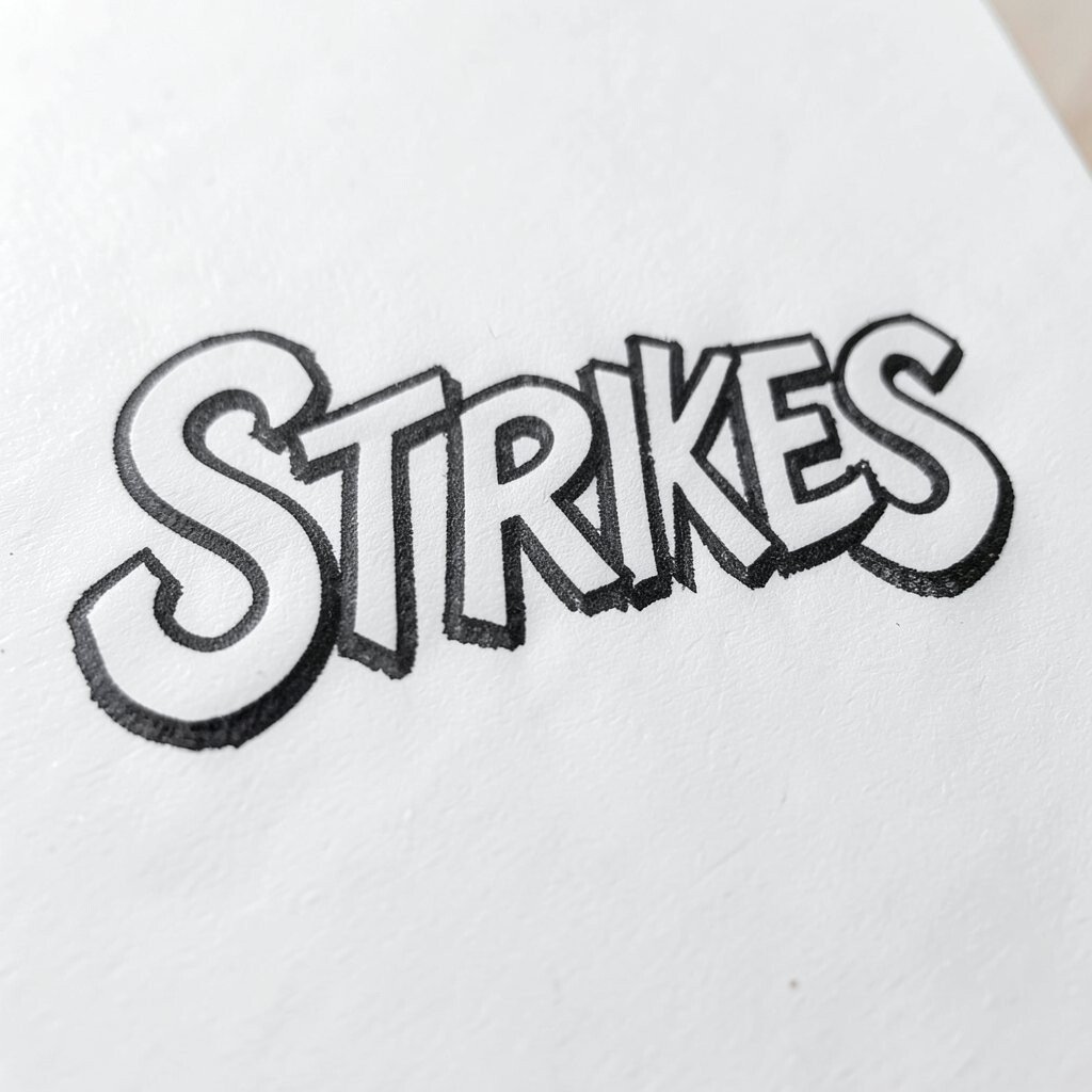
Instead of one smooth outline, use a felt-tip marker to draw broken lines around your main shape. The edges look energetic, like they’re vibrating with life.
This makes your artwork feel modern and bold right away.
Keep the broken outline slightly thicker at corners and thinner along curves. You can also outline only the front face and leave the back softer for a layered look.
The benefit is clarity, especially for people and objects with simple shapes.
9. Dry Brush “Windy” Grass and Fur
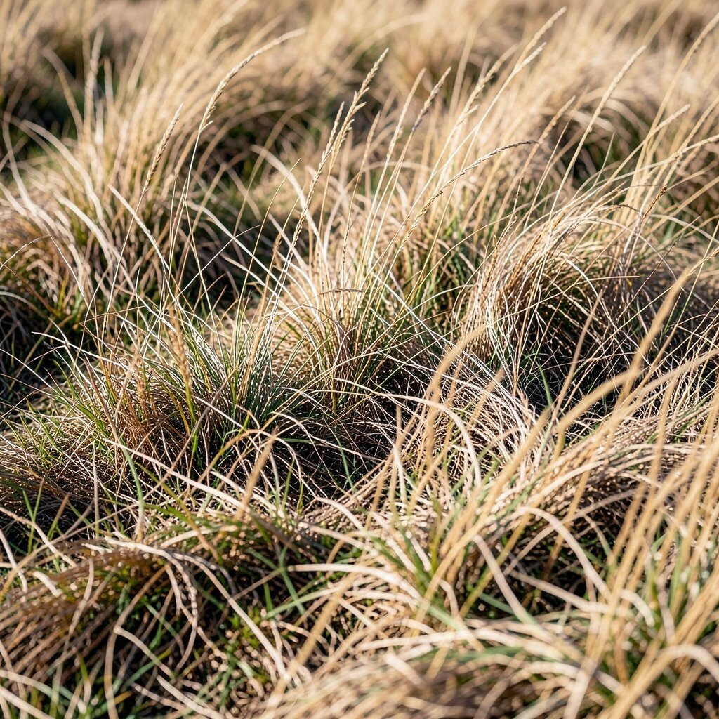
Load a small brush with paint, then remove most of it on a paper towel. Drag lightly so you get scratchy, dry brush marks.
These marks look like grass, fur, or tiny highlights that brighten the surface.
Use short strokes that follow the direction of growth. If you want more sparkle, add a second layer of a lighter color on top after it dries.
This creates depth while keeping the texture lively.
Cost is usually low because you can reuse inexpensive brushes and rely on paper towels instead of specialty tools. Current trends love “imperfect texture,” and dry brushing fits that perfectly.
Personalize by choosing unusual fur colors, like mint and warm brown, to make your subject feel magical.
10. Two-Color Strokes With a Split Brush
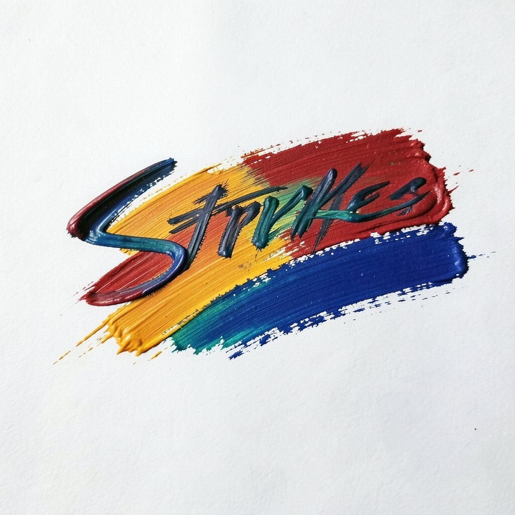
Dip one side of a brush into one color and the other side into a second color. When you paint, the stroke splits and mixes in the middle.
You’ll get a bright transition that looks smooth but still keeps personality.
Try combinations like blue and gold, green and lime, or purple and pink. Use these strokes where light would blend naturally, such as around cheeks, leaves, or the sky horizon.
The benefit is contrast without needing complicated shading.
For budget, a simple two-tone brush is optional, but you can also carefully load a regular brush and keep it tidy. A tip: clean the brush fully between sessions so the colors stay fresh.
Personalize by using your favorite palette, even if it’s not “realistic.”
11. Bold Color Blocks Underpainting
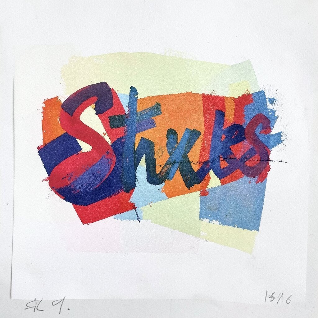
Cover key areas with simple, chunky blocks of color before you add details. You’ll see big shapes like a map, not yet a picture.
This gives your artwork strong structure, and it makes bright colors feel planned.
Choose a light block and a dark block for each major form. Then place the main object on top with thinner paint and smaller marks.
The result is easier composition and faster progress.
Cost consideration: you can get similar results with limited colors, like three primaries and one neutral. Current trends in graphic illustration and bold portraits often start with simple blocks, too.
Personalize by using “incorrect” colors for fun, like a cool red shadow or a sunny purple highlight.
12. Thumb-Press Smudges for Soft Glow
Press your fingertip or the side of your thumb into a small amount of paint, then gently smear it. You’ll get a soft glow edge that feels warm and human.
This technique brightens backgrounds and makes objects feel surrounded by light.
Use it sparingly so it doesn’t blur everything. Try smudging around the subject’s border, then leaving the center sharper.
That contrast makes the bright areas pop.
For cost, no extra tools are needed, and you can wash up with soap right away if you’re using washable paint. Current trends in cozy, imperfect art love this “friendly” look.
Personalize by smudging only one color, like lemon yellow, for a signature glow style.
13. Big Arrow Strokes to Guide the Viewer

Add short, bold arrow-like strokes near important areas, such as toward a face or a bright object. You can make them look like paint gestures rather than literal arrows.
This guides the viewer’s eyes and makes your bright color choices easier to notice.
Keep the arrows aligned with the direction you want the story to move. For example, use upward strokes for hope and downward strokes for calm or weight.
The benefit is better storytelling with simple marks.
14. Bright Rim Lines With a Fast, Loose Hand
Paint a thin bright rim along one side of a shape, like a glowing edge. Use fast, loose motion so the line feels alive instead of tight.
This rim makes the object stand out instantly, especially on darker backgrounds.
Choose a rim color that matches your light source, like pale yellow for warm sun or light blue for cool daylight. Add the rim to the parts facing the light, and skip the rest.
The result feels like a brighter atmosphere around your subject.
Cost is usually low since you can use a small brush, a fine liner, or even a pen for accents. Current trends in graphic realism and stylized portraits often use clean rim light strokes.
Personalize by trying more than one rim color, like a double edge with yellow plus pink for a playful glow.
15. Stencil Sprays for Quick Color Confetti
Use a stencil and spray or tap paint through it to add bright specks and shapes. You’ll see crisp little confetti marks that feel celebratory.
This instantly adds fun energy, especially in backgrounds.
For tips, hold the stencil steady and practice on scrap so your spray doesn’t flood the surface. Use fewer colors at first, then add one bright accent color after.
That step keeps your piece from looking cluttered.
Cost considerations: simple stencils can be cheap, and you can also cut your own shapes from cardboard. Current trends in street-art style and mixed-media art love sprayed textures.
Personalize by using symbols you love, like tiny leaves, hearts, or geometric tiles that match your theme.
16. Palette-Knife Scrape Patterns for Lively Backgrounds
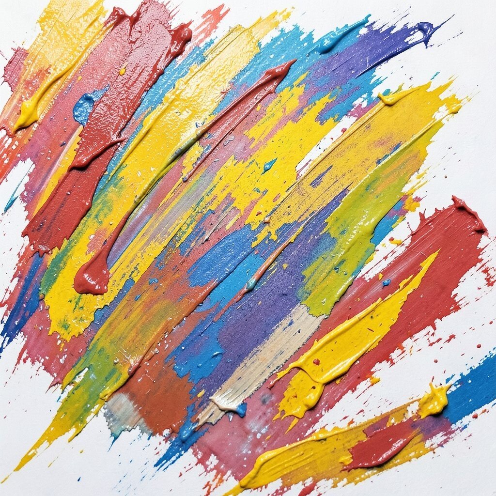
Spread a thin layer of paint, then scrape repeating patterns with a palette knife. You’ll see grooves and bright peaks that catch the light.
This method makes a background feel full without lots of detail drawings.
Try simple patterns like diagonal lines, crosshatch, or loose waves. Then overlay your subject with smoother paint so the contrast feels intentional.
The benefit is depth plus brightness, with a unique texture no brush can copy exactly.