
Sunlit color can make any room feel happier in seconds. These bright tropical shades bring warm energy, soft calm, and a fresh look to your everyday life.
-
1. Mango Tango
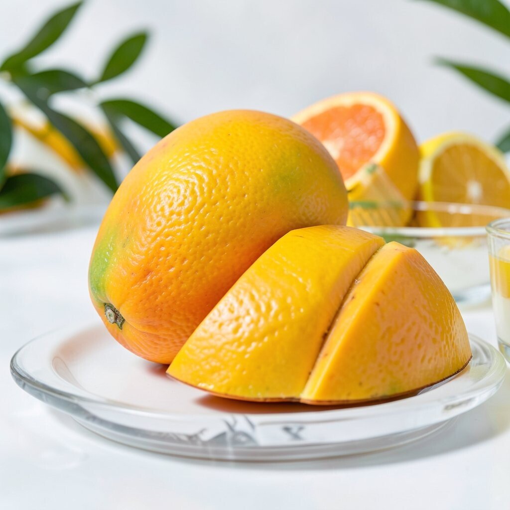
Mango Tango Mango Tango is a juicy, golden-orange that looks like sunshine caught in a paint can. It instantly warms up walls and can make a small room feel bigger.
Use it in a dining nook or a reading corner where you want cheerful energy. Pair it with crisp whites and light natural wood for a clean, modern vibe. For personalization, try a matte finish on walls and add glossy mango details on decor.
-
2. Papaya Pop
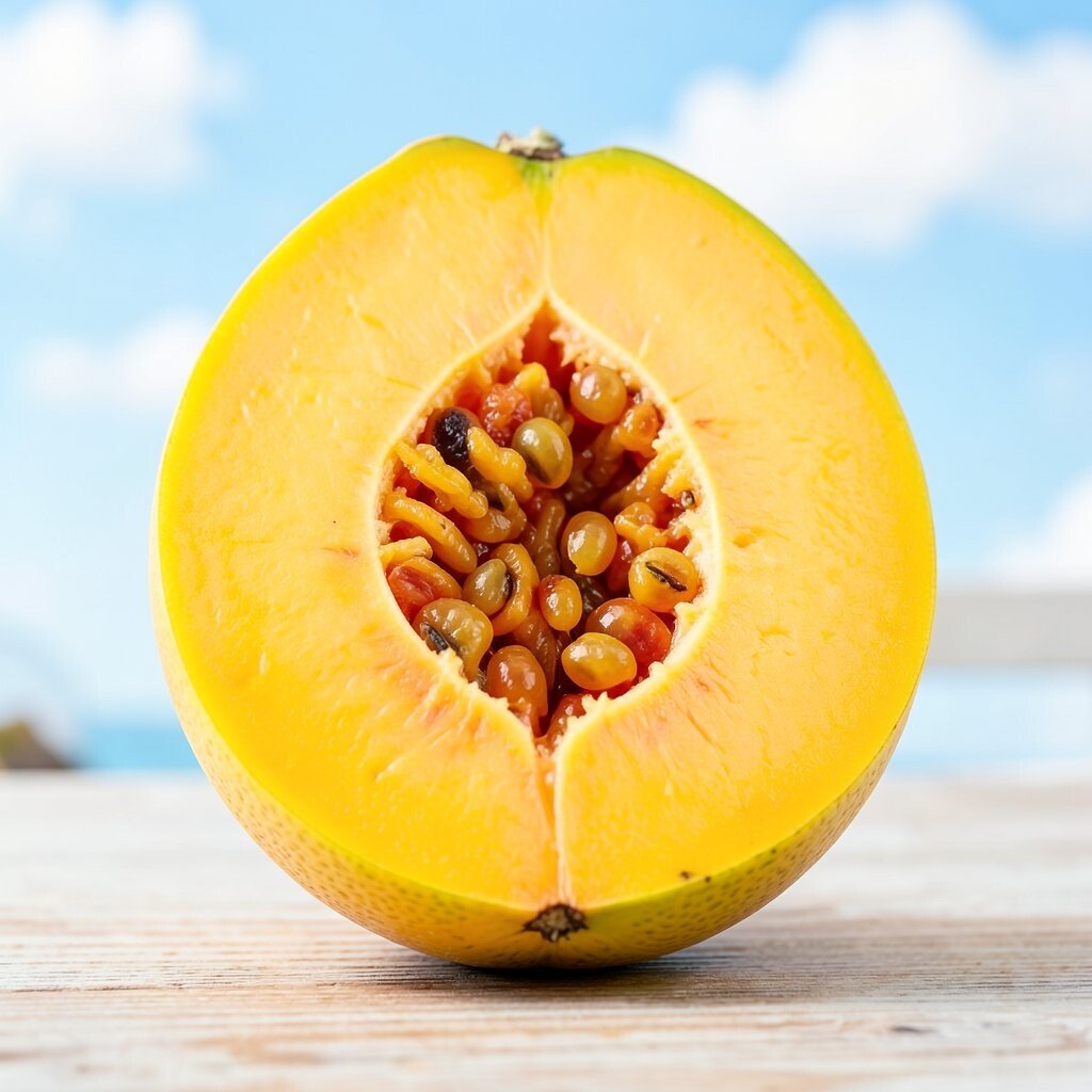
Papaya Pop Papaya Pop sits between coral and tangerine, giving your space a playful glow. It feels welcoming, like a sunny fruit bowl on the counter.
This shade is great for accent walls, entry areas, and even cabinet doors in small doses. It can also lift gray spaces without making them feel heavy. If you want a budget-friendly approach, paint just one wall and repeat the color in cushions or artwork.
Trend-wise, peachy tropical tones are showing up in modern homes because they work with many styles. Add personalization by using it with rattan, woven baskets, and simple gold frames. Keep the rest of the room neutral so the color stays the star.
-
3. Sunset Flamingo
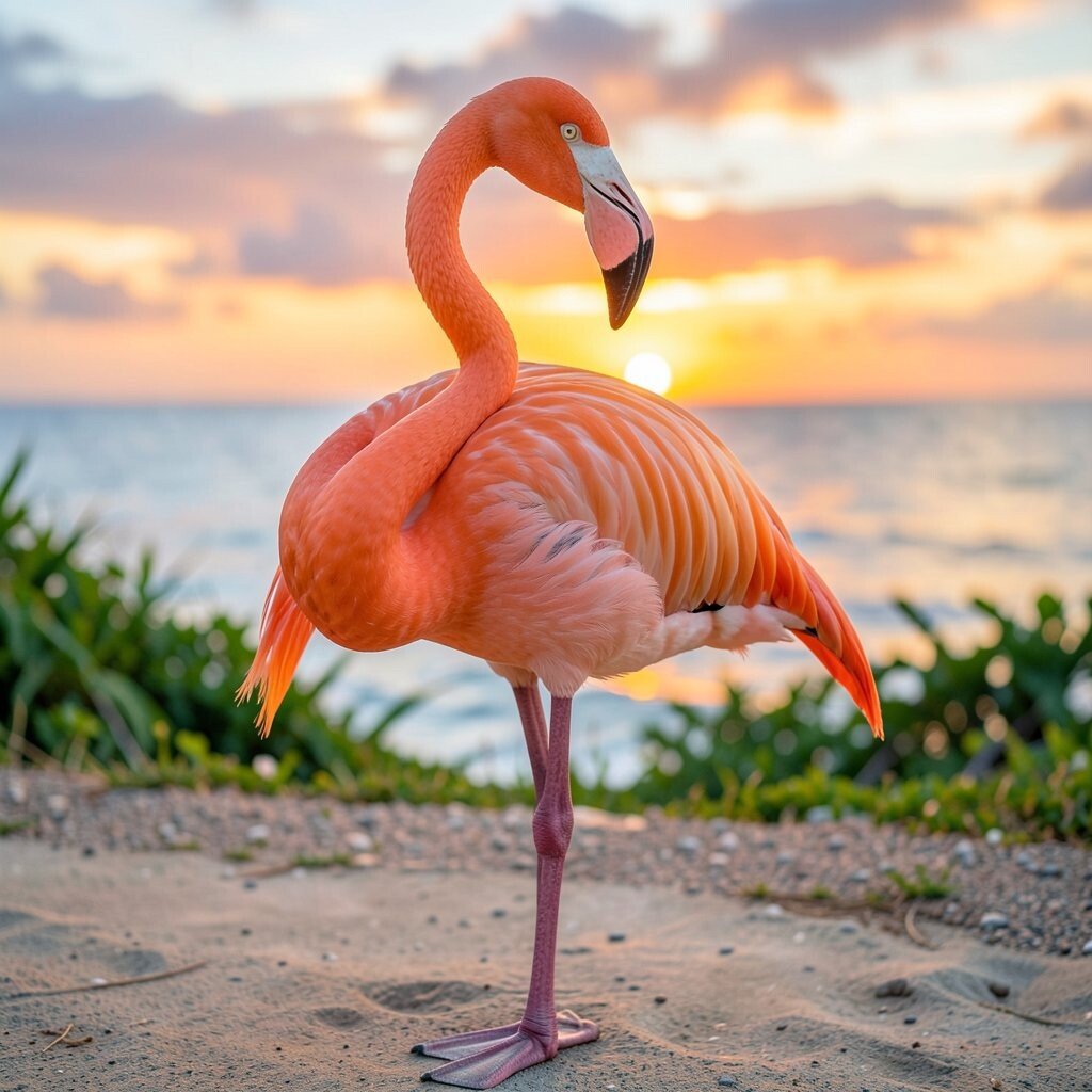
Sunset Flamingo Sunset Flamingo blends pink and warm coral for a bold, friendly look. It gives spaces a lively mood without feeling harsh.
Try it behind a bed, on a gallery wall, or on a statement chair. The benefit is that it can make your home feel like a holiday without you needing to do much. For a tip, use cream, blush, and warm gray to keep it balanced.
It’s unique because the tone feels soft at first glance but energizing up close. If you’re cost-conscious, use peel-and-stick wallpaper or removable wall decals to test the vibe before committing. You can also mix it into curtains or a throw blanket for a quick refresh.
-
4. Beachcomber Coral
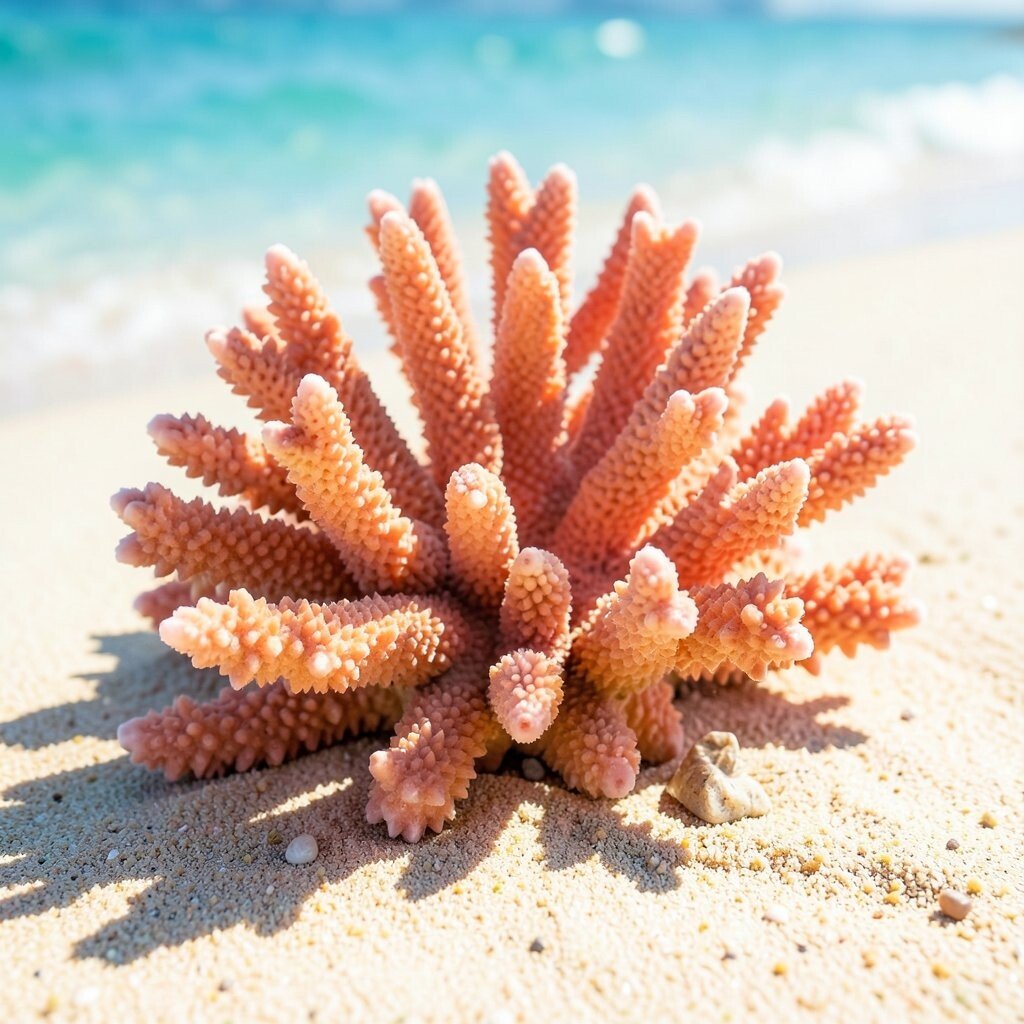
Beachcomber Coral Beachcomber Coral is a calmer coral shade that reads like warm sea daylight. It adds color that feels cozy and not too loud.
Use it where you want comfort, like a hallway or a family room wall. It pairs beautifully with beige, soft teal accents, and natural stone textures. If you want to keep costs lower, choose it for small surfaces like a built-in shelf or a painted picture rail.
-
5. Hibiscus Bloom
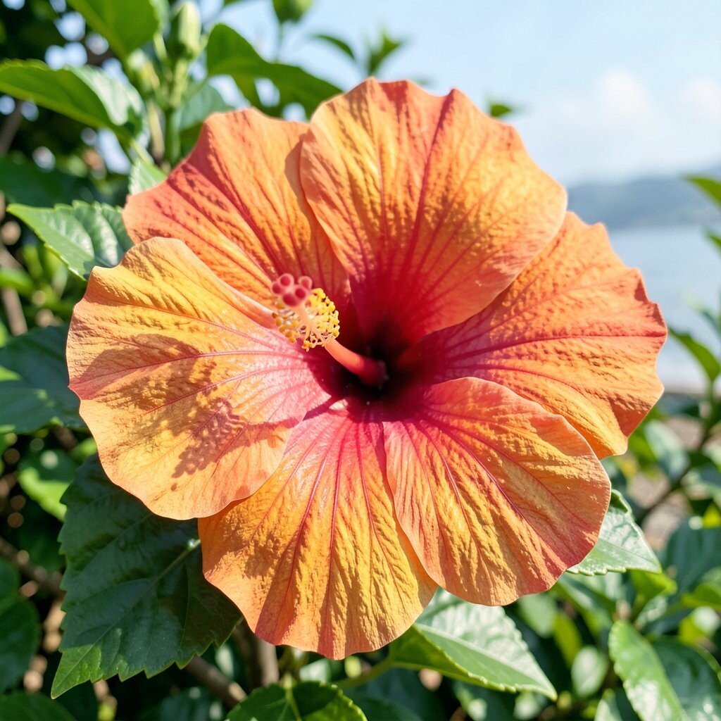
Hibiscus Bloom Hibiscus Bloom is a bright magenta-red that looks like a flower opening in real time. It instantly creates a dramatic focal point.
This shade works well for front doors, bold artwork walls, or one standout piece of furniture. The benefit is that it brings personality and helps neutral rooms feel styled. To personalize, combine it with dark green plants for a fresh tropical theme.
Current trends favor confident jewel-like pinks, especially in modern spaces with clean lines. For cost planning, consider painting smaller items like a side table or a frame, then echo the tone with accessories. A little goes a long way with Hibiscus Bloom.
-
6. Tropical Punch Magenta
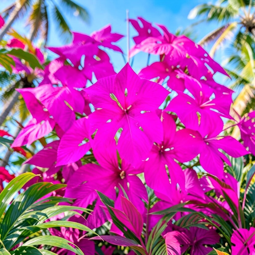
Tropical Punch Magenta Tropical Punch Magenta is deeper and richer, like ripe berries under warm light. It adds a glamorous twist to everyday spaces.
Try it in a powder room, on a cabinet base, or in a statement lamp shade. The benefit is that it can make lighting look warmer and more flattering. If you want flexibility, paint a removable cabinet panel or use it on temporary textiles first.
For personalization, match it with sleek black hardware and light marble patterns. This shade feels unique because it has a grown-up tone, not just playful pink. When planning a budget, price out a small paint sample and test it near your lighting before you commit to bigger areas.
-
7. Rainforest Fern Green
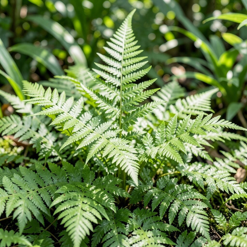
Rainforest Fern Green Rainforest Fern Green is lively and fresh, like new leaves after a warm rain. It brings calm focus and makes rooms feel alive.
Use it in kitchens, bedrooms, or rooms that need a refreshing boost. The benefit is that green can feel soothing while still being bright. For tips, pair Fern Green with warm wood, creamy whites, and touches of sunshine yellow.
This shade is unique because it looks rich without turning your space dark. If you’re cost-conscious, start with one wall or paint the inside of open shelving to add surprise. You can also use it through removable wallpaper or peel-and-stick tiles.
-
8. Lime Leaf Electric
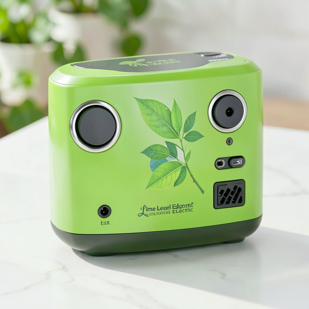
Lime Leaf Electric Lime Leaf Electric is zesty and sharp, like a lime cut open on a bright morning. It instantly makes your room feel more energetic.
This shade is best for accents: think a chair, a vase, a framed print, or a small section of wall. The benefit is that you can bring “tropical energy” without painting the whole room. If you want an easy personalization idea, match it with navy or deep charcoal for a crisp contrast.
-
9. Parrot Feathers Blue-Green

Parrot Feathers Blue-Green Parrot Feathers Blue-Green is bold and vivid, like colorful birds in a sunlit garden. It adds a tropical pop that feels modern and fun.
Use it on a feature wall, in a bathroom, or in a creative workspace where you want motivation. The benefit is that it can make white trim stand out even more. To personalize, add woven textures and light metal finishes for a balanced look.
This shade feels unique because it sits between teal and green, giving you a cooler tropical mood. For cost considerations, try painting only one set of built-ins or using it for cabinet interiors. It’s a smart way to keep spending in check while still getting a big wow effect.
-
10. Ocean Mist Teal
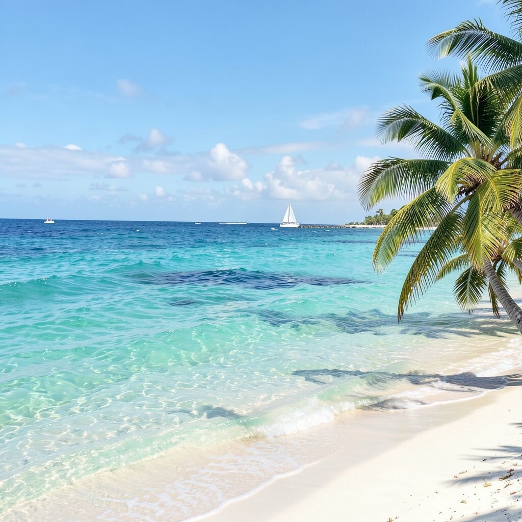
Ocean Mist Teal Ocean Mist Teal is softer than most teals, like sea air at midday. It makes rooms feel fresh and airy.
Great choices include living room walls, bathroom accents, or bedding patterns. The benefit is that it creates a calm vibe while staying bright. If you want a simple tip, keep your furniture light and add medium-toned wood to avoid a cold look.
In current home trends, gentle teal is popular because it blends well with both modern and coastal styles. Personalize by mixing teal with coral or mango accents for a tropical color story. For budget planning, use teal in paint on a single wall or choose a teal rug to cover more area at once.
-
11. Sea Glass Azure
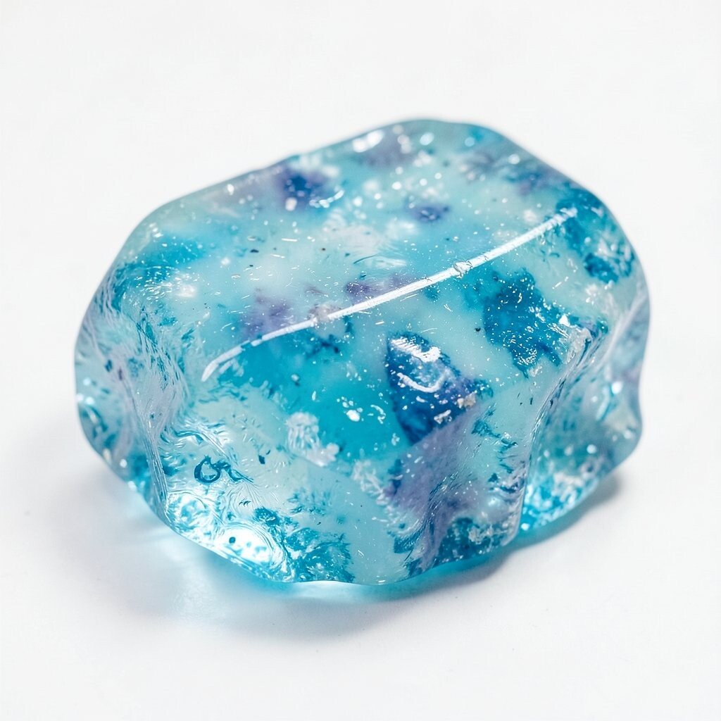
Sea Glass Azure Sea Glass Azure feels like cool, glowing water trapped in color form. It is bright, but it doesn’t feel aggressive.
It works especially well in kitchens, bedrooms, and places where you want a clean, open feel. The benefit is that it pairs nicely with white cabinets and light flooring. To personalize, add seaside-inspired art or simple geometric patterns in matching tones.
This shade is unique because it looks layered, like it has depth even when it’s flat paint. If costs are a concern, start with a paint sample and test it on a small area of wall near a window. You can also get the look using slipcovers, curtain panels, or a fresh coat on a single door.
-
12. Sky Surfer Aqua

Sky Surfer Aqua Sky Surfer Aqua is playful and bright, like a clear day with soft clouds. It adds a friendly splash to spaces that feel plain.
Try aqua on an accent wall, a desk backdrop, or a fun wall shelf area. The benefit is that it can make dull lighting feel more cheerful. For personalization, pair it with sunny yellow, white, and light green plants to keep everything feeling tropical and fresh.
-
13. Tropical Sky Blue
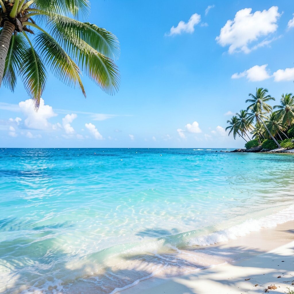
Tropical Sky Blue Tropical Sky Blue is light and uplifting, like the top of the sky over a beach. It helps rooms feel open, bright, and ready for guests.
Use it in kitchens, hallways, or bedrooms where you want a calm lift. The benefit is that it reflects light well, so the room feels airy. A helpful tip is to balance blue with warm elements like tan leather, oak wood, or golden brass.
This shade feels unique because it reads like “vacation energy” without needing loud accessories. For cost considerations, consider painting ceilings or upper wall sections where you can get a big effect with less paint. Then repeat the color in smaller items like pillows or bath towels.
-
14. Jungle Mango Yellow
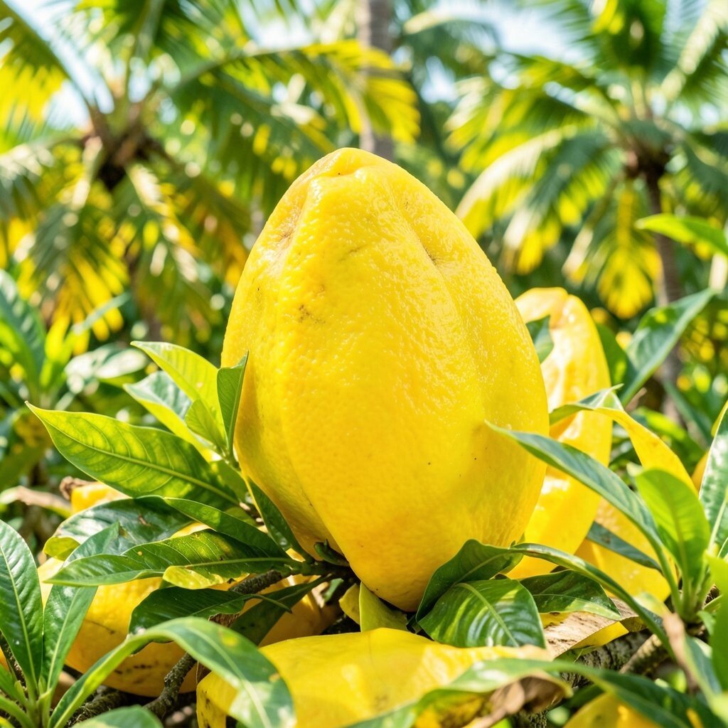
Jungle Mango Yellow Jungle Mango Yellow is sunny, bold, and full of life. It can turn a gloomy corner into a bright, happy spot.
Choose it for kitchens, breakfast nooks, and spaces that need a quick mood boost. The benefit is that yellow can make your home feel more energetic even on cloudy days. To personalize, pair it with deep green plants or navy accents to add contrast.
-
15. Sunburst Marigold
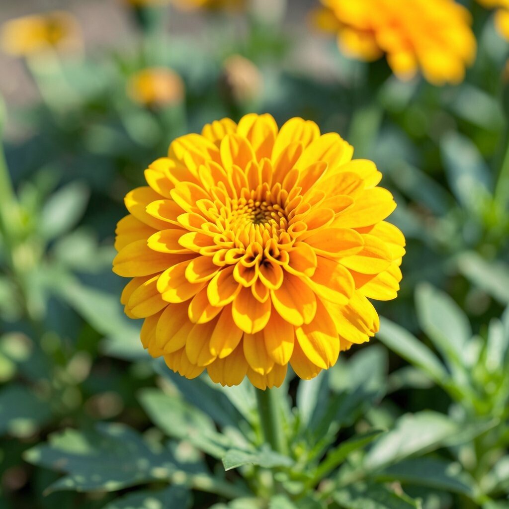
Sunburst Marigold Sunburst Marigold is a warm golden yellow with a tropical glow. It’s bright enough to stand out, but it still feels cozy.
This color is great for statement walls, bar carts, or decorative trim. The benefit is that it can make metals like brass and gold look even more shiny. If you want tips for a balanced look, keep the rest of the palette neutral and add textured fabrics like linen.
Marigold is unique because it has a slightly earthy warmth, so it doesn’t feel like a neon highlighter. For cost planning, use it in small furniture updates, then repeat it in wall art or a rug. Current trends also show warm yellows rising again, especially in modern kitchens.
-
16. Golden Palm Gold
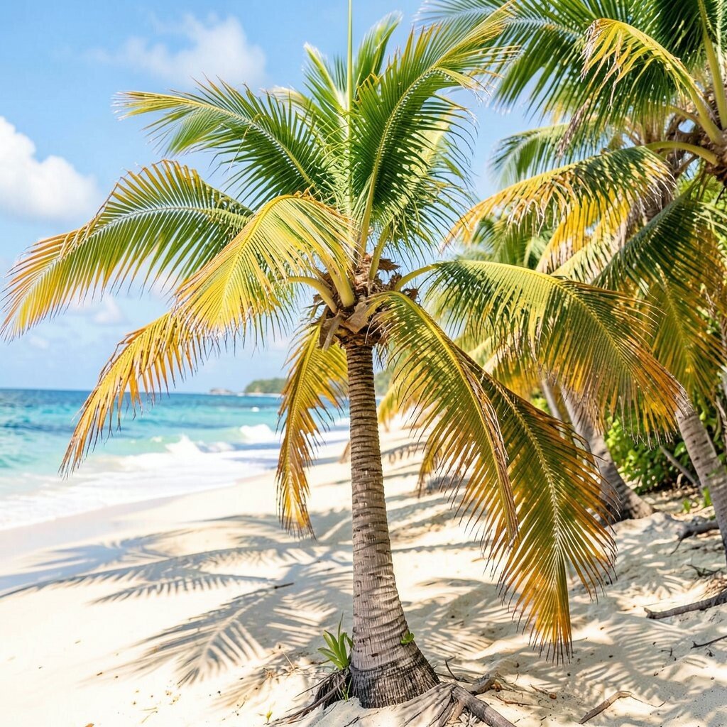
Golden Palm Gold Golden Palm Gold adds warmth like late-afternoon sun. It doesn’t always need to be a full wall color to make a strong statement.
Use it on hardware, picture frames, light fixtures, or as a soft wash on a feature wall. The benefit is that it can upgrade a room without a total makeover. For personalization, try pairing gold with deep green, crisp white, and light terracotta for a rich tropical mix.
This shade is unique because it can feel luxurious while still cheerful. If you’re watching costs, choose smaller upgrades first: paint a thrifted frame, rework cabinet handles, or add a gold-toned mirror. A little gold can make the whole room look more polished.
-
17. Papercraft Vanilla Tropic
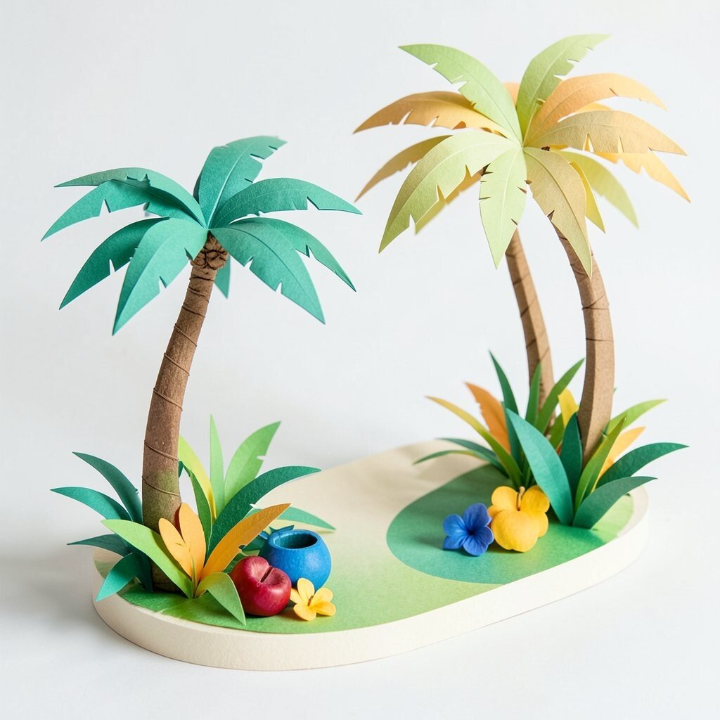
Papercraft Vanilla Tropic Papercraft Vanilla Tropic is a creamy, warm off-white with a tropical soul. It’s bright, but it also keeps your space soft and calm.
Use it on walls, cabinets, or ceilings when you want light without loud color. The benefit is that it makes other tropical shades look brighter next to it. For tips, pair it with bold teal, coral, or mango accents in pillows, rugs, and art.
This shade is unique because it acts like a “friendly background” for bolder colors. It can also help you save money since it’s easy to rework later and works with many decor styles. If you plan carefully, you can paint larger areas with vanilla first, then layer in accents over time.
-
18. Caribbean Crayon Green-Teal
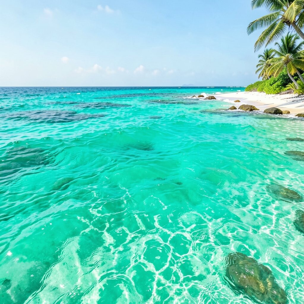
Caribbean Crayon Green-Teal Caribbean Crayon Green-Teal is playful and saturated, like a tropical postcard turned into paint. It brings a bold, creative energy to any room.
Try it on a single wall, a set of drawers, or a custom shelving backing. The benefit is that it can make your decor look more vibrant and fresh. For personalization, add patterned textiles in complementary tones and keep your main furniture light to balance the intensity.