
Salt air vibes can live right in your kitchen. With the right countertop, your space feels bright, calm, and full of life.
These themes use coastal colors, textures, and smart materials so your home looks fresh and feels easy to live with.
-
1. Sea-Glass Breeze (Light Green Quartz)

Sea-Glass Breeze (Light Green Quartz) Picture tiny bubbles frozen in time, like sea glass catching the sun. This theme uses a pale green quartz look to bring a gentle coastal glow into everyday cooking.
Quartz is non-porous, so it resists stains and makes cleanup feel simple. The soft color helps small kitchens look bigger and brighter. For personalization, choose a quartz pattern with scattered flecks, then pair it with white shaker cabinets and brushed nickel hardware.
If you want a realistic “coastal collection” feel, add a matching backsplash in a smooth, light-toned tile. A sea-glass top also works well with warm wood shelves, so your room feels both beachy and cozy. Budget-wise, quartz often lands in the mid-range and gives a long-lasting finish without heavy sealing.
-
2. Weathered Driftwood (Warm Taupe & Gray)

Weathered Driftwood (Warm Taupe & Gray) Driftwood-inspired counters look like sun-faded wood, even when the material is stone. The mix of warm taupe and gray feels earthy, not salty, which makes it great for year-round style.
This theme can hide everyday wear because the tones are blended and not too high-contrast. It also pairs beautifully with light cabinets and natural textures. To make it feel intentional, pick a design with long, flowing streaks that mimic wood grain.
For a coastal twist, add a slim strip of blue tile along the backsplash or under the upper cabinets. When planning cost, ask your fabricator about edge options, since a simple straight edge keeps pricing friendly. A honed finish can also reduce glare, which helps the wood-like pattern feel softer.
-
3. White Sand Veins (Bright Marble-Style Porcelain)
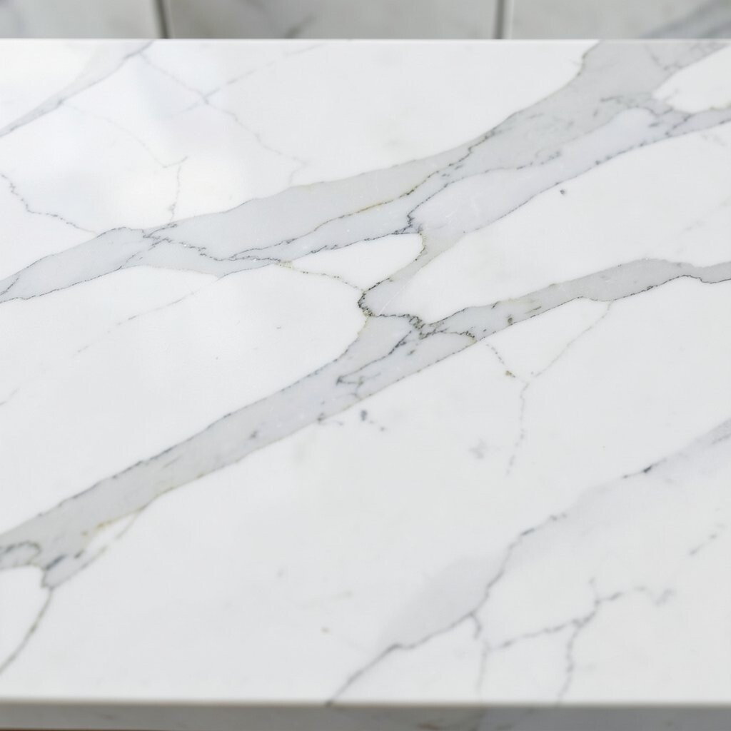
White Sand Veins (Bright Marble-Style Porcelain) Think of white sand with faint lines like ripples after a wave pulls back. A marble-style porcelain top creates a clean, airy look that feels coastal without going too themed.
Porcelain can be very durable and low-maintenance, and many options resist scratches and stains well. The bright base helps your countertops reflect light, making kitchens feel open. If you want a unique look, choose a pattern with subtle warm gray movement instead of bold swirls.
Pair it with rattan stools, light curtains, and matte white cabinet doors for a calm coastal mood. A softer finish, like satin or honed, helps the veining look more natural and less shiny. Cost depends on thickness and the size of slabs, so get quotes for both material and installation before you decide.
-
4. Coastal Limestone Look (Beige with Soft Speckle)
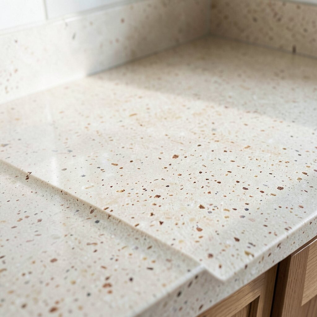
Coastal Limestone Look (Beige with Soft Speckle) Limestone-style counters bring a sandy, grounded feel with gentle speckles. The neutral base gives you a flexible canvas for blue accents, seashell decor, or greenery.
This theme helps hide minor scratches and stains because the color is not one solid shade. It also makes it easy to switch your coastal accessories from summer blues to fall neutrals. For personalization, match the countertop speckle direction with a backsplash that has a light, textured surface.
To stay practical, choose a finish that fits your lifestyle—some people prefer polished for easy wipe-downs, while others like honed for a more natural look. When thinking about costs, remember that “look-alike” materials can sometimes cost less than true stone. Ask about warranty coverage and stain resistance so you know what care is needed.
-
5. Oceanwave Blue Gradient (Bold Quartz)

Oceanwave Blue Gradient (Bold Quartz) Imagine a slow wave turning into a pretty pattern on your countertop. A quartz with blue movement creates a statement that still feels clean and organized.
Because quartz stays consistent, you get a smooth surface that resists staining and supports everyday cooking. The blue tones can make white cabinets and stainless appliances look even sharper. For tips, start by choosing the range of blue you love—light sky, teal, or deeper wave—then repeat that color in the room with small accents.
Try pairing this theme with white subway tile or a glossy, neutral backsplash so the countertop stays the star. If you’re worried about cost, consider selecting a slab with lots of pattern variation but fewer rare colors. Your fabricator can also help you pick a layout that reduces waste, which can help your total price.
-
6. Briny Charcoal Foam (Dark Speckled Quartz)

Briny Charcoal Foam (Dark Speckled Quartz) Coastal design can be moody too, especially with dark, airy speckling. This theme uses charcoal or near-black tones with lighter flecks that resemble beach foam.
The benefit is contrast: your backsplash and cabinet hardware pop right away. Dark counters also hide stains and everyday marks better than light shades. To make it feel coastal and not too heavy, choose warm lighting and add wood elements like floating shelves or a butcher-block-style island top.
For personalization, pick a soft gray grout color in your backsplash so the look stays smooth and modern. Cost-wise, quartz tends to vary by brand and color depth, so compare a few options rather than grabbing the first slab you see. Consider a heat-safe routine too, like using trivets, since darker colors can show heat marks with some finishes.
-
7. Tidepool Teal Swirls (Statement Stone Look)
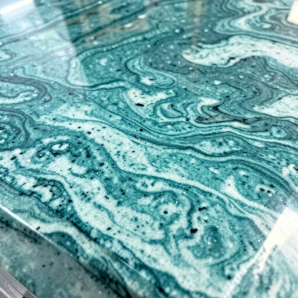
Tidepool Teal Swirls (Statement Stone Look) Tidepools are full of color, and your countertop can echo that magic. Look for a teal or aqua pattern with gentle swirls that feel like water moving under light.
This theme is unique because the countertop becomes art, even when your kitchen is busy. The advantage is that teal can work with many styles, from beachy cottage to modern minimal. Add a simple white backsplash and let the countertop carry the personality.
For tips, keep your accessories light and not too busy, since the swirls already bring energy. If you want personalization without clutter, choose a matching soap dispenser, utensil crock, or dish set in a related shade. Cost considerations matter here, because statement patterns sometimes require careful slab matching to reduce visible seams.
-
8. Pebble-Textured Pattern (Micro Speckle Composite)

Pebble-Textured Pattern (Micro Speckle Composite) Some countertops look like smooth pebbles you’d find at the shoreline. A micro-speckled composite or quartz-style finish can create that gentle, tactile vibe.
This theme feels relaxing because the pattern doesn’t demand your attention every second. It also helps hide crumbs, water spots, and small daily wear. If you like practicality, this is a great pick because small speckles can make life look tidier.
To personalize, add open shelving and set out simple coastal items like a ceramic bowl or a small plant. Choose a backsplash with a matte finish so it doesn’t compete with the countertop texture. Cost can be friendly depending on the brand, and composite options often come in a range that fits many budgets.
-
9. Seabreeze White & Gray (Clean Minimal Quartz)
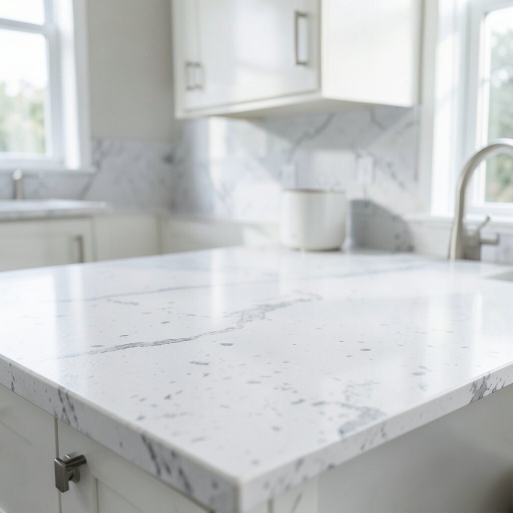
Seabreeze White & Gray (Clean Minimal Quartz) Clean and light feels like a fresh morning, and this theme nails that mood. White and gray patterns give you a coastal feel while staying modern and calm.
The benefit is how easy it is to decorate around it. You can add coastal accents like blue glass jars one season, then switch to simple neutrals the next. For personalization, pick a gray veining style that looks like soft, drifting clouds.
This countertop theme also works well for resale because it’s not too bold. Cost is often moderate, and choosing a common color range can sometimes help with slab availability. For tips, ask about seam placement so your veining looks continuous across the main cooking area.
-
10. Ocean Marble Gray (Cool Tones with Natural Movement)
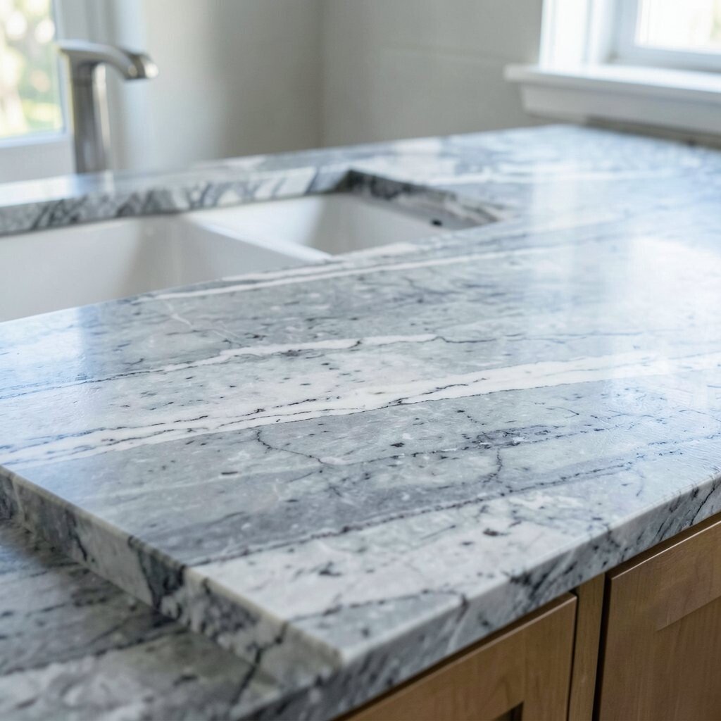
Ocean Marble Gray (Cool Tones with Natural Movement) Marble-style gray can feel like open water under cloudy skies. This theme keeps coastal energy without using bright blues, which many people find easier to live with.
Natural movement adds uniqueness, so no two countertops feel exactly the same. The advantage is that cool tones pair well with stainless steel, white cabinets, and modern lighting. For personalization, decide if you want more dramatic gray veining or a softer, quieter pattern.
To keep the look coastal, add a backsplash with subtle texture, like a thin stone look tile or a soft glazed finish. If you choose a polished surface, it will reflect light, while a honed surface looks calmer and less shiny. Cost considerations depend on how “marble-like” the pattern is, so compare a few grades and check for durability ratings.
-
11. Sandy Ochre Warmth (Golden Beige Quartz)
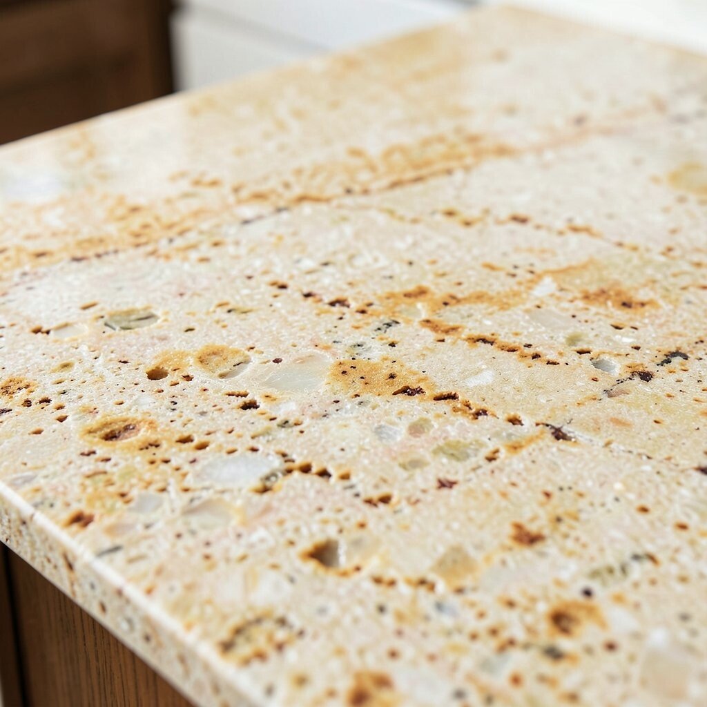
Sandy Ochre Warmth (Golden Beige Quartz) Golden beige countertops can feel like sunshine on the sand. This theme brings warmth to your kitchen and makes it feel welcoming, not just beachy.
One key benefit is how forgiving the color is. It hides many everyday small marks and still looks bright. For personalization, match the warmth with hardware in brushed brass or warm bronze tones for a coastal-meets-gold look.
To keep it fresh, choose a backsplash in white or cream so the ochre tones don’t get too heavy. Budget-wise, quartz can vary, but golden beige shades are often easier to source in multiple brands. Ask your fabricator about edge profiles, since a rounded edge can make the warm color feel softer.
-
12. Clearwater White (Solid White with Subtle Veins)

Clearwater White (Solid White with Subtle Veins) A clearwater theme is crisp, bright, and easy to style. Think solid white counters with faint gray or soft cream movement, like water catching light.
This theme benefits from being timeless and airy, which makes it great if you love coastal vibes but prefer clean design. It also pairs with almost any cabinet color, including navy, sage, or pure white. For personalization, add a thin blue grout line in the backsplash or select light blue accessories for small pops.
Cost considerations are usually straightforward because white patterns are common in many materials. Still, ask if the material requires sealing, especially if you go with anything stone-like. For everyday tips, use a gentle cleaner and avoid harsh abrasives to keep the surface smooth and bright.
-
13. Marina Blue Accent Line (Two-Tone Look)
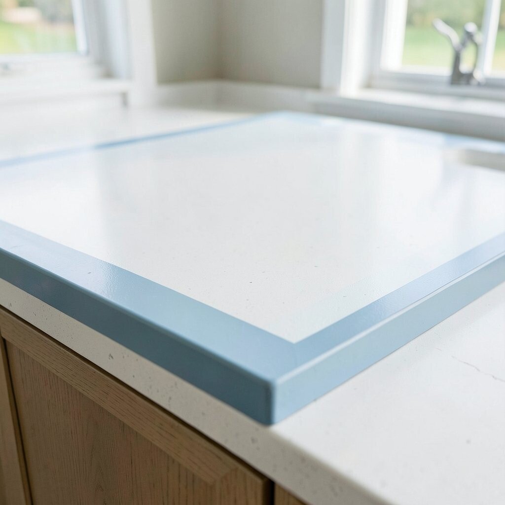
Marina Blue Accent Line (Two-Tone Look) Two-tone countertops can create a “channel” effect that feels like a marina. This theme uses one color base with a band of blue along the edge or near the backsplash area.
The benefit is control: you get coastal color without covering everything in bold pigment. It can also tie together the rest of the room, especially if your backsplash or cabinet hardware already uses blue. For personalization, choose a deep navy band for contrast or pick a softer teal line for a calmer look.
When planning, discuss edge design with your installer so the blue line stays aligned. Cost can be slightly higher if the design requires special cutting and layout, but it can still fit many budgets. This theme is also a great option if you want coastal style while keeping the kitchen feeling organized and modern.
-
14. Coral Reef Pink Whisper (Blush Tones)
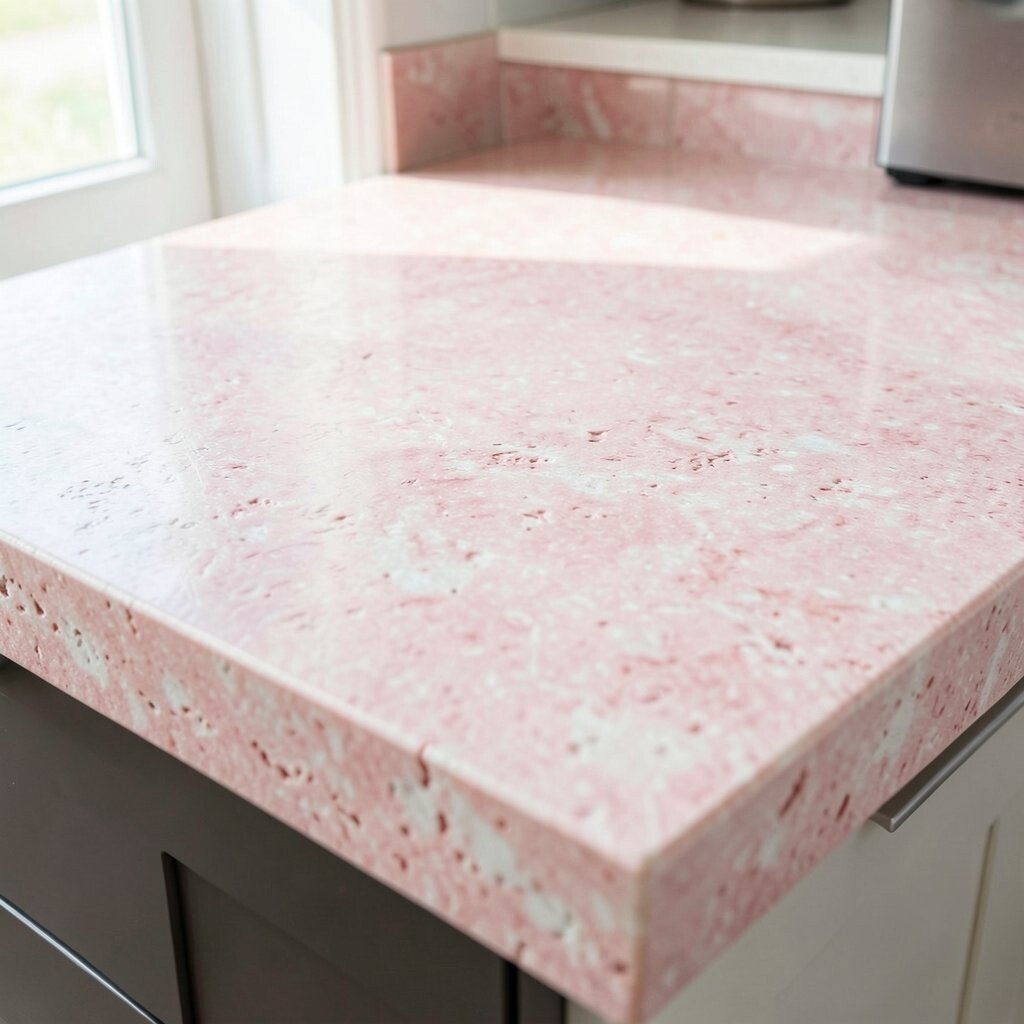
Coral Reef Pink Whisper (Blush Tones) Coral reef colors can be gentle, not loud, and this theme proves it. Choose blush or soft rose tones with subtle movement for a “pink sand” feeling.
This theme is unique because it adds warmth and personality without turning the room into a full beach costume. The benefit is that blush pairs beautifully with white, cream, and warm wood. For personalization, use light green plants and woven textures to echo coral and sea life.
Cost considerations depend on the material choice, since pink shades can be more limited. A helpful tip is to pick a countertop that has movement, so the color looks natural and not flat. If you like trends, this blush coastal look fits the current shift toward softer “sunset” palettes rather than bright, neon beach colors.
-
15. Coastal Verde Mist (Green with Gray Veining)
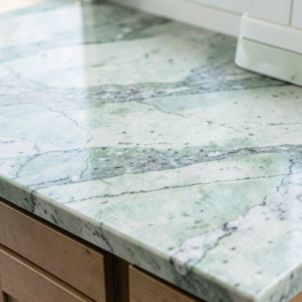
Coastal Verde Mist (Green with Gray Veining) Verde mist counters feel like mossy stones near the shoreline. The blend of green and gray looks calm and a little mysterious, like a shaded tidepool.
This theme is beneficial because the colors hide imperfections while adding depth. It also works well with warm metals, like gold or brass, and with earthy materials like terracotta or wood. For personalization, choose a backsplash with soft green accents or a simple white tile so the veining stays in charge.
If you’re planning a refresh, this is a fun “current trend” option because many kitchens are leaning into natural stone-inspired greens. Cost can vary widely, so compare a few slabs and ask how much polishing or finishing changes the price. For tips, keep cleaning consistent and use coasters when possible to maintain a beautiful finish.
-
16. Seaside Marble Classic (Timeless White with Gray Veins)
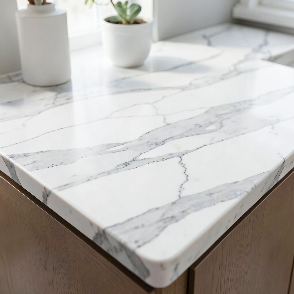
Seaside Marble Classic (Timeless White with Gray Veins) Classic seaside marble is the style that never feels out of date. White with gray veins looks elegant, and it instantly makes your kitchen feel more “designed.”
The biggest benefit is the wow factor, especially under bright lighting. It also gives you lots of decorating freedom because the color scheme works with almost everything. For personalization, match your backsplash tile shape—like small hex tiles or long slim subway tiles—to the way the veins flow.
Cost considerations are important here because real marble can be pricey and may need more care. If you want a similar look with less fuss, choose a marble-style quartz or porcelain alternative. Either way, consider sealing needs, and remind everyone in the home that acids like citrus can be tougher on some stone finishes.
-
17. Dune Ridge Texture (Warm Sand Tones with Movement)
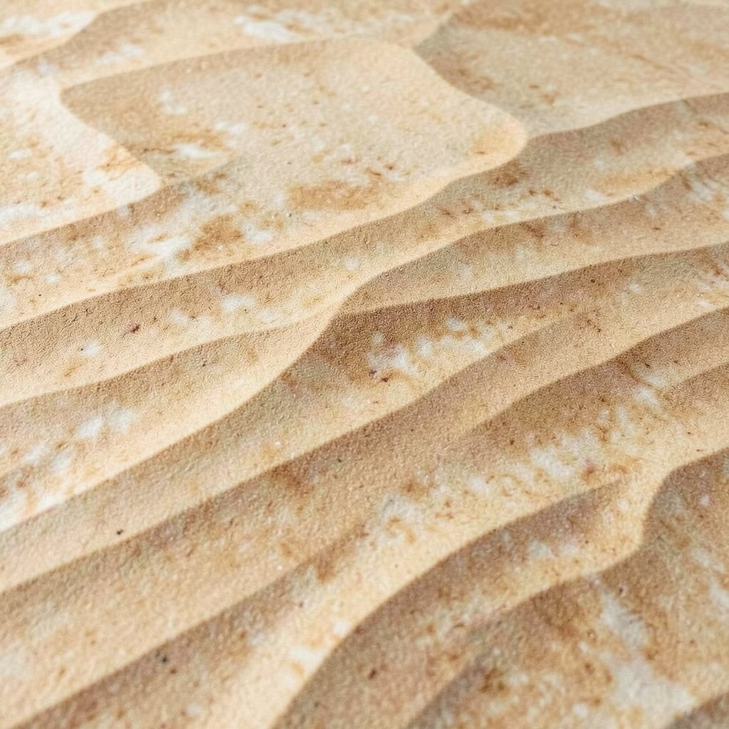
Dune Ridge Texture (Warm Sand Tones with Movement) Dune ridge counters look like sand hills after the wind has passed. Warm sand tones with gentle movement create a soft coastal landscape right on your walls.
This theme is unique because it feels natural and scenic, not just decorative. The benefit is that warm colors can make a kitchen feel cozy, even in cooler weather. For personalization, pair it with matte black fixtures for a modern coastal look or go all-in with natural wood for a relaxed cottage vibe.
As for cost, warm sand tones can be available in many materials, so you can choose from budget-friendly to higher-end options. A smart tip is to bring home a sample and view it in daylight and evening light, since sand colors can shift. When you plan your backsplash, choose something simple so the dune pattern remains the center of attention.