Color palettes boards can make your ideas feel real fast. Pick a few shades, and your project starts speaking in a clear voice.
Here are board-ready combos you can copy, remix, and use right away. Each item includes visual vibes, practical benefits, and easy ways to make it yours.
-
1) Sunrise Citrus
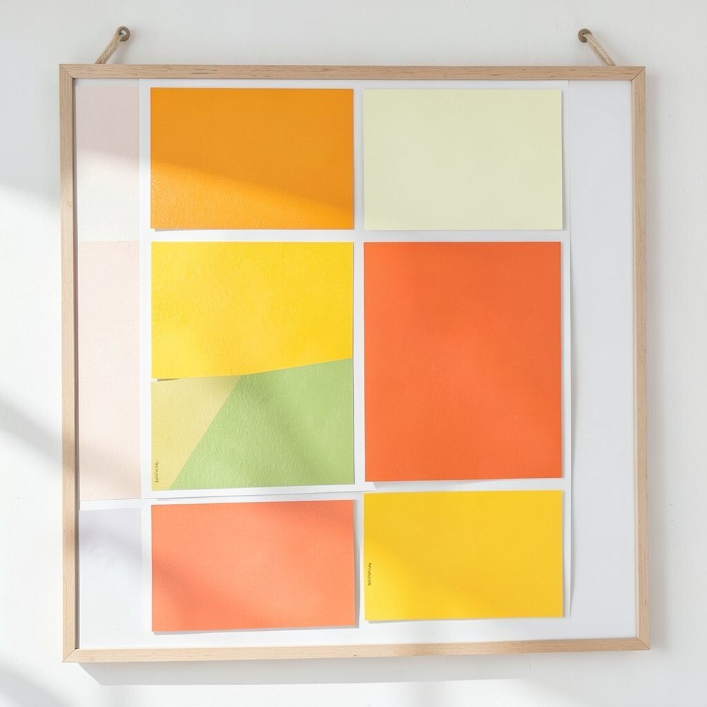
) Sunrise Citrus Palette: #FF6B35, #FFD166, #06D6A0, #118AB2, #2B2D42.
Picture warm orange meeting juicy yellow, like citrus squeezed into sunlight. Then teal and sky blue cool things down, while a deep navy keeps everything grounded.
This palette is great for energy-heavy brands like fitness apps, snack packaging, and playful landing pages. You’ll get a bold first impression without losing readability. Try using orange for headlines, yellow for highlights, and navy for the final text blocks.
To personalize it, swap the navy for charcoal if you want a softer look. For a cost-smart board, use online color pickers and print only your favorite swatch set on one sheet. A current trend is mixing bright accents with one steady “anchor” color, and this palette does it naturally.
-
2) Calm Sea Glass
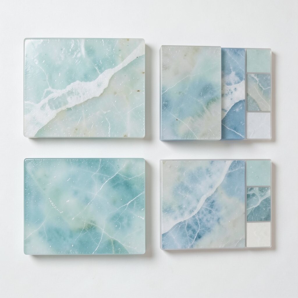
) Calm Sea Glass Palette: #BDE0FE, #A0E7E5, #D8F3DC, #F1FAEE, #1D3557.
Imagine soft glass pieces in ocean tones, layered in daylight. Light blues and minty greens feel clean, while pale warm off-whites keep the board airy.
This combo is perfect for wellness brands, dental offices, and calm product pages. It helps people feel safe and comfortable because the colors are gentle and not too loud. Use the deepest blue sparingly for buttons, links, and section headers.
Uniqueness comes from how you vary the spacing on your board: keep big areas of “breathing color” and add small accents. For personalization, try a slightly stronger teal on one page element only. If you’re watching costs, pick a simple background you can reuse across designs, then swap only accent colors.
A current style is “soft gradients with flat text,” and this palette supports that move well. Layer mint over pale blue for a modern, smooth look that still feels friendly.
-
3) Sunset Berry Retro
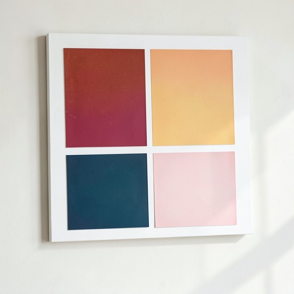
) Sunset Berry Retro Palette: #D81B60, #FF5A5F, #FFB703, #6A4C93, #1B1B1B.
Think of berry jam, warm sunset pink, and a flash of golden spice. A muted purple adds vintage charm, while near-black makes the whole set feel sharp.
This palette suits creative studios, music events, and dessert menus. It grabs attention fast and feels fun, not boring. Use the darker color for labels, menus, and any text that must stay readable.
To personalize, set one “star shade” such as the gold, then let the others support it. On a board, include mock-ups like a poster header, a price tag, and an icon set so you can see how it behaves. If you need to control costs, limit yourself to two printouts: one for light backgrounds and one for dark backgrounds.
Retro palettes are trending, especially when paired with modern layouts. Add small rounded shapes and friendly typography blocks to keep it current.
Tip: test contrast by shrinking your mock-up thumbnail; if it still looks clear, it’s a strong sign the palette will work in real use.
-
4) Forest Maker Green
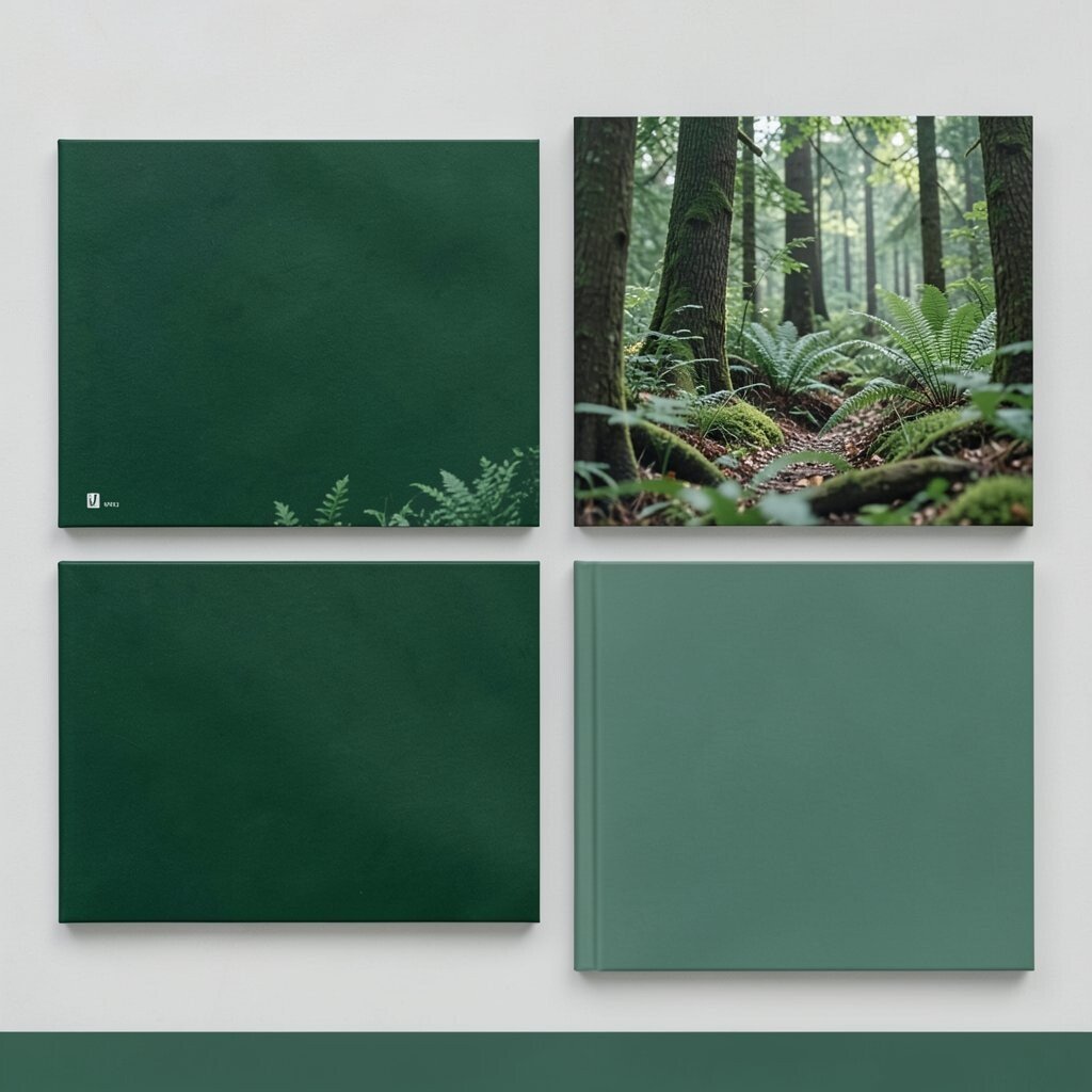
) Forest Maker Green Palette: #2E7D32, #66BB6A, #C8E6C9, #FFEE58, #0B1F14.
Picture fresh tree leaves mixed with soft spring green and a pale, almost creamy highlight. A little bright yellow adds a spark, and deep green-black makes it feel sturdy.
This palette is a strong choice for makers, hardware brands, and eco-friendly services. It signals trust and usefulness, which helps people believe what you’re offering. Try making the main button yellow and using deep green-black for headlines and long paragraphs.
-
5) Lavender Night Glow
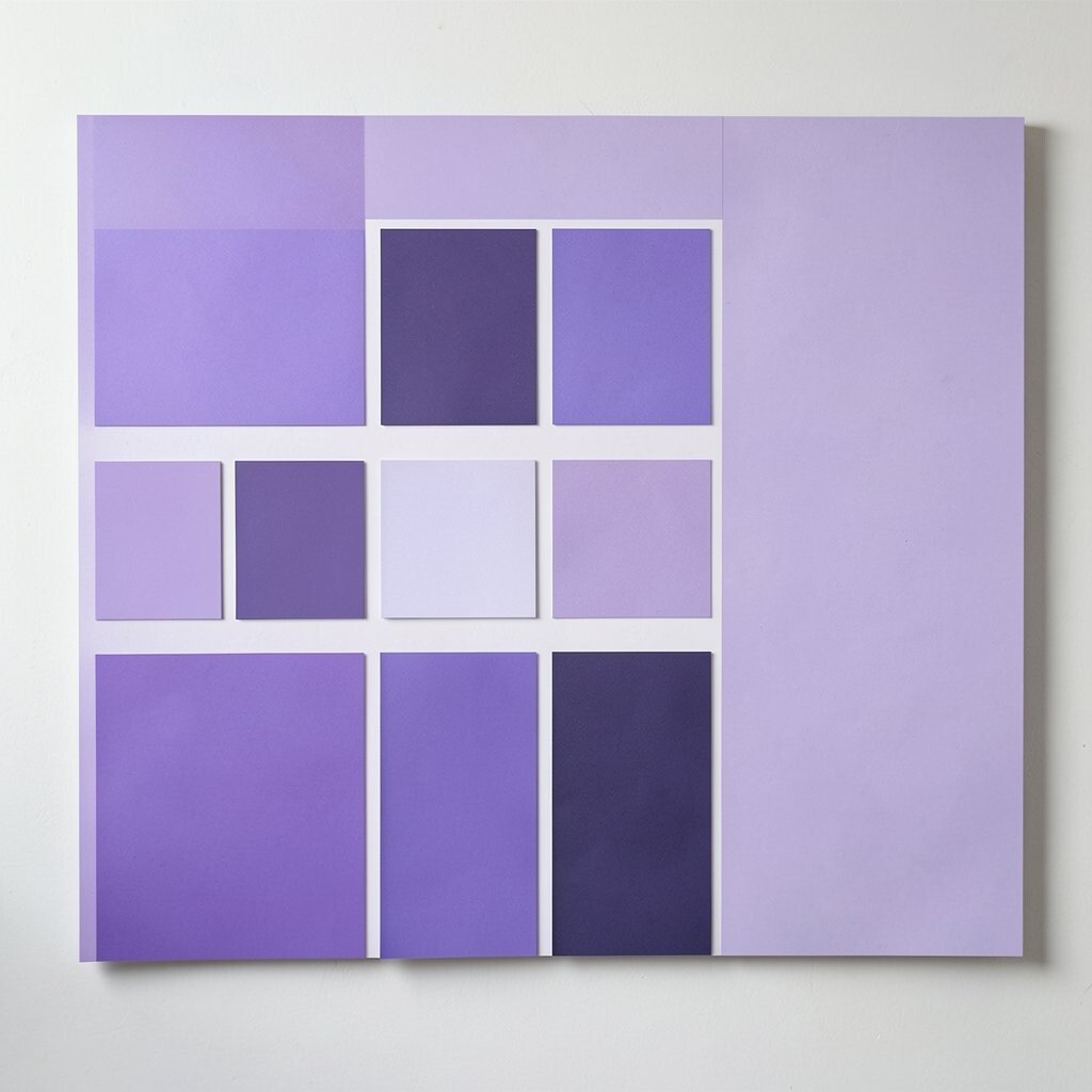
) Lavender Night Glow Palette: #B388EB, #7B61FF, #1F2A44, #F5F3FF, #FFCA3A.
Imagine a soft lavender haze that fades into deep night blue. Highlights feel smooth and dreamy, and the warm gold accent brings a playful glow.
This palette works well for skincare brands, book covers, and online courses. The contrast is friendly enough for readable text when you use the near-white carefully. Keep gold mostly for small moments like badges, hover states, or call-to-action arrows.
For uniqueness, pair the purple tones with one matte texture sample on your board. You can print a faux “paper grain” background cheaply by using a free texture image. Personalize by testing one layout where the accent color is only in tiny details, then another layout with a bigger gold element to see which you love more.
A current trend is “night-mode friendly palettes,” and this set is perfect for that mood. Use the deep blue for large blocks and keep lavender for illustrations and icons.
-
6) Peachy Apricot Pop
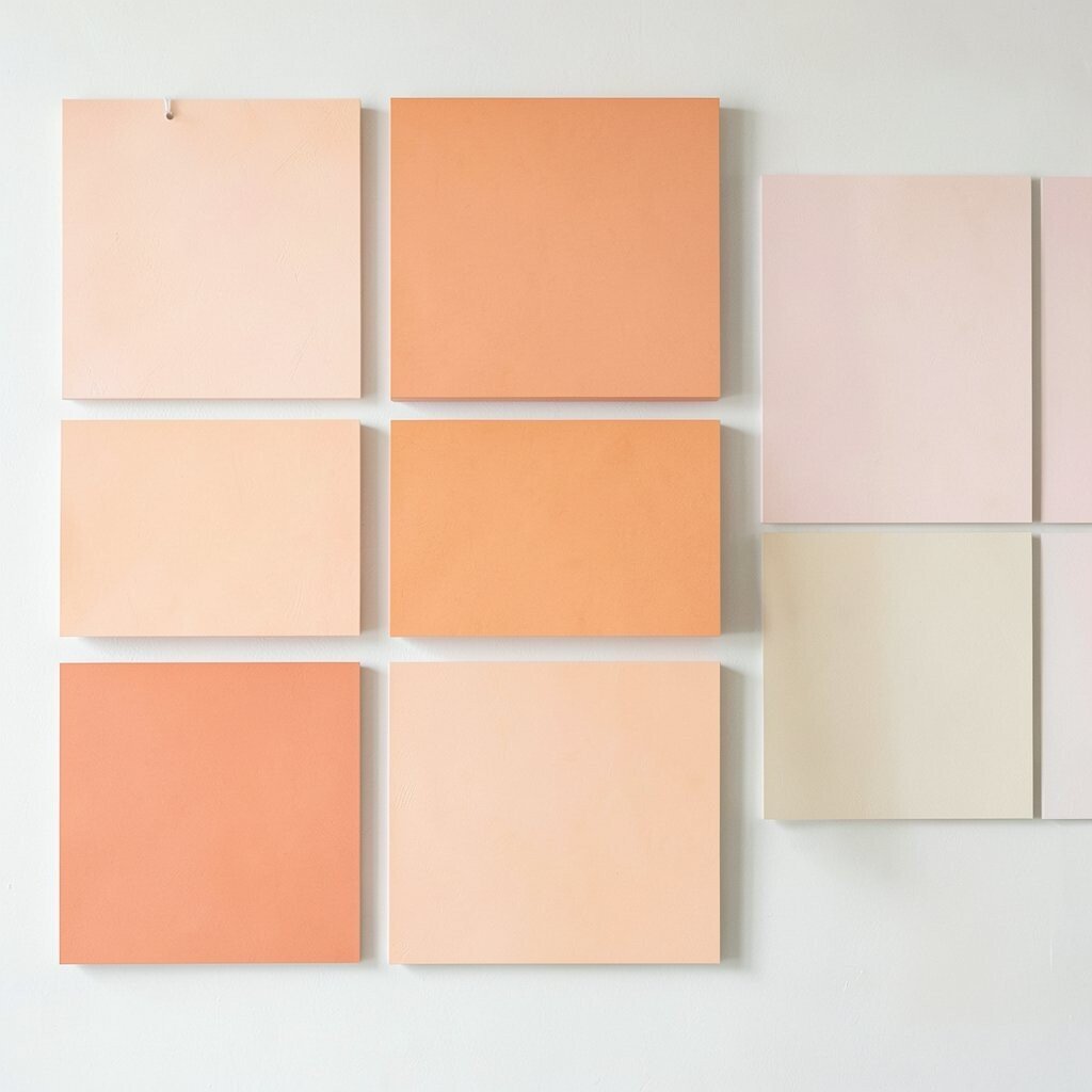
) Peachy Apricot Pop Palette: #FFA07A, #FFD6A5, #FF7A59, #264653, #F8F1FF.
Visualize a sweet peach tone layered over pale apricot, like warm fruit on a bright table. A coral-red pops for energy, while deep blue-green adds a steady, grown-up finish.
This board is ideal for cafe branding, lifestyle apps, and friendly personal sites. It feels welcoming, so people are more likely to stick around and read. Use the deep blue-green for paragraphs so the softer colors can shine above them.
Personalize by mixing in one “quiet neutral” like F8F1FF so the design can breathe. For cost considerations, build a digital board first, then print only a single set of swatches so you don’t waste ink. A nice modern touch is adding tiny line icons in the deep teal to match current minimalist trends.
-
7) Ocean Tech Blueprint
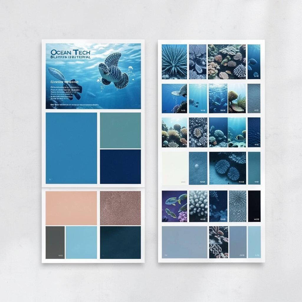
) Ocean Tech Blueprint Palette: #00B4D8, #0077B6, #90E0EF, #CAF0F8, #03045E.
Think of crisp blue lines on a bright plan, like a clean blueprint sheet. The lighter cyans feel modern, and the near-black blue brings a technical edge.
This palette is a strong fit for software, dashboards, and educational sites. It makes data feel organized and helps reduce “visual noise.” Put the darkest blue on headings and grid lines, then use lighter blues for charts and cards.
To make it unique, add one “warning” accent color only in small places, such as orange for alerts. Personalize your board by creating a sample chart mock-up, not just colored rectangles. If you’re budget-conscious, rely on screen-based tests first and skip expensive print trials until you’re sure.
-
8) Terra Clay & Sand
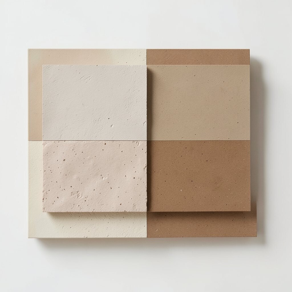
) Terra Clay & Sand Palette: #C97C5D, #E9C46A, #F4F1DE, #8D99AE, #2B2D42.
Imagine sun-baked clay, golden sand, and pale parchment sitting side by side. Cool gray-blue adds balance, and deep slate ties everything together.
This combination fits architecture, pottery studios, and home decor brands. It also works great for presentations because it feels natural and easy to read. Use sand tones for backgrounds, clay for emphasis, and slate for text.
Uniqueness comes from “materials.” Add a tile photo or fabric swatch onto your board so the colors feel like real things. Personalize by shifting one shade warmer or cooler to match your photos. For costs, choose neutral backgrounds once and reuse them across posters, slide decks, and website sections.
A trend right now is earthy minimalism, especially with warm neutrals and calm accents. This palette already sits in that sweet spot without feeling dusty.
-
9) Cherry Cloud Candy
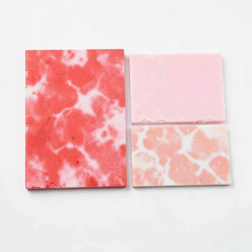
) Cherry Cloud Candy Palette: #FF4D6D, #FFB4A2, #FDE2E4, #219EBC, #0F172A.
Picture cherry-red swirls floating over soft pink clouds. A bright aqua adds a “fresh pop,” and dark navy keeps it from turning too sweet.
This palette is fun for kids’ products, playful app onboarding, and snack visuals. It’s high-joy, but still structured thanks to the deep anchor color. Try using aqua for small icons and red for bold headings.
-
10) Classic Charcoal Gold
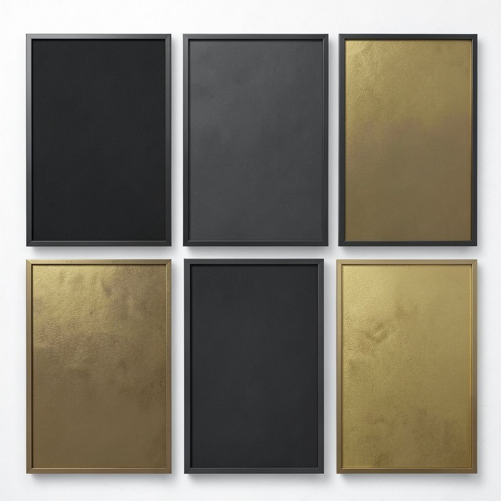
) Classic Charcoal Gold Palette: #111827, #374151, #F9FAFB, #D4AF37, #0EA5E9.
Think elegant dark charcoal with crisp light gray and a flash of gold. A hint of bright sky blue adds a modern tech sparkle.
This palette works for luxury brands, law firms, and product packaging that wants respect. The contrast is strong, so your typography stays clear. Use gold for logos, separators, and important highlights.
For uniqueness, try gold as a “thin accent” rather than a big block color. Personalize by using different gold tints for icons versus buttons. Cost-wise, print test pages on plain paper using high contrast so you can judge quickly without extra ink-heavy gradients.
A trend is “premium minimalism,” where one shine color does most of the work. This palette fits right in.
-
11) Citrus Meadow Spring
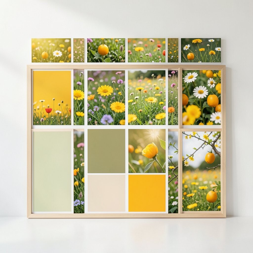
) Citrus Meadow Spring Palette: #8BC34A, #FFEB3B, #FF9800, #4FC3F7, #263238.
Imagine a sunny meadow where lime green meets bright lemon yellow. Orange adds warmth, and blue keeps the scene feeling light and open.
This set is great for seasonal campaigns, schools, and community events. It creates a friendly “we’re active and ready” feeling. Use dark slate for text so it stays easy to read on bright backgrounds.
Personalize by limiting your brightest colors to one or two parts of the layout, like headings and banner strips. Add a few small star shapes or leaf icons to make your board feel lively. If you’re controlling costs, reuse a single background color and just swap your accent blocks.
-
12) Dusk Plum Studio
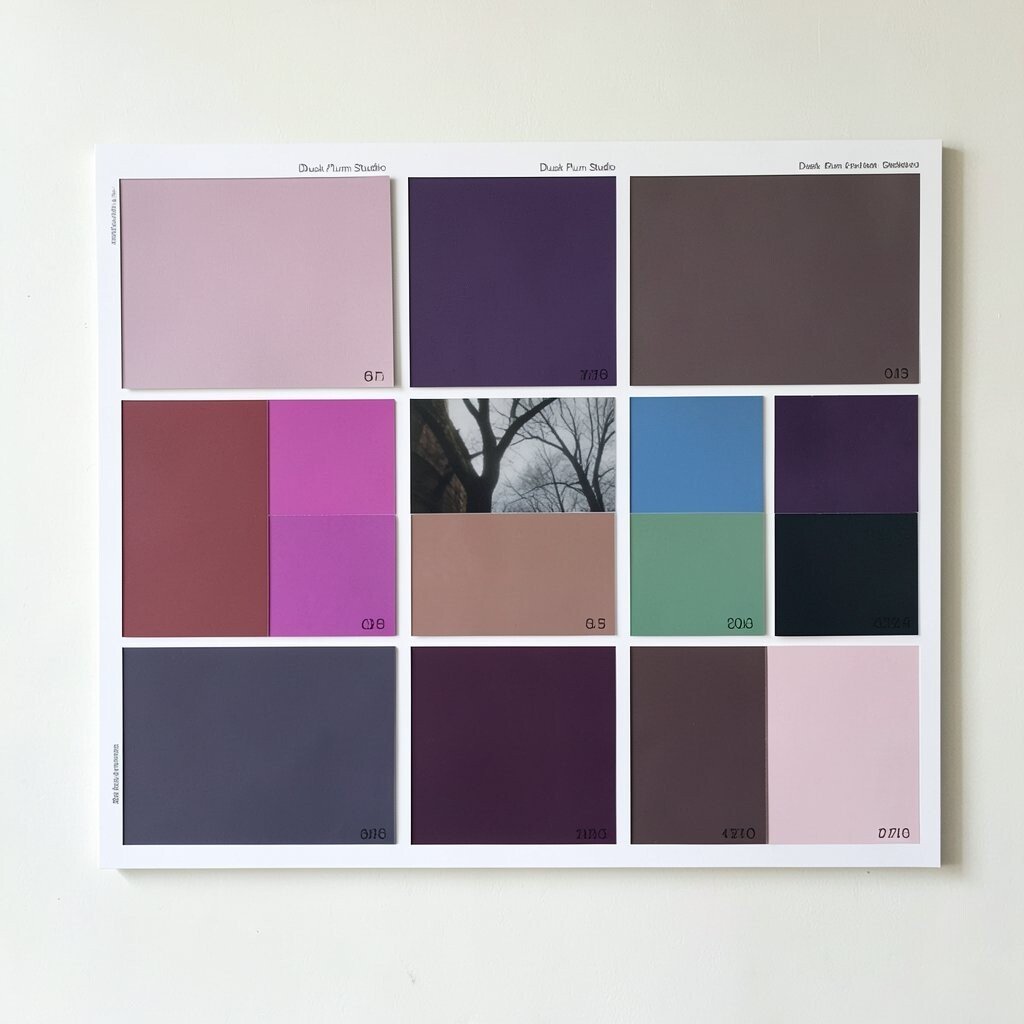
) Dusk Plum Studio Palette: #6D28D9, #A78BFA, #F3E8FF, #14B8A6, #0B1320.
Picture a creative studio light turning on at dusk. Rich plum and soft lilac feel artistic, while minty teal adds a fresh creative twist.
This palette works well for design portfolios, art classes, and music releases. It feels creative without being chaotic. Make plum your main heading color and use near-white for large background areas.
Uniqueness can come from adding one “glow” element on the board, like a soft border around a card. Personalize by matching teal to your most important message—use it for the one thing you want people to remember. For cost savings, keep patterns simple and use flat fills so printing stays affordable.
Trend-wise, purple tones are common in modern branding, especially when paired with a clear teal contrast. This combination helps your visuals stay stylish and easy to scan.
-
13) Retro Mint & Cocoa
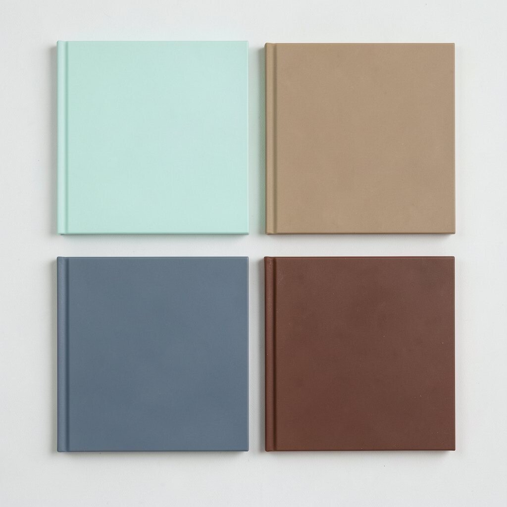
) Retro Mint & Cocoa Palette: #4DD599, #B8F2E6, #F2C14E, #6F4E37, #F7F7F7.
Think mint ice cream with a warm cocoa cookie color. Pale cream and soft yellow make it feel retro, while brown adds a comfy, grounded vibe.
This palette is perfect for cafes, recipe blogs, and boutique packaging. It feels nostalgic, which helps brands feel personal. Use cocoa for text and borders, then sprinkle mint and cream for a playful layout.
To personalize, try a simple two-tone header bar and one supporting pattern. Use the board to test how the brown looks on real-sized text, because warm browns can vary. If you’re keeping costs low, use fewer gradients and focus on strong blocks of color.
A trend is “retro food branding,” and mint plus cocoa is a classic modern combo. Add small sticker-like labels to bring that whole vibe to life.
-
14) Bright Lemon Minimal
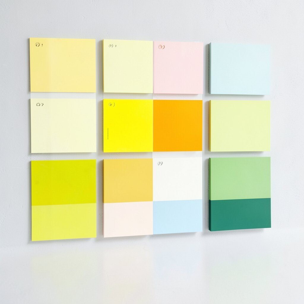
) Bright Lemon Minimal Palette: #FFE66D, #FFF3C4, #4A4E69, #9A8C98, #0B132B.
Visualize a lemon peel glow with pale cream highlights. Gray tones keep it calm, and deep blue makes it feel organized.
This palette is ideal for simple product pages, minimal posters, and clean UI designs. It supports quick scanning because the contrast is clear and the colors are tidy. Use the deep blue for main text and borders, then let lemon lead on key buttons.
-
15) Pink Orchid Bloom
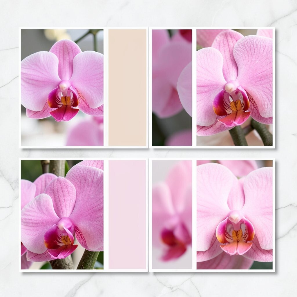
) Pink Orchid Bloom Palette: #F72585, #B5179E, #7209B7, #D9ED92, #0B1320.
Imagine orchid petals layered in pink and purple, with one leaf-green pop. Deep ink keeps the palette from getting too soft or blurry.
This palette is great for beauty brands, event invitations, and bold creative campaigns. It makes your page feel dramatic and memorable. Use the leaf-green sparingly for “important but small” actions like links or icon accents.
Personalize by choosing one shade to be “the hero” and turning the others down slightly in your layout. Add a mock headline in different sizes to check how the pink behaves in large type. For cost considerations, avoid complex textures if you plan to print, and stick to clean blocks that copy well.
A trend is “color stacking,” where multiple bright tones sit next to each other in a controlled, balanced way. This palette is made for that style when you keep the ink color steady.
-
16) Steel Blue Workshop
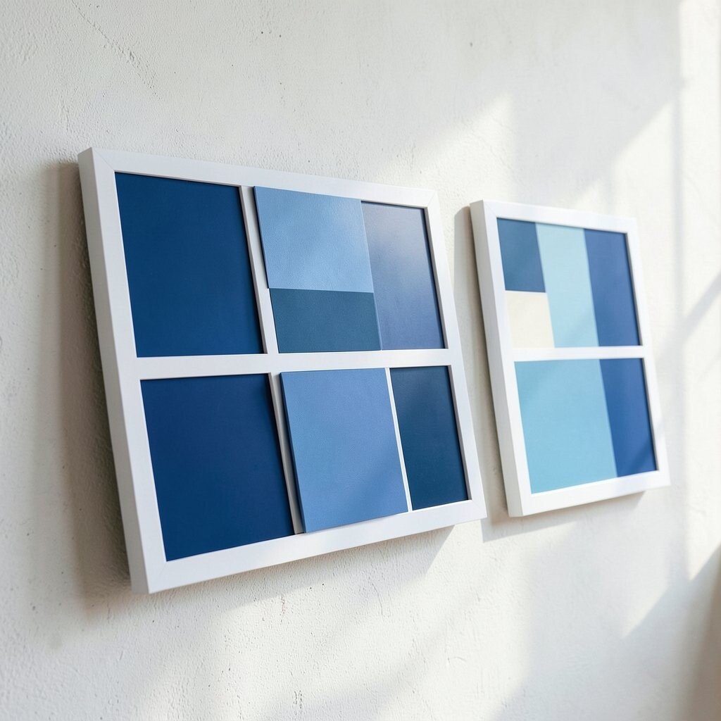
) Steel Blue Workshop Palette: #2D6A9F, #1D3557, #A8DADC, #F1FAEE, #E63946.
Picture a tidy workshop with blue metal beams and light panels. A clean off-white makes the scene bright, while a small red accent adds a tool-like “notice me” moment.
This palette fits industrial brands, engineering presentations, and straightforward business websites. It feels reliable, and the colors stay professional. Use red only for alerts or special highlights so it doesn’t overwhelm the design.
Uniqueness can be added through pattern choices on the board, like diagonal stripes for section dividers. Personalize by using different blue shades for headers versus backgrounds so your hierarchy stays clear. For costs, keep the red to a minimum so you don’t need heavy color ink coverage across your whole print.
-
17) Warm Rose & Olive
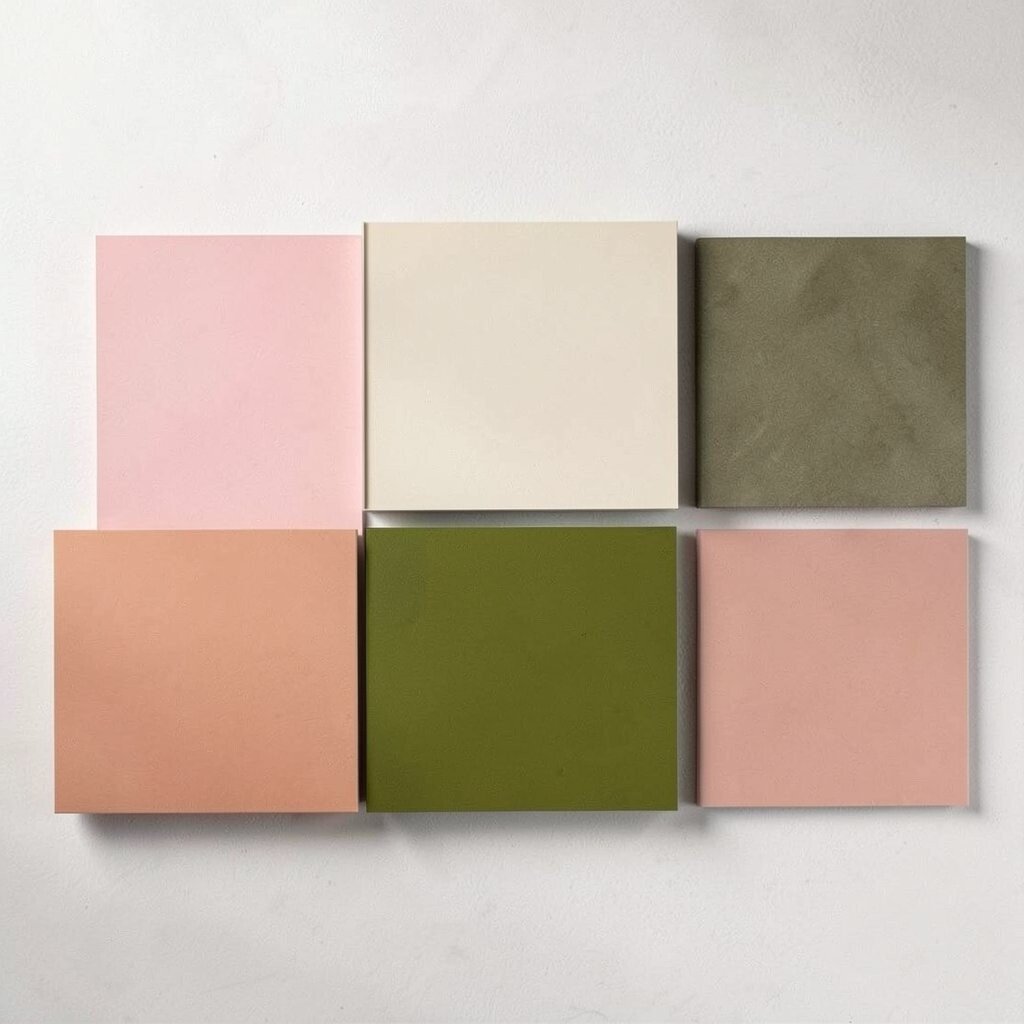
) Warm Rose & Olive Palette: #E9A5A5, #F4EBD0, #6B8E23, #C06C84, #1F2937.
Think soft rose petals paired with olive-green leaves. Warm cream tones create a cozy base, while deep slate keeps it tasteful and readable.
This set is beautiful for wellness brands, stationery, and modern restaurant menus. The olive gives a grounded touch, and the rose keeps it friendly. Use olive for small icons and dividers, then let slate handle the text.
To make it unique, add a “garden” element to your board, like a leaf silhouette or botanical photo strip. Personalize by matching the olive shade to any real greenery in your product images. If you’re watching costs, build the board digitally and only print the swatches plus one layout example.
-
18) Skywire Neon Accent
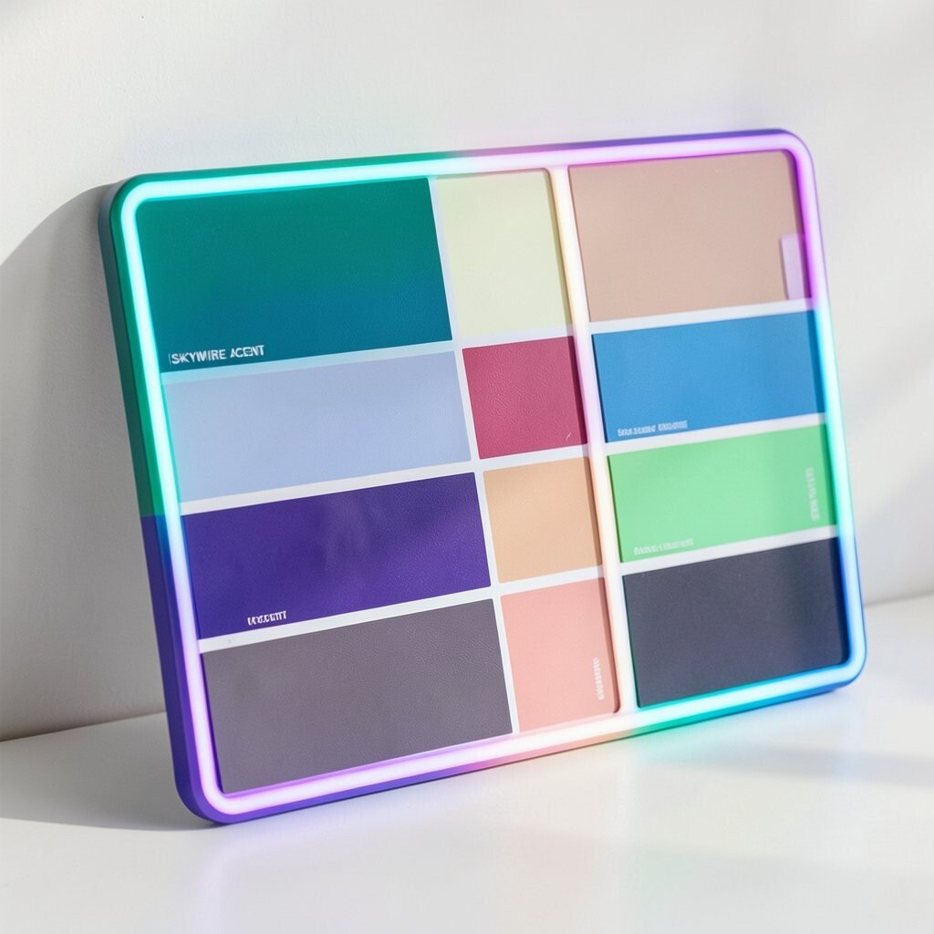
) Skywire Neon Accent Palette: #0EA5E9, #22C55E, #F472B6, #111827, #E5E7EB.
Imagine a clean dark canvas with bright neon-like accents. Sky blue and mint green feel energetic, while bubble pink adds a playful surprise.
This palette works well for gaming content, tech communities, and trend-forward product launches. It creates a strong contrast that draws the eye fast. Use the dark color for backgrounds and keep the neon shades for buttons, highlights, and key icons.
Personalize by setting one accent color for the entire campaign, like only sky blue for links. That way your designs look consistent. For cost considerations, dark backgrounds can be easier on printing because you can use smaller color areas and still look bold.
Trend-wise, neon accents on dark UI are popular, especially in social media graphics. Pair this with simple shapes and clean borders to keep it feeling modern.
-
19) Sandstone Sunset Earth
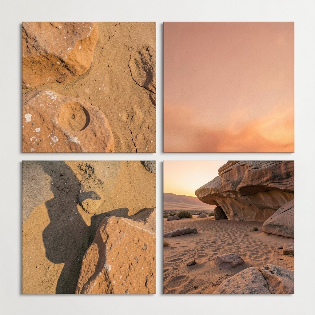
) Sandstone Sunset Earth Palette: #E07A5F, #F2CC8F, #81B29A, #3D405B, #FAF3E0.
Picture sandstone colors with a sunset orange glow. Soft cream and pale gold create warmth, while muted green and deep blue-gray add a calm balance.
This palette fits travel blogs, lifestyle brands, and casual product storytelling. It helps images feel warm and human, especially when you’re showing people or outdoor scenes. Use the deep blue-gray for headings and the cream for backgrounds.
Uniqueness comes from pairing warm colors with one quiet, cool tone like the blue-gray. Personalize by selecting which shade matches your brand’s “main story,” then build the board around that. For cost control, print just one poster mock-up so you can see how skin tones and outdoor photos respond to the palette.
-
20) Monochrome Cool + Teal
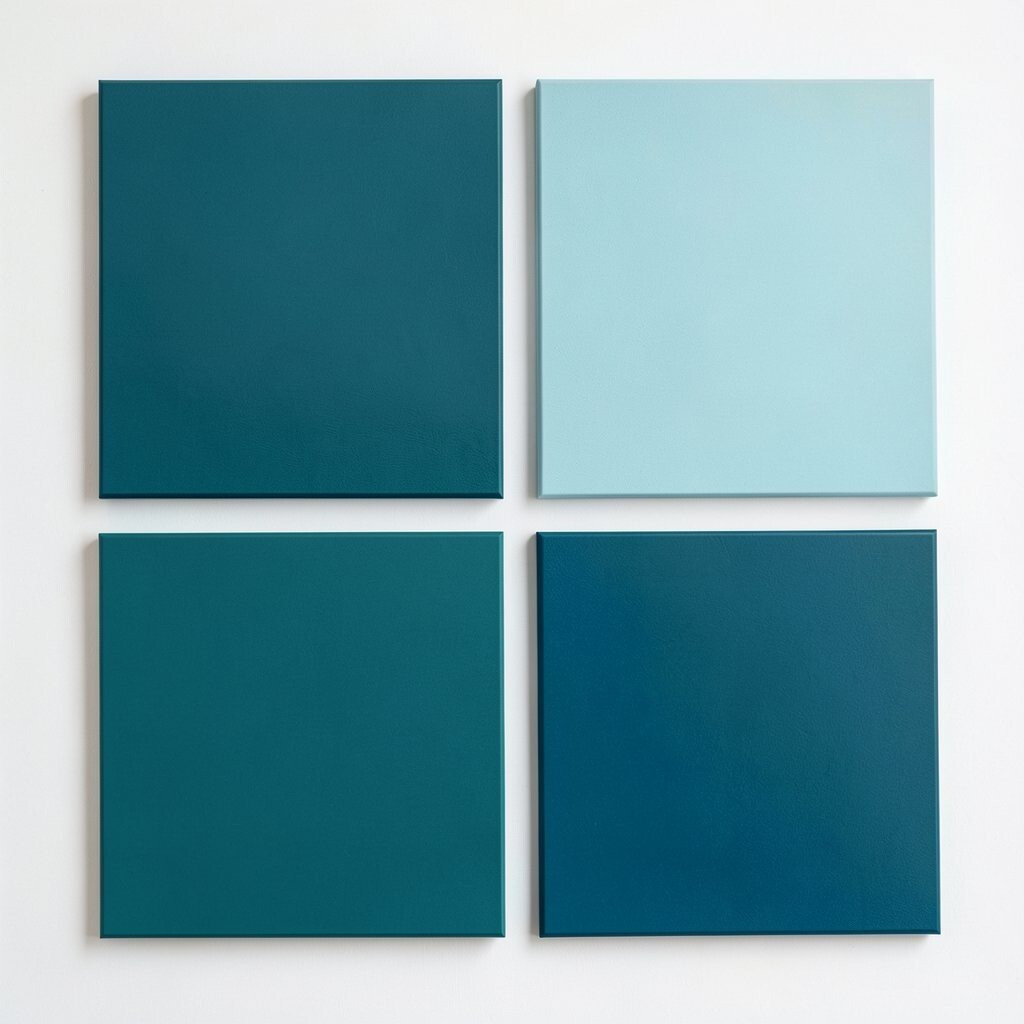
) Monochrome Cool + Teal Palette: #0F172A, #334155, #94A3B8, #E2E8F0, #14B8A6.
Imagine a set of steel and clouds, with teal as the one bright signal. Monochrome blues keep everything crisp, and the teal adds a friendly “spark.”
This palette is great for professional branding, startup pages, and content-heavy sites. It works because the structure is simple, and the teal helps guide attention. Use teal for call-to-action buttons and small icons, while keeping big areas mostly monochrome.
To personalize, try one version with teal mostly in borders and another with teal in backgrounds. Add a sample “feature card” on your board so you can test spacing and hierarchy. For cost considerations, monochrome palettes are often easier to print because they don’t require many distinct inks.
-
21) Coral Reef Candy Blue
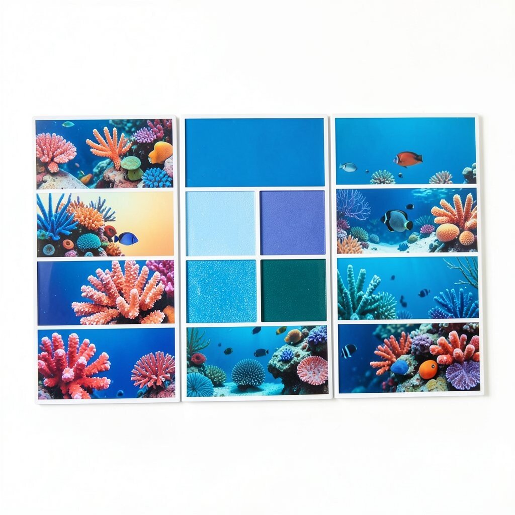
) Coral Reef Candy Blue Palette: #FF6F61, #87F7FF, #4A90E2, #FFF1D6, #1F2937.
Picture coral pink popping next to ocean candy blues. A pale cream background makes it sweet and bright, and dark slate keeps it clean.
This set is perfect for event flyers, summer promotions, and playful services. It feels cheerful, and the blues help balance the warm coral tones. Use coral for headlines and accents, then rely on blue and slate for readable body text.
Uniqueness can come from adding watery shapes, like circles that look like bubbles. Personalize by making one icon style—such as rounded icons—and coloring them with both coral and blue for consistent energy. If you want to keep costs down, avoid heavy background gradients and use flat colors with thin borders.
Trend tip: using bright “reef” colors in combination with clean, modern fonts is popular in social media design. Your board can include a mock carousel so you can see it at real size.
-
22) Royal Ink & Soft Butter
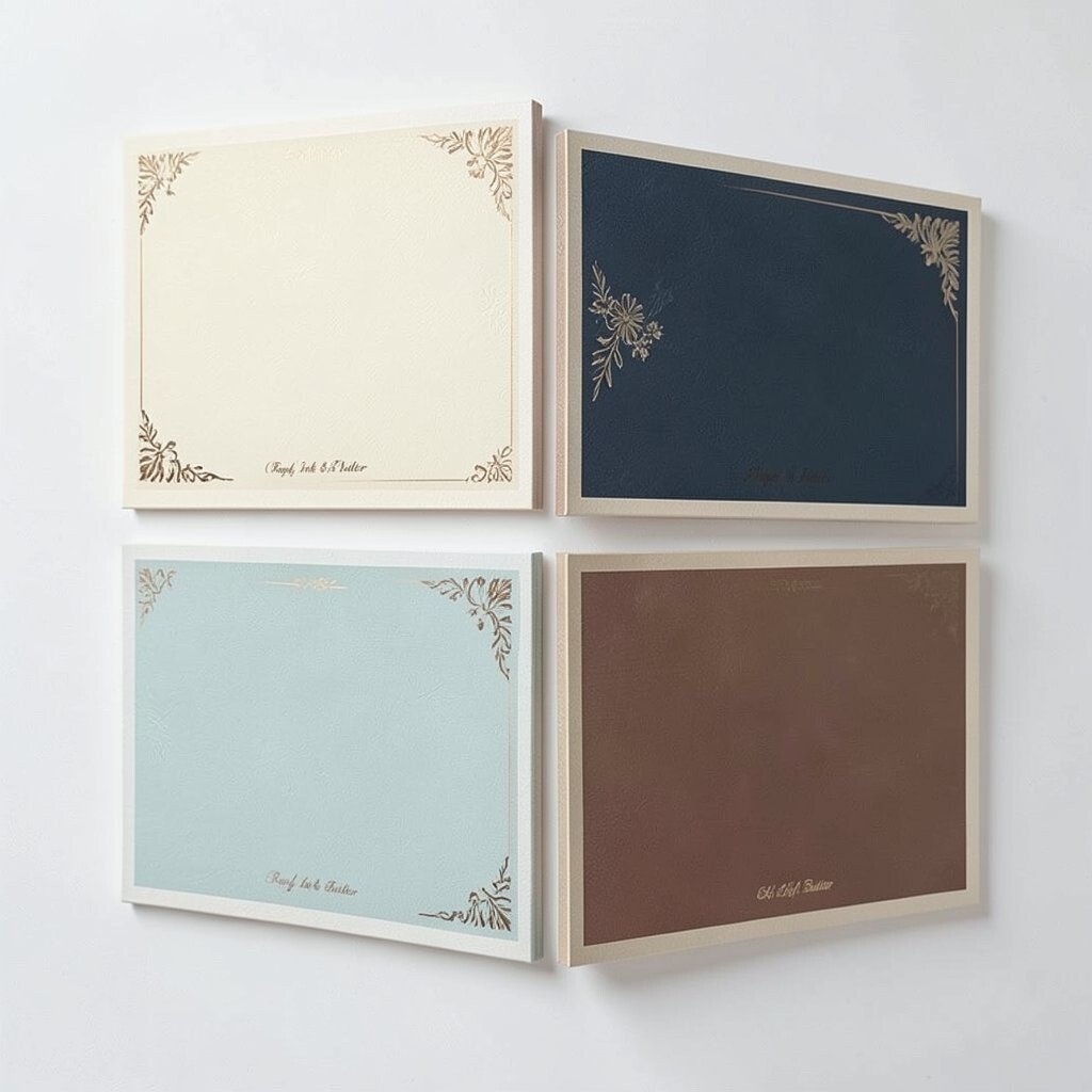
) Royal Ink & Soft Butter Palette: #1D4ED8, #1E3A8A, #FDE68A, #FEF3C7, #0F172A.
Imagine deep royal ink blended with smooth butter highlights. The bright yellow adds warmth, while dark navy brings a dignified, steady feel.
This palette works for education brands, product launches, and professional newsletters that still want charm. It keeps text readable and helps key sections stand out. Use the darker blue for headings and the soft butter for callout backgrounds.
For uniqueness, create a “spotlight” section on your board where only one element uses the bright butter color. Personalize by choosing a logo-ready blue shade that matches your existing brand image. For cost considerations, plan for one main background color and reuse it across pages so printing stays simple.