Plates can be like little art shows. Color helps every bite feel more exciting.
When you choose a palette on purpose, your food looks neat, tastes feel bigger, and guests get curious right away.
-
1. Creamy White + Soft Green + Lemon Yellow
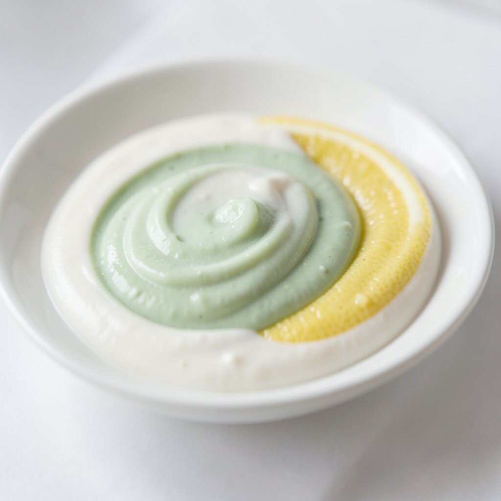
Creamy White + Soft Green + Lemon Yellow This palette feels clean and fresh, like morning light. Think of creamy yogurt, basil leaves, and a bright lemon wedge beside everything.
It works especially well for salads, bowls, and light sauces.To make it pop, keep the greens in one area and add lemon in small spots. Use white space on the plate so the eye can rest.
You can also drizzle lemon zest like confetti for a fun, low-cost boost.For personalization, match the herbs to what you actually have at home. Try parsley for a gentler green or chives for a tiny, crisp look.
This palette stays trendy because people love fresh, “farm-like” vibes. -
2. Deep Red + Roasted Brown + Toasted Orange
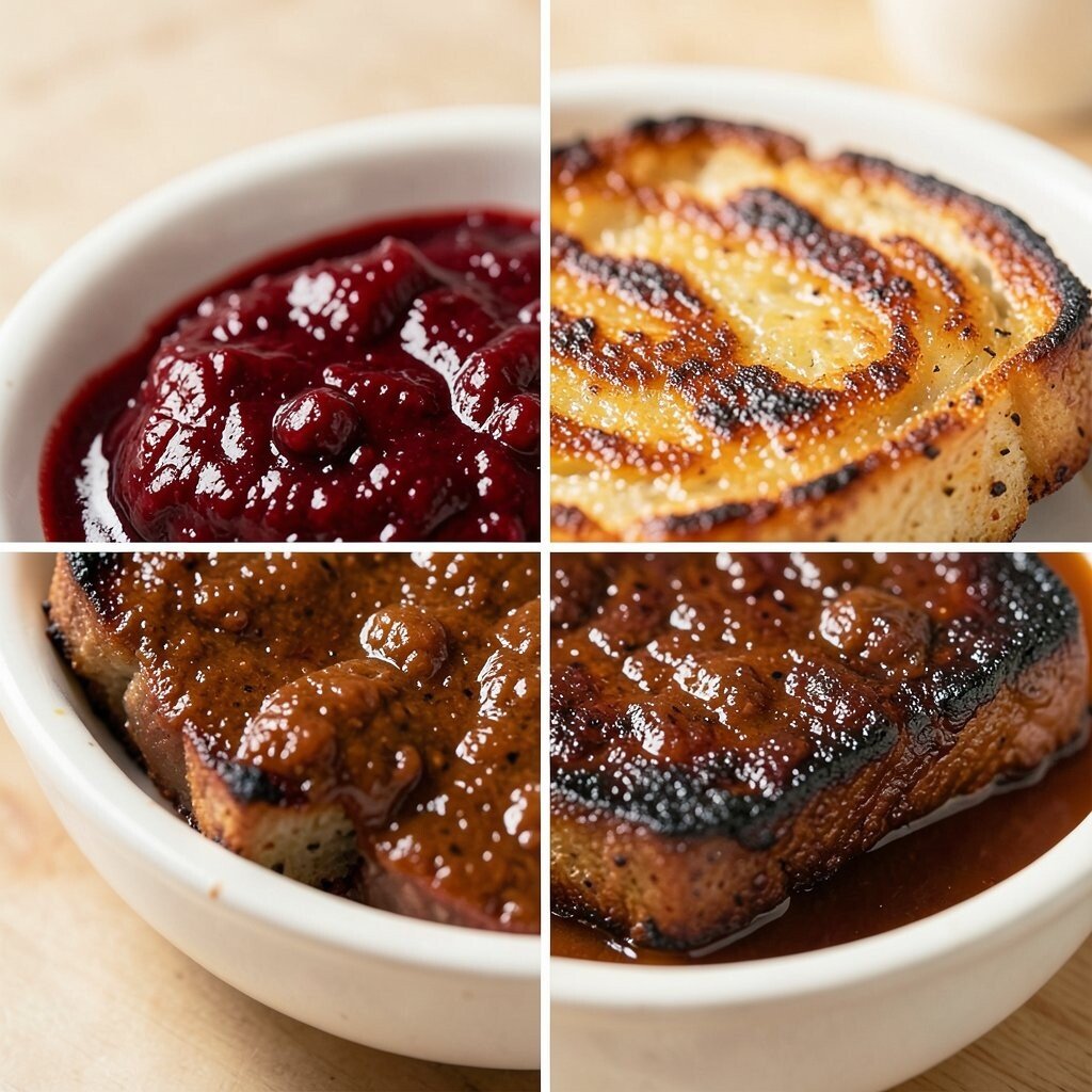
Deep Red + Roasted Brown + Toasted Orange Warm reds and browns look rich and cozy, like a slow-cooked meal. Picture roasted beets, balsamic glaze, and toasted nuts scattered on top.
It makes comfort food feel special without needing fancy tools.For best results, choose one main red ingredient and build around it with brown and orange accents. Add a thin glossy glaze to create shine.
Try using pomegranate seeds or paprika to bring orange warmth.Personalize by going seasonal: use cherries in summer or roasted squash in fall. This palette is budget-friendly because many brown tones come from pantry spices and roasted leftovers.
Current trends also favor bold sauces, so a careful drizzle goes a long way. -
3. Ocean Blue + Seafoam + Pearl White
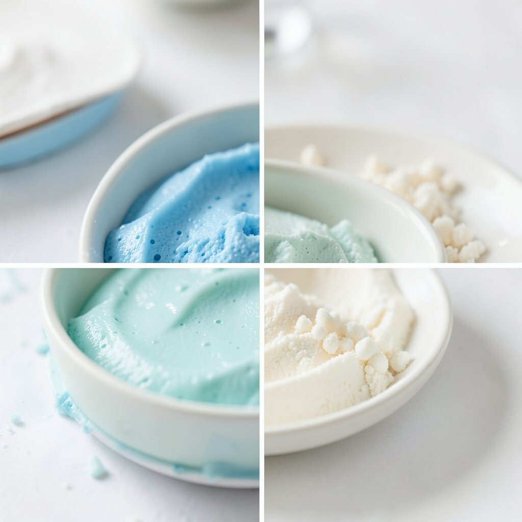
Ocean Blue + Seafoam + Pearl White This palette is calm and cool, like a beach morning. Imagine blue-tinted berries, seafoam herbs, and pearly rice or potatoes.
It’s perfect for seafood plates, sushi-style bowls, and light appetizers.Keep the blue muted by using blueberries, butterfly pea tea, or lightly colored syrups. Add seafoam with cucumber, mint, or avocado.
Finish with pearl white using a smooth base like cauliflower mash or coconut rice.Uniqueness comes from contrast: place the blue in a small “center dot” and let the whites spread out. Use a spoon to create gentle swirls so it looks like waves.
This can be cost-effective because herbs and basic grains are inexpensive.If you want a modern touch, aim for “minimal but glossy.” A light oil sheen or a citrus gel can make the plate look like a restaurant special.
Pair with seafood sauces that match the cool feeling, like lime and herb blends. -
4. Charcoal Black + Soft Gray + Bright White
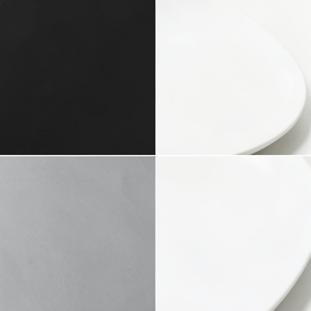
Charcoal Black + Soft Gray + Bright White A black-and-white plate feels sleek and trendy. Try black sesame, grilled mushrooms, or squid ink for dark tones, then add bright yogurt, rice, or grated cheese for white.
The gray can come from olives, smoked salt, or lightly sautéed onions.Use this palette like a designer: keep shapes simple and spacing neat. Add one small bright accent, like a green herb, for a pop.
For cost, black sesame paste or roasted seeds can replace pricier toppings while still looking dramatic. -
5. Sunrise Orange + Golden Yellow + Rosy Pink
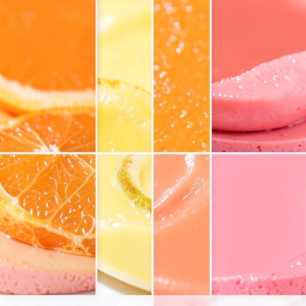
Sunrise Orange + Golden Yellow + Rosy Pink This palette feels joyful, like a warm sunrise. Think mango, roasted carrots, and slices of peach, with a gentle pink sauce or pickled onions.
It’s great for tacos, grain bowls, and sweet-savory snack plates.Balance the colors by keeping orange as the main area and yellow as highlights. Use pink in thin stripes so it doesn’t overpower everything.
A tiny spoon of spicy mayo can add both color and flavor.For personalization, match the “sunset mood” to your spice level. Go mild with peach and yogurt, or add chili and citrus for extra excitement.
This look is popular right now because it feels like social-media food, but it’s still easy at home. -
6. Emerald Green + Avocado + Bright Lime
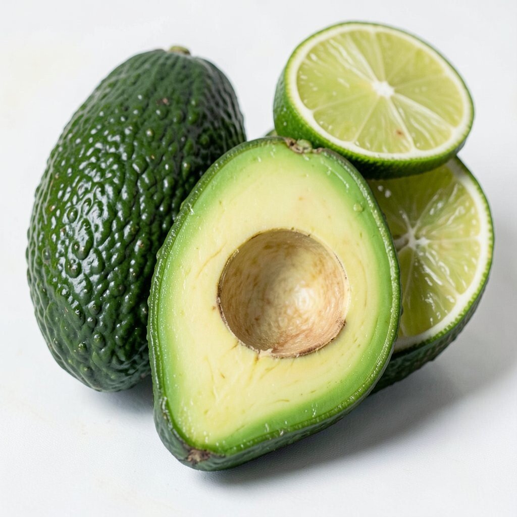
Emerald Green + Avocado + Bright Lime Green can look fresh and powerful when you use different shades. Picture avocado, green herbs, and a lime drizzle over a bright base like rice or noodles.
The result feels lively and healthy.A good trick is to layer textures: creamy avocado, crisp greens, and juicy lime. Add lime zest for tiny specks that catch light.
You can also use cucumber ribbons to make the plate look neat without extra cost.Uniqueness comes from using one “glossy” element, like a lime-herb oil. It makes everything feel more restaurant-style.
Personalize by swapping herbs: cilantro for bold flavor or basil for a calmer, sweeter vibe. -
7. Berry Purple + Plum + Rose Gold
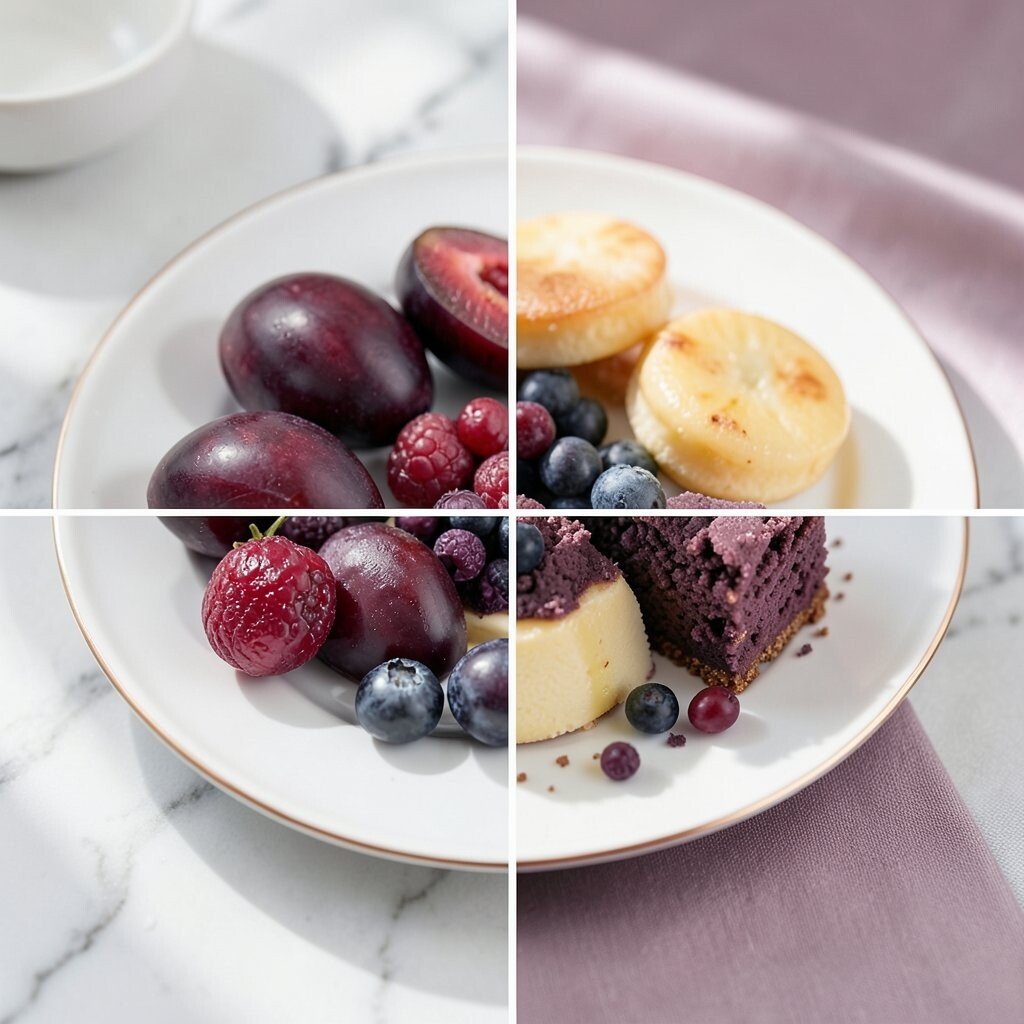
Berry Purple + Plum + Rose Gold Purple tones make food look magical and playful. Imagine blueberry compote, roasted plums, and a rose-colored sauce like raspberry yogurt.
This palette works well for desserts, breakfast plates, and even some savory dishes.Use berry purple as the “center color,” then pull in plum for depth. Add rose gold through edible glitter, rose syrup, or just a swirl of pink berry sauce.
Keep the rest of the plate simple so the purple looks powerful.To make it actionable, start with one fruit you already love and build around it. Frozen berries are often budget-friendly and still look gorgeous.
The trend of “juicy fruit swirls” is everywhere, and this palette fits it perfectly.Personalize with a crunchy topping like toasted nuts or granola. The crunch adds a satisfying contrast that guests notice fast.
Add a spoonful in a small pile so the plate stays clean. -
8. Earthy Tan + Sage Green + Warm Olive
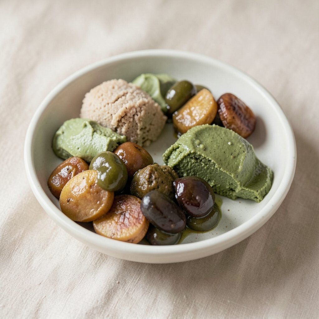
Earthy Tan + Sage Green + Warm Olive This palette feels natural and calm, like an herb garden table. Think toasted bread, roasted potatoes, sage leaves, and olives for warm green tones.
It’s ideal for vegetarian plates and hearty starters.Keep tan as the base and use sage for the “fresh” feeling. Add olive slices or tapenade in small amounts so flavors stay balanced.
For a low-cost upgrade, use herbs you already grow or buy in a small bunch. -
9. Bright Yellow + Tangerine + Fresh Green
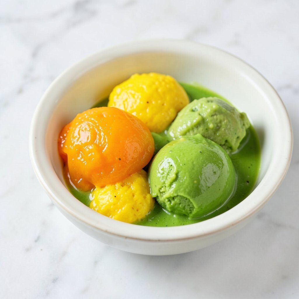
Bright Yellow + Tangerine + Fresh Green Yellow and green always feel energetic and happy. Picture lemon risotto, roasted tangerine slices, and crisp green peas or herbs.
This palette is perfect for brunch bowls, wraps, and sides.Make it look neat by placing yellow in one broad strip and adding tangerine dots. Then sprinkle green on top like a final finishing touch.
A squeeze of citrus just before serving can make everything look brighter.For personalization, control how bold the colors feel by choosing mild or spicy ingredients. Mild flavors make it gentle, while chili-lime adds excitement.
The “bright produce” look stays popular because it feels fresh and simple. -
10. Pink Blush + Soft White + Pale Peach
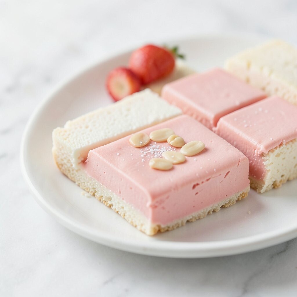
Pink Blush + Soft White + Pale Peach This palette feels sweet and delicate without being boring. Imagine strawberry slices, whipped cream or yogurt, and peach puree swirled lightly on a white base.
It’s also very pretty for charcuterie-style plates.To keep it elegant, use blush as a gentle accent, not a loud cover. Choose one creamy element and one fruit element, then add a few small garnishes.
Fresh mint or edible flowers can make it look extra special.Uniqueness comes from soft gradients. You can do this by mixing fruit puree with a little yogurt to create a smooth “wash” on the plate.
Cost-wise, use what’s in season to keep prices friendly.Personalize with flavor: vanilla and berries feel classic, while citrus and ginger make it modern.
This palette matches current trends that favor soft, “pretty-in-pink” plating. -
11. Sunset Maroon + Dark Teal + Cream
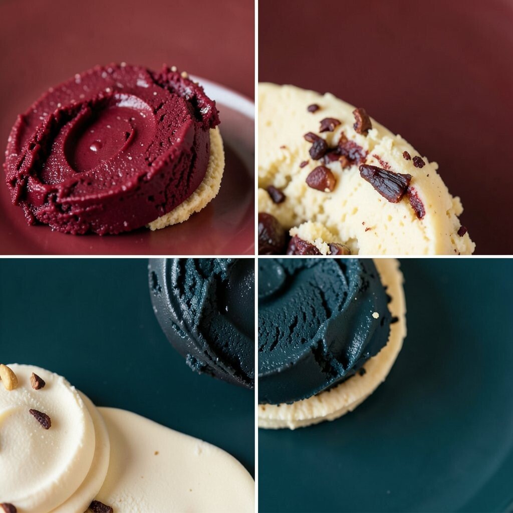
Sunset Maroon + Dark Teal + Cream Dark teal plus maroon looks deep and dramatic. Picture beet hummus, grilled eggplant, and a creamy yogurt drizzle across the plate.
This palette feels fancy even when the food is simple.Choose one rich base (maroon) and one cool accent (teal). Teal can come from roasted cabbage, spirulina, or blue-green sauces used in small amounts.
Use cream to soften the whole look and prevent it from feeling too heavy.Tip: keep the maroon and teal in separate “zones.” Let cream act like a bridge between them so the plate feels balanced.
Personalize by adding crunch with seeds or toasted crumbs.For cost considerations, remember that strong color often comes from spices and simple vegetables. Paprika, beet, and cabbage are usually cheaper than specialty items.
This palette fits the trend of “bold contrast with creamy breaks.” -
12. Sunlit Gold + White + Cocoa Brown
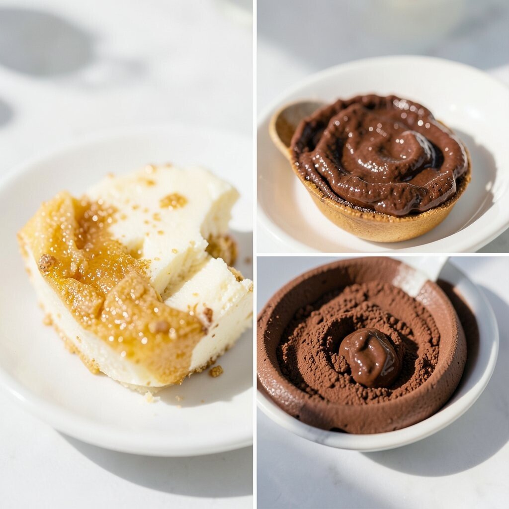
Sunlit Gold + White + Cocoa Brown Gold tones make food look warm and welcoming. Think roasted corn, cheddar cheese, and cocoa-brown elements like toasted spices or chocolate shavings on desserts.
It works for both savory and sweet plates.Use white as the “clean frame,” like a bed of rice, yogurt, or mashed potatoes. Add gold in the center and cocoa brown near the edges for a grounded look.
Sprinkle cinnamon, cocoa, or smoked paprika for brown depth that feels intentional.Personalization is easy here: try using honey for gold and roasted nuts for cocoa tones. Those ingredients are often affordable and easy to find.
Current trends also love golden sauces and glossy drizzles, so a light honey or butter finish looks amazing. -
13. Cool Salmon Pink + Light Orange + White
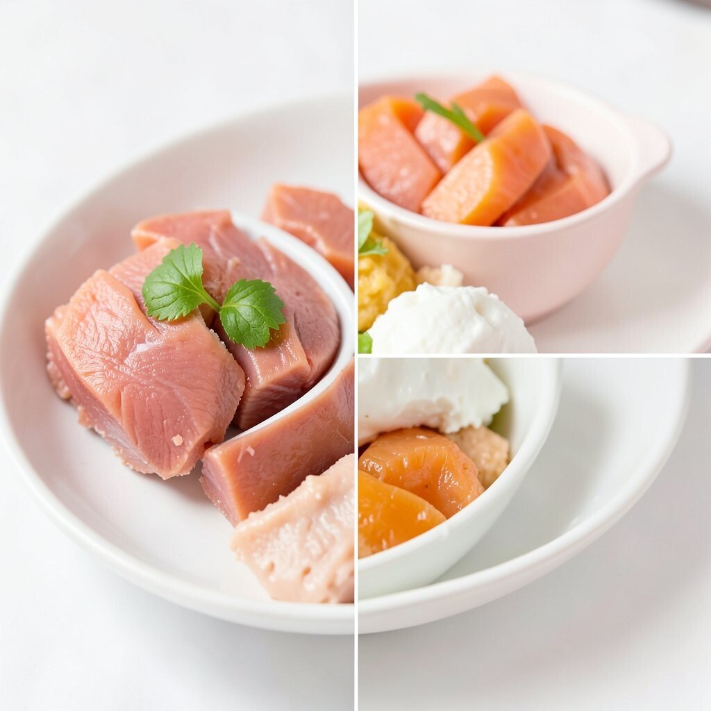
Cool Salmon Pink + Light Orange + White This palette is playful and fresh, with a “frosted” feeling. Imagine salmon-colored sauce, orange zest, and bright white rice or potatoes.
It’s great for fish plates, shrimp bowls, and light salads.To get the look right, keep the white base smooth and even. Then add salmon pink as a main swath, and use orange in tiny bright spots like zest or diced fruit.
A little squeeze of citrus makes the colors look even more alive.Uniqueness comes from choosing one creamy element and one crisp element. Add a crunchy garnish like toasted breadcrumbs or seeds.
For cost, you can make salmon-colored sauces with blended roasted carrots plus yogurt or cream.Personalize with your spice preference. Mild flavors keep it gentle, while chili-orange combos add a trendy kick.
This palette fits current “soft colors with sharp accents” plating styles. -
14. Fresh Green + Black Pepper + Flaky Salt White
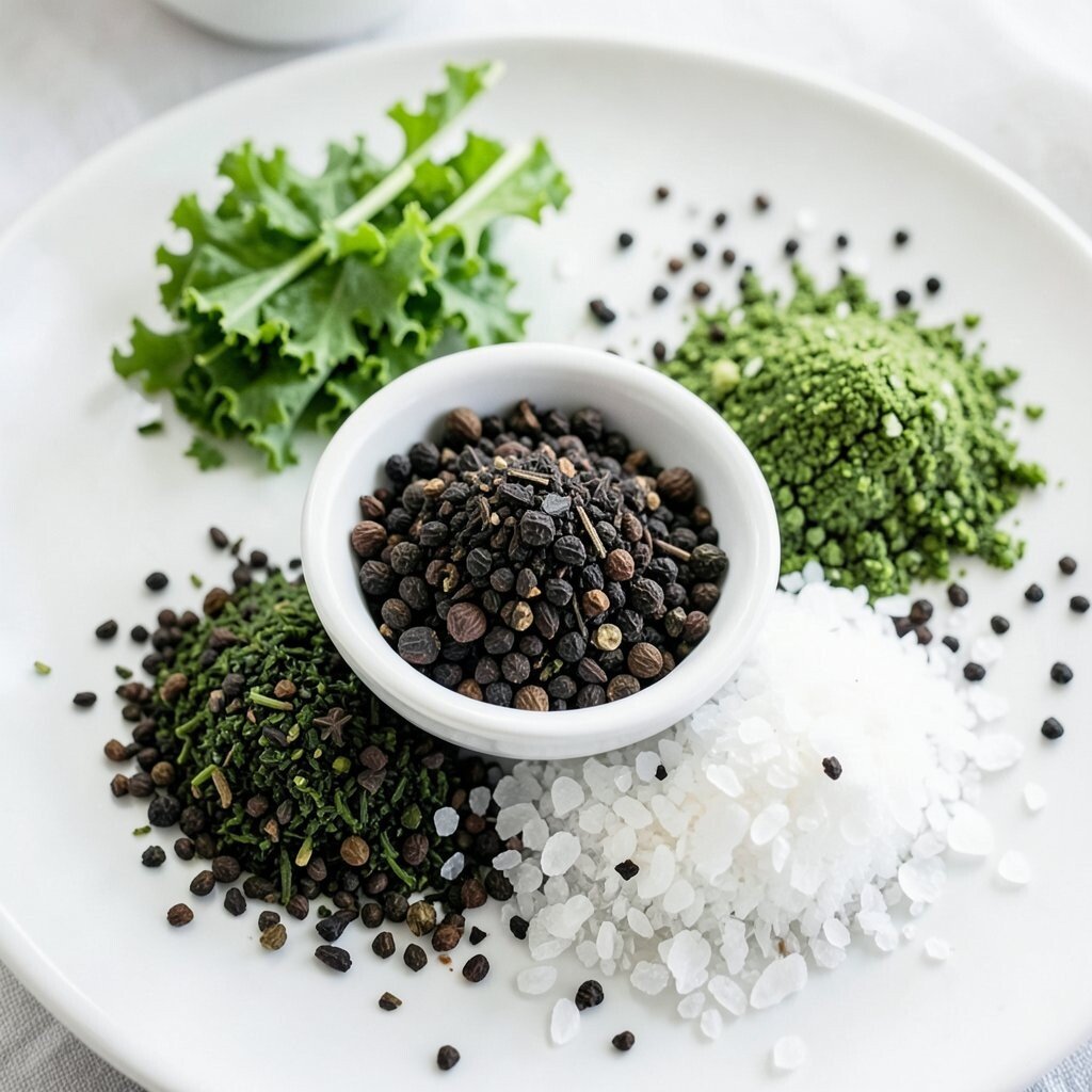
Fresh Green + Black Pepper + Flaky Salt White This palette is simple but powerful because it plays with contrast. Think basil and cucumber, plus black pepper and a sprinkle of flaky salt on top.
It looks clean, modern, and super appetizing.For best presentation, choose one or two green ingredients and then keep the rest minimal. Add black pepper at the very end so it looks fresh and speckled.
Use flaky salt sparingly for a fancy sparkle without extra spending. -
15. Bright Coral + Citrus Orange + Pale Mint
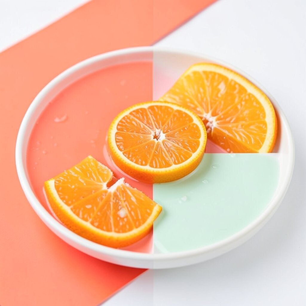
Bright Coral + Citrus Orange + Pale Mint Coral colors feel fun and bold, like a summer cocktail. Picture coral-colored pickled onions, orange citrus segments, and pale mint leaves around a light base.
It’s perfect for snack boards and refreshing bowls.Create harmony by pairing coral with lighter orange and then using mint for the calm finish. Mint should be a few scattered accents, not a full cover.
Add a simple sauce that matches, like orange yogurt or a lime-mint drizzle.Personalization ideas: add a crunchy element like crushed crackers or toasted seeds. This makes the plate feel more interesting in texture.
Cost considerations are friendly too, since mint and citrus are often budget-friendly when you shop smart. -
16. Burgundy + Copper + Creamy Beige
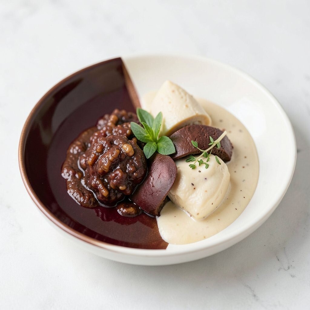
Burgundy + Copper + Creamy Beige Burgundy and copper together feel classy and rich. Imagine braised mushrooms, roasted red cabbage, and a coppery sprinkle like toasted sesame or paprika.
Beige ties it all together with a soft base.To build the look, start with beige underneath, then place burgundy in the middle. Add copper accents like spice powder or a drizzle of browned butter.
Keep portions small and intentional so the plate looks designed, not messy.Uniqueness is easy here: add one shiny element for sparkle, like a glaze made with reduced sauce. Guests love seeing shine because it suggests flavor.
Personalize by choosing how smoky you want it, from mild paprika to deeper smoked spice.This palette also matches current trends in “dark reds” for evening dining. It photographs beautifully under warm lighting.
If you’re watching cost, use vegetables and pantry spices rather than specialty garnishes. -
17. Tropical Green + Yellow Mango + Coconut White
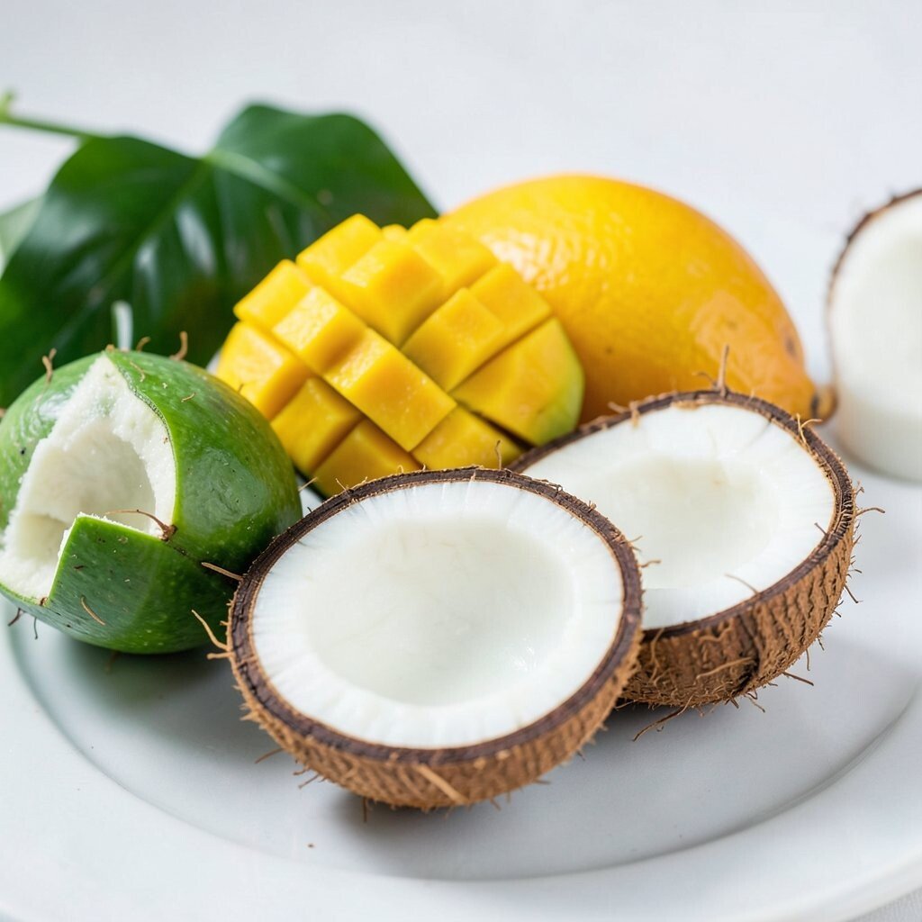
Tropical Green + Yellow Mango + Coconut White Tropical palettes look like vacation food. Think mango cubes, bright green herbs, and coconut white sauce or rice.
It’s wonderful for curry bowls, summer salads, and refreshing starters.Keep the coconut white as a smooth base or creamy drizzle so the yellow mango looks sunny. Add green herbs in a light scatter for freshness.
For a fun tip, use a squeeze bottle or spoon to create small “cloud” dots of sauce.Personalization is great because you can choose your fruit based on what’s ripe. Use mango when it’s available, or swap with pineapple for a similar vibe.
Current trends love tropical flavor combos, and this color pairing makes them feel even more exciting. -
18. Classic Blue + Bright Citrus + Soft Cream
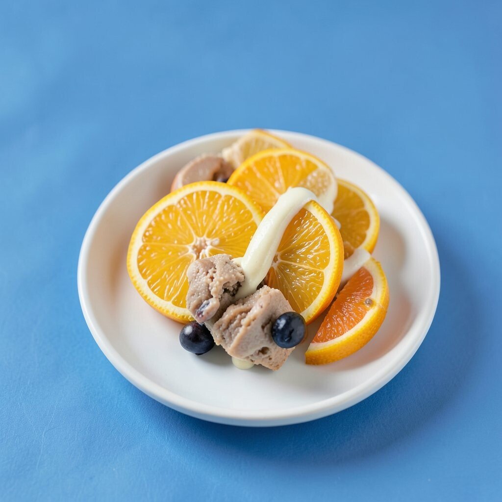
Classic Blue + Bright Citrus + Soft Cream Blue plates with citrus accents can look instantly bright. Imagine blue-tinted berries, orange segments, and a soft cream or yogurt spread.
It feels cool and lively at the same time.To get clean lines, place the cream first, then add fruit on top without mixing it all up. Keep citrus pieces small so the plate doesn’t get crowded.
A quick zest sprinkle at the end adds a fresh look with low effort.Uniqueness comes from choosing a “spotlight” fruit. Pick either the orange or the blue berry as the star, and keep the other as support.
Cost considerations: frozen berries work well and often cost less than fresh.Personalize with flavor pairings like honey, mint, or vanilla. This palette fits modern plating because it looks neat, bright, and photo-ready.
Serve it in a bowl or on a wide plate for a balanced feel. -
19. Olive Olive + Sunny Mustard + Crisp White
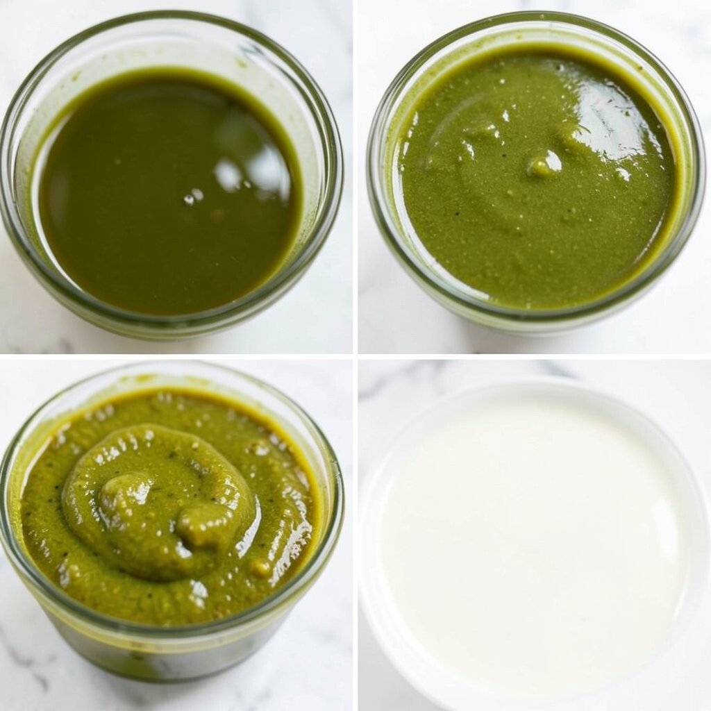
Olive Olive + Sunny Mustard + Crisp White This palette is savory and bold, like Mediterranean comfort. Picture olives and herbs, a mustardy drizzle, and crisp white elements like feta, yogurt, or rice.
It works beautifully for grain bowls, wraps, and grilled plates.Build layers so each color shows up in a clear way. Add olives and herbs for the olive tone, then use mustard in a thin line for a sunny contrast.
Keep white nearby to soften the strong flavors and make the plate feel balanced.For personalization, adjust the mustard style: mild Dijon for classic, or spicy mustard for extra heat. Add crunch with toasted seeds or chopped nuts.
This palette is budget-friendly because you can use pantry-friendly items like olives, mustard, and herbs. -
20. Ivory + Sage + Charred Edge Brown
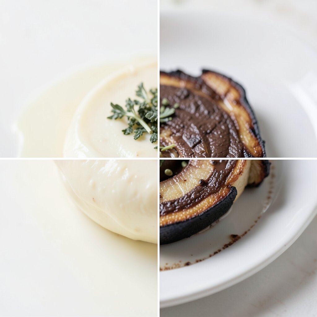
Ivory + Sage + Charred Edge Brown This palette feels calm, like a cozy kitchen with warm lighting. Think ivory rice or cauliflower, sage leaves, and a charred edge from grilled vegetables.
It’s earthy, modern, and great for plated mains.To make it look intentional, keep the ivory base smooth and place sage as small, fresh accents. Let the charred brown show up at the edges so it frames the plate.
A drizzle of olive oil can make the charred parts look richer without costing much.Uniqueness comes from the “edge effect.” Instead of mixing charred and fresh everywhere, put the charred bits around like a border.
Personalize by adding a light herb sauce or lemon oil to brighten the sage.Current trends lean toward natural textures and “chef-y” char marks. If you want a cheaper version, use a broiler or grill pan instead of special equipment.
The contrast between smooth ivory and toasted edges always photographs well. -
21. Rainbow Minimalism: One Bright Color + Neutrals + Herb Pop
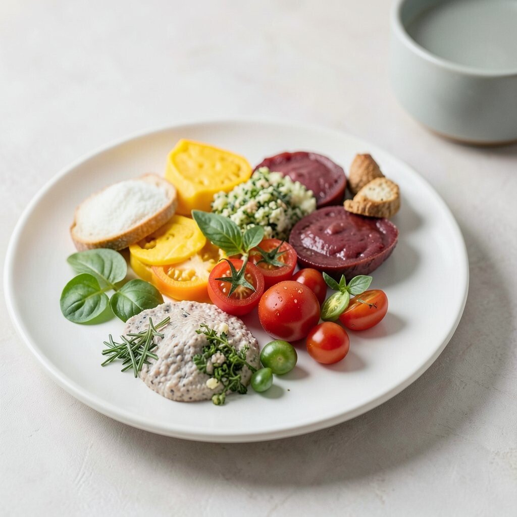
Rainbow Minimalism: One Bright Color + Neutrals + Herb Pop Rainbow minimalism is a smart way to look playful without making a mess. Choose one bright color, like red roasted peppers or bright orange carrots, and pair it with neutrals like rice, bread, or yogurt.
Add just a tiny herb pop so the plate feels fresh and alive.The benefit is focus: one loud color becomes the star, while neutral tones keep it classy. Use the bright color in a shaped pattern, like a line, circle, or swoop.
Then sprinkle herbs lightly so the whole plate looks finished.For personalization, swap the bright star based on what you have. Try beets for red, sweet potato for orange, spinach for green, or purple cabbage for purple.
Cost considerations are great because you can keep most items neutral and rely on one affordable produce choice.