
Color stories can feel like music for your eyes. The right palette can make a design feel warm, familiar, and brand-new at the same time.
This list is packed with festival-inspired palettes that you can use for websites, posters, packaging, and slides. Each entry includes a vivid look, practical benefits, and easy ways to personalize it without spending too much.
1. Holi Powder Glow (India)
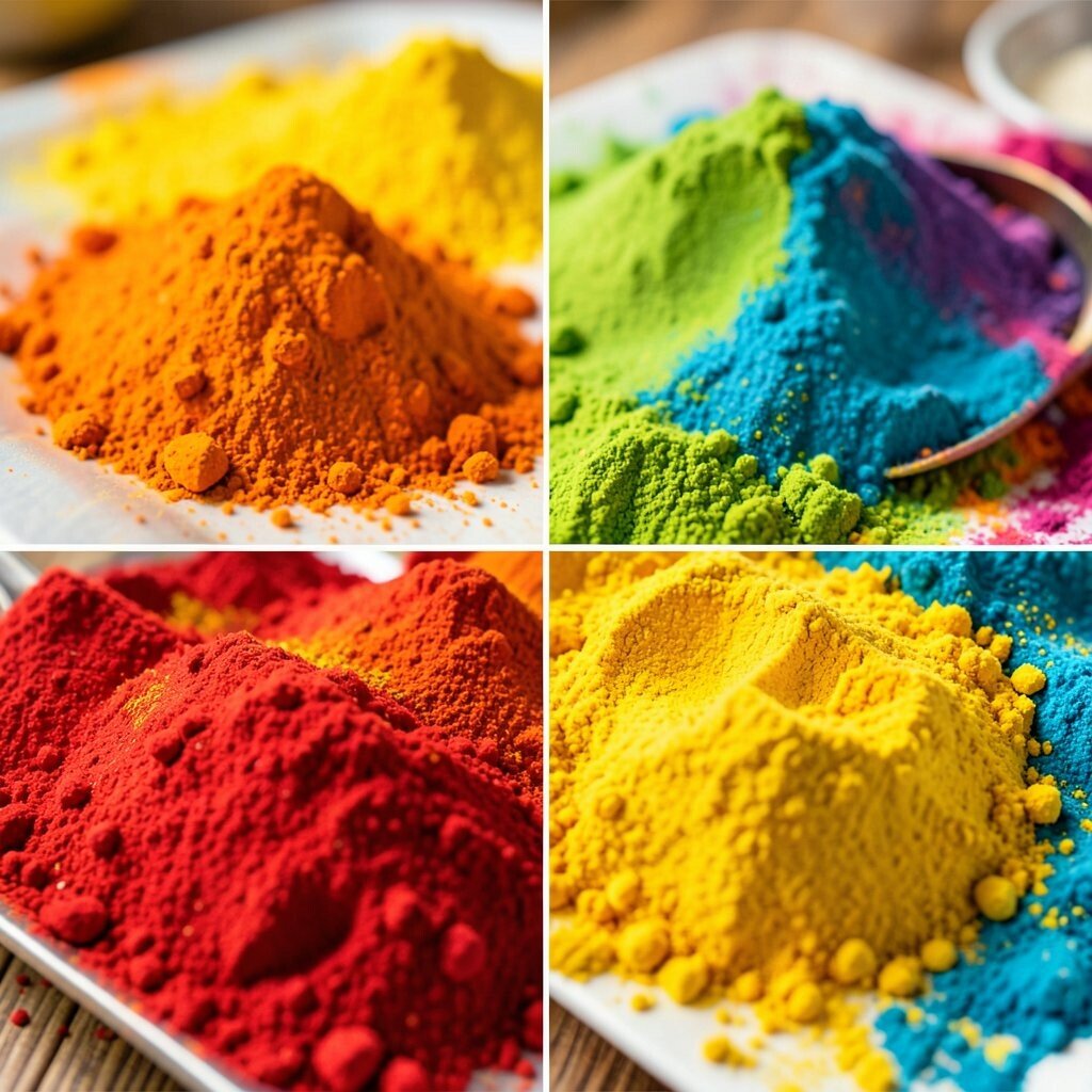
Imagine a burst of vivid color drifting through the air, like pink petals mixed with electric green and sunny orange. Think of a palette that feels playful, energetic, and a little bit magical.
Suggested palette: Magenta #E91E63, Hot Pink #FF4FA3, Vibrant Green #39D98A, Golden Orange #FFA726, Deep Plum #3B1F3A.
The benefits are instant attention and a joyful mood that works well for event pages and product launches.
For a tip, use the dark plum as a quiet anchor so bright colors don’t fight each other.
Personalization idea: swap one bright color with your brand color to keep the festival spirit while staying consistent. If you’re cost-conscious, use fewer colors and rely on gradients made from the same hues, which looks rich without extra assets.
2. Rangoli Geometry Night (India)
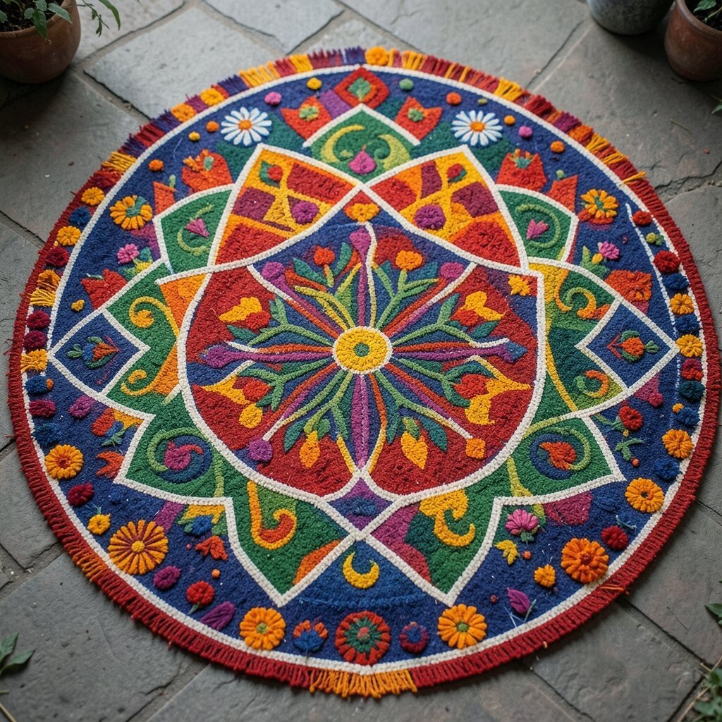
Picture crisp shapes on the ground—thin lines of color forming patterns that look tidy and exciting at the same time. This palette should feel balanced, like a grid that still has room for surprises.
Suggested palette: Ivory #F6F1E5, Saffron #F4B740, Turquoise #1EC9C6, Indigo #3F51B5, Rust #C85A3C.
The benefit here is clarity: it’s great for UI icons, logos, and poster layouts that need structure.
Keep one neutral tone like ivory for text backgrounds and spacing, and place the strong colors only in pattern areas. To personalize, pick one “signature” color that you repeat across the design, such as turquoise in borders, buttons, or illustration accents.
For current trends, try using subtle grain or dotted textures on top of flat fills to mimic festival art while staying modern.
3. Diwali Candle Festival Heat (India)
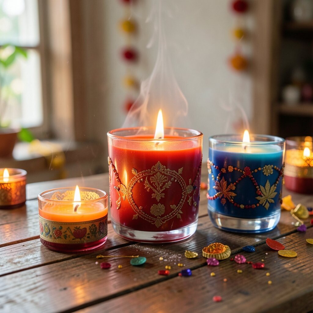
Imagine a row of small lights glowing, each one reflecting warm colors—gold, amber, and soft ember reds. The overall feeling is cozy, inviting, and full of hope.
Suggested palette: Deep Gold #C9A227, Burnt Orange #E56B2E, Amber #FFC44D, Smoky Charcoal #2B2B2B, Marigold Yellow #F9D423.
This palette benefits storytelling because it naturally supports “warm glow” visuals for banners, thumbnails, and holiday sales.
Use charcoal for headings or navigation, then add gold highlights sparingly so your design feels premium instead of heavy.
Personalization idea: include a tiny accent color that matches a real product—like a tea label or candle lid. Cost note: if you’re printing, aim for a small set of inks or use digital-only gradients for shine, which helps keep production budgets under control.
4. Turkish Carpet Rainbow Dance (Turkey)

Think of woven rugs where every thread brings a new color—teal, brick red, bright blue, and warm creams. The vibe is rich and detailed, but still welcoming.
Suggested palette: Cream #F3E7C9, Turquoise Blue #1FA4A7, Brick Red #C94B3B, Deep Cobalt #1E3A8A, Warm Rose #E08A8A.
The benefit is versatility: it can become playful for fun brands or elegant for cultural-inspired work.
Tip: use cream as your main background, then treat reds and blues like “pattern moments.” If you want a modern twist, try a limited gradient that moves between cobalt and turquoise, keeping the woven feel without looking outdated.
5. Carnival Confetti Pop (Brazil)

Picture confetti in the air, catching light in every direction—bold magentas, electric greens, and bright yellows. This palette feels loud in the best way, like a party poster that you can almost hear.
Suggested palette: Electric Green #2ECC71, Magenta #D81B60, Sunflower Yellow #FFC400, Royal Blue #1E5BFF, Night Black #0B0B10.
The main benefit is high energy: it’s ideal for event flyers, stage screens, and social graphics.
Personalize by matching one key color to the brand mascot or logo, then keep the other colors as “support.” For cost considerations, choose two bright colors plus one dark neutral for most layouts, and use the remaining shades only for highlights like stickers or callouts.
6. Hanukkah Oil Light Blues (Jewish traditions)
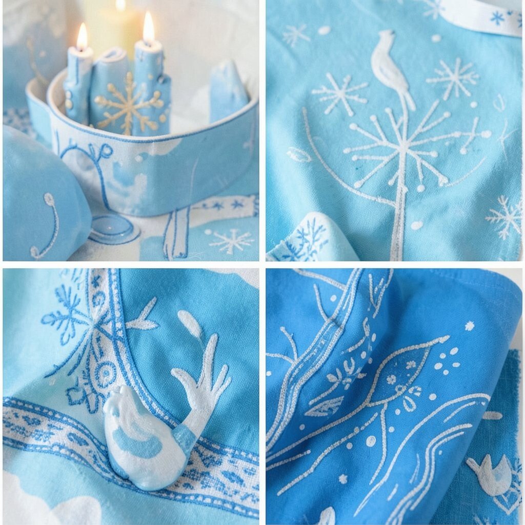
Imagine a gentle night glow with deep blues, soft silvers, and warm gold. It should feel calm, reflective, and still full of celebration.
Suggested palette: Midnight Blue #0B1F3B, Soft Silver #C9D3E1, Candle Gold #D4A017, Deep Navy #08162E, Stone Gray #8C96A8.
This palette benefits readable design because blues and grays provide strong contrast for text.
Tip: use gold only for buttons, important icons, or price tags so it stays special.
7. Sakura Blossom Soft Bloom (Japan)

Think of cherry blossoms floating like soft clouds—pinks that fade into pale rose, with warm creams and light lilacs. The palette should feel gentle, clean, and romantic.
Suggested palette: Blush Pink #F7A1C4, Light Rose #FAD0E1, Pale Cream #FFF2D7, Lavender Mist #D9C7FF, Ink Plum #2D1B2E.
The benefits are calm design and lovely skin-tone-friendly colors for lifestyle photography.
Personalize by choosing one shade as the “hero” and keeping the others lighter for a breathable layout. For a current trend, pair these tones with clean rounded typography and extra white space, so the design feels modern while keeping the blossom mood.
8. Diya Rang Glow (Pakistan & South Asia)
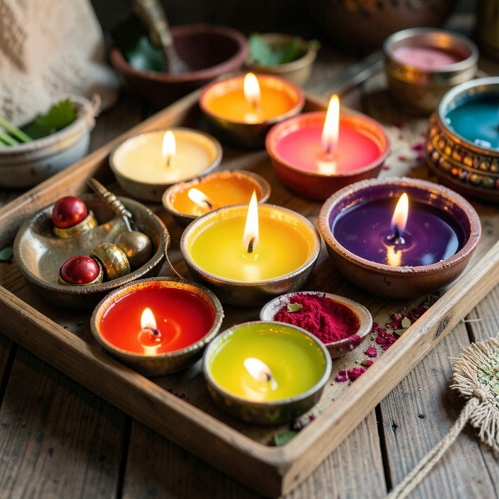
Picture a festival table where saffron threads, copper pots, and marigold flowers sit together. The colors feel rich and warm, like spices and candle smoke.
Suggested palette: Copper #B46A3C, Saffron #F6A21A, Marigold #FFB200, Evergreen #1F6D4A, Deep Night #121826.
This palette benefits festive branding because it supports “glow” illustrations and food-friendly imagery.
Tip: place evergreen as a background or border color so the warm tones look even brighter.
Personalization idea: take colors from your actual props—like tablecloth patterns or wrapping paper—then build a palette that matches real life.
Cost note: you can keep printing costs down by limiting saturated colors to small areas and letting neutrals do the heavy work.
For uniqueness, try adding subtle copper-like highlights using gradients that mimic metal sheen. This gives your work a premium look without expensive special effects.
9. Mardi Gras Jewel Tones (New Orleans)

Think of regal purple, lush green, and bright gold, all tangled together like beads on a string. This palette feels festive, bold, and a little dramatic in the best way.
Suggested palette: Royal Purple #6A1B9A, Jewel Green #0B7A4B, Gilded Gold #D4AF37, Velvet Magenta #C2185B, Soft Cream #F6F1E5.
The benefit is “instant theme”: it helps your design communicate party energy within seconds.
10. Mexican Day of the Dead Contrast (Mexico)

Imagine bold skull art with bright flowers and clean dark outlines—colorful, expressive, and strong. The palette should feel playful but also a little mysterious.
Suggested palette: Crimson #D32F2F, Bright Blue #1976D2, Vibrant Orange #FF6F00, Sunflower Yellow #FFCA28, Carbon Black #111111.
Benefits include excellent contrast for illustrations and strong visibility for posters.
Tip: use black for outlines and typography, then let the warm colors fill shapes like paper cutouts. To personalize, add one flower-like pastel version of a hero color so your palette feels less harsh while staying true to the theme.
Cost considerations: you can achieve a similar look using vector shapes and a limited color set, which keeps edits quick and reduces production complexity.
11. Qingming Spring Meadow Pastels (China)

Picture early spring with soft greens, pale sky blues, and gentle peach blossoms. This palette feels fresh, tidy, and calming, like a slow walk through a garden.
Suggested palette: Spring Green #7ED957, Leafy Mint #A6E3A1, Sky Blue #9AD5FF, Peach Cream #FFD6C2, Soft Charcoal #2F2F2F.
The benefit is friendliness: it works well for wellness apps, school projects, and community events.
Tip: keep the dark color for small text only, and let the lighter tones dominate the layout.
12. Ramadan Lantern Glow (Middle East)

Imagine lantern light pooling on the floor—golden, amber, and softly hazy around the edges. This palette should feel warm and respectful, with gentle contrast.
Suggested palette: Warm Amber #F4B942, Honey Gold #F9D36E, Deep Brown #4A2C2A, Cedar #A65A3A, Night Indigo #1A1442.
Benefits include emotional warmth that’s great for greeting cards, charity campaigns, and lifestyle branding.
Tip: use the night indigo as the background so the gold tones look like real light.
Personalization idea: match the palette to photography by picking the color from your lantern prop or LED background. For current trends, consider adding “glow” effects using lightweight CSS blur on gradients for screens, which can feel modern without heavy design work.
Cost note: these colors are easy to mix with standard design tools, so you can create many shades from the same few anchors. That keeps both design time and printing complexity lower.
13. Oktoberfest Beer & Lederhosen Colors (Germany)

Think of foamy beer, wooden barrels, and festival flags—golden browns, deep greens, and warm reds. The palette should feel hearty and friendly, like a big tent full of laughter.
Suggested palette: Foam Cream #F5F1E6, Oktober Gold #E0B04A, Barrel Brown #8B5E3C, Festival Green #1F6B4B, Brick Red #B23A2E.
Benefits: it works well for food and drink visuals because the tones feel natural and appetizing.
14. Songkran Water Splash Blues (Thailand)

Picture water droplets sparkling with bright blues and lively teals, with sunny highlights that feel like sunlight on streets. This palette should feel energetic and fresh, not heavy.
Suggested palette: Aqua #12C2E9, Teal #14B8A6, Sky Blue #60A5FA, Water White #E8FBFF, Coral #FF6B6B.
The benefits are “clean attention” and easy readability for headlines.
Tip: use water white for large backgrounds and place coral only in tiny details like icons or call-to-action buttons. Personalization idea: choose one teal shade and build a simple gradient from it, so your visuals stay consistent across banners, thumbnails, and social posts.
For cost considerations, keep the palette small and use animated droplets or sparkle overlays on screens instead of complicated illustration packs.
15. Vaisakhi Golden Fields & Sun Greens (Punjab)
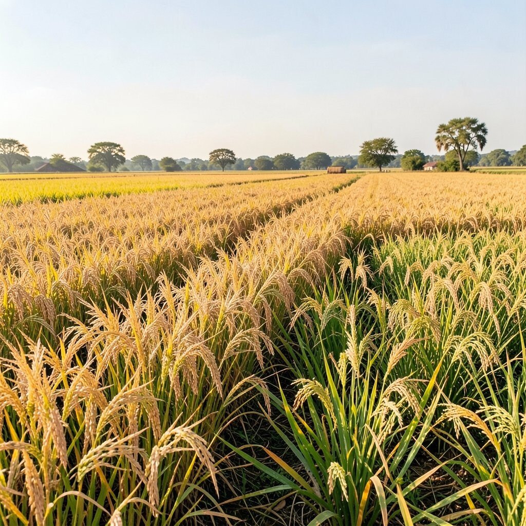
Imagine fields under a bright sun—golden wheat, green leaves, and deep earthy tones that make everything feel grounded. This palette should feel uplifting, strong, and warm.
Suggested palette: Wheat Gold #D8A400, Sunlit Yellow #F6C445, Field Green #4CAF50, Earth Brown #7A4A2A, Midnight Blue #1B2A4A.
The benefits include a strong “daytime” mood that’s great for community events and educational content.
Tip: use midnight blue for text and spacing, then let gold and green do the main storytelling.
Personalization idea: pull one color from a real sari, turban, or banner you like, then keep the others in the same temperature range. For uniqueness, add a tiny amount of earth brown texture like a paper grain so the design feels handmade.
Cost note: you can get a golden-wheat look using simple gradients and overlay textures that are inexpensive to produce. This keeps the palette feeling rich without requiring expensive custom artwork.
16. Independence Day Flag Boldness (Global celebrations)
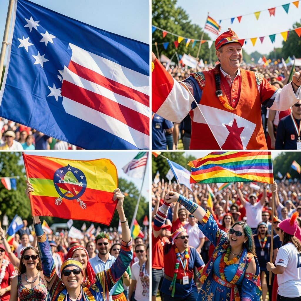
Imagine bold stripes, proud symbols, and sky-bright colors that stand out from far away. This palette should feel confident and clear, like it was made for banners and billboards.
Suggested palette: Sky Blue #3B82F6, Bright Red #EF4444, Deep Navy #0F172A, Sunny Yellow #FBBF24, Off White #F8FAFC.
Benefits: strong contrast makes it easy to read and easy to recognize, which is perfect for public messaging.
17. Nowruz New Day Fresh Tones (Persia & Central Asia)
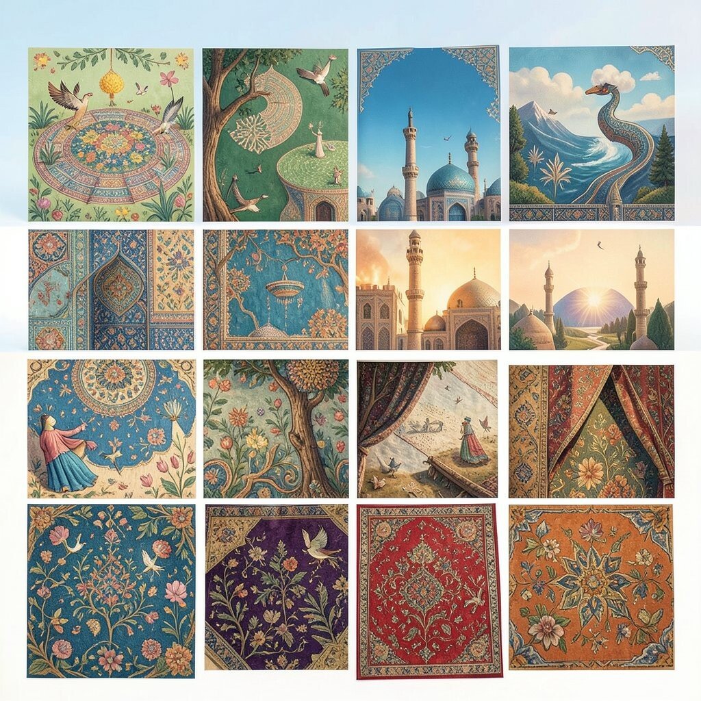
Picture a new beginning with fresh greens, crisp whites, and gentle reds that feel like blooming petals. This palette should feel clean, hopeful, and full of light.
Suggested palette: Fresh Green #2FBF71, Herb Mint #A7F3D0, Soft White #F7FAFC, Rose Red #E85D75, Clay Terracotta #C97C5D.
Benefits: it’s great for modern brands because it looks current, calm, and optimistic.
Tip: use soft white for backgrounds and keep rose red as an accent for key messages like “start” or “welcome.” Personalization idea: add a faint gradient that moves from mint to green to mimic morning air, and keep the rest of the layout simple so the colors can breathe.
For cost considerations, this palette is easy to reproduce using standard digital colors, and it also prints well on many common paper types without complicated color matching.