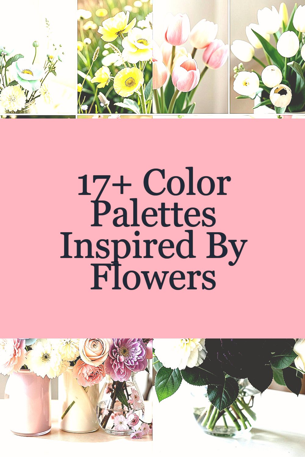
Color can feel like a mood you can wear. When flowers bloom, they quietly teach palettes that match every day you want to brighten.
Pick one palette and your space, outfit, or event will look finished in a way that feels natural and lovely.
-
1. Spring Meadow Pops (Mint, Butter Yellow, Soft Coral, Fresh Green)

Spring Meadow Pops (Mint, Butter Yellow, Soft Coral, Fresh Green) Think of a sunny garden path with little blooms peeking from the grass. This palette feels light, playful, and easy to love right away.
Use it in a vase with daisy-like flowers, tulips, or sweet peas for a gentle “just-bloomed” look. The benefits are simple: bright colors can make spaces feel bigger and mornings feel less heavy. Add a few mint-green leaves or eucalyptus to tie everything together, and you will get a clean, fresh finish.
If you want it to last, keep the stems trimmed and change the water often so petals stay perky. For personalization, match the butter yellow to a ribbon color or napkins, and let coral be the “pop” shade. Budget tips: choose one real flower as a hero (like tulips) and fill the rest with greenery or lower-cost blooms. Right now, people love “fresh garden” styling with lots of airy spacing, so leave room between stems.
-
2. Early Tulip Calm (Blush Pink, Warm White, Sage, Light Peach)

Early Tulip Calm (Blush Pink, Warm White, Sage, Light Peach) Imagine tulips still waking up at dawn, their colors soft and smooth. This palette whispers instead of shouts, which makes it perfect for cozy corners.
Build your arrangement with blush tulips, pale roses, and sage-toned foliage. This choice helps your room feel calmer, and it also works well for portraits and table photos. Try a warm white tablecloth or ceramic vase so the blush and peach look even brighter without feeling too bold.
To make it personal, pick one flower whose shade is the closest match to your favorite sweater. If you want to keep costs down, use one statement stem (like peach tulips) and add filler flowers in warm white. A trend that fits right now is “soft neutrals with a blush twist,” so this palette feels both classic and modern.
-
3. Cherry Blossom Dream (Rose Quartz, Powder Blue, Cream, Dusty Lavender)

Cherry Blossom Dream (Rose Quartz, Powder Blue, Cream, Dusty Lavender) Cherry blossoms don’t just look pretty; they look like a memory of spring. The colors feel dreamy, gentle, and a little bit magical.
Try arranging pale pink blossoms with small sprays of lavender-toned flowers and airy blue accents. This palette can make your home feel romantic, and it often photographs beautifully because the cream tones calm the stronger colors. Use a cream vase or wrap the stems with a neutral ribbon to keep everything cohesive.
For tips, keep your arrangement slightly asymmetrical, like the blooms are drifting in a breeze. Personalize by choosing one shade as your “main” (rose quartz or lavender) and let the others support it. Budget-friendly idea: swap some delicate blossoms for long-lasting dried or faux flowers in matching tones. Current styling favors “soft clouds” in decor, with light blues and creams showing up more in modern homes.
When you pick your palette, aim for a smooth gradient from cream to pink, then to lavender, so it feels layered and elegant.
-
4. Gardenia Nightfall (Deep Emerald, Ivory, Blackberry Purple)

Gardenia Nightfall (Deep Emerald, Ivory, Blackberry Purple) Picture lush gardenia leaves under evening light, then add a dark berry note like ripe fruit. This palette feels rich, dramatic, and still classy.
Use deep emerald foliage, ivory blooms, and small blackberry-purple accents for contrast. The benefit is that it adds depth to a room, making your decor feel more “styled” and less plain. For a unique look, choose flowers with different textures, such as smooth petals paired with small clustered blooms.
Cost considerations matter here: emerald-toned greenery can stretch your budget, since it fills space well. Try mixing one pricier bloom (like gardenia-style flowers) with filler flowers in ivory. Personalize by matching blackberry-purple to candle holders, placemats, or even a small clutch for an event.
-
5. Sun-Kissed Summer Table (Tangerine, Golden Yellow, Sky Blue, Seafoam)

Sun-Kissed Summer Table (Tangerine, Golden Yellow, Sky Blue, Seafoam) This palette feels like lemonade and beach air, bright and cheerful. It brings instant energy without being harsh.
Style it with sunflower-like blooms, orange zinnias, and touches of blue flowers or blue glass around the vase. The benefit is that it creates a “happy center” for lunches, birthdays, and casual dinners. Use seafoam greenery or blue-green leaves to keep the brightness balanced.
To personalize, repeat one color across the table, like sky blue in napkins or place mats. On a budget, buy one bold flower (sunflowers or orange blooms) and lean on inexpensive fillers like daisies. For current trends, look for color “mix-and-match” in summer decor, where bright tones are paired with clean whites and natural wood.
-
6. Dandelion Gold & Linen (Old Gold, Linen Beige, Soft Olive)

Dandelion Gold & Linen (Old Gold, Linen Beige, Soft Olive) Some color combos feel like warm light on a Sunday afternoon. This one looks like dandelion sunshine softened by cozy fabric.
Pair old gold blooms with linen-colored backgrounds and soft olive greenery. It makes your space feel welcoming, and it is easy to match with many home styles. The benefit is also practical: beige and olive help hide small imperfections in a rushed arrangement.
For tips, choose a natural-looking container like a clay pot or woven basket. Personalize by adding a thin ribbon in old gold to tie the whole look together. Cost considerations: linen-tones and olive greens are often affordable, so you can save money by using fewer expensive flowers and more greenery. A current trend is “warm cottage” styling, which loves these earthy, sunlit shades.
-
7. Ocean Breeze Blues (Powder Blue, Navy, Soft White, Coastal Teal)

Ocean Breeze Blues (Powder Blue, Navy, Soft White, Coastal Teal) Imagine waves rolling in, then see that calm blue layered with a deeper navy edge. This palette is cool, clean, and refreshing.
Use coastal teal foliage, soft white blooms, and a few navy accents like dark berries or deep blue flowers. This creates balance, so your arrangement feels fresh but not flat. A big benefit: blue shades can make a room feel serene and even help you focus.
Try placing the vase near windows because the natural light makes powder blue look softer. Personalize by matching navy to your dishware or a table runner. If you’re watching the cost, use dark accents sparingly—just a few deep pieces can make the palette feel complete. Right now, “coastal modern” decor is popular, and this palette fits that vibe perfectly.
Keep the color story simple: teal and white do the heavy lifting, while navy adds a confident finishing touch.
-
8. Wildflower Picnic (Coral, Aqua, Fresh Green, Cream)

Wildflower Picnic (Coral, Aqua, Fresh Green, Cream) Bring the feeling of a blanket on grass, with bold petals and playful leaves. This palette feels casual, fun, and full of life.
Build it with coral blooms, aqua accents, and a lot of fresh green stems. The benefit is that it feels welcoming, so it works for everyday decorating and outdoor parties. For uniqueness, mix flower sizes—small clusters with bigger open blooms—so it looks natural, not arranged too tightly.
To personalize, tie the cream color to your plates or a simple tablecloth, then let coral and aqua do the storytelling. Cost tips: choose flowers that are in season for better prices and better freshness. Current trends include “garden chaos, but in a good way,” meaning slightly wild shapes and lots of movement.
-
9. Autumn Maple Warmth (Burnt Orange, Rust, Honey Gold, Olive Brown)

Autumn Maple Warmth (Burnt Orange, Rust, Honey Gold, Olive Brown) Autumn colors make everything feel cozy, even if you’re just setting the table. This palette looks like a warm scarf and a crunchy leaf underfoot.
Use burnt orange blooms, rust-toned flowers, and honey gold highlights with olive-brown greenery. The benefit is that it creates a comforting mood and makes food styling look richer. If you want it to feel unique, add a few textured elements like dried seed heads or warm-toned grasses.
For tips, keep the palette balanced so orange doesn’t overpower the rest. Personalize by choosing a “favorite warm” shade—rust for romance, orange for excitement—and let the others support it. Budget considerations: dried elements can stretch your arrangement, and seasonal flowers usually cost less than off-season blooms. Right now, people love warm “harvest tones” with natural materials like wood and linen.
-
10. Cider Apple Romance (Rosewood, Warm Beige, Cocoa Brown, Soft Gold)

Cider Apple Romance (Rosewood, Warm Beige, Cocoa Brown, Soft Gold) This palette feels like candles flickering near a window, with soft glow in every shade. It looks romantic without trying too hard.
Pair rosewood blooms with warm beige filler flowers and cocoa-brown accents. Add soft gold as a highlight through flowers with golden tones or small warm metallic decor. The benefit is that the colors look elegant in both daylight and evening light.
For personalization, match rosewood to your lipstick shade or a favorite dress tone, then keep beige and brown as your calm base. Cost tips: cocoa-brown accents can be done with low-cost greenery or branches, which saves money while keeping the look rich. A current trend is “warm romantic neutrals,” and this palette fits that perfectly for fall events and dinner parties.
-
11. Late-Season Garden Depth (Mulberry, Deep Green, Cream, Dried Copper)

Late-Season Garden Depth (Mulberry, Deep Green, Cream, Dried Copper) When late-season gardens slow down, the colors become darker and more thoughtful. This palette feels moody, grounded, and a little bit dramatic.
Style it with mulberry flowers, deep green foliage, and cream blooms for breathing room. Add dried copper accents to make the palette look like it has golden dust in the air. The benefit is strong: deep shades make your arrangement feel full and luxurious even when you use fewer flowers.
To keep it actionable, choose one bold mulberry flower type as the hero and then add cream pieces around it. Personalize by selecting copper accents that match your home hardware, like brushed brass or copper picture frames. Budget considerations: dried copper elements can last a long time, which helps you reuse your styling. Current trends also lean toward “antique warmth,” making this palette feel very now.
Try not to overdo the copper; a few touches are enough to give that special glow.
-
12. Frosted Winter Whites (Chalk White, Soft Gray, Pine Green, Pale Silver)

Frosted Winter Whites (Chalk White, Soft Gray, Pine Green, Pale Silver) Winter whites can look clean, calm, and quietly powerful. This palette gives a feeling of fresh snow and frosty air.
Use chalky white blooms with pale silver accents, like metallic ribbon, and pine-green foliage to add contrast. The benefit is that white and gray make everything look neat, which is great if your space needs a “reset.” For uniqueness, use different shapes—round heads and spiky sprigs—so the arrangement looks like winter layers.
Cost tips: choose one main white flower and fill with greenery and evergreen-like stems to reduce spending. Personalize by adding a silver ornament detail to the container or by tying a soft gray bow around the vase. Right now, minimalist winter decor is trending, and this palette fits modern, simple styles beautifully.
-
13. Berry Evergreen Glow (Evergreen Green, Cranberry Red, Cream, Shiny Pine Needles)

Berry Evergreen Glow (Evergreen Green, Cranberry Red, Cream, Shiny Pine Needles) This palette looks like a wreath that got a little brighter from candlelight. It feels festive, warm, and ready for holiday tables.
Combine evergreen greenery with cranberry-red flowers and cream blooms to soften the intensity. Add shiny-looking pine tips or berry clusters for that “glow” effect. The benefit is that it creates a strong focal point, even in simple centerpieces.
For tips, keep the cranberry red grouped in small spots so it doesn’t smear visually across the arrangement. Personalize by matching the red to your mugs, napkins, or gift wrap color. Budget considerations: greenery can be a lower-cost filler, and berries can be seasonal and affordable. A current trend is bold holiday color done with clean neutrals, and cream makes that look feel balanced.
-
14. Winter Spice Tea (Caramel Brown, Cinnamon Orange, Olive Black, Toasted Cream)

Winter Spice Tea (Caramel Brown, Cinnamon Orange, Olive Black, Toasted Cream) Some palettes feel like you could taste them, and this one is like cinnamon steam. It brings warmth to winter days when everything else looks gray.
Use caramel-toned blooms with cinnamon-orange accents, then ground it with olive-black greenery. Add toasted cream for softness so the brown shades don’t feel heavy. The benefit: this palette makes spaces feel inviting, which is great for homes that need cozy energy.
To personalize, choose a container that matches your style—wood, matte ceramic, or even a simple glass jar with a warm wrap. Cost tips: earthy stems like olives and browns can stretch your arrangement, and you can cut costs by using fewer, richer blooms. Current trends include “spiced neutrals,” and this palette matches that aesthetic perfectly.
When styling, place it where the light can hit the warm tones, like near lamps or windows, so it looks extra glowing.
-
15. Spring Green Reset (Fresh Lime, White, Soft Lavender, Pale Yellow)

Spring Green Reset (Fresh Lime, White, Soft Lavender, Pale Yellow) This palette feels like opening a window on a bright day. It is fresh, light, and full of hope.
Use fresh lime foliage, white flowers, and soft lavender accents with pale yellow highlights. The benefit is that green and white together can make your arrangement look crisp, clean, and modern. For uniqueness, add small lavender clusters in just a few spots to create gentle contrast.
Tips: keep the lime tone controlled so it stays classy, not neon. Personalize by pairing lavender with your favorite scented candle or soap color, then repeat white in napkins or linens. Budget considerations: white flowers and greenery can be found widely, so you can spend your budget on one lavender “signature” bloom. Current trends favor “fresh greens” and pastel hints, especially for spring weddings and brunch tables.
-
16. Summer Rose & Lemon (Dusty Rose, Lemon Yellow, Teal, Soft Gray)

Summer Rose & Lemon (Dusty Rose, Lemon Yellow, Teal, Soft Gray) Picture a garden stroll where roses meet citrus light, with teal shadows in the background. This palette feels bright, cool, and flattering in many settings.
Style it with dusty rose blooms, lemon-yellow accents, and teal greenery or small teal flowers. Add soft gray through the vase, ribbon, or filler flowers to keep everything elegant. The benefit is that it works well for both casual and dressed-up events because it is colorful but still balanced.
For personalization, choose whether your hero shade is rose or lemon and keep the other shades quieter. Cost tips: lemon-yellow can be achieved with a mix of affordable flowers or even bright green highlights if you can’t find the perfect yellow blooms. A current trend is “muted color with one sunny pop,” and this palette nails that look.
Try adding a small spray of teal near the base so it creates depth from the bottom up.
-
17. Autumn Night Garden (Peach, Plum, Deep Olive, Antique Gold)

Autumn Night Garden (Peach, Plum, Deep Olive, Antique Gold) Some fall arrangements feel like evening in a cozy greenhouse. This palette blends gentle peach with deeper plum and a touch of antique gold.
Use peach flowers as a soft outer layer, then add plum accents and deep olive greenery to anchor the center. Add antique gold through dried accents, warm-toned ribbon, or metallic details on the container. The benefit: your arrangement will look both playful and grown-up at the same time.
Tips for a stunning look: keep peach pieces airy and allow plum to cluster near the focal point. Personalize by matching plum to a table setting color, like a napkin fold or candle jar. Budget considerations: antique gold can be made with paint, spray, or thrifted decor, so it doesn’t have to be expensive. Right now, many people are trending toward “moody warm palettes” for fall dinners and mantel styling.
When you arrange, think about depth like layers in a painting, from olive base to plum center to peach glow.
-
18. Year-Round Modern Monochrome (Two-Tone Blush, Warm White, Charcoal Green)

Year-Round Modern Monochrome (Two-Tone Blush, Warm White, Charcoal Green) Monochrome can still feel exciting when you use different shades and textures. This palette is modern, calm, and perfect when you want everything to look intentional.
Choose two-tone blush flowers, warm white filler, and charcoal-green leaves to create contrast without bright chaos. The benefit is that it makes styling easy, because you don’t need to juggle many colors. For uniqueness, pick flowers with different petal sizes, like small clusters paired with larger blooms, so the arrangement stays interesting.
To personalize, match the blush depth to your home’s main wall tone, then repeat warm white in linens or candles. Cost tips: working monochrome helps you shop smarter because you can buy fewer varieties and repeat what you find. A current trend is “quiet luxury” in decor, where subtle shading looks expensive without being complicated.
If you want extra pop, add one small matte-black detail like a vase label or a minimalist ribbon knot.