Color can act like a happy spark in your day. Pick the right mix, and your ideas start feeling bigger.
1. Lemon Soda & Sky Blue
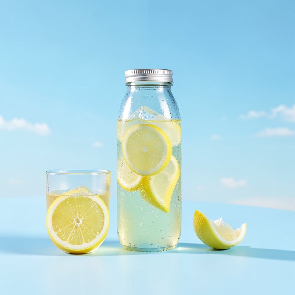
This palette looks like a cold drink on a hot afternoon. A bright lemon yellow pops beside a friendly sky blue, and it feels clean, light, and cheerful.
Use it for flyers, playful websites, or a kid-friendly classroom corner. The benefit is that the colors feel optimistic and easy to read.
For a tip, keep the lemon as the accent and let the blue do the background work.
Want it to feel more grown-up? Try softening the lemon with a slightly muted chartreuse and adding white for breathing room.
For personalization, match the yellow to your favorite fruit scent or your brand mascot.
If you want cost control, choose one strong yellow paint or one bold digital color, then reuse it across multiple items.
2. Berry Punch & Soft Cream
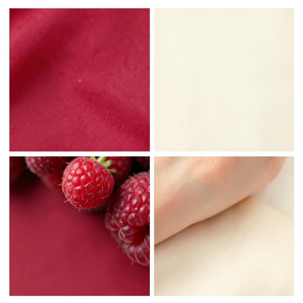
Think juicy berry tones paired with a calm cream base. The result is cozy, fun, and still classy enough for presentations.
It shines in invitations, packaging labels, and social graphics that need a warm welcome. Berry shades add excitement, while cream helps keep text readable.
Try this trick: keep large blocks in cream and sprinkle berry only where you want attention. Add a thin dark outline (like cocoa brown) for extra clarity.
Personalize by using one berry shade that matches your favorite berry dessert.
For trends, many brands are leaning into “soft food colors,” so this combo fits right in.
3. Watermelon Zing & Minty Green
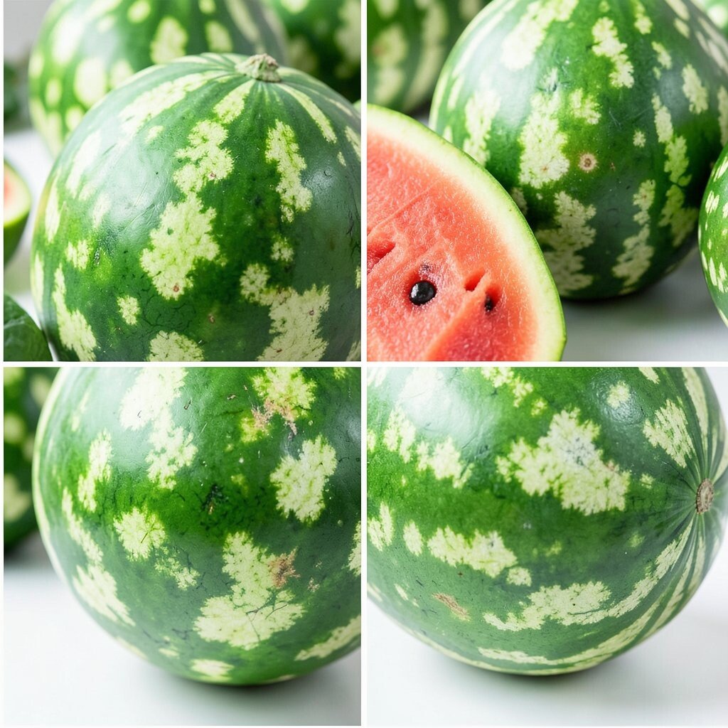
This set is loud in the best way. Watermelon pink and juicy red feel energetic, while mint green cools everything down like fresh air.
It works great for product launches, event banners, and sports-themed designs. The benefit is balance: bright excitement with a gentle, refreshing counter-tone.
To keep it tidy, use mint as the main background and let watermelon do the highlights.
If you love customization, pair the mint with a patterned texture that reminds you of swirly ice cream. In digital work, you can match the mint to a “hero” button color.
For cost considerations, this palette is easy to reuse because you can keep mint the same across many designs and only change the pink shade.
4. Sunburst Orange & Deep Teal
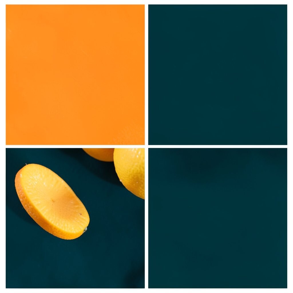
Orange feels like a cheerful “yes,” and teal adds a cool, modern edge. Together they create a bold look that still feels playful.
This mix is fantastic for app screens, posters, and studio branding where you want energy without chaos.
For tips, make teal the background and use orange sparingly for buttons, icons, and headlines. The benefit is strong contrast, so people can scan quickly.
Want a unique twist? Add a tiny accent of bright white or light sand so the colors feel crisp.
If you’re building a budget, choose one vivid orange and one teal that you can print or apply easily.
Current trend-wise, teal-and-orange is popular in creative tech looks, and it often feels “fresh” on modern layouts.
5. Grape Jelly & Pearl Gray
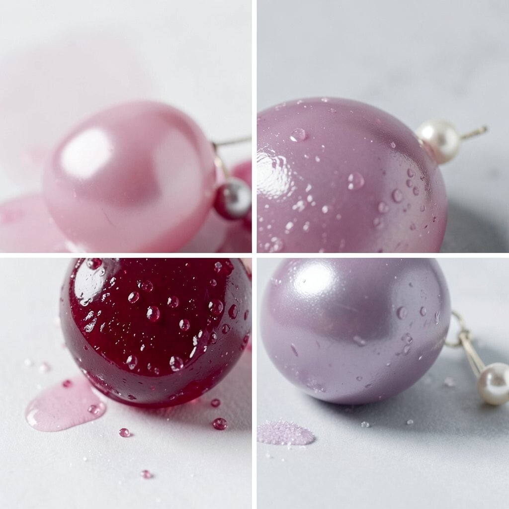
Purple can feel magical, especially when it’s paired with soft gray. This palette looks like grape jelly spread over toast, with a clean, calm finish.
It’s playful, but it doesn’t shout, which makes it great for friendly brands.
Use it for blogs, community groups, or product pages that need a gentle personality. The benefit is that gray keeps things organized while grape brings fun.
Personalize by selecting a grape tone that matches your mood: light lilac for calm, deep violet for bold. For design tips, keep paragraphs mostly on gray and highlight links with grape.
If you’re on a cost-friendly path, gray backgrounds are easy to match with many printers and inks, so you spend most effort on one purple accent.
6. Peach Glow & Navy Night
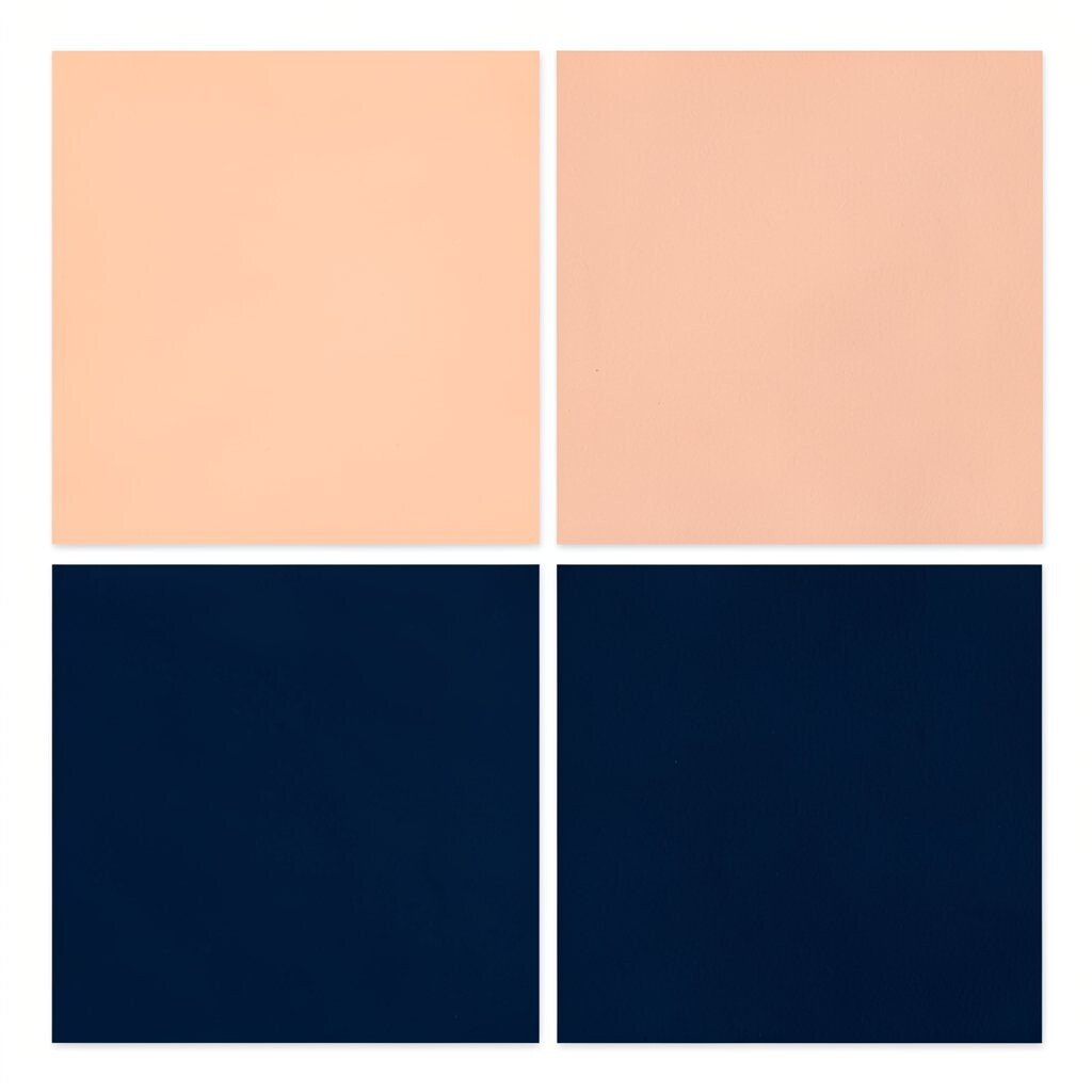
Peach and navy create a friendly contrast, like warm sunset light against a clear evening. It feels welcoming, creative, and a little dramatic.
This palette is great for websites, event schedules, and brand decks. The benefit is that navy helps text stand out, while peach adds warmth.
Tip: use navy for headers and navigation, then place peach as the “spotlight” color for important details.
Want something unique? Add a thin gold accent line, or swap gold for a warm tan if you want a softer look. Personalize by choosing a peach that matches a color you wear a lot.
Cost-wise, navy and peach are practical because you can print them well and keep them consistent across multiple sizes.
Current trends often point to “warm neutrals with bold darks,” and peach plus navy fits that vibe beautifully.
Try it in marketing materials for a look that feels both fun and trustworthy.
7. Mango Pop & Cocoa Brown
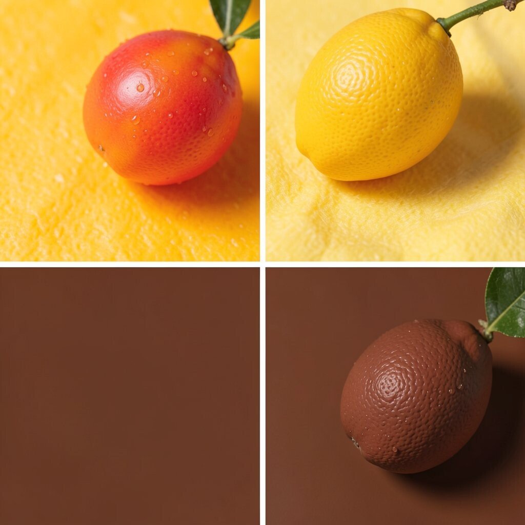
This palette tastes like summer: bright mango energy with a cozy cocoa anchor. The colors feel playful, but the brown keeps the design grounded.
It’s ideal for menus, stickers, educational posters, and craft shop branding. The benefit is clear hierarchy: mango grabs attention, and cocoa makes everything feel finished.
A simple tip is to use cocoa for most text and layout structure, then sprinkle mango for key highlights. Add small icon details in mango so the whole piece feels consistent.
For personalization, choose mango based on your favorite snack color or your brand name vibe.
Cost considerations: brown tones often stretch well across prints, while mango is easiest to keep as a limited accent.
8. Lime Zest & Charcoal Cloud
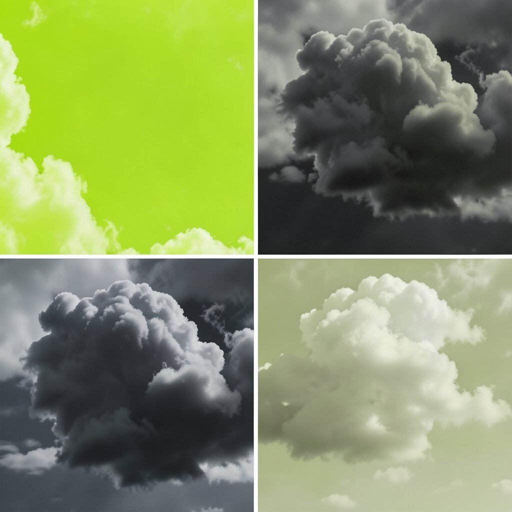
Lime zest looks electric, and charcoal cloud makes it look even cooler. Together they feel modern, lively, and ready for big ideas.
You’ll love it for tech startups, posters, and playful dashboard designs.
Tip: keep lime for badges, callouts, and important numbers, while charcoal supports long text. The benefit is readability plus a fun pop.
If you want uniqueness, add a tiny splash of white to create a “spark” effect.
9. Wildflower Pink & Sky Tint
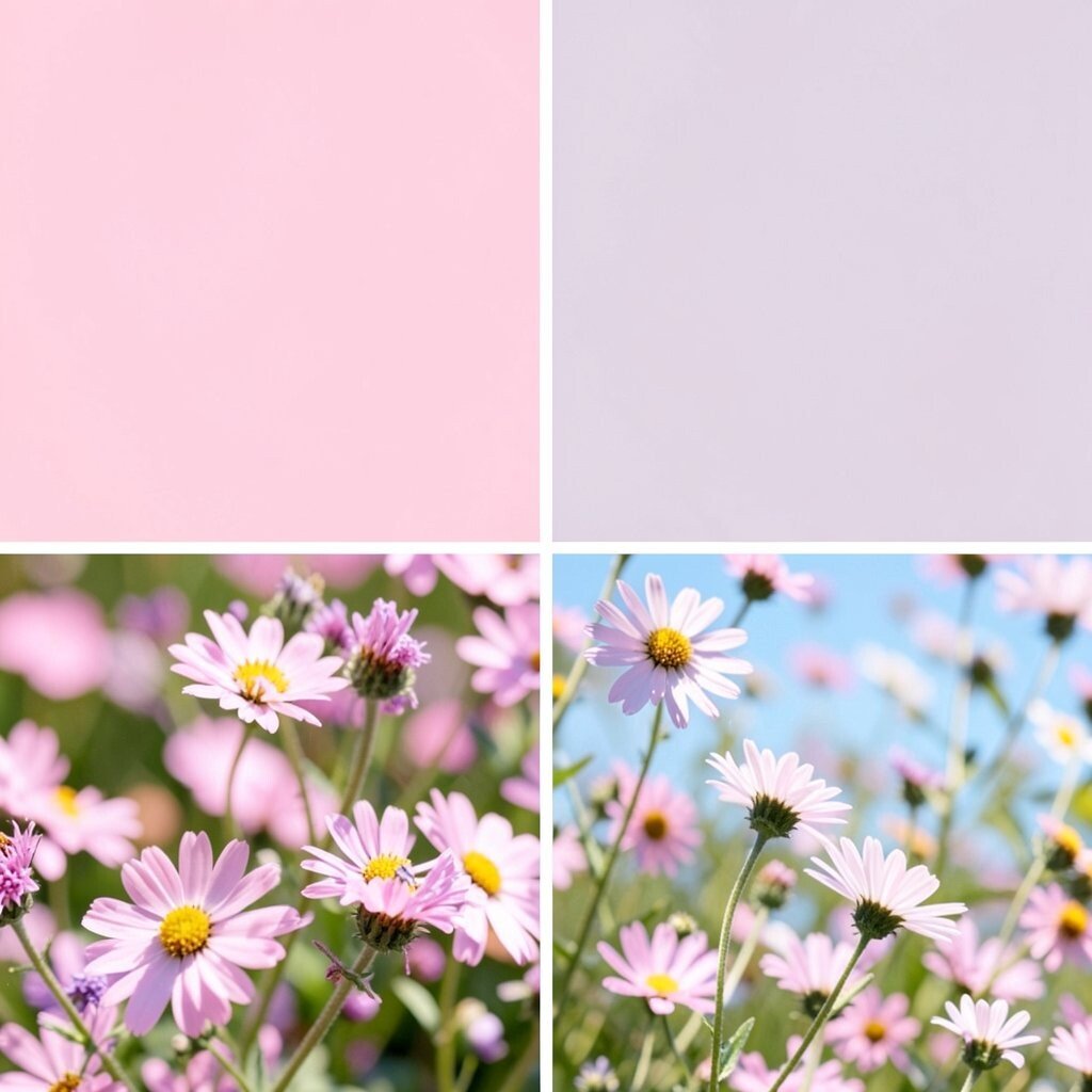
Wildflower pink brings a soft, creative energy, and sky tint keeps it airy. This combination feels like a spring day with fresh air and bright plans.
Use it for wellness flyers, community events, and lifestyle branding. The benefit is a friendly vibe that still feels polished.
For tips, choose one pink as the main accent and let sky tint do the background work.
Personalize by adding tiny details in a coordinating color, like small leaf shapes or cloud-like gradients. In digital design, try pink for hover states and sky tint for cards.
Cost considerations: bright pink can be more noticeable in print, so keep it to headings and buttons to manage ink usage.
Trend note: soft, breathable palettes are popular for “calm marketing,” especially in wellness and coaching.
To make the palette extra personal, match the sky tint to the color of your favorite notebook or stationery.
It’s a small detail, but it makes the whole design feel like yours.
10. Tangerine Cheer & Powder Blue
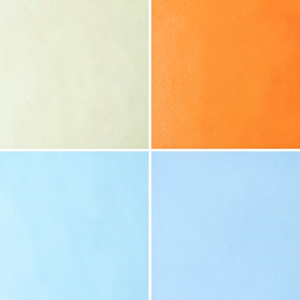
Tangerine cheer is joyful, and powder blue is sweet and gentle. The pairing feels like a sunny craft table with everything within reach.
This palette works well for kid products, family events, and hobby websites. The benefit is a bright mood that helps people feel comfortable.
Tip: use powder blue as the main background and keep tangerine for buttons and headlines.
11. Red Cherry & Misty Lavender
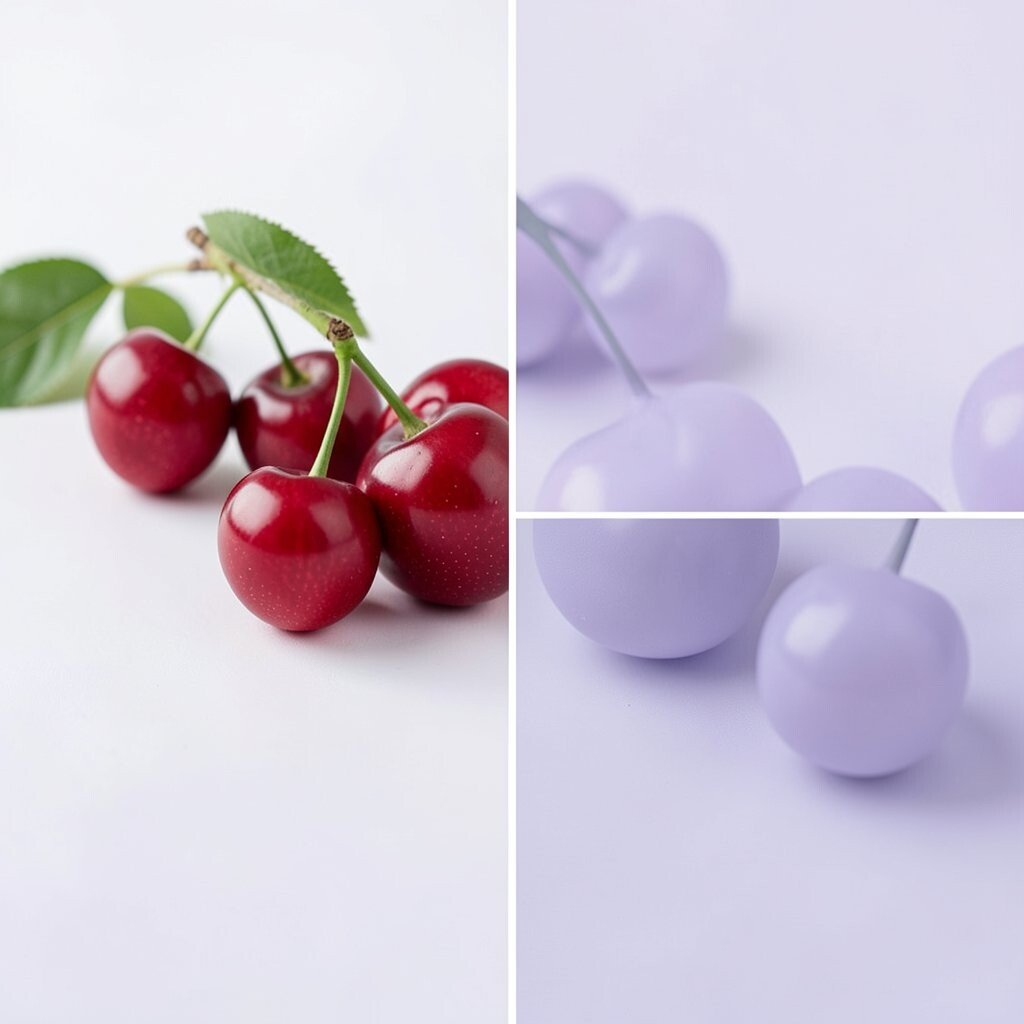
Cherry red feels bold and happy, while misty lavender adds softness around it. This palette is a playful mix of spice and calm.
It’s great for brand identity, playful packaging, and art prints. The benefit is that red creates urgency and lavender keeps the look gentle.
For tips, use lavender as the “stage” and cherry as the “spotlight.”
Personalize by selecting a lavender that matches a fabric you love—like a favorite hoodie color. Add a small line pattern in lavender for uniqueness without adding clutter.
Cost considerations: if you’re printing, choose a cherry red that works well in your printer settings so colors don’t shift.
Current trend: creative brands often mix warm candy colors with light “mood pastels,” and this combo fits that style.
It’s a fun choice when you want to feel playful but still organized.
12. Teal Wave & Coral Blush
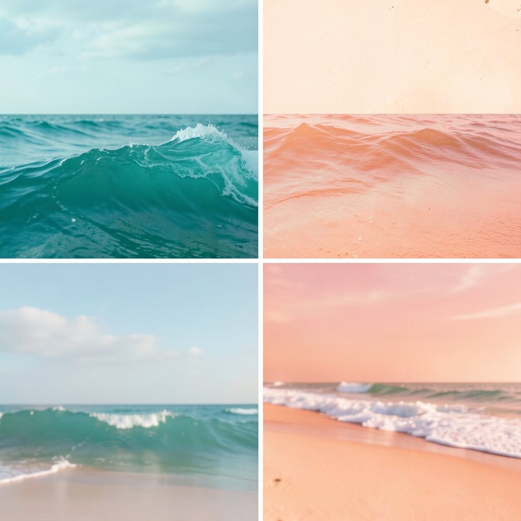
Teal wave is cool and confident, and coral blush adds friendly warmth. This palette feels like ocean color meeting a sunny smile.
Use it for travel pages, music visuals, and creative portfolios. The benefit is it reads like movement, so it fits dynamic content.
Tip: set teal as the background, and use coral for accents such as section headers and icons.
13. Butter Yellow & Slate Green
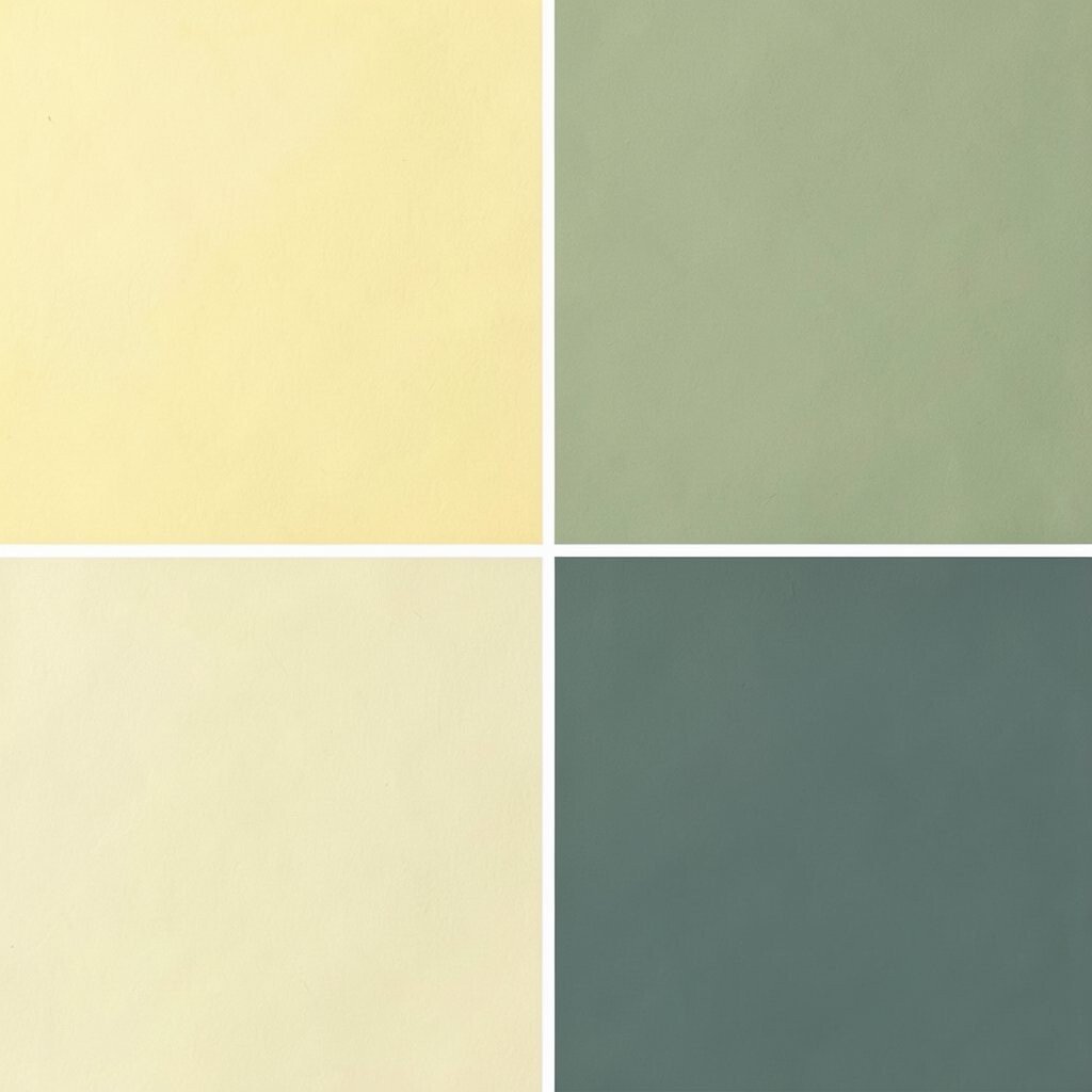
Butter yellow looks sunny and soft, and slate green keeps it calm and natural. Together they feel welcoming and easy on the eyes.
This palette suits cooking blogs, garden projects, and community newsletters. The benefit is a “fresh start” feeling that works for many topics.
Try using butter yellow for highlights and slate green for borders and cards.
Personalize by pairing the slate green with a leaf pattern, or by using a slightly different yellow for different product types.
For cost considerations, greens and yellows can print nicely, but limit the brightest yellow to reduce ink load.
Trend note: nature-inspired palettes are staying strong, especially in eco-friendly marketing.
14. Electric Blue & Soft Apricot
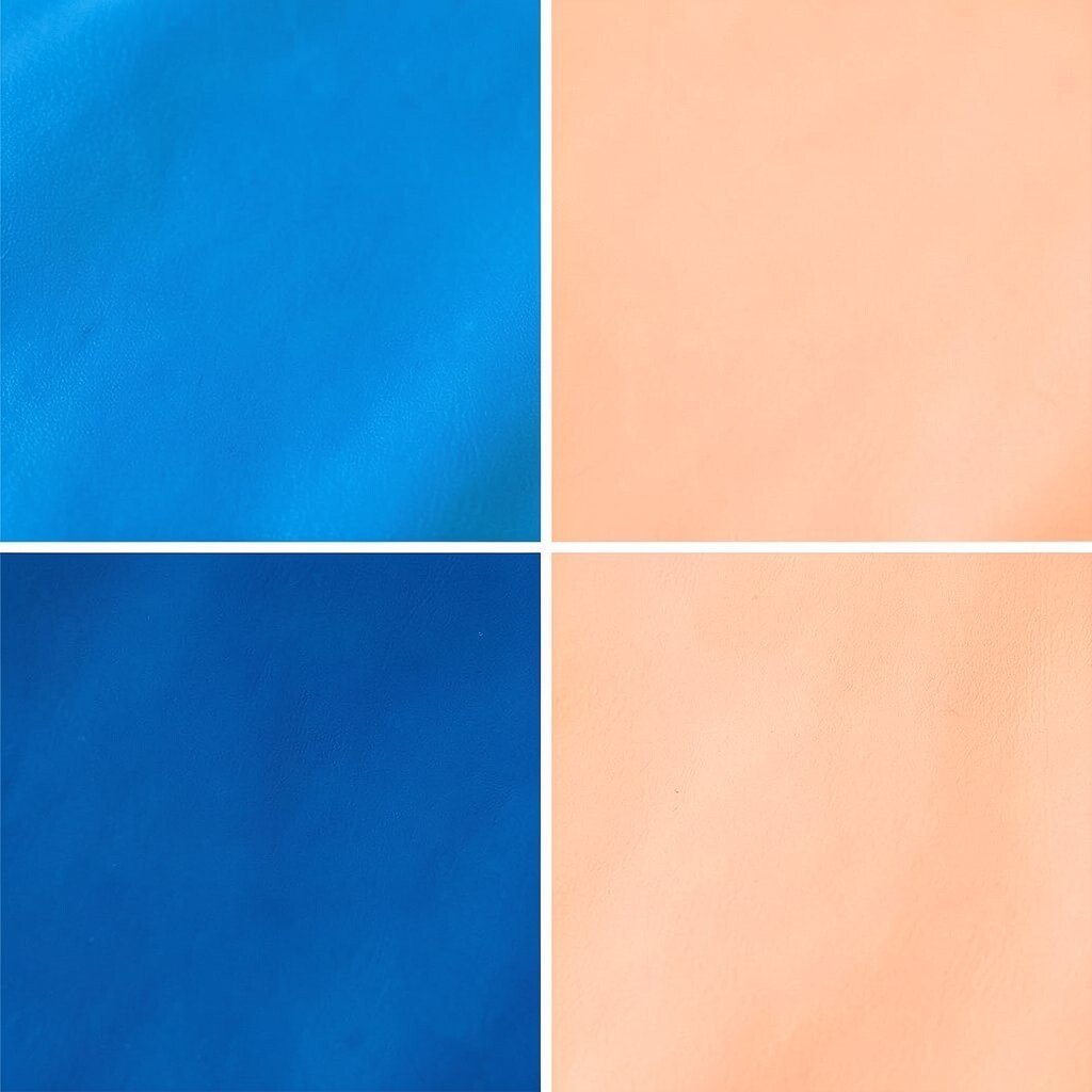
Electric blue is vivid like a blinking sign, and apricot makes it feel friendly. This palette is energetic, but it won’t scare people away.
It’s perfect for modern events, tech workshops, and bold brand headers.
Tip: choose apricot for supporting areas like callout boxes, then use electric blue for key actions. The benefit is clear focus with a pleasant, human touch.
For personalization, you can match apricot to your favorite skin-tone friendly warm shade used in illustrations.
Cost considerations: bright blues may cost more depending on printer settings, so keep the deepest blue for small elements rather than full backgrounds.
Current trends show brands using one “high voltage” color with one warm neutral, and this palette nails that idea.
Add white text or soft outlines to keep the look crisp on screens and paper.
Small tweaks make the palette feel custom and intentional.
15. Rosewood Pink & Sage Shadow
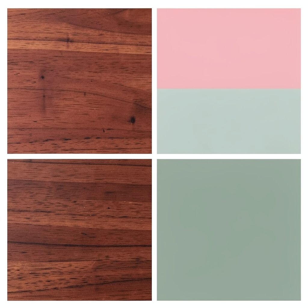
Rosewood pink is romantic and rich, while sage shadow feels calm and earthy. This palette is soft enough for cozy pages, yet stylish enough for branding.
Use it for boutique shops, lifestyle blogs, and wellness brand materials. The benefit is a grounded warmth that feels inviting without being too loud.
Tip: keep backgrounds sage and use rosewood for buttons, headings, and important highlights.
16. Royal Purple & Mint Candy
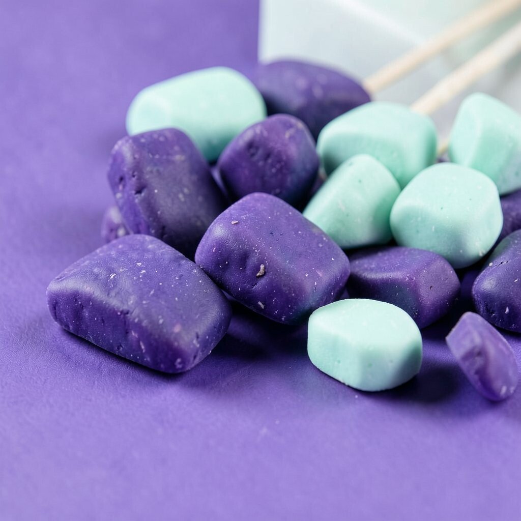
Royal purple brings drama and creativity, and mint candy adds a fun, fresh twist. The combination feels like a colorful candy shop with a classy sign out front.
This palette works well for posters, festival visuals, and creative event pages. The benefit is high attention-grabbing contrast with a playful mood.
For tips, balance the strong purple by using mint for large areas and whitespace.
Personalize by choosing a purple shade that matches your favorite gemstone—amethyst for mystery or deep plum for boldness. Add small “sprinkle” dots in mint to create uniqueness without clutter.
Cost considerations: mint tones usually print clearly, so you can use them as the main background to reduce the number of expensive purple areas.
Trend note: bold jewel tones paired with fresh pastels are showing up everywhere in modern design.
17. Seafoam Green & Lemon Crumb
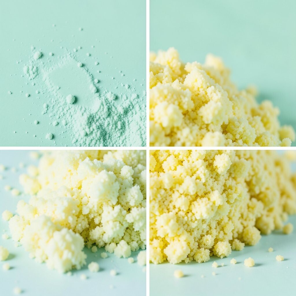
Seafoam green feels light and calm, and lemon crumb adds a playful spark. Together they look like foam on a sunny shore with a sweet hint of dessert.
Use it for menu boards, skincare branding, and friendly product labels. The benefit is a clean, refreshing mood that still feels fun.
Tip: use seafoam for backgrounds and lemon crumb for icons, highlights, and quick labels.
18. Charcoal Grape & Warm Vanilla
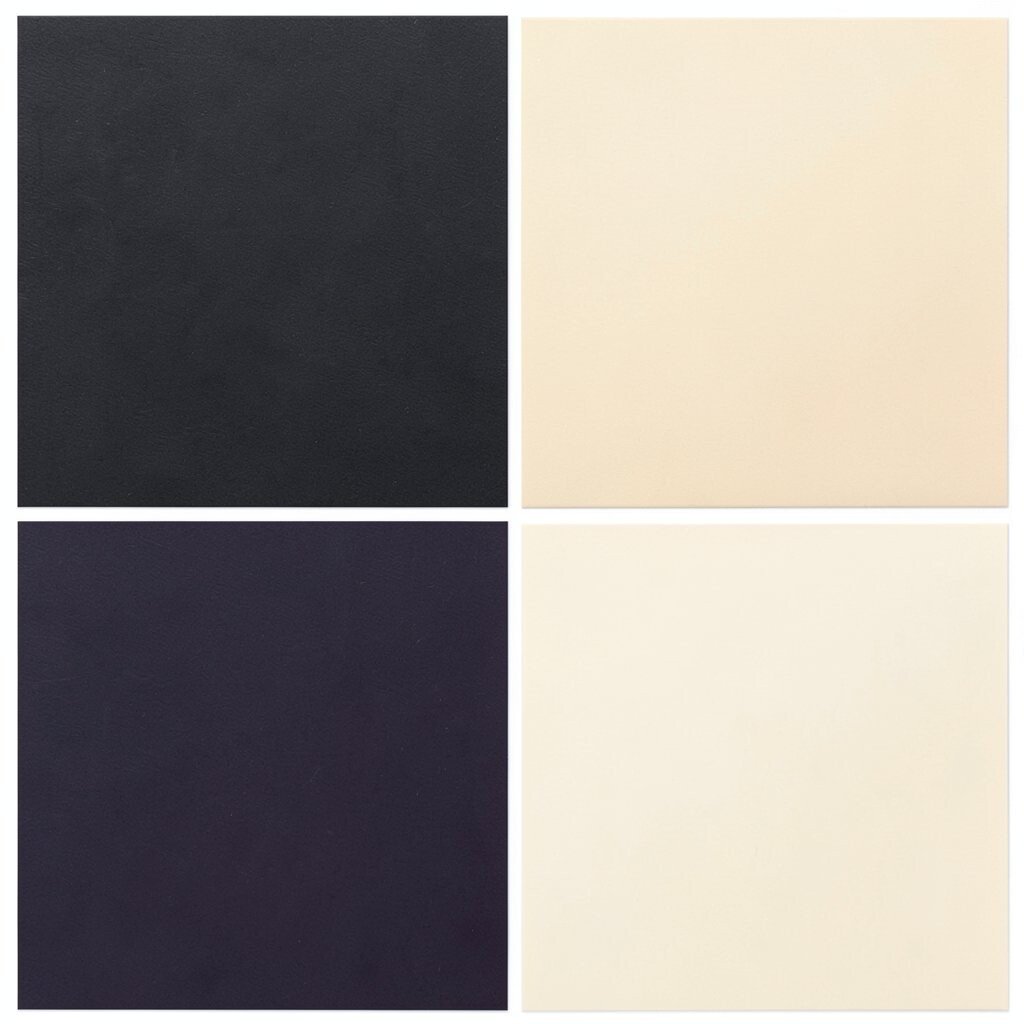
Charcoal grape is deep and stylish, and warm vanilla makes it feel gentle and smooth. This palette is playful for bright ideas, but it also feels mature and dependable.
It’s great for presentations, posters, and brand systems that need both personality and professionalism.
For tips, use warm vanilla for the main surfaces and keep charcoal grape for text, headings, and key lines. The benefit is readability plus a unique, modern twist.
Personalize by adjusting the grape depth based on your audience: lighter grape for friendly communities, deeper grape for premium vibes.
Cost considerations are manageable because neutrals like vanilla help reduce the amount of heavy ink coverage. If you’re designing digital assets, you can keep the grape as the brand identity color and reuse vanilla everywhere else.
Current trends favor rich, muted tones with soft cream backgrounds, and this palette fits that direction perfectly.