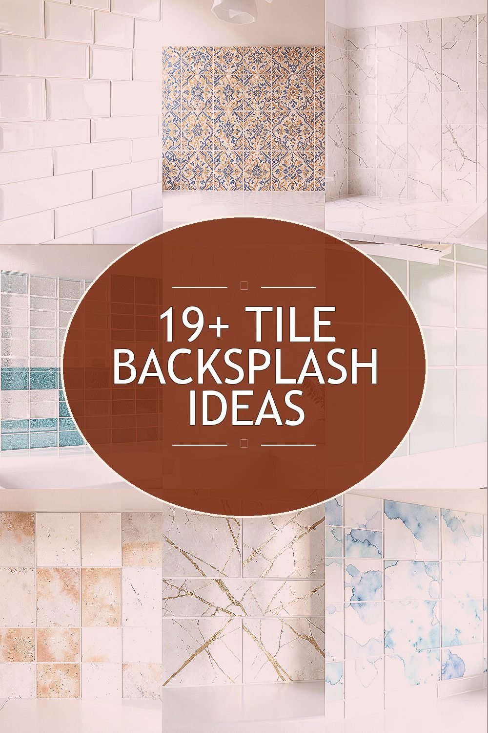
Your kitchen deserves a backsplash that makes everyday cooking feel lighter and brighter. The right tile can add shine, style, and practical protection without needing a full remodel.
1. Glossy White Subway Tile With Bright Grout
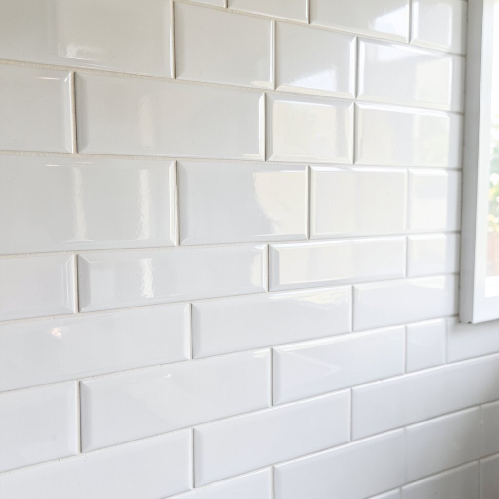
Glossy white subway tiles catch light and make the walls look cleaner. Pair them with bright, crisp grout so the lines look sharp from morning coffee to dinner cleanup.
This option feels timeless but still reads fresh because the high-gloss finish reflects light. It also helps hide small splatters better than flat, matte surfaces. For practical results, choose a grout color that matches your countertop undertones and seal it if the tile manufacturer recommends it.
2. Sun-Kissed Moroccan Pattern Tiles
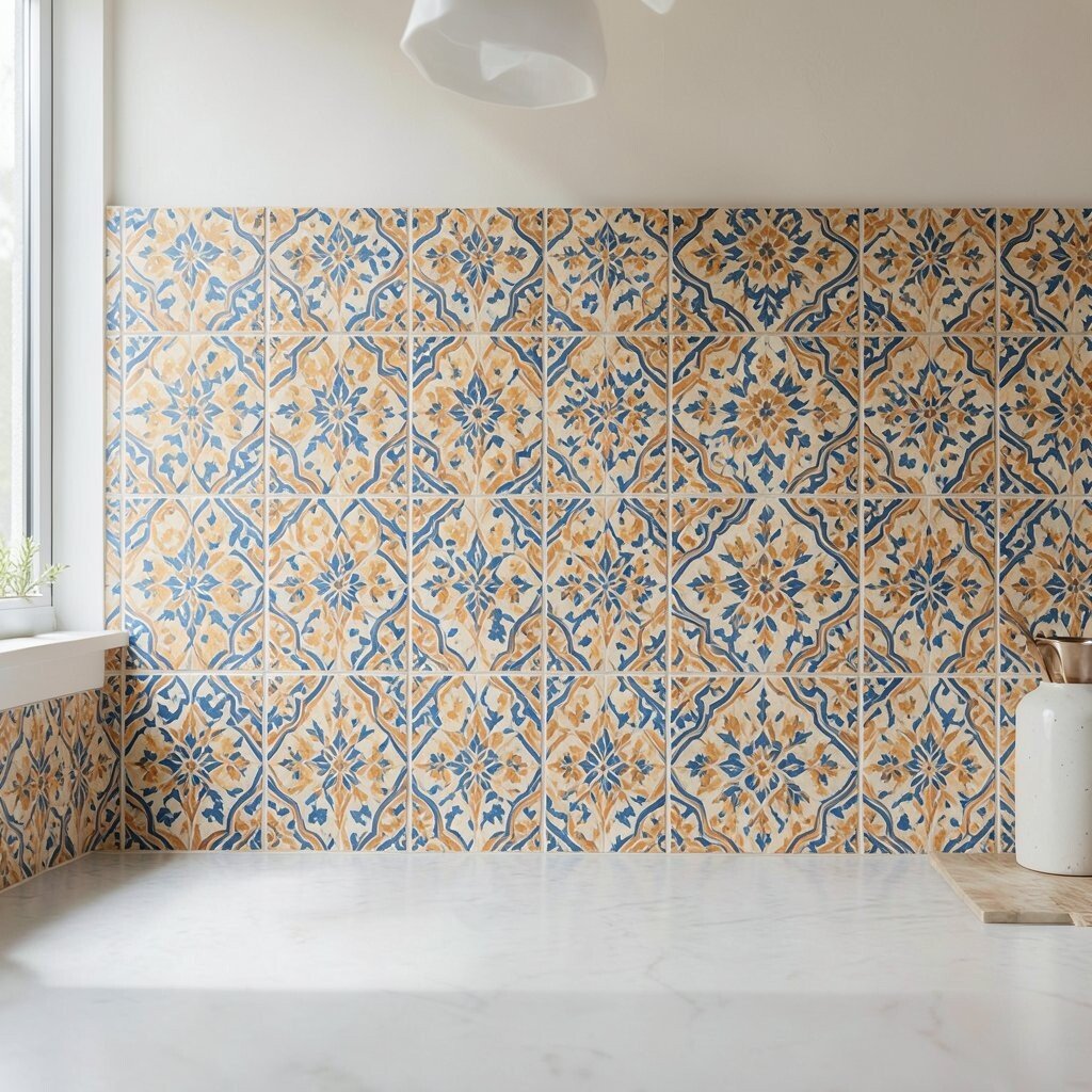
Moroccan-inspired tiles add instant warmth with bold geometry and playful color. The pattern can act like jewelry for your kitchen, making plain cabinets feel special.
Because the design is already full of visual interest, use simple hardware and keep wall paint in the light-to-medium range. The mix of tones can also help hide minor stains and chips since small variations are part of the look. When budgeting, ask about sample pricing and consider doing a partial backsplash if you want the pattern effect without covering every inch.
To personalize it, repeat one or two colors you love—like sunny ochre and terracotta—and let the rest stay in supporting roles. If your kitchen is small, choose a lighter version of the pattern so it doesn’t feel crowded. A professional can help align the repeating motifs so the design feels intentional rather than accidental.
3. Light Marble Look Porcelain Tiles
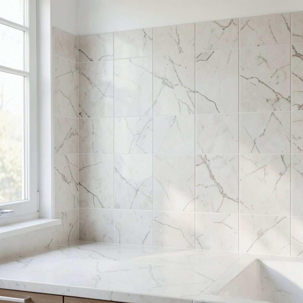
Marble look porcelain gives you that luxe vibe while staying practical for daily life. You get elegant veining that brightens the space without the fuss of natural stone maintenance.
Porcelain is also tough against moisture and frequent cleaning, which is a big plus near sinks and stovetops. Pick a bright base—soft white, creamy ivory, or pale gray—to maximize the light feel. If you’re matching existing surfaces, bring home a few sample tiles and compare them under your kitchen lighting.
This style is unique because the veining usually looks different in each tile, so your backsplash never looks flat. To keep it cohesive, choose a tile with a consistent veining direction across the set. For cost, note that porcelain often costs less than real marble and usually installs with similar techniques.
For personalization, you can add a slim metallic accent strip near the counter for a subtle glow. Trends right now favor natural-looking stone patterns, especially with warm undertones that don’t feel too cold. If you have darker cabinetry, marble-look tiles will brighten it without clashing.
4. Shimmering Glass Tiles in Clear and Teal
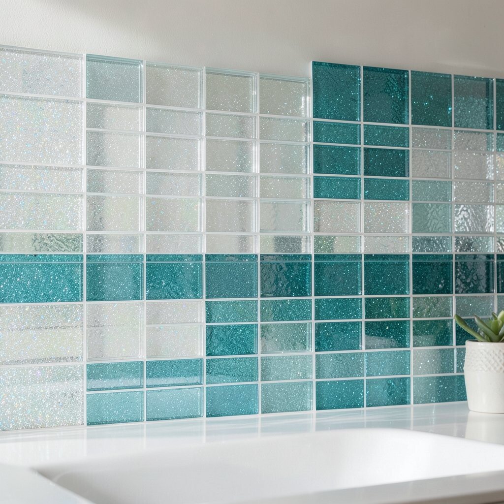
Glass tile backsplash ideas look bright because they reflect light like little prisms. Clear glass with a hint of teal creates a clean glow that feels both modern and relaxing.
They’re also great for kitchens where you want extra pop without heavy pattern. Since glass can show water spots more than ceramic, use a gentle cleaner and wipe dry after splashes. For uniqueness, mix small mosaic sections behind the stove with larger rows near the counter so the brightness lands where you need it most.
5. Soft Cream Hexagon Tiles
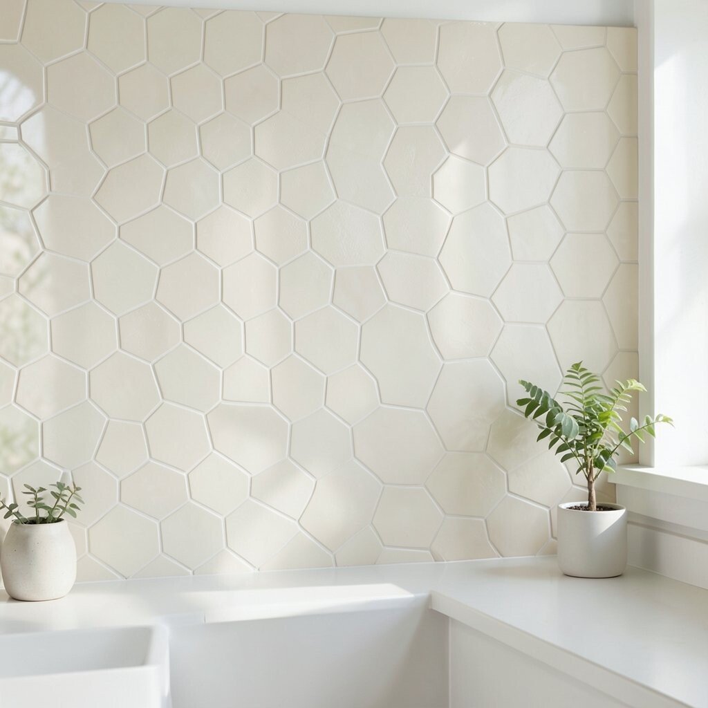
Hexagon tiles bring a gentle, friendly texture that feels design-forward. Creamy tones can brighten your kitchen while staying cozy instead of sterile.
The shape makes small areas feel more dynamic, and the grout lines create a subtle rhythm. Choose a light grout so the hexagons look crisp rather than heavy. Installation tips matter here: align the pattern carefully and plan the layout around outlets to avoid tiny awkward cuts.
This backsplash feels unique because it blends playful geometry with a timeless color family. If you want cost control, consider using hex tiles only for the main backsplash area and using a simpler tile on sides. Current trends lean toward warm neutral textures like this because they pair easily with both modern and classic kitchens.
6. Pastel Green Tiles With a Clean White Border
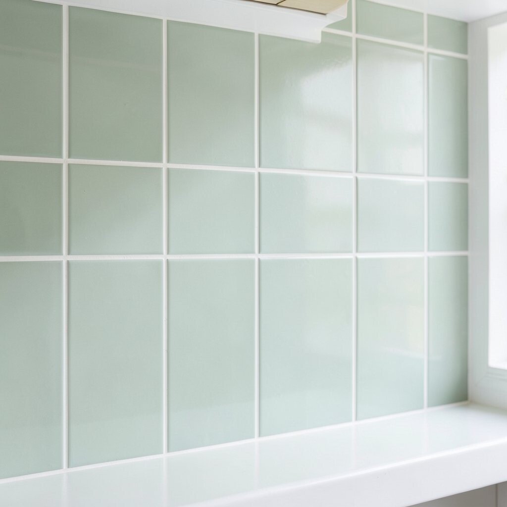
Pastel green can brighten your kitchen while adding a calm, fresh vibe. A crisp white border frames the color and keeps the whole look tidy.
This works especially well if you want color but don’t want something loud. The unique part is the two-tone structure, which makes the backsplash feel intentionally designed rather than just “paint and tile.” For practical tips, choose tiles with a durable glaze and use grout that resists staining.
To personalize, match the green shade to your favorite accent—like a bowl, curtain, or plant pot. Budget-wise, border tiles cost less than covering the entire wall in custom colors, and the effect still looks high-end. Under current trends, soft greens are popular because they feel fresh without overpowering the room.
7. Off-White Cement Look Tiles With Warm Undertones
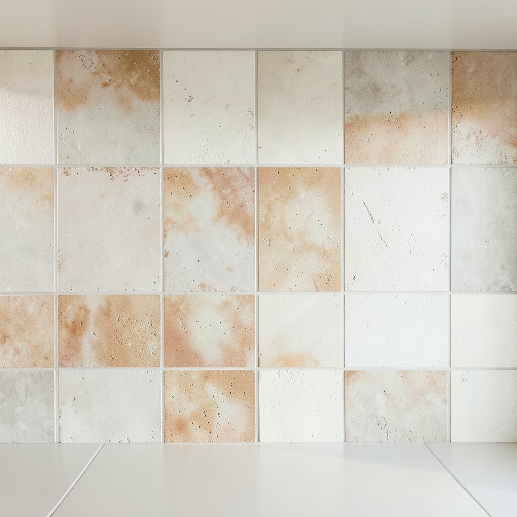
Cement look tiles offer a handmade style that still feels sleek and modern. An off-white base with warm undertones adds brightness and a little texture you can see and feel.
This look is unique because it often includes soft speckles and subtle shading, which help hide small marks. It also works well when you want something more interesting than plain white tile but less busy than high-pattern mosaics. If you’re planning a longer backsplash run, repeat the pattern line-by-line so it feels consistent.
For practical care, use a pH-neutral cleaner and follow the grout sealing plan. Depending on the tile and grout type, sealing can be important to keep stains from soaking in. Consider cost too: cement look styles can range, so ask for mid-range options with similar color variation for a budget-friendly upgrade.
8. Metallic Gold Vein Accent Tiles
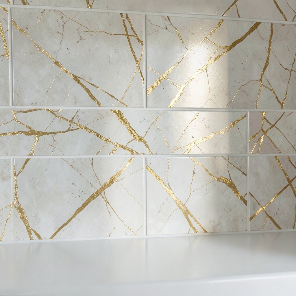
Metallic accents can make a backsplash feel like it’s lit from within. Gold vein tiles, especially on a light background, give you that elegant sparkle without turning the kitchen into a disco ball.
This style is unique because it balances shine with restraint. Use metallic tiles as a band, a focal panel, or a vertical highlight, and keep the surrounding tile more neutral. For tips, line up the veins intentionally and keep spacing even so the accents look like part of a design, not scattered decorations.
In terms of personalization, you can match gold tones to faucet finishes and cabinet hardware. Current trends favor warm metals over cool chrome, so gold and champagne tones often blend smoothly with modern kitchens. Budget considerations are also friendly here: metallic tiles are usually pricier, but using them as an accent helps control total cost.
If you’re installing yourself, do a dry layout first so you can see where cuts fall near outlets. A little planning prevents wasted tiles and keeps the glow consistent across the wall.
9. Watercolor Effect Tiles in Light Blues
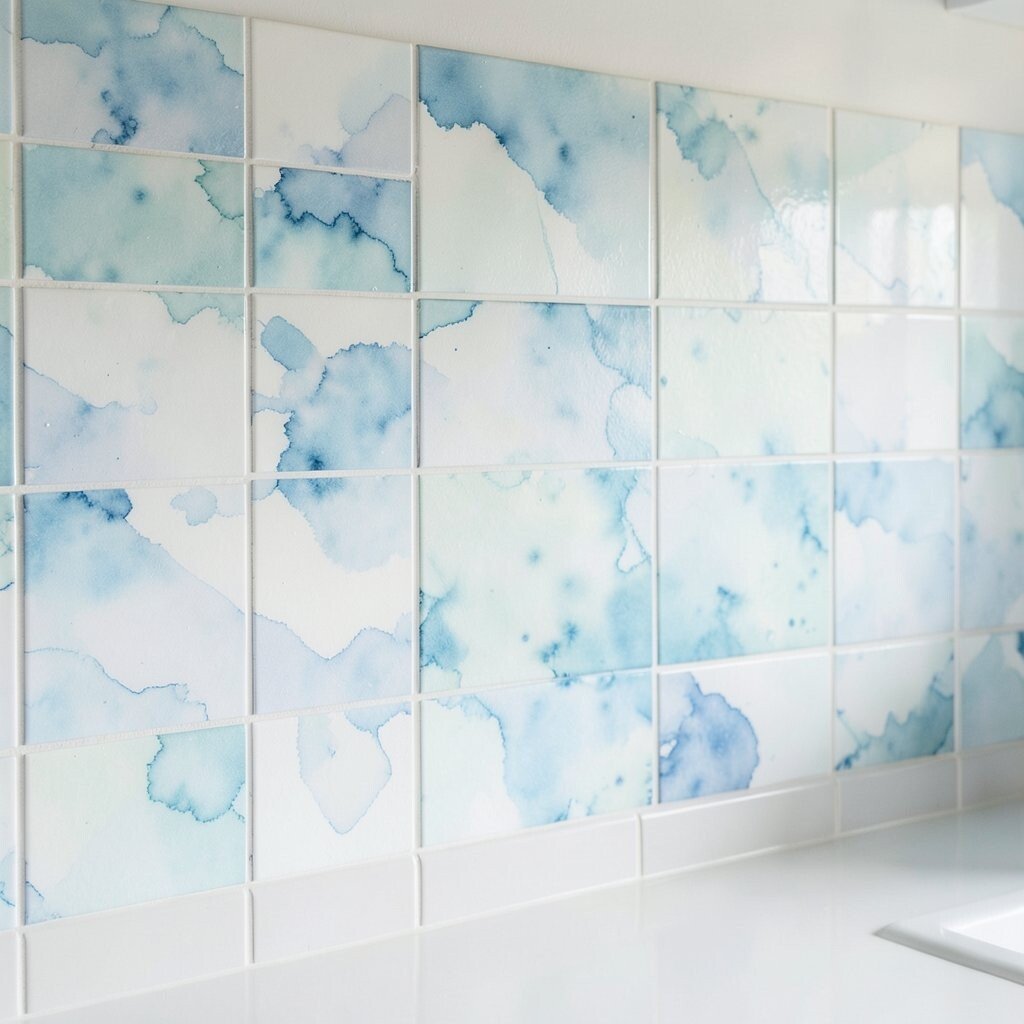
Watercolor effect tiles create a soft, artistic blur that brightens the wall in a gentle way. Light blues can make your kitchen feel airy, like fresh sky tones above a sunny countertop.
The uniqueness comes from the “washed” look, where each tile blends slightly differently, giving a lived-in, creative feel. This style can also help hide small unevenness because the variation reads as part of the design. To keep it practical, choose grout that matches the most common light color in the palette.
If you want a smoother visual flow, keep the pattern consistent and avoid mixing too many tile types. For personalization, pick watercolor colors that echo your dishes or wall art so everything feels connected. Cost-wise, watercolor tiles can be mid-range; using them for a backsplash feature area can lower total spending while still giving a wow effect.
For current trends, soft artistic tiles are growing in popularity because they add personality without requiring full cabinets changes. Pair this backsplash with simple cabinet lines and warm lighting so the color stays bright rather than dull.
10. Classic Cream Marble Mosaic (Small Format)
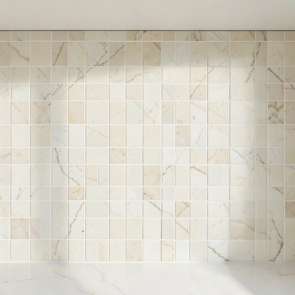
Small-format marble mosaic tiles look delicate and bright, especially in creamy tones. They create a refined “sparkle” effect because tiny pieces reflect light from different angles.
This backsplash is unique because it feels textured without looking loud. It also gives you great coverage, meaning you can hide slight wall imperfections better than large planks. For practical tips, check the mesh backing quality if you buy mosaic sheets, and press them firmly so edges don’t lift.
When thinking cost, natural marble can be pricier, but you may find budget-friendly alternatives like marble-look porcelain mosaics. Sealing matters more with natural stone, so factor in the time and product cost. If you want personalization, consider a slightly off-white grout to blend with the stone rather than adding strong contrast lines.
11. Bright White Carrara Look With Clean Linear Grout
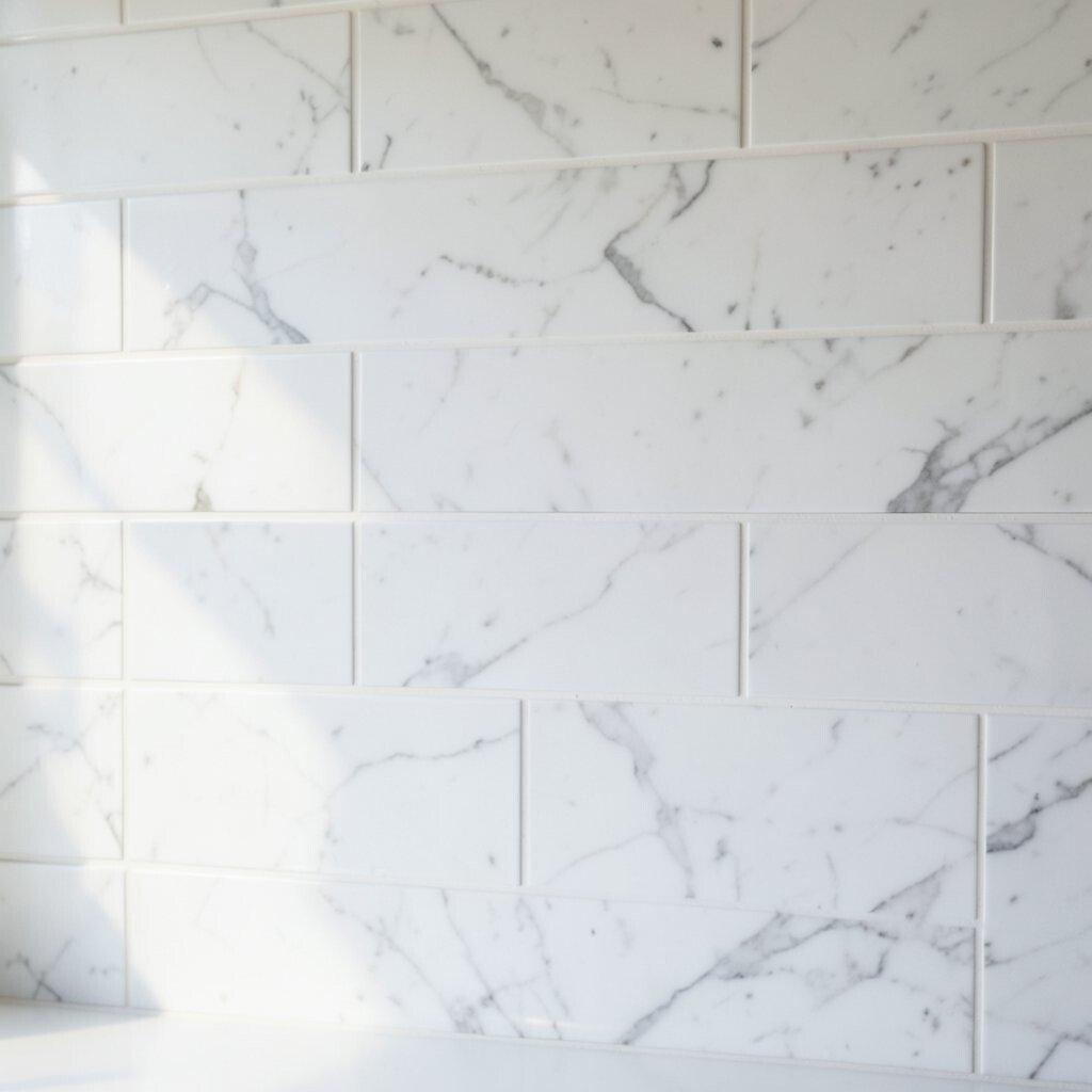
Carrara look tiles bring bright, cool elegance that still feels classic. When you pair them with clean linear grout, the whole backsplash looks crisp and modern.
This style stands out because the veining tends to be subtle and uniform, which keeps the space calm and airy. It’s a great choice if your kitchen already has patterns in curtains, floors, or dishware. For practical guidance, keep grout consistent and avoid mismatched shades that can make the veining look blurry.
To personalize, consider a slightly warmer grout or add a thin metal trim near the countertop. Budget-wise, porcelain Carrara look tiles often deliver the look at a fraction of the cost of real stone. Current trends show a continued love for marble-inspired surfaces, especially when paired with matte finishes and simple cabinetry.
12. Color-Blocked Tiles in Light Gray, White, and Pale Yellow
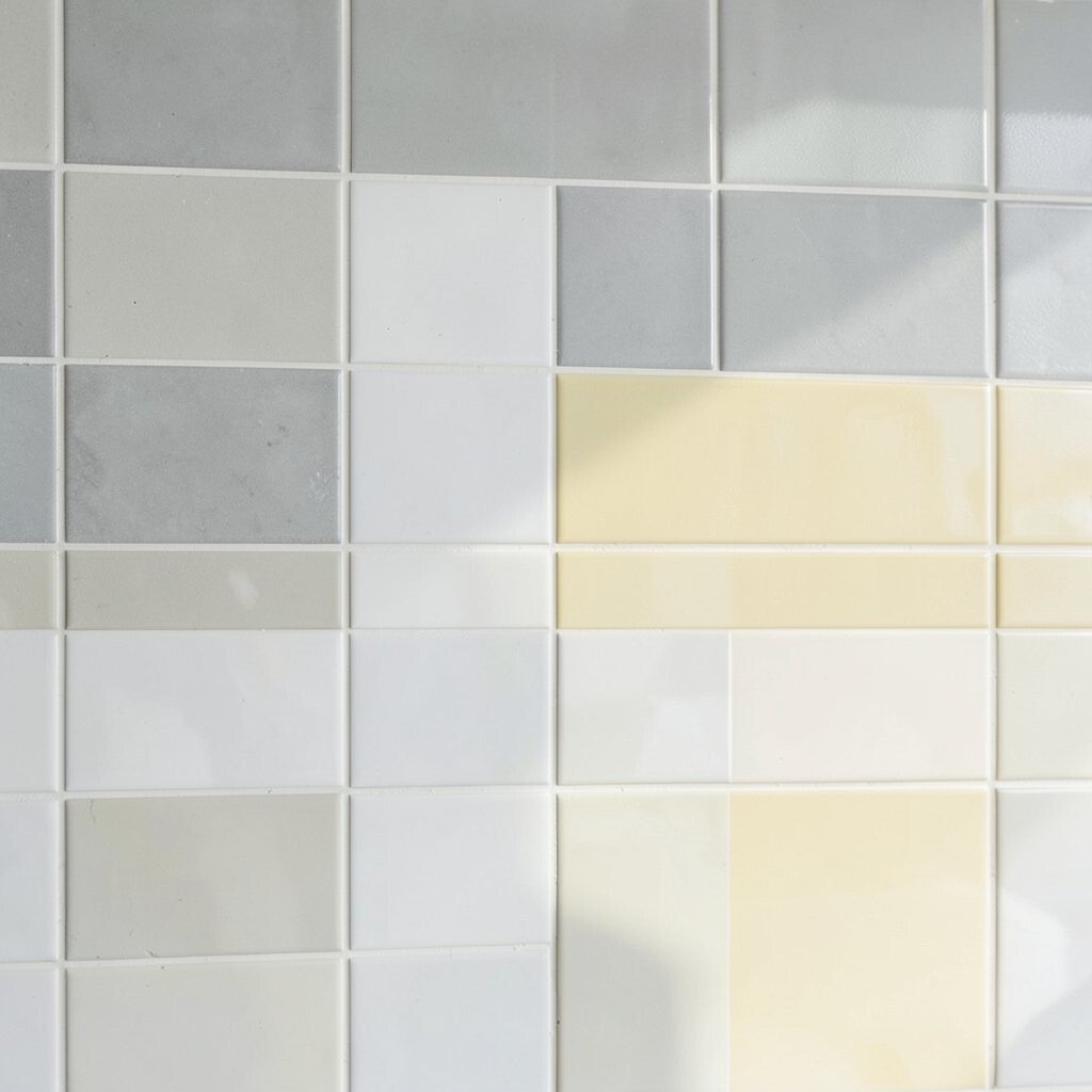
Color-blocked tiles let you brighten your kitchen with a modern, designed feel. Using light gray, white, and pale yellow creates a cheerful palette without overwhelming the room.
This backsplash is unique because it behaves like an art piece, with bold blocks that still stay soft due to the lighter colors. To make it practical, measure carefully around outlets and plan where each block starts so nothing ends awkwardly near corners. If you’re DIYing, mark tile rows ahead of time to keep the edges straight and aligned.
For personalization, pick pale yellow with warm undertones if your kitchen lighting is warm, or pick a cooler yellow if your lights run more neutral. Cost considerations are helpful here too: you can keep the number of different tiles low and limit custom cuts by designing blocks around standard tile sizes. This style also fits current trends because it brings “designed color” into kitchens without requiring full color cabinets.
Finish the look with simple white grout for a bright, open feel. A glossy finish can boost reflectiveness even more, especially behind the stove.
13. Glossy Light Pink Tiles for a Soft, Happy Kitchen
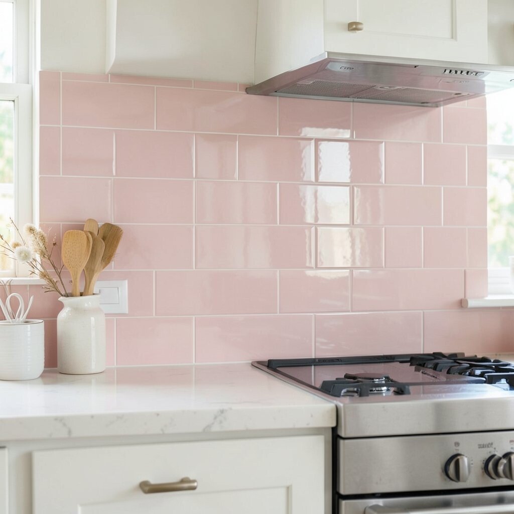
Light pink tiles can brighten a kitchen in a way that feels sweet but still stylish. Glossy finishes help the color reflect light and keep it from looking dusty.
What makes this unique is how it adds warmth without darkening the space. Pair it with white cabinets or light wood for a balanced, friendly look. For practical tips, use a high-quality grout and seal if your tile requires it, since pink hues can show staining more easily than darker colors.
Cost varies depending on tile material, but a glossy ceramic option is often budget-friendly. You can also keep spending under control by choosing pink tiles for the main backsplash area and using a neutral tile on the side runs. Personalization is easy here: add matching accessories like a pink utensil holder or artwork with similar tones.
As a trend, soft blush colors are showing up more in kitchens because they feel optimistic and modern. Keep the rest of the kitchen simple so the backsplash remains the star.
14. Scandinavian Light Wood-Look Tile With White Grout
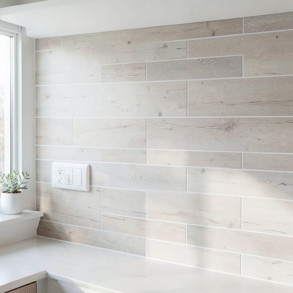
Wood-look tile adds warmth and brightness at the same time, especially in light Scandinavian shades. The texture reads cozy, while the pale color keeps everything feeling open.
This option is unique because it gives you the look of wood without the risk of warping that real wood faces near water. It’s also practical for cleaning, since tile wipes down easily. For best results, use bright white grout sparingly if you want warmth; choose a slightly creamy grout to avoid harsh contrast that can make the pattern seem busier.
15. Bright Blue-Gray Slip Tile With Subtle Texture
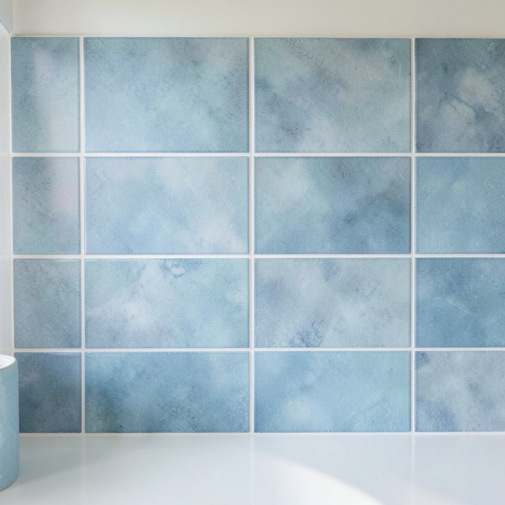
Blue-gray slip tiles bring a calm, ocean-inspired mood to your kitchen. Their subtle texture adds depth, and the cooler tones can make light-colored counters look brighter.
This backsplash feels unique because slip tile often has handmade character, including gentle variations that make each section feel tailored. Practical tips include sealing the grout and wiping spills quickly so the texture stays looking fresh. If you love the look but want it lighter, choose a paler blue-gray and pair it with warm lighting.
For cost, slip tiles can range, but you may find good value in standard sizes and simpler patterns. Personalization ideas include matching the blue-gray to your kitchen paint color or choosing accessories that bring in the same undertone. Trends currently lean toward tactile surfaces, and slip tile is a great way to add that without going too bold.
16. Oversized Porcelain Slabs With a Thin Edge Reveal
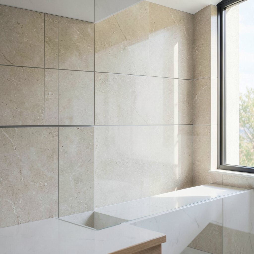
Oversized slab-style tiles can brighten your kitchen by reducing grout lines and creating a smooth, open wall. A thin edge reveal makes the surface feel sleek and custom.
This style is unique because it shifts the backsplash from “tile busy” to “clean design,” letting light travel across a larger uninterrupted surface. It’s also practical since fewer grout lines mean fewer places for grime to collect. Measure the wall carefully and plan the layout around switches and outlets so the large pieces fit neatly.
For cost considerations, slab-look porcelain can be mid to higher depending on brand, but fewer lines and fewer pieces can reduce labor time. Personalization comes through in the color and finish: choose matte for modern calm or polished for extra shine. Current trends favor minimal, architectural looks, especially in kitchens with modern cabinetry.
If you DIY, use the right thinset and keep spacing consistent so the edge reveal looks even across the wall. A professional is often worth it for large-format tiles if you’re not experienced.
17. Classic Marble Look With a Contrasting Black Grout Line
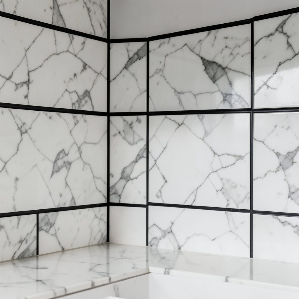
Marble look tiles plus black grout creates a dramatic brightness that feels high-end. Even though the grout is dark, the light tile base keeps the backsplash from feeling heavy.
This combination is unique because it frames the tile like a graphic outline, making every veining pattern pop. It can also help define the backsplash area visually, which is helpful if your counter and cabinets share similar tones. For practical tips, use a grout that resists staining and plan regular cleaning because black grout can show dust more easily than lighter grout.
Cost considerations depend mostly on the tile quality and whether you pick real stone or porcelain. Personalization is easy: match black grout accents to light fixtures, cabinet hardware, or a black faucet. Trends currently show renewed interest in bold contrast lines, especially in otherwise light kitchens.
When installing, be extra careful with grout application so the lines stay consistent and don’t look messy. A neat, straight grout line is what makes this style look designer.
18. Small Light Terrazzo Tiles With Specks of Gold
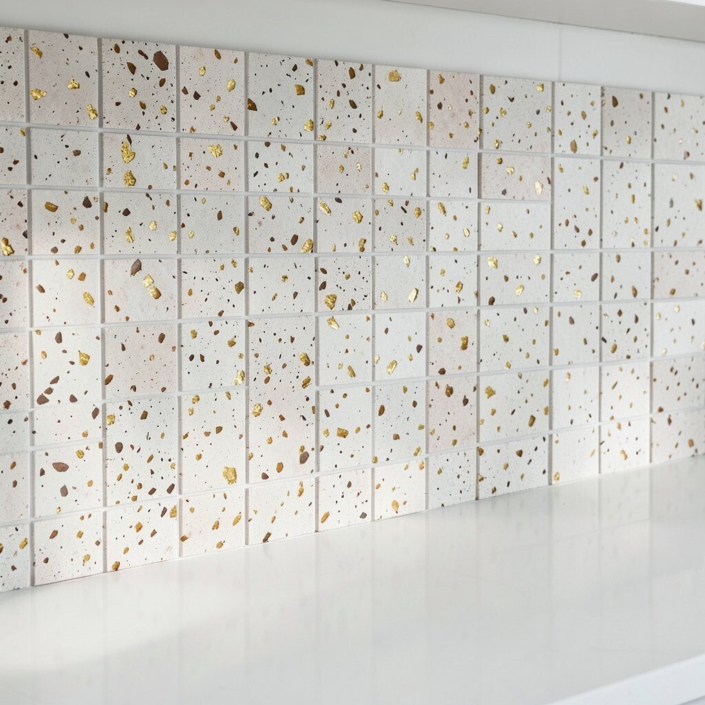
Light terrazzo tiles bring bright energy through speckles that scatter light across the wall. When the flecks include a touch of gold, the backsplash looks warm and lively.
This backsplash is unique because terrazzo naturally hides tiny chips and stains, which is great for real-world cooking. It also adds depth without needing large patterns. For practical tips, choose grout in a tone that matches the base color and seal if recommended to protect against spills.
If you’re personalizing, consider using terrazzo behind the sink and stove while keeping the rest of the backsplash simpler for a balanced look. Cost-wise, terrazzo options can vary, but you can save money by selecting a smaller speckle pattern and a common size. Current trends love terrazzo because it adds texture while still looking fresh in neutral kitchens.
19. White Shaker Cabinet Friendly: Soft Beige Matte Tiles
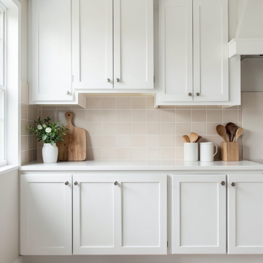
If you want brightness without a shiny surface, soft beige matte tiles are a smart choice. They complement shaker-style cabinets while keeping the backsplash warm and inviting.
This is unique because matte finishes feel calm and hide fingerprints better than gloss. The beige tone can also smooth out contrasts between countertops, walls, and flooring. For practical tips, pick a tile with a durable glaze so it stands up to regular cleaning and accidental splashes.
To personalize, decide whether you want slight movement with micro-speckles or a more uniform look. Budget considerations can be friendly since matte ceramic and porcelain tiles often cost less than glass or natural stone. Trends currently favor cozy neutrals, and matte beige backsplashes fit perfectly with that direction.
Pair with bright lighting and warm hardware so the matte tile still feels lively. A sealed grout choice will help keep the look clean over time.
20. Citrus-Inspired Yellow Tile With a Subtle Texture
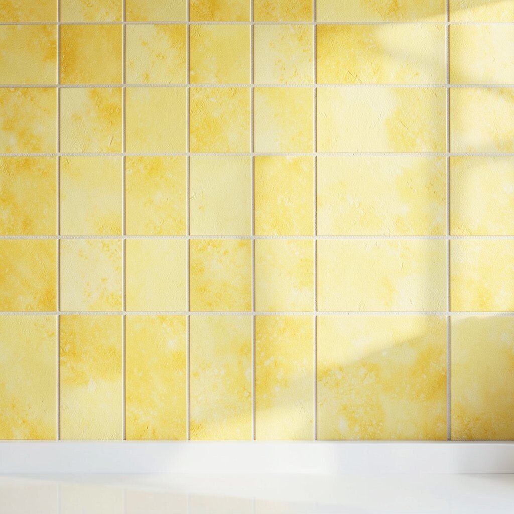
Citrus-inspired yellow tiles instantly brighten a kitchen and make it feel cheerful. A subtle texture adds depth so the color doesn’t look flat or one-dimensional.
This option is unique because it brings a “sunny pause” to everyday routines, especially in kitchens that lack natural light. Keep the rest of the kitchen palette simple—think white, cream, or light wood—so the yellow stays fresh rather than overwhelming. For practical tips, choose tiles with a strong glaze and use a grout that resists staining.
Cost considerations are manageable because many textured yellow tiles come in standard sizes and materials like ceramic. Personalization ideas include repeating the yellow tone in small accents, like a rug or dish set, to make the room feel coordinated. Current trends often favor bold color pops in kitchens, and yellow is a standout choice because it reads bright even in small spaces.