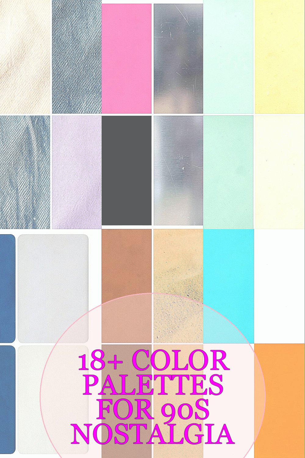
The 90s had a special kind of glow. It shows up in color choices that feel warm, playful, and a bit sweet.
Pick a palette, then let it paint your spaces, outfits, or projects with that familiar memory feeling.
1. Peachy Beige + Denim Blue + Soft Lilac
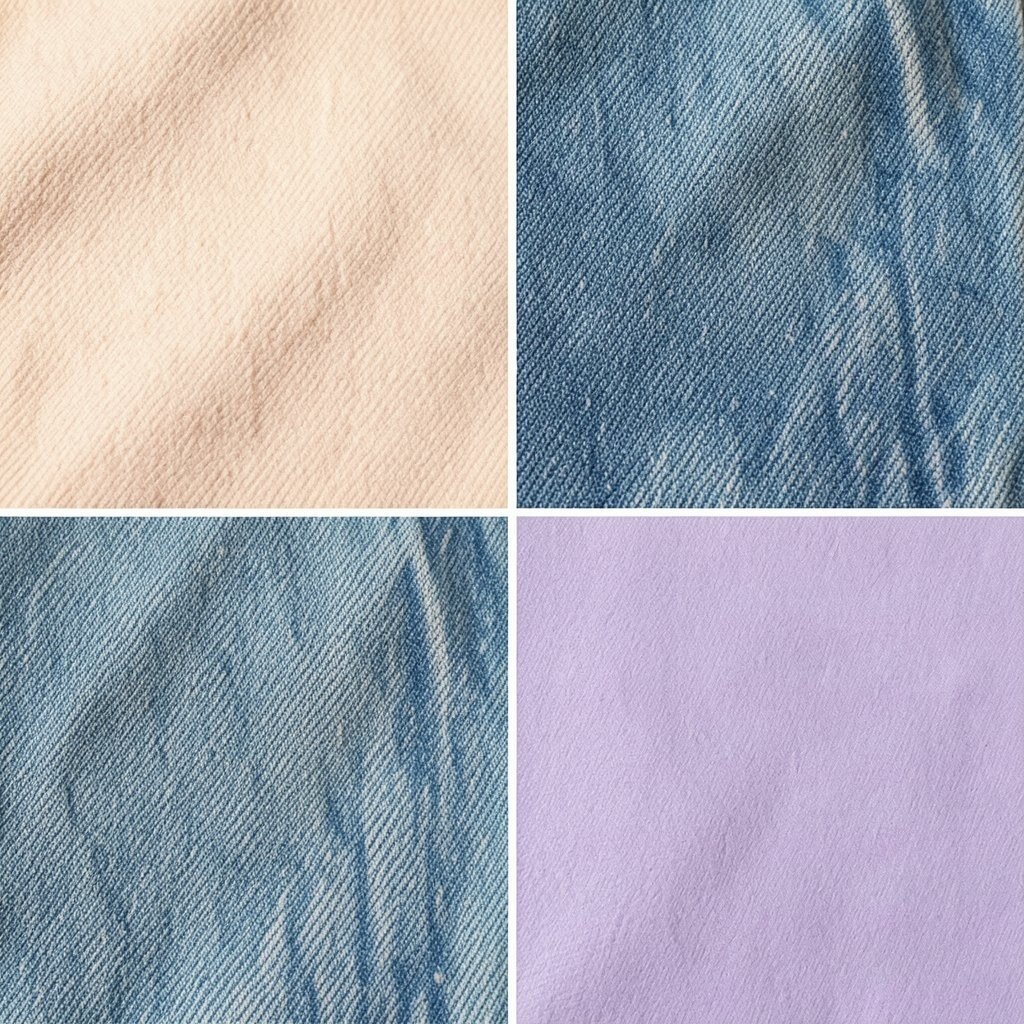
Imagine sun-warmed walls and a backpack that always looked clean. This mix brings gentle comfort with a little pop that feels like a cassette case you found in a drawer.
It’s great for bedrooms, cozy cafés, and casual branding because it looks friendly without shouting. To make it work, use the beige as the base, then add denim blue for contrast and lilac in small spots like frames or buttons. Want it to feel more personal? Try swapping lilac for a slightly deeper plum if you love moody evenings.
2. Hot Pink + Black Cherry + Metallic Silver
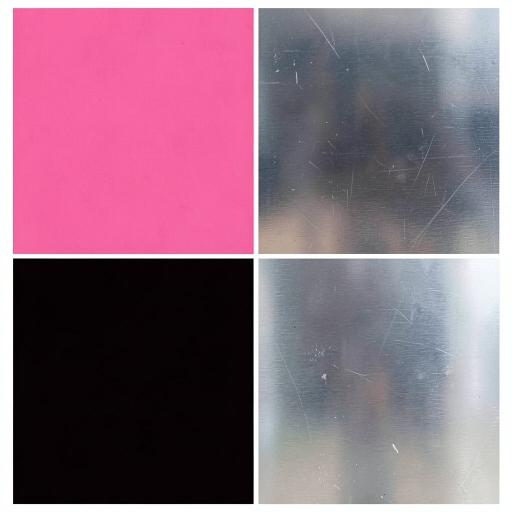
This palette screams late-night skating rink vibes and glossy magazine ads. The hot pink feels electric, while the dark cherry keeps it grounded and dramatic.
It’s perfect for party posters, sneakers, and social media graphics because it grabs attention fast. For a smart tip, use silver as tiny accents like zipper details, thin lines, or nail art dots.
For cost, you can start small with one bold item: a throw pillow, a phone case, or a graphic design banner. If you want current energy, mix in a matte version of black cherry so it looks modern but still nostalgic.
3. Lime Zest + Seafoam + Sunbleached Yellow
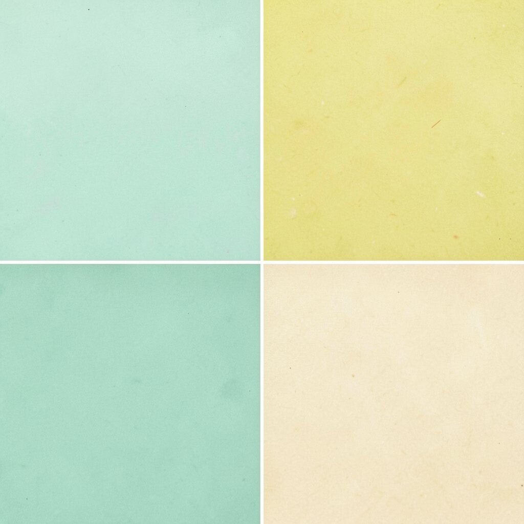
Picture playground paint that looks freshly applied, even decades later. The lime zest gives energy, and the seafoam feels calm like a summer morning breeze.
Use sunbleached yellow for big surfaces like curtains or a warm wall stripe. This combination helps make small rooms feel brighter, which is a big practical benefit. Pair it with one deeper teal accent so your eyes have somewhere to rest.
For uniqueness, try a pattern approach: stripes, wavy borders, or a repeated dot texture. Personalization idea: match lime zest to a favorite hoodie color, then pull seafoam from a bottle cap or graphic sticker.
Keeping costs friendly is easy because these colors work well in removable things. Paint samples, wallpaper swatches, and fabric prints let you try the look without major spending.
4. Cobalt Blue + Pastel Gray + Creamy White
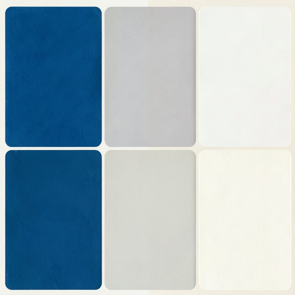
This palette feels like a school binder, clean sneakers, and a TV screen that always looked crisp. Cobalt blue pops, while pastel gray and cream keep the overall look smooth and easy on the eyes.
It’s a strong choice for modern 90s vibes because it stays balanced. Try using cobalt for headings, signage, or one statement wall, and let the light tones do the heavy lifting for readability.
5. Terracotta + Cocoa Brown + Warm Sand
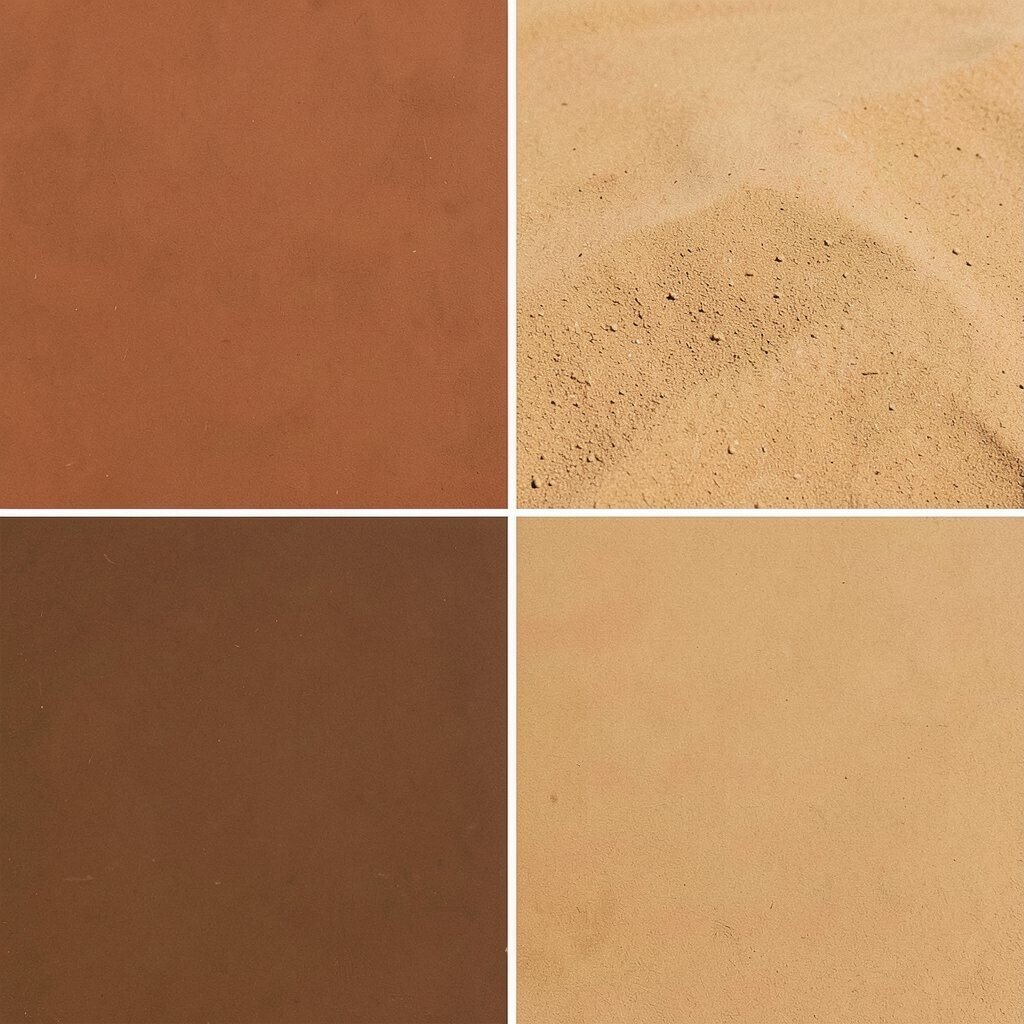
Think of cozy wood tones, old-school magazines, and the kind of warmth that makes a room feel safe. Terracotta adds a lively glow, cocoa brings depth, and warm sand keeps everything soft.
This palette is great for kitchens, reading corners, and even branding for coffee shops. A helpful tip is to use the sand color for larger areas, then layer terracotta in textiles like throws, and use cocoa for trim or typography.
To personalize it, pull one shade from something you already love, like a terracotta plant pot or a favorite leather belt. For cost, try painting just a cabinet door, then repeat the same colors in small decor pieces so it feels intentional.
6. Aqua Blue + Bright White + Neon Orange
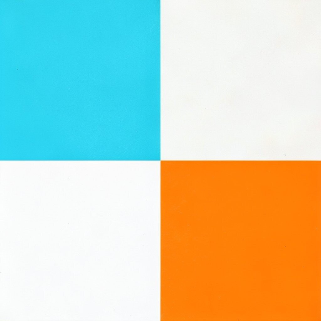
Close your eyes and you can almost hear the splash of summer in a backyard pool. Aqua blue feels light and clean, while neon orange adds that signature 90s punch.
Use this palette for activewear, dashboards, and sporty logos because it reads fast and feels joyful. For best results, keep neon orange for small accents like icons, buttons, or a thin stripe. Personalization idea: match aqua to an ocean photo you love, then choose neon orange based on a favorite fruit color.
7. Teal Green + Lavender Mist + Deep Plum
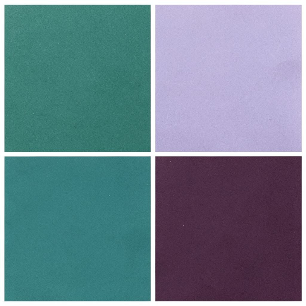
This combo feels like a late afternoon sky over a music store. Teal gives a refreshing base, lavender adds a soft dreamy tone, and deep plum brings drama.
It works especially well for art prints, playlist covers, and calm-but-bold rooms. Try a simple method: use teal as the background, lavender for large blocks of color, and plum for text and outlines.
For uniqueness, mix in a subtle pattern like small dots or a diagonal stripe to mimic old album design. If you want a current trend touch, choose a slightly muted teal so it feels more modern while still staying nostalgic.
8. Olive Drab + Soft Moss + Oat Cream
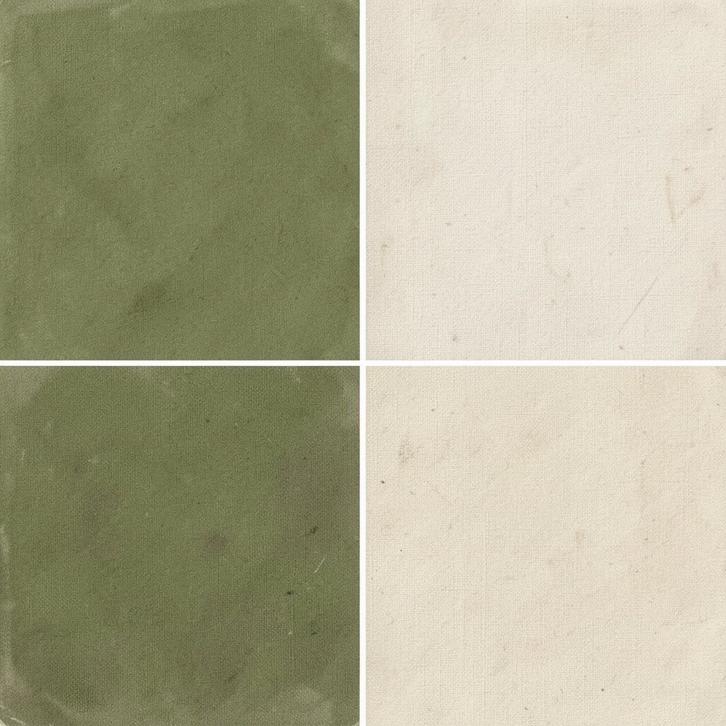
Imagine a backpack filled with school supplies, but also a small hope for a fun day outside. Olive drab and moss feel grounded, while oat cream adds a gentle, friendly highlight.
This palette is a smart pick if you want nostalgia without loud colors. It helps spaces feel cozy and balanced, and it’s easier to style than many neon mixes. Use the deeper green for outlines and the lighter oat for walls, curtains, or paper goods.
For personalization, tie it to nature: match olive to a plant leaf, then bring moss into a fabric pattern you already own. Want something unique? Add a small pop color in mustard or rust, but only in tiny amounts.
Cost considerations are kind here because you can build it using thrift finds. Old wood frames, plain canvas, and simple linen can be dyed or painted with these shades without major expense.
9. Bubblegum Pink + Vanilla Yellow + Navy Ink
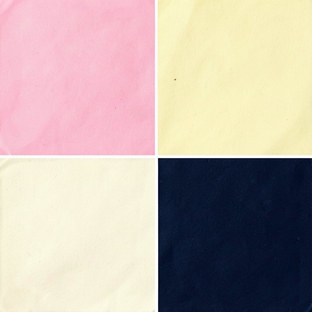
This palette brings to mind candy ads, bright sneakers, and the playful energy of locker decorations. Bubblegum pink feels sweet, vanilla yellow makes everything warmer, and navy ink adds crisp contrast.
It’s perfect for kids’ rooms, study corners, and creative brand visuals because it looks cheerful but still organized. A tip: keep navy for typography and edges, then let the two brighter colors fill the main areas.
10. Sky Blue + Soft Rose + Steel Gray
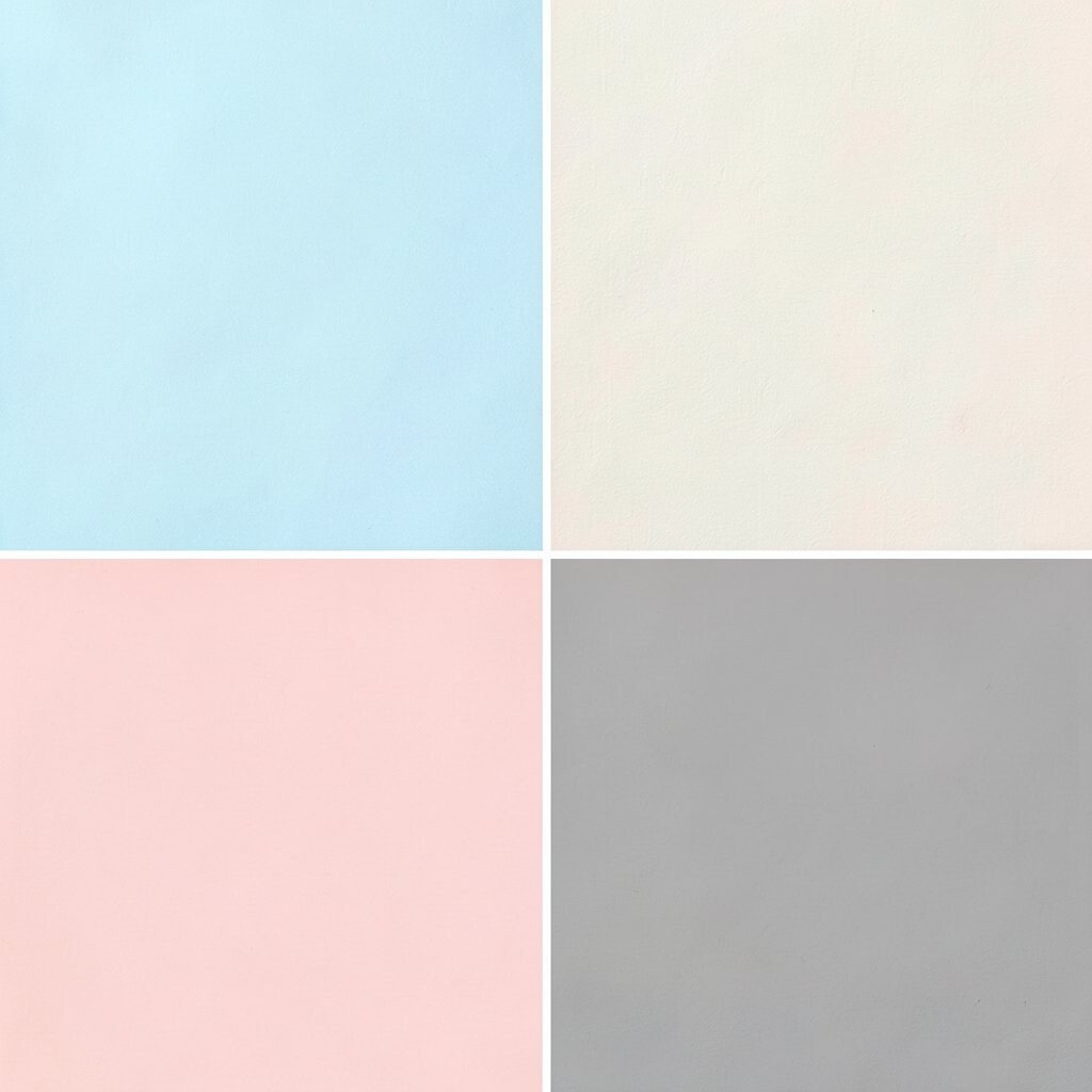
Think of a soft sunrise behind a classroom window, with a hint of pink in the air. Sky blue feels airy, soft rose brings gentleness, and steel gray keeps it grounded for real-life use.
This palette helps with “calm focus” design because it avoids heavy darkness. Use it for folders, stationery, slides, or bedroom walls where you want comfort without chaos. For personalization, choose rose from a favorite sweater color and match gray to your desk chair or lamp base.
If you want a modern trend touch, blend in matte finishes and slightly textured surfaces like linen, felt, or paper with a soft grain. It’s usually budget-friendly since these shades appear in many affordable paints and home goods.
11. Neon Yellow + Royal Purple + Espresso Brown
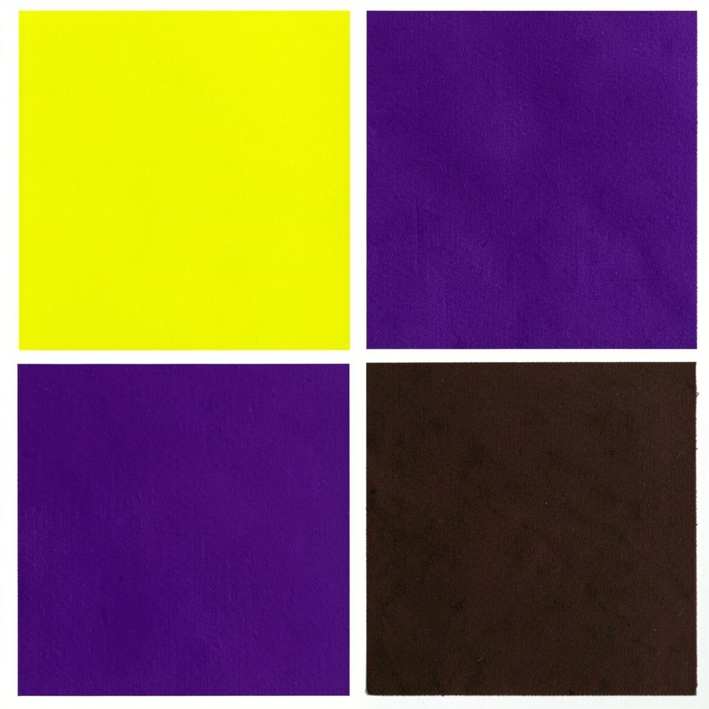
This palette feels like a mixtape cover with bold lettering and a secret message. Neon yellow pops like a highlighter, royal purple feels stylish, and espresso brown makes the glow look intentional.
Use it for streetwear accents, gaming themes, and bold event flyers. Keep neon yellow for highlights and icons, then use espresso brown for text blocks so everything stays readable. Personalization idea: pick the royal purple shade that matches your favorite hoodie, then add neon only in one or two places.
12. Powder Blue + Creamy Peach + Charcoal

Powder blue and creamy peach feel like an old photograph that got better with time. Charcoal adds structure, so the colors look cute instead of messy.
This palette shines in design work because it’s soft and easy to pair with photos. Try using powder blue for backgrounds, peach for headings, and charcoal for buttons or captions. For personalization, match charcoal to your phone case or a frame color you already own.
Cost can stay low because these shades are common in everyday products. You might only need one painted tray, a set of stickers, or a simple color wash on a notebook cover.
13. Mustard Gold + Dusty Teal + Light Gray
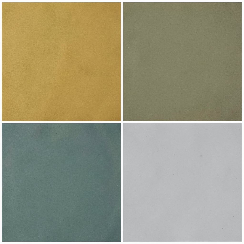
Mustard gold feels like warm street lights and the glow of a late bus stop. Dusty teal adds a calm, slightly vintage touch, and light gray keeps it modern enough for today.
This palette is unique because it doesn’t rely only on bright neon. It’s a great option for grown-up 90s nostalgia, like styling a living room, a website, or a product label. Use light gray as the base, mustard in smaller areas, and deep teal for contrast.
To personalize it, choose a photo or object that already has mustard tones, like a vintage ticket or a book cover. Then echo dusty teal through cloth, paint swatches, or a small accent lamp.
For cost considerations, try mixing existing neutrals with one bold mustard element. Buying one small accent item is often cheaper than repainting everything.
14. Bright Orange + Cream + Ocean Navy
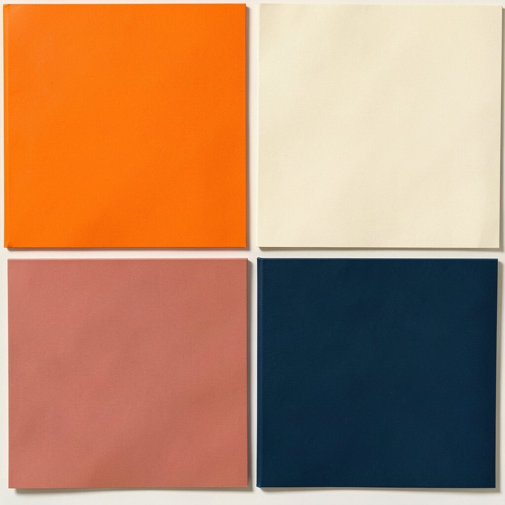
This palette feels like a summer road trip, with orange signs and ocean-blue sky. Bright orange brings excitement, cream makes it friendly, and ocean navy gives a clean, classic edge.
It’s great for packaging, labels, sports visuals, and playful home decor. A simple tip is to keep cream as the biggest area, then place orange in focal points like borders or icons, with navy for text.
15. Green Apple + Soft Gray Mint + Licorice Black
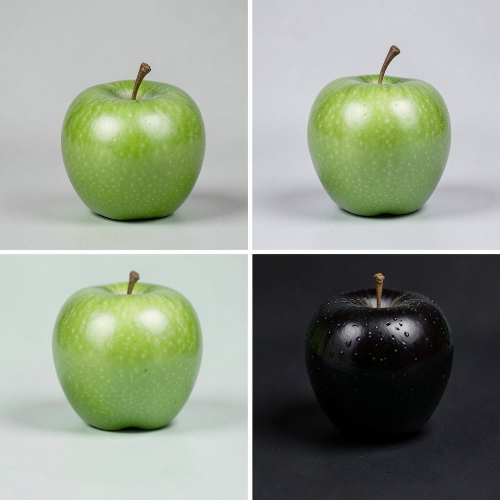
Green apple tones feel fresh and snappy, like a candy shop window. Soft gray mint makes it calmer, and licorice black adds that bold 90s outline energy.
This palette is a strong pick for apps, posters, and any design that needs quick attention. Try using green apple for highlights, mint for big areas, and black for labels so everything stays clear. Personalization idea: choose mint from a wall you already like, then use green apple as a removable accent.
Cost considerations are helpful here because you can buy small decor items in these shades without overspending. If you want a current trend look, use matte finishes and simple shapes instead of busy patterns.
16. Burgundy Wine + Light Blush + Pale Gold

This palette gives “cool kid” vibes from a vintage TV show. Burgundy wine looks rich, light blush makes it feel gentle, and pale gold adds a classy glow.
It’s great for autumn-themed events, romantic branding, and cozy corners at home. Use pale gold for accents like candle holders or thin graphic lines, then let blush soften the overall look. If you want personalization, match blush to your favorite lipstick shade or a scarf, and keep burgundy as the main voice.
17. Skywash Teal + Butter Yellow + Espresso +
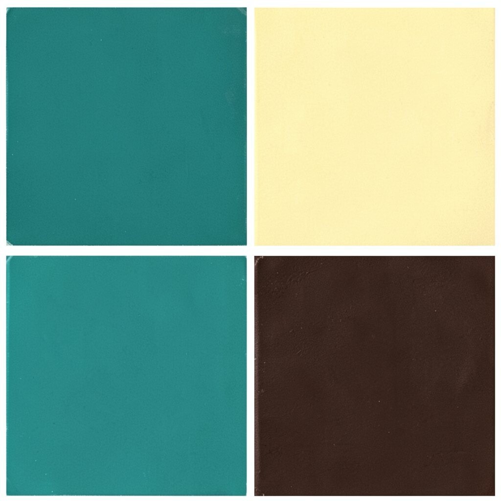
Imagine teal water with sunlight on it, plus a little butter warmth nearby. This palette feels bright but also gentle, like a friendly note tucked into a lunchbox.
It’s useful for spring branding, kitchen sets, and cheerful design projects. Try skywash teal on larger sections, butter yellow for playful details, and espresso for outlines and readable text. To personalize, pull espresso from a wood chair or a leather strap you already have.
For uniqueness, use a textured approach like painted speckles or a lightly patterned fabric. If you want a current trend touch, keep the palette airy and use lots of white space so it feels clean and modern.
18. Neon Cactus Green + Bubble White + Dark Denim
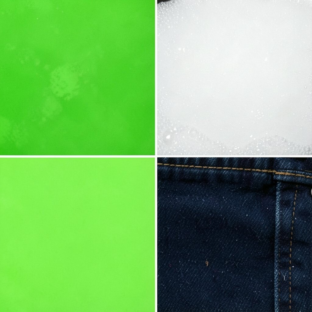
This mix feels like a school notebook you customized with bold stickers. Neon cactus green gives a pop, bubble white keeps it fresh, and dark denim makes the palette look sharp.
It’s a great choice for modern 90s style because it balances fun with structure. Use bubble white as a calm base, then place neon cactus green in accents like corner designs, nail art, or app icons. Finish with dark denim lines for a crisp, readable look.
For personalization, make a small “rules” list for yourself. For example, you can only use neon cactus green on details that fit in pockets, like buttons or border strips.
Cost considerations: you can get the whole vibe with just one neon element plus neutral supplies. Look for affordable spray paint, removable wall decals, or printed fabric that matches your colors.
19. Lavender Gray + Oat Milk Beige + Punchy Red
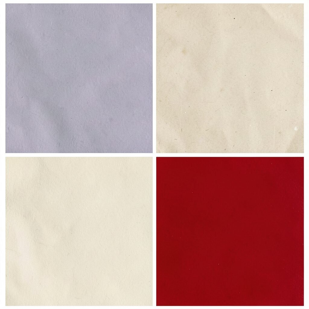
This palette feels like an old movie poster that has aged beautifully. Lavender gray is soft and nostalgic, oat milk beige adds warmth, and punchy red brings the 90s excitement right back.
It’s a strong option for posters, website themes, and home accents that need a cozy base with a bold focal point. Use oat milk beige as the main background, then sprinkle lavender gray for shapes and panels, and save punchy red for icons, callouts, or a single wall moment.
To personalize, choose punchy red based on a favorite sports logo or a vintage sneaker detail. For cost, start with one affordable print, then build outward with rugs, curtains, or stationery to match the palette over time.