Bright ideas need color that feels like a friendly push. The right palette can make your room, brand, or design feel calm, exciting, and easy to look at.
-
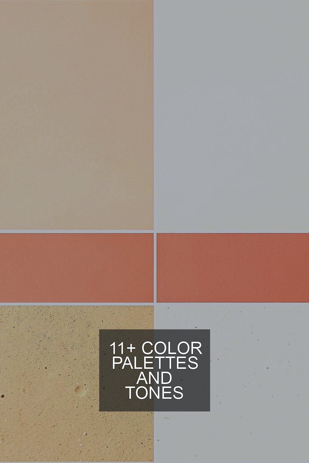
1) Sunlit Peach + Coral + Warm Sand + Soft Cream

) Sunlit Peach + Coral + Warm Sand + Soft Cream Picture a late afternoon glow on terracotta steps. Peach and coral feel like a smile, while warm sand and soft cream keep everything gentle.
This palette is great for people who want energy without stress. It works well in kitchens, playrooms, cafes, and friendly websites. To personalize it, try switching coral for a deeper rose if you want more drama.
For tips, use cream as the background and let peach be your main “wow” color. Add coral as accents like buttons, curtains, or art frames. If you’re designing a logo, start with warm sand for the shape and use peach for the text glow.
Cost is usually friendly because peach and sand tones are common in paint sets and craft stores. You can also mix them with small swatches of coral to keep expenses low. A current trend is using “warm comfort” palettes in branding, especially for lifestyle brands.
-
2) Ocean Teal + Deep Navy + Sea Glass + Mist Gray
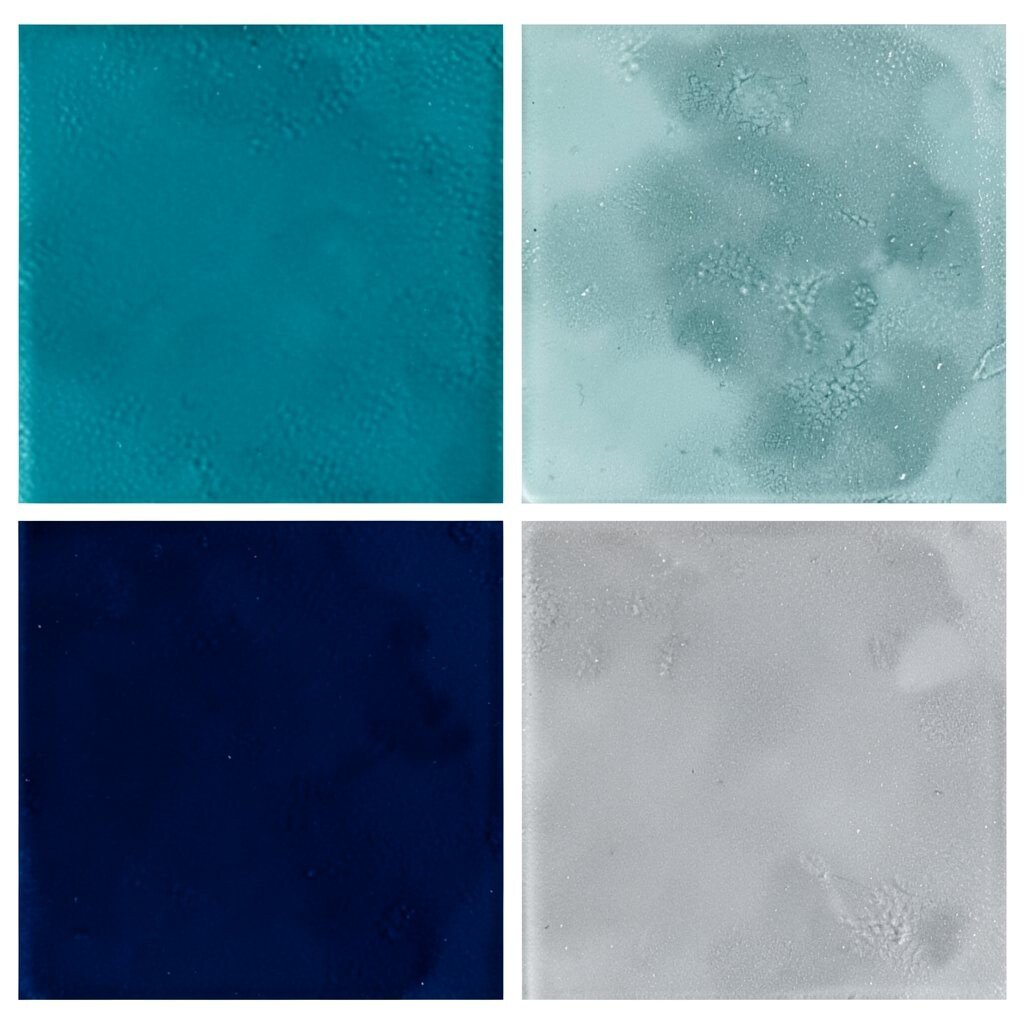
) Ocean Teal + Deep Navy + Sea Glass + Mist Gray Imagine looking down at clear water with a darker horizon in the distance. Teal and sea glass bring life, while navy and mist gray add focus.
This set is perfect for websites, study spaces, and modern product designs. It helps people feel steady while still staying curious. If your content has lots of numbers or details, navy can make everything easier to read.
Try this trick: use mist gray for large sections like panels, cards, or walls. Place teal in headlines and sea glass in icons or small decorations. When you need a pop, use navy for links, borders, and thin lines.
For cost considerations, navy and gray are widely available and easy to match. You can often buy fewer colors and still get variety by using lighter tints of teal. A trend right now is “calm tech” color, where teal tones show up in dashboards and apps.
Personalization idea: match the sea glass shade to something real around you, like a favorite mug or a scarf. That way, your palette feels like it belongs to you, not just to a website.
-
3) Berry Wine + Plum + Blush Pink + Cocoa Brown
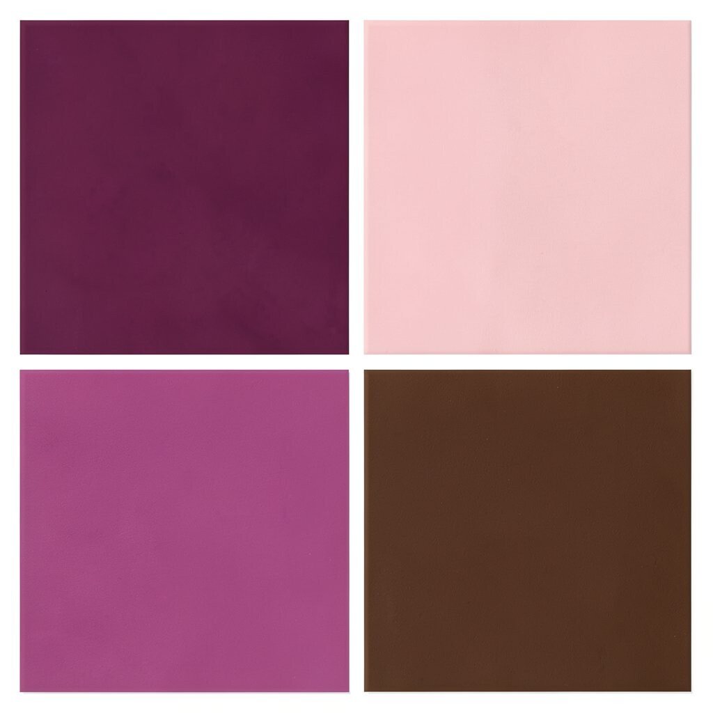
) Berry Wine + Plum + Blush Pink + Cocoa Brown Think of dark berries tucked into a cozy blanket. Wine and plum feel rich, while blush pink and cocoa brown keep the look soft and inviting.
This palette is bold in a classy way, so it’s great for fashion brands, dessert menus, and evening events. It can also work in bedrooms when you balance deep tones with gentle blush. Want a modern twist? Use blush for the main space and let wine be your accent.
To make it feel balanced, keep cocoa brown as your “anchor” color for text and borders. Use plum for medium-size areas like headers, sidebars, or throw pillows. Then use wine sparingly, like for a single hero button or a statement wall.
Cost is manageable because brown and blush shades blend well with many neutrals you might already own. If you’re painting, choose a premium deep color only for an accent wall to save money. Right now, berry tones are trending for branding that wants a “premium yet friendly” vibe.
Personalization idea: use the berry tone for a yearly theme, like “fall socials” or “winter gatherings.” That turns your colors into a story, not just a look.
-
4) Lively Lime + Chartreuse + Light Gray + Charcoal
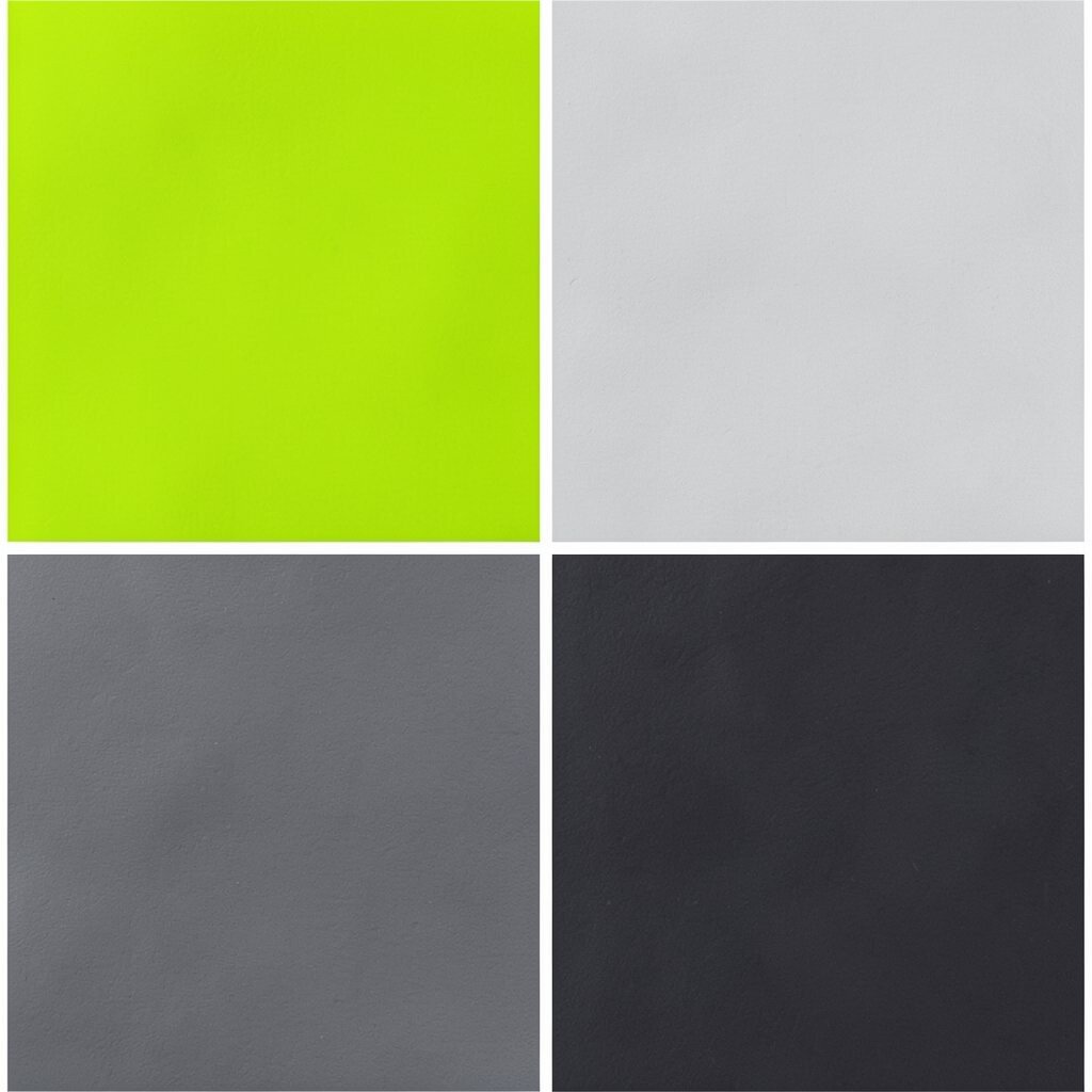
) Lively Lime + Chartreuse + Light Gray + Charcoal Picture a bright sidewalk chalk drawing that instantly makes you grin. Lime and chartreuse bring fast energy, while light gray and charcoal keep your design readable.
This palette is excellent for flyers, sports teams, fitness brands, and classroom materials. It can also work in presentations to highlight important points. The key is control: use the bright colors as highlights, not as the full background.
Try using light gray for the page base and charcoal for text. Place lime behind small callouts, and use chartreuse for icons, charts, or a second accent. Personalize it by choosing a lime shade that matches a favorite snack label or a sports jersey.
For cost, you can often find lime and chartreuse in craft paint and design tools at reasonable prices. If you’re using digital design, these tones are easy to reproduce across devices. A current trend is “high-energy contrast,” especially for announcements and event signage.
-
5) Citrus Gold + Honey + Cream White + Burnt Orange

) Citrus Gold + Honey + Cream White + Burnt Orange Imagine warm sunlight spilling onto a table full of fruit. Gold and honey feel joyful, while cream white keeps the palette clean and open.
This combo is ideal for home décor, bakery brands, and cheerful app designs. It can make content feel friendly and welcoming right away. If you’re working on a menu, use cream white as the card background and gold for section headers.
For tips, use burnt orange as a “story color” for little moments like dividers, stamps, or small images. Keep the amount of burnt orange modest so it stays bright, not heavy. Personalization idea: add a small accent of a color from your kitchen, like green from basil or blue from a mug.
Cost considerations are simple because cream, gold, and orange are popular paint and print shades. You may save money by using cream as your main tone and only adding gold in details. A trend worth noting is “warm minimal,” where bright yellows sit next to lots of whitespace for a modern look.
-
6) Forest Green + Sage + Off-White + Soft Teak

) Forest Green + Sage + Off-White + Soft Teak Think of a quiet trail where the leaves feel fresh and calm. Forest green gives strength, sage adds softness, and off-white makes everything feel airy.
This palette is great for eco brands, wellness spaces, and calm home interiors. It’s also a smart choice for documents because green tones can feel easy on the eyes. If you want uniqueness, pair forest green with soft teak accents for a “wood + garden” feel.
Try this setup: use off-white for walls or backgrounds, sage for side panels, and forest green for headers. Add teak tones in frames, buttons, or typography accents. Personalize it by matching the sage shade to plants you already have, like pothos or herbs on your windowsill.
For cost, greens and off-whites are easy to find in many budgets. If you’re painting, consider a matte finish for sage to keep it warm and not shiny. A current trend is nature-inspired branding, especially for sustainable products and skincare.
One more tip: use sage as the “help” color for hints and instructions. People often find it less harsh than bright blues.
-
7) Sky Blue + Powder Blue + Coral Pink + Deep Slate

) Sky Blue + Powder Blue + Coral Pink + Deep Slate Imagine a clear sky with a soft cloud border. Sky and powder blue feel light, while coral pink adds friendly warmth, and deep slate adds control.
This palette works well for kids’ learning materials, friendly landing pages, and clean UI screens. It balances calm and action, so it’s great for calls to action. For personalization, choose a coral pink that matches a hoodie, toy, or favorite art marker.
To keep it readable, use deep slate for body text and outlines. Use powder blue for large sections and sky blue for headers or charts. Add coral pink for “tap here,” highlights, or small badges.
Cost can be affordable because blue tones and slate are common across paint brands and design libraries. You can also save by using just three colors plus white. A trend right now is “soft contrast,” where bright accents sit on gentle backgrounds for a modern feel.
Tip: test your palette under morning light if it’s for a room, because blues can shift. Digital designers can do the same by checking in both light and dark modes.
-
8) Classic Red + Rose + Cream + Charcoal Smoke

) Classic Red + Rose + Cream + Charcoal Smoke Picture a bold sign that still feels tasteful and cozy. Classic red grabs attention, rose softens it, cream keeps it calm, and charcoal smoke makes it grounded.
This palette is excellent for restaurants, events, headlines, and strong branding moments. It can also help important messages stand out in presentations. If you’re worried it will feel too intense, let cream take the lead and keep red for key spots.
Use charcoal smoke for text, borders, and thin lines. Place rose in backgrounds for a gentle layer behind content. Personalization idea: choose a rose that matches a favorite lipstick shade or a wall color you already love.
Cost is often moderate because red and cream are common in paint and print. You can stretch the budget by using cream as the main paint and adding red only on one wall or trim. A trend in branding is “heritage contrast,” where classic red returns with softer companions like rose and cream.
-
9) Lavender Mist + Periwinkle + Soft Butter + Espresso

) Lavender Mist + Periwinkle + Soft Butter + Espresso Think of early evening where purple clouds mix with warm lantern light. Lavender and periwinkle feel dreamy, while soft butter adds cheer and espresso brings depth.
This palette is perfect for creative studios, book covers, and calm but stylish websites. It also works well for beauty products because it feels gentle and thoughtful. If you want uniqueness, try swapping butter for a slightly deeper gold for a richer look.
For tips, use espresso for headlines and buttons so text stays crisp. Use lavender for main backgrounds, and periwinkle for secondary sections. Add soft butter as a highlight for callouts, small icons, or tiny patterns.
Cost considerations are good because lavender and espresso are easy to find. For painting, espresso can be a strong “trim” color, which helps you spend less by using it only in details. Current trends lean toward “soft mystery” palettes in design, especially for creative and wellness brands.
Personalization idea: add a tiny accent color taken from your environment, like sage from nearby plants or blush from a scarf, to make the palette feel lived-in.
-
10) Midnight Purple + Orchid + Light Lilac + Pale Sand
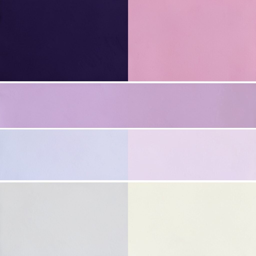
) Midnight Purple + Orchid + Light Lilac + Pale Sand Picture a night sky with a soft glow at the edges. Midnight purple feels bold, orchid adds romance, and light lilac keeps the whole palette friendly.
This combo is great for music, arts, and event branding that wants a magical vibe. It can also work for apps when you use sand tones to keep the interface calm. For personalization, pick an orchid shade that matches a favorite flower or a piece of clothing you feel confident in.
Try pale sand as your background to reduce glare and make purple feel smoother. Use light lilac for panels and orchid for icons, links, and badges. Add midnight purple for headings, focus outlines, and the most important buttons.
Cost is often manageable because sand and lilac are common, while deep purples can be used sparingly. If you’re printing flyers, you can use one purple tone across multiple elements to cut ink variation. A current trend is “moody pastel,” where darker purples meet light airy tones.
-
11) Neutral Taupe + Warm Ivory + Rose Clay + Slate Blue

) Neutral Taupe + Warm Ivory + Rose Clay + Slate Blue Imagine a soft stone wall with hints of warm blush. Taupe and ivory feel grounded, rose clay adds warmth, and slate blue gives a quiet, modern edge.
This palette is great for home offices, lifestyle brands, and calm product pages. It’s also helpful when you want your design to feel mature without being cold. To make it unique, lean into slate blue for a small “surprise” accent, like a timeline line or a subtle button color.
For tips, keep taupe for larger areas and ivory for backgrounds and cards. Use rose clay for headings or highlight strips, then use slate blue for links and fine details. Personalization idea: choose taupe based on a favorite piece of furniture fabric so the palette matches your space.
Cost considerations are usually low because taupe, ivory, and slate tones mix well with many existing neutrals you might already own. You can save more by focusing on fabric swatches and paint sample cards before buying full buckets. A trend right now is “quiet luxury” style, and this palette fits that look nicely.
-
12) Bright Cyan + Fresh Mint + Off-White + Deep Coral

) Bright Cyan + Fresh Mint + Off-White + Deep Coral Think of ocean air mixed with sweet fruit sweetness. Cyan and mint feel crisp and clean, while off-white keeps everything light and easy to read.
This palette is perfect for tech startups, game graphics, and refreshing summer campaigns. It gives a “new day” feeling and can make buttons and labels look extra clickable. If you want uniqueness, use deep coral for only one main feature so it becomes memorable.
Try a simple system: off-white as the base, mint for backgrounds, cyan for key headings, and deep coral for callouts. Keep coral for no more than a small portion of your design so it stays special. Personalization idea: match cyan and mint to your favorite drink label or a beach photo you love.
For cost, mint and cyan are easy to find in digital tools and printable materials. If you’re painting, use off-white in large areas and save the coral for a small wall, shelf, or decorative stripe. A current trend is “fresh futurism,” where clean aqua tones pair with warm coral for balance.
Tip: when you print, check how your cyan looks on paper, because some inks shift slightly. Testing a small proof can save time and money.