Pages can feel like they’re telling stories. The right layout makes every idea feel clear and exciting.
-
1. The Hero-First Stack
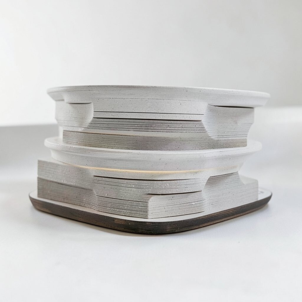
The Hero-First Stack Start with a big hero block at the top, like a bright billboard. Add one clear message, a short sub-message, and a button people can tap.
This layout is great because it answers “what is this?” fast. It also keeps attention on your main goal. Use a strong background image or soft gradients so the page feels modern.
-
2. The Split-Screen Conversation

The Split-Screen Conversation Use two columns like a friendly chat between left and right. Put your headline and key points on one side, and a photo, diagram, or mockup on the other.
This is useful because comparisons feel natural. It helps readers scan and understand at a glance. Try swapping the sides on different sections to keep it lively.
Keep spacing consistent so nothing feels crowded. Use one main color for headings and another for supporting text. If you sell something, show the product image next to the benefit list.
-
3. The Card Parade Grid
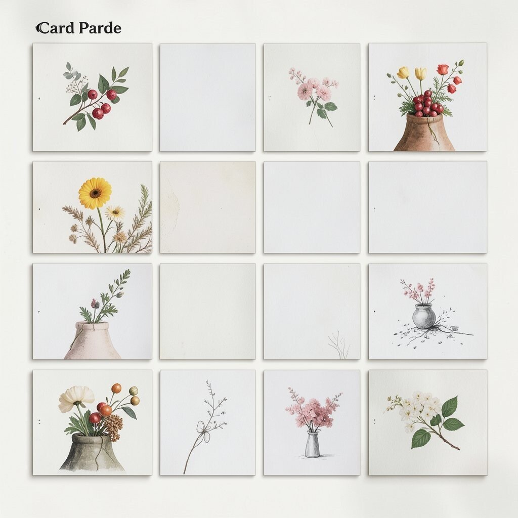
The Card Parade Grid Build your layout from many small cards that line up like a parade. Each card can hold a title, a short description, and one visual.
Cards are a win because they make content feel organized and easy to skim. They also work great on phones because you can stack them. Choose one consistent card style so the design feels calm.
To personalize, swap icons per card and use custom mini-photos. Add hover effects like a tiny lift when someone moves their cursor over it. Keep costs in mind by using simple shapes and shared image sizes.
-
4. The Timeline Journey
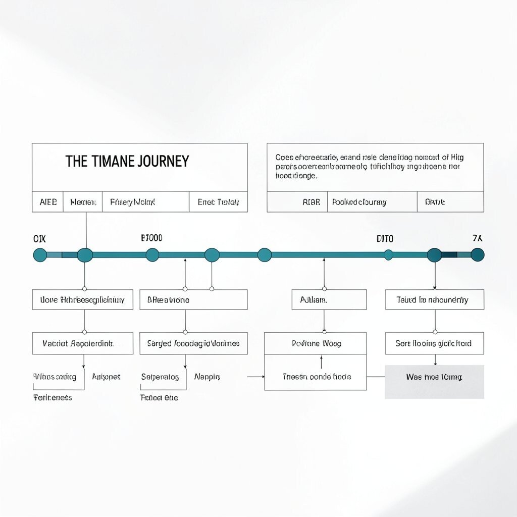
The Timeline Journey Turn your process into a timeline with clear steps that move left to right or top to bottom. Each step can include a mini image, a short title, and a couple of sentences.
This layout is helpful because it tells a story in order. People feel less lost when they can see progress. Use clean lines and generous spacing so the timeline stays readable.
-
5. The Feature Mosaic
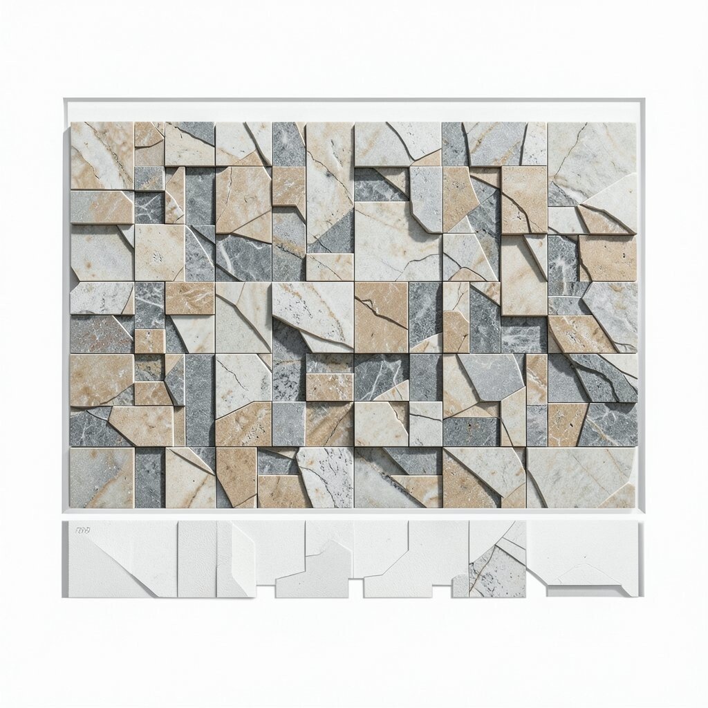
The Feature Mosaic Mix different-sized content blocks like a mosaic, but keep a grid underneath. One block might be a large quote, another a small icon group, and another a photo.
This structure is unique because it feels artistic while still being organized. It helps important content grab attention. Use it for portfolios, landing pages, or project summaries.
For personalization, match the mosaic pattern to your brand style, like waves, stars, or diagonal cuts. Keep text short inside smaller blocks. For cost, reuse one photo set and crop it into consistent ratios.
-
6. The Sticky Sidebar Flow
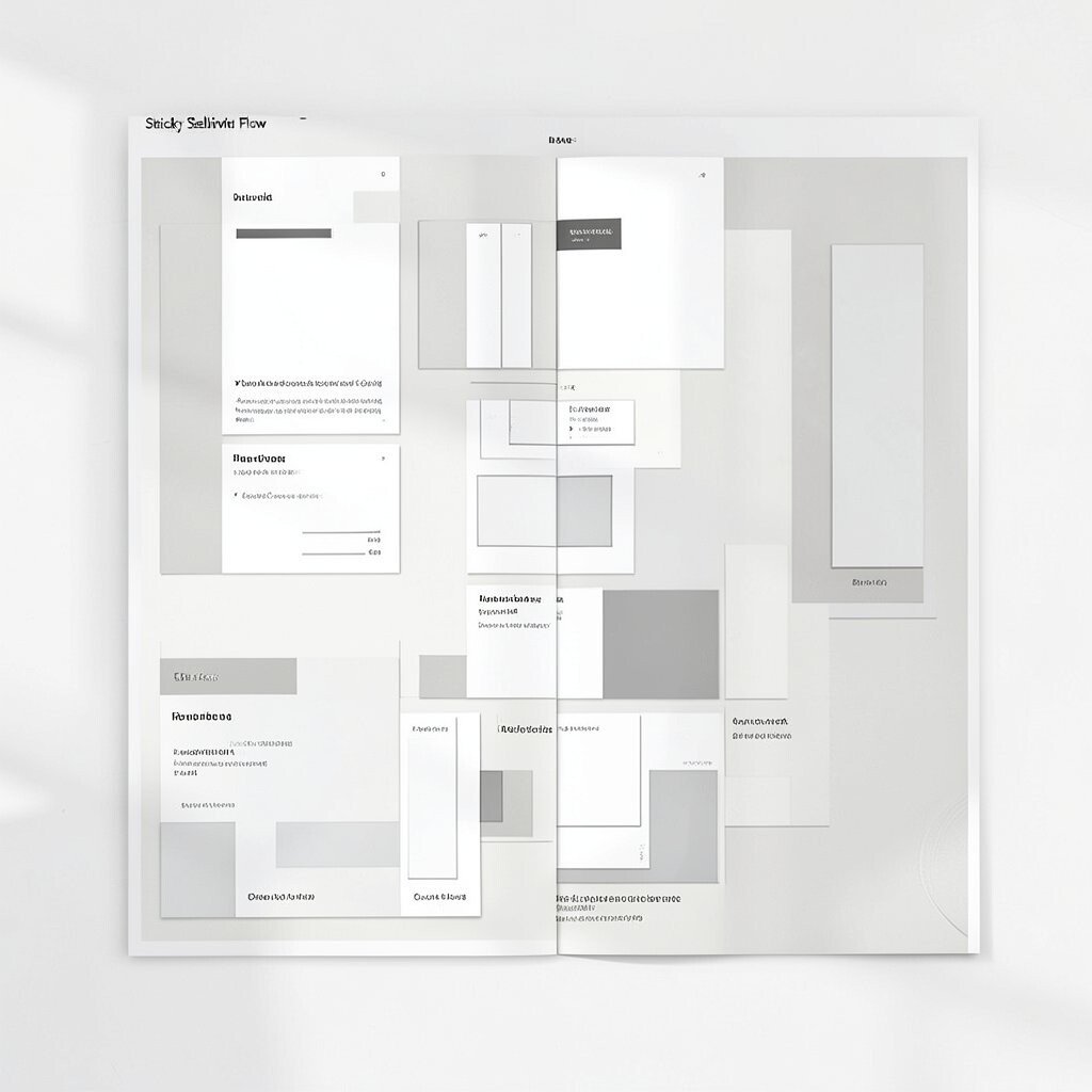
The Sticky Sidebar Flow Create a sidebar that stays visible while the main content scrolls. Put navigation, quick links, or a short “about” card there.
This approach benefits long pages because users always know where they are. It also makes the page feel structured and easy to control. Choose a sidebar width that doesn’t crowd the reading area.
-
7. The Magazine Layout Rows
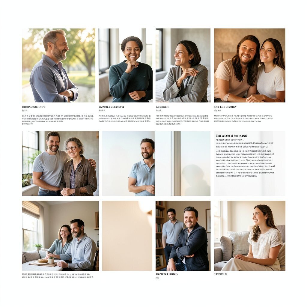
The Magazine Layout Rows Design your page like a magazine with repeated rows of content. Each row can include an image, a headline, and a block of text.
Rows help because readers can scan quickly and stop at what interests them. It also supports multiple content types, like tips, interviews, and galleries. Keep alignment consistent across rows so it feels polished.
To personalize, vary the image styles slightly, like one row using photos and another using illustrations. Use bold typography for headlines, but keep body text easy to read. For budget control, use the same photo locations and angles.
-
8. The Accordion Story Cards
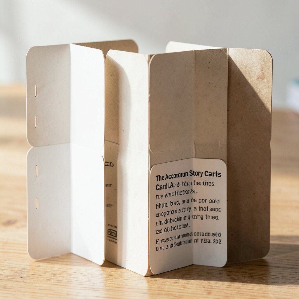
The Accordion Story Cards Use accordion sections so content expands only when someone clicks. This creates a neat, uncluttered page that still holds a lot of information.
Accordions are beneficial because they reduce overwhelm and keep focus. They also work well for FAQs, product details, and tutorials. Make sure each section title clearly tells people what they will get.
Personalize by using icons that match each question, like a chat bubble or a calendar. Add a gentle animation when panels open. Keep costs lower by writing shorter copy for each panel and using the same icon set.
-
9. The Centered Single-Column Focus
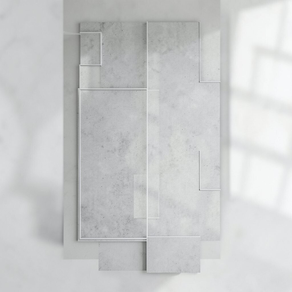
The Centered Single-Column Focus Choose one strong center column and let it hold everything. Keep the background simple so text and visuals stand out.
This layout is great for reading because it reduces distractions. It also keeps your page feeling calm and professional. Use wide margins and readable font sizes for comfort.
-
10. The Gallery Lightbox Grid
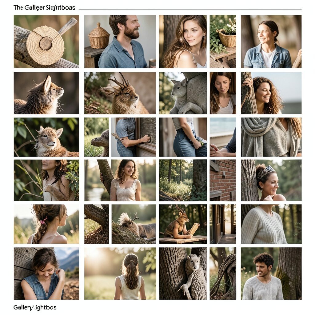
The Gallery Lightbox Grid Arrange images in a tidy grid that opens bigger when clicked. This feels smooth and modern, especially for portfolios and product photos.
The benefits are clear: users can browse without leaving the page. It also makes your work look high quality. Choose a consistent grid size so the gallery doesn’t jump around.
To personalize, add small captions or categories under each image. For current trends, consider subtle image zoom or soft frame shadows. Keep cost in check by optimizing photo sizes and using fewer image variations.
-
11. The Pricing Table With Comparison
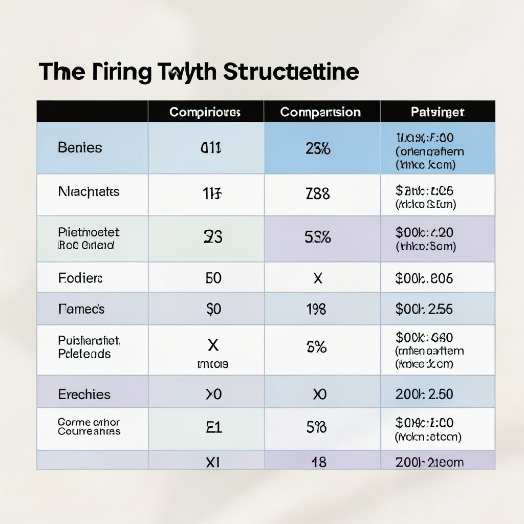
The Pricing Table With Comparison Place plans side by side in a table so people can compare quickly. Highlight the most popular plan with a different color or badge.
This layout helps because choices feel clearer and faster. It also supports add-ons and feature lists in a neat structure. Keep each plan section balanced so nothing feels unfair.
-
12. The Template Blocks System
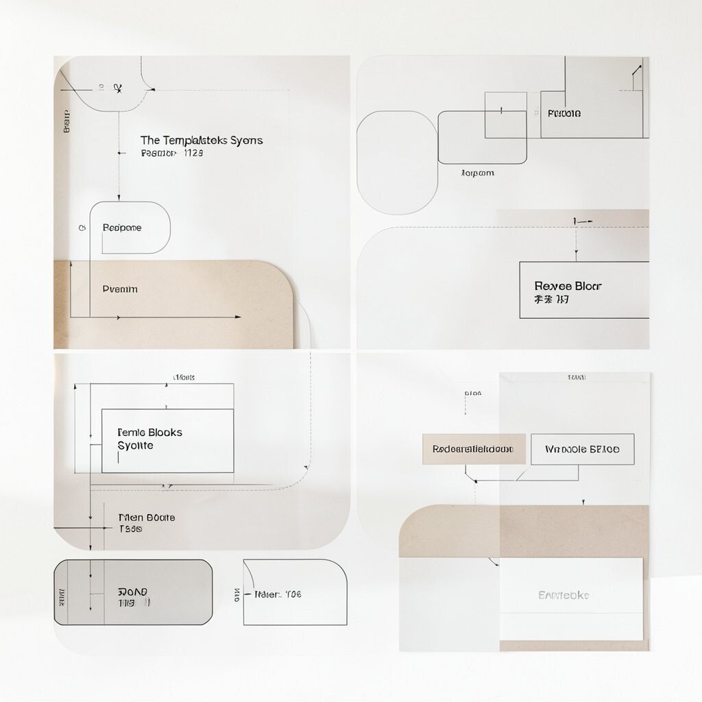
The Template Blocks System Design your page using reusable blocks, like “intro,” “benefits,” “how it works,” and “testimonials.” Each block has its own style, but they all match the same grid.
This is unique because you can build many pages with the same system. It saves time and reduces design mistakes. You can also mix and match blocks based on what matters most to the audience.
Personalize by making small changes inside each block, like different icons, image sets, or accent colors. For cost, reuse components and avoid custom designs for every page section. This approach also fits current trends toward design systems and faster content updates.
-
13. The Split-Block With Pull Quote
The Split-Block With Pull Quote Use a section split into two areas, then add a pull quote that “pulls” attention. The quote can sit above the divider or float in a card.
This layout benefits storytelling because quotes add personality. It also breaks up long paragraphs and keeps readers engaged. Choose a quote that connects to a key benefit or a real customer moment.
Personalize with typography that matches your brand, like rounded lettering or bold slab style. Keep the quote short so it stays powerful. For cost, use a single custom font or a simple text treatment instead of complex images.
-
14. The Full-Width Photo Bands
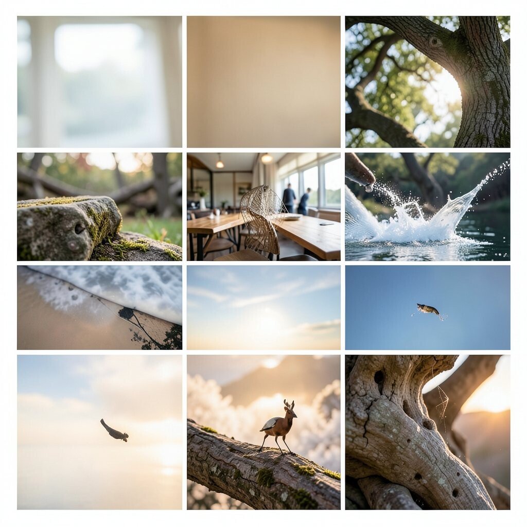
The Full-Width Photo Bands Create sections that stretch across the full screen using big photo bands. Add a short text overlay that stays readable with a dark or light tint.
This layout is friendly and strong because images set mood right away. It also makes your project feel high-end. Keep text overlays simple and never hide important words behind busy parts of the image.
-
15. The Step-By-Step Checklist Page
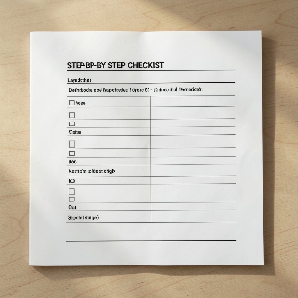
The Step-By-Step Checklist Page Build your layout around a checklist that people can follow. Each step should have a checkbox, a small note, and a related image or icon.
This structure is beneficial because it turns information into action. It also helps people feel like they are getting things done. Use clear numbering style, even if the page is not exactly numbered in a visible way.
To personalize, add mini progress hints like “start,” “middle,” and “finish.” If you offer a service, include what to prepare before each step. For cost, use icons and simple backgrounds instead of custom illustrations for every item.
-
16. The Responsive Hero + Feature Tiles
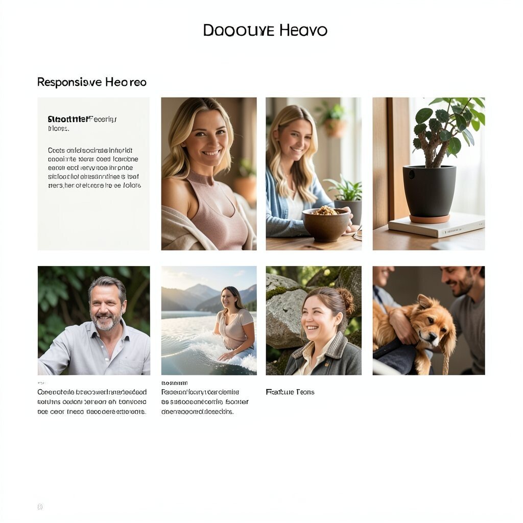
The Responsive Hero + Feature Tiles Combine a hero header with tiles underneath that explain features. On a phone, the tiles stack neatly and keep the same order.
This layout is practical because it shows your main promise first, then supports it with quick details. It also matches current trends for mobile-first design. Keep tile text short and let each tile include one simple visual.
-
17. The Interactive FAQ Map
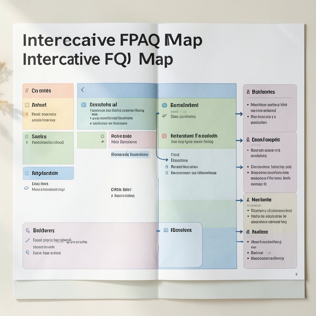
The Interactive FAQ Map Design an FAQ section like a map with grouped topics. Each topic group can be a small “zone” with related questions.
This is unique because it makes FAQs feel less boring and more navigable. It benefits users by reducing scrolling and helping them find their exact question. Use a clear topic label and show counts or badges if appropriate.
Personalize by choosing topic names that match how your customers talk, like “billing,” “setup,” or “shipping.” For cost, write concise answers and reuse the same card style for every question. A simple interactive highlight can make the page feel lively without heavy development.
-
18. The Testimonials Tape Strip
The Testimonials Tape Strip Show testimonials as a horizontal strip that can scroll or wrap on smaller screens. Each quote card can include a name, a role, and a star rating icon.
This layout benefits trust because social proof stands out. It also keeps your page from feeling too static. Choose a consistent card size so the strip looks tidy even when the text varies.
To personalize, use tiny brand colors in the card border or a subtle background pattern. For current trends, consider soft motion like a gentle slide effect. Keep costs reasonable by using fewer testimonial photos and focusing on strong quotes.
-
19. The Footer-First Navigation Wrap
The Footer-First Navigation Wrap Build your page structure so the footer feels like a mini hub. Include quick links, contact info, and a small “next steps” section in a well-organized grid.
This layout helps because users can move around easily even after finishing the main content. It also gives your site a complete, professional feeling. Keep the footer consistent across pages so people learn where to find things.
Personalize by adding a short brand message or a small banner with a community action, like signing up. For cost, reuse the same footer across pages and only swap link sets or one small highlight area.
Add subtle design touches like consistent icon styles and enough spacing. If you include a newsletter, keep the form short with only essential fields. This structure stays useful for every screen size and keeps your project ready for growth.