Kitchen walls can feel plain until you add the right touch. Small changes can make the whole room feel polished and personal.
When art matches your daily life, it turns into a warm backdrop for cooking, chatting, and gathering.
-
1. Framed Botanical Prints in Soft Greens
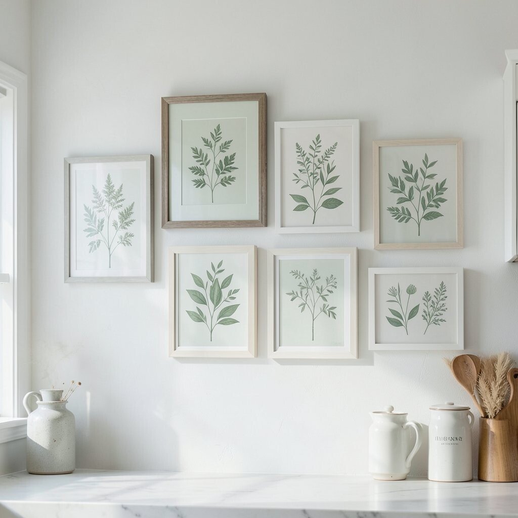
Framed Botanical Prints in Soft Greens Think of leafy branches in gentle greens, like fresh herbs that never stop growing. Choose frames in white, light oak, or black so the art looks clean and elegant.
These prints make kitchens feel calm and lively at the same time. Botanical themes also pair well with plants, dishware, and linen textures. Hang them at eye level, and mix one larger print with two smaller ones for a nice rhythm.
-
2. A Statement Tile Mosaic Accent
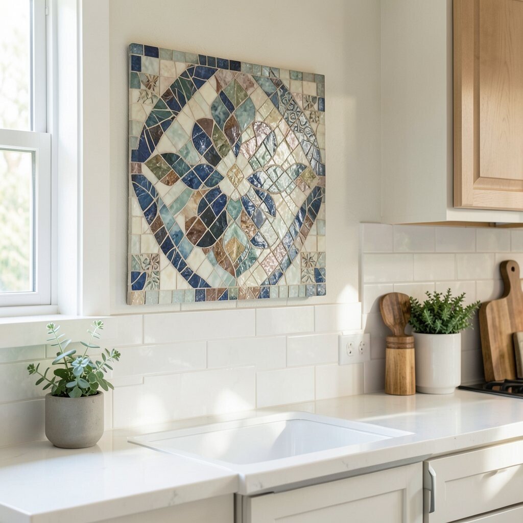
A Statement Tile Mosaic Accent Imagine a small wall area covered in colorful or neutral mosaic tiles. The shine catches light when you move around, so your kitchen feels more “designed.”
Tile art is great because it stays strong against daily cooking steam and splashes. It also looks unique since no two tile layouts are exactly the same.
Keep cost in mind by using a pre-made mosaic panel or a limited grid design. For personalization, match tile colors to your backsplash or countertop edges, then seal it for easy care. If you love trends, look for warm terracotta, speckled stone looks, and matte finishes right now.
-
3. Classic Black-and-White Food Illustrations
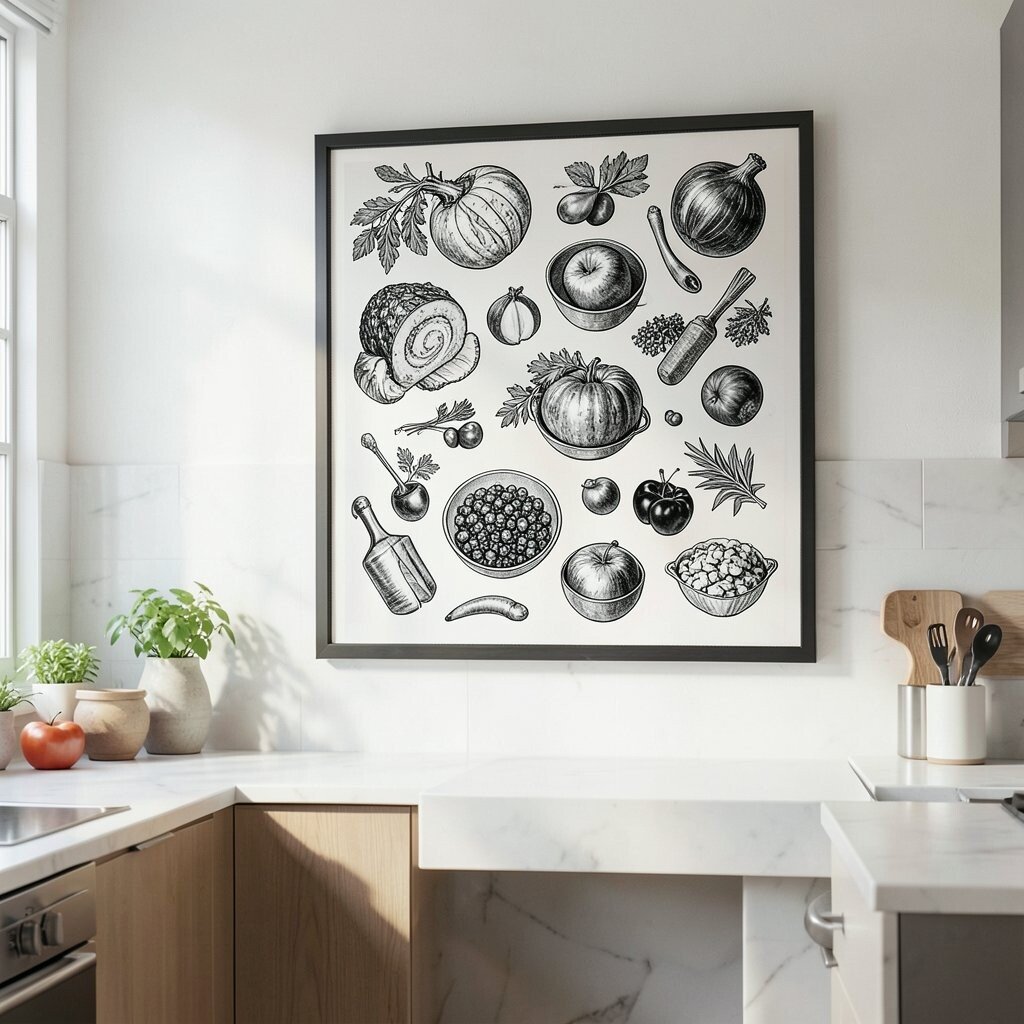
Classic Black-and-White Food Illustrations Picture simple drawings of coffee beans, citrus slices, or vintage kitchen utensils. Black-and-white art gives a crisp, timeless style that never feels busy.
This look helps your kitchen feel more grown-up without needing bold colors. It’s especially helpful if your cabinets are already strong in color or texture. Try using slim frames so the art stays light and airy.
If you want a personal twist, pick illustrations that match what you actually cook. Cost can be friendly when you print high-quality art at home and use affordable frames. For current trends, minimal ink linework and “still life” vibes are very popular.
-
4. Floating Shelf Gallery With Small Art Objects
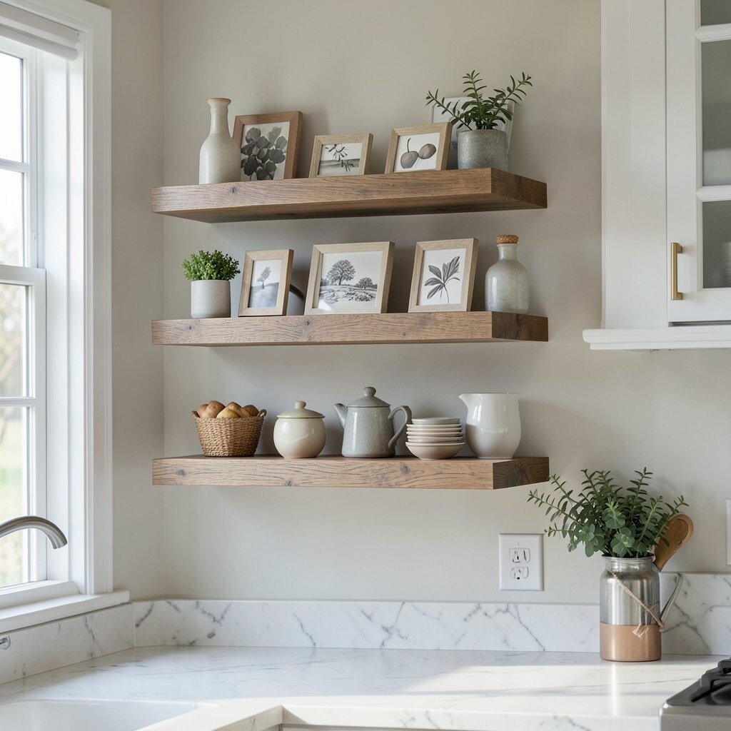
Floating Shelf Gallery With Small Art Objects Use a floating shelf to show tiny framed pieces, small ceramics, or a short row of mini art. This style feels curated because the shelf looks like a little display, not just wall space.
It’s helpful when you want art plus function, since you can add cookbooks, a small plant, or a jar of utensils nearby. You also get easy personalization by swapping items with seasons. For cost, start with one shelf and build slowly, using thrifted frames and a few matching decor pieces.
-
5. Color-Blocked Abstract Canvases
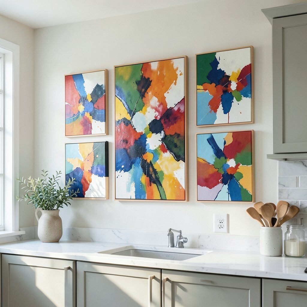
Color-Blocked Abstract Canvases Think of clean shapes in soft colors, like muted peach, dusty blue, or warm cream. Abstract pieces look elegant because they add movement without clutter.
They also help hide scuffs on the wall since the colors pull attention. This kind of art is unique because it can match your exact palette. If your kitchen feels neutral, color-block art adds energy, but still keeps a tidy look.
For tips, keep the canvas size proportional to the wall and use consistent frame colors. Consider a gallery trio if you want variety without spending much. A trend to watch is “quiet color” abstract art that feels calm, not loud.
-
6. Oversized Wall Clock as Sculptural Art
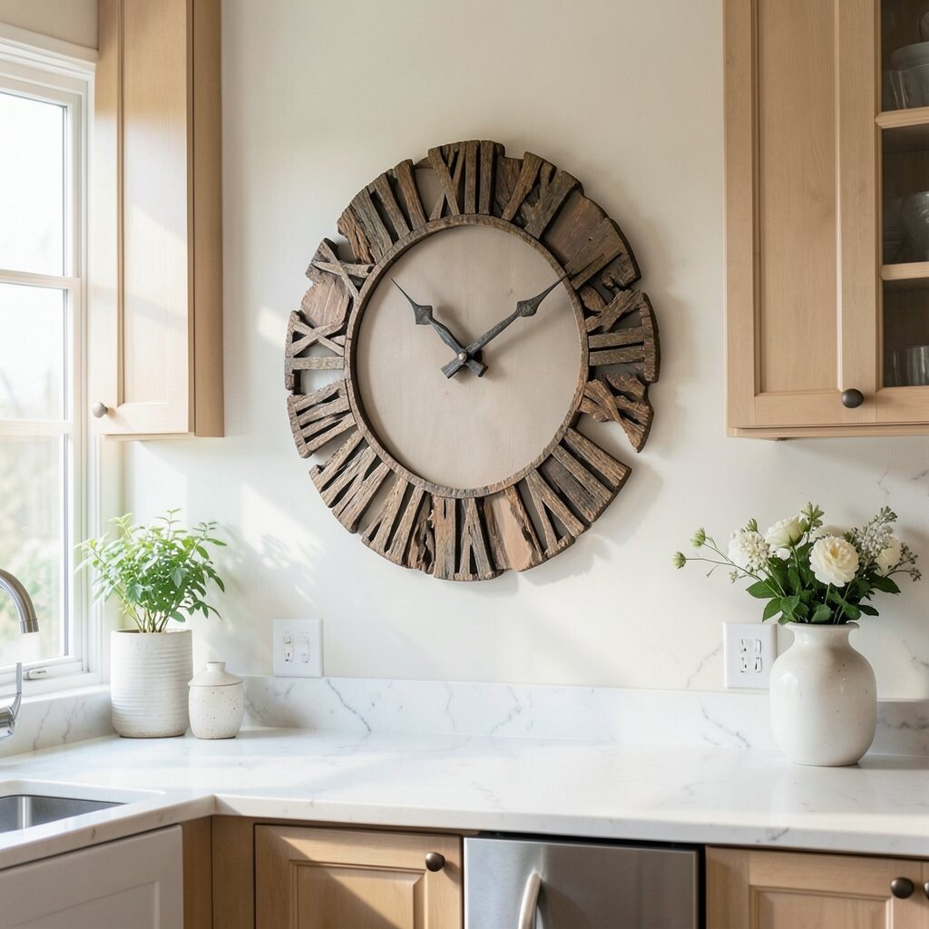
Oversized Wall Clock as Sculptural Art Picture a large clock with bold numbers or a smooth, sculptural frame. When it’s oversized, it acts like wall art and a practical tool at the same time.
This gives your kitchen a focal point, which makes it look more finished. It’s also a smart choice if you like function but still want beauty. Hang it centered above a blank wall spot, and keep the style matching your lighting.
-
7. Handwritten Recipe Quote Prints
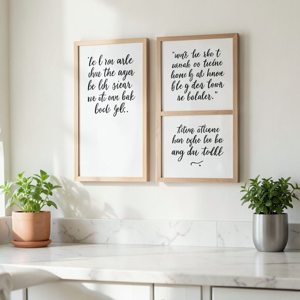
Handwritten Recipe Quote Prints Imagine elegant handwriting on art prints, like “Bake with love” or a favorite family saying. The text makes the kitchen feel warm and lived-in.
These prints are a great benefit because they connect your art to daily habits. They also let you personalize quickly, since you can choose words that mean something to you.
For a budget-friendly approach, print designs on quality paper and frame them with simple mats. Choose fonts that look like cursive or vintage script for a classy feel. Right now, personalized quote art is trending, especially when it matches kitchen colors.
-
8. Vintage Poster-Style Travel or Market Prints
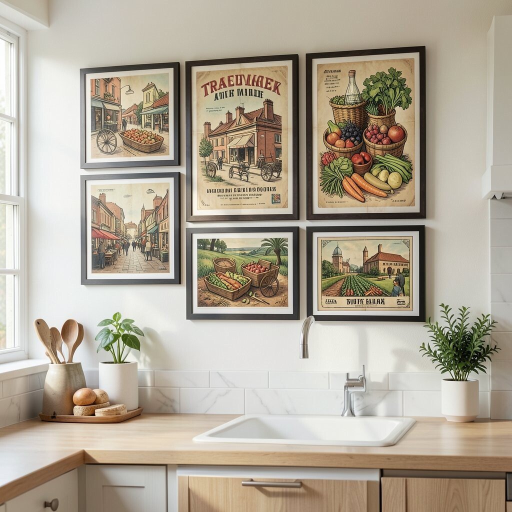
Vintage Poster-Style Travel or Market Prints Think of warm, vintage-style posters with market scenes or small city maps. They bring charm and story to a kitchen, even if the space is small.
These prints make your room feel unique because vintage art usually has character. They also pair well with wooden accents, woven baskets, and aged finishes. Keep the palette close to your kitchen—like warm creams and muted reds—so everything blends.
For tips, choose one strong poster and frame it in a finish that matches your hardware. If cost is a concern, look for reproduction prints or high-quality digital downloads. A trend you’ll notice is “old-world markets” and muted poster colors that feel cozy.
-
9. Oversized Framed Fabric Art or Embroidery
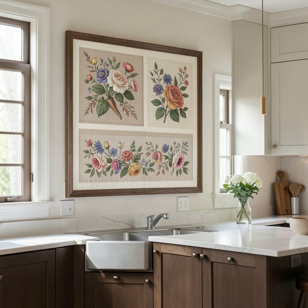
Oversized Framed Fabric Art or Embroidery Consider framing a piece of fabric art, like linen embroidery or a bold textured panel. Fabric on the wall adds softness and warmth that paper art sometimes lacks.
This option benefits you by adding texture, which makes a kitchen feel more inviting. It’s also unique because fabric patterns can’t be perfectly repeated. For personalization, pick motifs that match your style—tiny flowers, simple stripes, or even a stitched monogram.
-
10. Minimal Line-Art of Kitchen Icons
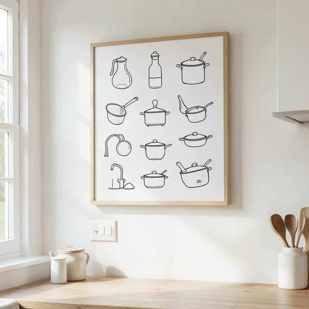
Minimal Line-Art of Kitchen Icons Picture delicate line drawings of a whisk, spoon, rolling pin, or coffee cup. Minimal icons keep the wall looking neat and modern.
This style is helpful if you want art that won’t fight with busy backsplashes or colorful appliances. You can make it personal by selecting the icons that match your cooking routine. Arrange them in a clean grid or a calm vertical stack.
For cost control, buy one set of prints and frame them together, or use a single large piece that includes several icons. Look for current trends in “single line” drawings and simple shapes. Choose frames in matte black or warm white for an elegant finish.
-
11. Textured 3D Wall Letters for “Gather” or “Cook”
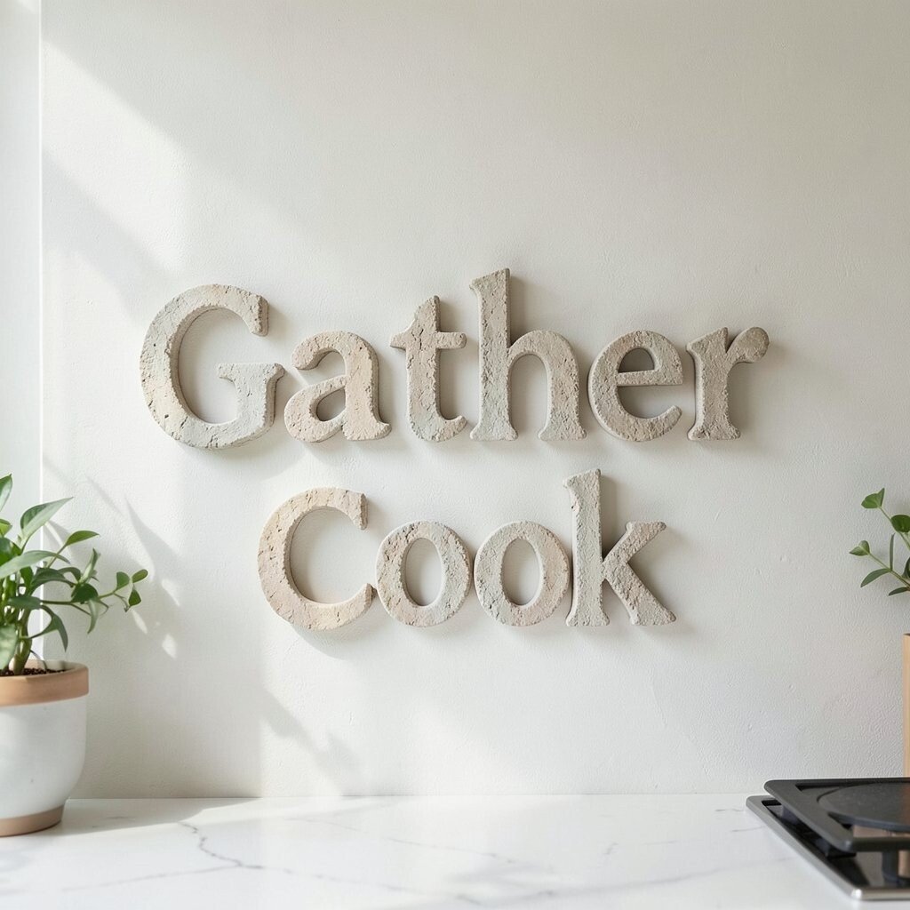
Textured D Wall Letters for “Gather” or “Cook” Try wall letters made from wood, metal, or painted resin that spell one meaningful word. “Gather,” “Cook,” or even your family name can look stylish when the letters are bold and neat.
This creates a benefit because it brings personality without needing many pieces. It’s also unique since the shadows from 3D letters add depth on the wall. Place the letters in a spot with good natural light if possible.
-
12. Gallery Wall of Small Vintage Frames

Gallery Wall of Small Vintage Frames Imagine a cluster of small frames, each with a different print, photo, or recipe card. This style looks playful but can still feel elegant when you keep the frames coordinated.
It’s a big benefit for personalization because you can use family photos, ticket stubs, or old cookbooks pages. You also get a unique “you” look since no two gallery walls match. Use a consistent frame color, like black, brass, or natural wood, to keep it cohesive.
For tips, lay frames on the floor first to plan spacing. A cost-friendly method is to thrift frames and print affordable images. Current trends include “collected” gallery walls with mixed sizes, clean mats, and a calm color theme.
-
13. Large Framed Botanical Typography
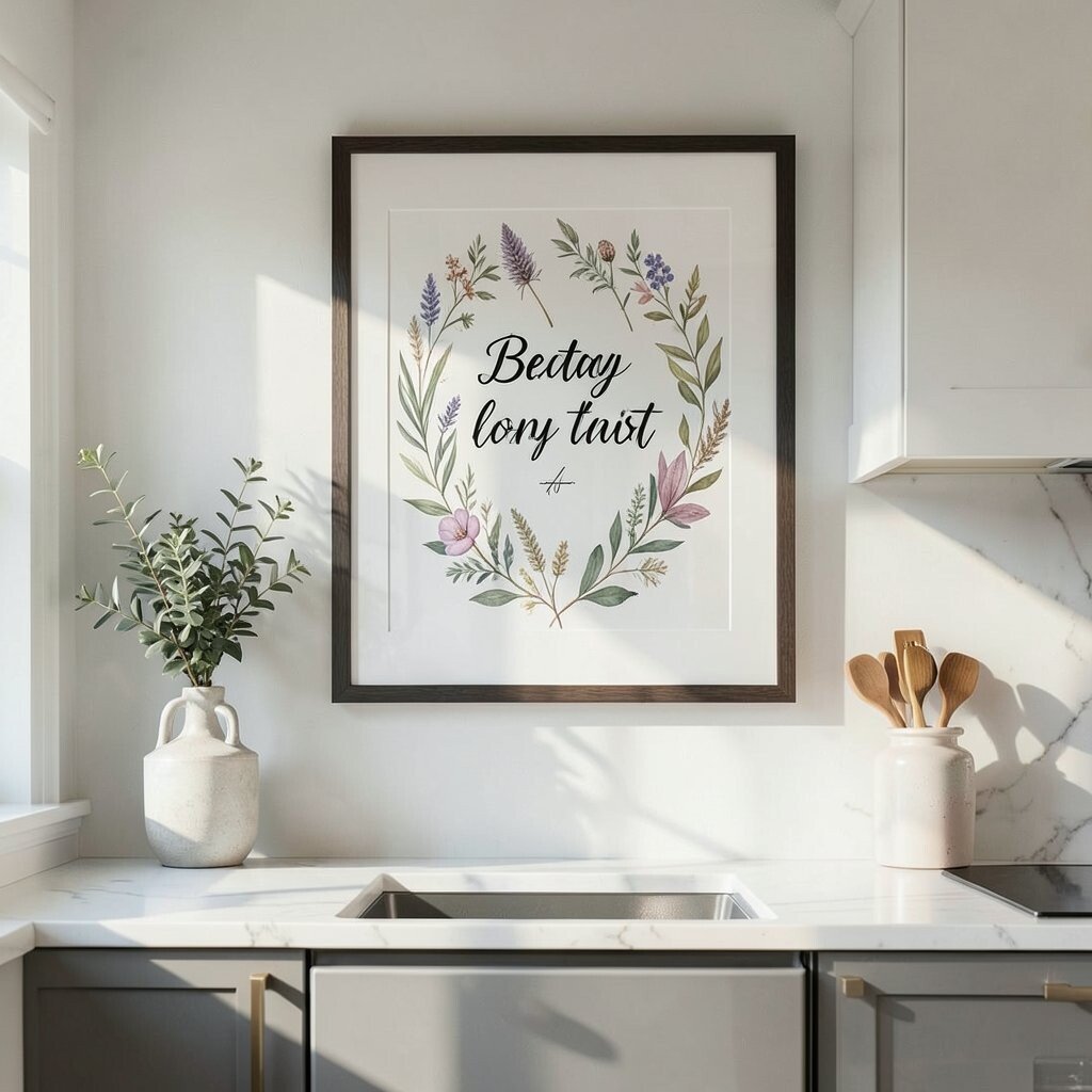
Large Framed Botanical Typography Think of botanical art that also includes names of plants in elegant lettering. This gives your kitchen a smart, gallery feel without being too serious.
It’s beneficial because the typography adds structure, so the wall looks designed. Botanical typography is also unique since it mixes art and information, like a classy science poster. Match the ink color to your kitchen accents for a smooth look.
For personalization, choose plants you actually grow, like basil or rosemary. Cost can be managed by choosing one larger piece instead of several smaller ones. A current trend is botanical “field guide” style prints with muted tones and clean fonts.
-
14. Statement Botanical Wreath With Pressed Leaves

Statement Botanical Wreath With Pressed Leaves Picture a wreath made of dried herbs or pressed leaves, framed like an art piece. It brings nature into the kitchen and looks beautiful even from across the room.
This benefits you by adding warmth and softness, especially on bare walls near dining areas. It’s unique because it can look different every time depending on the herbs you choose. For tips, keep it away from direct steam and replace elements when they fade.
-
15. Minimalist Chalkboard Wall Art (Stylish, Not Messy)

Minimalist Chalkboard Wall Art (Stylish, Not Messy) Consider a framed chalkboard panel with neat lettering or a simple border. If you keep it clean, it can look elegant and still be practical.
This option helps you change your message for holidays, weekly menus, or seasonal themes. It’s also unique because it becomes a living art piece that updates as your life changes. Use chalk markers or a fine chalk style for crisp lines.
For personalization, write a short welcome message or a rotating quote, then wipe it easily. Cost is often lower than many prints, especially if you use a small framed board. A trend you may notice is “menu chalk” used in a polished, minimalist way rather than messy scribbles.
-
16. Oversized Monochrome Photography of Ingredients

Oversized Monochrome Photography of Ingredients Think of a large photo showing coffee beans, garlic, or spices in black-and-white. A big image makes the kitchen feel like a magazine spread.
This benefits you by adding dramatic contrast, which makes walls look more interesting. Photography is also unique because it adds realism and detail. Place it where it can catch light, so the textures pop.
-
17. Framed Pressed Citrus or Herb Specimen Prints
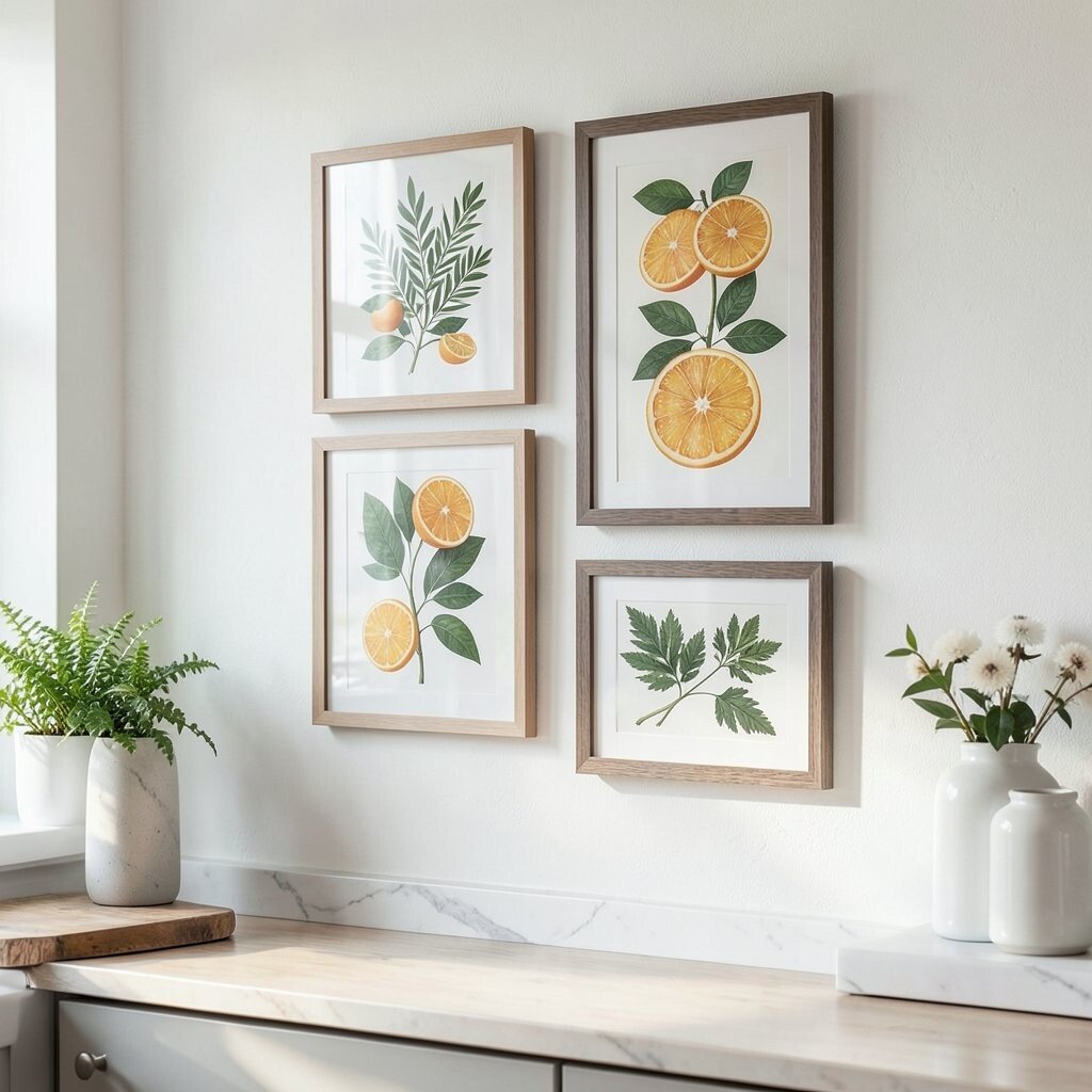
Framed Pressed Citrus or Herb Specimen Prints Imagine framed pressed citrus slices or herb specimens displayed like a neat collection. This looks fresh, artsy, and slightly scientific in the best way.
It’s beneficial because it brings a “farm to table” feeling into your space. It also stands out because it looks handmade, even when it’s carefully arranged. For personalization, choose herbs you love and arrange them by color or size.
For cost, you can start with a small frame and work up later. Use UV-protective glass if possible to help prevent fading. Current trends include botanicals done in a modern, clean layout with simple white mats and muted backgrounds.
-
18. Metal Wall Art With Cutout Kitchen Patterns
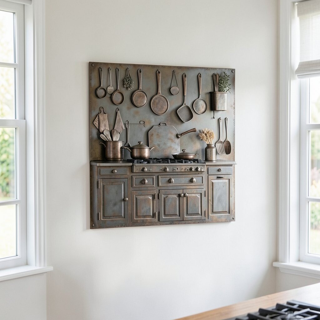
Metal Wall Art With Cutout Kitchen Patterns Picture a metal wall piece with cutout shapes like leaves, utensils, or subtle geometric lines. The shadows it casts can look like moving artwork on the wall.
This is helpful because it brings texture and dimension, even to plain walls. It’s also unique since the pattern and finish can feel modern or rustic depending on the design. Choose a finish like brushed bronze, matte black, or warm pewter to match your hardware.
For tips, measure your wall first so the cutout art doesn’t feel too small. Consider installing it with secure anchors so it stays safe. A trend right now is laser-cut designs that look airy, not heavy.
-
19. Matching Set of Framed Prints for a Smooth Look

Matching Set of Framed Prints for a Smooth Look If you want a polished feel fast, choose prints that match in theme, color, and frame style. For example, three framed pieces of the same botanical series can look calm and elegant.
This benefits you by making the wall feel organized instead of random. It’s also unique because you’re curating a “set,” which can look like professional decorating. Pick one main color from your kitchen, then keep the art’s palette close to it.
-
20. Chalk-Paint Style Gallery Sign With Useful Messaging

Chalk-Paint Style Gallery Sign With Useful Messaging Picture a sign with a soft chalk-paint look that says “Coffee” or “Hello, Kitchen.” The worn texture can feel classy and cozy at the same time.
This option is beneficial because it adds function to beauty, like pointing guests toward the right spot. It’s unique because you can personalize the wording, font, and color. Even if you keep it simple, it brings a friendly vibe.
For cost, buy a small ready-made sign or create one with plain wood and paint. Keep it from getting too close to heat, and wipe it gently with a dry cloth. Trends show a rise in matte finishes and soft vintage typography, especially in farmhouse and transitional kitchens.
-
21. Large Abstract Framed Art Made for Your Color Palette
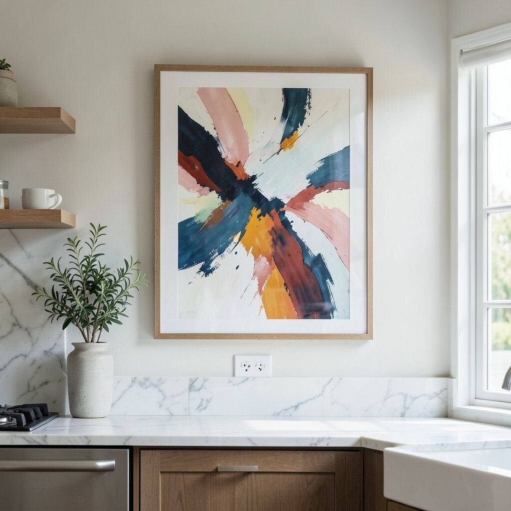
Large Abstract Framed Art Made for Your Color Palette Choose one large abstract piece that includes the colors already in your kitchen. Think of soft neutrals with a pop of olive, terracotta, or deep navy depending on your style.
This works well because one big artwork becomes the “anchor” for the whole wall. It’s also unique since a single statement piece can feel like a custom design. For tips, place it where it can be seen when you enter, and keep the frame finish matching your cabinet hardware.