Framed art can make a room feel new without a single wall renovation. The best part is you can mix style, color, and meaning in a way that still feels like you.
1. Sunlit Gallery Wall With Color Pops
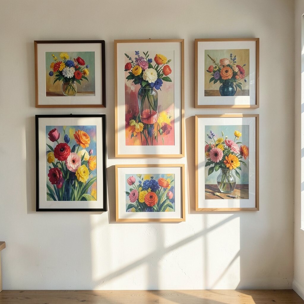
Choose frames that share a simple style, then let the art do the talking. Use warm tones like coral, golden yellow, and sunny orange to lift the mood.
Arrange three to five pieces in a loose grid so your eye moves smoothly across the wall. Keep mat colors bright, like crisp white or pale cream, to make the colors look extra clean. For practical styling, hang the center piece at eye level and step back to adjust spacing before you commit.
2. Vintage Botanical Prints in Matching Frames
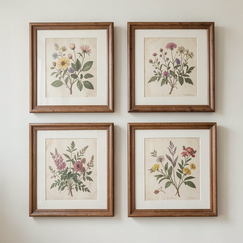
Botanical prints bring a calm, lived-in feeling that works in kitchens, hallways, and bedrooms. Pick leaves, flowers, and botanical diagrams with muted greens and soft browns for an easy cozy look.
To make it unique, mix two print types: one set of detailed illustrations and another set of simpler silhouettes. Use the same frame color across all pieces so the collection feels intentional instead of random. If you want a modern twist, add one artwork that features larger shapes or a single bold flower.
For personalization, tailor the plants to your space by using herbs you actually grow, like lavender or rosemary. If you’re budget-minded, use printable vintage-style art and print it on heavier paper for a more “real” feel. A standard frame size like 8×10 can keep costs down while still looking polished.
3. Black-and-White Family Photos With a Modern Twist
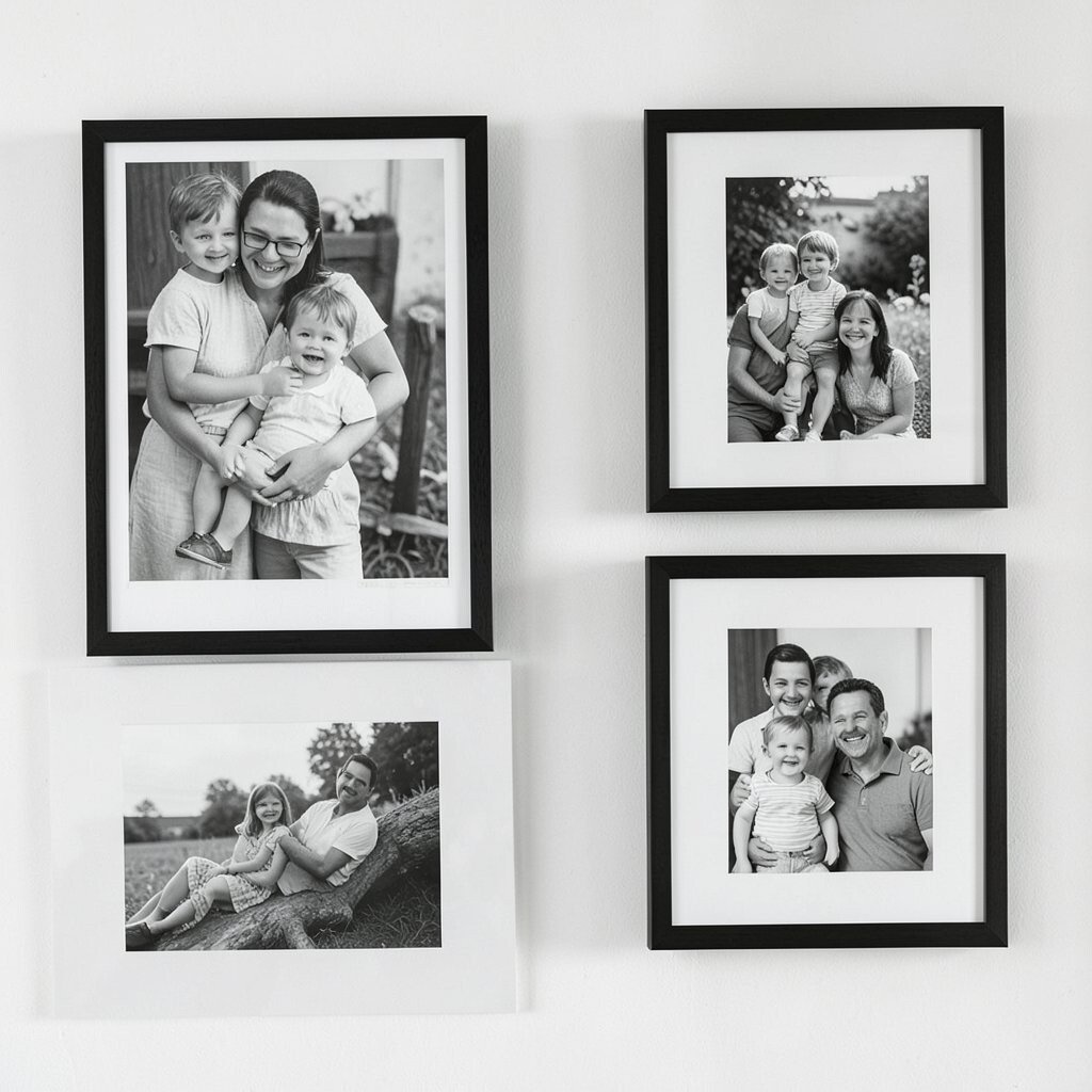
Classic black-and-white photos instantly make a space feel timeless. They also add contrast, which helps lighter rooms look brighter.
Make the set feel fresh by using frames in two finishes, like matte black and warm wood. Try varying orientations, with one portrait photo, one landscape photo, and one square crop. That small mix keeps the wall from feeling too formal.
For practical tips, keep the photo editing consistent so skin tones and lighting match across the series. If you can, crop to clean backgrounds so the focus stays on faces and memories. Use an archival print service or photo-quality prints to avoid fading over time.
In terms of cost, you can print a set of photos at a low price and reuse the frames later as your style grows. This idea stays on-trend because personal storytelling remains a favorite in home decor.
4. Oversized Single Artwork for Instant Impact
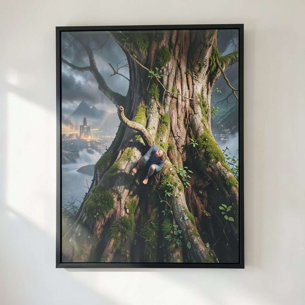
One large framed piece can be the “sunbeam” of a room. It gives your eyes a clear focal point and reduces the stress of matching many items.
Pick artwork with bright highlights or clear color blocks, such as abstract shapes or a bold landscape. Use a frame with a wide mat or slim profile depending on the room’s style, then hang it where people naturally look, like above a sofa or bed. If you want extra brightness, consider light-colored matting to reflect more light.
5. Coastal-Inspired Seashells and Shoreline Scenes
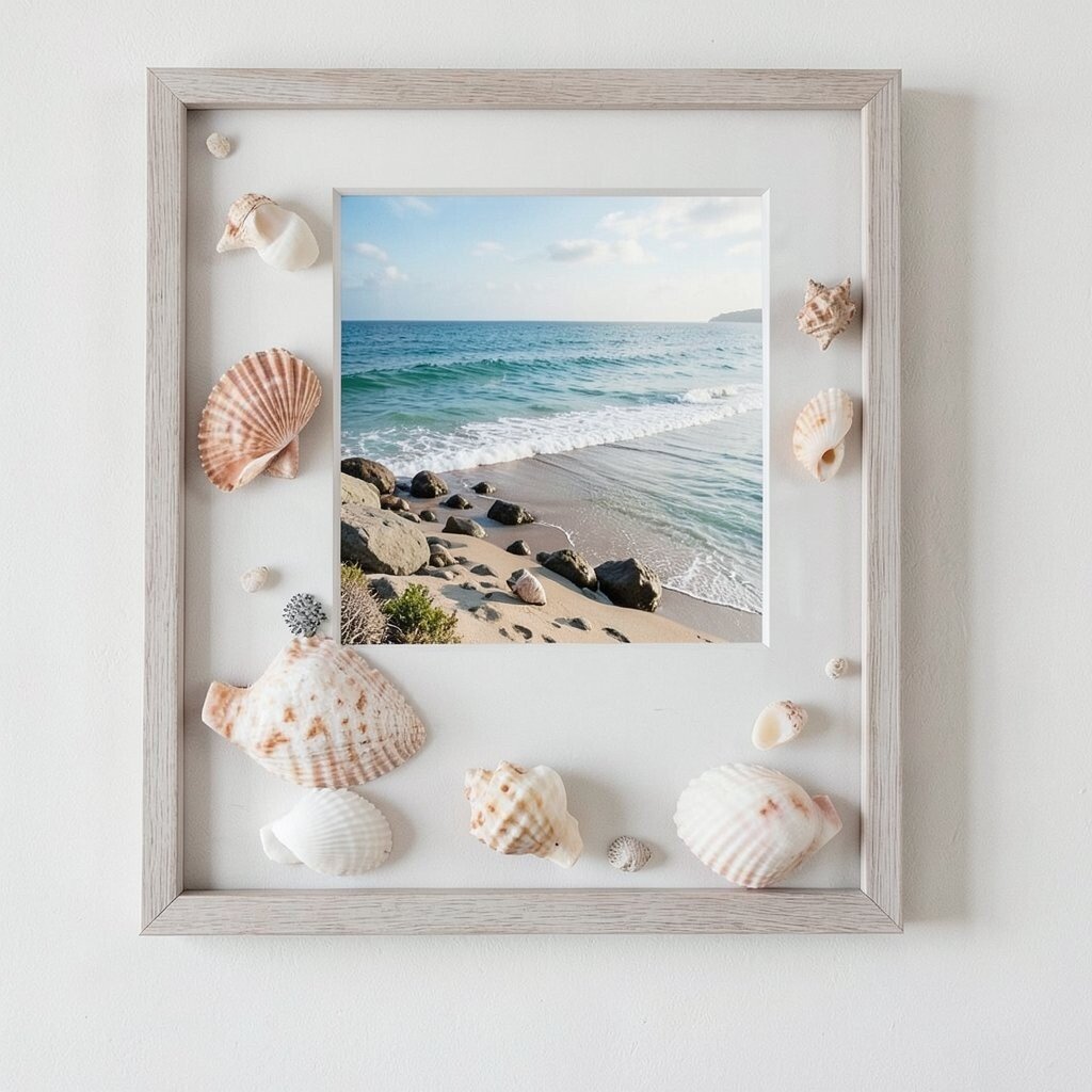
Coastal art adds a breezy, relaxed energy that works all year. Choose framed prints that show shoreline colors like seafoam, sand beige, and gentle sky blues.
To keep it unique, pair a shoreline photo with a simple line-art seashell drawing. That contrast between detailed and minimal makes the wall feel curated rather than themed. Use natural wood frames for a warm look, or go sleek with white frames for a crisp feel.
For personalization, include one piece that matches a favorite beach color you always notice, like deep teal water or pale dune grass. Cost can stay reasonable by printing coastal images at standard sizes and using affordable frames from home stores. Current trends favor “coastal minimal,” so keep the palette calm and the designs simple.
6. Color-Blocking Abstract Prints With Slim Frames
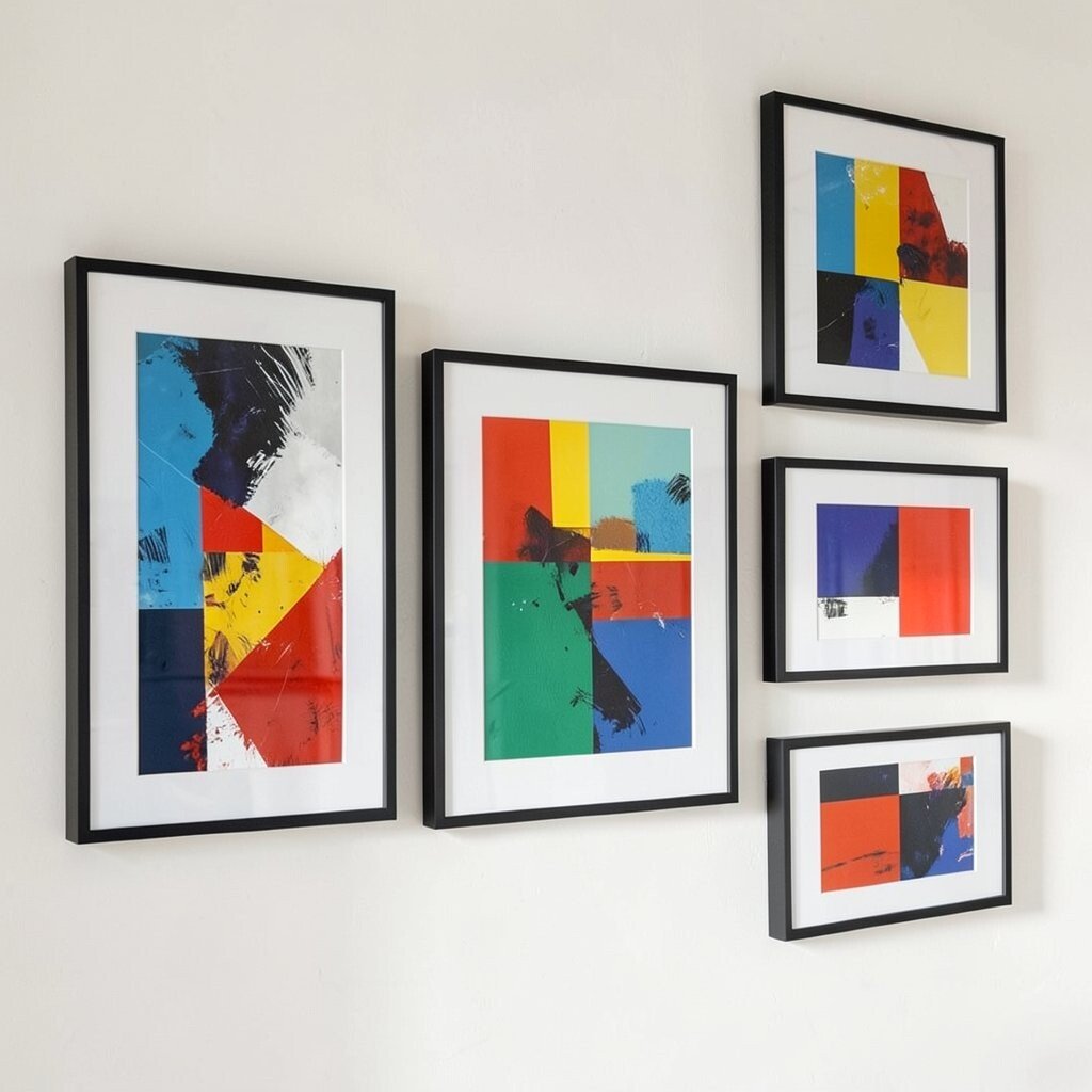
Abstract art is a fast way to add color without needing it to “match” everything perfectly. Color-blocking styles can make a neutral room feel lively in seconds.
Use slim frames in a consistent finish, such as brushed gold or black, to keep the focus on the artwork. Choose one main color family, like blues or warm reds, and repeat it across your pieces. That repetition makes the set look cohesive even when the shapes change.
If you’re personalizing, select one color that appears in your textiles or accessories, like a throw blanket or rug accent. For practical tips, place abstract pieces where you already see that color so the room feels connected. Budget-wise, you can buy poster-style abstract prints and upgrade the look with quality matting.
7. Maps of Places You Love in Subtle Tones
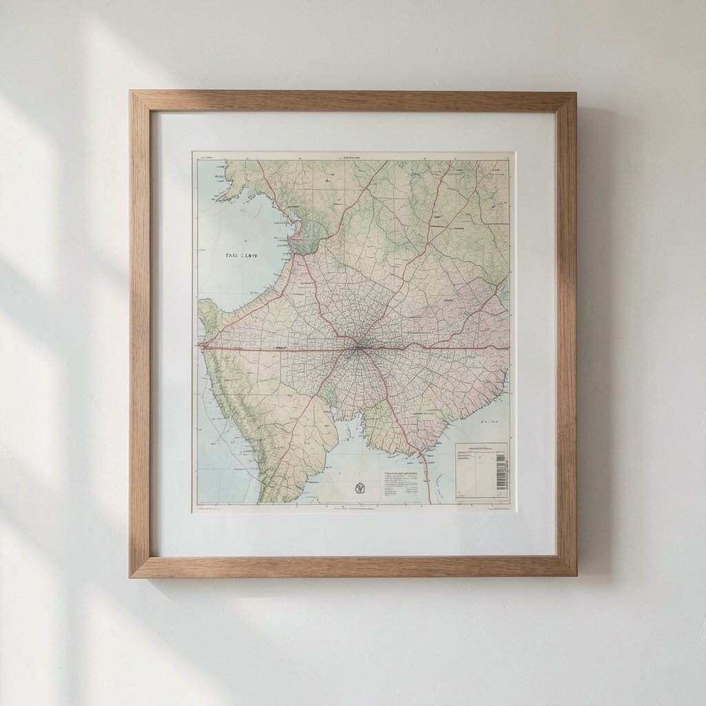
Framed maps turn travel memories into everyday decor. They look especially nice in home offices, reading nooks, and entryways.
Make the idea feel unique by picking coordinates or a specific neighborhood map rather than a whole world map. Use soft-toned prints with grays and muted blues so they blend with many design styles. Pair the map with one complementary print, like a compass rose or a simple travel quote in minimalist typography.
To personalize, choose places that mean something to you, such as where you met, your hometown, or a favorite weekend spot. Cost considerations are flexible because you can find prints online and have them sized to fit common frames. This trend stays popular because it mixes nostalgia with clean, modern layout.
For hanging tips, consider aligning the map center with the middle of a door or console table, so it feels balanced and not tilted. Use thicker backing or lightweight foam board if the print curls after printing.
8. Warm Textures: Framed Fabric Art or Embroidery
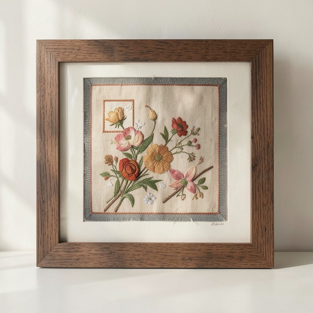
Fabric art adds warmth you can almost feel. It’s great for bringing softness into a space with lots of hard surfaces.
Choose a piece with a simple pattern, like woven linen stripes or a small embroidery motif. Then frame it with a mat that gives the fabric a little breathing room. That little gap makes the texture stand out and keeps it looking intentional.
To make it practical, use pieces you already own, such as a favorite scarf, vintage handkerchief, or small patch. Secure it carefully so it stays flat, then use an acid-free backing so colors remain bright. If you love DIY, this idea can be a low-cost upgrade because the “art” is already in your closet.
For personalization, match fabric colors to your throw pillows or curtains. Current trends lean toward tactile, handmade-looking decor, so framed fabric art fits right in without feeling overly trendy.
9. Inspirational Quotes in Gallery Layouts
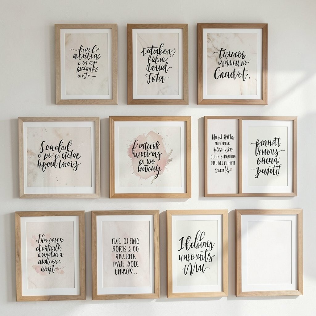
Words can brighten a room by making it feel encouraging and personal. A framed quote set can also create a calmer vibe than busy artwork.
Choose typography that feels friendly, such as clean script or simple sans serif. Use the same font style across multiple frames, or vary only the font size so it stays organized.
For uniqueness, write your own short phrases and keep them meaningful to your daily life, like “Make room for joy” or “Slow mornings matter.” Use mat colors that complement your room, such as warm white for cozy spaces and cool gray for modern rooms. If you want a budget-friendly route, print quotes on quality paper and use standard frames.
Hang quotes where you’ll see them often, like near a desk or reading chair. That visibility turns decor into motivation, and it keeps the space feeling alive.
10. Modern Line-Art Portraits in Matching Mats
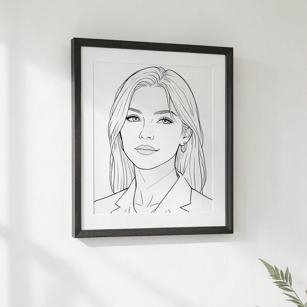
Line-art portraits look light and airy, even when they’re bold. They’re perfect for small spaces because the style doesn’t visually crowd your walls.
Pick portraits with simple shapes and clean strokes, then frame them with matching mats in a consistent color. White or pale gray mats create a bright, gallery-like feel. If you want it to feel more personal, choose portraits that resemble family members or your favorite characters.
11. Framed Children’s Drawings With “Best of” Highlights

Kids’ art can be the most joyful decor you’ll ever hang. It also makes guests smile because it feels real and full of personality.
To keep it from getting overwhelming, choose a handful of the best pieces and rotate them seasonally. Frame each drawing with a mat, which protects the paper and makes it look more finished. If a drawing has lots of color, use simple frame colors so the artwork stays the star.
For practical tips, scan the drawing if it’s fragile, then print a copy for framing while keeping the original in a folder. Consider acid-free materials and avoid direct sunlight to help it last. Cost is usually low, especially if you use basic frames and do a DIY mat cut or printable border.
Personalization is built in, and the look stays relevant because family-centered decor keeps rising in popularity. This is a great way to make a hallway feel warm and lived-in.
12. Geometric Patterns in Soft Pastels
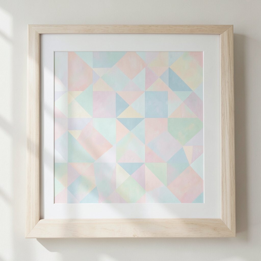
Geometric art brings structure, and pastels bring brightness. Together, they create a tidy, cheerful look that feels calm instead of loud.
Choose designs with repeating shapes, like triangles, circles, or gentle arches. Use consistent mat colors and keep the frame finishes matching, such as light wood or matte white. That unity makes your wall feel organized even when the patterns vary.
For uniqueness, select one artwork with a slightly richer pastel, like a blush with peach undertones, and repeat it as a “highlight” color elsewhere in the set. Budget-wise, you can print geometric pattern art from affordable sources and frame it with standard sizes. This style matches current trends because it balances modern design with gentle color.
13. Landscape Prints With Morning Light Colors
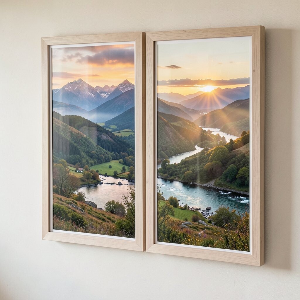
Landscapes are soothing, and morning light colors can brighten the whole room. Think golden sunrise tones, pale clouds, and cool blue shadows.
Pick one series of landscapes that share a consistent “time of day” feeling, like sunrise or late afternoon. That makes multiple frames look like a planned collection rather than separate pieces. Use frames that match your furniture—wood for a warm home, black for crisp modern spaces.
14. Framed Chalkboard-Style Art for Flexible Decorating

Chalkboard-style frames add a playful, changeable touch to your decor. They look especially good in kitchens, laundry rooms, and creative studios.
Use printable chalkboard quotes or simple sketches that you can swap out seasonally. For personalization, write a short message that fits the moment, like “welcome spring” or “movie night.” If you want to keep costs low, choose one chalkboard frame and update the inside prints as often as you like.
15. Monochrome Typography With Bold Hierarchy

Typography art turns a wall into a design statement. A monochrome palette keeps it modern, while bold sizing adds energy.
Choose one theme like “home” or “calm,” and vary the scale across multiple frames. For uniqueness, mix short words with one larger centerpiece phrase so the set feels layered. Use a consistent type style, then alternate between different weights like light and bold.
To personalize, pick words that match your goals, such as “breathe” or “grow.” Consider cost by printing typography designs at home or through an online print service, then placing them in inexpensive frames. This idea stays on-trend because minimalist text art looks clean in many interior styles.
16. Statement Frame With Mixed Styles Inside
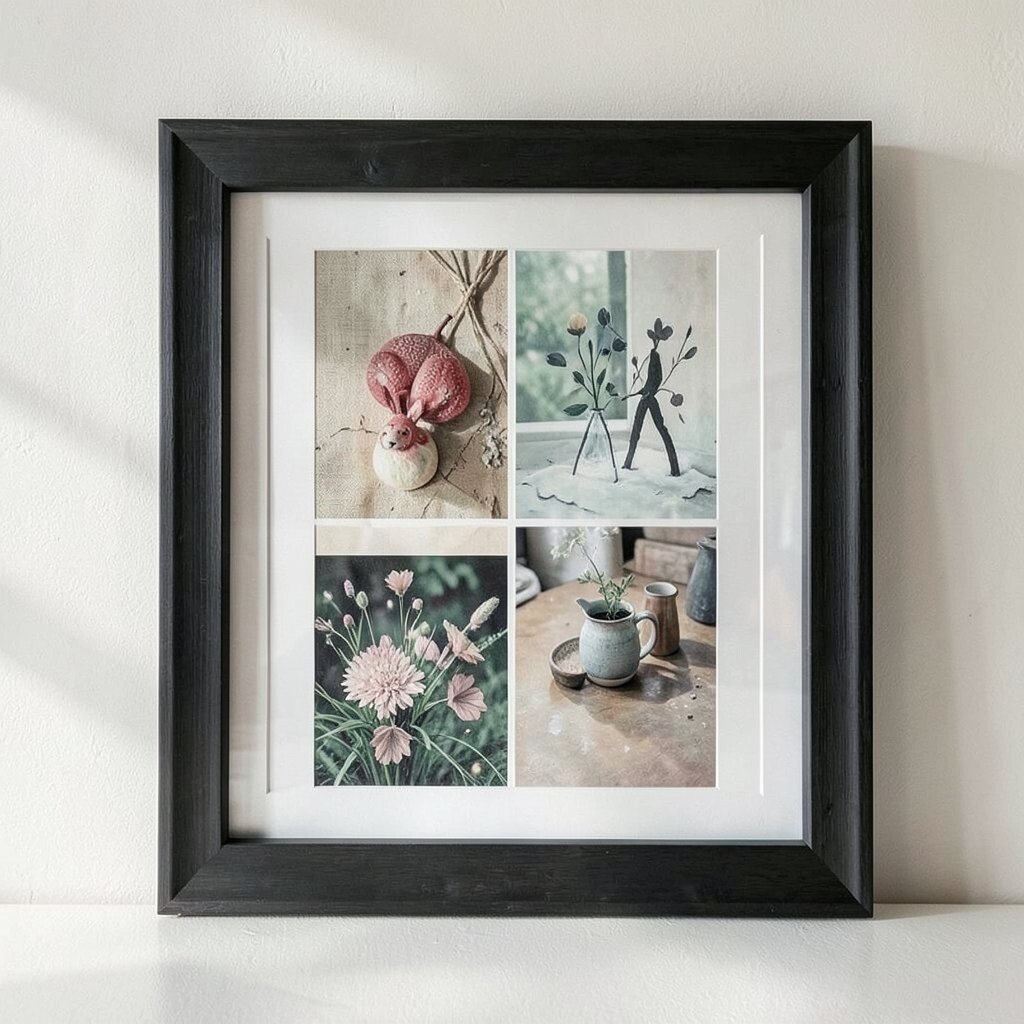
A statement frame is the secret shortcut to making any artwork look intentional. Even if your art collection is varied, the frame choice can make it feel unified.
Pick one main large frame shape, like an ornate border, a wide matte frame, or a bold dark wood. Inside, place smaller prints, photos, or even a curated collage that reflects your interests, like music, books, or nature. For practical tips, keep the inner pieces aligned to a grid and use spacers so everything looks tidy.
Cost considerations are simple: you can spend more on the one standout frame and save on the smaller prints. This approach also supports personalization because you can rotate the inner content anytime without replacing the whole display.