
Granite can make a kitchen feel calm, bold, or fancy—sometimes all at once. The right color helps every cupboard and floor look like they belong together.
-
1. Classic White Granite

Classic White Granite White granite looks crisp and clean, like a bright morning light on your counters. You might see soft gray specks that move gently across the surface.
It can make a small kitchen feel bigger because the color bounces light around the room. White counters also pair well with many styles, from modern to farmhouse. For a budget-friendly plan, choose a granite with less dramatic veining, since highly patterned stone can cost more.
-
2. Soft Cream and Beige Granite

Soft Cream and Beige Granite Cream and beige granite brings a warm, cozy mood to the kitchen. Flecks can look like tiny toasted swirls, which makes the whole space feel inviting.
This color is great for people who want warmth without going too dark. It also hides small day-to-day messes better than very pale stones. To personalize it, match the countertop with warm wood tones and golden cabinet hardware.
Cost can vary by how consistent the pattern is across slabs. If you want a steadier look, ask for slabs that show a balanced distribution of color. You can also consider a simple backsplash to keep the beauty of the stone in the spotlight.
-
3. Deep Black Granite
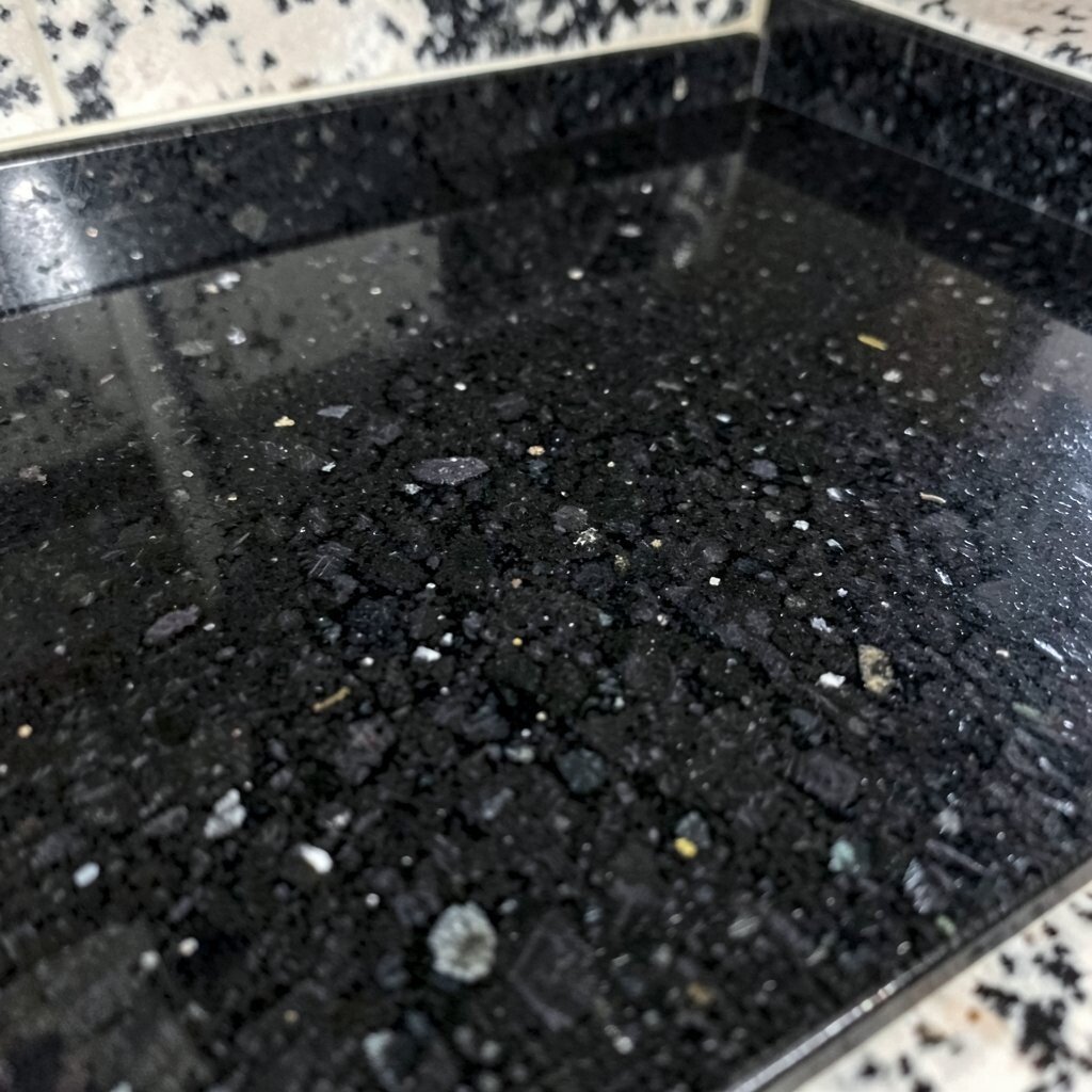
Deep Black Granite Black granite has a sleek, high-end look that can make cabinets feel sharper. You may notice smoky specks or subtle shimmer that catches the light.
This color is a strong choice for modern kitchens, especially with white or light gray cabinets. It also creates a dramatic stage for colorful items like fruit bowls and brass decor. For tips, seal the stone and wipe spills soon, since darker colors can still show streaks when cleaning is rushed.
Black granite can be priced in many ranges depending on the rarity of the background color and pattern. If you love the look but want to manage costs, pick a stone with a simpler pattern so fewer slabs are “special.” Bring home a small sample and check it near your cabinet color during the day.
-
4. Gray Granite with Silver Veins

Gray Granite with Silver Veins Silver-veined gray granite looks smooth and steady, like calm clouds across the sky. The veins often create elegant movement that feels both modern and classic.
It works beautifully with cool colors like navy, charcoal, and bright white. Because gray is neutral, you can change kitchen styles later without replacing the countertops. For personalization, choose a backsplash tile with a gentle pattern so the countertop stays the main feature.
-
5. Light Gray Granite with Cloudy Patterns

Light Gray Granite with Cloudy Patterns Light gray granite can feel airy and soft, with cloudy blotches or faint streaks. It gives a gentle, “blended” look that is easy to live with every day.
This shade is a smart option if you want a modern feel but not too much contrast. It hides many small marks and looks clean even when you’re busy. Try pairing it with matte black faucets for a trendy look, or go warmer with brushed nickel for a calmer vibe.
Pricing depends on the depth of the gray and how bold the pattern appears. Stones with consistent, low-contrast veining may be easier to find in a wide price range. Ask your fabricator about slab availability early so you can plan your budget and schedule.
-
6. Green Granite with Earthy Flecks
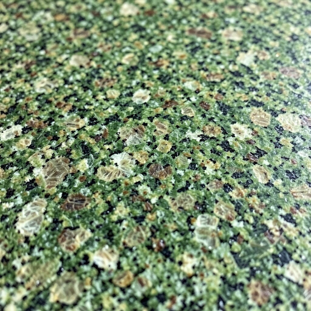
Green Granite with Earthy Flecks Green granite can look like forest stone, with earthy flecks that feel grounded. Colors may range from sage to deep evergreen, and the specks often sparkle in sunlight.
This color can add a fresh, nature-like energy that feels unique in most kitchens. It also works well with wood cabinets, cream walls, and warm metals. To personalize it, pick a backsplash with small green accents or use neutral subway tile to balance the stone.
Cost often depends on how vivid the green is and how rare the pattern looks. If you want the strongest color, expect higher pricing, but you can balance the cost by choosing a calmer cabinet finish. When samples arrive, view them with your flooring and paint swatches so the green doesn’t fight other colors.
-
7. Blue Granite with Cool Undertones

Blue Granite with Cool Undertones Blue granite can look like a still lake, with soft blue tones and darker shadows. Some slabs show tiny crystals that feel almost magical under the right light.
Blue counters can make the kitchen feel cooler and more modern, especially with white cabinets. They also look stunning with gray hardware and stainless steel appliances. For tips, consider a simple backsplash and let the stone’s movement stand out.
If you want to manage cost, ask for slabs with less intense veining and more even color. Blue stones can be priced higher when the blue tone is strong and evenly distributed. Keep in mind that sealing can help keep the surface looking rich and fresh over time.
-
8. Brown Granite with Warm Swirls

Brown Granite with Warm Swirls Brown granite brings a warm, welcoming feel, like coffee and cinnamon in the air. You may see swirling patterns that look detailed and full of character.
This color is great for traditional kitchens and also works in modern spaces that need warmth. Brown granite pairs nicely with cream, tan, or honey-colored cabinets. For personalization, use warm lighting above the counter, and choose cabinet hardware in bronze or antique brass.
-
9. Tan and Sand Granite

Tan and Sand Granite Tan and sand granite looks like desert stone, with gentle movement and soft specks. It often creates a calm, relaxed look that fits many kitchen styles.
This color can hide everyday wear while still feeling bright. It is a smart pick if you want a neutral countertop but don’t want “plain” to be the only word. Try adding texture with a handmade ceramic backsplash or a simple shaker cabinet in light wood.
Cost can be friendly for many tan stones, but it still depends on the slab pattern and availability. Choosing a more uniform look can help you stay closer to your budget. Ask your fabricator about remnant options too, since some tan stones are common enough to find good deals.
-
10. Burgundy and Red Granite

Burgundy and Red Granite Red and burgundy granite feels bold and confident, like a deep ruby glow. You might notice warm veins that look dramatic without being messy.
This color is perfect for homeowners who want a statement kitchen and love rich tones. It can also create an amazing contrast with light cabinets and neutral walls. For tips, keep the rest of the kitchen simple so the countertop stays the star.
Burgundy granite often costs more if the color is vivid and the veining is striking. You may spend extra for a slab that matches the look you want across the entire run. Plan your layout carefully so seams and pattern direction feel intentional.
-
11. Orange Granite with Coppery Highlights
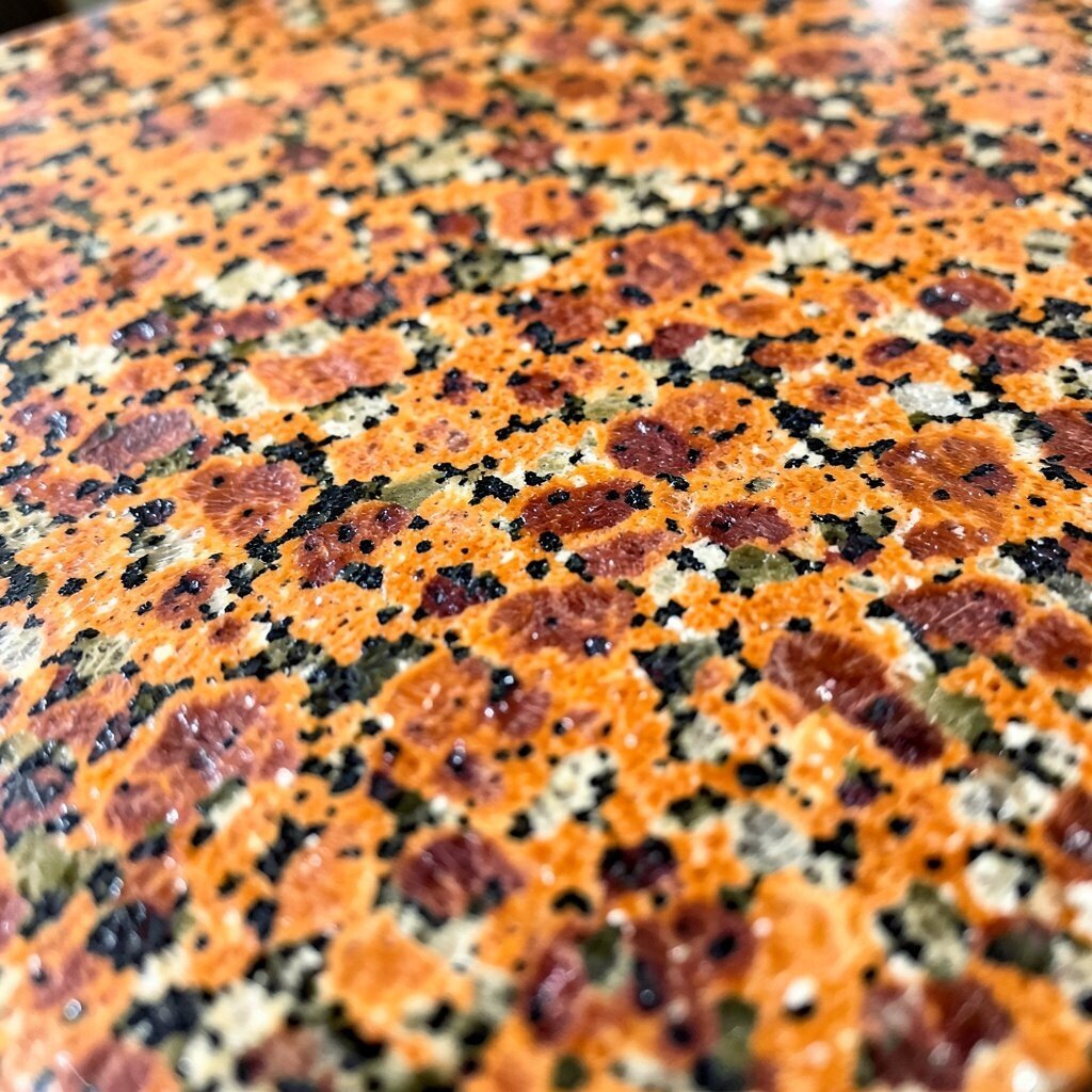
Orange Granite with Coppery Highlights Orange granite can add a lively, sunny mood to your kitchen. Some slabs show copper-like sparks, which can look amazing near warm lighting.
This countertop color brings energy and warmth, especially when paired with neutral cabinets. It also feels unique because orange granite is less common than white, gray, or black. To personalize the look, choose earthy decor like terracotta accents or patterned pottery on open shelves.
Cost depends on the richness of the orange and the stone’s overall demand. Some orange slabs are harder to find, which can raise the price. If you love the color, budget for proper sealing and ask about maintenance so your finish stays glossy and strong.
-
12. Blue-Gray Granite with Mixed Veins

Blue-Gray Granite with Mixed Veins Blue-gray granite blends cool calm tones with visible movement. The veins can look layered, like brushstrokes across a canvas.
This color can fit trendy kitchens because it sits between gray and blue without fully committing. It also makes stainless steel appliances look clean and stylish. For tips, pair it with soft gray cabinets or crisp white paint so the countertop can shine.
You might find good value here, since many blue-gray stones fall into mid-range pricing. Still, the price can change based on whether the stone has strong contrast or a softer blend. Request a slab with enough consistency so your countertop doesn’t end up patchy or uneven.
-
13. Marble-Like White Granite with Veining
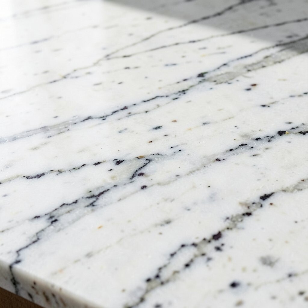
Marble-Like White Granite with Veining Marble-like white granite looks fancy, with thicker veining that feels like artwork. It can give you the elegance of marble while still offering granite’s durability.
This color works well in kitchens that want a luxury vibe without going fully classic. Veined stones can look especially striking with dark cabinets or deep green cabinetry. For personalization, choose a countertop edge style that matches the mood, like a polished edge for a crisp look or a softer profile for a gentle feel.
-
14. Multicolor Granite with Speckled Chaos (In a Good Way)

Multicolor Granite with Speckled Chaos (In a Good Way) Multicolor granite can look like a natural confetti mix of grays, creams, and darker flecks. The pattern often feels busy, but the overall look can still feel balanced.
This is a great choice if you can’t decide on one color story. Multicolor stone can hide stains well and keeps the countertop from looking “too perfect,” which many people love. For tips, choose cabinets in a solid color so the countertop pattern remains the main detail.
-
15. Chartreuse and Lime Toned Granite (Bold Pop Options)

Chartreuse and Lime Toned Granite (Bold Pop Options) Lime toned granite can bring a playful, energetic pop to your kitchen. Some slabs show chartreuse hints with specks of darker green that add depth.
This color is for kitchens that want personality, not just neutrality. Pair it with simple white cabinets, light gray walls, and modern hardware to keep the vibe fresh. For personalization, add a matching small accent color in decor, like in a dish towel or a vase, so the granite feels intentional.
Because bright greenish stones are rarer, costs may be higher depending on the slab availability. To manage your budget, consider using the stone in a smaller section like a kitchen island plus a more neutral perimeter. Always check samples in your real lighting, since lime tones can shift under warm bulbs or cool daylight.