That wall behind your sink quietly shapes how your whole kitchen feels. Choosing the right backsplash is like picking the perfect outfit for everyday life.
When it looks good and works hard, you notice it every time you cook.
-
1. Start with your kitchen mood
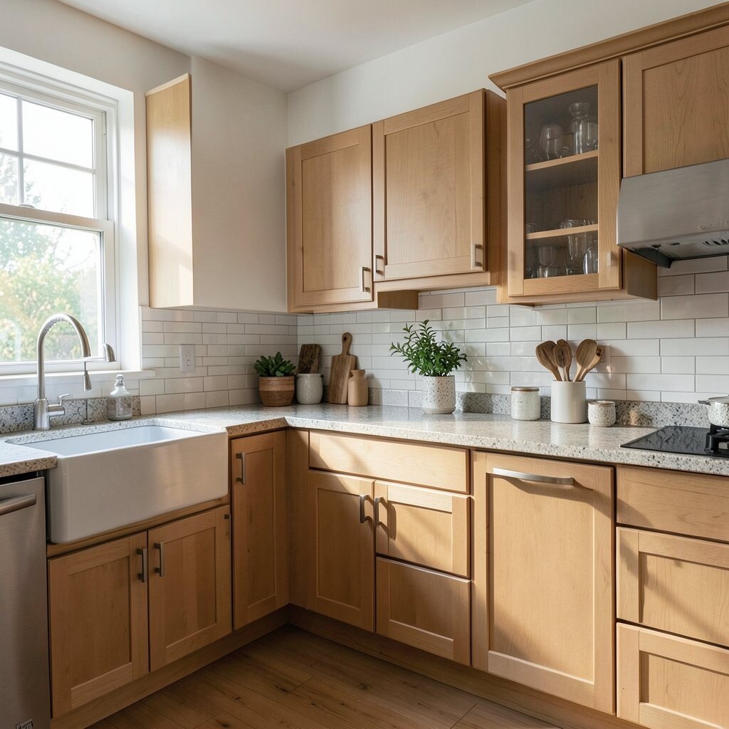
Start with your kitchen mood Look at your cabinets, floors, and countertops first. Notice the colors that already feel “in charge,” like warm oak tones or cool gray stone.
Your backsplash should support that mood, not fight it. If your kitchen is bright and airy, consider lighter materials with clean lines for an open look. If it feels cozy, you might pick warmer shades and textured finishes to add comfort.
Visual cues matter: smooth glossy surfaces can look crisp, while matte tiles can feel calm. A well-matched backsplash creates a simple, pleasing story from counter to wall. For personalization, try matching one small accent color from your decor, like a cabinet knob or rug stripe.
-
2. Think about how you cook day to day
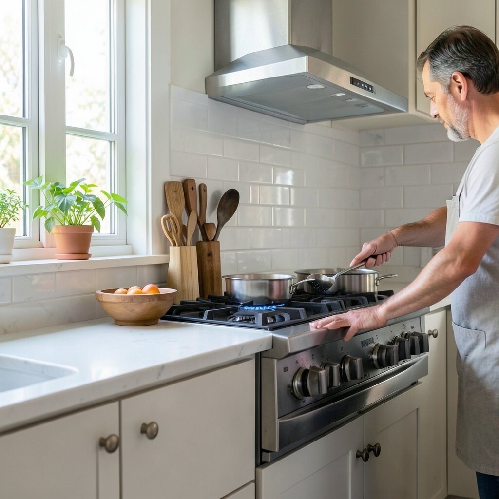
Think about how you cook day to day Ask yourself what happens most in your kitchen. Do you splash a lot near the sink, or do you cook with higher heat right by the stove?
For busy cooking, you want materials that handle grease, splatters, and frequent wiping. Ceramic and porcelain tiles are a popular choice because they resist stains and are easy to clean. A solid surface like quartz or a glass panel can also give a sleek, wipe-friendly feel.
Texture helps too: finishes that don’t show water spots save time. If you love bold meals, pick a backsplash that stays looking fresh with simple soap and water. Consider a tight grout color match if you choose tile, since that makes the wall look even and neat.
Cost-wise, think beyond the sticker price. Cheaper materials can need more attention later, especially if they stain or chip easily. Investing a bit more in a resilient option can be cheaper in the long run, because you replace it less.
-
3. Measure the space and plan your layout
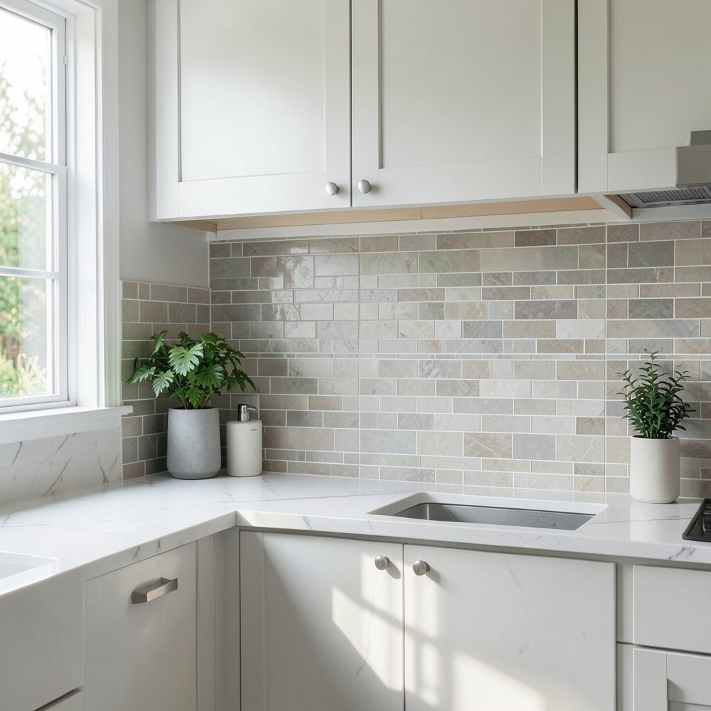
Measure the space and plan your layout Measure the height and width of the backsplash area before you fall in love with a style. This keeps your choices realistic and helps you avoid “almost enough” materials.
Decide if you want to cover the whole wall or just part of it. Full coverage can look polished and custom, while a partial height backsplash can keep the budget friendlier. If you have an outlet-heavy wall, plan for how you’ll place tiles or panels around them.
For a visual win, create a layout that feels intentional. Center patterns behind the sink or align lines with cabinet edges for a tidy look. If you’re using subway tile, consider a classic running bond, or try stacked patterns for a modern feel.
Personalization tip: bring a sample sheet to your kitchen and mark the spots where light hits. That helps you see grout lines, reflections, and how colors will look in real daylight.
-
4. Choose a material that fits your lifestyle and budget
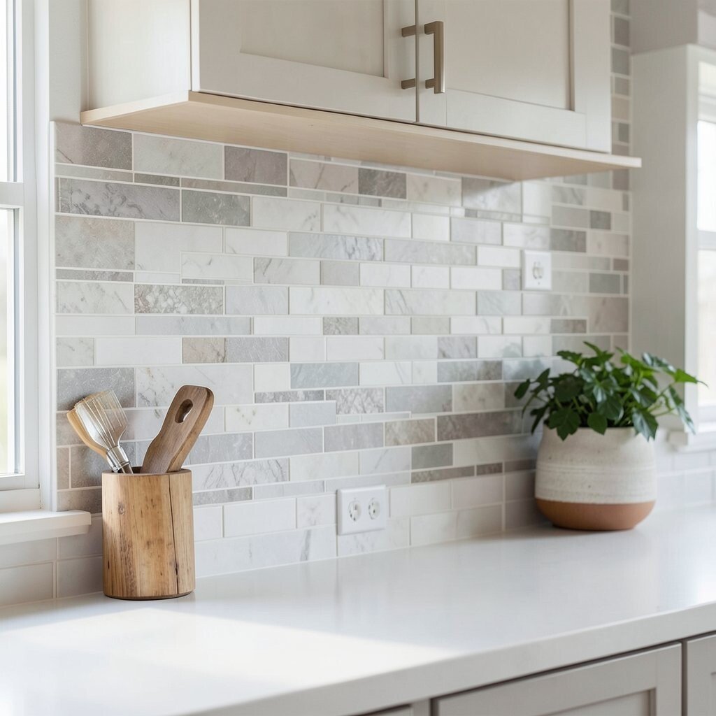
Choose a material that fits your lifestyle and budget Backsplash materials range from budget-friendly to high-end, and each has its own look. Ceramic tile can give you endless colors, while natural stone can add luxury and variation. Stainless steel and other metals can look sharp and modern, especially under bright lighting.
When you think “cost,” include installation and maintenance. Some materials are affordable but require careful sealing or frequent upkeep. Others cost more upfront but stay beautiful with simple cleaning.
Uniqueness comes from what you choose to invest in. If you want a standout wall, consider handmade tiles with slight shape differences for charm. If you want calm and clean, large-format tiles or smooth surfaces create fewer seams and a more streamlined vibe.
A helpful tip is to ask for a few installer recommendations and read how they handle each material. The right installer can make even simple materials look professional. Always check what your kitchen needs, especially around heat, moisture, and daily cleaning.
-
5. Explore tile styles that can look custom
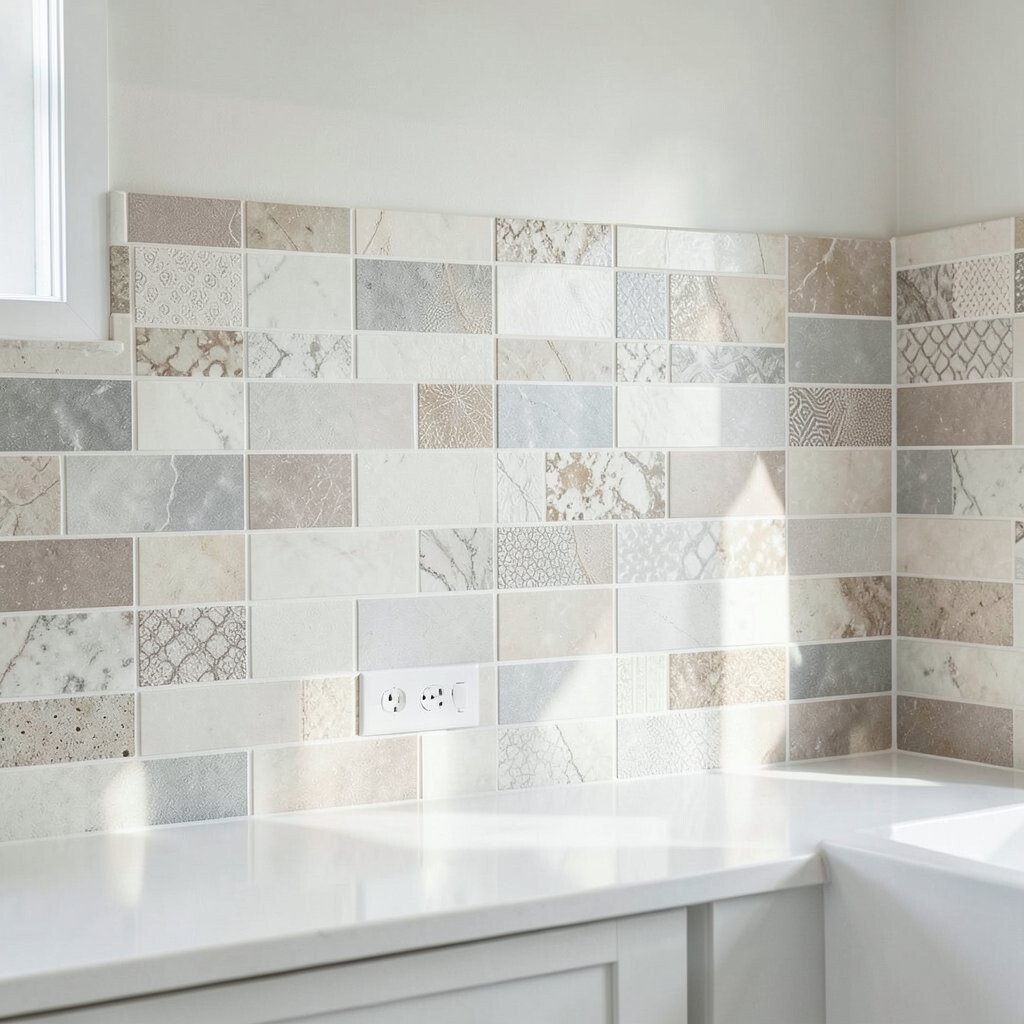
Explore tile styles that can look custom Tile is loved because it can look like art. You can choose shapes like subway, hexagon, arabesque, or even small mosaics for a playful feel.
Visual descriptions help you choose faster. Glossy tiles catch light and look lively, while matte tiles feel soft and modern. Textured tiles can hide tiny messes and add depth behind your counters.
For personalization, mix two tones carefully, like a main neutral with a thin stripe of a bolder color. You can also use decorative trim pieces to frame the backsplash like a picture.
Cost considerations are real with tile. Smaller tiles often mean more grout lines, which can add time and labor. Larger tiles can cost more per piece but may lower installation time, especially if your walls are fairly straight.
-
6. Understand grout: it can make or break the look
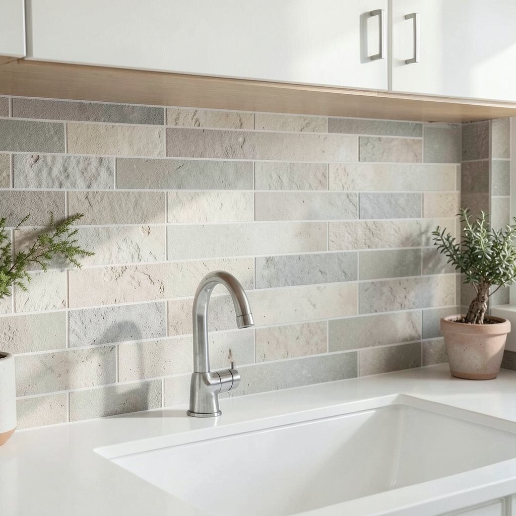
Understand grout: it can make or break the look Grout is the quiet linework that holds everything together. Its color changes how your backsplash reads from far away.
Light grout can make white or cream tiles look bright and airy. Dark grout can give a stronger contrast that highlights each tile shape. If you want a smooth, continuous look, choose a grout color close to your tile color.
For benefits, the right grout helps with cleaning and keeps the wall looking crisp. Ask your installer about grout type and how it resists stains. Sealed grout can be a smart step if your kitchen gets lots of splashes.
Uniqueness trick: pick grout that matches your cabinetry hardware for a subtle, pulled-together look. If you love a clean modern style, consider a grout finish that doesn’t look too chalky. This small choice adds big personality.
Cost wise, better grout systems may cost a little more. Still, they can reduce maintenance and help the backsplash stay picture-ready longer.
-
7. Decide on color strategy with confidence
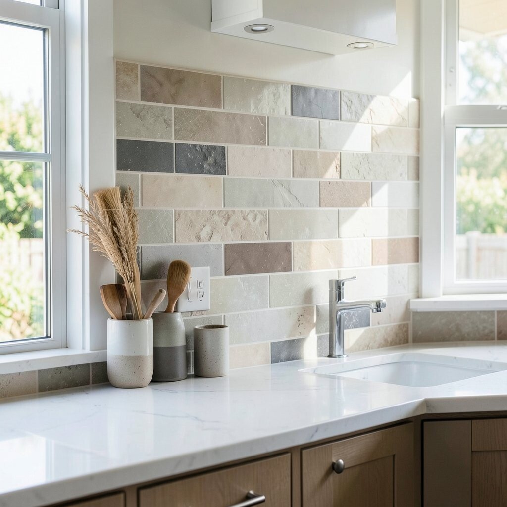
Decide on color strategy with confidence Pick a color plan before you shop, so you don’t get overwhelmed by all the pretty samples. A simple plan is to choose one main color, one supporting neutral, and one accent.
Visualize how color will look at different times of day. Warm morning light can make cool colors look softer, while evening lighting can deepen dark shades.
If you want a safe, timeless look, go with white, cream, or soft gray. If you want uniqueness, add color through a patterned tile border or a darker accent section behind the range. You can also blend metals, like pairing warm wood tones with a cool stone for an interesting contrast.
Personalization ideas: match the backsplash to your favorite dishware color, or choose a shade that echoes a painting in the kitchen. Even a small accent can make the space feel designed, not accidental.
-
8. Pick finishes that work with your lighting
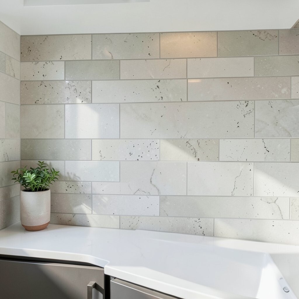
Pick finishes that work with your lighting Backsplashes look different under bright ceiling lights, soft pendant lights, and natural daylight. Before choosing, hold samples near your cabinets and sink area and wait a few minutes to see the change.
Glossy finishes can look vibrant and clean because they reflect light. Matte finishes feel modern and calm, and they hide smudges better. Satin finishes can give you a middle ground that feels refined without being too shiny.
For benefits, the right finish reduces the “show every smudge” effect. If you cook often, you may want a finish that doesn’t highlight fingerprints and water marks. Textured finishes can also camouflage minor splashes.
Cost considerations can change with finish too. Specialty glazes or high-end stone finishes can raise the budget, but they often look incredible for years. A smart approach is to start with a finish you’ll love, then adjust material or size if cost needs help.
-
9. Consider backsplash height and “end points”
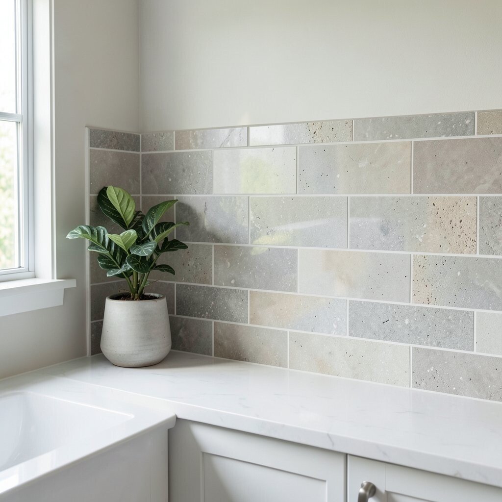
Consider backsplash height and “end points” Backsplashes don’t have to be the same height everywhere. You can stop at the counter line for a classic look, or extend higher for added drama.
If your range hood sits higher, extending the backsplash can frame it like a spotlight. A full-height backsplash can look elegant and helps protect walls near splatter zones. For a more budget-friendly choice, you can cover the most used areas and leave less wall exposed.
Uniqueness comes from details at the edges. Use trim pieces, bullnose tile, or a clean wall finish so the backsplash feels finished, not cut off. This matters especially around windows and near corners.
Personalization idea: match the top line to the underside of upper cabinets. When the visual line feels aligned, the whole kitchen looks custom.
Keep cost in mind, because more height means more materials and more labor. Plan the height that gives you protection where you need it most.
-
10. Match style with hardware and fixtures
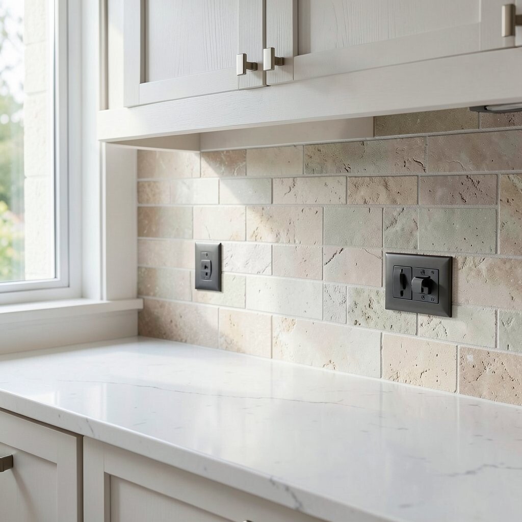
Match style with hardware and fixtures Notice your faucet, cabinet pulls, and lighting fixtures. If they are brushed nickel, you can keep the backsplash in a similar family for a steady look.
For visual cohesion, metals should “talk” to each other. Stainless steel counters and modern faucets pair nicely with simple tile patterns or subtle stone. If your fixtures are warm brass, consider warm-toned tiles or stone with golden movement.
Benefits include a more balanced kitchen where everything feels like it belongs. It can also make the kitchen look more expensive, even when you choose a straightforward material.
Uniqueness option: choose a backsplash that echoes just one detail, like a faint gold speck in a stone tile. That makes the design feel intentional without copying everything.
Cost considerations: metal-look panels and real metal backsplashes can be priced higher. You can often get similar style by using stone or tile with metal-like undertones.
-
11. Choose a pattern that fits the room size
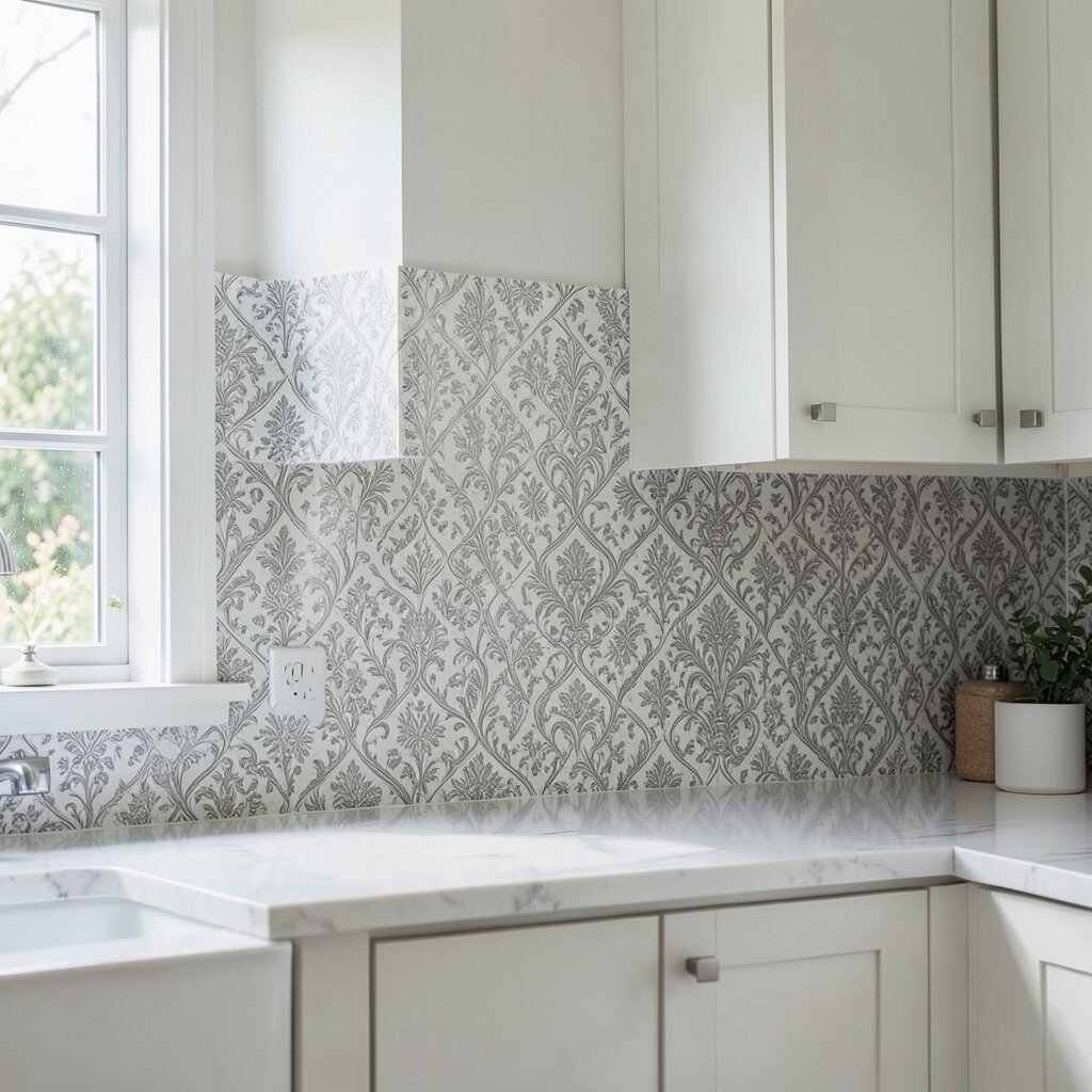
Choose a pattern that fits the room size Pattern scale changes how a kitchen feels. Large, bold patterns can make a statement, while smaller patterns can add charm without feeling busy.
If your kitchen feels narrow, too many loud patterns can make it feel tighter. A calmer backsplash can help the space feel roomy and breathable. For wide kitchens, you can be more playful because there’s more visual space to enjoy details.
Visual description helps here: imagine a grid of small tiles. It can look neat and structured, like a polished mosaic. Picture a single-color slab panel, and it can look smooth and airy, like a clean canvas.
Personalization tip: use a patterned border only in high-focus zones, such as behind the sink. This keeps your budget under control while still giving you wow-factor.
Cost-wise, complex patterns might require extra cutting and extra labor. Simple repeating layouts often install faster and help manage expenses.
-
12. Compare slab options for a sleek look
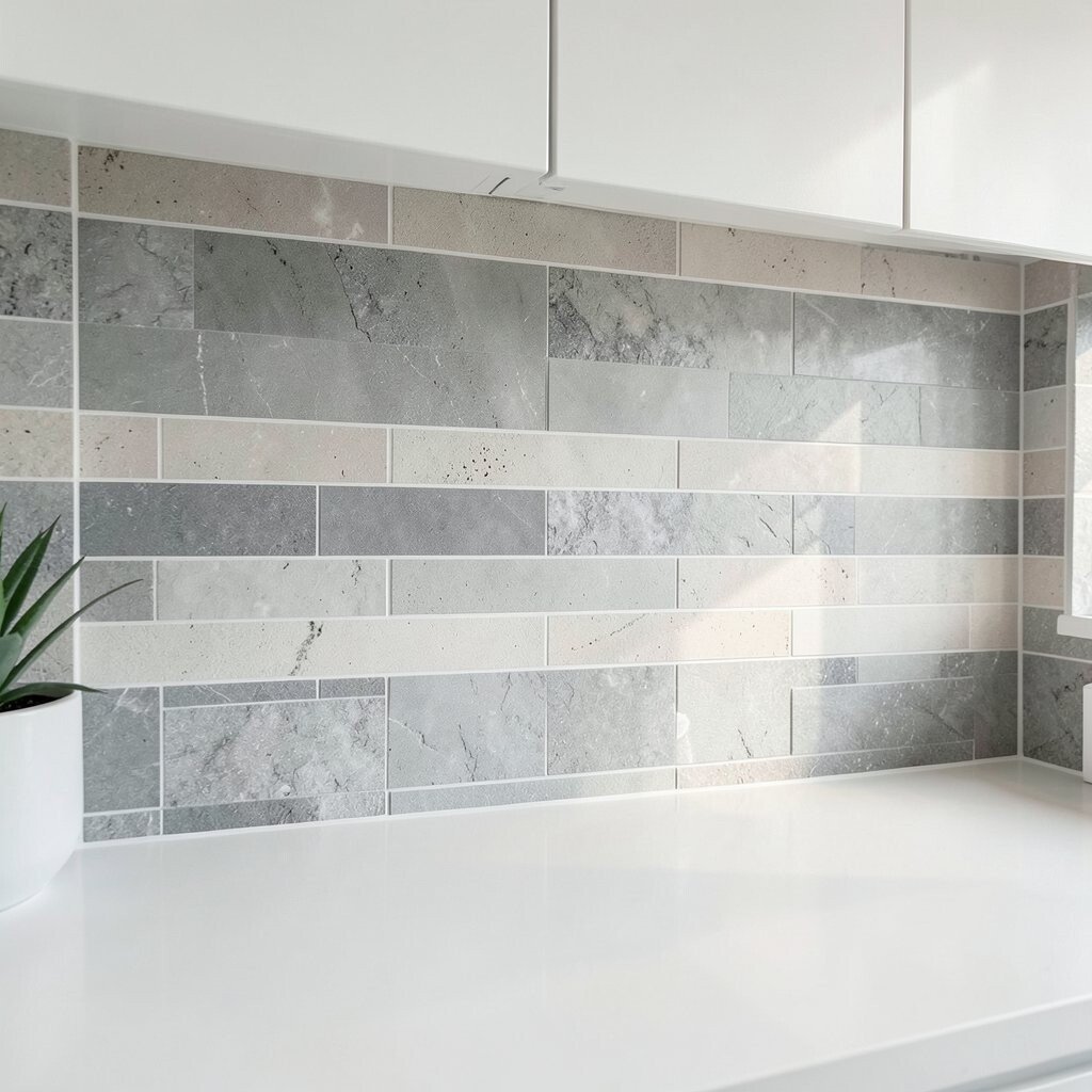
Compare slab options for a sleek look Slab backsplashes can feel modern and calm. They often create fewer seams, which can make cleaning easier.
Materials like quartz, marble, and certain wall panels can give a smooth surface with a polished look. Natural stone offers unique veining that no two kitchens have exactly the same. Man-made stone can mimic that beauty with more consistent colors.
Benefits include a tidy, high-end appearance and fewer grout lines to maintain. If you hate scrubbing, slab-style can be a relief. It also works great when you want the backsplash to look like part of your countertop design.
Uniqueness comes from veining and color movement, especially with marble and some natural stones. Personalize by choosing a slab with a vein direction you like, then align it so the movement looks centered behind your sink.
Cost considerations: slab materials often cost more than standard tile, and installation can require careful measuring. Still, the clean look and easier maintenance can make it worth it.
-
13. Learn about glass backsplashes and their benefits
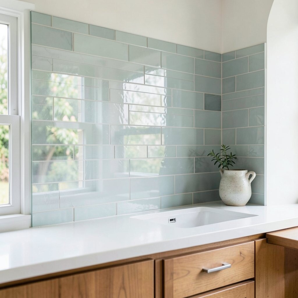
Learn about glass backsplashes and their benefits Glass backsplashes have a glossy, reflective look that can make your kitchen feel brighter. You may see light bounce around like little sparkles.
One of the main benefits is that glass is smooth and usually easy to wipe. Grease and splatters don’t cling as much on a non-porous surface. This can be especially helpful if you cook frequently.
Visual description: glass tiles often look like they’re layered with color, even when they’re a solid shade. They can also add depth if you choose translucent styles.
For personalization, pick glass in a tone that matches your cabinets but use a slightly different shade for subtle contrast. You can also choose backer colors behind the glass to intensify the look.
-
14. Choose natural stone for one-of-a-kind character
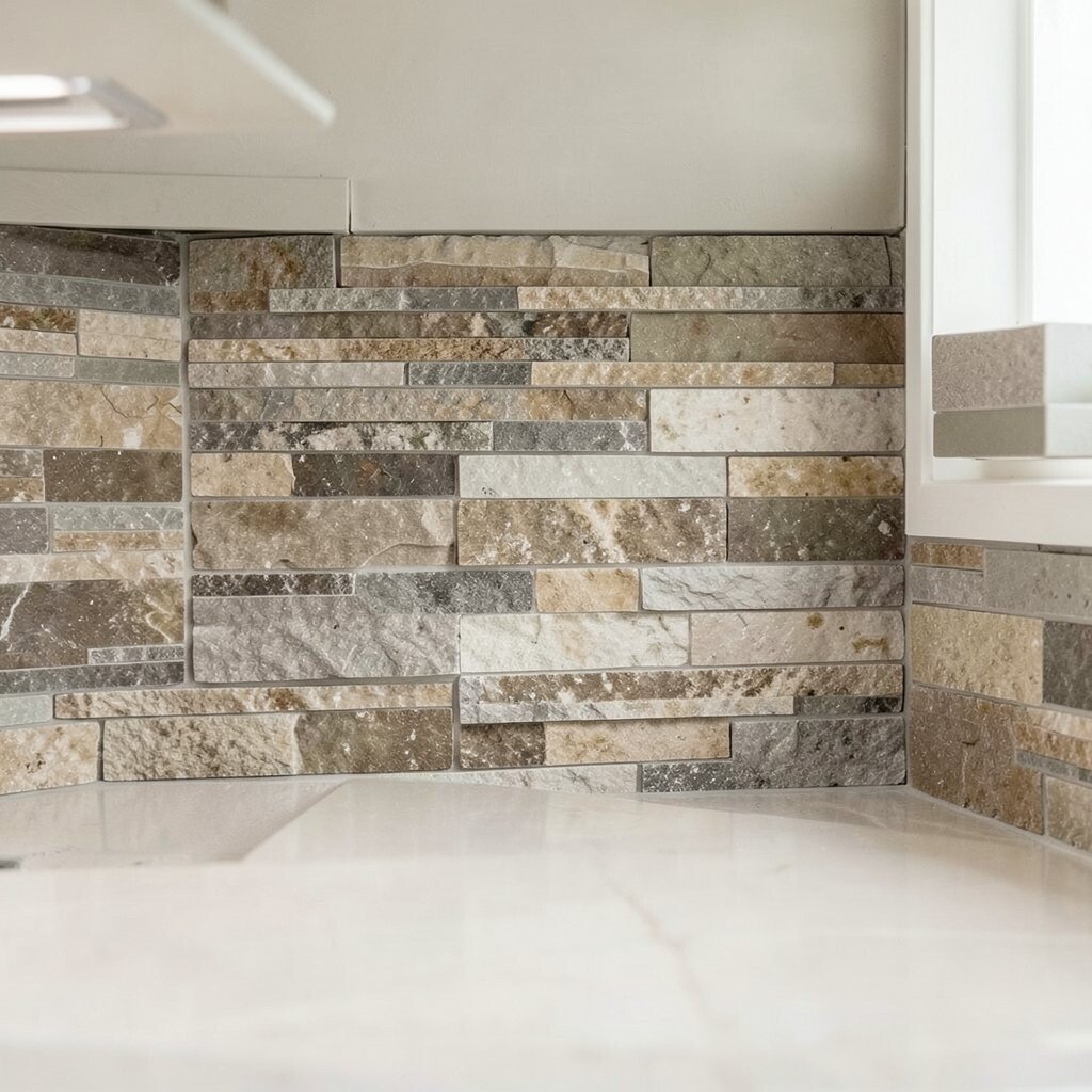
Choose natural stone for one-of-a-kind character Natural stone brings personality into your kitchen. The tiny variations in color and texture are like fingerprints, and that makes each backsplash unique.
Marble can look elegant and dramatic, while travertine can feel warm and rustic. Slate can give a darker, moody vibe that looks great in modern spaces.
Benefits include a high-end appearance and a material that can feel luxurious. Stone can also add a timeless look that doesn’t go out of style quickly.
Tip: ask whether the stone is honed, polished, or textured. Polished surfaces reflect more light, while honed surfaces feel soft and modern. Some stones need sealing to protect against stains, so plan for that maintenance.
Cost considerations: natural stone can be pricey, especially if you choose rare colors or require slab-level installation. Still, if you want a backsplash that feels truly special, stone is one of the best ways to do it.
-
15. Consider metal looks for a bold, modern edge
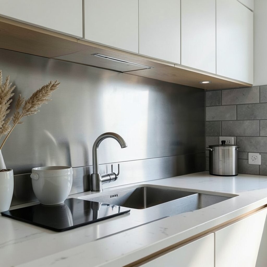
Consider metal looks for a bold, modern edge Metal backsplashes can look sleek, industrial, or glamorous depending on the finish. Think of brushed stainless that feels tidy and hardworking.
Visual description: a metallic surface can make reflections feel clean, like a well-lit workshop. It can also pair beautifully with simple cabinetry and crisp lines.
Benefits include durability and resistance to many daily messes. Metal can also handle heat well, which is useful near cooking zones. If you like a modern look, metal can be a strong match.
Personalization idea: choose a copper or champagne tone if you want warmth. You can also add a simple tile border elsewhere so the metal area feels like a feature wall.
Cost considerations: real metal can be more expensive than standard tile. Look for metal-look panels if you want the look at a friendlier price.
-
16. Add warmth with earthy textures
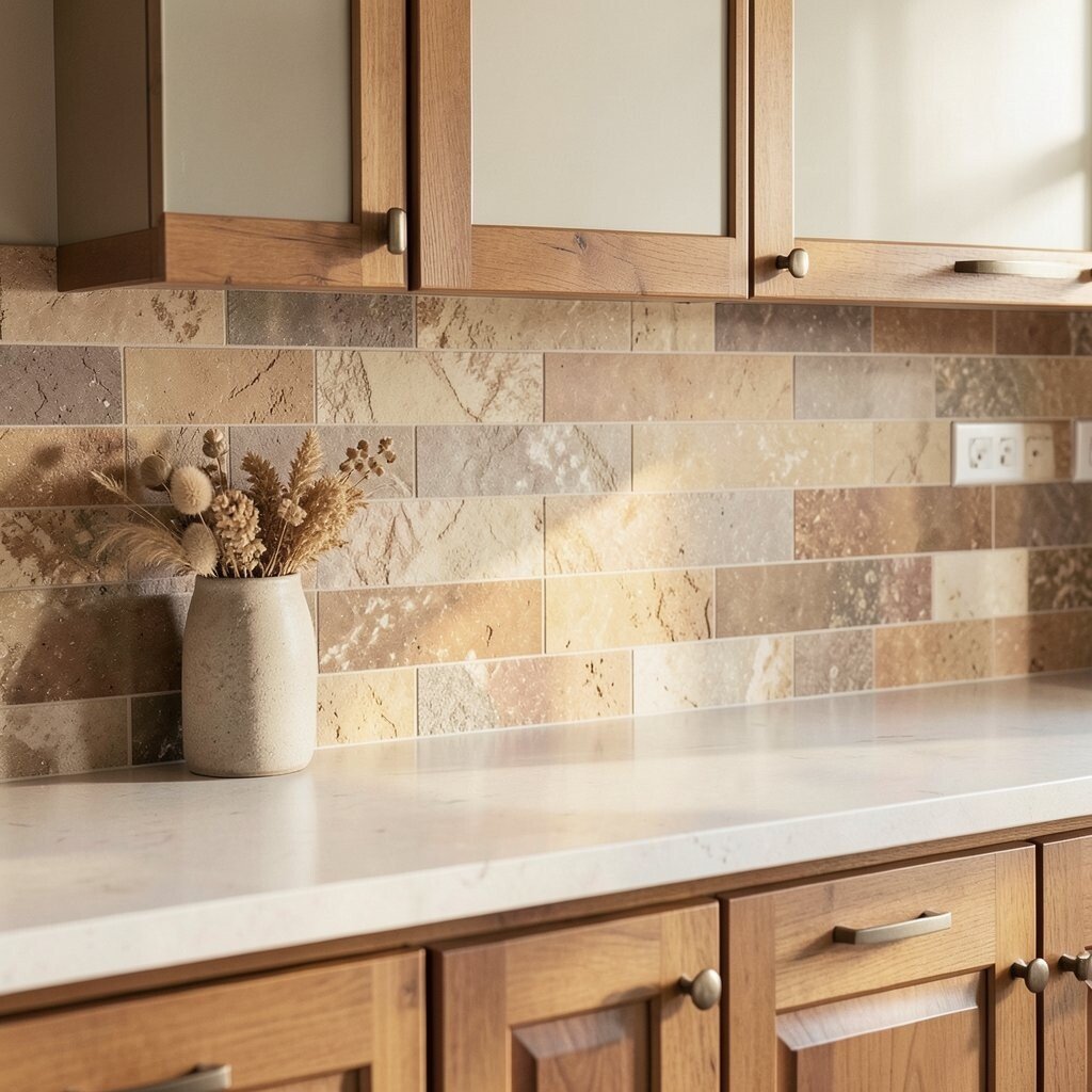
Add warmth with earthy textures Earthy textures make kitchens feel grounded and welcoming. You might picture warm terracotta tiles, lightly speckled stone, or textured ceramics that catch light in a gentle way.
Benefits include a cozy feel that works with wood cabinets and natural materials. Textured surfaces can also hide tiny imperfections, which is great if you live in your kitchen.
Visual description: imagine a backsplash that looks like it has tiny hills and valleys. From a distance, it creates depth, while up close it shows handmade character.
Uniqueness tip: pair a textured backsplash with simple cabinet hardware so your kitchen doesn’t feel chaotic. You can also choose one tone and vary it across multiple tiles, like warm cream with hints of sand and clay.
Cost considerations: handmade tiles and special textures might raise the budget. If cost is tight, use texture only in the most visible areas like behind the sink.
-
17. Use pattern creatively without going too busy
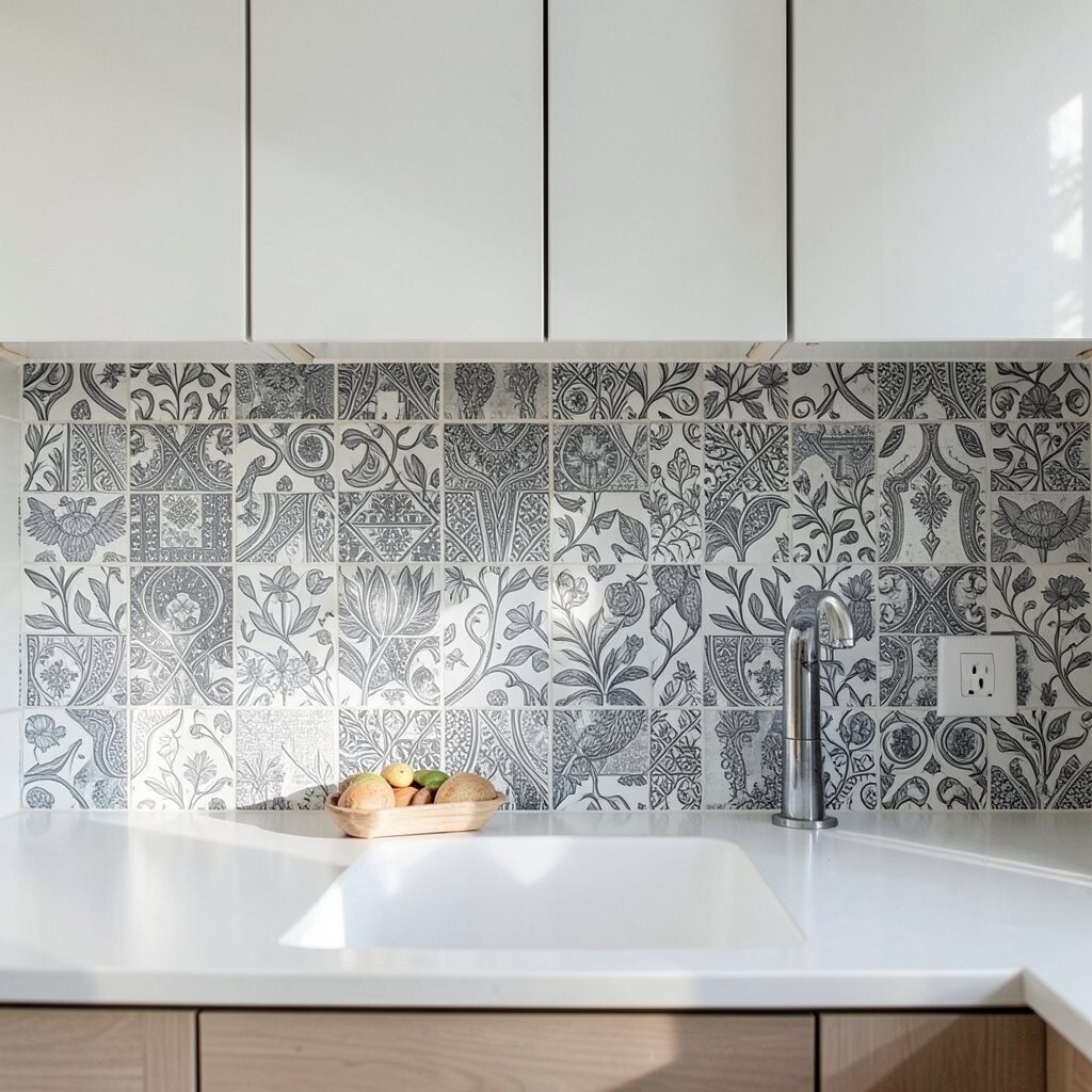
Use pattern creatively without going too busy Patterns can look amazing, but too much of a good thing can feel loud. The trick is to choose one hero pattern and keep everything else calm.
Visual description: a small geometric tile can look sharp and energetic, while a simple herringbone can look classic and neat. If you choose a bold pattern, keep grout and surrounding finishes quieter.
Benefits include making your backsplash feel like a focal point. It can also help your kitchen feel less plain even if your cabinets are simple.
Personalization idea: create a “focus zone” behind the stove using patterned tiles, and use solid tiles around it. That gives you personality where you see it most.
Cost considerations: custom patterns often require extra cutting and planning. To save money, stick to repeating layouts and limit specialty pieces.
Trends to watch: many kitchens now use micro-patterns or mix neutral solids with a narrow accent stripe. This makes the look feel modern but still wearable.
-
18. Match grout color to your cleaning habits
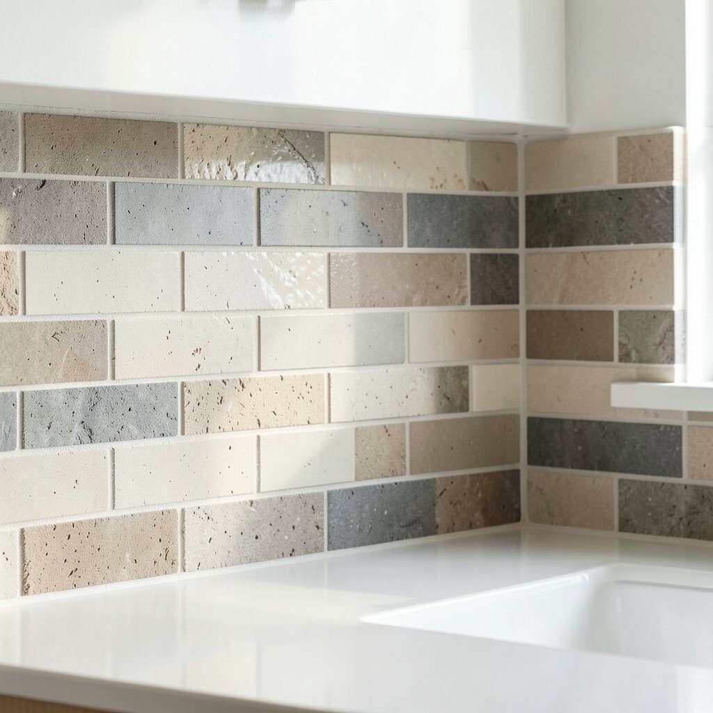
Match grout color to your cleaning habits Your grout choice should fit how you actually clean. If you’re a quick wipe person, you may prefer colors that don’t show every tiny splash.
For benefits, grout color can affect how high-contrast your backsplash looks. A matching grout tone makes your wall look smooth and continuous. A contrasting grout tone makes every tile line pop and stand out clearly.
Visual description: with matching grout, the tiles blend into one surface. With contrasting grout, you’ll see a crisp grid that feels designed and structured.
Personalization tip: think about your sink habits. If you rinse lots of sauces, consider a grout color that hides light discoloration. If you’re careful and clean often, a lighter or more contrasty grout can look fantastic.
Cost considerations: some grout products are more stain resistant or easier to maintain. Investing in better grout can reduce future frustration.
-
19. Plan for outlets, switches, and edges
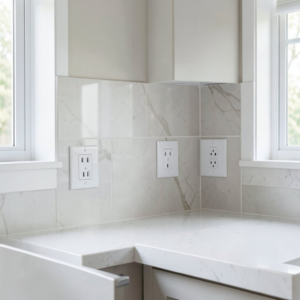
Plan for outlets, switches, and edges Outlets and switches are part of the backsplash story. Planning around them helps your design look neat instead of “patched.”
Before installation, check whether your wall has irregular surfaces around boxes. Uneven areas can affect how tiles line up and how edges look.
Visual description: clean cutouts look like they were meant to be there, while messy edges draw attention. Using proper trim or outlet covers that match your finish can make the whole backsplash look intentional.
Personalization idea: choose outlet covers in a finish that matches your faucet or cabinet hardware. This small detail can make your kitchen feel finished.
Cost considerations: if you want special trim pieces or custom cut tiles, that can add labor. Still, planning early helps you avoid rework, which is usually the biggest budget saver.
-
20. Keep an eye on ventilation and moisture
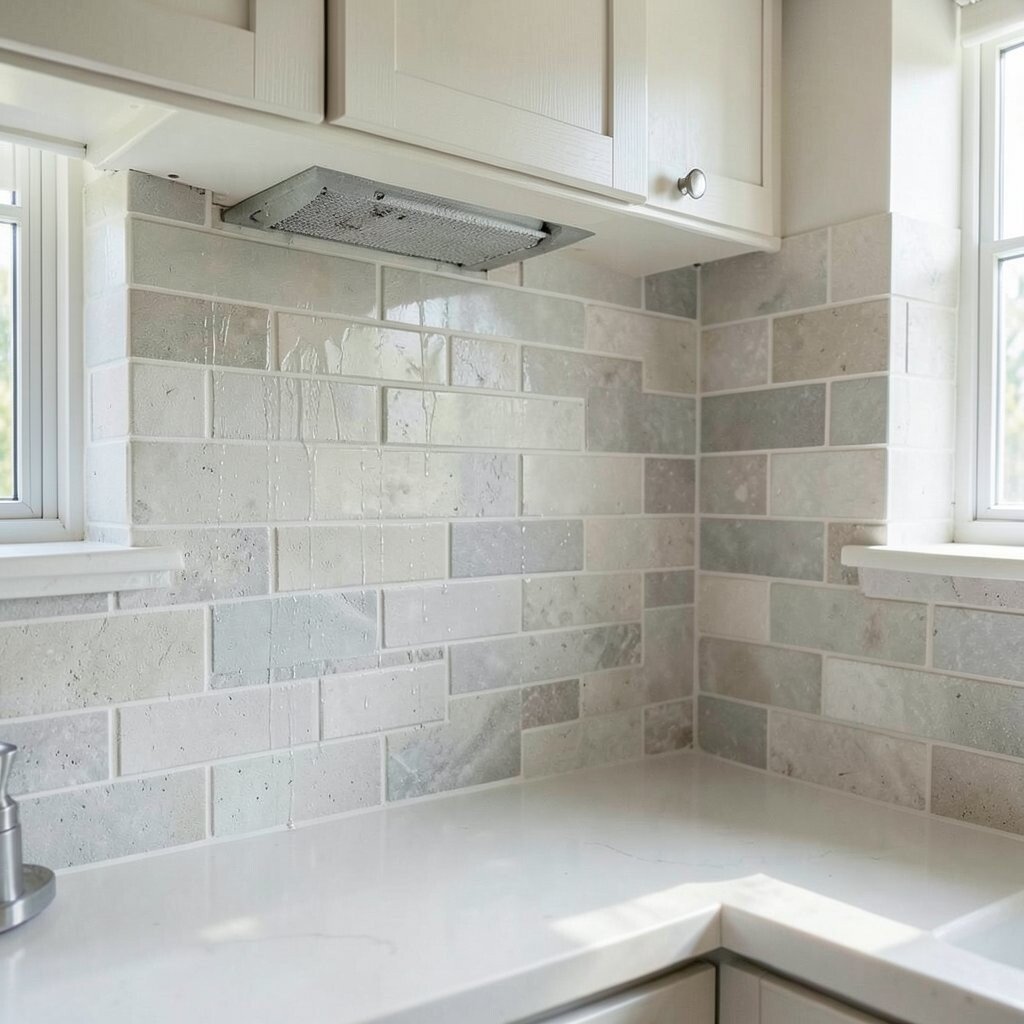
Keep an eye on ventilation and moisture Your backsplash needs to handle kitchen moisture, especially near the stove. Steam and grease can build up around cooking zones, so protection matters.
Benefits include choosing a material that resists moisture and is easy to keep clean. Non-porous surfaces like glass panels and some metals can help with grease wipe-downs. If you choose porous stone, be sure it’s properly sealed.
Visual description: a backsplash that looks sealed and uniform will keep your kitchen looking tidy. When moisture is managed well, grout lines stay brighter and tiles look fresh.
Trends to consider: many people are using more heat-friendly materials behind ranges and adding ventilation solutions that reduce backsplash mess. This is one of those “looks good and works better” choices.
Personalization tip: if you love drama, choose a stronger color behind the stove so any minor wear blends in. If you prefer calm, choose light tones and seal carefully.
-
21. Test samples in real light before you buy
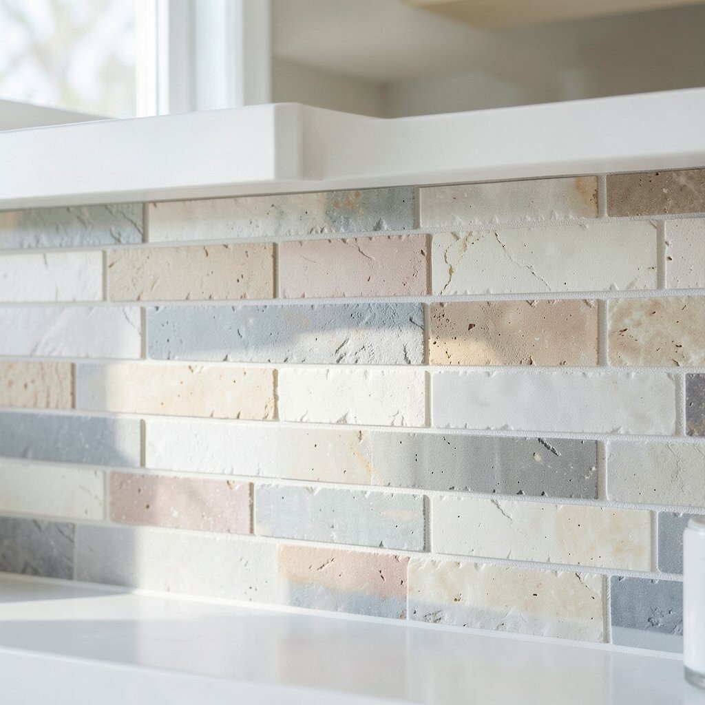
Test samples in real light before you buy Samples are your best friend. Paint chips and tile swatches can look totally different in your kitchen compared to a store.
Benefits of testing include fewer surprises and happier results. Hold samples near your countertops, near your sink, and near the area where light hits the most. Notice how colors shift through the day.
Visual description: some whites look creamy, while others look icy. Some grays have blue undertones, while others feel warmer and more inviting.
Personalization idea: try two options that are close in color but different in texture. Then choose the one that feels more “you.” This is also a good moment to decide how bold you want your backsplash to be.
Cost considerations: order samples first to reduce the chance of buying the wrong material. Even if samples cost a little, they can save money by preventing reorders and wasted tiles.
-
22. Style your final look with accessories and finishing touches
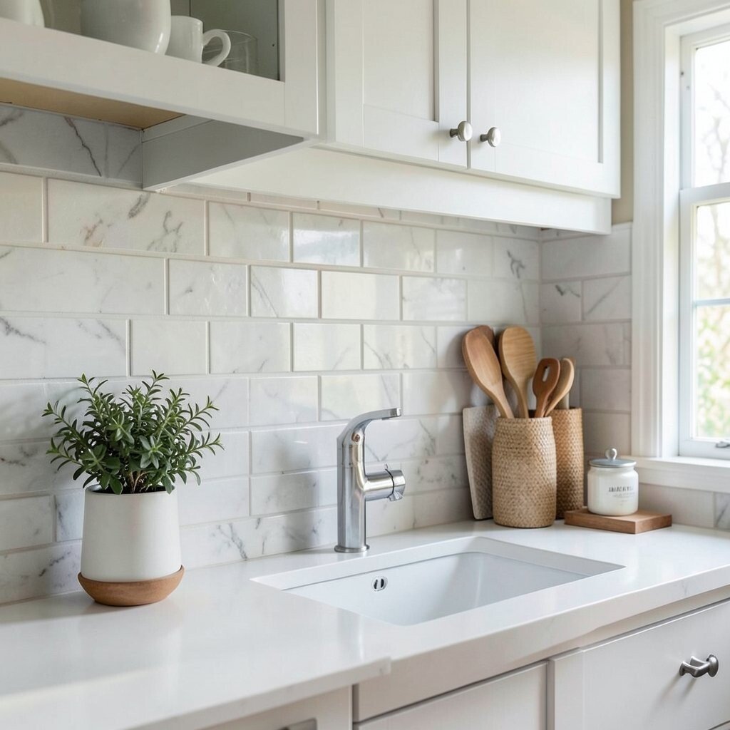
Style your final look with accessories and finishing touches Your backsplash works best when it’s supported by finishing details. Think about caulk lines, trim edges, and how your counters and wall meet.
Benefits include a clean, professional appearance that makes your kitchen feel cared for. A well-finished edge also helps protect the wall from moisture.
Visual description: a backsplash with neat caulk and tidy transitions looks like it belongs there. You’ll notice the difference every time you stand at the sink or cook under cabinet lights.
Uniqueness comes from small choices like the right shelf or rail, a matching utensil holder, or artwork that echoes your backsplash colors. You can also add a small accent soap dispenser or a cutting board that shares a shade from the wall.
Trends to watch: coordinated hardware and layered neutrals are popular right now. People also like mixing sleek backsplashes with warm wood touches for balance.
Cost considerations: finishing touches can be affordable but make a big impact. Set aside a small part of your budget for trim, caulk, matching outlet covers, and a couple of accessories that tie the whole space together.