Choosing a kitchen color is like picking the mood of your day. Done right, your space will feel bright, calm, and “you” the moment you walk in.
Use the tips below to match your style, your light, and your everyday life. You will find choices that look great now and still feel right later.
-
1. Start With the Light You Actually Have

Start With the Light You Actually Have Look at your kitchen at morning, noon, and evening. The same wall can look warm or cool depending on sun and bulbs.
For a quick test, tape small paint samples to the wall. Watch how they change when the lights turn on. This helps you avoid surprises and choose a color that stays pretty all day.
If your kitchen gets lots of sunny light, you can enjoy deeper shades without them feeling heavy. You get the benefit of a rich look with less worry about the room looking dim. A color that “shows up” well in strong light often becomes a favorite fast.
For kitchens with softer or limited light, aim for colors that reflect brightness. Creamy whites, pale yellows, and light grays often keep things airy. Personalize by adding warmer accents like wood, brass, or creamy textiles.
Keep cost in mind by buying only a few sample quarts first. A small test can save you from a full paint job you regret. Right now, many homeowners are choosing gentle, light-reflecting tones because they feel clean and modern.
-
2. Match the Color to Your Cabinets and Floors

Match the Color to Your Cabinets and Floors Before picking anything new, study what you cannot easily change. Cabinets, countertops, and floors already set the base mood of the room.
Try to pick a kitchen wall color that works with those surfaces, not against them. If your cabinets are warm wood, choose warm wall tones like soft beige or honeyed cream. If your cabinets are cooler, light greys or crisp whites can feel smooth and neat.
Here is a simple visual rule: look at the “undertone” in your current finishes. Warm finishes often show a slight yellow or orange hint. Cool finishes often show a blue or grey hint.
When colors match undertones, the whole kitchen looks pulled together. You get a calm, finished look without needing lots of extra décor. Uniqueness can come from a surprising accent color, like a muted teal backsplash or a matte black faucet.
To save money, consider repainting walls first before you change hardware or tiles. Paint is usually the most budget-friendly upgrade. Current trend: mixing warm cabinets with soft, modern neutrals for a cozy but updated vibe.
-
3. Choose a Mood: Cozy, Bright, or Fresh

Choose a Mood: Cozy, Bright, or Fresh Think about how you want the kitchen to feel when you start cooking. Cozy feels warm and inviting, bright feels lively, and fresh feels clean and light.
Cozy kitchens often use creamy colors, soft taupes, and gentle warm tones. Bright kitchens lean toward clear whites and cheerful light shades. Fresh kitchens often feature cool whites, pale greens, and airy blues.
If you love visual calm, pick colors that are not too loud. You will notice the difference every time you wash dishes or sip coffee. Pair your wall color with simple styling like matching canisters or a neat utensil holder.
Want energy for weekday cooking? Use a slightly richer accent on one area, like the island or a lower band. That gives you personality without making the whole room feel busy. It also helps you stay practical when you want easy repainting later.
For cost considerations, remember that a single accent wall can deliver big impact. It often costs less than changing every surface. For personalization, add a small color story in your art, curtains, or seat cushions.
-
4. Use the “Color Temperature” Trick
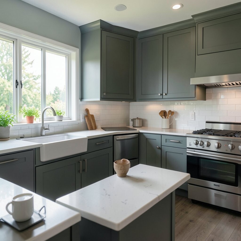
Use the “Color Temperature” Trick Color temperature means warm or cool tones. Warm colors feel like late afternoon sunshine. Cool colors feel like crisp air after rain.
Choose warm if your kitchen elements feel golden, honeyed, or earthy. Choose cool if your surfaces read grey, blue, or clean and modern. This keeps everything from clashing and helps your kitchen look more expensive.
-
5. Pick a Main Color, Then Add a Second One
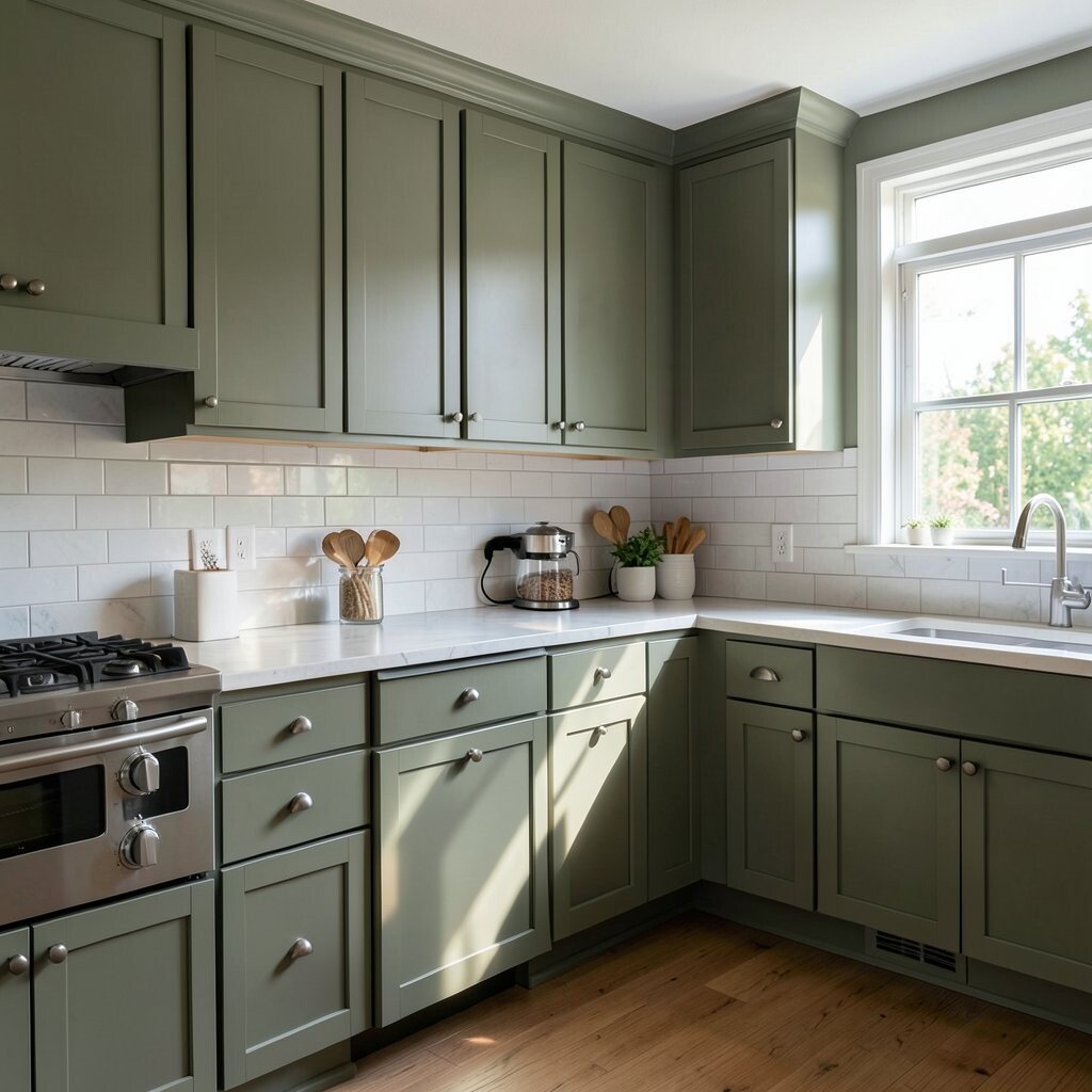
Pick a Main Color, Then Add a Second One When you choose just one color, the room can look flat. When you use two, your kitchen looks layered and complete.
Pick one color for walls and another for trim, doors, or accents. For example, creamy walls with crisp trim make a neat border. Another popular pair is soft sage walls with white details.
Visual variety makes cooking spaces feel more fun. You will also find it easier to choose décor because you have a color plan. Keep the second color either lighter, darker, or more saturated so it stands out in a nice way.
Try personalization by matching your second color to something you love. It could be a bold mug collection, a favorite bowl set, or a backsplash tile. That turns your kitchen into a story, not just a room.
For cost, you can keep expenses low by painting only walls and trim. If you already have good cabinets, this approach is even more budget-friendly. Current trend: using soft, muted second colors instead of very bright ones for a calm modern look.
-
6. Consider Neutral Colors That Still Feel Special
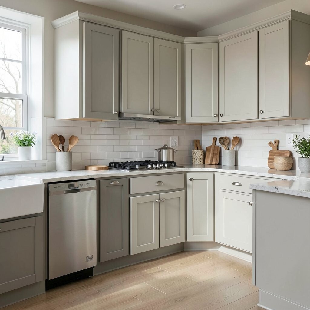
Consider Neutral Colors That Still Feel Special Neutral does not have to mean boring. The right neutral can look rich, soft, and stylish.
Look for neutrals with texture in mind, like greige, warm beige, or creamy off-white. These colors reflect light well while still adding warmth. You get the benefit of flexibility because many styles work with neutrals.
To keep it unique, choose a neutral with personality in the undertone. A slightly peachy beige can feel inviting and cozy. A slightly greenish greige can feel fresh and balanced. Test samples near your countertops so you can see the blend.
Try adding a matte finish for walls if you want a smooth, gentle look. Matte hides small imperfections and makes colors feel soft. Personalize with cabinet hardware, a rug, or wall art that matches the undertone.
-
7. Go Bold With an Island Color

Go Bold With an Island Color If you want drama without total risk, paint the island instead of every wall. An island color feels like a focal point that you can enjoy every day.
Deep colors like navy, forest green, or charcoal look stunning beside light cabinets. Lighter islands in pastel tones can feel playful and bright. This method also helps the rest of the kitchen stay calm.
Benefits show up fast: you get a fresh look and a clear visual center. It also makes your kitchen look “designed” even with simple décor. You can add matching accents like bar stools or a pendant light to tie it together.
For a unique twist, choose a color with a subtle sheen or a chalky matte. Matte looks soft and cozy. A gentle sheen can make the island stand out and feel crisp.
Cost considerations: painting an island often means less coverage than painting all walls. It can be a smart mid-budget move. Personalize by matching the island color to a small recurring detail like a tray or a cookbooks shelf.
-
8. Think About Wall Height and Layout

Think About Wall Height and Layout The layout changes how color “walks” across the room. Open kitchens can benefit from smooth, consistent tones. Small kitchens can feel bigger with lighter colors.
If you have tall cabinets or a high backsplash, lighter wall colors can help the space feel balanced. If you have lower cabinets and a lot of empty wall, you can paint a deeper tone and still keep it looking cozy. Your goal is to make the room feel in proportion.
-
9. Pair Cabinet Color With Backsplash Style
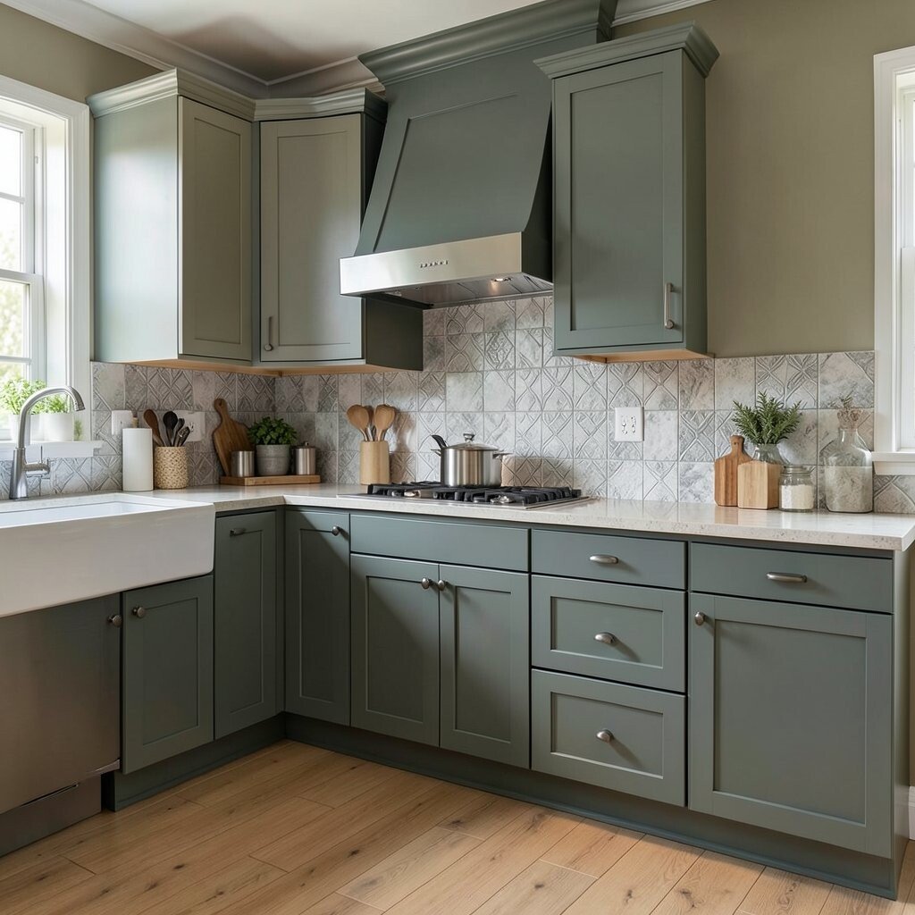
Pair Cabinet Color With Backsplash Style Backsplashes are like the kitchen’s outfit details. They can match your walls, or they can create a fun contrast.
If your backsplash is busy with patterns, keep your wall color calmer. If your backsplash is simple and solid, you can choose a wall color that adds warmth or freshness. This balance helps the kitchen feel neat instead of crowded.
For uniqueness, repeat a small shade from your backsplash in a different place. For example, if there is a hint of green in your tile, use a greenish grey wall tone. Repetition makes the room feel thoughtfully planned.
Benefits include easier styling and fewer “what goes where” moments. Once you find the shared color link, decorating becomes simpler. You can also use paint to soften strong tile colors.
Cost wise, painting walls is usually cheaper than changing backsplash tile. Current trend: warm, earthy tile looks paired with soft, modern wall colors for a relaxed feel.
-
10. Use the Right White (It Matters a Lot)
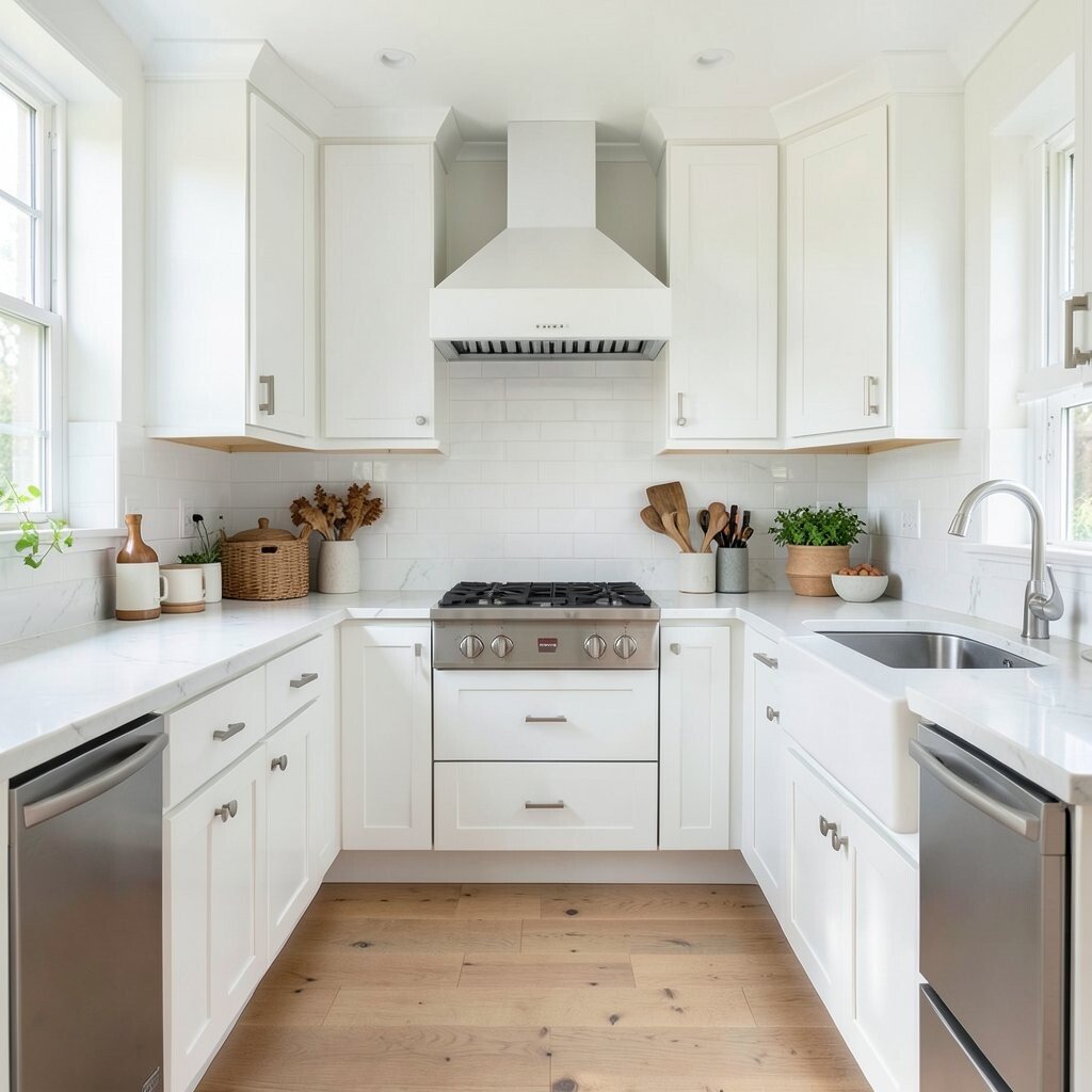
Use the Right White (It Matters a Lot) White is not one single choice. There are warm whites, cool whites, and pure whites, and each one acts differently.
Warm whites can make your kitchen feel cozy and welcoming. Cool whites can make it feel crisp and clean. Pure whites can look sharp and bright, but they may show streaks or shadows in some lighting.
Try comparing paint samples side by side near your countertops. You will see which one makes your space look smooth and which one makes it look dull. This is one of the easiest ways to personalize without major changes.
Benefits include a bright look and a helpful backdrop for décor. You can swap accessories later and still keep the kitchen feeling current. If you like a fresh look, whites with soft undertones are a great choice.
Budget note: many people underestimate how quickly white can show marks. Consider a durable, washable paint if you cook often. Trend-wise, slightly warm off-whites are staying popular because they feel more natural than icy white.
-
11. Try Soft Greens for Calm and Fresh Energy
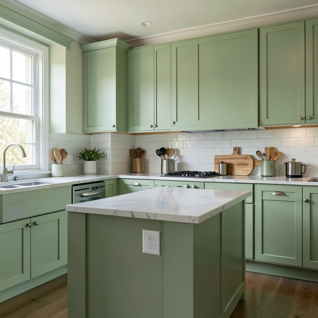
Try Soft Greens for Calm and Fresh Energy Green can make a kitchen feel like it is breathing. Soft green tones feel gentle, calm, and “fresh” without being too bright.
Sage, muted mint, and sage-grey shades pair well with natural wood and warm metals. They also look beautiful with white cabinets. You get a unique, calming color that still feels modern.
Visual descriptions help here: imagine a light sage wall that looks like a garden morning. It feels relaxing and gives your kitchen a healthy vibe. When you add plants, the color connection feels natural and easy.
Tips for personalization: pick a green that matches your favorite herbs or your backsplash tile colors. Then echo it in small items like towels, a soap dispenser, or a jar label set. This keeps the green from feeling random.
Cost considerations: green paint can hide wall imperfections depending on the shade and finish. Matte finishes can be great for calm look, while eggshell can be easier to clean. Current trend: nature-inspired colors that feel grounded and not overly bright.
-
12. Consider Earthy Tones for a Cozy, High-End Feel

Consider Earthy Tones for a Cozy, High-End Feel Earthy colors can make your kitchen feel warm and grounded. Think clay, terracotta hints, warm taupe, or a soft sandstone shade.
These colors look great with wood cabinets, woven baskets, and natural textures. They also pair nicely with black hardware and warm lighting. The benefit is that the room feels welcoming even on busy days.
To keep it unique, choose earthy tones with a soft undertone instead of an overly orange one. A muted terracotta can feel elegant, not loud. A warm greige can feel calm, not dull.
Tips: balance earthy walls with crisp whites or lighter countertops so the space does not feel too heavy. Add cozy lighting like warm bulbs or a dimmable fixture. Personalize with spices, ceramics, and a wood cutting board display.
Cost considerations: these tones often look great with minimal décor changes. Since they are forgiving, you may not feel the need to repaint quickly. Trend-wise, many kitchens are leaning toward grounded color palettes that feel both modern and timeless.
-
13. Use Accent Colors in Smart, Low-Risk Ways

Use Accent Colors in Smart, Low-Risk Ways Accent colors can bring fun fast. You just need the right places to use them.
Try painting the inside of open shelving, the back wall of a breakfast nook, or the trim around a window. That gives you color impact without covering every surface. You get uniqueness and a fresh look without the pressure of a full room change.
Visual benefits include clear focus. When color sits behind shelves, dishes look more vibrant. When color frames a window, natural light feels extra special.
For personalization, match the accent to a hobby or favorite theme. Use a gentle blue if you love coastal vibes. Use a warm red-brown if you love rustic style. Keep the accent limited so it feels intentional.
Cost can stay lower by focusing on one small area. Painting a detail spot is often cheaper than a large wall refresh. Current trend: micro-accents that look custom, like designer touches you can spot immediately.
-
14. Pair Cool Tones With Sleek Metals
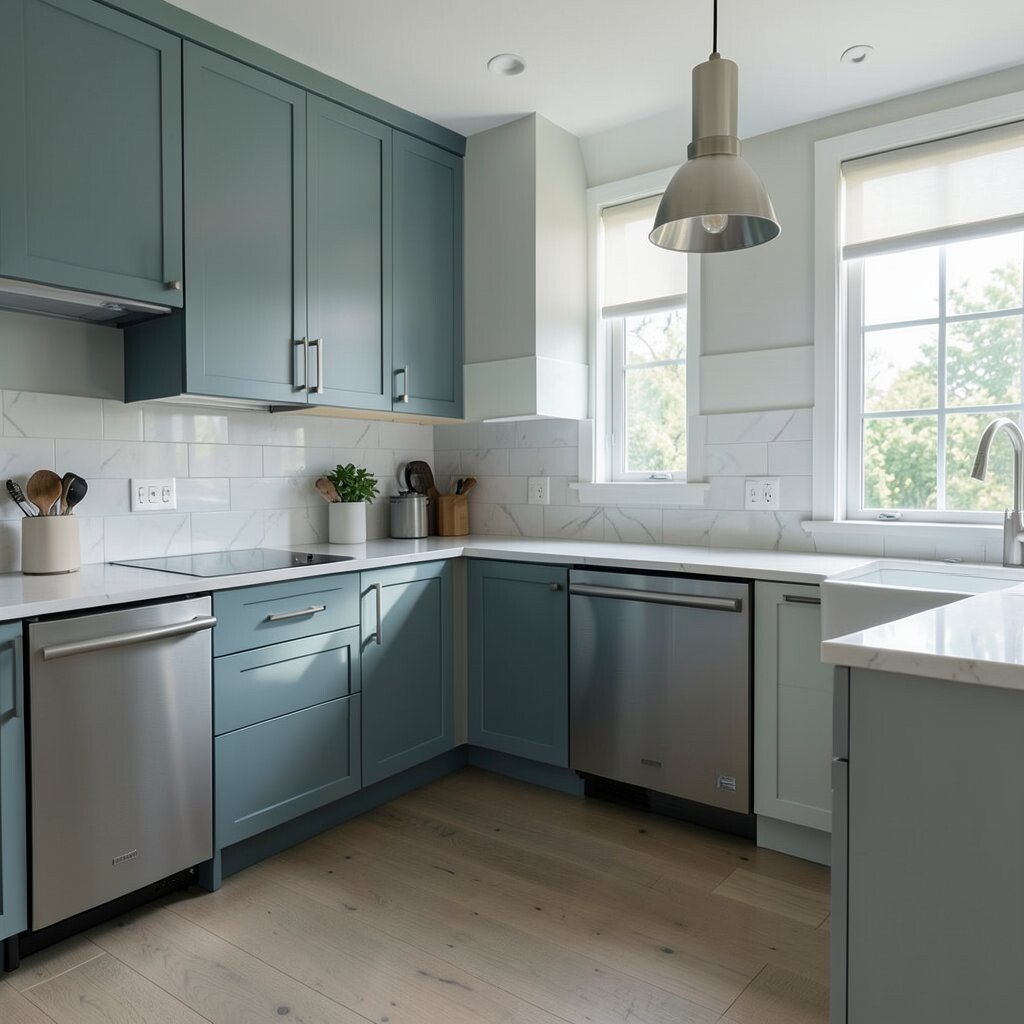
Pair Cool Tones With Sleek Metals If your kitchen has stainless appliances or chrome fixtures, cool tones can look extra smooth. Cool colors include soft greys, airy blues, and crisp whites with grey hints.
These pairings can make the room feel clean and modern. When the colors match the metals, everything looks organized. You also get a benefit: it is easier to keep décor matching because cool tones are simple to coordinate.
-
15. Warm Tones Look Amazing With Brass and Wood
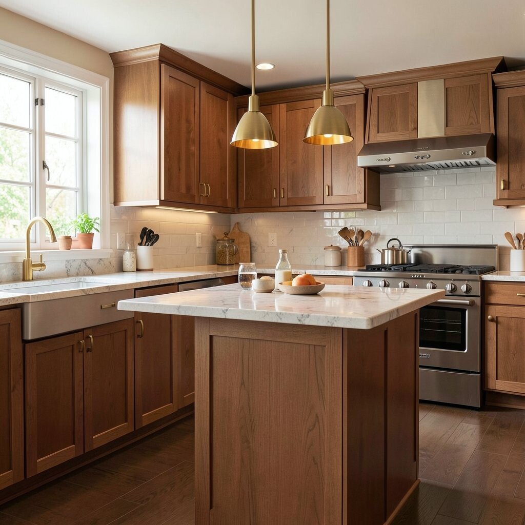
Warm Tones Look Amazing With Brass and Wood Warm kitchens are usually the most inviting. They pair beautifully with brass accents, warm wood, and golden lighting.
Try warm creams, soft beige, or light caramel shades. These colors can make the space feel cozy and friendly, like a welcoming café. You get visual comfort, which is a real benefit when you spend time cooking.
For uniqueness, blend warm walls with a darker trim color. Matte black or deep espresso edges can look chic. That contrast makes the kitchen feel styled without being complicated.
Personalize by matching cabinet pulls or pendant finishes to your wall warmth. Even small details like the color of a trash can can pull the look together. It all adds up to a kitchen that feels “finished.”
Cost considerations: warm neutral walls can work with many backsplash types, so you avoid expensive regret. Trend-wise, warm metals and soft warm walls are still going strong because they feel natural and modern.
-
16. Choose Colors That Hide Wear and Tear

Choose Colors That Hide Wear and Tear Kitchens get touched, splashed, and cleaned often. Your paint should handle real life, not just pictures.
Light colors can show smudges, while some deeper shades can hide them better. Also, paint finish matters: satin or eggshell often cleans well. Choosing the right finish can give you a cleaner look for longer.
For visual description, imagine a wall that keeps its charm even after cooking. Eggshell can look smooth and still wipe clean. That means you spend less time worrying and more time enjoying.
To personalize, test sample colors in “high traffic” spots like near the stove or sink. You will see how the wall holds up with daily use. This tip helps you choose a color that stays pretty.
Cost considerations: washable paint can cost a bit more, but it may save money later. Current trend: homeowners are choosing durable, easy-clean finishes that look great and last.
-
17. Plan Your Color Around Countertops and Appliances
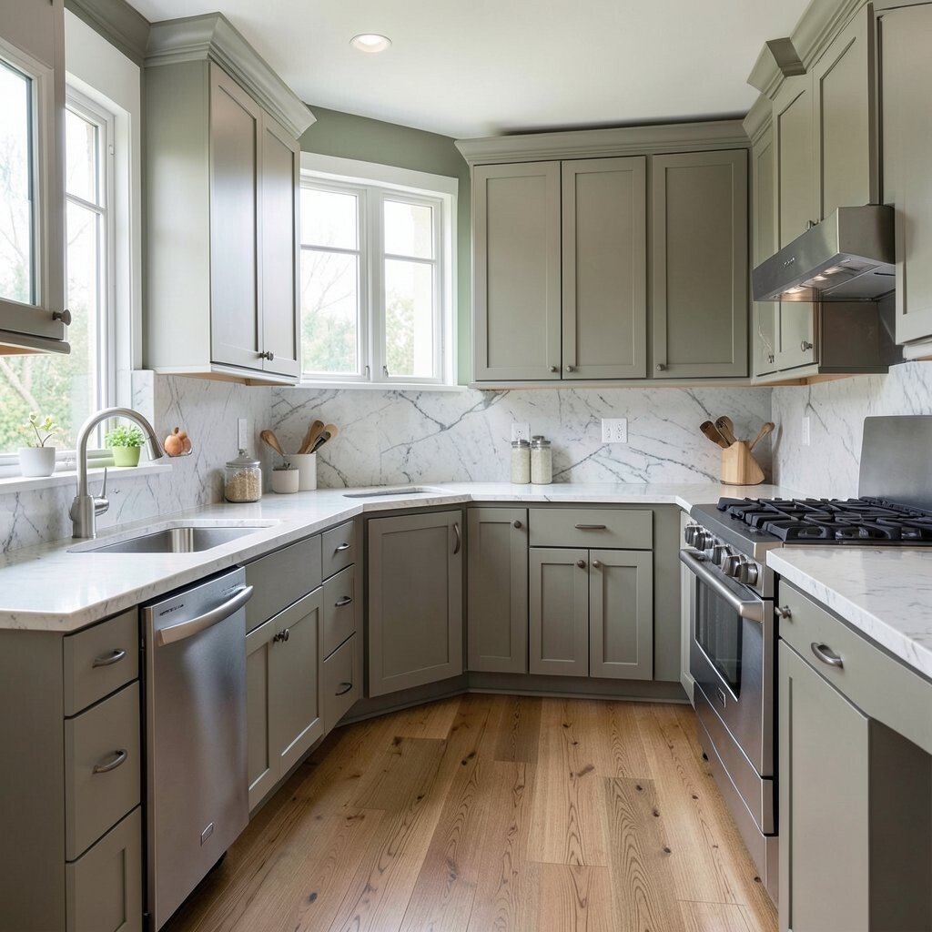
Plan Your Color Around Countertops and Appliances Your countertops and appliances are like the kitchen’s foundation. The color you choose should make them look their best.
With cool stone countertops, soft greys or cool whites can look crisp and balanced. With warm stone, choose warm neutrals or soft creamy tones. This approach helps your kitchen feel coordinated instead of scattered.
Visual benefits: your counters can look brighter and your backsplash can look more vibrant. When the wall color supports the surfaces, the whole room looks curated. It also makes choosing décor easier because everything shares the same color story.
Personalization idea: if you have patterned countertops, keep your walls quieter. If your counters are plain, you can add a bit more personality with wall color. That balance keeps the kitchen from feeling too busy.
Cost considerations: changing countertops is expensive, so paint is the smart place to adjust. Trend-wise, kitchens are embracing flexible neutral walls that let stone and hardware stand out.
-
18. Add Texture With Color and Finish, Not Just Paint

Add Texture With Color and Finish, Not Just Paint Color is not only about shade. Finish changes how color looks in real light and real life.
Matte paint can feel soft and calm, while satin can feel smoother and easier to clean. Textured paint effects can add depth, but they should be used carefully. A subtle finish shift can make a kitchen look more custom without extra renovation.
-
19. Create Contrast With a Ceiling or Upper Cabinet Shade
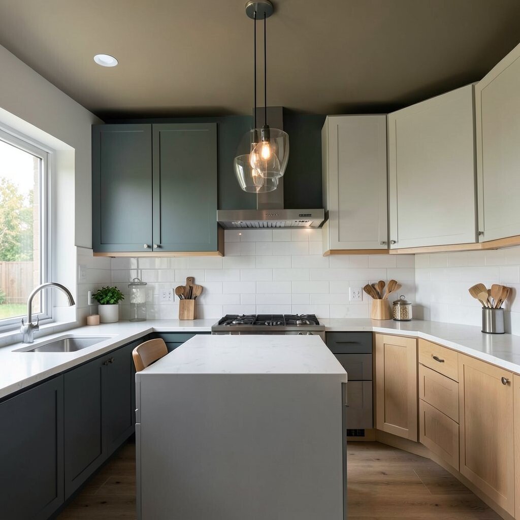
Create Contrast With a Ceiling or Upper Cabinet Shade Many people ignore the ceiling, but it can help your kitchen feel taller or brighter. A slightly lighter ceiling can make the space feel open.
You can also paint upper cabinets in a different shade for a layered look. Light uppers with darker lower cabinets feel stylish and grounded. This gives a unique look that looks like a designer did it.
Visual description: imagine the upper area feeling like a gentle backdrop, while the lower area anchors the room. It helps the kitchen feel structured and comfy at the same time. You also get a benefit: visual contrast can hide clutter.
Personalize by choosing colors that match your favorite season vibe. Soft blue can feel airy and summer-like. Warm greige can feel comforting all year.
Cost considerations: upper cabinets can be more work, so plan carefully. If you want easier budgeting, repaint just the ceiling or choose a single upper cabinet color change. Current trend: using two-tone cabinetry and soft contrast rather than harsh, bright differences.
-
20. Test Samples Like a Pro (No Guessing)

Test Samples Like a Pro (No Guessing) Paint samples are your best friend. Small patches tell you the truth about color in your kitchen light.
Apply samples on two or three different wall spots. Compare them near windows, near the sink, and near the darkest corner. This helps you avoid picking a color that looks perfect only in one area.
Give the samples time to settle too. Color can look different after drying, and it can look different under evening bulbs. You will get a more accurate result when you check at different times of day.
Tips for personalization: if you have open shelves, tape sample cards near items you plan to display. This shows you how the colors work with your everyday objects. It is a small step that makes the result feel much more “you.”
Cost considerations: samples are usually cheaper than repainting. Current trend: many people are using a “sample wall” moment before committing, because it cuts down regret. Treat it like a fun mini project, not a stressful task.
-
21. Keep It Personal With a Color Story You Can Live With

Keep It Personal With a Color Story You Can Live With The perfect kitchen color is the one that fits your life. It should match your taste and feel right every day.
Create a color story by choosing one main wall color and echoing it in small places. That could be towels, a rug, art prints, or the color of your dishware. When the choices repeat, your kitchen looks intentional and unique.
Visual description can help: picture a kitchen where every little spot feels related, like the same theme is running through. Your counters look calm, your shelves look coordinated, and the whole room feels like it belongs to you. That feeling is the biggest benefit of choosing well.
Try personalization ideas that do not cost much. Swap cabinet liners, add a new set of canisters, or paint just one decorative panel. You can also use removable wallpaper behind open shelves for a quick accent.
Cost considerations: start with paint if you want the biggest change for your money. Then add smaller décor items to finish the look. Current trend: warm neutrals with soft color accents, because they feel fresh but still comfortable.