Bold ideas don’t always arrive like lightning. Sometimes they grow from small sparks you invite in.
Your job is to make those sparks feel safe, playful, and ready to become art.
-
1. Use a “Rule of Three” Color Hunt
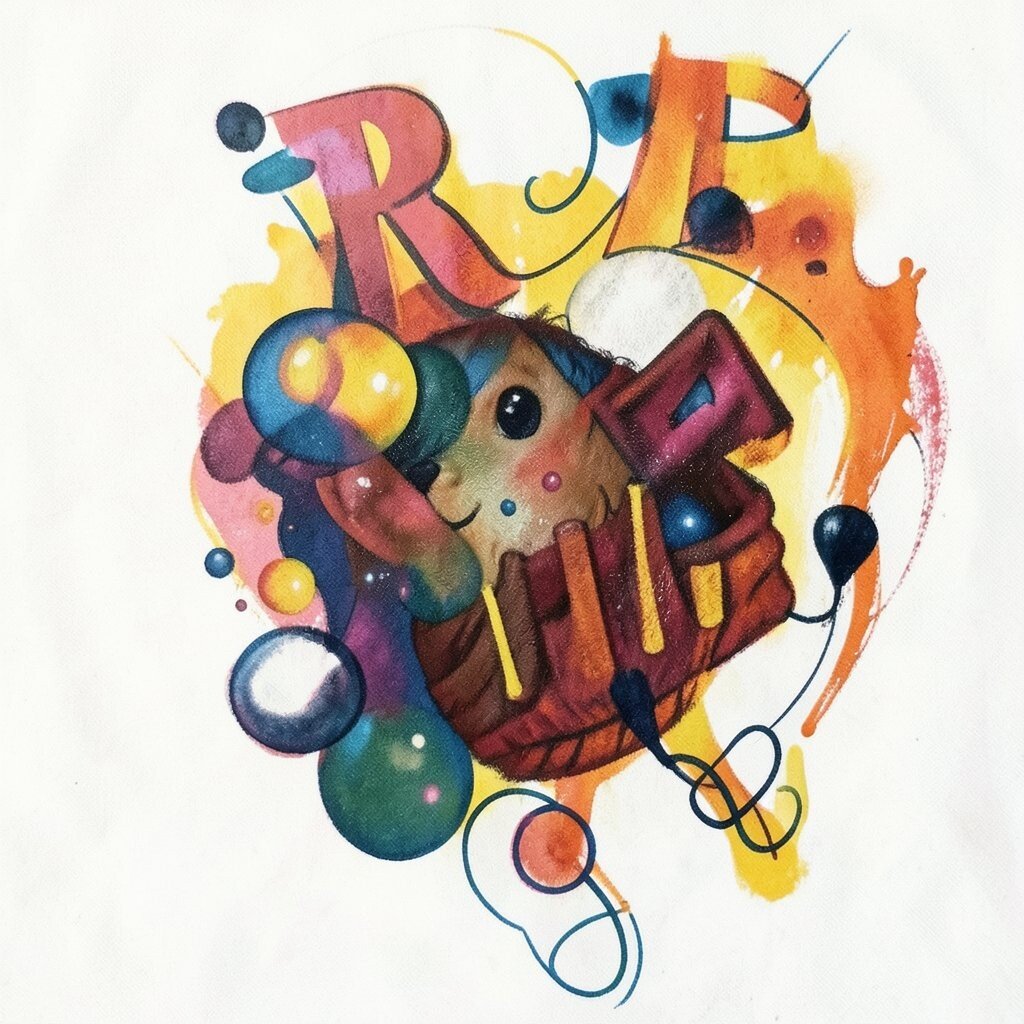
Use a “Rule of Three” Color Hunt Pick three colors that feel bold together, then build a tiny plan before you paint or draw. Imagine a sunset made from hot pink, deep teal, and warm yellow, with thick shapes that pop off the page.
Start by making a quick thumbnail sketch that shows only big shapes. Next, choose one background value—light or dark—so your colors stand out.
This method helps you move faster and reduces “blank page” stress. It also gives you a clear direction, so your art looks confident even when you are still learning.
-
2. Collect “Texture Evidence” From Everyday Life
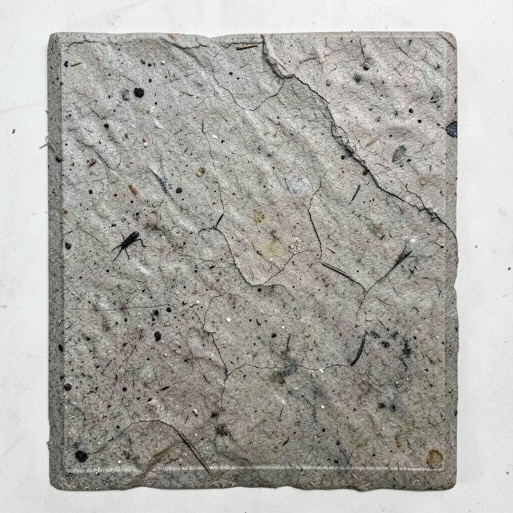
Collect “Texture Evidence” From Everyday Life Look around for surfaces that feel interesting, like tree bark, old paper, tiled walls, or denim. Notice how the light hits them and how patterns repeat in small ways.
Try rubbing charcoal on textured paper or using a pencil to trace a pattern you find in a sidewalk crack. You could even photograph a texture and turn it into bold lines, like turning a rough wall into jagged strokes.
Using real texture makes your work feel real and unique, not copied. It also helps your viewer’s eyes travel across the piece, which keeps attention longer.
-
3. Sketch a “Hero Pose” for Any Object
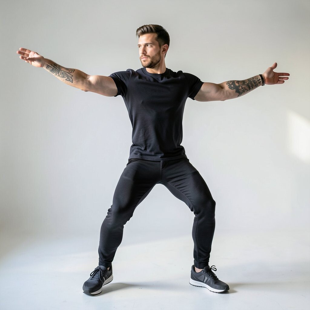
Sketch a “Hero Pose” for Any Object Choose something simple, like a spoon, sneaker, mug, or paperclip, and give it a heroic pose. Think of the object standing tall like a small statue in a museum spotlight.
Start with a gesture sketch, then exaggerate one feature, like stretching the handle long or making the shadow huge. Add bold outlines and a confident shadow shape so it looks like it belongs on a poster.
When you treat everyday things like characters, your imagination gets louder. This is a fun way to create art you would actually want to hang on a wall.
To personalize it, swap the “hero outfit” by changing background shapes, like a starburst or a moon. Keep costs low by using what you already have at home and one extra sheet of paper.
-
4. Turn a Photo Into a “Bold Map”
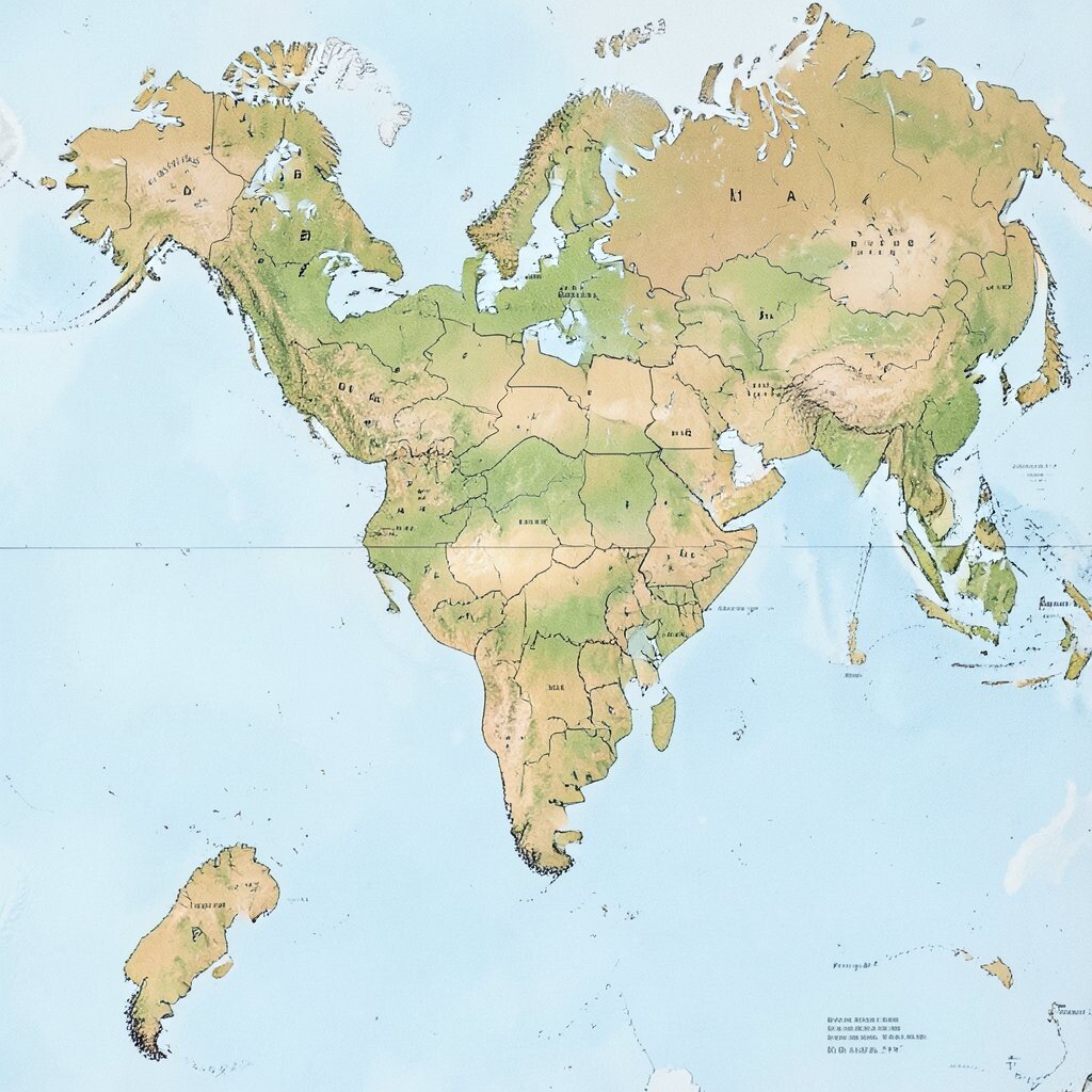
Turn a Photo Into a “Bold Map” Take one photo and simplify it into a map of shapes, not every tiny detail. Imagine your subject turned into thick regions, like a comic book version of reality with strong borders.
Trace the main shapes, then choose a limited palette and a clear light source. This creates a striking look that still feels connected to the original moment.
The benefit is speed plus clarity, because your viewer sees the story right away. It also helps you learn design rules, like contrast, grouping, and focal points.
-
5. Use “One Mistake” on Purpose
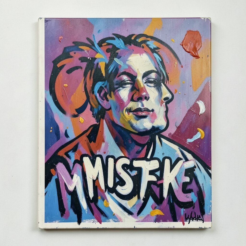
Use “One Mistake” on Purpose Pick a predictable place where mistakes happen, like hands, letters, or edges, and plan to break the rules there. For example, let one area have a messy brush stroke while the rest stays clean.
This creates bold energy, like your art is alive. It can also make your piece feel more personal because it shows human choices, not perfect printing.
To make it work, keep the mistake small and intentional, so it supports the design. Try using tape to block clean areas, then remove it for controlled chaos at one spot.
-
6. Build a Background First, Then Let It Choose the Subject
Build a Background First, Then Let It Choose the Subject Start with a bold background wash using watercolor, gouache, or even colored pencils mixed with a wet brush. Imagine a deep violet sky with sweeping swirls and light bursts.
Once the background looks strong, decide what silhouette or shapes it wants. You can draw a monster, a garden, a city skyline, or a dancer as simple cutout shapes.
This approach gives your art a “push” from the start, so you spend less time wondering. The benefit is that your subject fits your background, making the whole piece feel like one idea.
-
7. Create a “Pattern Parade” Using Repeated Shapes
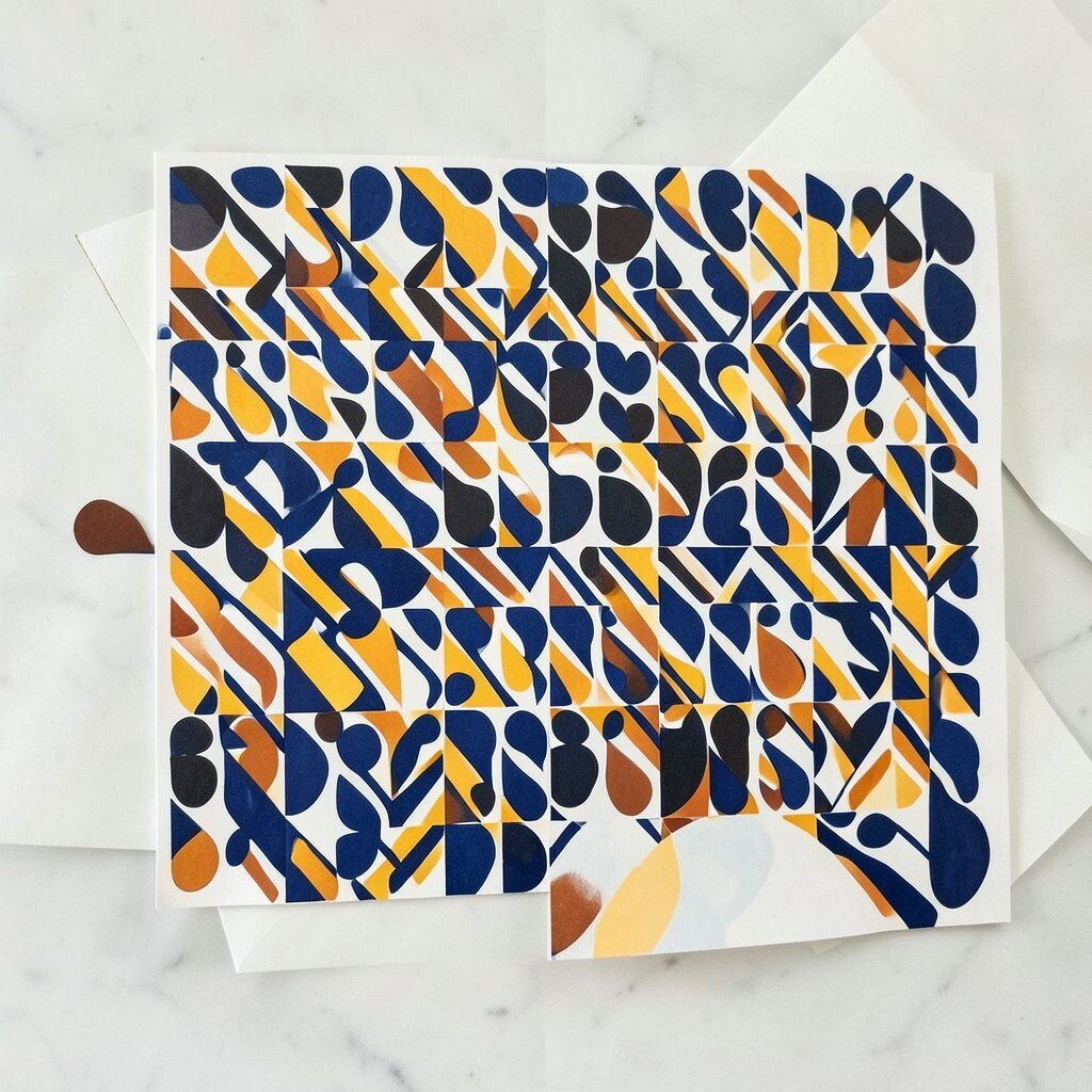
Create a “Pattern Parade” Using Repeated Shapes Choose one shape—circles, squares, waves, triangles—and repeat it in different sizes. Picture a row of jellybeans that morph into diamonds, with alternating dark and bright colors.
Vary the spacing, rotate some shapes, and add one surprising interruption. That interruption is what makes the design feel bold instead of flat.
If you want uniqueness, invent your own pattern rules, like “every third shape is facing left.” This keeps your work playful and shows your style.
For personalization, build a pattern that matches something you love, like game icons, leaf shapes, or music notes. Costs stay low because patterns can be made with basic markers, pens, or even free digital brushes.
-
8. Use “Big Shadow” to Make Anything Dramatic
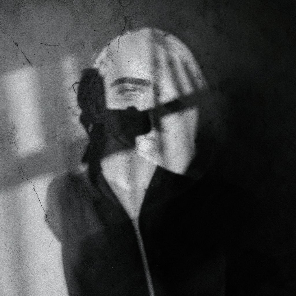
Use “Big Shadow” to Make Anything Dramatic Pick one light direction and make the shadow huge and simple. Imagine a small cup sitting on the page with a shadow that stretches like a banner across the background.
Draw the shadow first, then place your object on top of it. This trick adds drama fast and makes your piece feel like a movie still.
It also improves your understanding of value, which is a key design skill. You don’t need expensive tools—pencil plus marker or paint works great.
-
9. Write a Short Story, Then Create the Visual Moment
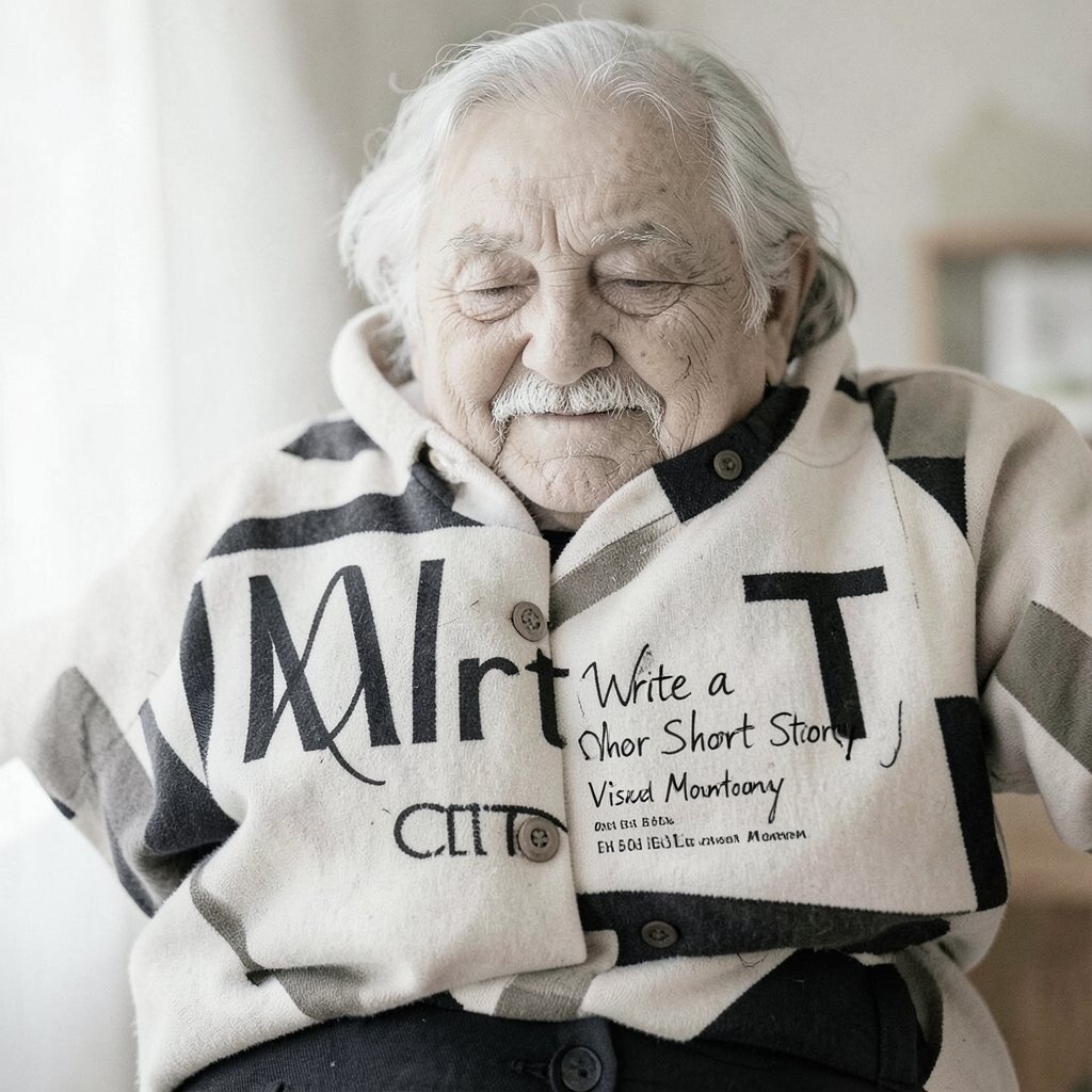
Write a Short Story, Then Create the Visual Moment Write a tiny story with three parts: the problem, the feeling, and the outcome. For example: “A lonely kite finds the wind, feels brave, and flies over lights.”
Now draw only the most emotional moment from the story. Use bold shapes, like a kite made of sharp triangles and a wind that looks like arrows or ribbons.
This gives your art a reason to exist, which often makes it more interesting. It also helps you choose what details to include and what to leave out.
-
10. Try “Limited Lines” With Thick, Confident Strokes
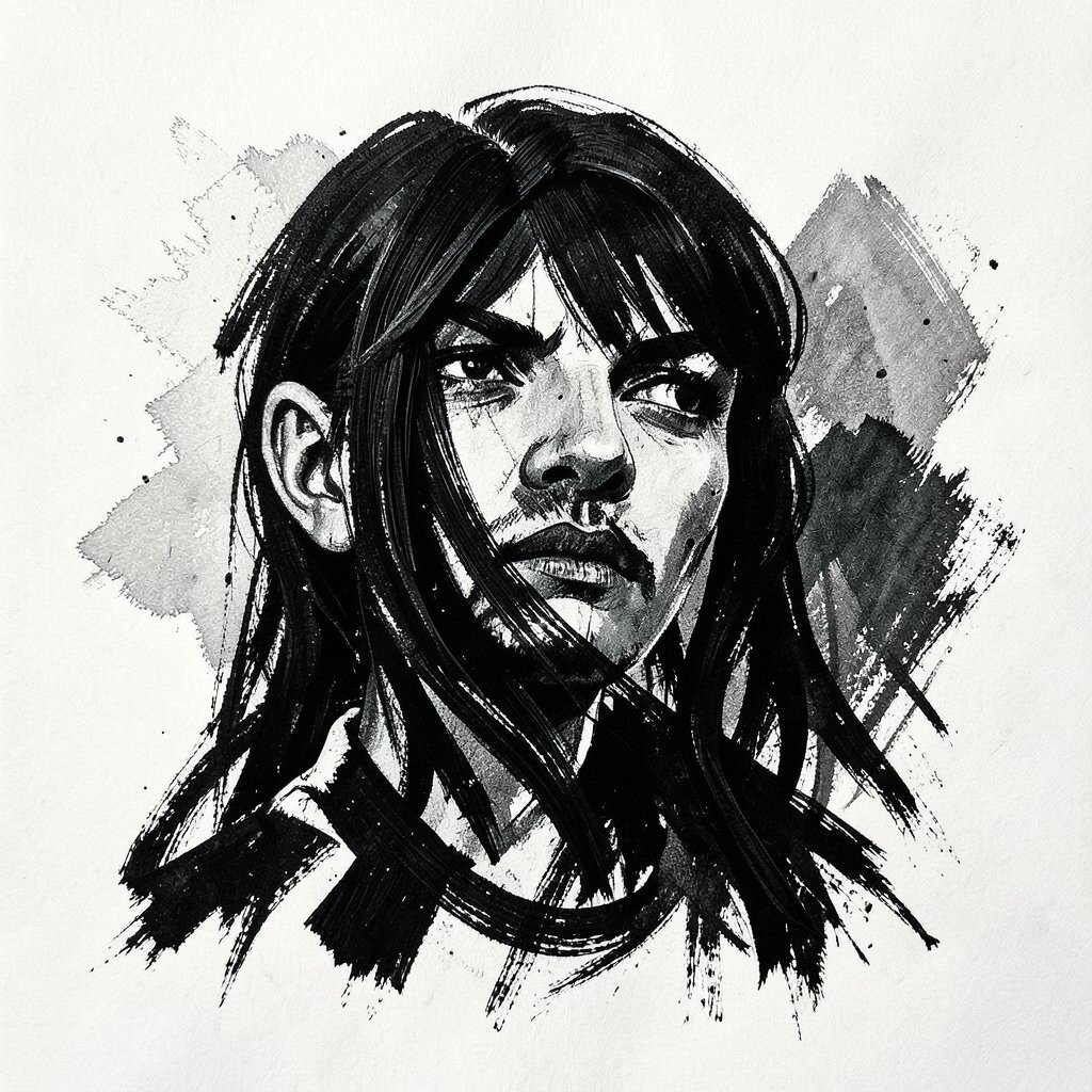
Try “Limited Lines” With Thick, Confident Strokes Decide you will use only a few line weights: one thick and one thin. Imagine a portrait drawn with bold outer lines and cleaner inner marks, like a sticker style.
When you commit to thick strokes, your work looks intentional right away. It also helps you avoid messy overworking.
For personalization, switch tools so the line style matches your mood: a brush pen for confidence, a gel pen for sparkle, or a sharp pencil for a gritty vibe. Cost is flexible since most people can start with one marker or one pen.
Right now, bold outlines and “sticker-like” illustration styles are popular because they scan well on screens and look great on prints. Use that trend by choosing strong contrast and simple shapes.
-
11. Make a “Mood Board Page” Before You Start
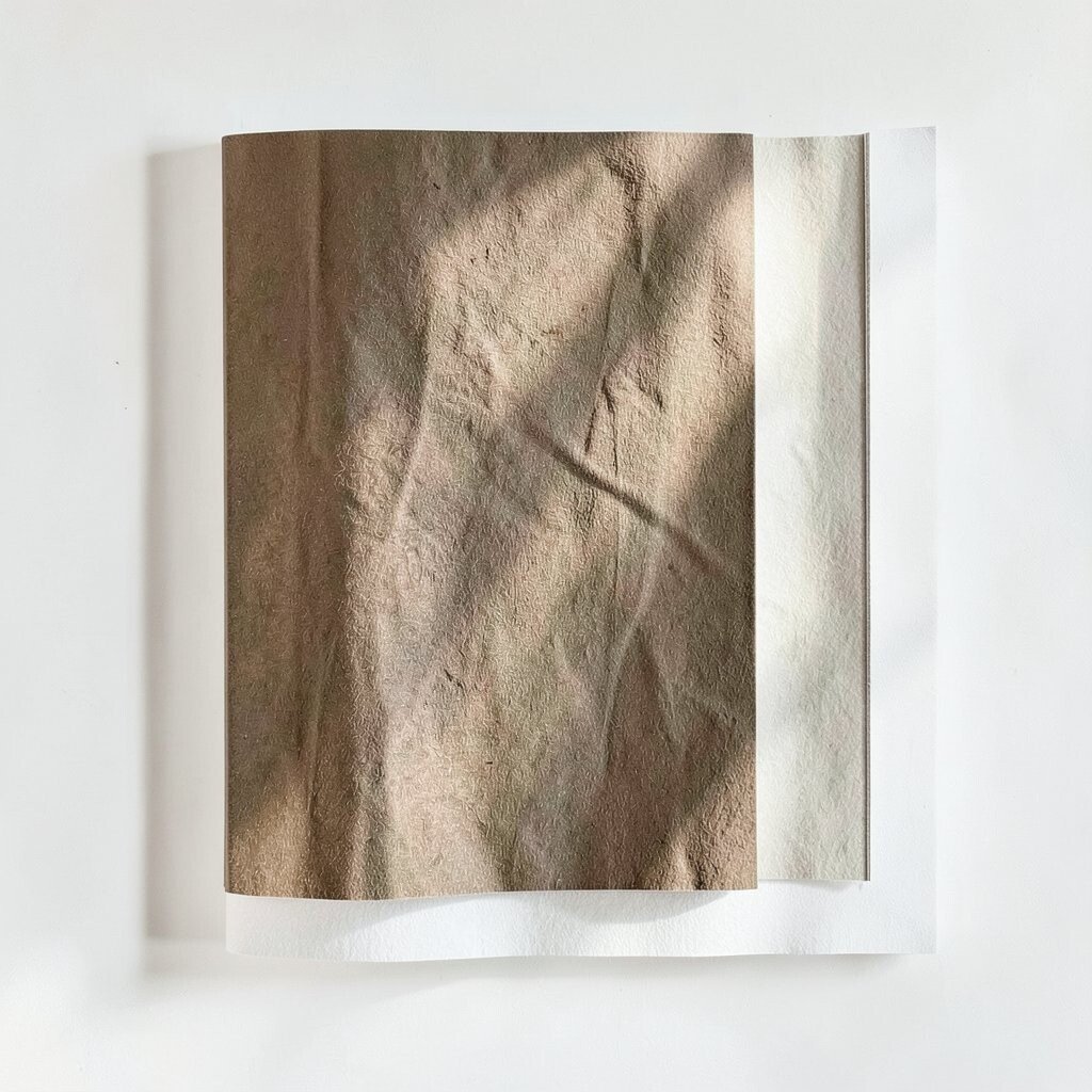
Make a “Mood Board Page” Before You Start Gather images that match one mood: calm, angry, dreamy, funny, or mysterious. Cut them out or save them on your phone, then arrange them on a page.
Look at what repeats—colors, themes, fonts, or textures. Then create a single artwork using those repeating clues, like building a piece that feels like your favorite movie poster.
This boosts your originality because you blend influences into your own version. It also helps you choose colors and compositions without guessing.
-
12. Make “Two Versions” of the Same Idea
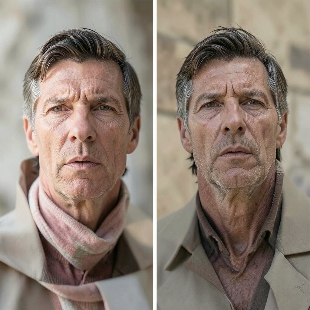
Make “Two Versions” of the Same Idea Choose one subject and create two different versions: one realistic and one stylized. Imagine a cat drawn first with simple shading, then again as a geometric cat made from triangles and blocks.
Keep the pose or main shape similar so you can compare results. Then pick the version that feels more exciting and refine that one.
Making two versions helps you learn quickly and reduces fear. You are not stuck; you have options, and that confidence shows in your final work.
-
13. Use a “Sacred Corner” Composition
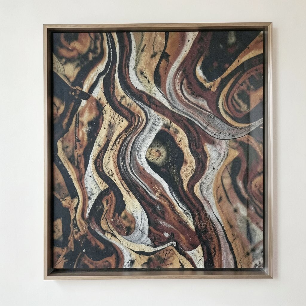
Use a “Sacred Corner” Composition Place your main subject in one corner instead of the center. Picture a giant flower blooming from the bottom left, while the top right stays mostly empty.
This composition instantly feels bold because it breaks the usual layout habit. It also makes the negative space look like part of the artwork, not wasted paper.
To personalize it, match the subject corner to your favorite feeling, like placing it near the direction you naturally feel drawn to. Keep costs down by limiting materials and working on scrap paper.
As a bonus, this technique works great for posters, since corner-heavy layouts feel modern and clean.
-
14. Turn Everyday Writing Into Visual Art
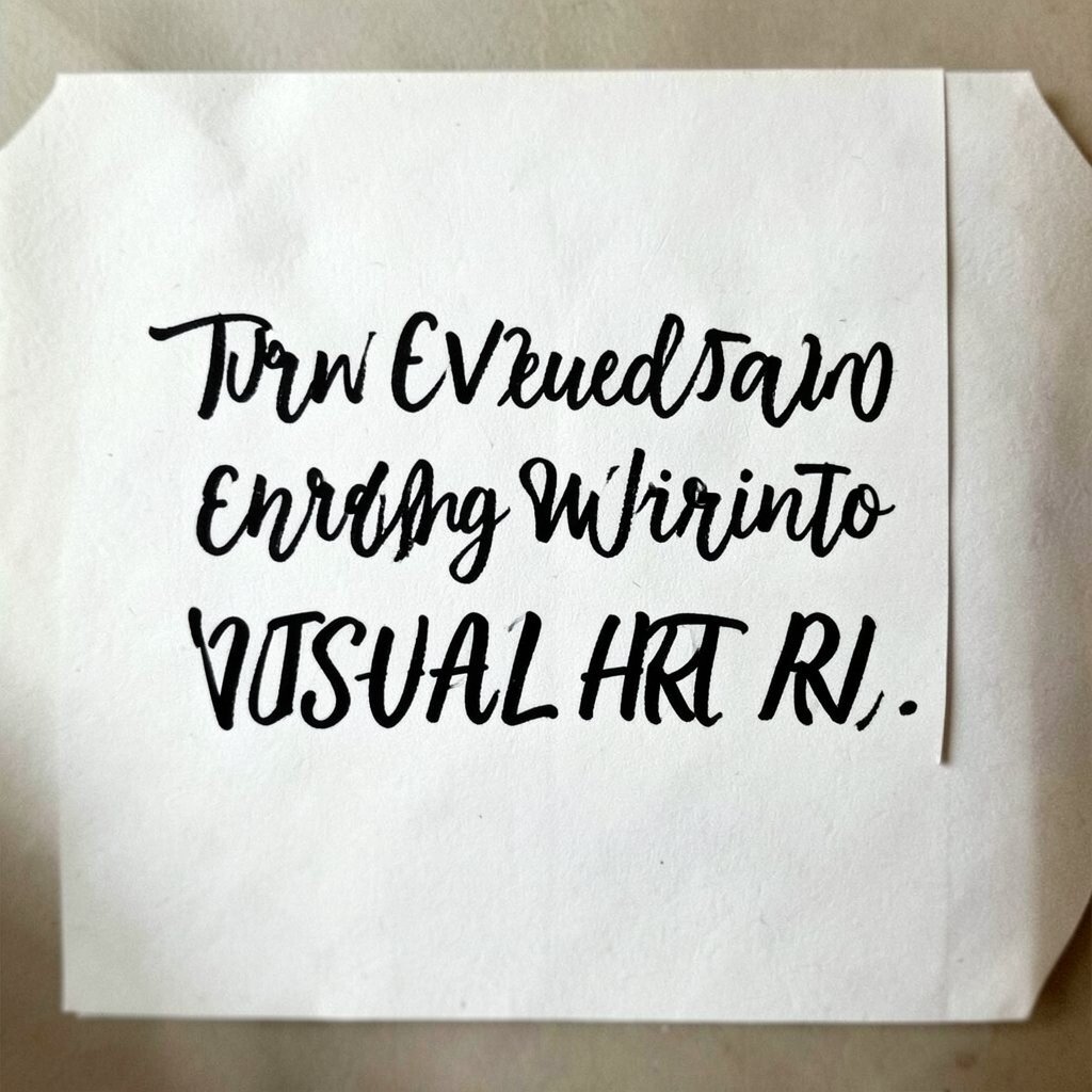
Turn Everyday Writing Into Visual Art Take a quote, a grocery list, or even your own doodle words and make them bold. Imagine letters that grow into shapes, like each letter turning into a striped ribbon.
You can use marker lettering, stencil letters, or hand-drawn typography, then mix in simple icons. The benefit is that your art becomes meaningful because words carry your voice.
For uniqueness, underline one key word with a color that fights with the background, like neon green on warm beige. Cost is low because paper and a few markers can do the job.
-
15. Create a “Wrong Perspective” Challenge
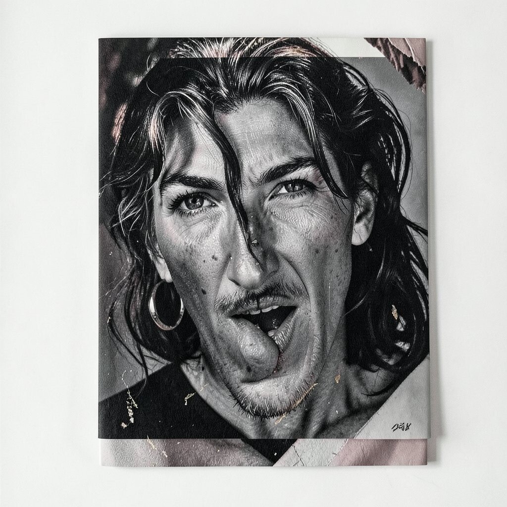
Create a “Wrong Perspective” Challenge Break perspective on purpose, but do it with intention. Draw a room where the window is too big, the floor tilts more than it should, and the light beams stretch unnaturally.
This makes your scene feel dreamy, comic, or even slightly scary. Your viewer’s eyes will keep moving because the rules feel playful.
To keep it controlled, choose one perspective rule to keep and one to bend. For example, keep horizon direction consistent, but change scale for one object like a chair.
Personalize it by turning it into a place you know, like your bedroom turned into a fantasy control room. You can do it digitally too, with perspective tools if you like, but traditional sketching works just fine.
-
16. Add “Bold Evidence Lines” for Motion
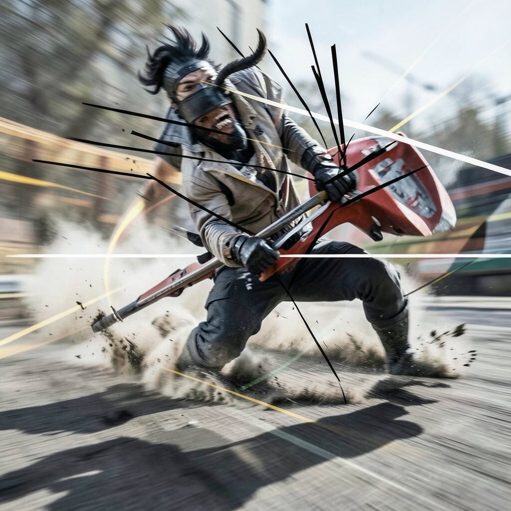
Add “Bold Evidence Lines” for Motion Use lines to show motion, like speed lines, wave lines, or wind trails. Imagine a running figure drawn in simple shapes, with thick swooshes behind it like the page is spinning.
Keep the motion lines bold and few, then add one highlight mark, like a white streak. This helps your piece feel energetic without becoming messy.
The benefit is that it creates feeling fast, even if your drawing style is simple. It also helps you practice gesture and rhythm, which are essential for animation-like art.
-
17. Mix “High and Low” Materials for Surprise
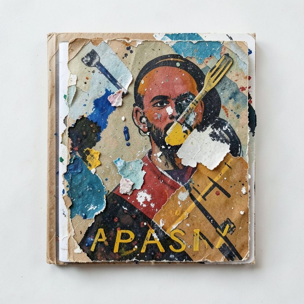
Mix “High and Low” Materials for Surprise Combine materials that behave differently, like marker plus watercolor, pencil plus collage, or acrylic paint plus crayon. Imagine a painted background with paper shapes layered on top, creating raised edges and tiny shadows.
This technique adds uniqueness because texture and shine will vary across the piece. It also helps your viewer see your process, which can make the art feel more friendly and real.
For cost considerations, use scraps first: old magazines, torn wrapping paper, and leftover paint samples. If you want a clean look, try glossy varnish or glue in thin spots to make highlights.
Current trends often favor mixed media looks because they feel hands-on and modern. You can lean into that by choosing one bold focal area and keeping the rest simple.
-
18. Build a Personal Symbol System
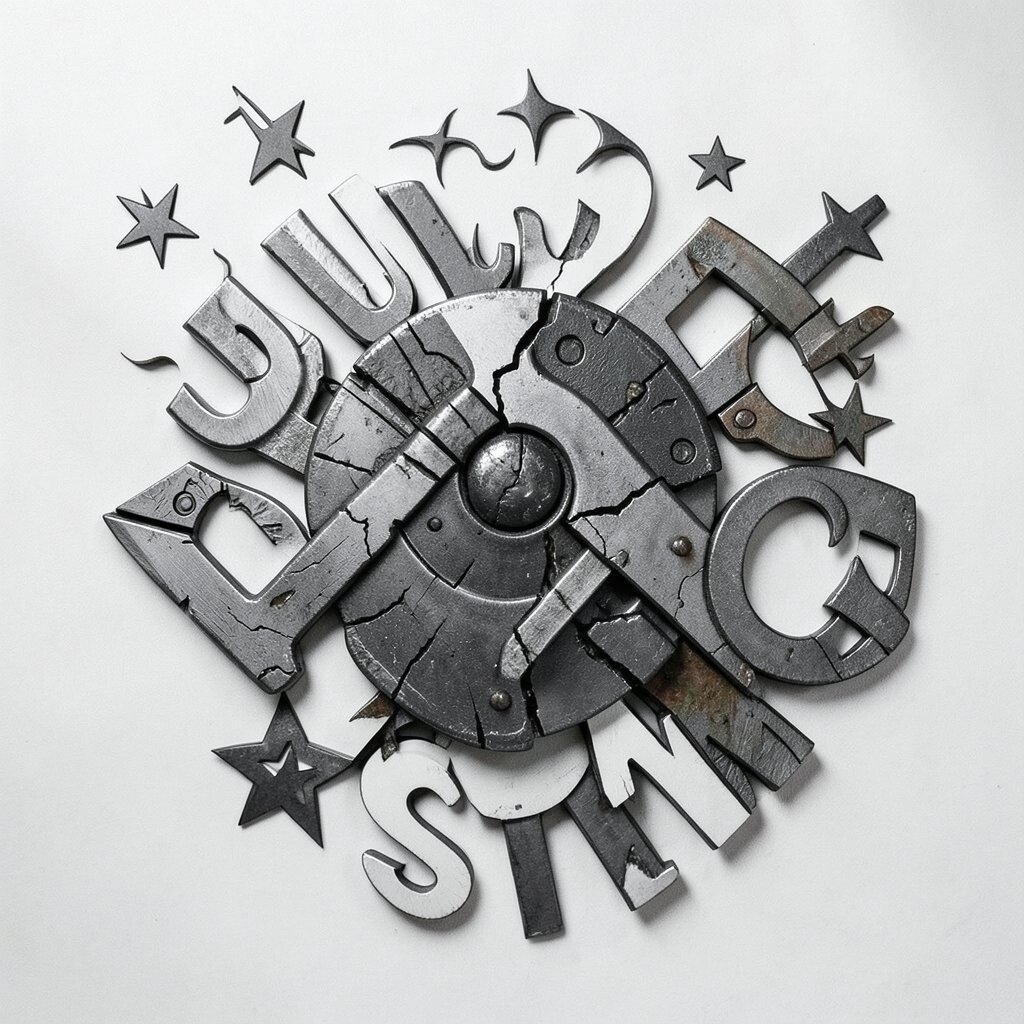
Build a Personal Symbol System Pick symbols that represent you: a star for excitement, a key for curiosity, a cloud for calm, a lightning bolt for energy. Imagine a whole artwork made of your symbols forming a pattern, like your own secret language.
Place the symbols in a strong arrangement, such as a circle, a spiral, or a map-like path. Then limit your colors to a few bold options so the symbol set feels like a unified design.
This is a powerful personalization tool because your ideas stop being random. You create a visual identity that you can reuse and refine, making future art easier to start.
To make it actionable, create a small “symbol sheet” on one page and add new symbols whenever inspiration hits. Cost stays low because most symbols can be drawn with one pen and one marker, and you can go digital later if you prefer.