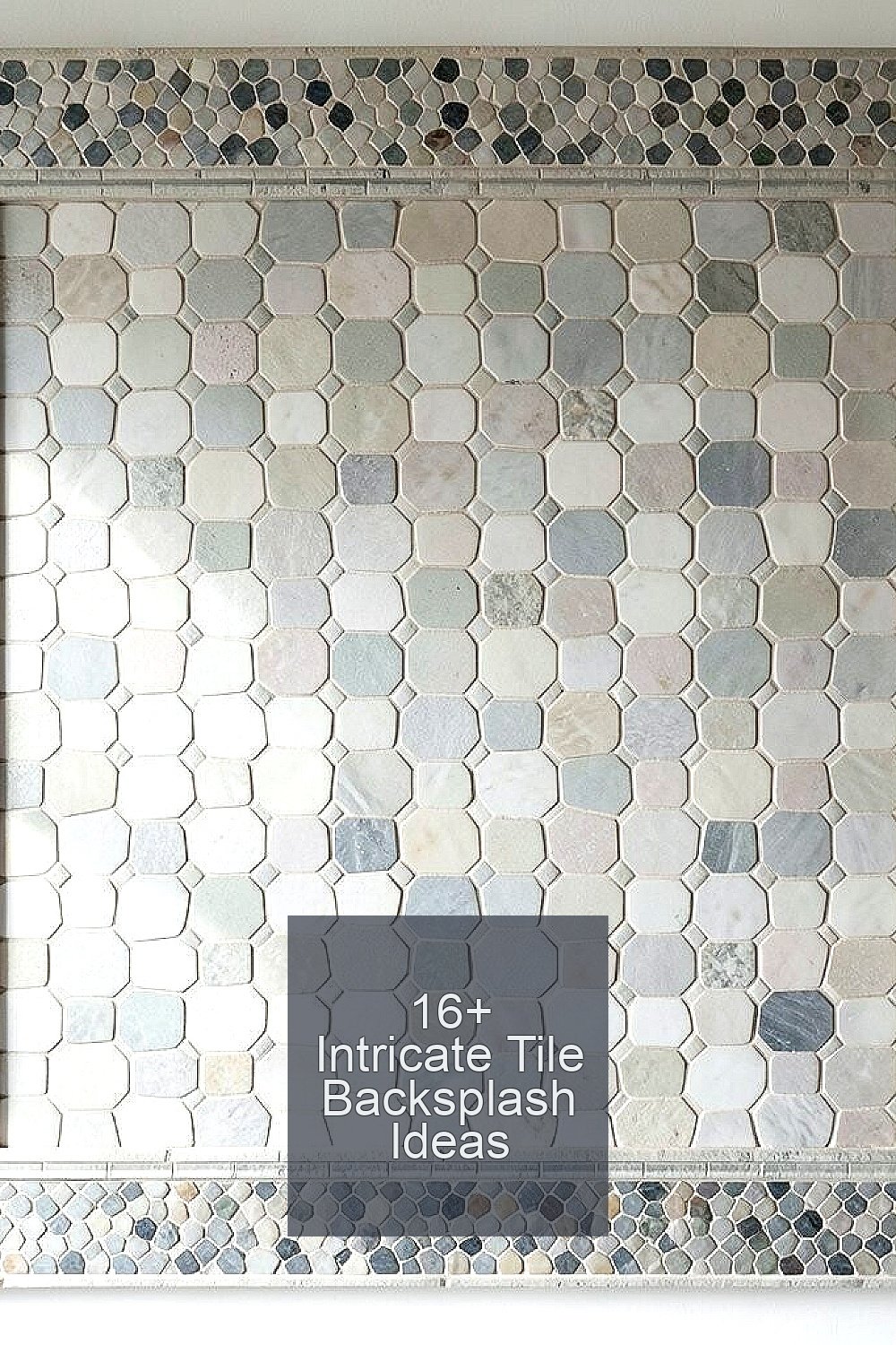
Kitchen backsplashes can turn everyday cooking into something special. The right tile pattern catches the eye and makes the whole room feel finished.
Here are intricate ideas that look amazing, work hard, and still fit real life.
-
1. Hand-Painted Moroccan-Inspired Zellige Patterns
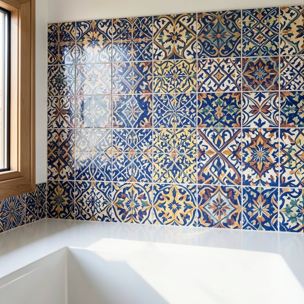
Hand-Painted Moroccan-Inspired Zellige Patterns Picture small, uneven tiles with a soft glaze that reflects light like a gentle wave. The colors can feel warm and rich, with little specks that look almost like tiny star dust.
Choose this style when you want personality without needing extra decor. It helps hide minor splashes because the surface has texture and variation. For best results, seal the tile if your glaze needs it, and use a grout color close to your mid-tone so nothing looks harsh.
For personalization, match one color from the tiles to your cabinet hardware or a vase on the counter. Costs vary a lot based on whether tiles are made by hand and how custom the palette is. A practical tip: order extra tiles for repairs, because exact matching can be tricky once a batch is gone.
-
2. Hexagon Tiles With a Mosaic Border Frame
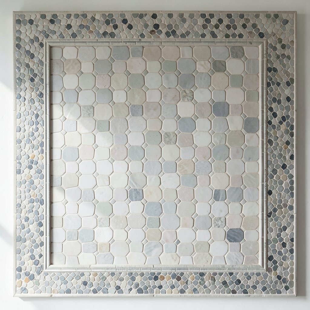
Hexagon Tiles With a Mosaic Border Frame Imagine a steady row of hexagons that forms a honeycomb pattern, then topped with a thin mosaic border that frames the edges like jewelry. When the light hits, the facets create small highlights that make the backsplash look crisp and clean.
This layout brings a modern feel while still looking intricate. It also makes busy kitchens look calmer because the pattern repeats in a neat rhythm. If you love the look but want easier upkeep, choose glazed tiles with smooth finishes.
To personalize, pick two coordinating shades—one main and one accent—so the border feels intentional. Budget-wise, hex tiles can be mid-range, but borders usually add cost because they require more layout time. Save money by doing the intricate border only in key zones, like around the sink and the stove, instead of wrapping the whole wall.
-
3. Classic Subway Tiles in a Herringbone Layout
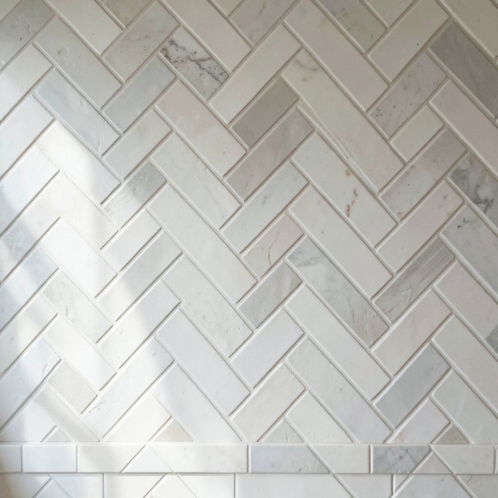
Classic Subway Tiles in a Herringbone Layout Think of bright subway tiles set at angles so they form a herringbone pattern that looks sharp from across the room. The lines feel lively, and the grout creates a neat “grid-with-a-twist” effect.
This idea is popular because it stays timeless and still feels special. It makes small spaces look taller and cleaner, especially with light grout. When you want something that never feels outdated, herringbone subway tile is a safe and stylish bet.
For personalization, choose warm white or creamy off-white instead of a flat pure white. Also, consider narrow grout lines for a more detailed look, but keep in mind that tighter grout can raise labor time. Costs are usually moderate, yet the angled install takes extra skill, so ask for a clear estimate.
If you cook often, a glossy glaze is great for wiping off splatters quickly. For extra protection, pair the backsplash with a good sealant on grout where needed. This can keep the pattern looking sharp for years.
-
4. Marble-Look Tiles With Vein-Realism and Gold Flecks
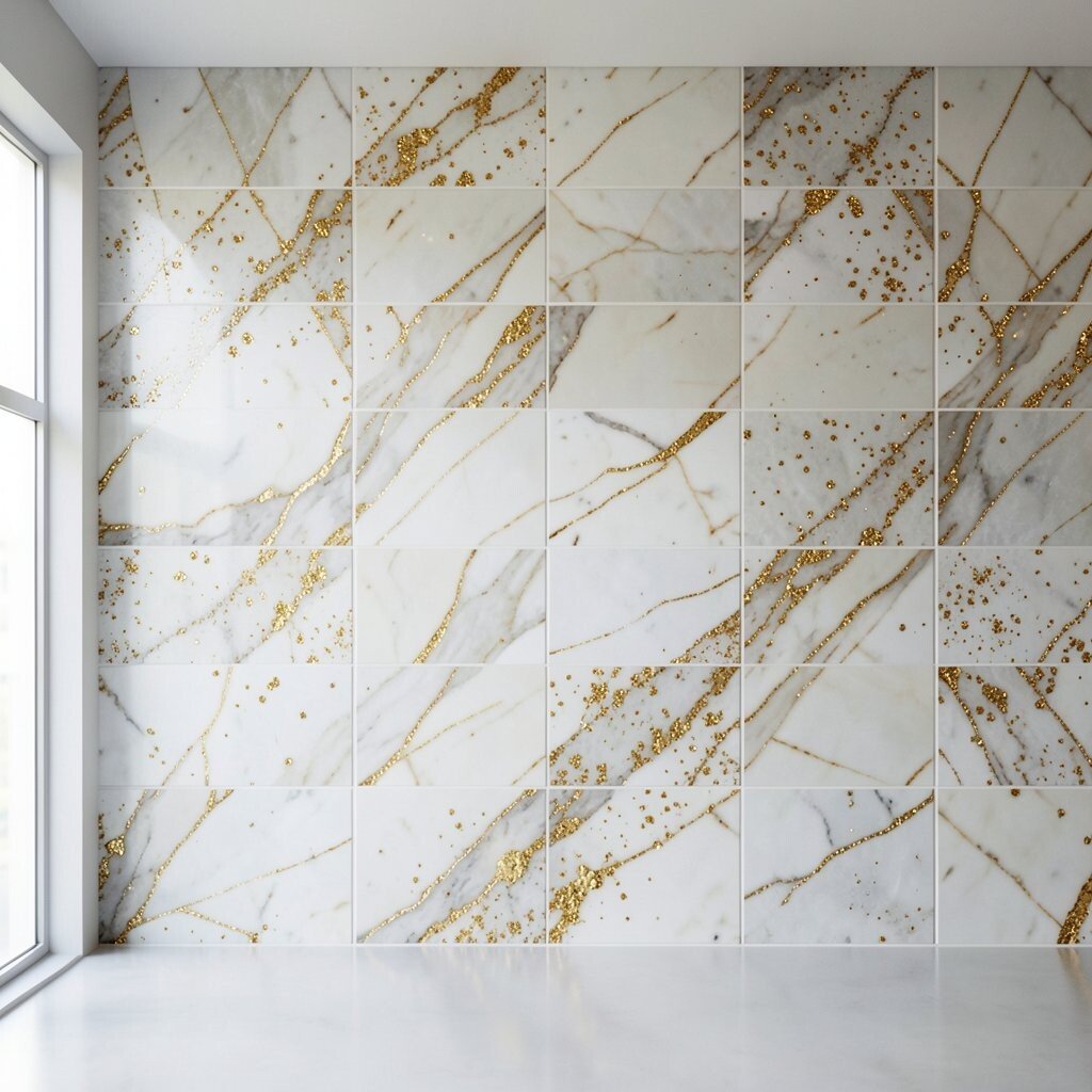
Marble-Look Tiles With Vein-Realism and Gold Flecks Picture a smooth marble-look surface with veins that move like natural rivers, plus tiny gold flecks that feel subtle rather than loud. From a distance, it looks elegant, and up close, it looks almost hand-finished.
This style gives a high-end feel without the full cost and weight of real marble. It also works well with many color schemes because the veins add depth. Choose matte or satin finishes if you want less glare near bright lights, especially above the stove.
To personalize, pick a grout color that matches the lightest vein tone so the tile lines look clean. Budget considerations matter here: look for quality printing or better coatings that resist staining. If you want to spend wisely, invest more in tile quality and save by keeping the layout simple with fewer accent pieces.
-
5. Micro-Roman Tiles in a Soft, Textured Finish
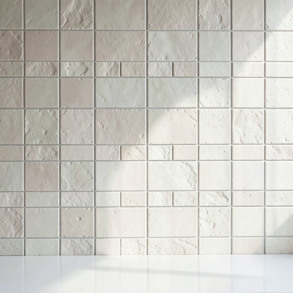
Micro-Roman Tiles in a Soft, Textured Finish Imagine tiny square tiles with a slightly curved or ridged surface that catches light in gentle ways. The overall look is calm, but the texture adds depth that makes the backsplash feel rich.
Micro-scale tile designs can hide grime and small imperfections better than large flat tiles. They also give a “handcrafted” vibe that feels cozy in everyday kitchens. For upkeep, glazed micro tiles are easier to clean, so check the finish type before you buy.
To personalize, mix two related shades like oatmeal and sand for a layered feel. Costs can be moderate, though installation time can raise labor because the grout lines are small and plentiful. If you want an easier install, ask your installer about mesh-mounted tiles that keep spacing consistent.
-
6. Moroccan-Inspired Star Medallions With Center Focus
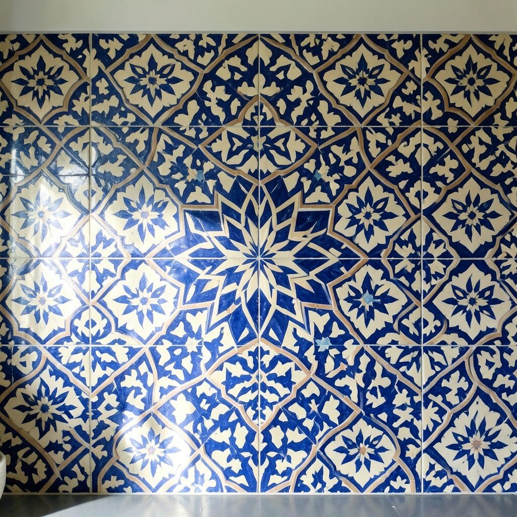
Moroccan-Inspired Star Medallions With Center Focus Picture a dramatic center medallion made of star-shaped tiles, surrounded by simpler pieces that let the design take the spotlight. The result feels like a piece of wall art that also protects against splashes.
This idea works especially well if your backsplash has a clear focal point, like behind the stove. The medallion creates a “wow” moment without covering everything in busy detail. Use a cohesive color palette so the design feels elegant instead of chaotic.
For personalization, repeat a smaller star motif around the sink area using tiles from the same collection. Costs can be higher due to the medallion panel or custom layout, but you can control spending by choosing a smaller center section. A tip: measure carefully and plan the medallion height so it aligns with cabinet edges and outlets.
Current trend note: many kitchens are using “statement moments” instead of full-wall patterns. This design fits that trend while still offering intricate craftsmanship.
-
7. Scalloped Tiles in a Blended Ocean Palette
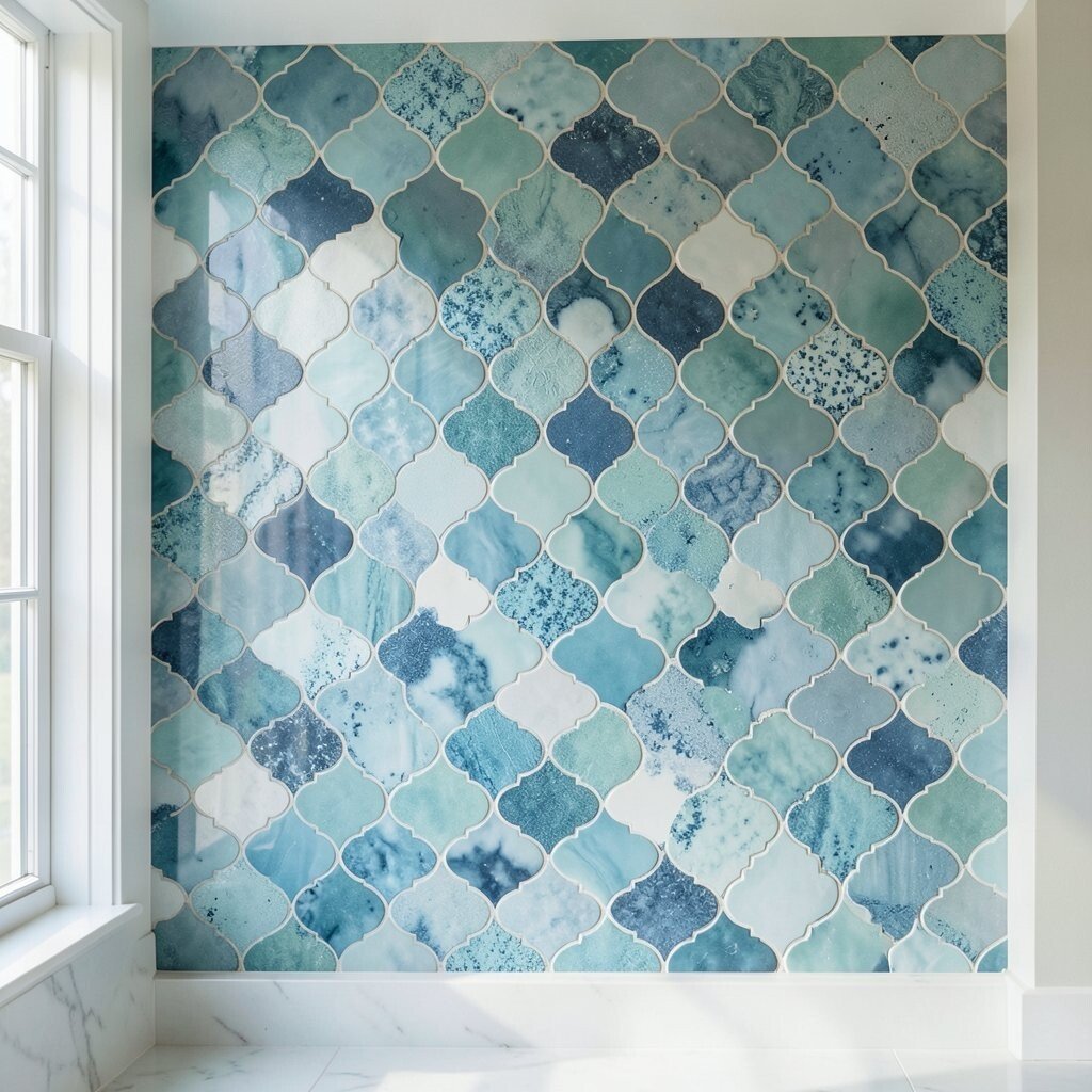
Scalloped Tiles in a Blended Ocean Palette Think of scalloped tiles like gentle shells, arranged in repeating rows that look playful yet sophisticated. The edges create tiny shadows, so even a simple color scheme looks layered.
This backsplash idea adds movement to a kitchen and makes even plain cabinets look more curated. It is a fun way to bring in soft color while still keeping the wall easy to clean. Pick a glazed finish to help with wiping and to reduce staining from cooking splatter.
To personalize, choose a gradient palette—like seafoam near one end and deeper blue near another. Budget-wise, scalloped shapes can cost more because they require precise installation to line up curves. If you want savings, keep the scallop tile for the main area and use simpler tiles around outlets.
-
8. Patterned Encaustic-Style Cement Look Tiles

Patterned Encaustic-Style Cement Look Tiles Encaustic-style tiles bring bold geometry with a “printed-on-earth” look that feels old-world and new at the same time. The mix of colors feels like art, and the surface often looks slightly porous in a good way.
Because the pattern is busy, it tends to hide small stains and light wear very well. It also makes your backsplash feel like a statement without adding extra objects. For benefits, cement-look designs can handle heavy kitchen life when you choose a sealed, quality product.
Personalize by picking a palette that matches your countertops or your dining area, so the pattern feels tied to the home. Costs vary, but quality encaustic-look tiles often sit in a mid-to-higher range. A smart tip: test a few tiles under your kitchen lighting because colors can shift from warm to cool depending on bulbs.
If you love intricate designs but worry about maintenance, plan to seal and re-seal grout based on the manufacturer’s guidance. That small effort keeps the look crisp and prevents discoloration.
-
9. Brick-Pattern Tiles in Modern Color Blocks
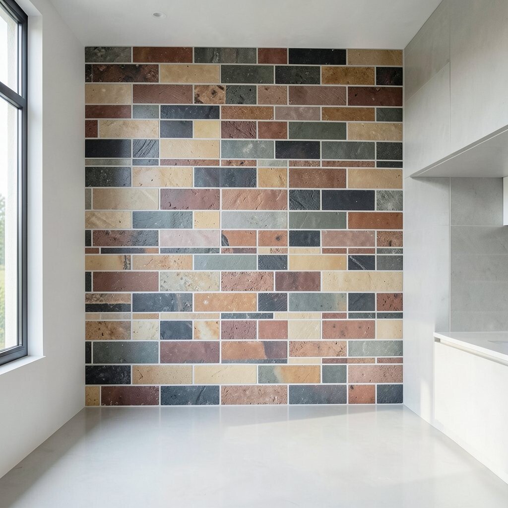
Brick-Pattern Tiles in Modern Color Blocks Imagine classic brick-style layout, but with each “brick” in a carefully chosen set of colors. The backsplash looks like a modern mural, with clean lines and a bold rhythm.
This design is great when you want structure but still crave visual interest. The brick pattern naturally directs the eye, which can make the wall feel organized even with color variation. For benefits, the repeating blocks make it easier to plan cleaning because splashes blend into the pattern.
Personalize by limiting your palette to three tones, such as cream, terracotta, and deep green. Budget considerations depend on the tile material—ceramic tends to be more affordable, while glass or stone can increase the price. To control cost, you can use higher-end tiles only on a band behind the stove and keep the rest in a matching simpler finish.
For a current trend, many kitchens are using color blocking rather than full-on prints. This approach gives that feel while keeping the installation layout straightforward.
-
10. Glass Tiles With Subtle Iridescent Specks
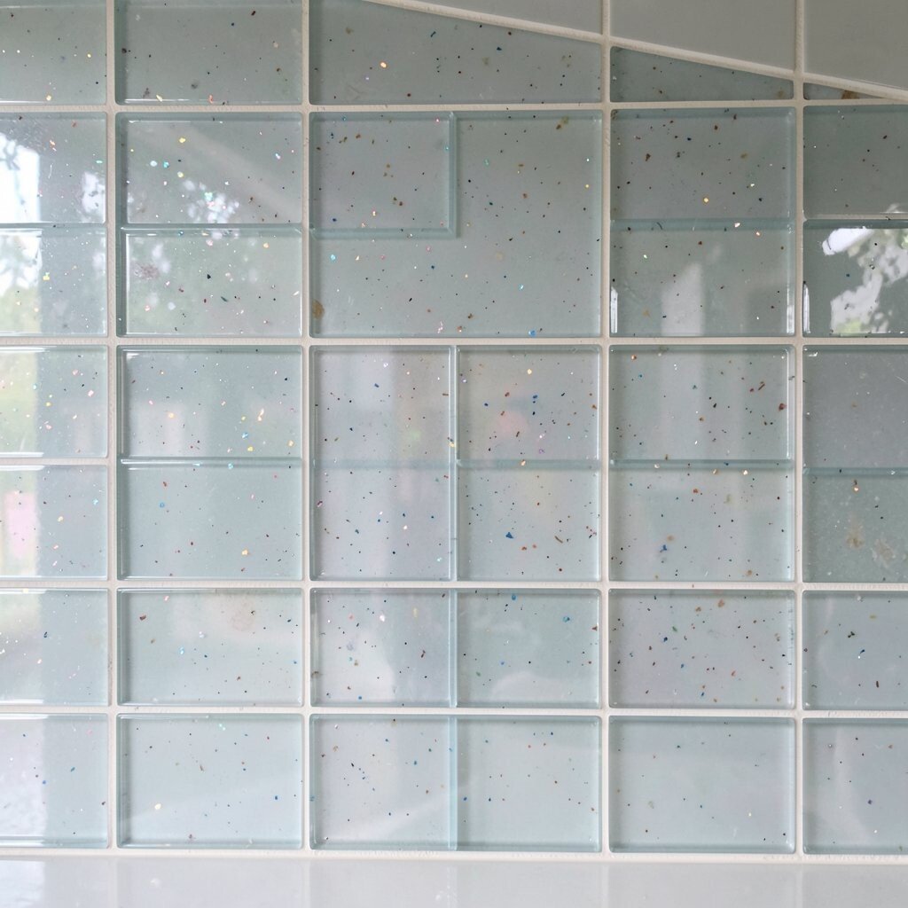
Glass Tiles With Subtle Iridescent Specks Picture glass tiles that shimmer slightly, like tiny bits of light trapped behind clear or tinted layers. The shimmer can look soft in the morning and more dramatic at night.
This style adds brightness, which is a big benefit for kitchens that get less natural light. It also helps hide minor scuffs because the tiles reflect and scatter glare. For best results, choose iridescent glass with a consistent background tone so the wall looks smooth, not blotchy.
To personalize, pair a neutral cabinet color with a cool-toned glass like sea glass or smoke gray. Costs can be higher due to material price and careful installation needs. A practical tip: make sure the installer uses a strong thinset and proper spacing so the tiles sit evenly.
If you worry about maintenance, prioritize tiles with a stain-resistant backing and choose a grout that matches your glass tone. That keeps the look clean and reduces the chance of visible grout haze.
-
11. Large-Square Tiles With a Twisted Accent Strip
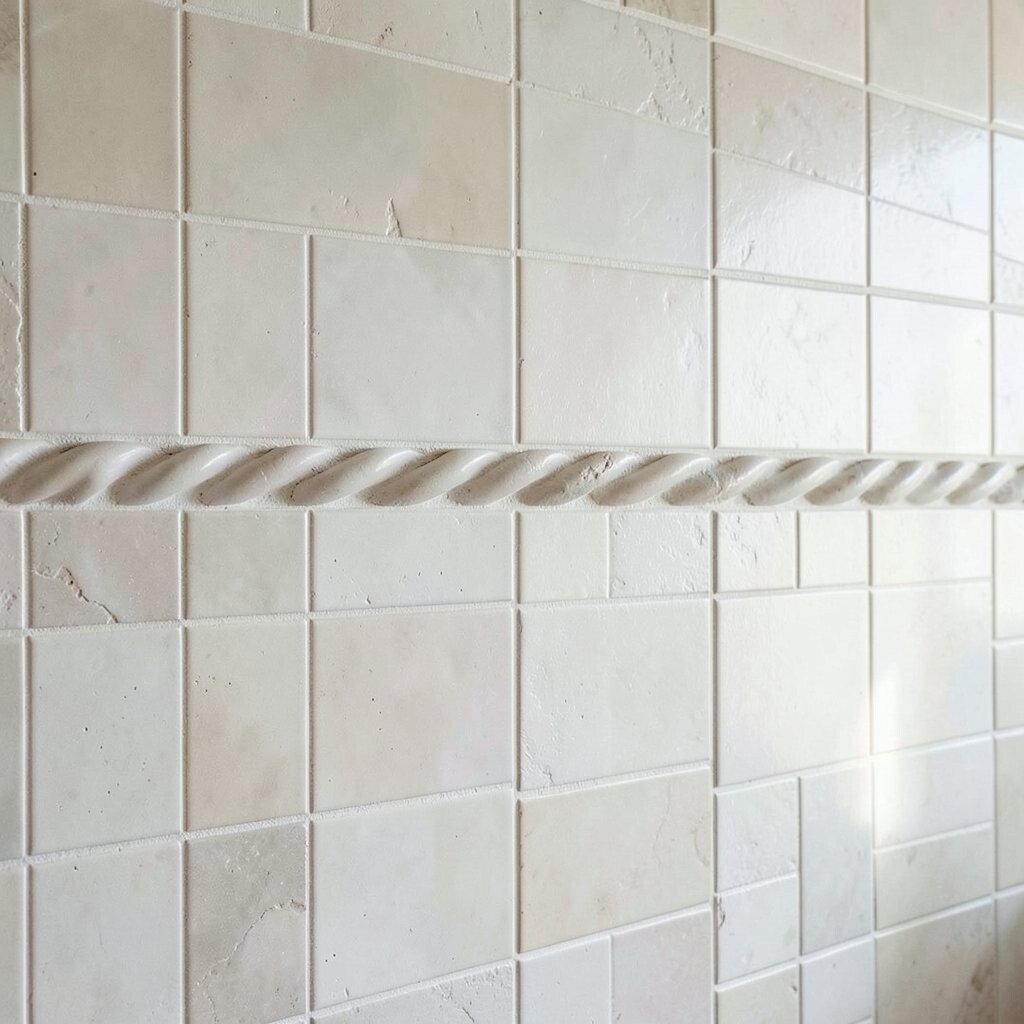
Large-Square Tiles With a Twisted Accent Strip Imagine a calm field of large square tiles, broken by a thin accent strip that has tiny geometric details. The overall look feels sleek, while the accent adds just enough intrigue to keep your eyes busy.
This is a smart choice if you want intricate design without covering every inch in pattern. Large tiles also mean fewer grout lines, which helps with cleaning and speeds up the install. When you want a tidy look, this idea offers the best of both worlds.
Personalize by choosing an accent strip that matches your kitchen vibe, like tiny diamonds, micro dots, or a thin herringbone. Budget considerations are usually friendly because fewer tile pieces reduce labor. You can also save by using an accent that spans only the most visible height behind the counter.
-
12. Victorian-Style Corner Flourish Tiles
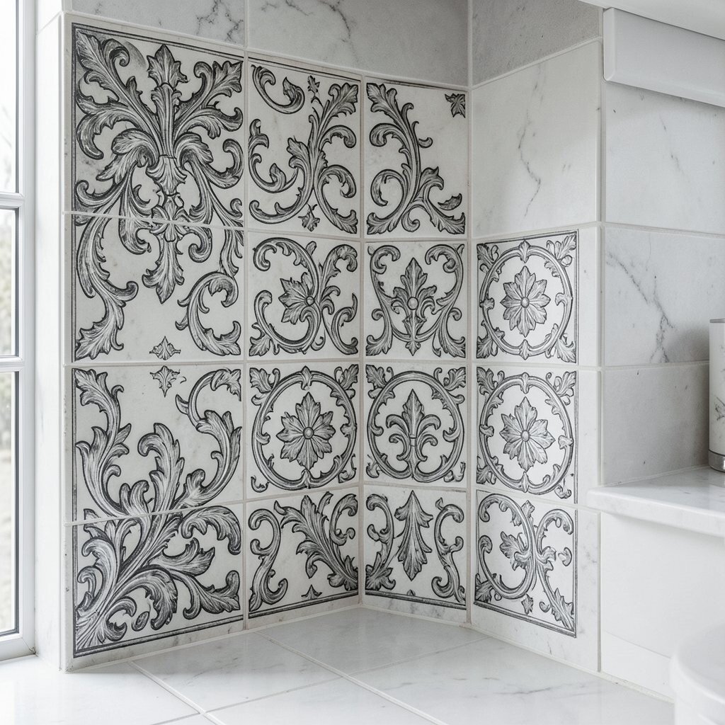
Victorian-Style Corner Flourish Tiles Picture ornate tiles placed at corners, with floral curves and filigree-like details that look vintage and fancy. When positioned near windows or under warm lights, the design feels almost like lace.
This idea brings a decorative moment without forcing you to commit to a full-wall pattern. It helps create a “designed” look while keeping the rest of the backsplash simple. For benefits, the rest of the wall stays easy to wipe because it is not covered in tiny pieces.
To personalize, match the flourishes to cabinet trim—if you have brushed brass, consider gold-toned grout or accents. Costs can be mid-to-high because decorative corner tiles are often sold in smaller sets. A tip: plan placement carefully so the curls align at the exact height you want, especially near outlets and switches.
Current trend note: more kitchens are mixing styles, and Victorian accents are showing up in modern homes as tasteful details.
-
13. 3D Relief Tiles in a Matte Finish
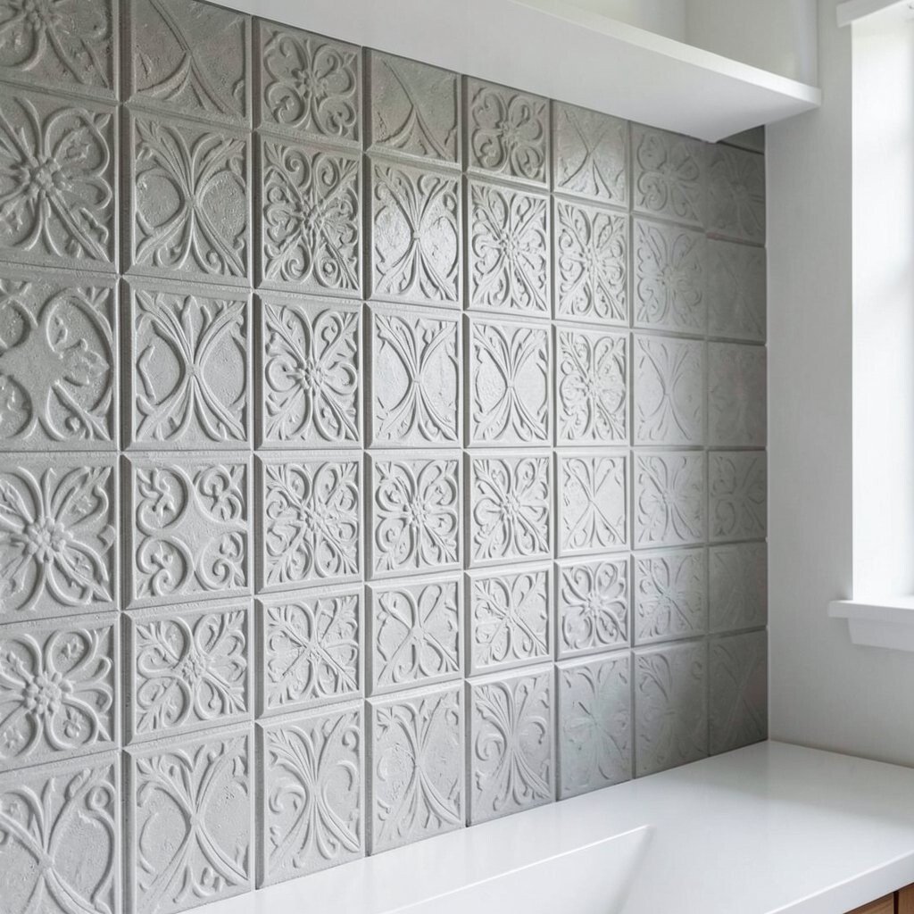
D Relief Tiles in a Matte Finish Imagine tiles that rise and fall in gentle patterns, like waves or tiny arches carved into the surface. The matte finish makes the shadows look soft, so the wall feels stylish without looking glossy or loud.
This tile idea adds texture that can make a kitchen feel richer, even with simple colors. It also benefits the wall because the relief can disguise small residue that shows on flat glossy surfaces. Choose relief tiles designed for backsplash use so they handle heat and moisture.
To personalize, pair a neutral tile base with one accent row of a slightly darker relief tone. Budget-wise, 3D tiles can cost more because of materials and the need for accurate leveling during installation. Ask about using a laser level to keep lines straight, which is a small step that makes a big difference.
If your cooking is heavy, wipe tiles after cooking to prevent grease build-up from settling into texture. With the right cleaning habits, this option stays beautiful.
-
14. Teal and Cream Patterned Tiles in a Runner Layout
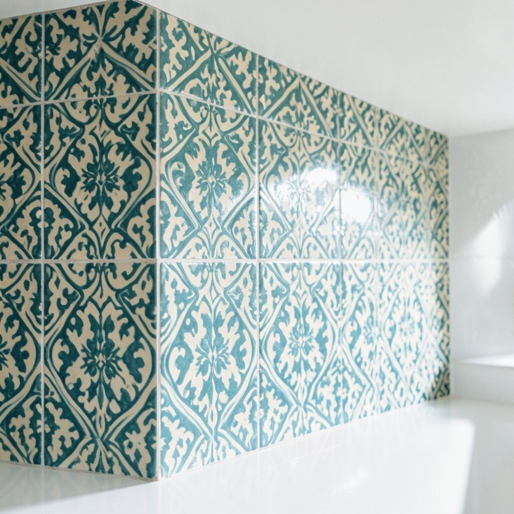
Teal and Cream Patterned Tiles in a Runner Layout Picture a long “runner” of patterned tiles that runs horizontally across the backsplash, with calm solid tiles above and below. The teal pop adds energy, while the cream keeps everything feeling light and friendly.
This layout is great for personalization because you can control exactly where the pattern sits. It also helps your kitchen feel styled even if you have a busy countertop. For benefits, mixing pattern and solid tiles can make maintenance easier since you spend less time cleaning busy surfaces.
Personalize by picking a teal shade that echoes your kitchen accents, like a kettle or artwork. Costs can be managed because you use patterned tiles only in the runner area instead of the whole wall. A tip: keep the grout color neutral so the pattern stays the star.
If you want a current trend, think about using color that looks “natural,” like ocean teal, rather than neon. Natural-looking colors feel calmer and more timeless.
-
15. Artistic Ceramic Tiles With a Hand-Dipped Look
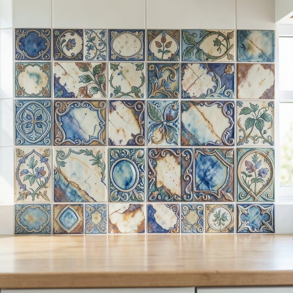
Artistic Ceramic Tiles With a Hand-Dipped Look Imagine ceramic tiles with a glaze that looks like it was dipped and dripped, creating soft edges and artistic color movement. Some tiles may show slightly darker patches, which makes the backsplash look handmade.
This style gives visual interest while still feeling warm and inviting. It is unique because the colors do not look perfectly identical across tiles, which adds character. For benefits, the glaze variations can hide minor wear better than tiles that look perfectly flat and uniform.
To personalize, select tiles that match your cabinetry undertone—warm cabinets often look best with warm glaze tones. Costs can swing depending on whether the tiles are studio-made or mass-produced with a similar look. If you want to stay within budget, consider using the most detailed tiles only behind the stove and using simpler coordinating ceramics elsewhere.
-
16. Book-Match Marble Tiles With Waterfall Veining
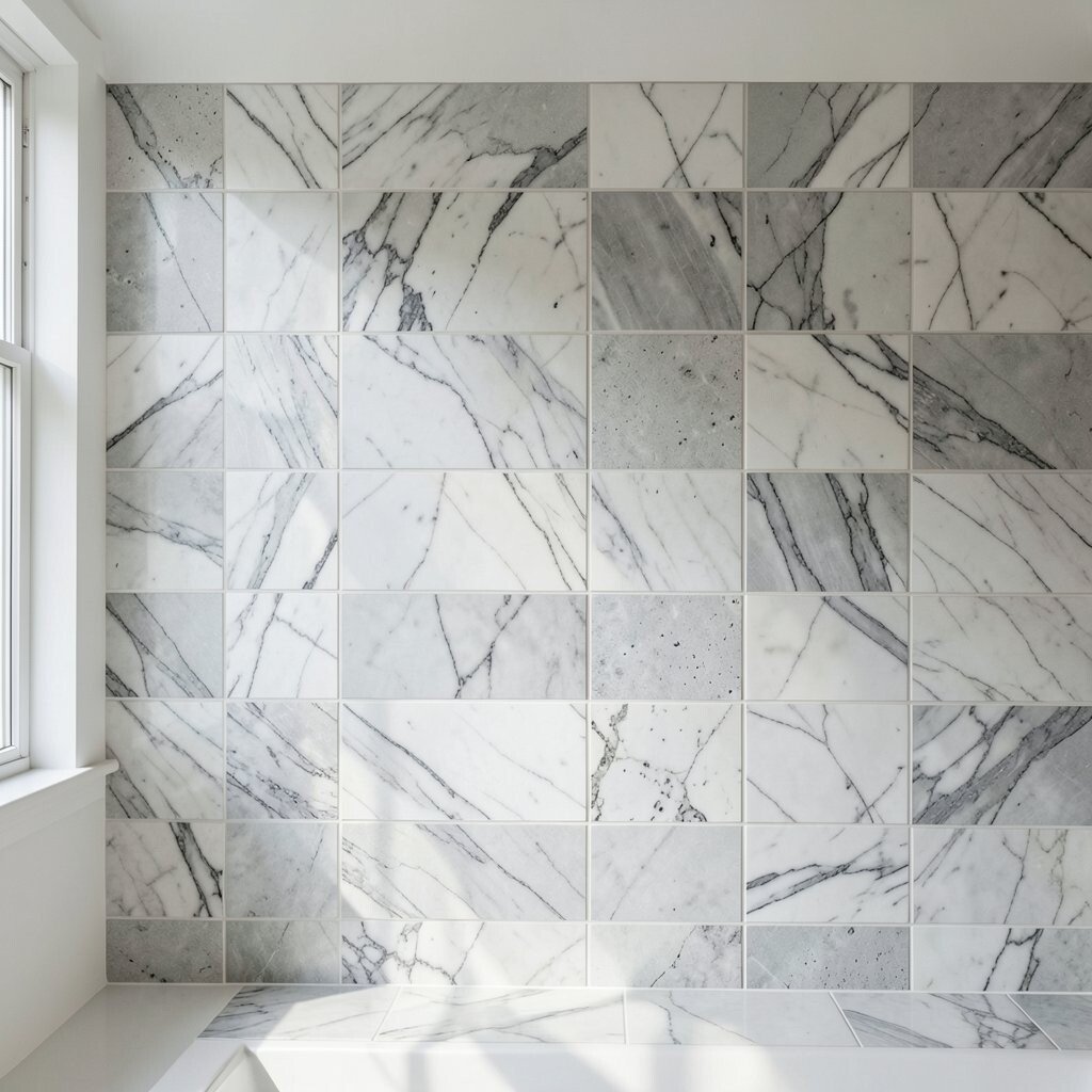
Book-Match Marble Tiles With Waterfall Veining Picture marble-look tiles where the veining lines up so they look like flowing water. When panels meet correctly, the pattern feels dramatic and sculptural, like a waterfall frozen on the wall.
This backsplash idea delivers a luxury look, especially against clean modern cabinets. It also benefits the room by adding depth without needing extra accessories. Choose a finish that matches your space: polished marble-look for drama, or honed for softer light.
Personalize by selecting a vein direction that complements your layout—vertical flow can make the room feel taller. Cost considerations are important here because book-match effects often require precise tile matching and more labor. A helpful tip: ask your supplier if they can provide layout guidance and confirm you will receive compatible tiles for the veining plan.
For long-lasting beauty, use quality grout and consider sealing if the grout or tile recommends it. That extra step helps keep the veining looking crisp.
-
17. Mixed Materials: Porcelain Base With Brass Inset Lines
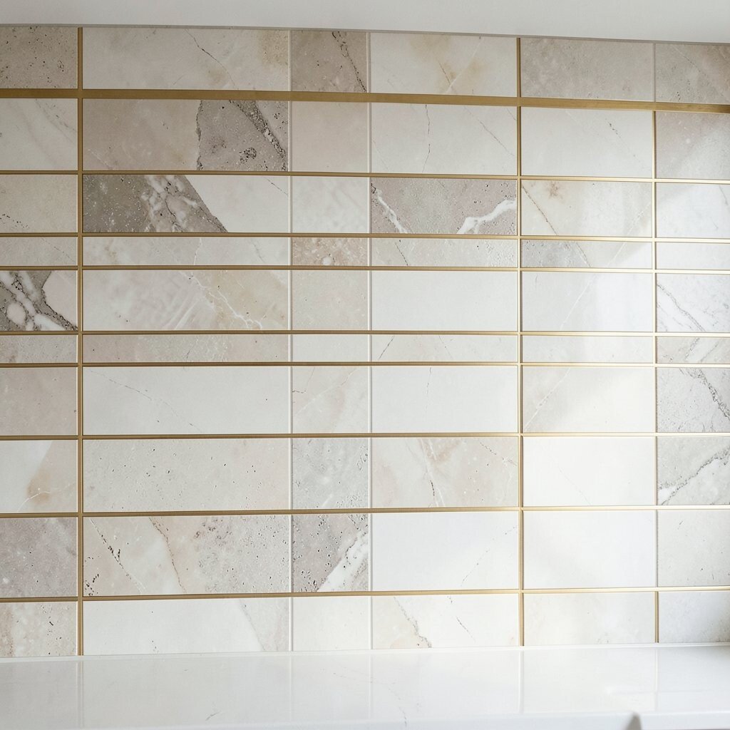
Mixed Materials: Porcelain Base With Brass Inset Lines Imagine a porcelain tile backsplash with clean surfaces, then broken by slim brass inset lines that run like elegant stripes. The mix of smooth ceramic and warm metal creates a “tailored” look that feels both modern and classic.
This idea is irresistible because it adds detail without chaos. The porcelain surface is tough and easier to wipe, while the brass lines add sparkle and definition. For benefits, you get strength where you need it most and decoration where it matters visually.
To personalize, choose brass that matches your faucet and lighting finishes, such as warm gold or brushed champagne. Costs can be higher because metal insets often cost more than standard trim, but porcelain remains a strong value. A tip: plan your inset lines to align with the top of cabinets and major countertop edges so the whole wall feels intentional.