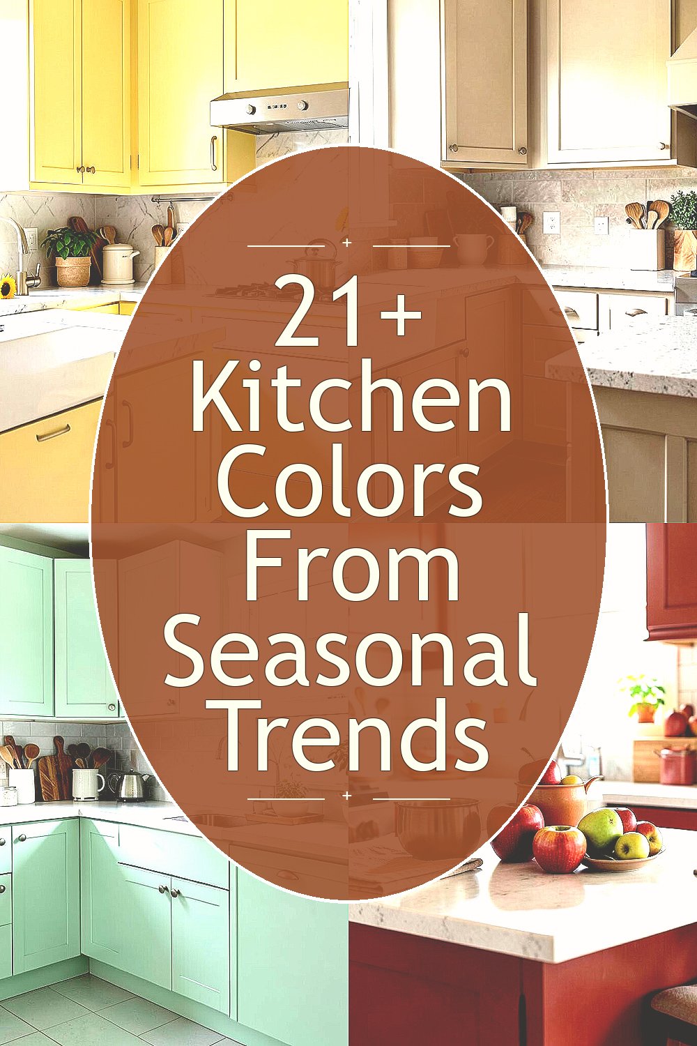
Season changes, and your kitchen can feel brand-new without moving a single wall. Pick a color that matches the mood outside and your cooking days will feel lighter.
Below are seasonal kitchen colors that bring comfort, style, and practical benefits to real homes.
-
1. Buttery Sunflower Yellow
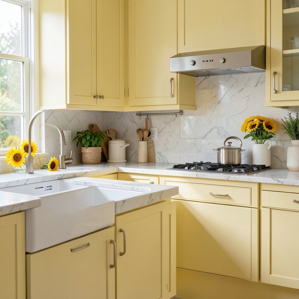
Buttery Sunflower Yellow Warm sunflower yellow makes the room feel sunny even on cloudy mornings. It pairs beautifully with light wood, creamy countertops, and simple white dishes.
Try it on cabinet doors, or choose yellow accents like bar stools, curtains, or a small wall panel. Yellow can brighten darker kitchens and help colors look fresher. For cost control, paint just the lower cabinets and keep the upper ones neutral.
If you want a softer look, choose a buttery shade instead of a bold highlighter. Add personalization with a yellow kettle, matching soap dispenser, or patterned tea towels. This color stays popular during spring because it gives everyone an easy, cheerful feeling.
-
2. Cozy Oat Milk Beige
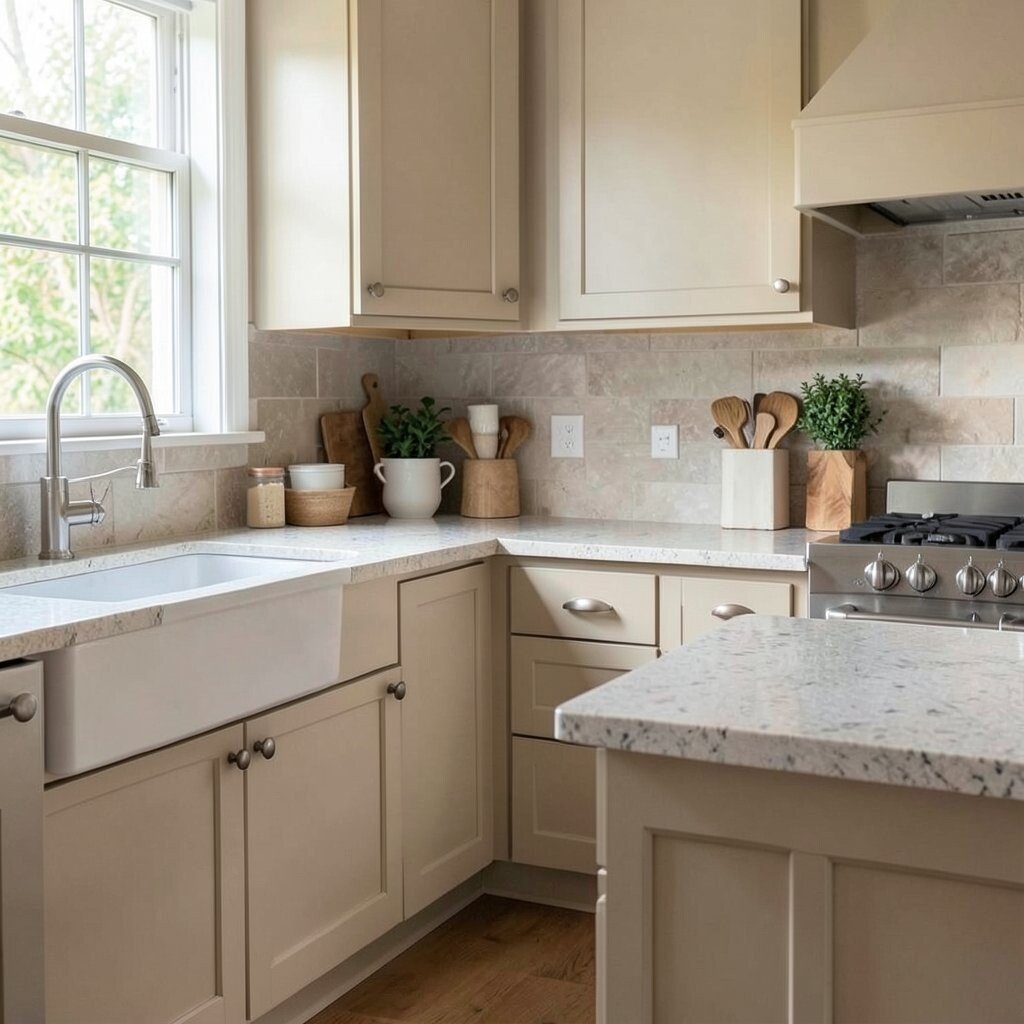
Cozy Oat Milk Beige Oat milk beige feels calm, clean, and welcoming. It works like a soft blanket over busy kitchen surfaces.
Paint walls in oat milk beige when you want a background that never feels harsh. This color is great for open-concept homes because it blends well with many flooring colors. It also helps the kitchen look bigger since light colors reflect more brightness.
For uniqueness, pick beige with a tiny warm tint and combine it with matte black hardware. If you want a more seasonal twist, swap accessories each season—think woven baskets in fall or fresh herbs in summer. To keep costs low, start with a paint refresh on walls or buy ready-to-assemble open shelving in a matching tone.
-
3. Fresh Mint Green
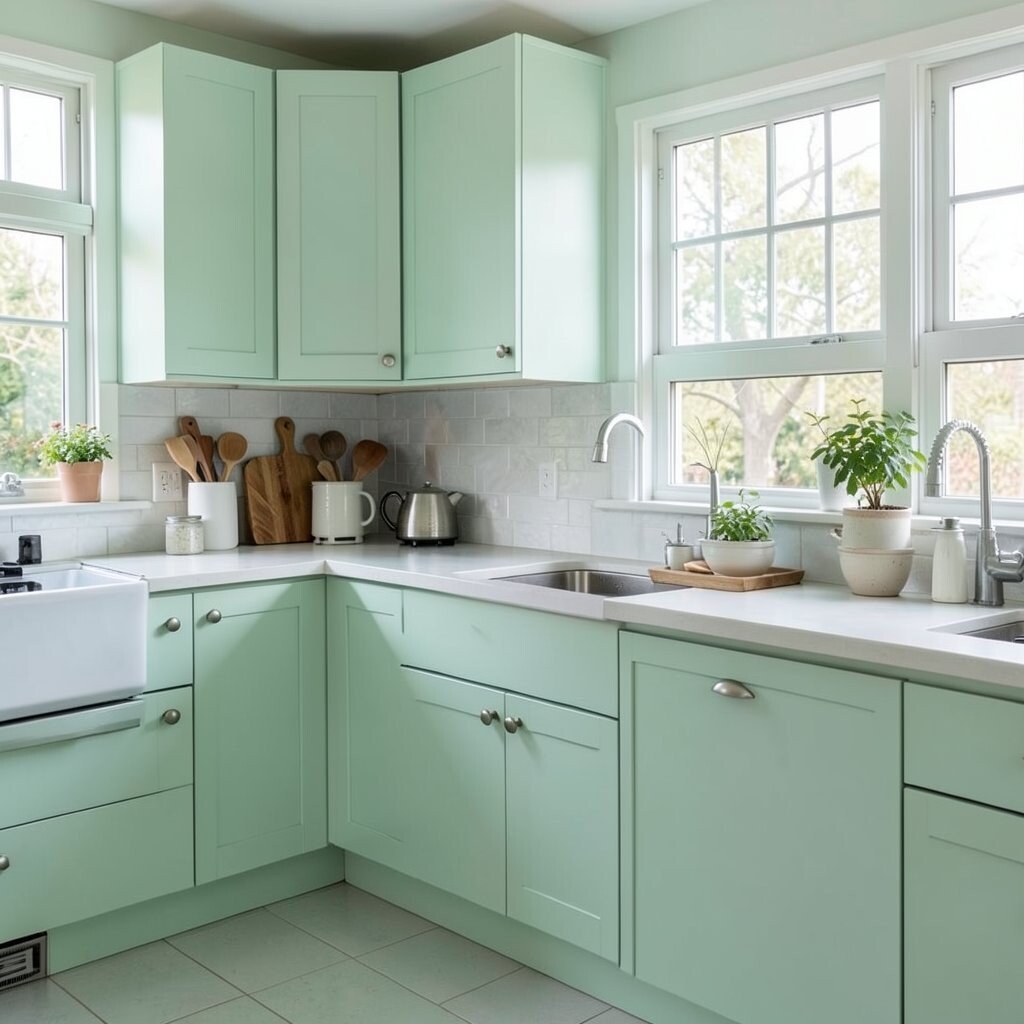
Fresh Mint Green Mint green brings a cool, crisp feeling that fits spring and early summer. It looks great with white tiles and shiny chrome faucets.
Use mint in small ways first, like painting a backsplash wall section or using mint glass jars for pantry items. The benefit is that it gives your kitchen a lively look without taking over the whole room. Mint also makes herbs look extra vibrant on the counter.
For personalization, match mint with natural textures like rattan, bamboo, or linen. Choose a satin finish for easy wipe-downs, especially near the sink. If you’re watching the budget, paint only one cabinet side or one wall to keep things affordable.
Seasonal trend-wise, minty greens keep coming back because they feel clean and modern, not heavy. Pair it with warm wood to balance the cool vibe.
-
4. Apple Orchard Red
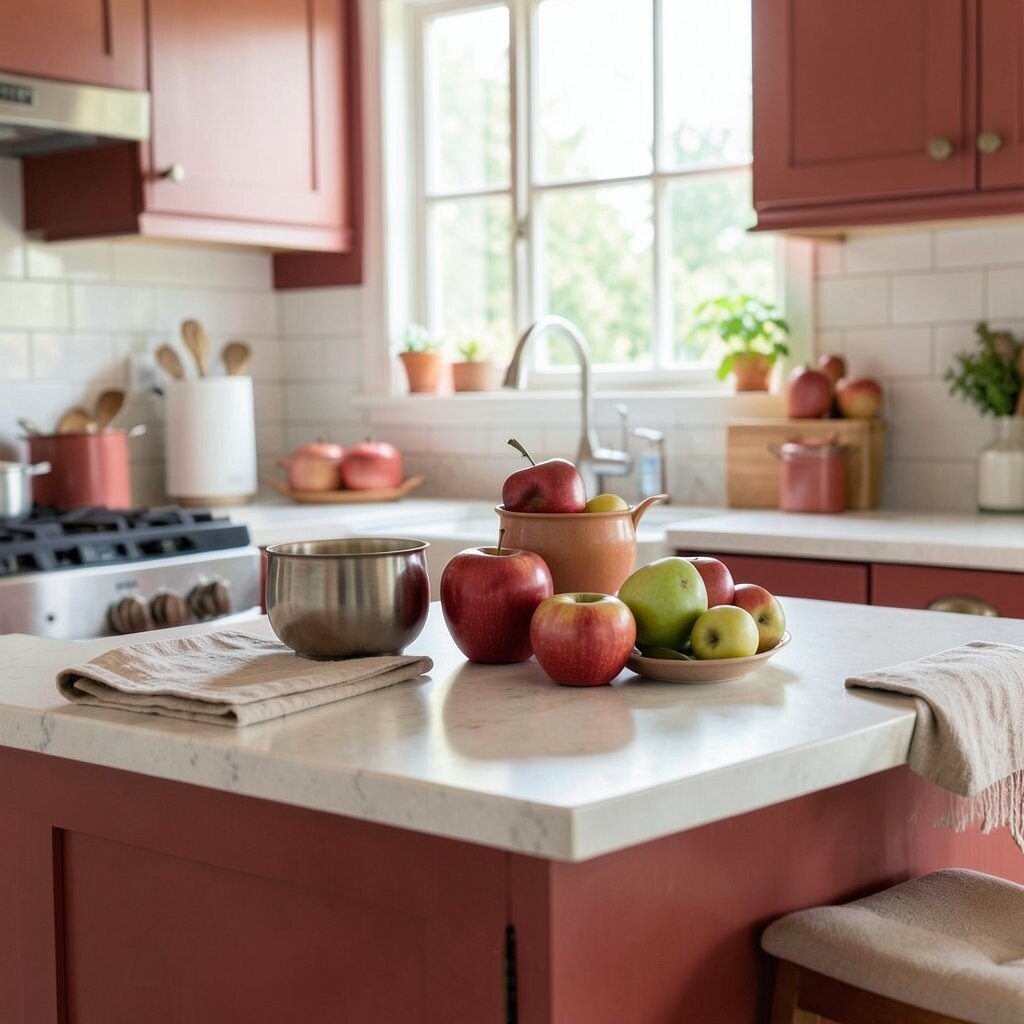
Apple Orchard Red Apple orchard red adds a cozy, confident touch that feels perfect for autumn. It brings energy to a kitchen without needing complicated decor.
Consider using this color on a single feature, like a statement island, one wall behind shelving, or the inside of cabinet doors. Red can make everything else look richer, especially white plates, brass frames, and dark countertops. For practicality, use a semi-gloss or cabinet-grade paint so it cleans easily.
If you worry red might feel too strong, go for a muted apple shade instead of a fire-engine tone. Add uniqueness with simple gold knobs and a warm-toned runner rug. Budget tips: refresh old hardware first, then paint only what you want to stand out.
-
5. Evergreen Forest Green
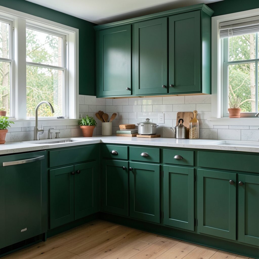
Evergreen Forest Green Forest green feels grounded and cozy, like stepping into a quiet tree-lined path. It pairs so well with warm lighting and natural wood.
This trend color can work on upper cabinets for a balanced look. You’ll also love it as a wall color if your kitchen gets good natural light. Green often brings a calm mood, which can make everyday cooking feel less stressful.
For uniqueness, choose forest green with a slight blue undertone, then add brass or aged bronze accents. Personalize with patterned curtains in earthy tones or a framed print of botanical leaves. Cost considerations: if full cabinet paint feels like too much, paint just doors, drawers, or a single hutch section.
-
6. Sea Glass Blue
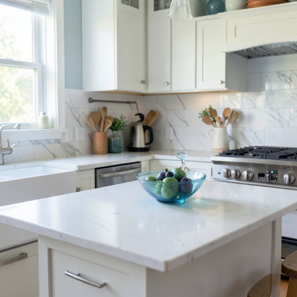
Sea Glass Blue Sea glass blue looks soft and watery, like calm waves at the shore. It makes kitchens feel airy and gentle.
Use it on walls for a soothing backdrop, especially if you like white cabinetry. You can also pick sea glass for a small breakfast nook or breakfast bar. Benefits include a fresh look that doesn’t date quickly.
To personalize, combine sea glass blue with light gray countertops and warm wood shelves. Add bright accents like citrus bowls when summer is in season. If you want to keep the cost down, paint the pantry or a small wall instead of the whole room.
-
7. Cocoa Dust Brown
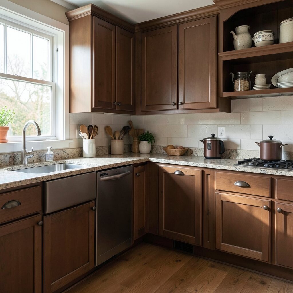
Cocoa Dust Brown Cocoa dust brown is rich without being too heavy. It brings a warm, grounded vibe that matches winter cooking and cozy meals.
Choose cocoa for lower cabinets or for a single accent wall, and keep the rest neutral. This color hides minor smudges better than very light paint, which is a real-life benefit. Pair it with light cream walls and soft brass details for a stylish contrast.
For uniqueness, try mixing matte cocoa with glossy black hardware. Add personalization with textured textiles—think a knit runner or earthy linen curtains. Budget-friendly idea: refinish existing cabinets with a stain-like paint layer instead of full replacement.
Seasonal trend: deep browns and earthy tones keep showing up because they feel timeless and comforting.
-
8. Pear Blossom Pink
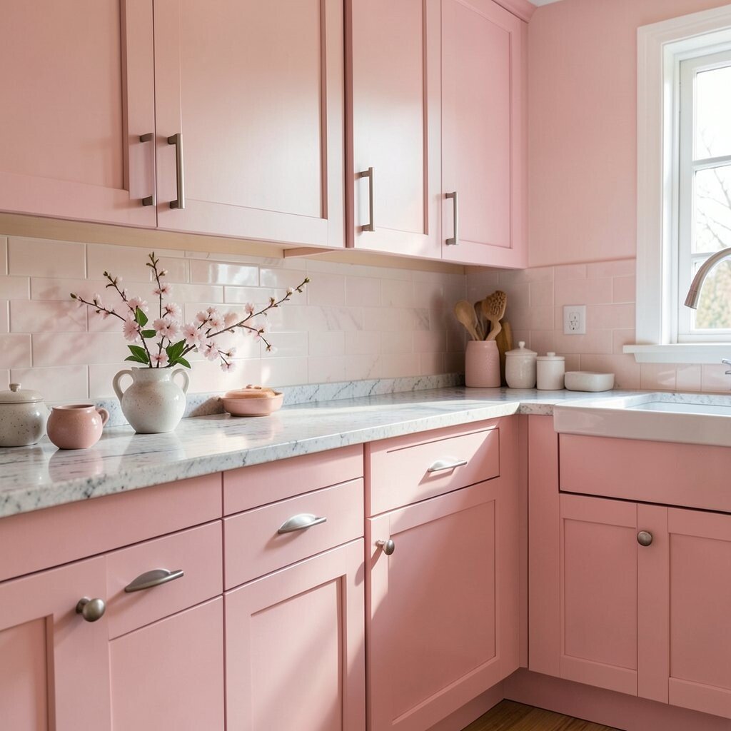
Pear Blossom Pink Pear blossom pink feels light, sweet, and a little fancy. It can turn an ordinary kitchen into a place you enjoy showing off.
Try pear blossom pink on cabinets in a dining-kitchen corner or as a gentle wall color. The benefit is that pink can look fresh and bright when balanced with white trim and natural wood. It also makes fruit and flowers look extra vivid.
For personalization, use neutral gold accents and simple ceramic canisters. If you want a more grown-up look, pair the pink with warm taupe and avoid too much bright color at once. Cost considerations: painted trim and cabinet fronts are usually cheaper than new countertops, so start there.
-
9. Linen White With Warm Undertones
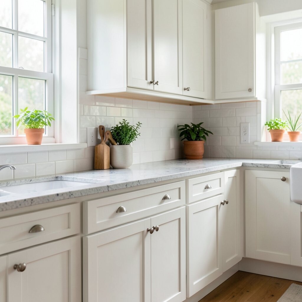
Linen White With Warm Undertones Linen white gives your kitchen a clean, soft glow. It feels like fresh laundry and calm morning light.
This color is a smart choice when you want to change decor often. It works with almost every metal finish and most flooring styles. You’ll benefit from a kitchen that feels bigger and brighter.
For uniqueness, pick linen white with a warm undertone so it doesn’t look icy. Then add texture: a subtly speckled backsplash, woven baskets, or a light wood shelf. If you’re staying on a budget, repainting walls is often the easiest and most affordable update.
-
10. Harvest Spice Orange
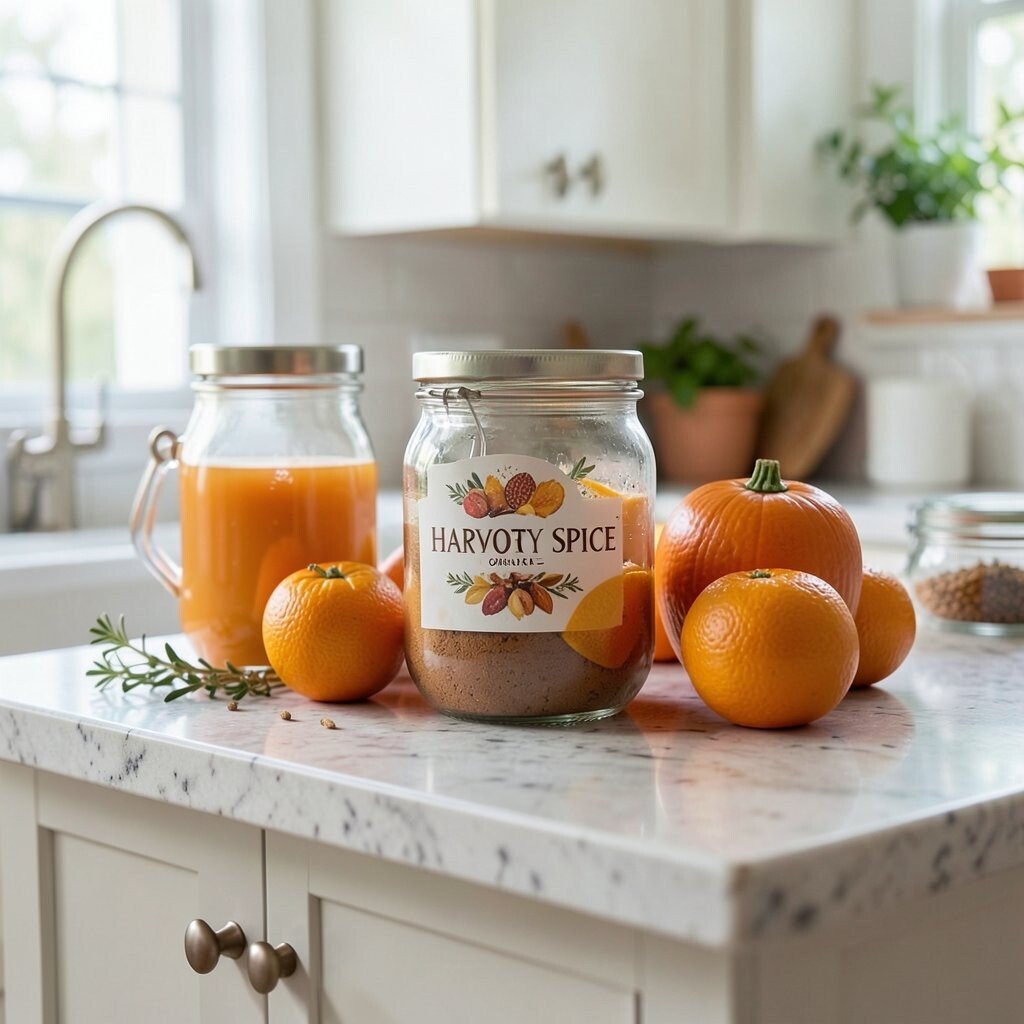
Harvest Spice Orange Harvest spice orange brings a lively, autumn-ready glow. It feels like warm spices in a jar, ready to make everything taste better.
Use orange in a small but confident way, such as painting the island, a few cabinet doors, or a built-in shelf wall. Orange can create a welcoming feeling that’s great for gatherings. It also helps your kitchen look energetic, especially near warm lighting.
Personalize with patterns like terracotta tiles, or add orange-toned dishware for a coordinated look. For cost, consider painting only the island or using peel-and-stick tile for the backsplash. A bold color can be less expensive than replacing cabinets, and it still makes a big change.
Seasonal trend: warm orange tones show up often in fall interiors because they mirror the outdoors.
-
11. Coastal Gray Mist
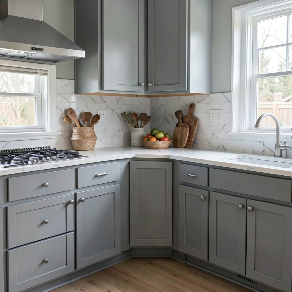
Coastal Gray Mist Coastal gray mist is smooth, modern, and calming. It has just enough softness to feel inviting, not cold.
This color is perfect for kitchens that need a neutral base with style. Paint walls in coastal gray and choose white cabinetry, or use gray on cabinets with light countertops. The benefit is a balanced look that pairs with many accent colors.
For uniqueness, add a backsplash in soft cream or subtle blue tones. Personalize with open shelving and colorful jars for flour, pasta, or coffee. Budget tip: gray paint can cover older stains well, and you won’t need many extras to make it feel finished.
-
12. Sunbaked Terracotta
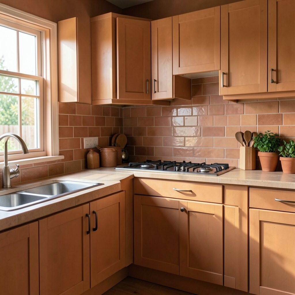
Sunbaked Terracotta Sunbaked terracotta feels warm and artistic, like pottery fresh from the kiln. It brings a Mediterranean vibe that many homeowners love.
Use terracotta for walls, or choose it for a tile backsplash if you want something more durable. This color helps kitchens feel cozy and inviting, especially during cooler months. Pair terracotta with creamy whites and natural wood for a harmonious look.
Personalize by adding olive oil bottles on display, woven baskets, and simple greenery. If you’re cost-conscious, start with terracotta accents like a few shelves, curtains, or a patterned rug. Then upgrade to tile when you’re ready for a bigger project.
Trend note: terracotta is still going strong because it looks beautiful with both modern and rustic styles.
-
13. Midnight Charcoal
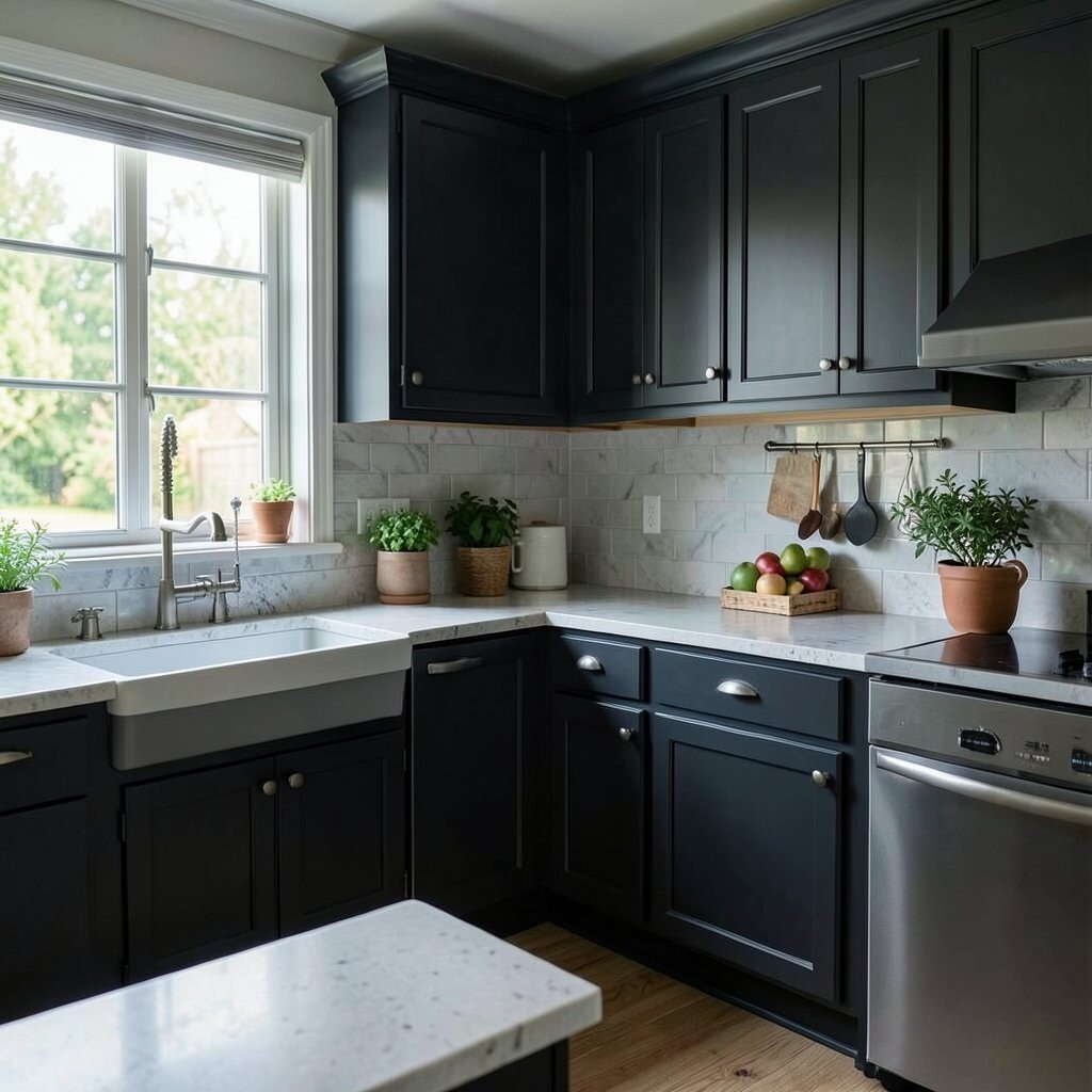
Midnight Charcoal Midnight charcoal makes a kitchen feel dramatic and sleek. It turns simple spaces into something that feels high-end.
Consider using charcoal on cabinets, a feature wall, or upper shelving for a bold contrast. The benefit is that darker colors can hide wear and smudges better than light tones. Just be sure to add bright lighting so the room still feels open.
If you want to personalize, pair charcoal with warm white countertops and brass hardware. You can also add a lighter backsplash so the overall look stays balanced. Budget consideration: instead of replacing cabinets, you can repaint them and swap hardware for a big visual upgrade.
-
14. Sage Kitchen Garden Green

Sage Kitchen Garden Green Sage green feels fresh, gentle, and easy to live with. It works in kitchens that want a calm, natural look.
Try sage on walls or on the bottom half of cabinets, then keep the top half neutral. This gives you variety without visual overload. Sage also complements stainless steel appliances and natural wood finishes.
For personalization, add herb-themed artwork or small plants that sit near the window. If you want a trend-forward touch, combine sage with matte black or brushed nickel hardware. Cost tip: painting walls is usually less expensive than major renovations, and sage can give you a full-room refresh quickly.
-
15. Creamy Lemon Zest
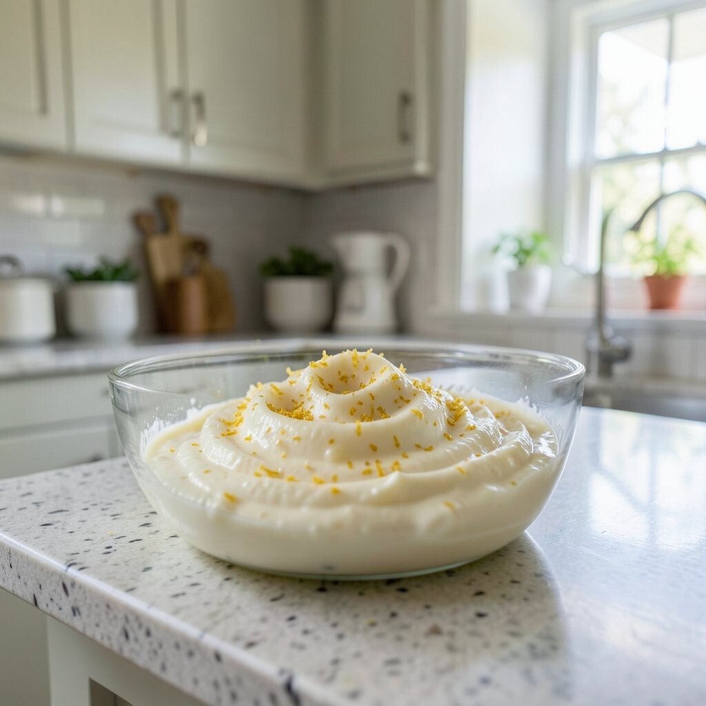
Creamy Lemon Zest Lemon zest is bright, fun, and full of life. It can make your kitchen feel like it’s always ready for breakfast.
This color is great for accent walls, pendant cords, or pantry doors. It benefits the space by adding warmth and making everyday items look cheerful. If your kitchen feels dark, lemon tones can help it feel more open.
Personalize with white subway tiles, light wood racks, and patterned tea towels. For a budget-friendly approach, paint just one cabinet or update the backsplash with a removable or low-cost option. Seasonal trend: citrus shades keep showing up in spring and summer because they match the outdoors.
Just remember to balance it with neutrals so the room stays cozy, not loud.
-
16. Winter Snow Soft Gray
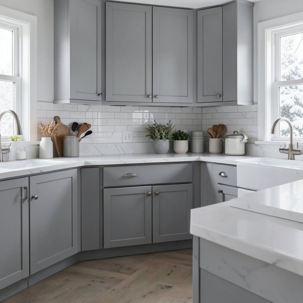
Winter Snow Soft Gray Winter snow soft gray feels quiet, clean, and gentle. It’s a smart choice if you want a calm kitchen during the colder months.
Use this color on walls or cabinets paired with white trim and light stone countertops. The benefit is a tidy look that still feels warm because soft gray is not harsh. It also helps other colors like red cookware or green plants stand out.
To personalize, add warm brass or rose-gold hardware, and choose light-toned textiles. If you want to stay budget-friendly, repaint walls and swap cabinet pulls first. You’ll get a noticeable change without a big construction project.
-
17. Berry Jam Deep Purple
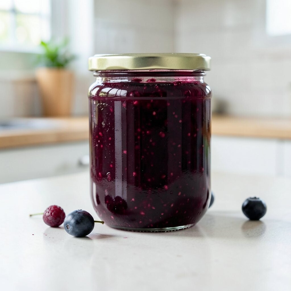
Berry Jam Deep Purple Berry jam deep purple feels bold, creative, and cozy. It adds mood and personality to the heart of your home.
Try deep purple on a statement area, like an island or a section of upper cabinets. The benefit is that it makes your kitchen look unique right away. Purple also looks stunning with warm wood floors and light countertops.
For personalization, add gold accents, dark gray fabrics, and decorative bowls filled with fruit. Choose a paint with good stain resistance near cooking areas. Budget consideration: if you’re not ready for painting everything, start with one cabinet bank or a removable accent like panels and curtains.
Trend note: jewel tones like purple are popular because they bring drama without needing flashy clutter.
-
18. Morning Oat Swirl With Beige Veins
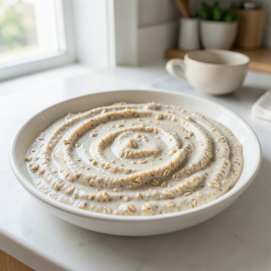
Morning Oat Swirl With Beige Veins Morning oat swirl is a creamy neutral with a subtle, elegant look. It feels soft, cozy, and easy to style.
This color is especially nice if you have marble-like textures or want that warm, boutique feeling. Use it on walls or cabinets, then pair with white and light brown accessories. The benefit is that it won’t clash with most dish colors and it hides small marks better than bright white.
To personalize, add a patterned runner in muted greens or rust tones. You can also incorporate wood cutting boards and simple copper or brass décor. For cost, choose paint over wallpaper, or start with a half-wall treatment to spread the expense.
Seasonal tip: neutrals like this feel great across many seasons, so you can focus your seasonal style through décor.
-
19. Rainy Day Slate Blue
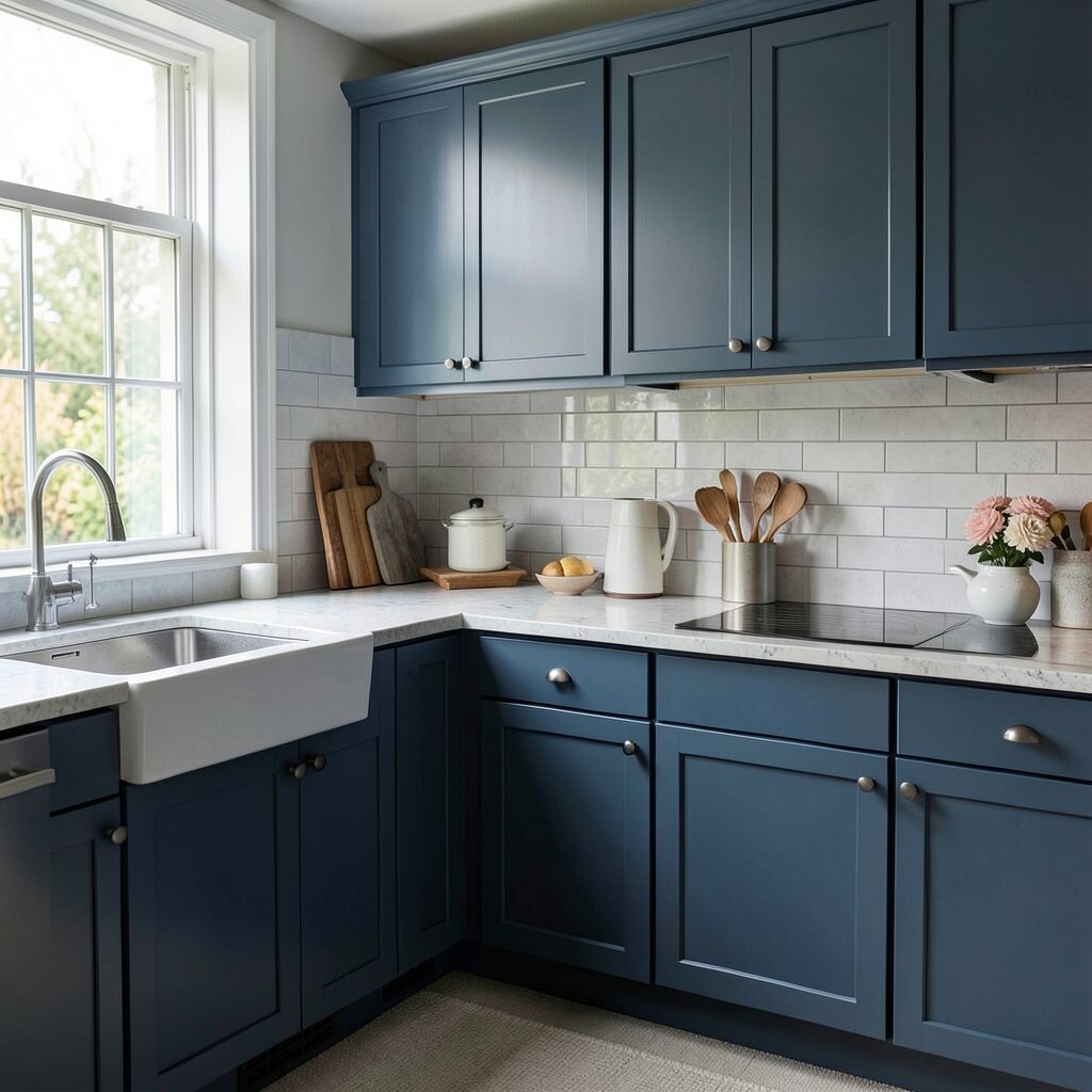
Rainy Day Slate Blue Rainy day slate blue is moody, calm, and quietly stylish. It feels like a fresh sky after the clouds pass.
Use slate blue as an accent wall or for cabinets where you want a gentle pop of color. The benefit is that blue can cool down warm wood and add a modern touch. This shade also helps brighten stainless steel appliances visually.
Personalize by pairing it with white countertops, warm lighting, and simple ceramic decor. If you’re budget-minded, paint just one area and keep the rest neutral. Choose washable paint near the stove so daily cooking won’t ruin the look.
-
20. Autumn Maple Warm Brown-Orange
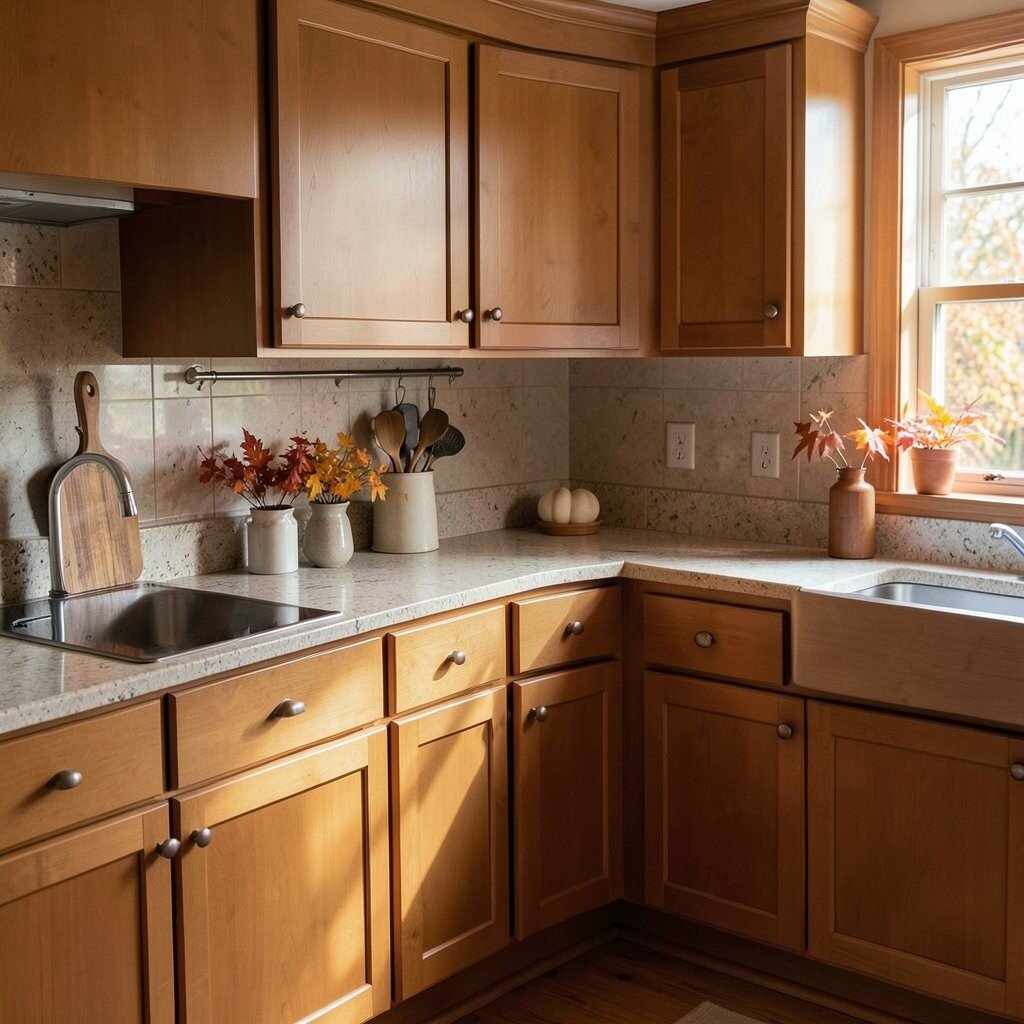
Autumn Maple Warm Brown-Orange Autumn maple warm brown-orange feels rich and inviting. It brings the comfort of fall leaves right into your kitchen.
Consider it for cabinets, a backsplash wall, or even a warm wood-toned stain that matches your existing surfaces. The benefit is that it makes the kitchen feel cozy, especially in the evening with warm lights. It also pairs well with black hardware and cream accents.
To personalize, style open shelves with mugs, woven baskets, and jars filled with pantry goods. If you want to manage costs, paint only the most visible cabinet fronts and leave the others neutral. This gives you a strong look without paying for a full redo.
-
21. Spring Meadow Yellow-Green
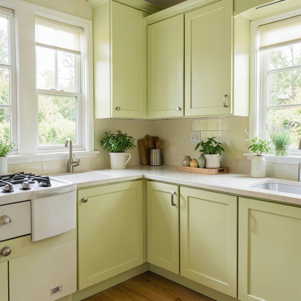
Spring Meadow Yellow-Green Spring meadow yellow-green feels playful and balanced. It sits between yellow and green, so it feels alive without being too loud.
This color works beautifully in kitchens that want a bright but soft vibe. Use it on walls, or choose it for smaller areas like a breakfast nook or cabinet interior. The benefit is a fresh mood that still feels natural and friendly.
For personalization, add white trim, light gray hardware, and clear glass containers so the whole space feels light. Budget tip: if you’re not ready to paint cabinets, update the look with matching dish sets, a new curtain panel, or a removable backsplash option. Seasonal trend: yellow-green tones often come back because they reflect new leaves and early sunshine.
-
22. Classic Vanilla White
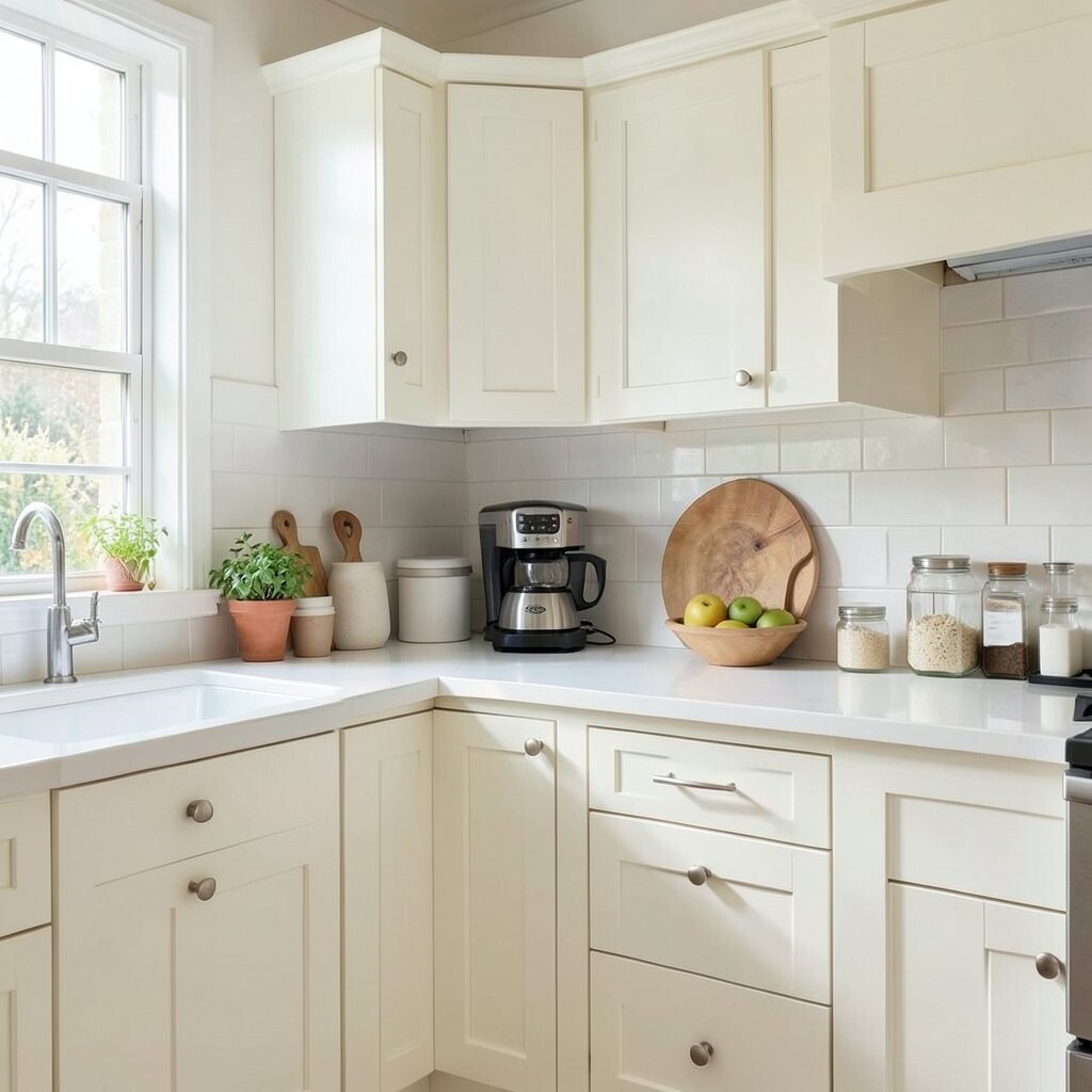
Classic Vanilla White Classic vanilla white is timeless and warm, like dessert you can’t wait to taste. It’s the kind of color that makes your kitchen feel clean and welcoming.
Use vanilla white for walls and cabinets if you want a bright base that can handle any seasonal change. The benefit is easy styling: you can switch rugs, towels, and small décor with each season without repainting. It also pairs well with almost every countertop color and flooring choice.
For uniqueness, add depth with different textures, like matte paint, a wood shelf, and a patterned backsplash. Personalize with your favorite cookware colors or a rotating wall gallery above the sink. Cost considerations are simple here: paint is often the most affordable way to get a big visual upgrade, and vanilla white helps everything else look better.