Light has a way of changing your mood before you even sit down. The right kitchen color can make everyday meals feel lighter, warmer, and more fun.
Today you’ll find bold and gentle color ideas, each with easy ways to use them. You’ll also see budget tips, trend notes, and ways to make the look truly yours.
1. Soft Butter Yellow
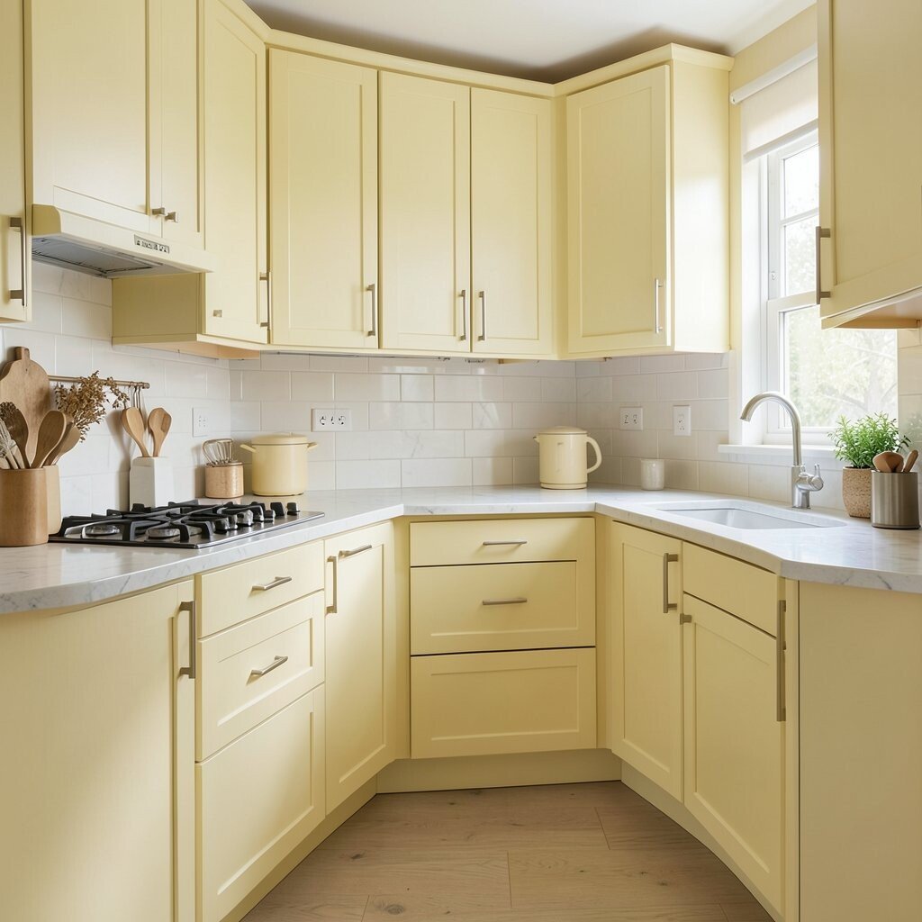
Butter yellow can make cabinets, walls, and trim look like sunshine. It pairs well with natural wood and makes the whole room feel more welcoming.
Try it on upper cabinets or an accent wall if you want brightness without a big commitment. Yellow also works great with white countertops because the two colors bounce light around. For personalization, add brass hardware or a yellow-tinted backsplash to tie the theme together.
If you’re watching your budget, paint is the easiest win. A semi-gloss finish on cabinet doors can handle cooking splashes and wipes better than flat paint. Trend-wise, warm “butter” shades are showing up more often because they feel calm, not loud.
2. Refreshing Mint Green
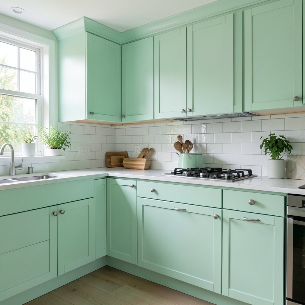
Mint green feels clean and cool, like a garden breeze. It looks especially pretty in kitchens with lots of white or light gray.
You can paint the walls mint and keep everything else light for a bright, airy look. Mint also makes chrome and stainless steel appliances feel sharper and more modern.
To personalize, choose mint tiles with tiny speckles or a subtle pattern. Add woven baskets and light curtains to keep the vibe cozy. If you want to go smaller, try mint only on the backsplash or on just the pantry door.
3. Airy Sky Blue
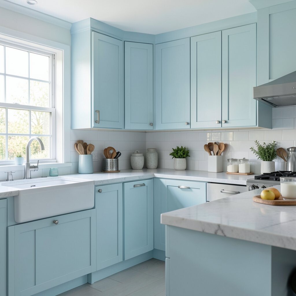
Sky blue can bring a calm, open feeling to your kitchen. It’s a great choice when you want brightness but prefer something cooler than yellow.
Consider painting the ceiling a soft sky blue shade, then pairing it with white walls and light floors. This trick makes the room feel taller and more relaxed.
For a unique look, use sky blue in a narrow band around the upper walls, like a gentle frame. That keeps the color intentional and still keeps most surfaces neutral. If you’re worried about cost, start with paint and one feature—like a single cabinet run or the backsplash.
Sky blue also matches current trends toward light “coastal” palettes. Add simple hardware in matte black or brushed nickel for contrast.
4. Blush Pink Accents
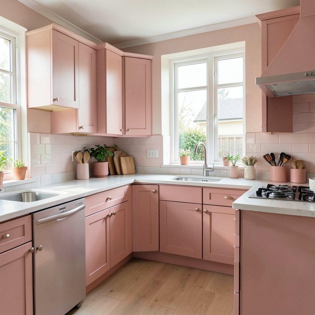
Blush pink adds a sweet spark without taking over the entire kitchen. It looks charming with white cabinets and warm wood tones.
You can use blush pink in small areas like bar stools, a runner rug, or even a few decorative tiles. This gives you personality while keeping the space bright. For personalization, pick a blush shade that matches your favorite mug or kitchen towel colors.
If you’re working on a budget, choose removable or easy-to-swap items first. Painting cabinets can get expensive, so start with accessories and switch out art or textiles. Blush tones are popular right now because they feel modern, soft, and friendly.
5. Crisp White With Warm Undertones
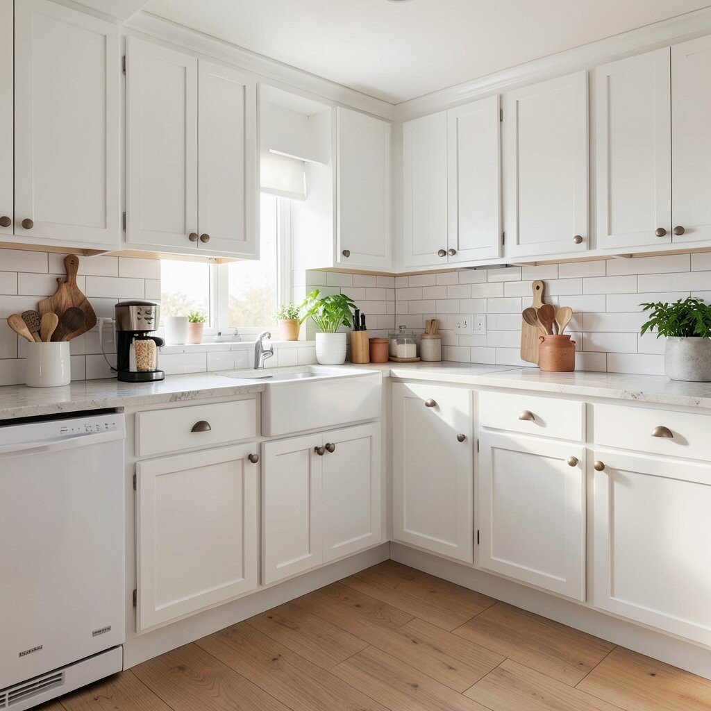
Crisp white makes a kitchen look fresh fast. But the best results come from choosing a warm undertone, not a harsh blue-white.
Paint the walls a warm white and keep trims and ceilings slightly brighter for a clean layered look. This helps your room reflect light like a bright photo.
To personalize, mix in warm materials like honey oak, tan leather, or natural stone. Add greenery or a fruit bowl to bring color without changing everything. If cost matters, white paint and new lighting are usually cheaper than full cabinet replacements.
Warm whites are a big ongoing trend because they feel timeless and they work with almost every style. Pair them with modern fixtures for a polished finish.
6. Sunny Orange for a Feature Wall
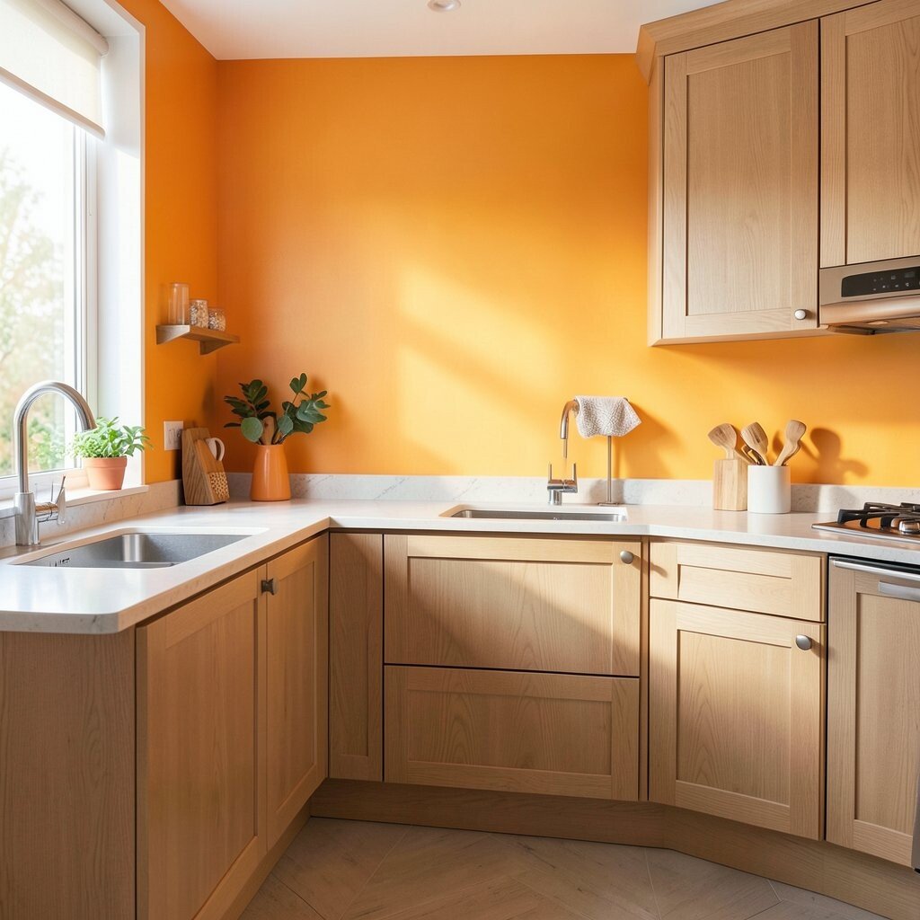
Sunny orange can feel playful and energetic. It works best when you choose it for one area, so it stays fun instead of overwhelming.
Try orange on a feature wall behind open shelving or on a cabinet island. Orange pairs beautifully with cream, light wood, and brushed brass.
For personalization, pick a muted terracotta-orange if you like a cozier tone. Add patterned ceramic canisters or a backsplash with tiny geometric shapes to echo the warmth. On a budget, you can paint one wall and swap hardware for the look to feel finished.
Right now, warm accents are trending because people want kitchens that feel alive, not sterile. If you’re going bold, keep other colors calm so the orange becomes the star.
7. Sage Green for Calm Energy
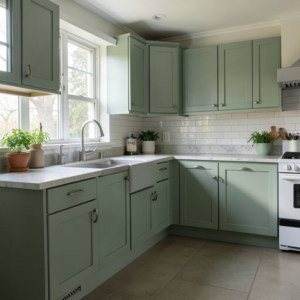
Sage green is like a gentle exhale. It brings calm energy and still makes spaces look brighter than you’d expect.
Paint lower cabinets sage while keeping uppers white to balance the room. This layering method helps light move through the kitchen instead of getting trapped.
To personalize, choose sage with a slightly gray or creamy base so it feels soft in daylight. Add white subway tile, light stone countertops, or a warm wood table for harmony. If you’re trying to save money, refinish cabinet fronts instead of replacing whole cabinets.
8. Soft Gray That Shows the Light
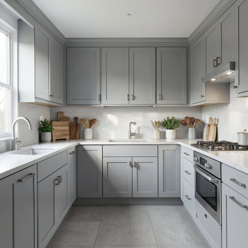
Soft gray can be surprisingly bright when it’s not too dark. It’s a great option if you want a clean look but still want warmth.
Use light gray on walls and pair it with crisp white trim and warm-toned floors. This makes the kitchen feel modern while still welcoming.
For personalization, pick gray that leans beige if your home gets lots of natural sunlight. Add colorful dishware or a bright art print to make the room feel lively. Consider a satin finish for walls so it wipes clean after cooking days.
Budget tip: paint is much cheaper than changing flooring. Trend note: softer “greige” tones keep showing up because they match both traditional and modern styles.
9. Deep Navy for Wow-Style Contrast
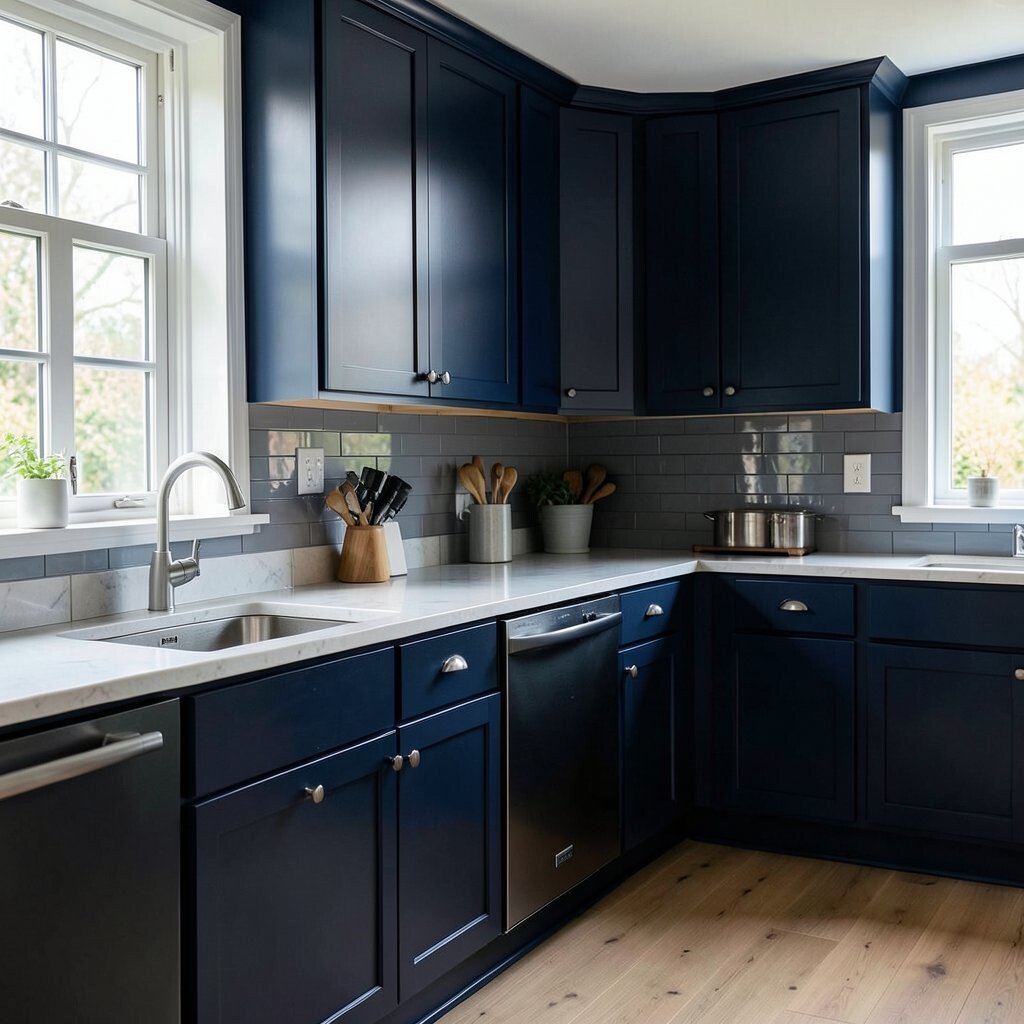
Deep navy brings a dramatic glow to kitchens with plenty of natural light. It can make white counters look sharper and hardware look more elegant.
If you love bold design, paint lower cabinets navy and keep everything above in white. You’ll get contrast without turning the whole room dark.
To personalize, choose navy with a hint of teal if you want it to feel richer in sunlight. Add brass accents, warm wood shelves, and a light backsplash with subtle texture. If cost is a concern, start with one navy surface like an island or a pantry door, then build from there.
Navy remains a popular trend because it feels classic, but it still looks fresh and stylish. Pair it with bright lighting to keep it from feeling heavy.
10. Pale Lemon on Cabinets
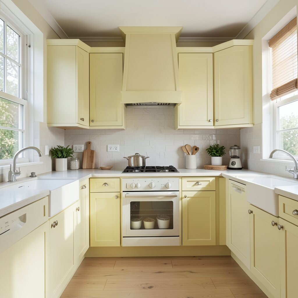
Pale lemon can brighten your kitchen in a cheerful, not-too-sweet way. It’s a perfect color if you love citrus but want something softer than loud yellow.
Paint cabinets pale lemon and use white countertops so the color stays light. This also makes your kitchen feel more “morning-friendly,” even if you wake up tired.
For personalization, choose lemon with a creamy base so it blends with warm metals. Add light wood bar stools and simple striped curtains to keep the vibe playful. Budget-wise, you can also paint only cabinet doors and keep frames neutral to save effort and materials.
11. Warm Beige for a Cozy Glow
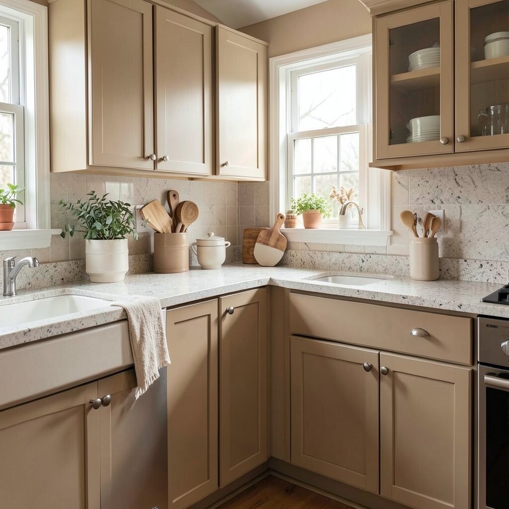
Warm beige makes a kitchen feel calm and comforting. It’s also great for homeowners who want brightness without strong color.
Try beige on walls and use white or light cream cabinets. Beige warms up cooler daylight, making the kitchen feel sunny even on gray days.
To personalize, add different shades of beige in textiles like rugs and curtains. You can also bring in color with a bold backsplash or bright ceramics. If you want to keep costs low, paint first, then upgrade lighting, because good lighting makes neutral colors pop.
Beige kitchens stay popular because they fit many design styles. Add modern hardware and clean lines to keep yours feeling current.
12. Golden Honey Tones
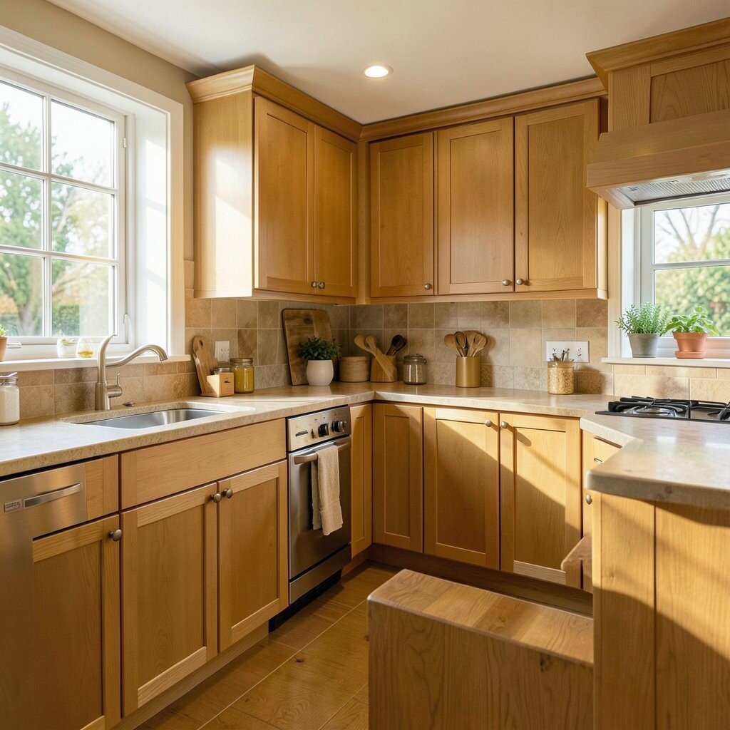
Honey-gold tones feel rich and inviting. They brighten up a kitchen by adding warmth, especially when paired with white or cream.
Use honey color in details like open shelving, cabinet interiors, or a warm backsplash accent. Even a few touches can make the whole space feel more golden and alive.
For personalization, choose honey that matches your flooring or wood furniture. Add light fixtures with a warm bulb color so the glow stays consistent. If budget is tight, swap cabinet hardware and use golden-toned art or kitchen canisters instead of repainting everything.
13. Lively Chartreuse in Small Doses
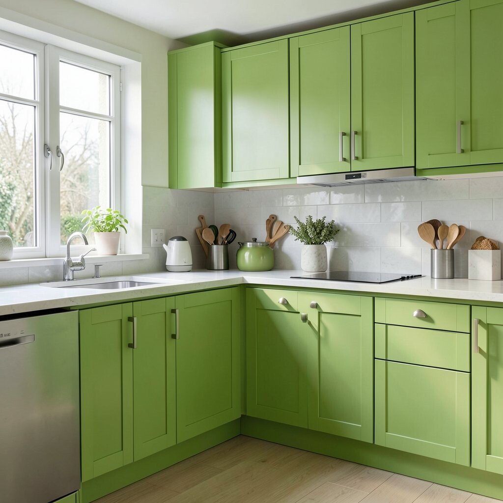
Chartreuse is a bold green-yellow that screams energy. It can brighten your kitchen in the most surprising way—especially when used carefully.
Choose chartreuse for one small area like a drawer front, a chair, or a backsplash panel. This keeps the look exciting but still tasteful.
To personalize, match chartreuse with natural wood and white so it feels balanced. Add black accents like faucets or cabinet pulls to ground the bright color. Cost considerations are good here because you can start with accessories or paint a single section instead of redoing the whole kitchen.
Trend note: adventurous, punchy greens are showing up in design boards because people want kitchens that feel personal. Just remember: one confident spot goes a long way.
14. Light Taupe for a Soft Neutral
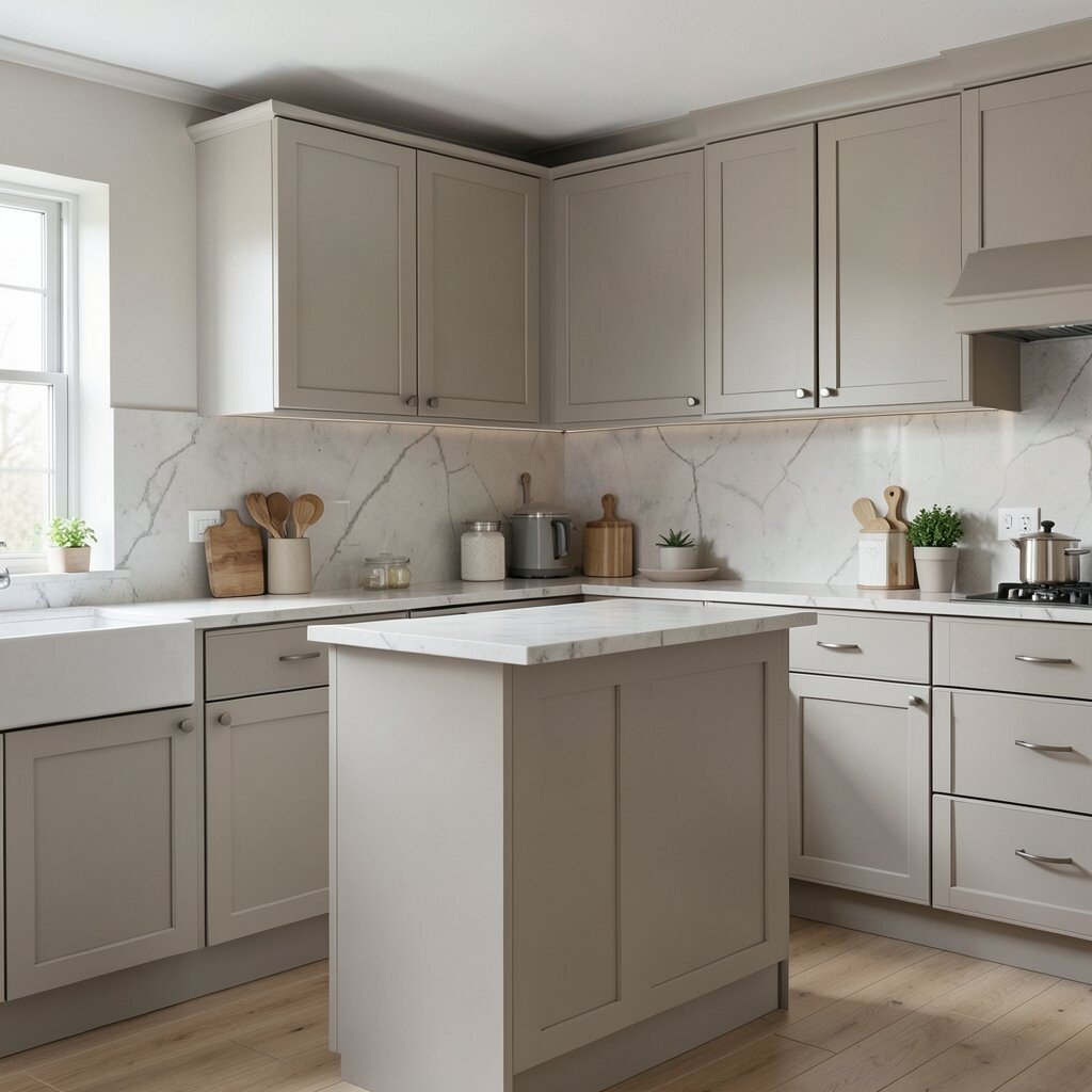
Light taupe is a gentle color that adds brightness without looking cold. It sits between beige and gray, which makes it easy to style.
Paint walls taupe and choose lighter cabinets for contrast. This combination helps light reflect across the room so it feels open and airy.
For personalization, pair taupe with warm metals like brushed brass or copper. Add textured elements like woven baskets, linen towels, or a natural-fiber rug. If you want to save money, do a paint refresh and replace just the most worn cabinet hardware first.
15. Coral on an Island or Table Zone
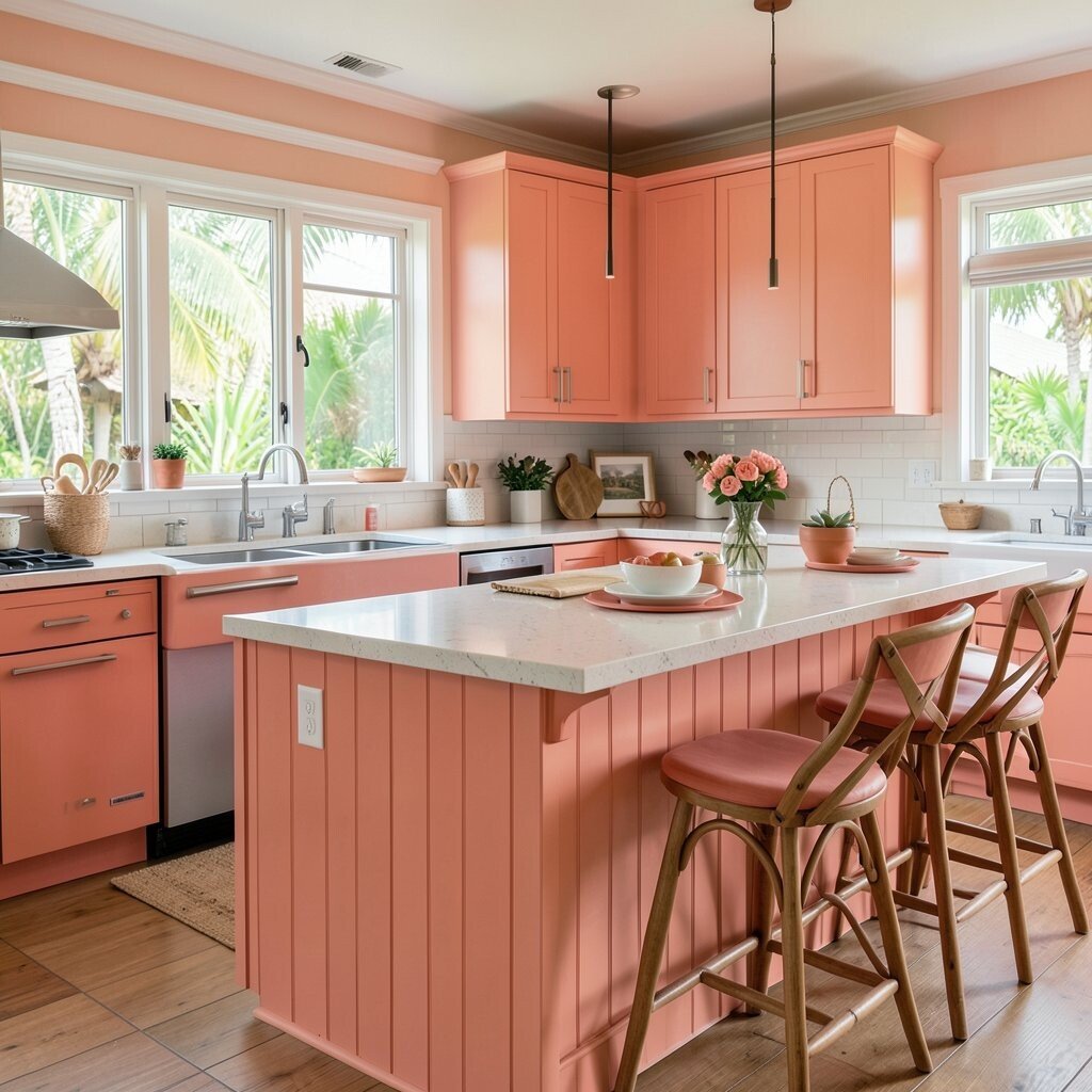
Coral is bright, warm, and friendly. It adds a splash of color that feels energetic but not harsh.
Paint a kitchen island coral and keep the rest of the cabinets neutral. The island becomes a natural gathering spot, and the kitchen feels more playful right away.
To personalize, choose coral that leans toward peach if you want it softer. Add matching coral accents in bowls, napkins, or a pendant light shade. Budget-wise, islands are often easier to paint because they’re smaller than whole cabinet systems, and they usually draw the most attention.
Coral is also a fun trend because it brings “sunset energy” into interior spaces. Pair it with light countertops and white walls so your coral always looks fresh.
16. Pale Teal for a Modern Pop
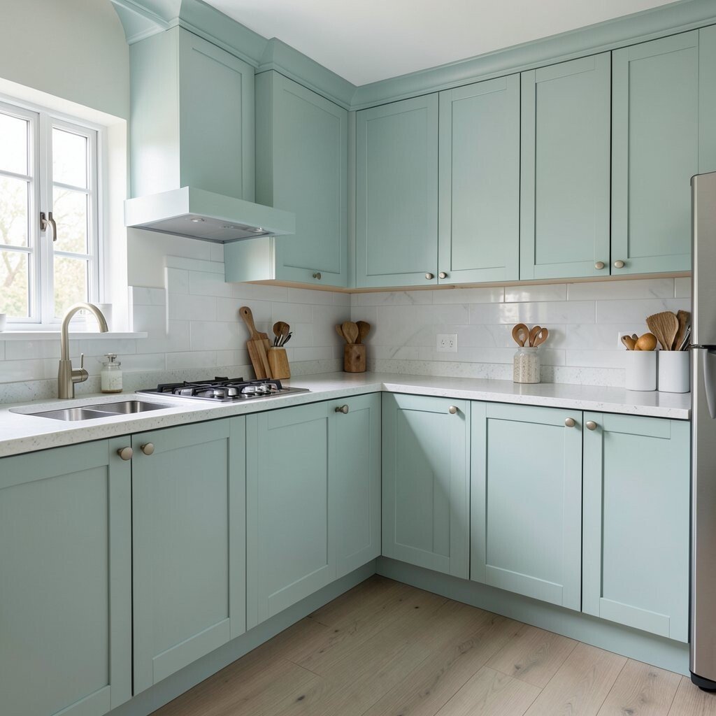
Pale teal feels modern, calm, and bright. It’s a great option when you want color that looks crisp next to stainless appliances.
Try pale teal on the backsplash or on a few cabinets, then keep countertops and walls light. This creates a pop of color that still feels clean and organized.
For personalization, use teal tiles with a glossy finish to bounce light. Add white grout or a grout color that matches the tiles for a polished look. If cost matters, tile just the area behind the sink or stove instead of covering the whole backsplash.
17. Black and White Pattern With a Bright Base
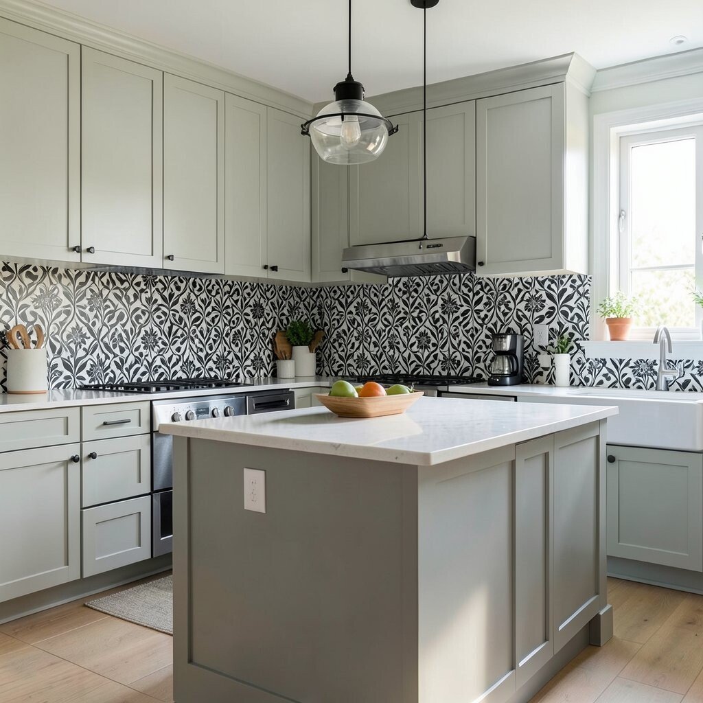
A black-and-white pattern can brighten your kitchen by adding strong contrast. When you keep the base light, it feels crisp and lively instead of dark.
Consider a black-and-white patterned backsplash or a geometric runner rug. Pair it with white cabinets and light walls so the pattern feels like a highlight, not a burden.
To personalize, choose patterns that match your style—simple lines for modern homes, softer shapes for classic spaces. Add bright lighting and sleek hardware so the whole room feels polished. Budget tip: patterned peel-and-stick backsplash sheets can give you a bold look without big costs.
Patterned accents keep trending because they let you have fun without committing to a full-color kitchen. Choose a pattern that won’t tire you quickly.
18. White With Color-Blocked Trim
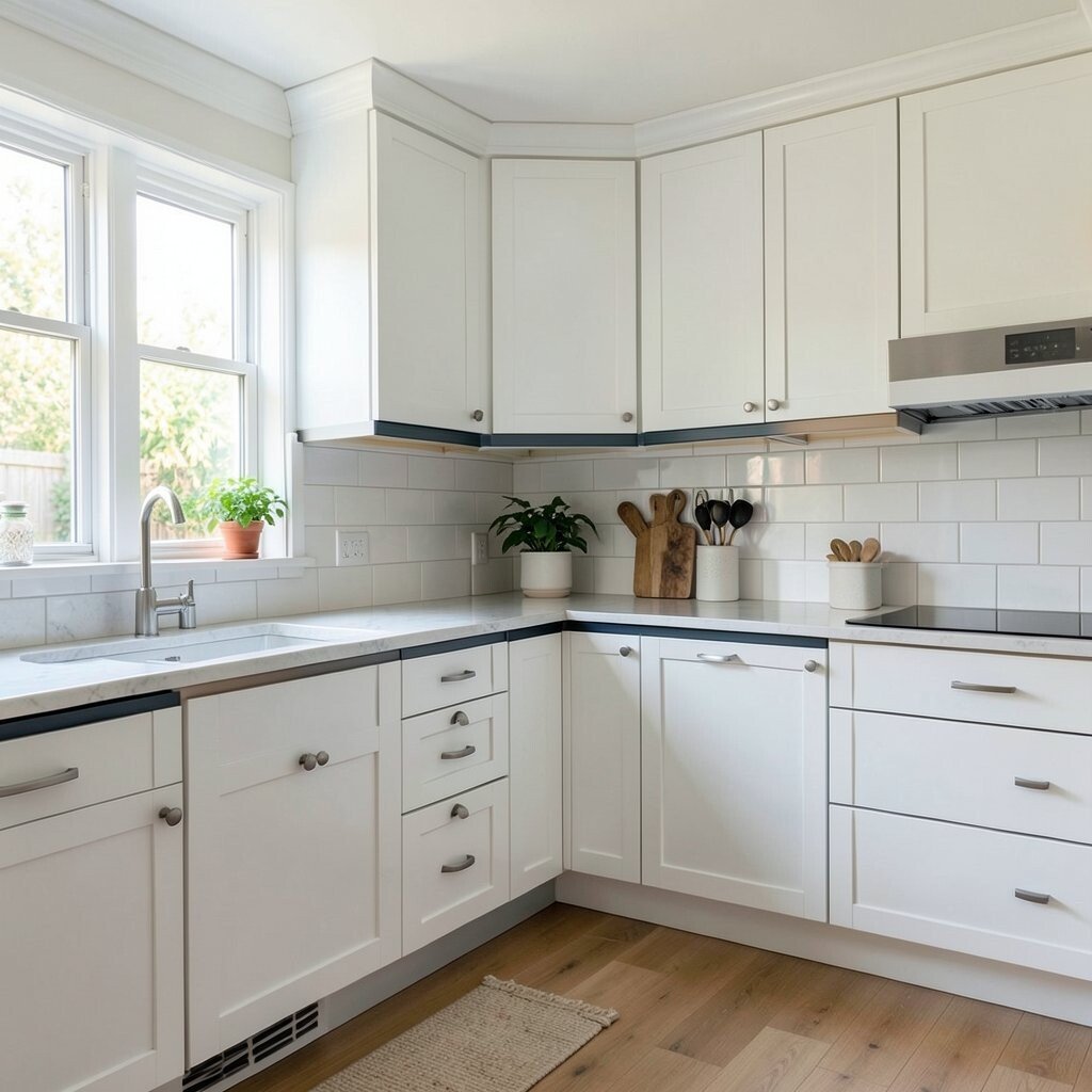
Color-blocked trim is a clever way to brighten your kitchen and still keep it neat. It uses small color areas around edges to create a fresh look.
Paint your walls a warm white, then add trim in a light color like sage, sky blue, or pale yellow. The trim makes your kitchen feel designed, even if you only change a few details.
For personalization, match the trim color to your backsplash or your favorite countertop pattern. You can also paint just the inside edges of open shelves for a hidden pop. Cost considerations are usually good here because trim work uses less paint than full cabinet changes, and it can be done in phases.
19. Light Wood + Painted Accents Combo
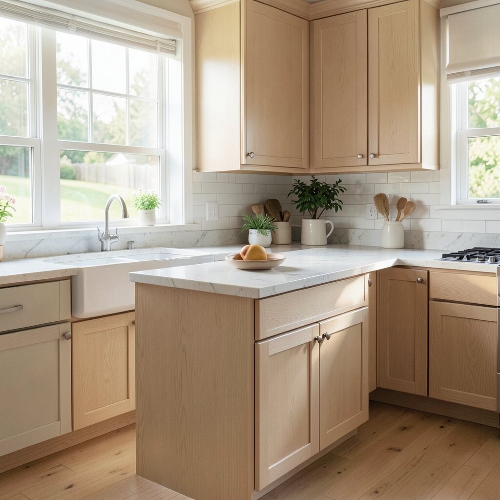
Light wood makes a kitchen look bright right away. When you add painted accents, the room feels both natural and lively.
Keep cabinets in light wood tones, then paint one or two items in your favorite bright color like mint, coral, or butter yellow. You can also update a door, a single wall, or a pantry panel instead of repainting everything.
To personalize, match your paint color to a small detail like the color of your dish towels or a framed print. Add warm lighting so the wood and paint glow together. If budget is a concern, focus on repainting one area and upgrading lighting fixtures, because those changes affect how the whole space looks.
Trend note: mixed materials are popular because they feel balanced and easy to live with. This combo keeps the kitchen bright today and still stylish for years.