
The kitchen is where everyday life quietly shines. A new color can make it feel new again in minutes.
Pick a hue that fits your mood, your light, and your home story.
-
1. Soft Sage Green

Soft Sage Green Sage green looks calm and fresh, like morning air. It pairs beautifully with warm woods and gentle white counters.
One big benefit is how it makes kitchens feel less harsh, even under bright lights. For a modern vibe, choose a matte or eggshell finish that hides fingerprints. If you want it to feel personal, paint only the lower cabinets sage and keep the top cabinets creamy.
-
2. Warm Greige Neutrals
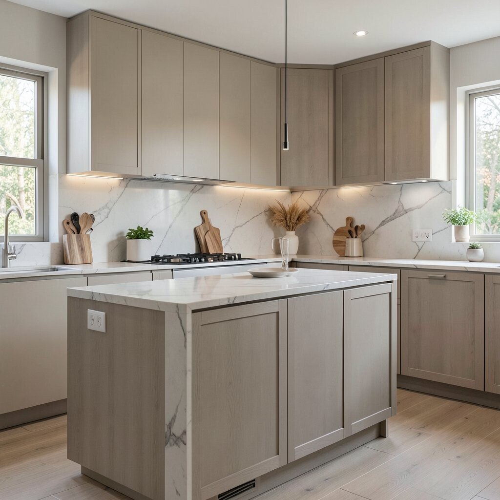
Warm Greige Neutrals Greige sits right between gray and beige, and it feels cozy. You get a clean look without the cold feeling some grays bring.
This hue helps your kitchen feel organized, especially when you mix metals like brushed nickel and brass. Try using greige on walls and letting cabinetry stay white or a light wood. To keep costs friendly, repaint walls first, then swap small items like cabinet pulls.
For trend energy, match greige with subtle texture, like a gentle plaster-look finish. Add a few sage or terracotta accents through dish towels and bowls to make the whole space feel intentional.
-
3. Milky White With a Touch of Cream
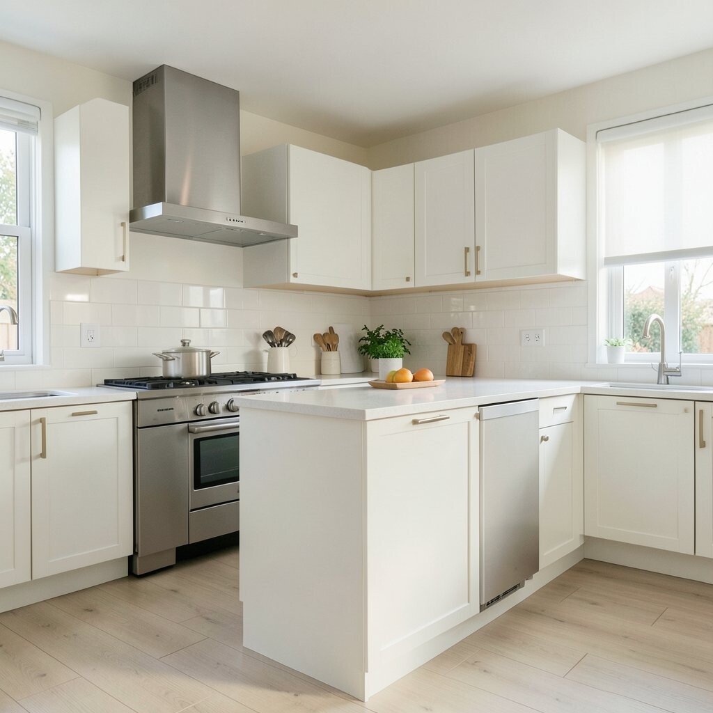
Milky White With a Touch of Cream Milky white makes a kitchen feel bright and airy. It also helps small kitchens look bigger without adding clutter.
Choose a paint color labeled “warm white” or “cream white” to avoid a blue cast. It benefits open shelving because your dishes look softer and cleaner. Want uniqueness? Use milky white for the cabinets and pick a bold floor color to anchor the room.
For personalization, add framed art or a simple backsplash pattern that brings in your favorite tone. Keep costs in check by focusing on paint and a limited number of hardware upgrades instead of replacing everything.
Current trends love layered neutrals, so pair milky white with natural stone textures and woven baskets.
-
4. Deep Charcoal Slate
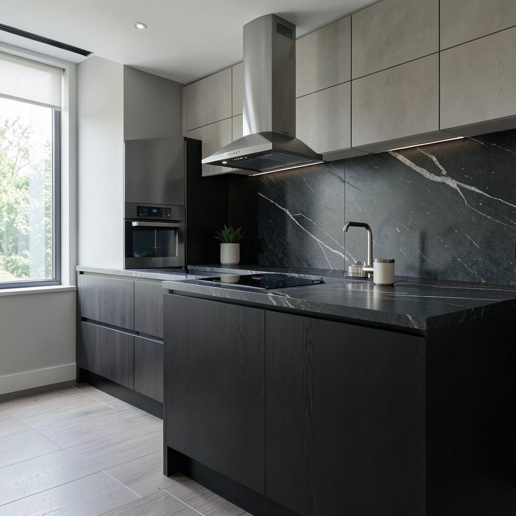
Deep Charcoal Slate Charcoal slate looks sleek and grown-up. When light hits it, the surface feels almost velvety, like stone after rain.
This hue can hide small marks better than glossy whites, which is great for busy kitchens. Use it for an accent wall, open shelving backing, or even the island. For a modern look, combine charcoal with warm lighting and light countertops so the room stays inviting, not gloomy.
-
5. Coastal Blue-Gray
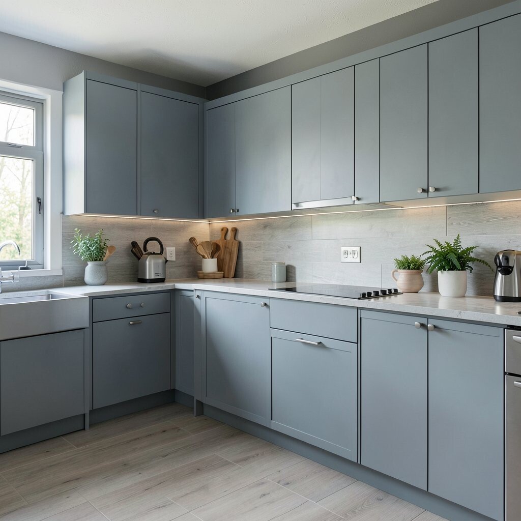
Coastal Blue-Gray Blue-gray feels like a calm shoreline in your kitchen. It brings a cool, clean mood that still feels friendly.
This color is a great choice if you want something modern but not too loud. Pair it with white quartz or pale stone for a crisp look that stays timeless. If you want to personalize, add blue-gray to cabinet doors while keeping the interior shelves in a lighter tone.
For cost considerations, try painting just the island first and see how you like it in different daylight. Trends also favor light blue accents in hardware, glass jars, and subtle backsplash tiles.
-
6. Terracotta Clay
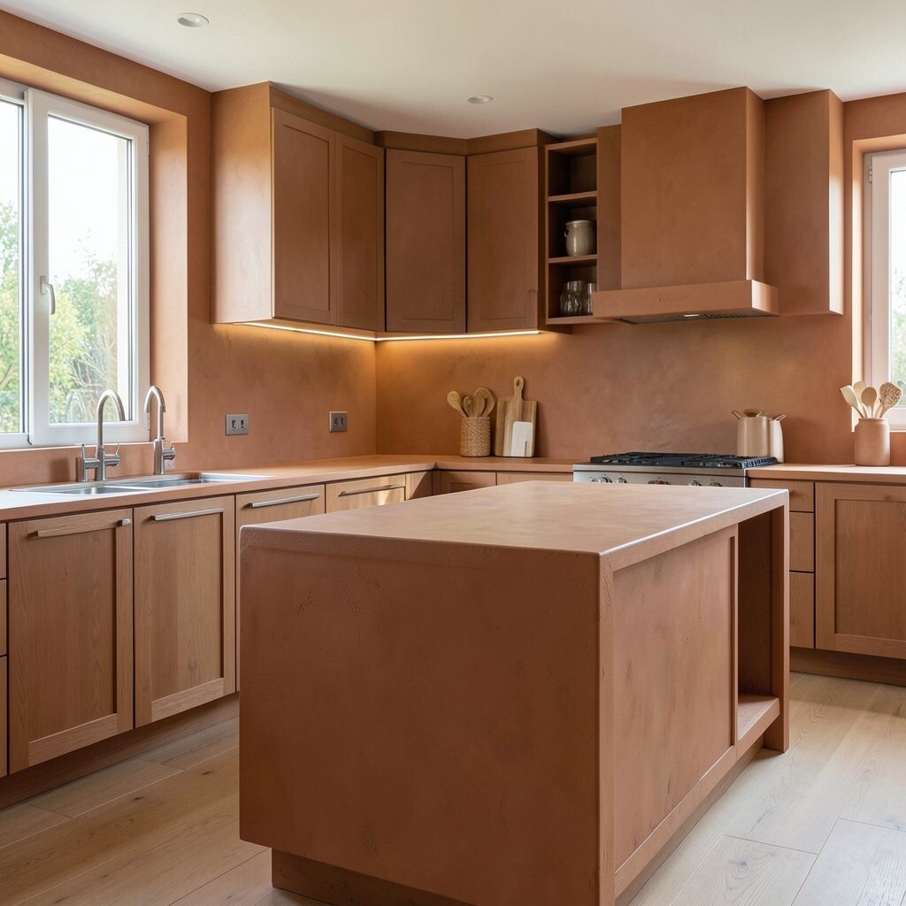
Terracotta Clay Terracotta is earthy, warm, and full of personality. It looks like sunbaked pottery and brings instant comfort.
One benefit is how terracotta makes neutral kitchens feel alive. It also works well with black accents, creating a bold modern contrast. If you want a smoother budget plan, paint one section like the pantry wall or lower cabinets instead of covering every surface.
For uniqueness, mix terracotta with sandy beige textiles and light wood cutting boards. Add a few patterned ceramics on open shelves to make the look feel collected, not copied.
-
7. Butter Yellow (Not Too Bright)
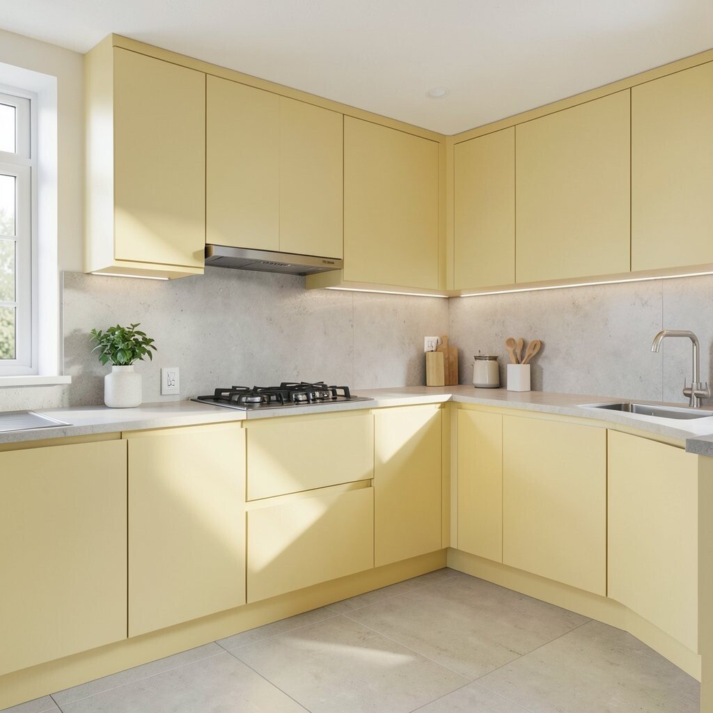
Butter Yellow (Not Too Bright) Butter yellow brings cheer without shouting. It turns the kitchen into a warm, welcoming place to start the day.
This hue is perfect for people who want freshness but still want comfort. Use it on upper cabinets or the breakfast nook area for a balanced feel. Tip: keep the rest of the kitchen in soft whites and warm metals so the yellow stays classy.
If you love personalization, add matching yellow accents with bar stools, a runner rug, or bright fruit bowls. To manage costs, focus on paint and hardware first, then add a small backsplash if you want extra pop.
Right now, gentle yellows are showing up in modern kitchens because they feel optimistic and homey.
-
8. Soft Blush Pink
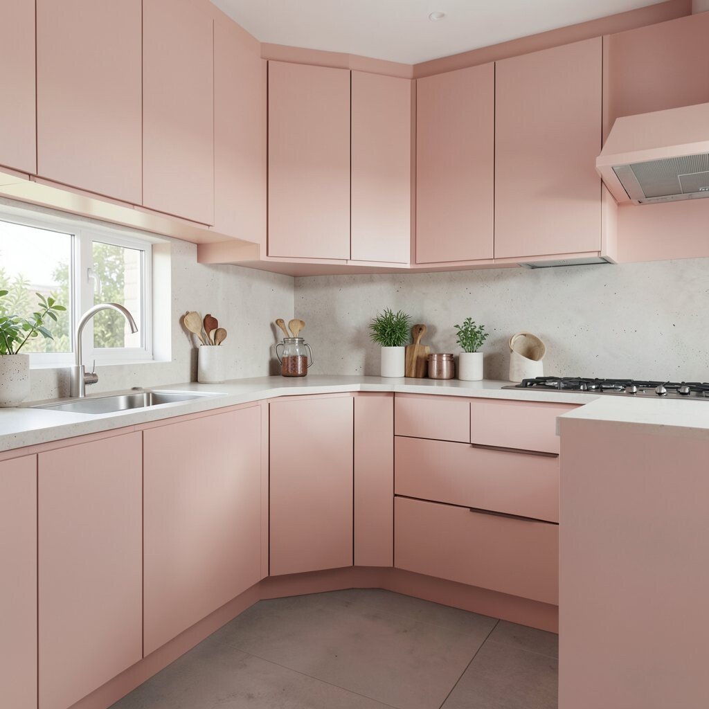
Soft Blush Pink Blush pink feels delicate, modern, and surprisingly easy to style. It makes your kitchen feel like it has a little heart.
Choose muted blush for walls or cabinet panels so it stays calm, not overly sweet. This hue benefits lighting because it reflects warmth and makes everything look softer. For a modern twist, pair blush with matte black hardware and light marble-look counters.
-
9. Olive Leaf Green
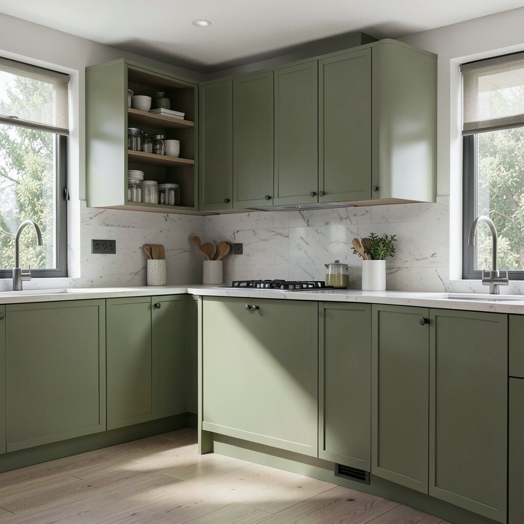
Olive Leaf Green Olive leaf green adds depth, like a grounded forest tone. It looks great with darker hardware and warm light bulbs.
The benefit here is that olive feels rich but still natural. It hides everyday wear and looks great with stone, wood, and even brass. If you want to personalize, try olive on a lower cabinet run and keep the upper cabinets a creamy white.
Cost-smart tip: reface or paint just the island if you want a big impact. Trends lean toward nature-inspired colors, and olive is a top pick because it feels both classic and current.
-
10. Bright White Pop With a Matte Finish
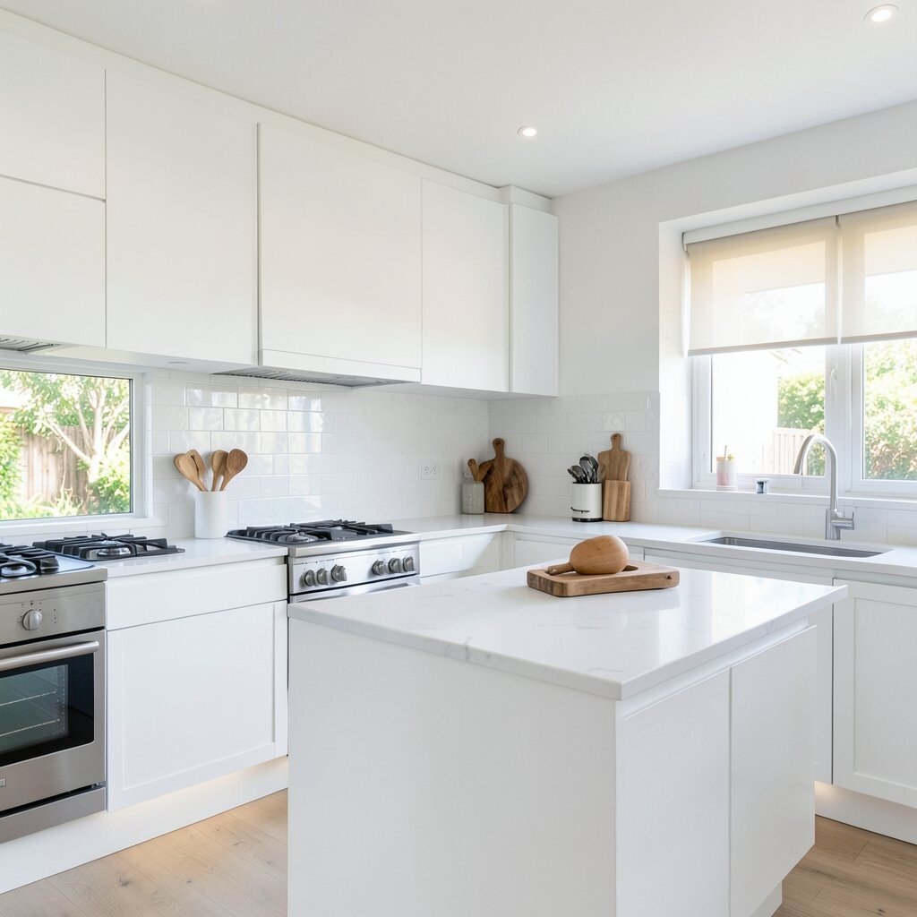
Bright White Pop With a Matte Finish Bright white can feel modern and crisp when you use a matte finish. It gives walls a smooth, clean look that feels fresh.
This hue helps the whole kitchen feel open, especially with sleek cabinet lines. Pair it with darker grout or simple, straight backsplash lines to keep it looking designed. For uniqueness, choose a white with a slight warm tint so it never looks harsh at night.
Personalization idea: mix in colorful kitchen accessories, like a colorful toaster or a matching set of jars. For cost, bright white paint is often one of the most affordable ways to refresh a space without major changes.
-
11. Metallic Bronze Accents
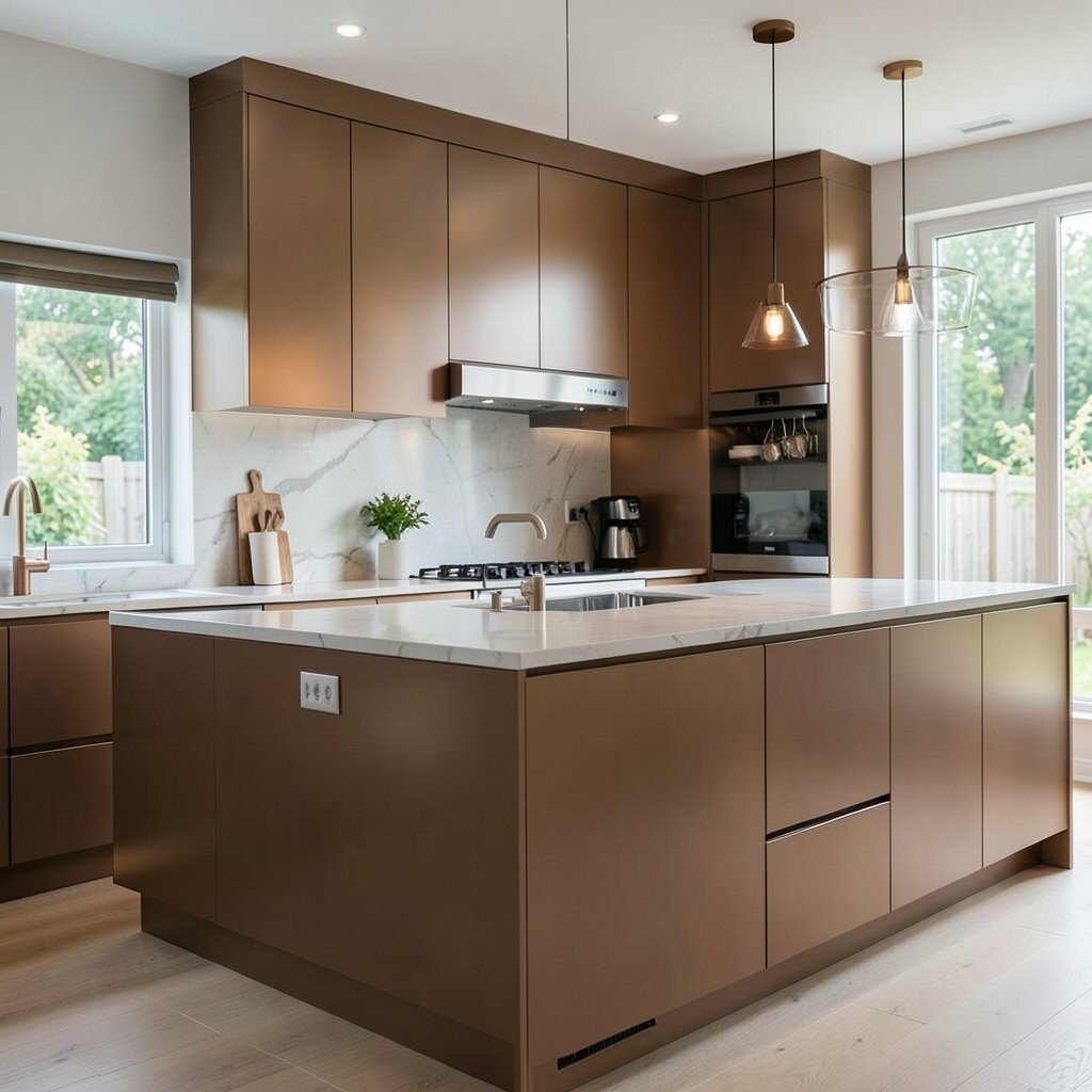
Metallic Bronze Accents Bronze is not just a metal—it can feel like a living color. It adds warmth and depth even when you use it in small spots.
This hue’s benefit is flexibility, because you can go subtle or bold. Try bronze for cabinet hardware, faucets, and light fixtures, then pick a neutral wall color so bronze becomes the hero. For a modern look, pair bronze with charcoal, warm white, or soft greige.
To personalize, match bronze tones across small details, like the curtain rod and towel bar. Budget tip: skip changing everything at once, and start with the items you touch every day.
Current trends love mixed metals, and bronze is a favorite because it feels timeless and rich.
-
12. Ocean Teal (A Calm Statement)
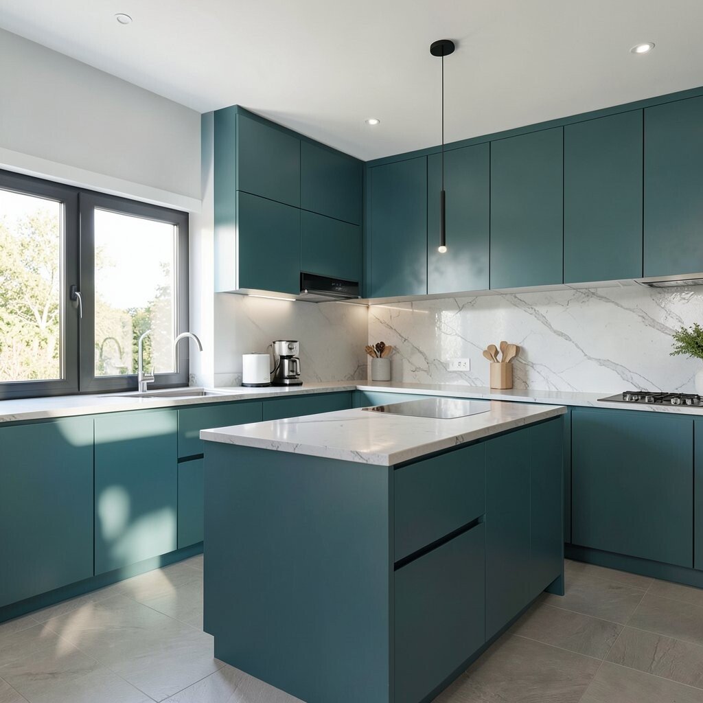
Ocean Teal (A Calm Statement) Ocean teal brings energy, but it still feels soothing. The color sits between green and blue, like water under sunlight.
One major benefit is that teal makes white counters and chrome or bronze accents look extra sharp. It also creates a modern “statement” without needing loud patterns. Tip: use teal on the island, the pantry area, or a single feature wall with simple, clean hardware.
-
13. Chocolate Brown for Cozy Style
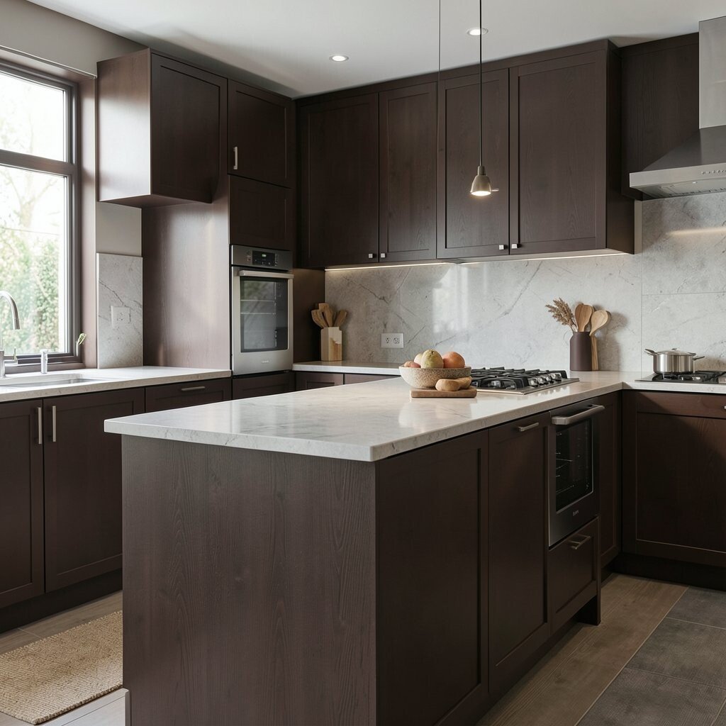
Chocolate Brown for Cozy Style Chocolate brown makes a kitchen feel grounded and cozy. It pairs well with creamy whites and soft natural textures.
This hue is great if you love a warm, gathered look. It benefits the room by adding contrast and depth, especially if your floors are also warm-toned. For uniqueness, try chocolate on lower cabinets and use lighter upper cabinets to keep the kitchen feeling open.
Cost considerations: you can refresh the look with brown paint plus a new backsplash and updated lighting. Trends show that warm brown cabinets and rich accents are making a strong comeback because they feel inviting and stylish.
-
14. Modern Ink Blue
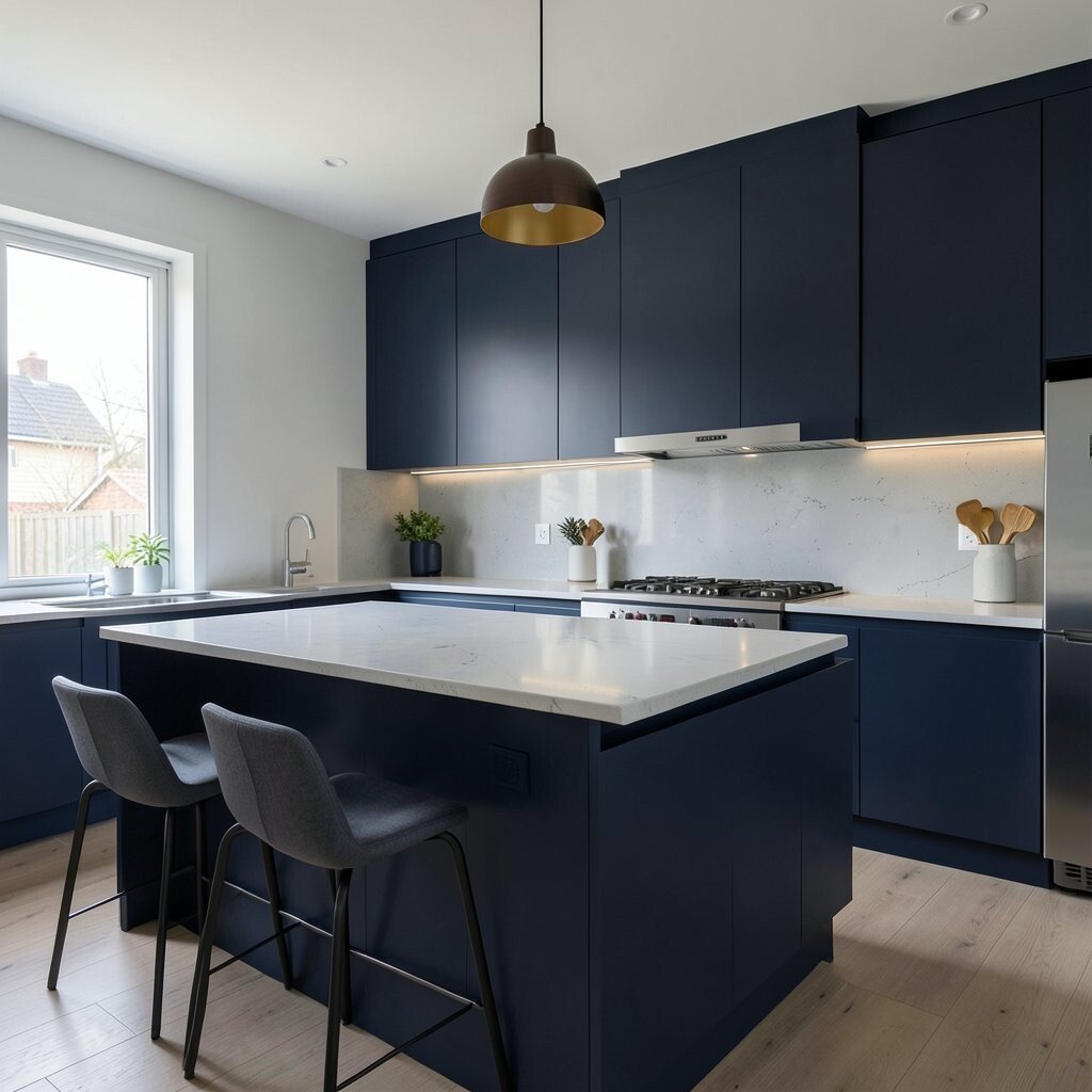
Modern Ink Blue Ink blue feels dramatic and modern, like a night sky near a window. It instantly adds personality and a little luxury.
This hue’s benefit is that it makes simple lines look designer. Use ink blue for cabinet doors, a tall pantry section, or a strong backsplash wall. For tips, keep countertops bright and choose hardware in brushed nickel, bronze, or black for a clean match.
If you want it more personal, add warm wood shelves and display everyday items like cookbooks, mugs, and canisters. Cost-smart move: paint an accent area first so you can adjust the shade before committing to the entire kitchen.
Right now, deep blues are trending because they feel bold but still classic.
-
15. Soft Metallic Champagne (Light Catcher)
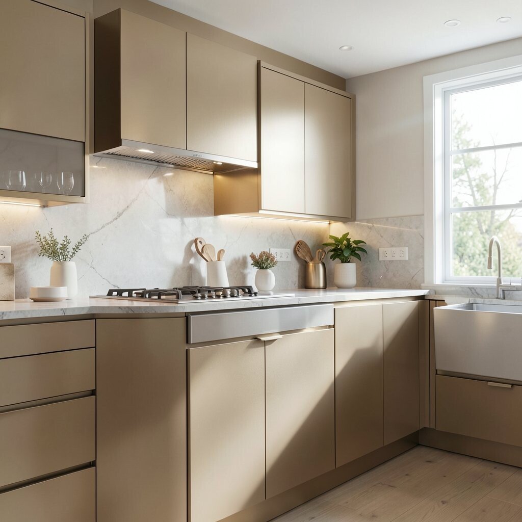
Soft Metallic Champagne (Light Catcher) Champagne tones bring a gentle glow that feels fancy but not flashy. It looks like warm light on a calm morning surface.
This hue is perfect for people who love shine but want it subtle. Use it in small areas like cabinet hardware, a backsplash tile, or even a painted accent stripe. The benefit is that champagne works with many colors, including white, greige, blush, and olive.
For personalization, pair champagne accents with linen textures and neutral stone finishes. Cost considerations matter here: instead of changing every surface, upgrade a few key pieces so the look stays budget-friendly and high-impact.