Some cushions can feel like a soft mood ring for your living room. A smart color shift can make every season look planned, not forced.
When weather changes, you want comfort that also looks right. Cushions are the easiest way to keep your home feeling fresh without buying a whole new set of furniture.
-
1. Oat Milk + Sage Step-In
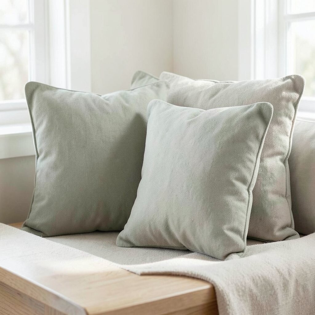
Oat Milk + Sage Step-In Imagine creamy oat tones paired with gentle sage. These shades look calm in bright afternoons and cozy at night.
They work great for early spring mornings when the sun is warm but the air still has a chill. The soft colors help your eyes rest, and that can make your space feel less busy. Try mixing one sage cushion with two oat-colored ones for a smooth, balanced look.
For personalization, add a small stitched leaf patch or a tiny border in pale gray. If you want a budget-friendly option, choose removable covers so you can swap colors later. A current trend is muted natural palettes, and this one fits right in.
-
2. Butter Yellow + Clay Warmth
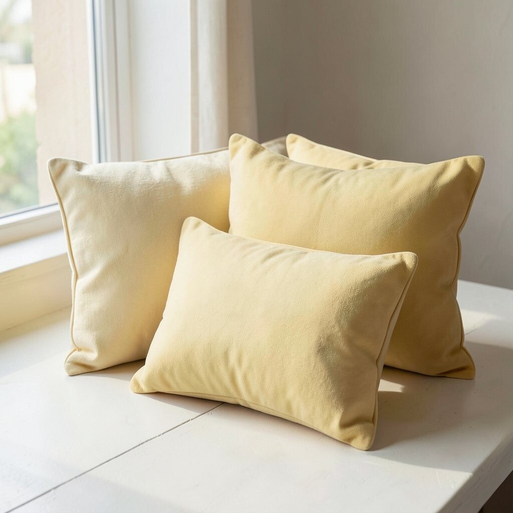
Butter Yellow + Clay Warmth Picture a butter-yellow cushion that glows like morning light. Add clay or terracotta edges for warmth that feels grounded.
This pairing is perfect when summer starts teasing you but you still want a little warmth. It can brighten dark corners and make neutral sofas feel more alive. You’ll also get a cozy vibe without needing heavy blankets.
To make it unique, look for subtle texture like boucle or woven linen. If you’re cost-conscious, pick one statement cushion in butter yellow and keep the rest of the pillows simple. Color trends right now favor earthy brights, so this palette stays modern.
-
3. Sea Glass + Soft White Clouds
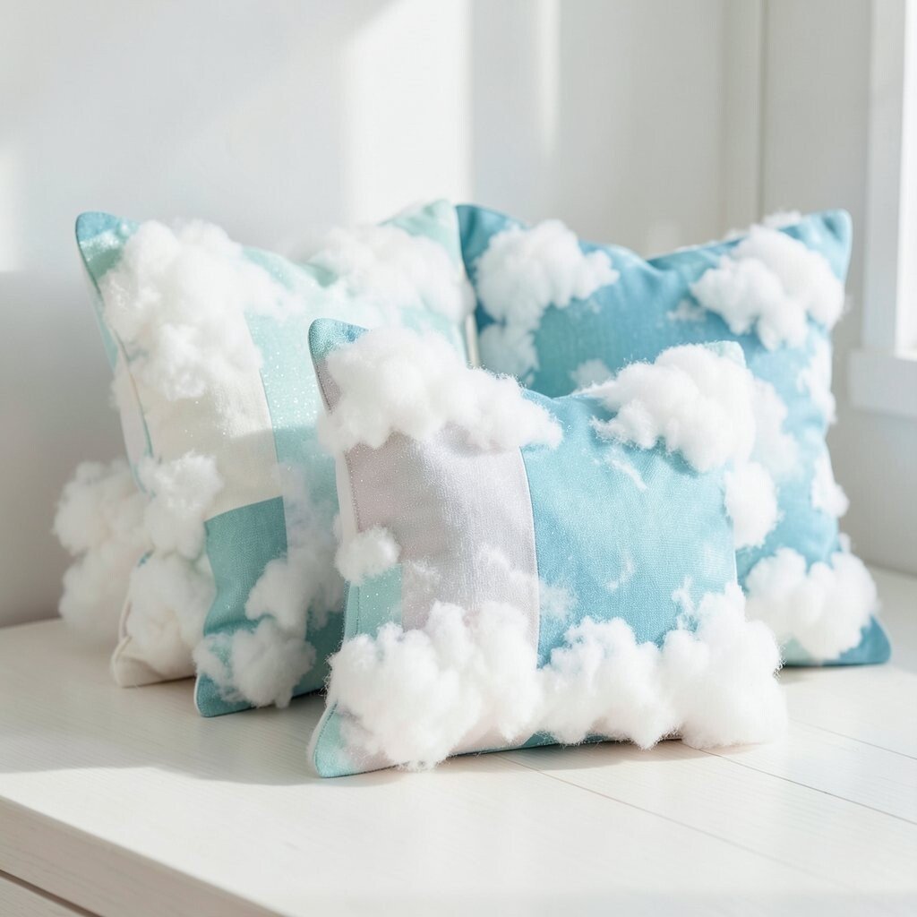
Sea Glass + Soft White Clouds Think of sea glass greens that look cool and clean. Pair them with soft white that feels like clouds on a breezy day.
This cushion color combo helps your room feel airy as temperatures shift. It also blends well with wood, rattan, and light gray floors. If you swap out only covers, you can keep the same cushion inserts all year.
For personalization, choose a sea-glass pattern like tiny waves or faint geometric lines. Consider a washable fabric so you can enjoy the light look without stress. This is a popular “coastal calm” trend, and it feels especially great in spring and early fall.
Tip: place the green cushion at the edge of the sofa so it frames the room like a window view.
-
4. Rose Dust + Warm Oat Stripes
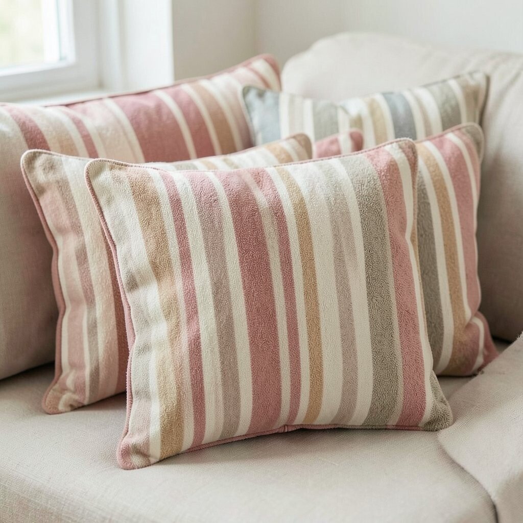
Rose Dust + Warm Oat Stripes Rose dust feels romantic but still relaxed. Add warm oat stripes so the cushion looks stylish, not too sweet.
As the weather changes, this palette can help your home feel softer and more welcoming. The mix of gentle pink and creamy neutral works for many decor styles. You can even pull it together with blush throws or light wood accents.
To personalize, look for embroidered details or a thin stripe border. If you want to keep costs down, buy one cover in rose dust and rotate it between chairs. A current trend is “quiet romance,” and this combination matches that mood.
Suggestion: add a small tray in the same warm oat tone to tie everything together.
-
5. Midnight Navy + Natural Linen
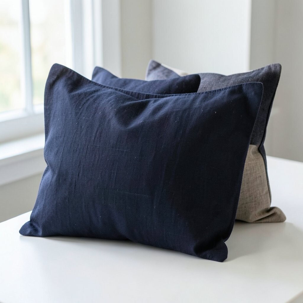
Midnight Navy + Natural Linen Picture deep navy cushions that look bold but not harsh. Place them on natural linen for a grounded, classic look.
This palette shines when autumn arrives and the air gets crisper. Navy gives you a cooler contrast, while linen keeps the room warm and breathable. It’s also an easy way to make your space feel more “finished” with less effort.
Try a mix of textures: one navy velvet cushion and one linen cushion. Personalization can be as simple as adding gold piping or a stitched monogram. If you’re watching cost, choose cotton-linen blends since they keep the look without the higher price.
-
6. Burnt Orange + Creamy Sand
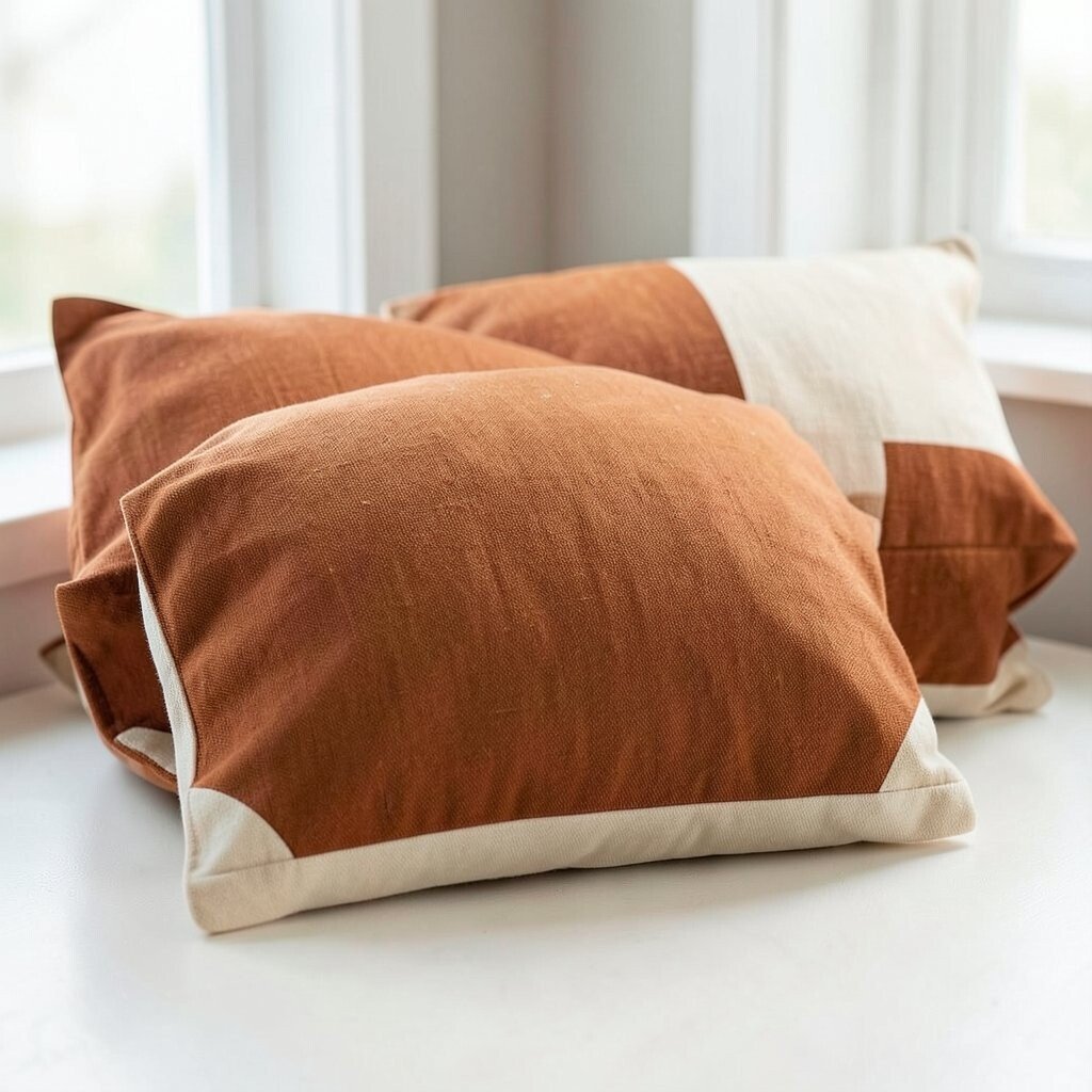
Burnt Orange + Creamy Sand Burnt orange can feel like a sunset you can sit on. Pair it with creamy sand for a warm, inviting base.
This works beautifully for fall transition days when you want warmth but still want bright energy. The orange brings comfort, and the sand tone keeps it light. You’ll also notice it pairs well with dark wood and warm metals like bronze.
Uniqueness tip: choose an abstract pattern that looks like brushstrokes. For personalization, add a cover with a small tassel or fringed corner. Cost consideration: buy one burnt orange cushion as a focus and keep the rest in neutral sand tones.
-
7. Cool Teal + Gray Mist
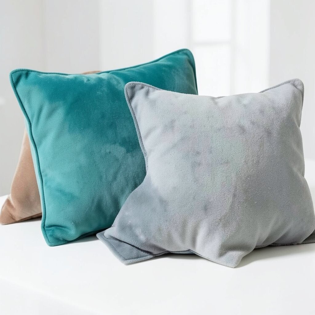
Cool Teal + Gray Mist Teal can feel refreshing when spring is arriving. Add gray mist so it looks calm and not overly loud.
This combination can help your room feel cooler and cleaner. It also looks great next to metal decor, like black frames or silver trays. If your walls are off-white, this palette stands out in a gentle way.
To personalize, select teal cushions with a subtle geometric weave. If you want to stay budget-friendly, choose cushion covers that zip smoothly for easy washing. A helpful styling tip is to repeat the teal tone in one small accessory, such as a vase or candle jar.
-
8. Plum Jam + Chocolate Brown
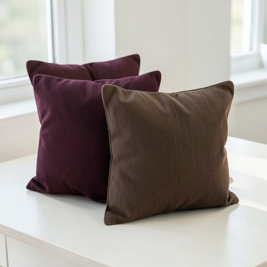
Plum Jam + Chocolate Brown Plum jam looks rich, like fruit spread on toast. Pair it with chocolate brown for a cozy, autumn-ready vibe.
This palette makes your living room feel deeper as evenings get longer. It can also add a fancy feel without needing extra decorations. You’ll benefit from the warm contrast, especially if your room has lighter rugs or bright curtains.
For uniqueness, try a cushion with a velvety finish and a simple seam line. Personalization idea: add two plum cushions and one chocolate cushion with a different texture. Cost tip: if you can only afford one expensive cover, make it the plum velvet one.
Trend note: jewel tones remain popular because they look luxurious in many home styles.
-
9. Soft Coral + Pale Sage
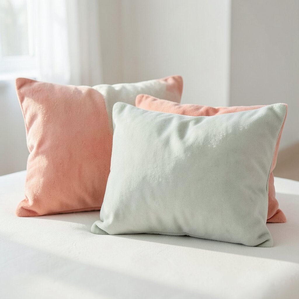
Soft Coral + Pale Sage Soft coral gives you a gentle pop that feels cheerful. Pale sage keeps everything grounded and easy on the eyes.
This mix is great for that in-between season when you want fun colors but still crave calm. Coral brings energy to your couch, while sage balances it like a cool breeze. It also looks nice with white walls and light natural flooring.
Uniqueness tip: choose coral cushions with subtle speckled fabric. Personalization can be done with reversible covers, so one side is coral and the other side is sage. If you care about cost, reversible covers often help you get more value from fewer purchases.
-
10. Charcoal + Misty Lavender
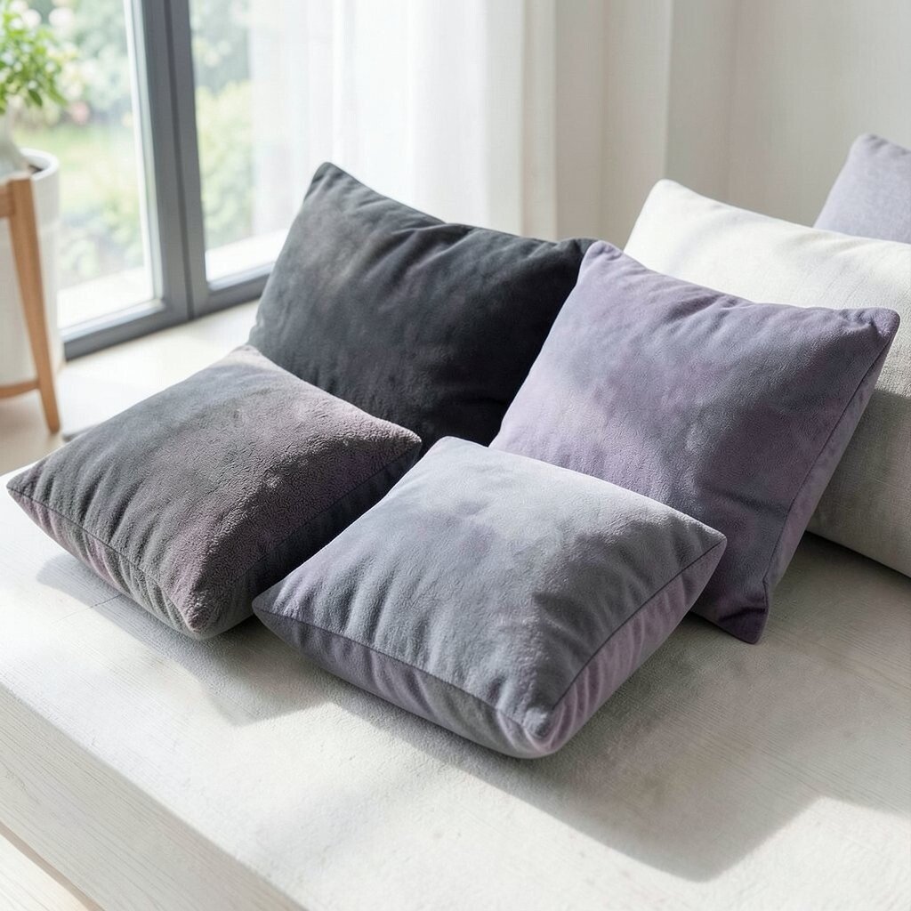
Charcoal + Misty Lavender Charcoal is modern and strong, like a stylish suit. Add misty lavender for a dreamy twist that feels calm.
This palette works well when you want a seasonal change that still feels grown-up. It’s especially good for late summer nights and early fall days. The lavender adds softness, while charcoal keeps the look crisp and clean.
Try personalization with lavender embroidery on a charcoal background. If you want a budget idea, start with charcoal cushions you already own, then switch only the lavender accent cushion. A current trend is mixing deep neutrals with gentle pastels, and this is a perfect match.
-
11. Wheat Gold + Cream Linen Loops
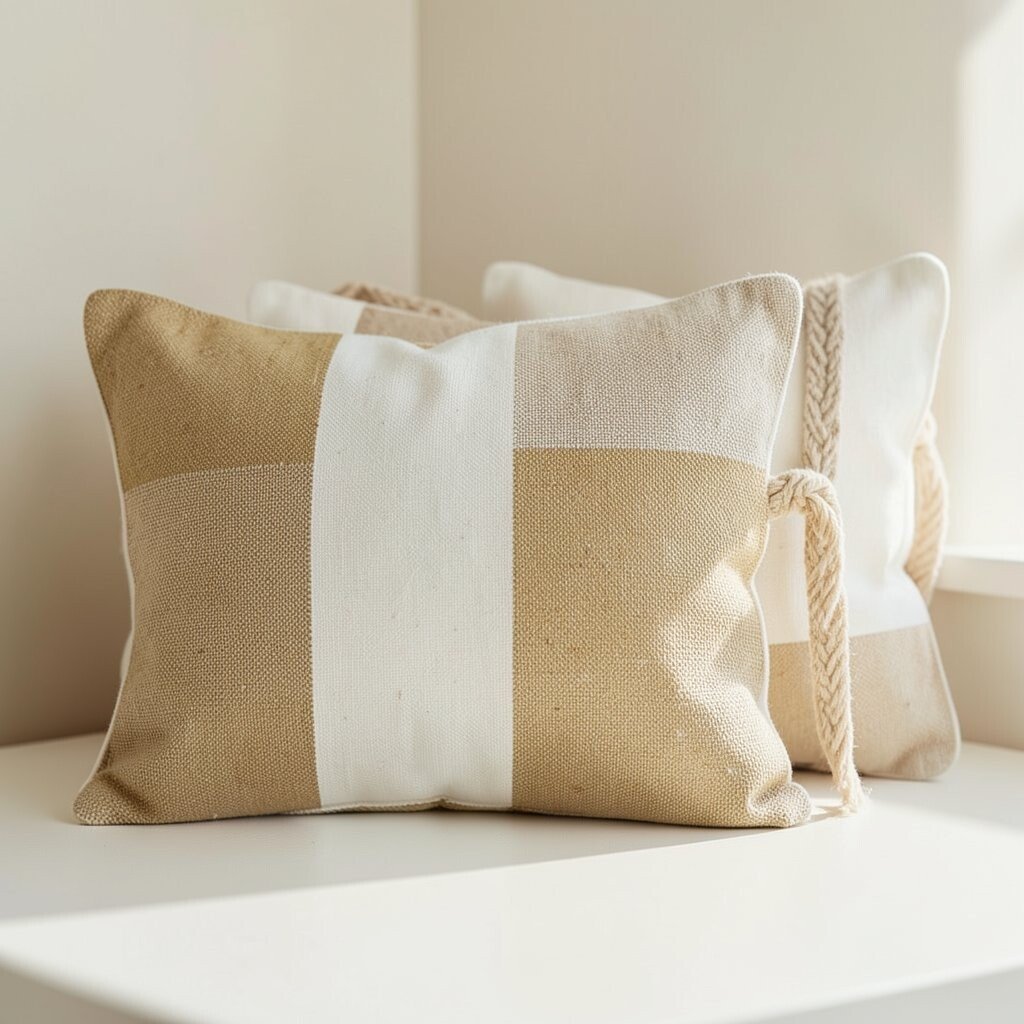
Wheat Gold + Cream Linen Loops Wheat gold feels sunny without being too bright. Pair it with cream linen that has soft loop texture or subtle stitching.
This cushion palette is a friendly way to welcome early autumn and late summer. It gives warmth to your space while still keeping things light and natural. You’ll also love how it matches many rugs and curtains.
For uniqueness, look for cushions with looping patterns, braided edges, or woven details. Personalization idea: add a small fabric patch shaped like a leaf or acorn. Cost consideration: buy covers in wheat gold, and keep the inserts for years so you spend less over time.
-
12. Sea Salt Blue + Off-White Knit
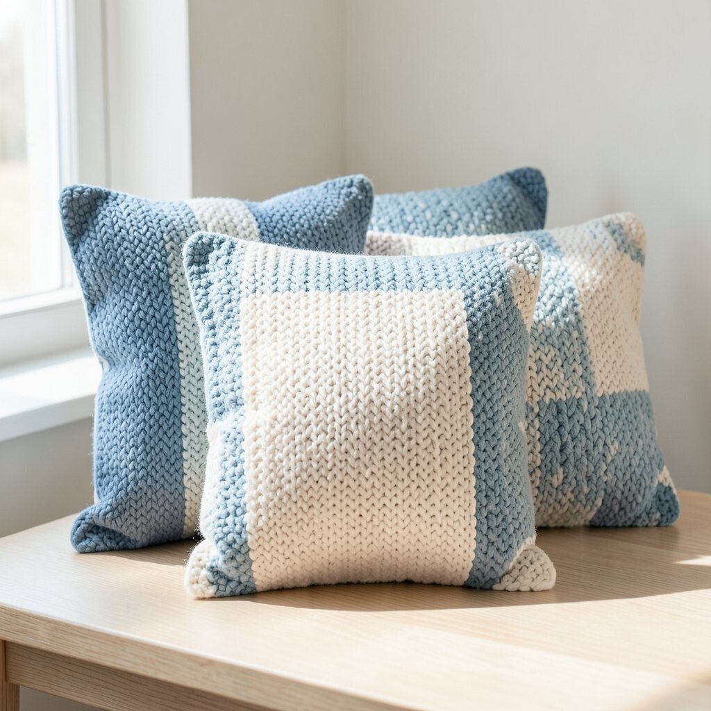
Sea Salt Blue + Off-White Knit Sea salt blue looks like gentle ocean waves. Off-white knit makes the whole arrangement feel soft and comfy.
This color pair is perfect for spring when you want brightness that doesn’t feel harsh. It also pairs nicely with beach-inspired decor, but it can still look modern in city homes. The knit texture makes everything feel cozy without adding extra bulk.
To personalize, pick one cushion with blue tassels and another with a knit pattern. If you’re keeping costs down, search for knit-look covers that mimic the texture at a lower price. A smart tip: avoid overcrowding—two matching blue cushions can do the job.
Trend note: knits and texture-forward fabrics are still going strong because they feel handmade and lived-in.
-
13. Lemon Zest + Gray Stone
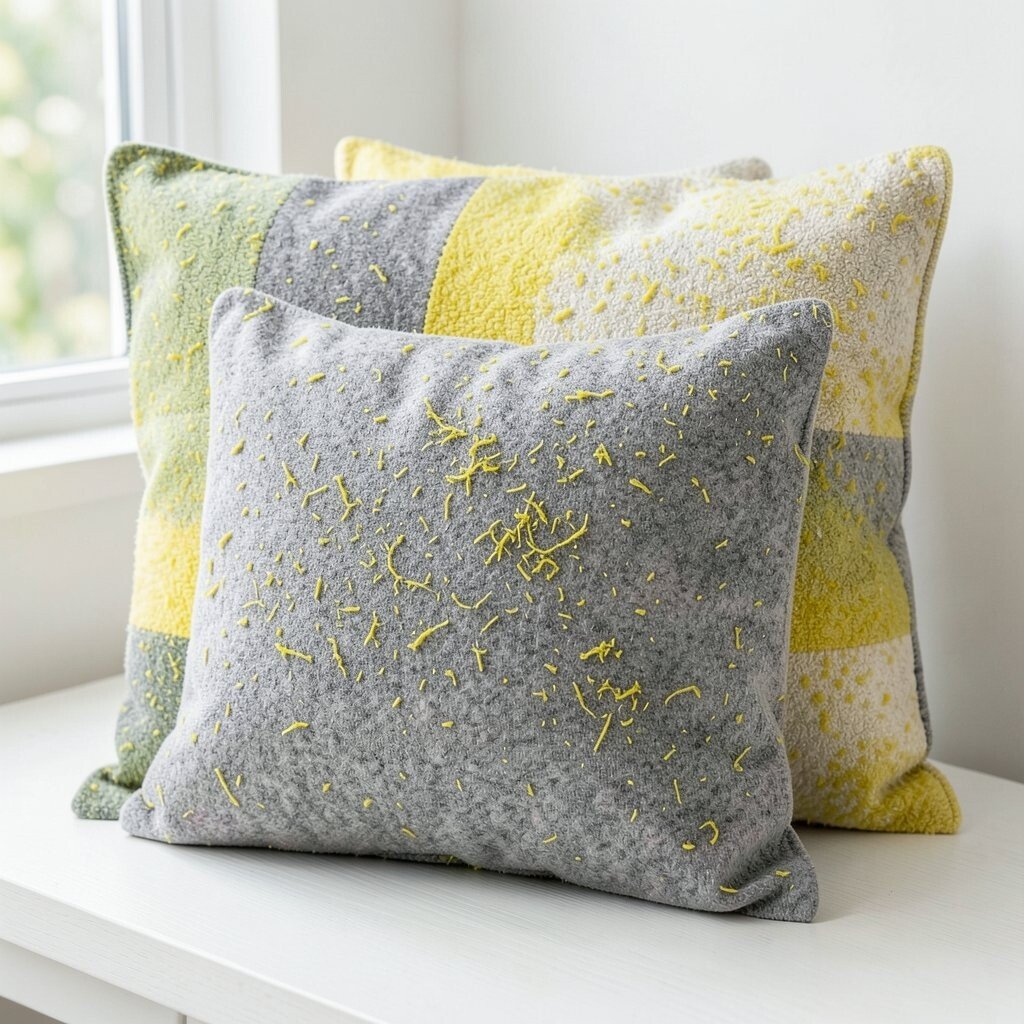
Lemon Zest + Gray Stone Lemon zest feels fun and fresh, like citrus in a bowl. Gray stone helps it stay balanced, so it doesn’t overwhelm the room.
This combo works when you want a bright seasonal lift, especially during spring and early summer. It can make your home feel energetic, like you opened a window. The gray background also helps the lemon pop in photos and in real life.
Uniqueness tip: go for cushions with a sunburst pattern or tiny dot prints. Personalization idea: match the gray tone with your frames or lamp base for a neat look. Cost idea: use just one lemon cushion as a hero and keep other cushions in gray and white.
-
14. Sage Green + Soft Taupe
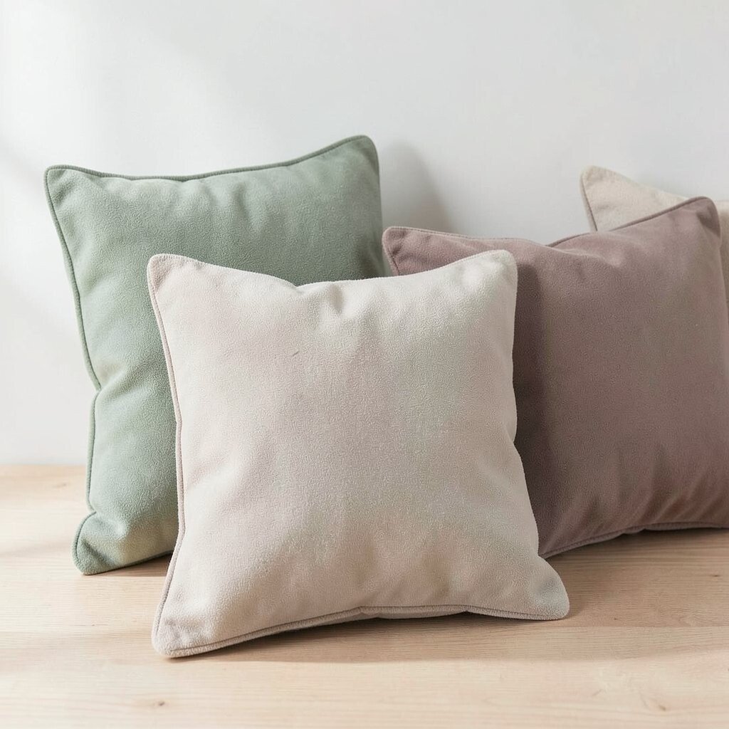
Sage Green + Soft Taupe Sage green is calming, and soft taupe feels warm and steady. Together they create a smooth, natural transition palette.
This works for multiple seasons because it’s not too bright and not too dark. It also helps your room feel tidy, especially if you use neutral furniture. The benefit is that you can keep these cushions out longer than flashy seasonal ones.
For personalization, add a subtle pattern like a small vine or minimal stripes. If you want a budget-friendly approach, buy pillow covers in both colors and rotate them. Trend note: “slow living” palettes like sage and taupe stay popular because they feel relaxed and intentional.
Tip: add a warm throw in cream or tan to make the taupe feel even richer.
-
15. Terracotta + Sandstone Speckle
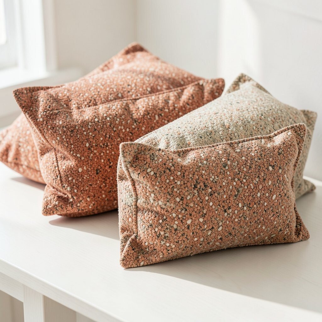
Terracotta + Sandstone Speckle Terracotta brings warmth like sunbaked clay. Sandstone speckle adds a natural, stone-like charm that feels earthy.
This palette is a great bridge between warm and cool months. It makes your living area feel inviting, especially if your floors are wood or you have warm lighting. You’ll also get a unique look because speckled fabrics feel more detailed and less flat.
Uniqueness tip: choose speckle cushions with uneven color spots, like real stone. Personalization idea: pair terracotta with a small bowl or wall art in the same orange-red family. Cost considerations: speckle fabrics can hide minor wear, which may help cushions last longer.
-
16. Forest Green + Buttermilk Cream
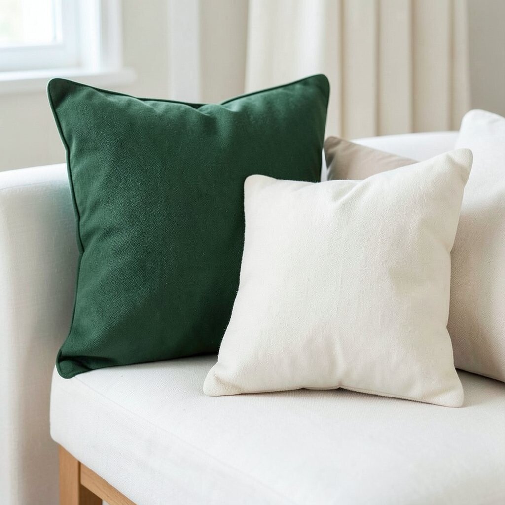
Forest Green + Buttermilk Cream Forest green feels deep and cozy, like a calm forest path. Buttermilk cream softens it and makes it feel friendly.
This cushion palette is perfect for late fall and early winter, but it can still work as a gentle transition if you keep the lighting warm. The cream helps the green feel approachable instead of heavy. You’ll also love how it pairs with plaid throws and wooden accents.
For personalization, try forest green cushions with stitched pine details or simple grid patterns. If you’re on a budget, pick one forest green cushion as the main accent and keep the rest in cream. Current trends favor forest greens because they look rich and timeless.
Suggestion: add a warm lamp with a soft yellow bulb tone to enhance the buttermilk cream.
-
17. Cinnamon Brown + Soft Rosewood
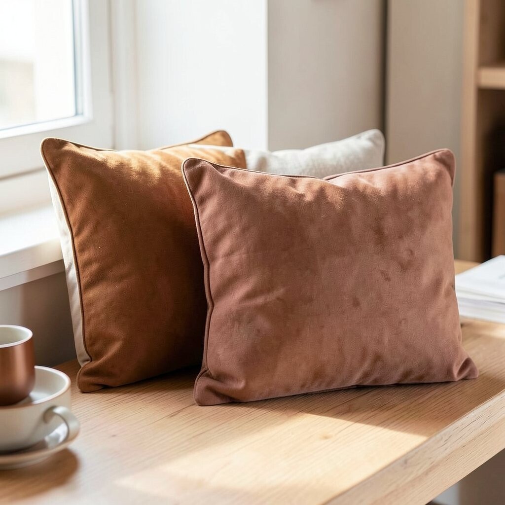
Cinnamon Brown + Soft Rosewood Cinnamon brown looks cozy, like warm spices in a kitchen. Soft rosewood adds a gentle reddish note without becoming too loud.
This palette helps your home feel comforting when evenings cool down. The warm brown acts like a base, while rosewood gives a subtle glow. It’s also a nice choice if you want something different from typical orange and traditional fall tones.
Uniqueness tip: look for cushions with woven patterns that show tiny color shifts, like spice rings. Personalization idea: match the rosewood tone in a photo frame or a small ceramic piece. Cost consideration: consider buying one patterned cushion and one solid cushion to balance the look.
-
18. Rainy Day Blue + Charcoal Sprinkles
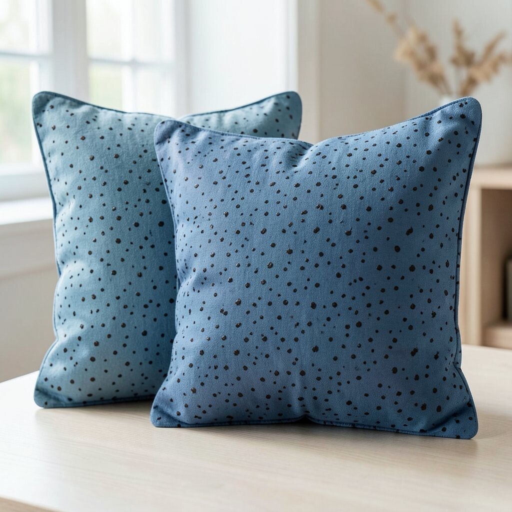
Rainy Day Blue + Charcoal Sprinkles Rainy day blue feels soothing, like a cloudy sky before the sun returns. Charcoal sprinkles add a playful, modern texture that looks stylish up close.
This is a great transition palette for times when the weather can’t decide. It’s cool enough for spring and gentle enough for early fall. The charcoal detail keeps the design grounded and prevents the blue from feeling too light.
For personalization, choose sprinkles that look like tiny scattered dots or faint confetti. A smart styling tip is to pair this cushion with solid neutrals so the texture stays the star. If you want cost savings, look for covers that are machine washable because patterns often hide stains.
-
19. Apricot Glow + Creamy White Boards
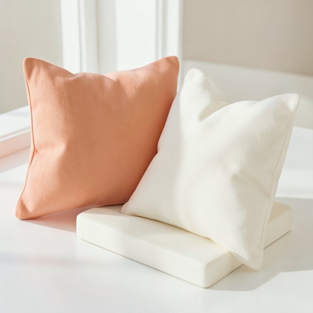
Apricot Glow + Creamy White Boards Apricot glow has a peachy warmth that feels friendly and fresh. Creamy white boards, like smooth blocks or panel stripes, help the color feel clean.
This palette works beautifully when you want a soft summer-to-fall shift. It brings brightness, but the white structure keeps everything neat and modern. You’ll benefit from the cheerful look without needing bold colors all over the room.
Uniqueness tip: pick cushions with paneling lines or a quilted board texture. Personalization idea: rotate one apricot cover with a neutral cover so you can adjust the vibe week by week. Cost consideration: if you want to spend less, choose a slightly smaller cushion size and add a matching throw for a full, layered effect.
Trend note: warm peach tones and structured patterns are popular because they look lively and tailored at the same time.