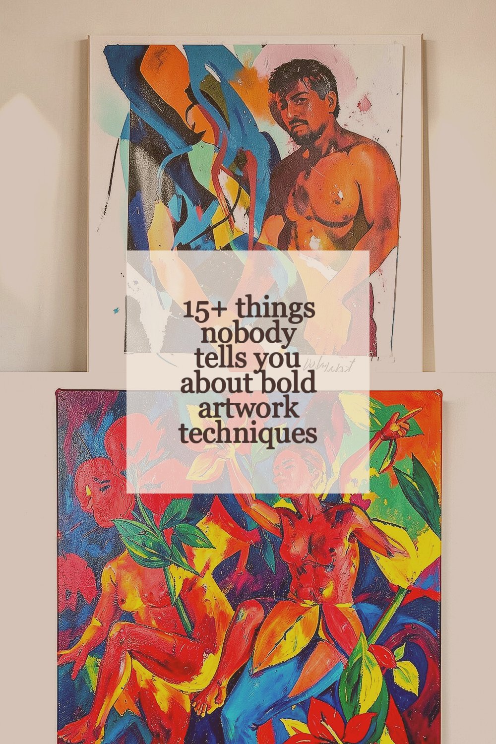
Bold artwork can feel scary at first glance. But once you know a few practical secrets, it becomes playful and doable.
You don’t need a fancy studio to make pieces that grab attention.
-
1. Bold starts with “deciding what matters”
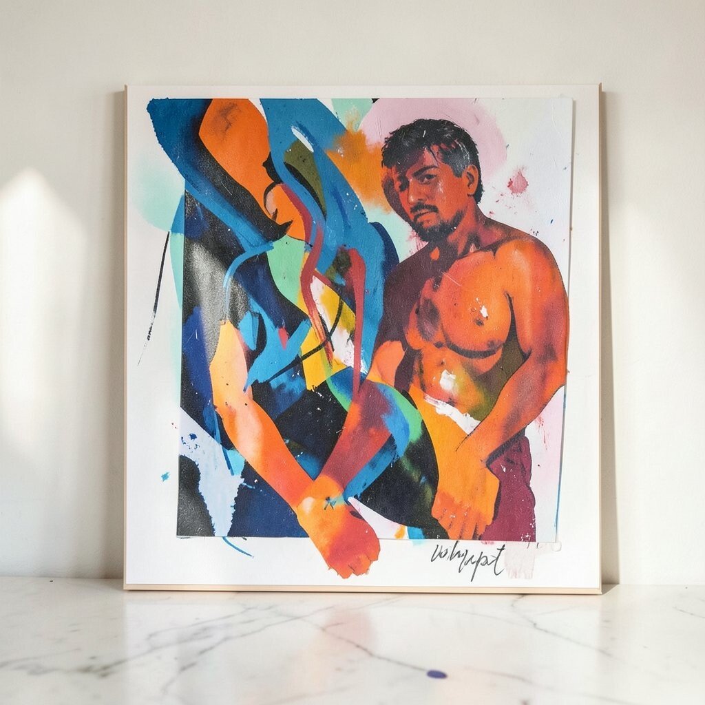
Bold starts with “deciding what matters” Before you touch paint or ink, pick the one thing your viewer should notice first. It might be a face, a shape, a skyline, or even a single flower with a crazy color.
When your focus is clear, you waste less energy on busy details. This helps your art look confident, not crowded. Try naming your subject out loud, then simplify everything else around it.
-
2. Limits can make colors look louder
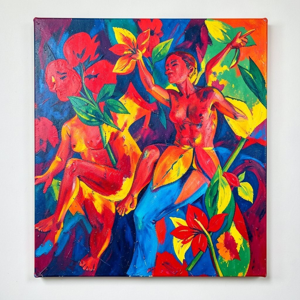
Limits can make colors look louder Too many shades can hide the strong ones. A small color plan makes each choice pop like a spotlight.
Pick a tight set of colors, then reserve the brightest colors for key areas. Your viewer’s eye will jump where you want it to. For personalization, write down your “power palette” based on your favorite snacks, sports teams, or mood words.
If you’re on a budget, start with basic paints or a limited set of markers. Even cheap pigments can look bold when used in bold amounts.
-
3. Use value contrast, not just color

Use value contrast, not just color Many people chase vivid hues and forget the secret of light and dark. Big value contrast helps your work read from far away.
Try making a quick thumbnail sketch using only dark and light shapes. Then build your colors on top of that structure. You’ll notice your artwork instantly looks stronger and more readable.
For a fun twist, make one version with high-contrast shadows and another with softer shadows. Pick the one that matches your vibe.
If you’re using digital tools, adjust “grayscale” to test values. If it still looks clear in black-and-white, it will feel bold in color too.
-
4. Big shapes beat tiny textures at the start

Big shapes beat tiny textures at the start Begin with simple shapes that cover the page. After the big forms are set, textures become meaningful instead of chaotic.
Think of it like building a strong house before adding decorations. This approach saves time and gives your art cleaner edges. If you want a unique look, use one texture style for the whole background and another for the main subject.
-
5. Let edges be uneven on purpose

Let edges be uneven on purpose Perfect edges can make bold art feel stiff. Uneven edges, like a slightly wobbly brush edge, add energy.
Try leaving some boundaries crisp and others soft. That contrast makes the whole piece feel alive. You can also smear a little paint on purpose, then wipe a section with a cloth to create a glow-like effect.
To personalize, match the edge style to the mood: jagged for excitement, smooth for calm, rough for grit. This is a low-cost trick because it uses what you already have—your brush, your fingers, and your patience.
-
6. You can “oversaturate” carefully with glazes

You can “oversaturate” carefully with glazes Bold doesn’t always mean dumping thick color everywhere. Sometimes the brightest look comes from layered glazes.
Apply thin transparent layers, letting each one dry. This builds depth and keeps colors from looking muddy. For personalization, mix a glaze color that matches your favorite clothing—like deep teal for a jacket or warm coral for a scarf.
-
7. Backgrounds should support, not compete

Backgrounds should support, not compete A bold artwork needs a background with a job. If the background fights the subject, everything looks messy.
Decide what the background is doing: framing, fading, or adding rhythm. Then keep the pattern smaller or simpler so the main focus stays dominant.
Try one trend-friendly idea: paint a graphic backdrop using repeating shapes. It’s modern and bold, especially when you limit the colors. If money is tight, use inexpensive paper and household items like sponges to stamp patterns.
-
8. Build a “visual rhythm” with repeated marks

Build a “visual rhythm” with repeated marks Bold art often feels exciting because it has a beat. That beat comes from repeating marks, like short strokes, dots, or curved lines.
Use repetition to guide the eye. Place the same mark in different sizes, like small beats near the edges and bigger beats near the center. This trick makes your work feel designed, not random.
For uniqueness, take one mark from your real life—like the shape of bubble wrap—and translate it into paint. You’ll be surprised how original it can look.
Costs stay low because you can make marks using scrap cardboard, old sponges, or even the corner of a stiff brush.
-
9. Contrast in thickness can be a style, too
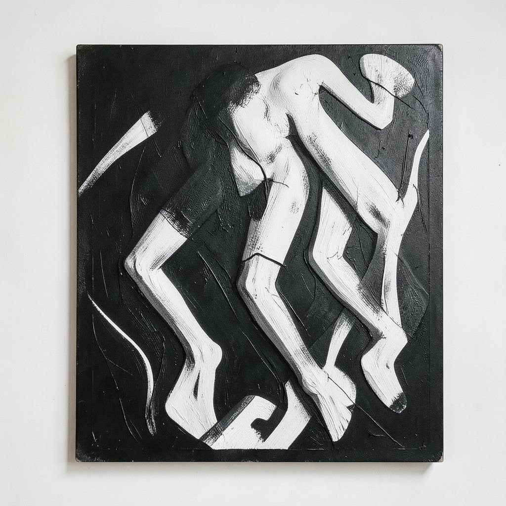
Contrast in thickness can be a style, too Thick paint and thin paint tell different stories. Bold artwork gains character when you vary how much paint you use.
Use thicker strokes for the most important edges, and thinner layers for shadows and transitions. This creates a tactile “highlight” feel even if your surface stays smooth. If you’re personalizing, match thickness to emotion: heavy for drama, light for softness.
-
10. Don’t wait for “perfect” before you add the strong parts

Don’t wait for “perfect” before you add the strong parts Many artists hold back because they want everything to look neat. But bold pieces often look best when they’re started confidently.
Put down at least one bold element early, like a main color block or a large highlight. Then you can build around it without losing your center. This helps you avoid overworking the rest of the image.
Try a quick rule: place the biggest highlight while the paint is still fresh and easy to move. It’s a practical way to keep your gestures bold. If you’re working on a budget, even marker and pen layers can create the “bold start” effect.
-
11. Use warm-cool color pairs to add depth fast
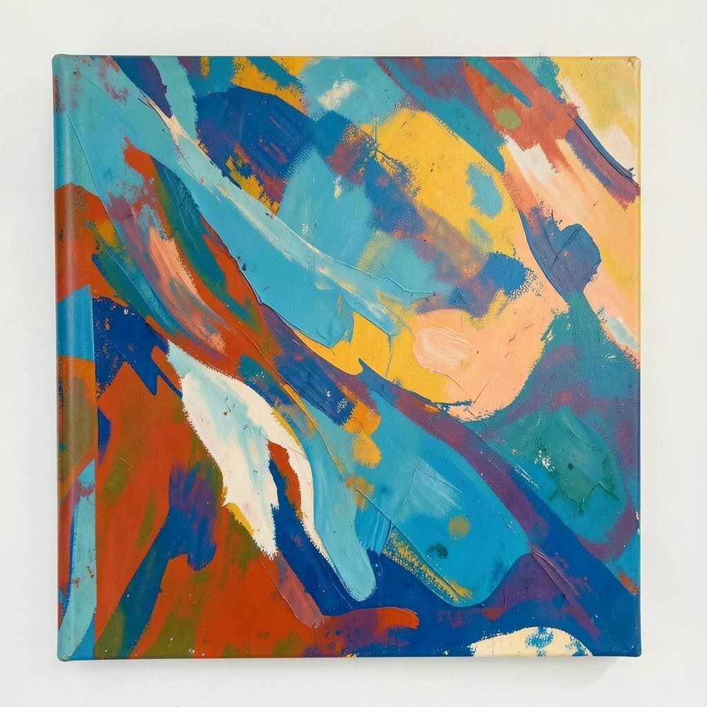
Use warm-cool color pairs to add depth fast Warm colors look like they move forward, and cool colors look like they move back. Pairing them can make your shapes feel three-dimensional.
For example, use a warm yellow or red for light areas and a cool blue or purple for shadow areas. This gives instant depth without needing complicated shading. Personalize by choosing warm and cool colors based on your favorite brand colors or the places you love.
If you’re using digital art, try a “split tone” technique. Assign shadows to one cool color and lights to one warm color, then keep the rest simple.
-
12. Let mistakes become texture maps
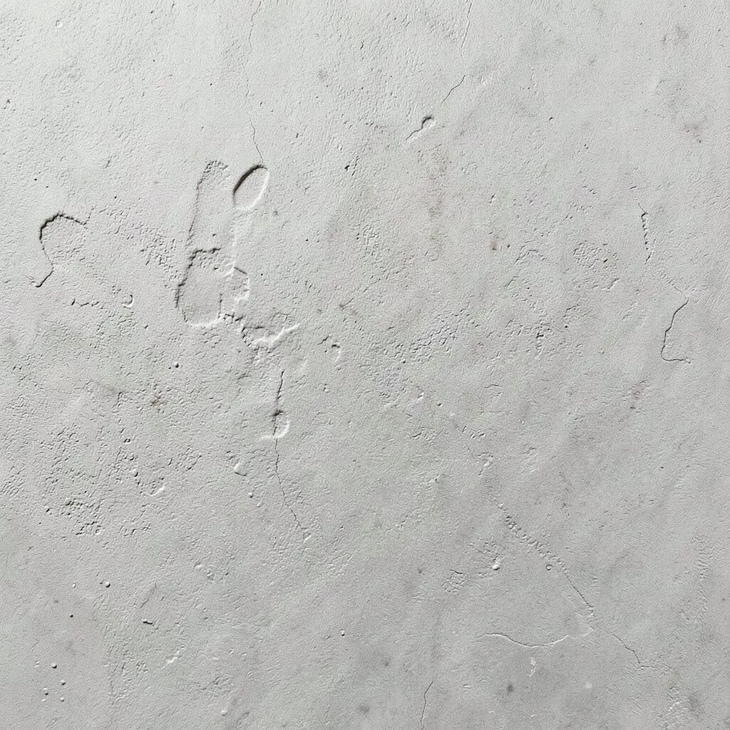
Let mistakes become texture maps Mistakes feel scary, but they can become your secret weapon. A smudge can turn into a pattern, and a drip can become a planned streak.
Look at the mark and ask what it wants to be. Then guide it with quick strokes around it so it feels intentional.
For uniqueness, treat every “oops” like a new texture location. You can also use different tools to make each accidental mark feel like a design element. This idea stays friendly for beginners because you’re not trying to erase everything—you’re using what happened.
-
13. Bold composition is easier than you think

Bold composition is easier than you think Composition doesn’t have to be complicated. Start with simple placements: center, off-center, or layered depth.
Try placing the main subject slightly off-center and using a few shapes to “push” the eye toward it. Triangles and diagonals are especially helpful for energetic artwork. For personalization, use your own body’s favorite perspective, like how you see things from a sidewalk or from a kitchen chair.
-
14. Your tools matter, but your habits matter more
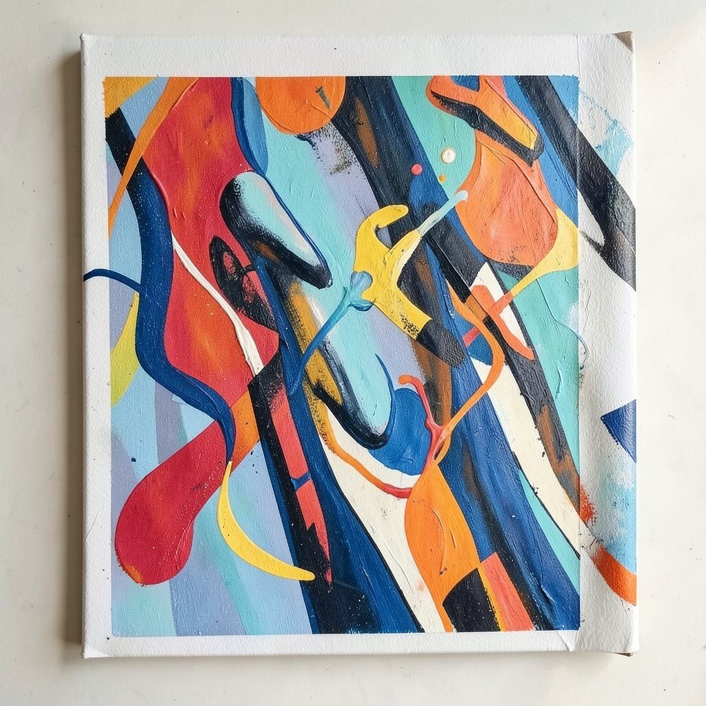
Your tools matter, but your habits matter more You don’t need the fanciest supplies to make bold work. However, good habits can make even basic tools perform better.
Rinse your brush often, keep paper flat, and test colors on scrap first. Small routines help you avoid surprises and keep your bold marks clean. If you’re going for a trend look, keep brushes more loaded for dramatic strokes and use drier strokes for crisp lines.
To manage cost, buy one reliable brush and one inexpensive backup. Then focus on using them in a smart way rather than collecting a lot at once.
-
15. Create a “two-step finish”: block first, refine second

Create a “two-step finish”: block first, refine second Bold artwork looks best when it has two clear phases. The first phase is blocking big areas, and the second phase is refinement.
During phase one, don’t worry about tiny details. Put down shapes, values, and main color areas. During phase two, tighten edges, add highlights, and adjust the parts that pull attention the wrong way.
This keeps you from overworking and helps your final piece feel fresh. Personalize by choosing your own refine style—like adding tiny doodles, sharp white highlights, or simplified shadows. If you’re using mixed media, finish with one bold marker line pass for extra clarity.
-
16. Share process photos to learn faster than you expect

Share process photos to learn faster than you expect Bold techniques get easier when you watch how your own work changes. Take quick photos as you go, even with your phone.
Compare the early stage with the final stage and notice what made the artwork stronger. You might spot that your best contrast happened when you stopped adding details and started adding bigger shapes. That’s a valuable lesson for the next piece.
For uniqueness, turn your process shots into mini posters or social media strips. Current trends love behind-the-scenes art stories. It can also help you find your personal style faster without spending more money on new supplies.
If you’re on a tight budget, this “sharing practice” is free. It’s a smart way to invest in learning, not just materials.