
Color can turn a simple gathering into a happy memory. The right shade makes people feel noticed the moment they walk in.
Here are lively theme ideas you can use, mix, and match without stress.
-
1. Electric Blue Energy

Electric Blue Energy Electric blue feels like a burst of fresh air. Think of it on glossy banners, cool lighting, and sleek table runners that pop from far away.
It helps with clarity and confidence, so guests feel calm and focused. Try pairing electric blue with white accents and a little silver for a clean, modern look. For personalization, add name tags in matching blue tones or use blue gradient stickers for seating areas.
If you’re watching your budget, use painted foam letters or downloadable printable signs instead of expensive custom art. A current trend is using light-up LED strips behind signage to make the color glow on photos.
-
2. Coral Sunshine Warmth
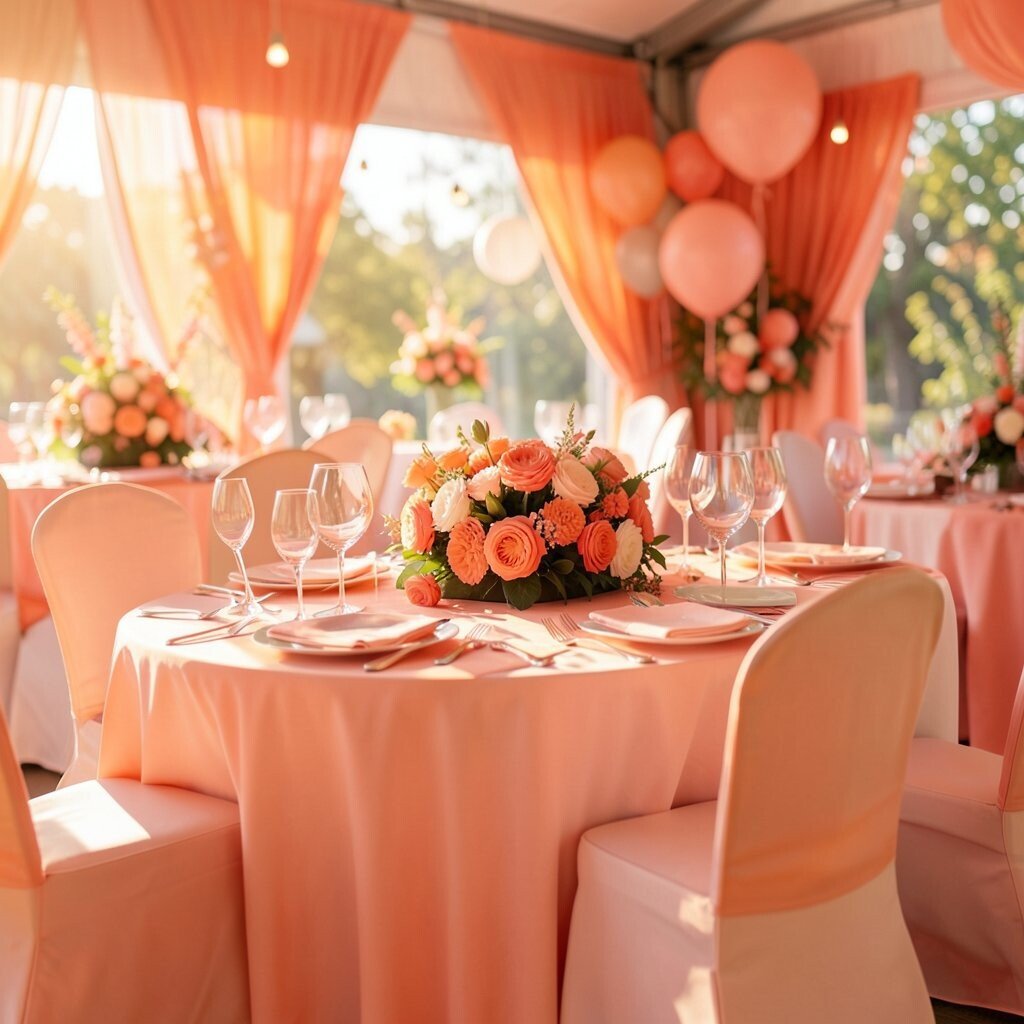
Coral Sunshine Warmth Coral brings warm, friendly vibes that feel like sunshine. Picture it on balloon arches, peachy tablecloths, and handwritten welcome signs that look extra cheerful.
Guests often smile more in warm color spaces, which makes conversations start faster. For a unique twist, mix coral with blush pink and warm gold, like a summer sunset. You can personalize by giving each person a coral-colored wristband or a small card that matches their assigned table color.
To keep costs down, rent balloon styles or use paper lanterns instead of costly florals. Right now, many events are using fruit-themed props, so add coral napkins with orange and strawberry visuals for a playful touch.
-
3. Emerald Garden Sophistication

Emerald Garden Sophistication Emerald feels rich and fresh at the same time. Imagine deep green centerpieces, satin ribbons, and a backdrop that looks like a leafy stage.
It adds a sense of elegance without feeling stiff. People tend to associate green with balance, so it can make the whole event feel comfortable. Try personal touches like leaf-pattern menus or small name cards stamped with a simple emerald logo.
If you want it to stand out, add gold outlines around signs and frames. For cost concerns, use green fabric table runners and mix in a few high-impact emerald balloons rather than covering everything.
Current trends include using natural-looking textures, like faux greenery walls with a mix of different shades of green for depth on camera.
-
4. Bright Yellow Happy Moments

Bright Yellow Happy Moments Bright yellow is the color of good news and quick energy. Picture it in bold typography, sunny photo frames, and cheerful confetti that scatters with every laugh.
Yellow can boost optimism, so it’s great for workshops, brand launches, and team celebrations. Pair it with navy or charcoal to keep it readable and to make everything feel crisp. For personalization, add “fun facts” cards on yellow holders at each station, so guests find something new while they move around.
On a budget, use printed cardstock cutouts, yellow plastic tableware, and simple DIY signage. A trend you’ll see often is “color blocks” in event branding, where yellow fills a big shape behind a main message for strong photos.
-
5. Vibrant Magenta Creative Mood

Vibrant Magenta Creative Mood Magenta feels bold, artsy, and confident. Think of it on neon-style wall decals, bright drink labels, and satin ribbons that catch light like candy.
It’s a great choice for creative sessions because it signals fun and originality. Combine magenta with purple and white for a layered look, or try it with black for a pop that looks modern. Personalize by using magenta for custom stamps on favors or by color-coding activity stations so guests can find their way easily.
If you’re keeping costs in mind, focus on a few “magenta hero spots,” like the photo wall and the stage backdrop. Recent trends include using bold gradient lighting on backdrops for dramatic video clips.
-
6. Azure Sky Clarity Theme

Azure Sky Clarity Theme Azure gives a feeling of open space and calm thinking. Imagine sky-blue linens, airy drapes, and signs that look like they’re floating with white clouds behind them.
This color can help guests feel comfortable, which is perfect for networking and learning events. Pair it with soft gray and light tan so the theme stays gentle. Personalize by printing a simple sky map on menus, or label booths with cloud icons so everything feels playful and easy to follow.
To save money, use reusable blue paper banners and swap them between different events. A current style is “weather-themed” branding, where you use color plus cloud graphics to make the whole event feel cohesive.
-
7. Royal Purple VIP Feel

Royal Purple VIP Feel Royal purple instantly feels special, like a backstage pass to something exciting. Picture velvet-looking table cloths, purple spotlights, and a deep backdrop with gold accents.
Guests often associate purple with creativity and mystery, which makes a theme feel unique. Pair it with warm gold, cream, or deep green so it doesn’t feel too heavy. For personalization, make a “royal” seating chart with each table named after a star or a kingdom.
Budget tip: use purple lighting and paper décor first, then add real flowers only in the main stage area. A trendy approach is mixing matte and shiny finishes, like matte purple signs with glossy gold stickers for high contrast.
-
8. Orange Ember Fun Energy

Orange Ember Fun Energy Orange feels lively and talkative, like a campfire glow. Imagine it in warm balloons, orange napkins, and bright signs with friendly rounded fonts.
This theme can help guests feel energized, especially at events with games or energetic speakers. Pair orange with cream and teal for a fun, modern contrast. Personalize by adding “choose your path” cards in different orange shades so people feel like they’re picking their own adventure.
If cost is a concern, rent a few bold décor pieces and keep the rest simple with printed signage. Right now, many events use interactive stations, and orange works great for highlighting those stop points with eye-catching color.
For extra uniqueness, make your stage timer or scoreboard in orange blocks so updates are easy to spot.
-
9. Teal Ocean Calm Focus

Teal Ocean Calm Focus Teal mixes calm and excitement, like waves that keep moving. Picture teal backdrops, ocean-themed centerpieces, and light reflective details that make photos look cool.
It can support a focused mood, which is perfect for panels, product demos, and teamwork activities. Combine teal with white and seafoam to keep things fresh and not too dark. Personalize by using teal for section headings, like “Strategy,” “Design,” and “Stories,” with matching icon signs.
To manage costs, use teal fabric scraps or table runners and add one or two statement pieces, like a photo booth frame. A current trend is “soft gradients,” where lighting or printed graphics fade from one blue-green shade to another for a soothing look.
-
10. Crimson Bold Statement

Crimson Bold Statement Crimson is dramatic and attention-grabbing. Imagine deep red curtains, bold red-and-white stripes, and centerpieces that look like they’re glowing from within.
This color can make an event feel high-impact, which is great for awards nights and big announcements. Pair it with black, gold, or cream so it looks sharp and stays readable. Personalize by giving guests crimson tickets or “vote cards” that match the theme for interactive moments.
For budget planning, use red tablecloths in sections rather than covering every surface. A trendy style is using red in “frames,” like border lines around signs and step-and-repeat walls for a strong brand look in photos.
-
11. Lime Pop Youthful Play

Lime Pop Youthful Play Lime feels playful, quick, and full of imagination. Picture it in bright accent dots, lime-green balloons, and fun props with bold patterns.
It can boost the mood at family events and student meetups. Pair lime with navy or bright purple so it feels energetic instead of neon-chaotic. For personalization, add lime-colored icons for different activities, like a small leaf for “art,” a lightning bolt for “science,” and a smile for “games.”
If you’re trying to control spending, focus on a few lime pieces that guests will see first, like the welcome sign and activity cards. A current trend is using color-coded “zones,” and lime is perfect for naming the loudest, most fun area.
-
12. Pink Blush Gentle Celebration

Pink Blush Gentle Celebration Blush pink feels sweet, welcoming, and easy to pair. Imagine soft pink drapes, subtle floral accents, and menu cards with light typography.
It helps guests feel relaxed, which is perfect for community nights and engagement-style gatherings. Pair it with champagne, light gray, or dusty rose so the theme stays calm and polished. Personalize by letting guests choose a blush-colored favor tag at the entrance, so every person feels involved.
Budget tip: use printed blush bunting and simple tabletop décor, then spend a little more on lighting that makes pink look warm on camera. A trend right now is minimal décor with strong color choices, so keep the setup neat and let blush do the work.
Try adding a blush photo filter sign to encourage guests to match the theme in pictures.
-
13. Sand Beige Cozy Neutral Glow

Sand Beige Cozy Neutral Glow Sand beige sounds quiet, but it can look super stylish. Picture warm beige backdrops, layered linen textures, and simple typography that feels classy.
Neutral color themes help everything else stand out, especially bright centerpieces and colorful food. Pair beige with one vivid accent color, like teal or magenta, so you get a clean look. Personalize by using beige as your “canvas” and adding custom stickers for each guest’s name in the accent color.
To keep costs reasonable, beige décor often reuses well, like reusable fabric banners and neutral plates. A current trend is “warm minimal,” where neutral tones make the event feel upscale while still being friendly.
-
14. Bright Green Fresh Growth Theme
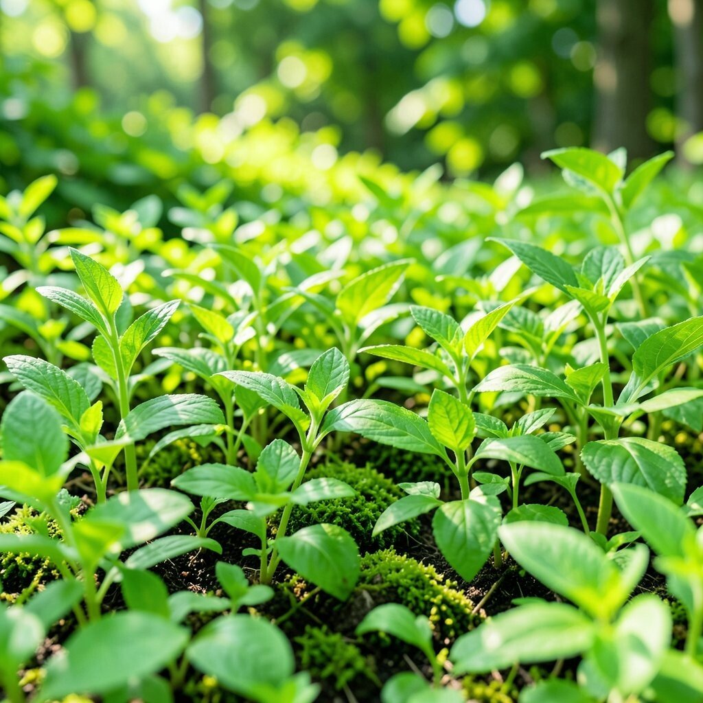
Bright Green Fresh Growth Theme Bright green signals fresh energy, like the first day of spring. Imagine green signage, bold centerpieces, and playful patterns that look like growing vines.
This theme can encourage movement and participation, which works well for active games and interactive demos. Pair bright green with white and sunny yellow for a lively combo. Personalize by using plant tags for table names, like “Mint,” “Basil,” and “Sprout,” and let guests place their cards on the “plant” at each station.
Budget tip: use leafy printed paper and DIY “growth chart” boards instead of expensive live plants everywhere. A trend you might see is eco-style visuals, so include recycling icons and reusable giveaways to match the theme’s fresh feel.
-
15. Charcoal Black Modern Contrast

Charcoal Black Modern Contrast Charcoal black adds power and makes bright colors look even brighter. Picture matte black step-and-repeat walls, clean black frames, and vivid neon accents around key messages.
This theme is great when you want a sleek brand look without clutter. Pair charcoal with electric blue, hot pink, or bright lime for a strong “pop” effect. Personalize by printing guest names in a vivid ink color on black cards for a crisp, premium feel.
For costs, black décor can be reused across events, which helps you spend less over time. A current trend is “bold typography on dark,” where big words do most of the visual work instead of heavy decorations.
-
16. Golden Sun Shimmer Celebration
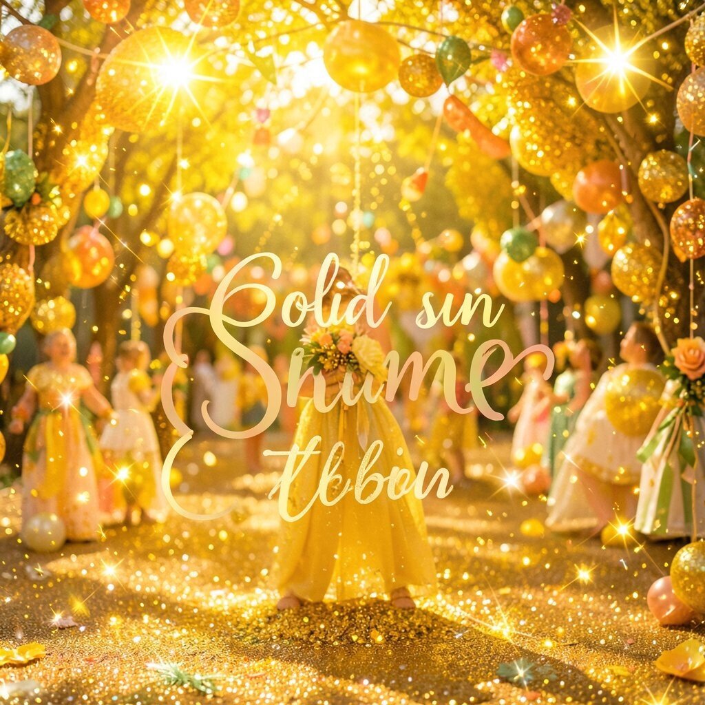
Golden Sun Shimmer Celebration Gold feels like celebration in color form. Picture shiny gold balloons, warm amber lights, and table settings that glow when people walk by.
It adds a festive mood and helps guests feel like they’re part of something special. Pair gold with deep green or royal blue for a rich, high-contrast look. For personalization, stamp your event logo in gold on menus or add small gold star stickers to each guest’s name card.
If you’re budgeting, use gold as an accent rather than covering everything, like gold ribbon, gold foil labels, and a few shiny centerpieces. A trend now is mixing gold with textured materials, like kraft paper and linen, for a warm modern vibe.
-
17. Silver Frost Futuristic Clean

Silver Frost Futuristic Clean Silver looks crisp, futuristic, and polished. Imagine metallic silver balloons, shiny table trays, and cool gray lighting that makes the whole event feel high-tech.
This color can make presentations feel sharper and more professional. Pair silver with teal or electric blue so the combo looks like a sci-fi sky. Personalize by using silver for QR code cards or name tags, then add colored dots for each guest group.
Budget tip: silver can be created with reflective paper, metallic ink labels, and budget-friendly “foil” details. Current trends include “techy shine,” where reflective accents are used sparingly around the stage and photo moments for maximum impact.
Try using silver for your trophy stand, your award backdrop, or your main entrance sign.
-
18. Coral Reef Pink-Orange Twist

Coral Reef Pink-Orange Twist This coral reef idea blends pink and orange so the theme feels playful and tropical. Picture a backdrop that fades from pink to orange, plus striped décor and bright drink signage.
It’s unique because it doesn’t look like just one color, it looks like a whole mood. Guests love themes that feel like a place, and this one feels like a vacation spot. Personalize by giving guests “sea shells” with names written on them, and let them place the shells in a display as they arrive.
To manage costs, print large gradient panels for the wall and use smaller pieces of matching décor for tables. A trend that keeps showing up is “mood gradients,” where the background color changes subtly instead of staying flat.
-
19. Ocean Navy Night Sky

Ocean Navy Night Sky Ocean navy makes everything feel deep and elegant. Picture navy drapes, starry silver confetti, and lights that guide guests like a night path.
This color can make event details feel more important because navy creates strong contrast. Pair it with white and bright accents like cyan or lime to keep it fun, not gloomy. Personalize by using navy name tags with a small “constellation” line in guests’ favorite accent color.
Budget tip: use glow-in-the-dark stickers or printed star sheets instead of expensive lighting rigs. A current trend is “night sky branding,” where you add subtle star graphics to signage, invitations, and photo booths.
-
20. Berry Blueberry Pop
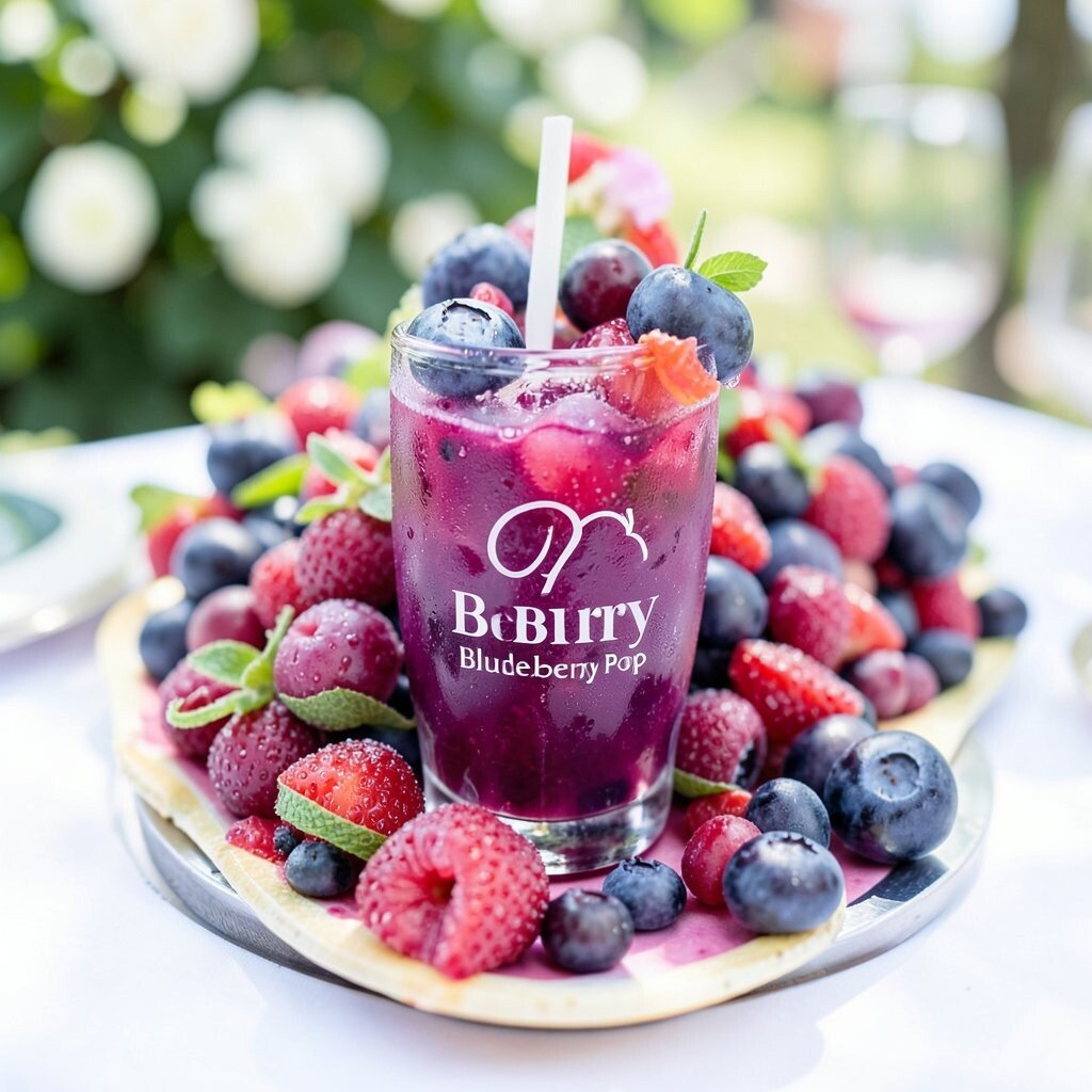
Berry Blueberry Pop Berry colors feel bold and fruity, like candy that looks grown-up. Picture berry-purple balloons, blue-toned lighting, and table décor that looks like a modern berry basket.
Berry themes can be great for food events, product tastings, and dance nights. Pair berry with crisp white and a hint of teal to keep it fresh. Personalize by using berry-colored flavor cards and let guests “vote” for favorites with berry stickers.
To keep costs down, use printed berry patterns on table runners and napkins instead of heavy custom décor. A trend you’ll see is using color-matched labels for drinks and menus, because guests love ordering with style.
For uniqueness, add a berry stain-style art wall, like abstract splashes that look fun in photos.
-
21. Bright White Clean Studio Style

Bright White Clean Studio Style Bright white gives a studio-like clarity that makes modern design shine. Picture white drapes, clean signage, and colorful centerpieces that feel extra vibrant against the light.
This theme works well for tech meetups, brand pop-ups, and formal events that still want a friendly feel. Pair it with one or two bold accent colors so the look stays organized. Personalize by using white place cards with colored handwriting or markers, so each guest’s spot looks custom.
Budget tip: white décor can be reused easily, like plain linens and generic frames with swapped color overlays. Current trends include “white space layouts,” where you keep the background quiet so the guests’ experiences and products become the main focus.
-
22. Rainbow Confetti All-In-One Joy
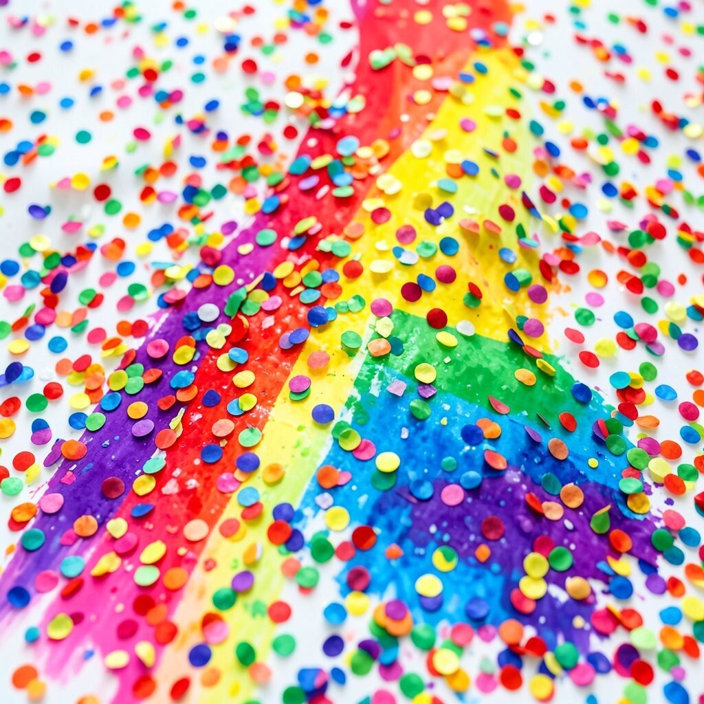
Rainbow Confetti All-In-One Joy Rainbow themes feel like a celebration that never runs out. Picture bright table runners in stripes, rainbow balloon clusters, and a photo booth wall packed with colorful frames.
This theme is unique because it lets every guest feel included through many color choices. It also helps you separate activity zones, like using a different rainbow color label for each station. For personalization, offer a “choose your color” badge at the entrance and let guests match their badge to their seating section.
To manage cost, print rainbow signs and use small color items like napkins, cups, and labels instead of buying full sets of décor. A current trend is “micro-color moments,” where you place tiny rainbow accents all around so the theme feels lively without being expensive.
Make it extra actionable by setting up a mini craft station where guests can assemble their own rainbow keychain or sticker sheet.