A waterfall countertop can make your room feel instantly more open and polished. The best part is that the look works in many styles, from cozy to ultra-modern.
1. Sleek White Quartz With Crisp Veins
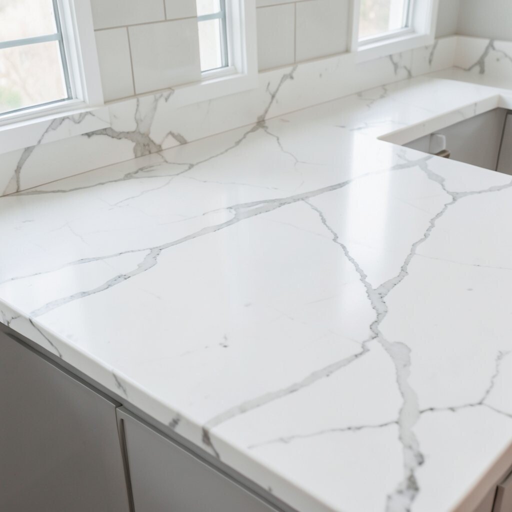
White quartz with sharp, bright veining can look like polished stone pulled straight from a gallery. The waterfall edge sends the countertop down into the room, making everything feel cleaner and more luminous.
Choose a high-gloss or honed finish depending on how much reflection you want in your lighting. The smooth surface wipes down easily for busy kitchens and daily life. For a tailored look, match the quartz pattern direction to your backsplash so the whole wall reads as one continuous design.
2. Warm Marble-Look Quartz for Soft Glam
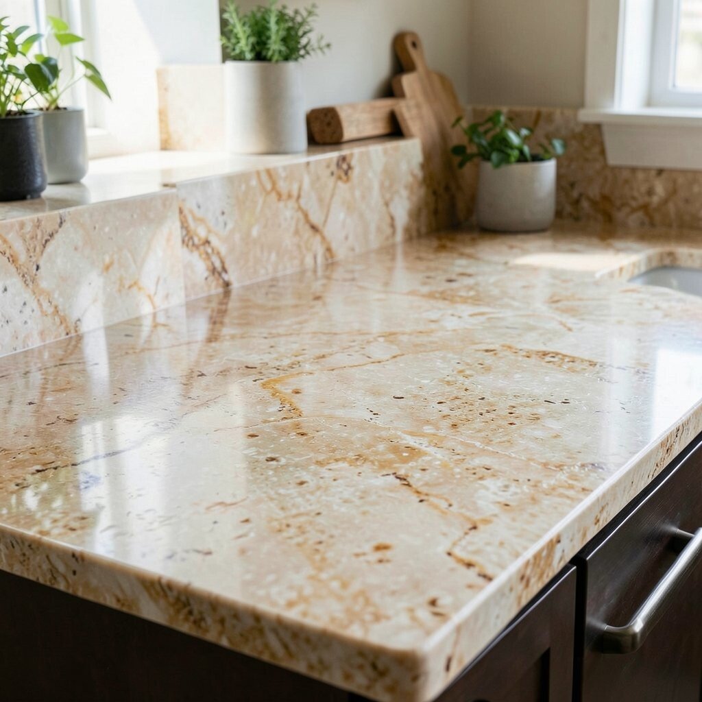
Marble-look waterfall counters bring warmth and elegance without the stress of real stone. Veins that fade from creamy white into gentle gray help soften hard lines around cabinets.
To keep it bright, pair the waterfall face with light cabinetry and a backsplash that doesn’t compete. If you want extra drama, pick a slab with bolder veining and let it run down the vertical section for a showpiece effect. Budget-wise, quartz marble-look options often cost less than premium marble while still giving you that upscale movement.
For personalization, consider a subtle border trim on the waterfall edge so it feels intentional and finished. In current trends, many homeowners are choosing warmer “marble” tones over stark icy whites to make rooms feel inviting. A quick tip: add under-cabinet lighting aimed slightly upward so the vertical face catches light and glows.
3. Light Oak Woodgrain Waterfall Panel
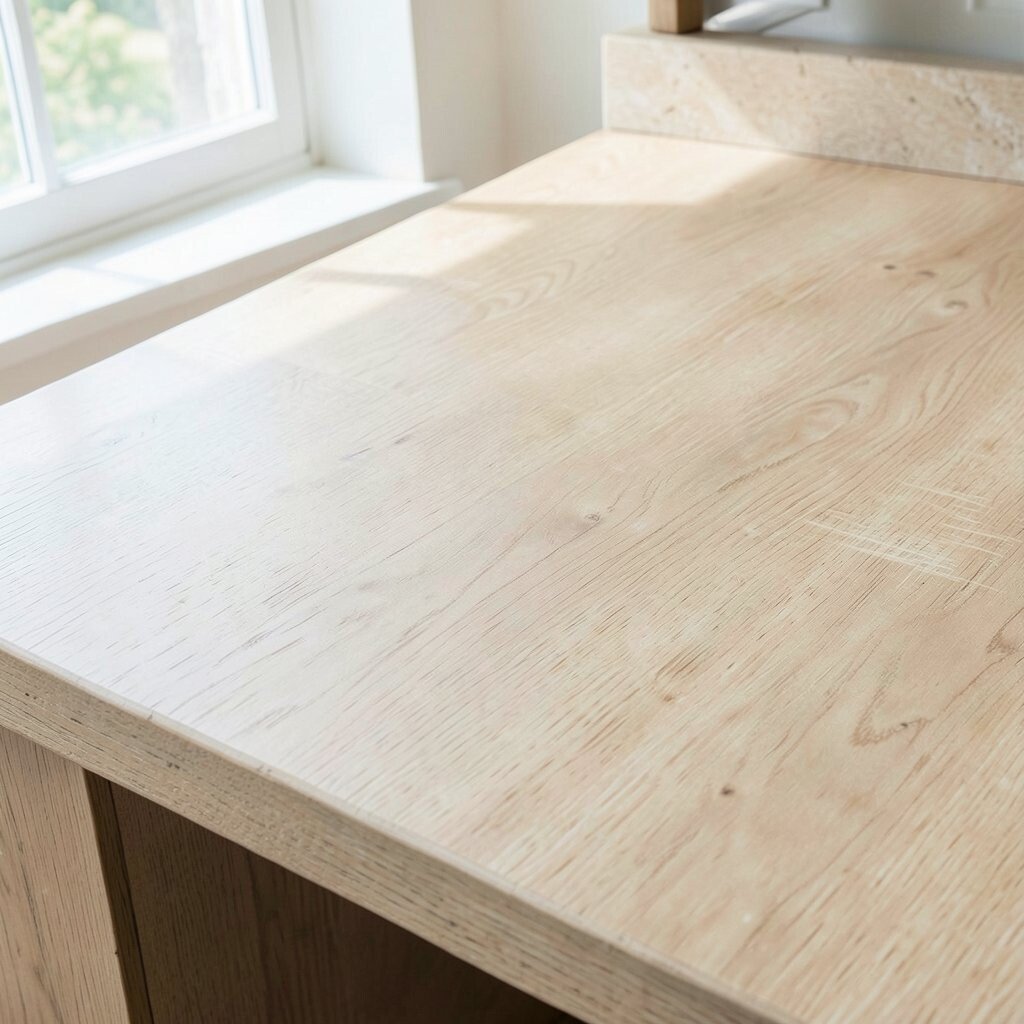
If you want warmth without going fully traditional, a light oak woodgrain waterfall looks fresh and modern. The vertical drop creates a panel-like effect that makes the space feel taller.
Woodgrain surfaces can soften the contrast of white walls, stainless fixtures, and gray floors. Use a durable countertop finish designed for heavy kitchen use so the pattern stays crisp over time. This idea is unique because it turns the countertop into a feature wall instead of just a work surface.
For practicality, keep the pattern consistent by choosing a countertop manufacturer that can align the grain across the top and waterfall face. Cost is often mid-range depending on material choice, but laminate-style or engineered options can be more budget-friendly than natural wood. Trend-wise, textured surfaces are popular right now because they add depth even in bright rooms.
Personalize it by pairing with black hardware or brushed brass lights, which makes the warm tones stand out. A matte finish can hide fingerprints better if the waterfall face is near a high-traffic area.
4. Cool Gray Concrete-Style for Industrial Brightness
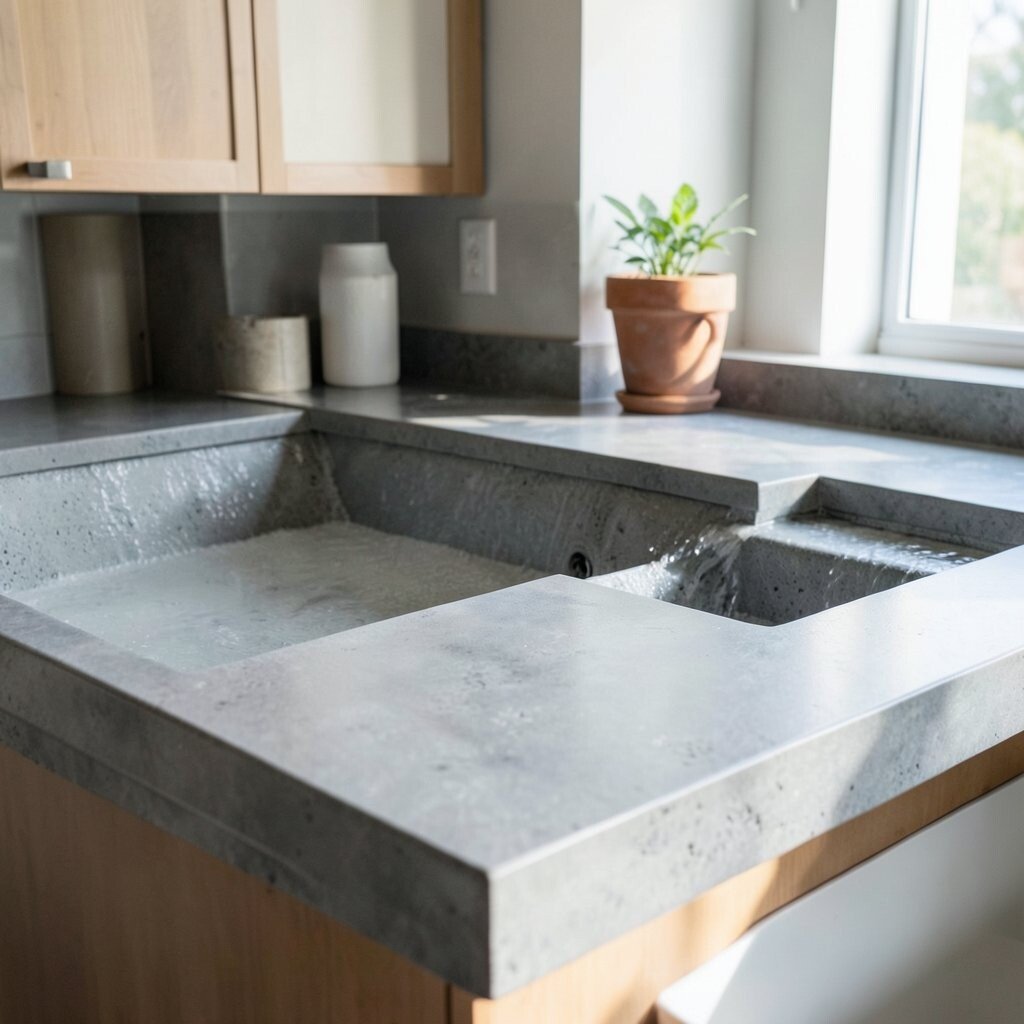
A concrete-style waterfall countertop can look bold while still feeling airy. Choose a light gray with subtle speckling so it brightens rather than darkens your space.
This style stands out because the waterfall edge makes the “industrial” look feel intentional and architectural. To keep it practical, seal concrete-style materials properly and clean with non-abrasive products. If you’re working with a small kitchen, balance the look by using warm lighting and light cabinet colors.
5. Charcoal Stacked Stone Look With Contrast
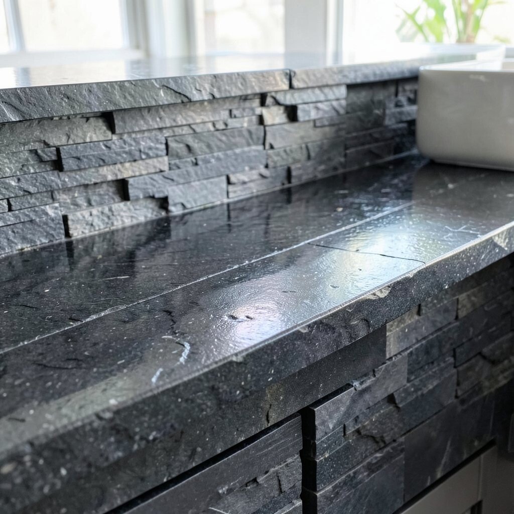
Charcoal waterfall countertops create a striking frame that makes surrounding features look brighter. Even in a dark color, the waterfall shape adds depth and structure.
This idea is unique because it uses contrast to “turn up the brightness” of the room without adding white surfaces. For a stylish approach, keep your backsplash lighter—think creamy tile or glossy white slabs. When it comes to cost, dark stone-look materials can vary a lot, so request several sample options and compare installation requirements for the waterfall edge.
To personalize, add a slightly thicker waterfall lip or a beveled edge so the shadow line looks crisp. Current trends often pair dark countertops with warm metal accents like bronze or champagne-colored pulls.
6. Soft Sage Green for a Calm, Fresh Kitchen
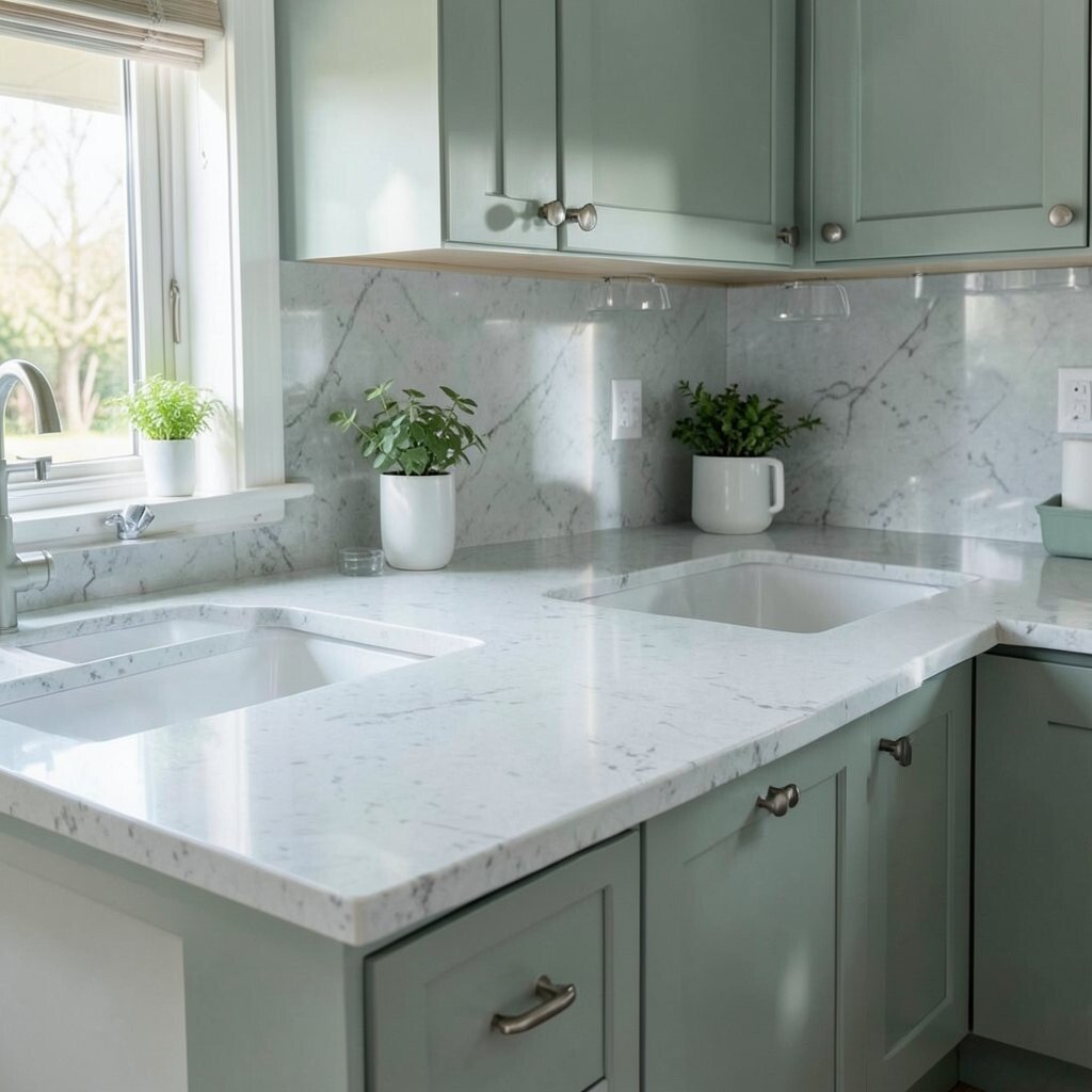
Sage green waterfall countertops feel like a breath of fresh air. The vertical face helps the color read as soothing and spacious instead of heavy.
Green works especially well when you pair it with natural wood, light stone flooring, or white walls. Look for a sealed surface with consistent color so the waterfall part doesn’t show uneven tones after installation. This design stands out because it blends a decorative color with a clean modern silhouette.
If you want practical tips, consider a backsplash with a gentle neutral pattern to reduce visual noise. Cost depends on material, but many engineered options offer a green look at a more predictable price. For trend alignment, soft greens are staying popular because they feel both modern and cozy.
7. Glossy Black Mirror Finish for High-Impact Shine
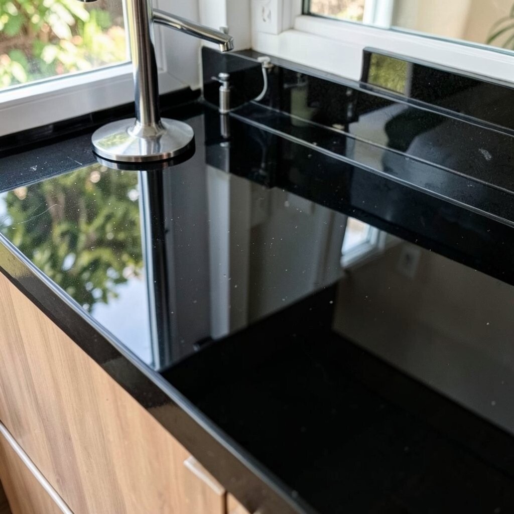
A glossy black waterfall countertop can feel dramatic and sleek. The waterfall edge amplifies the shine by turning light reflections into a continuous stripe.
This look is unique because it’s almost like a vertical mirror that makes lighting feel brighter. To avoid showing smudges too easily, wipe down often and choose a surface meant for high-gloss maintenance. For practical pairing, use warm lighting and light flooring so the room doesn’t feel too dim.
8. Subtle Beige Travertine-Style for Sunlit Texture
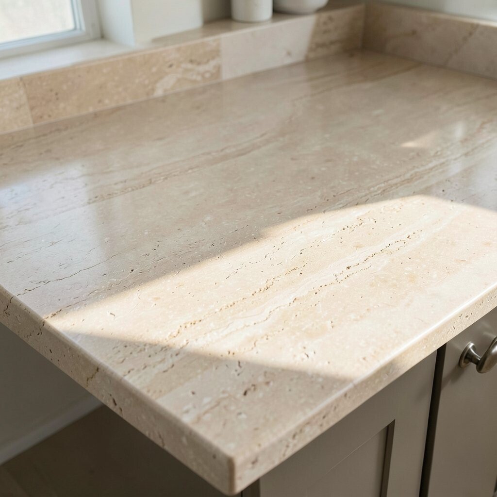
Travertine-style waterfall countertops bring sunlit texture with a gentle, earthy tone. The light beige palette makes spaces feel calmer and visually wider.
The waterfall design makes the texture feel architectural, like a stacked stone feature. For benefits, this look pairs well with both modern and traditional cabinets, so it’s easy to personalize over time. Keep maintenance in mind: choose a finish that balances texture with cleanability.
For a practical tip, match the color of your grout or use a similar tone backsplash so the waterfall doesn’t compete with wall details. Cost considerations vary based on whether you choose a true stone look or engineered travertine-style surfaces, but travertine-inspired materials often offer a middle ground. Current trends show lots of natural-looking textures, and this is one of the easiest ways to achieve that vibe.
9. Light Blue Quartz With a Fresh Coastal Feel
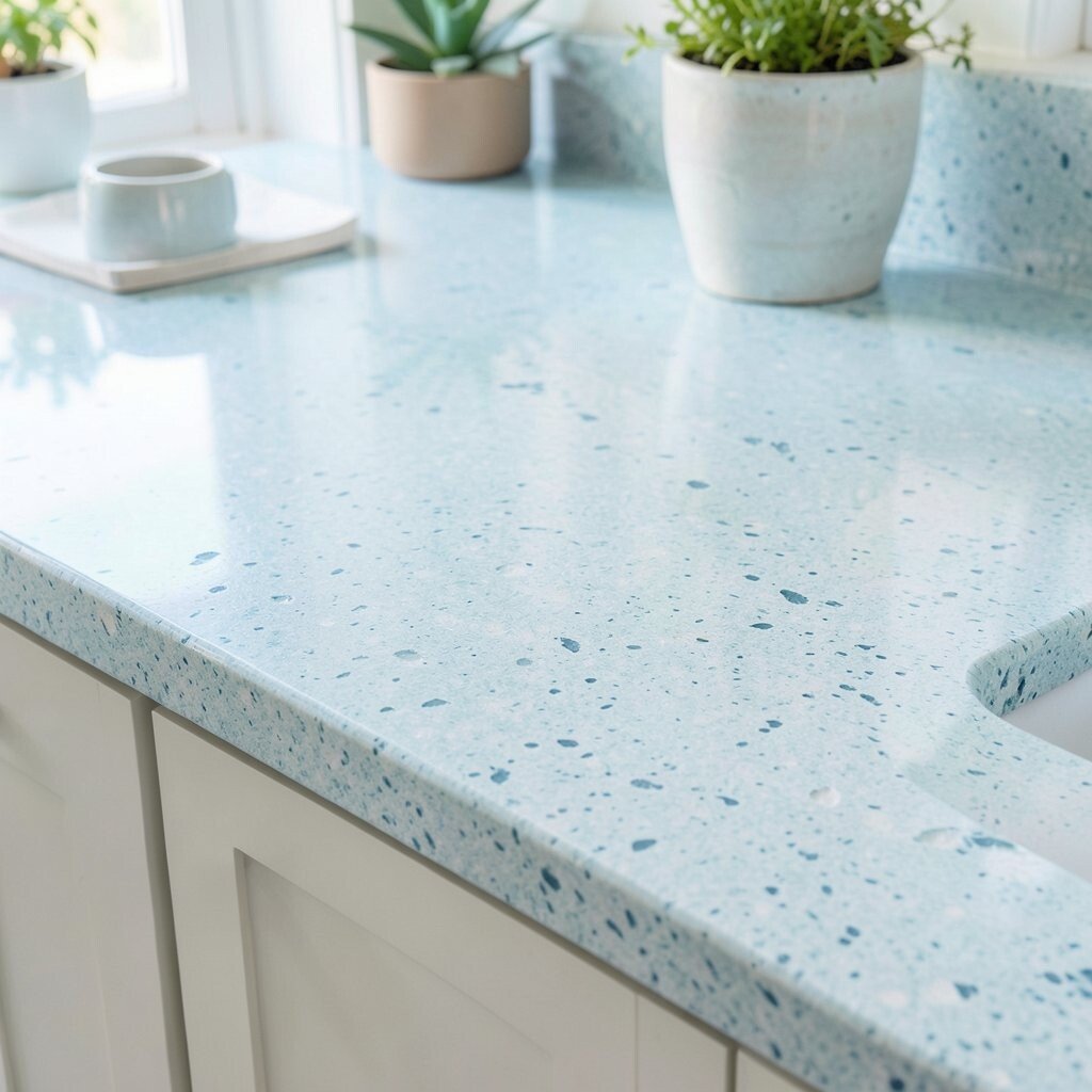
A light blue waterfall countertop can bring an airy, coastal vibe without turning your kitchen into a theme park. Choose a soft, misty blue for the most flattering brightness.
This idea is unique because the color sits on a tall vertical plane, so it feels like part of the room’s “sky.” To keep it practical, use a scratch-resistant quartz or engineered stone and keep cleaners gentle to preserve the finish. Pair with white cabinetry, brushed steel fixtures, and simple hardware so the blue stays the star.
Budget-wise, colored quartz can cost more than plain whites, but samples help you spot the best match for your lighting. If you want personalization, add a waterfall edge with a smooth, rounded profile so the look feels soft and inviting. A current trend is using gentle color in countertops rather than bold paint, and this style fits perfectly.
10. Two-Tone Waterfall: White Top With Dark Vertical Face
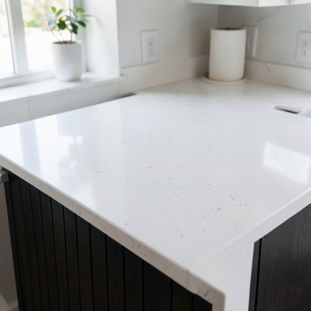
Two-tone waterfall countertops look like custom furniture. Using a white top and a dark vertical face creates an eye-catching contrast that brightens the room by definition.
This design stands out because it turns the waterfall into a visual “frame” around your backsplash area. For practical planning, ensure the countertop thickness and edge profile are coordinated so the junction line stays sharp. Cost can be slightly higher due to more complex layout and careful slab selection, but many people see it as worth it for the custom look.
To personalize, repeat the dark color elsewhere—like cabinet hardware, a faucet finish, or a barstool frame. Trend-wise, bolder contrasts are popular because they look clean on camera and in photos. In daily use, the white top helps hide minor mess, while the dark face can make the whole design feel more grounded.
11. Monochrome Cream for Warm Brightness
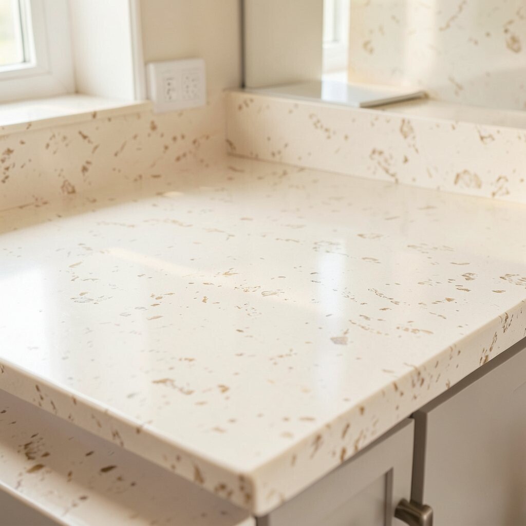
Monochrome cream waterfall counters can make your space feel softly lit all day. The calm tone works well with natural light and makes many color palettes feel cohesive.
This style is unique because it relies on tone rather than dramatic pattern. Benefits include a timeless look and easier matching with cabinets, floors, and backsplash materials. For practical tips, consider a slightly warm undertone cream so it doesn’t read yellow under cool lighting.
12. Clear Quartz With Subtle Sparkle
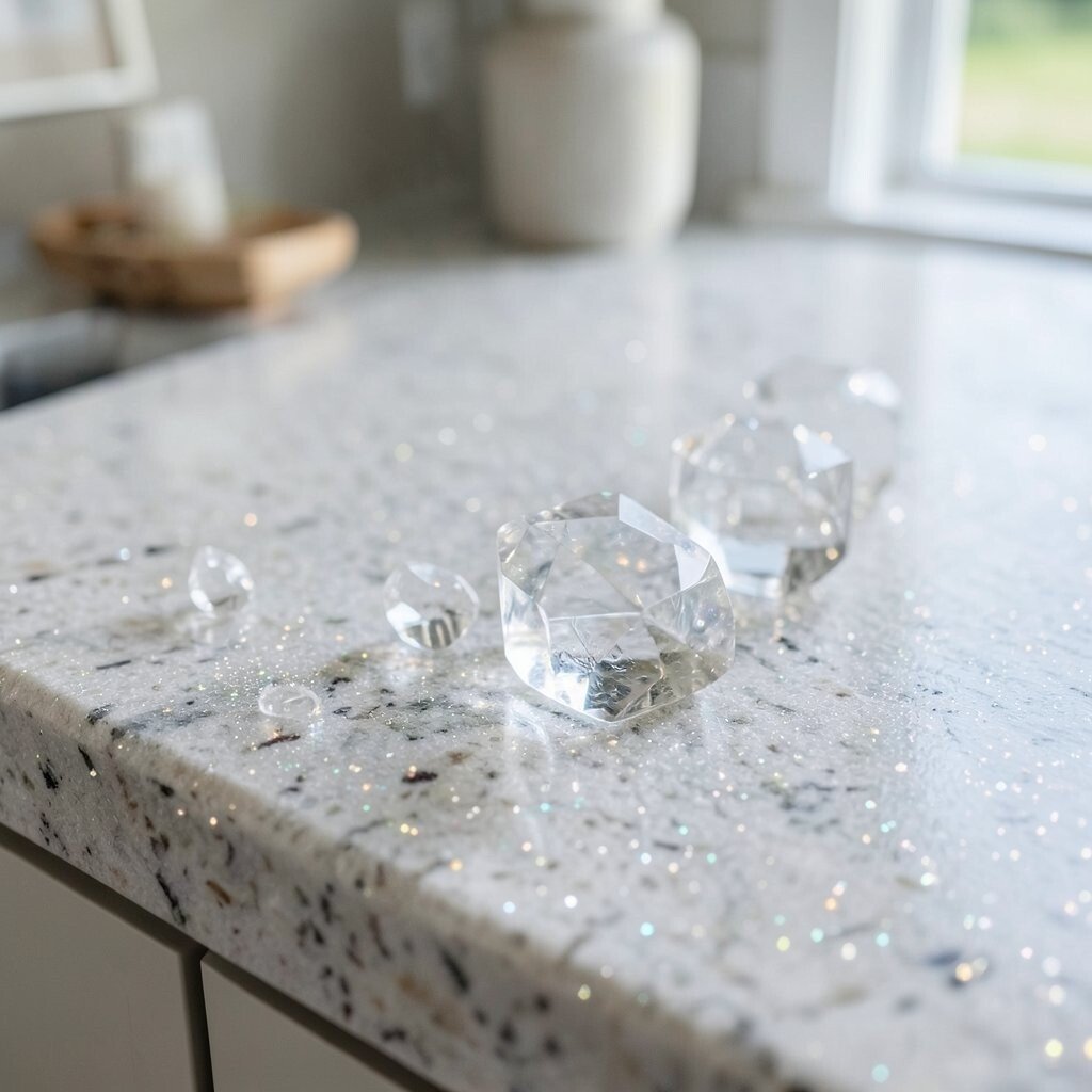
A clear quartz waterfall countertop can create a bright, glassy effect. Even subtle sparkle catches light along the vertical face, making the countertop feel more dimensional.
This idea stands out because the waterfall shape turns tiny flecks into a continuous glow. Choose a variety labeled for consistent sparkle distribution so it doesn’t look patchy. For everyday practicality, keep the surface sealed if recommended and clean with non-abrasive products to preserve clarity.
Cost can run higher than standard solid colors, but you can manage the expense by selecting a slab with the level of shimmer you like rather than the highest-tier option. Personalize by pairing it with simple, neutral backsplash tile so the sparkle remains the focus. Current trends show a move toward “luminous” surfaces, and this is an elegant way to do it.
13. Bold Patterned Tile-Look Waterfall (Top to Bottom)
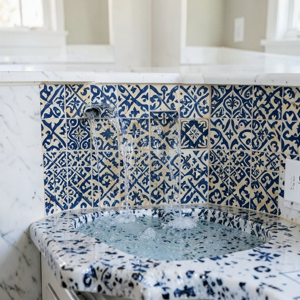
If you love personality, a tile-look waterfall can make your countertop feel like art. Think repeating patterns or soft mosaics that continue from the top down the face for a cohesive statement.
This design is unique because it turns the vertical portion into part of the pattern instead of hiding it. Practical benefits include visual texture that can hide minor wear, but cleaning matters—choose grout lines thoughtfully and use a sealing routine if required. For cost considerations, patterned surfaces can vary widely based on whether it’s engineered stone with a printed look or a more custom tile system.
Personalize by selecting a pattern scale that fits your room size. Smaller kitchens often look best with finer patterns, while larger spaces can handle stronger designs. A current trend is using “micro-murals” and patterned materials in modern ways, and the waterfall edge gives the look extra impact.
14. Soft White Quartz With Warm Underlights
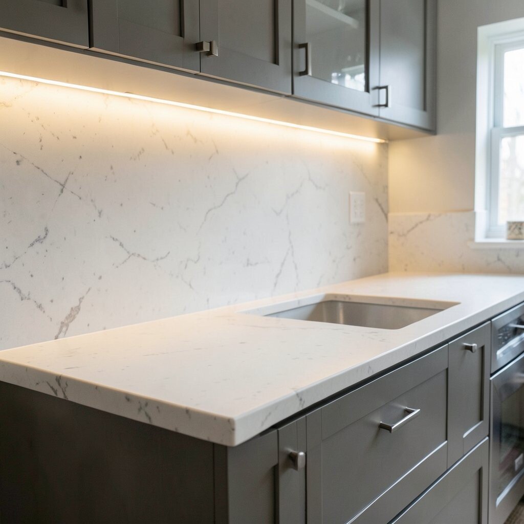
Soft white waterfall countertops paired with warm underlighting can brighten a room without feeling harsh. The combination makes the vertical face look like it’s gently backlit.
This idea is unique because the countertop itself isn’t the only glow source; your lighting design becomes part of the waterfall effect. For practical tips, position lights so they wash across the waterfall face rather than only lighting the top surface. Cost can increase slightly due to electrical planning, but it often saves money because you may not need as many additional decorative light fixtures.
To personalize, match the color temperature to your room—warm white is cozy, while neutral white keeps the stone crisp. Trend-wise, integrated lighting continues to rise because it looks premium and photographs beautifully. If you plan to entertain, this is a great way to create a flattering ambiance for guests.
15. Textured Matte Stone Look for Everyday Calm
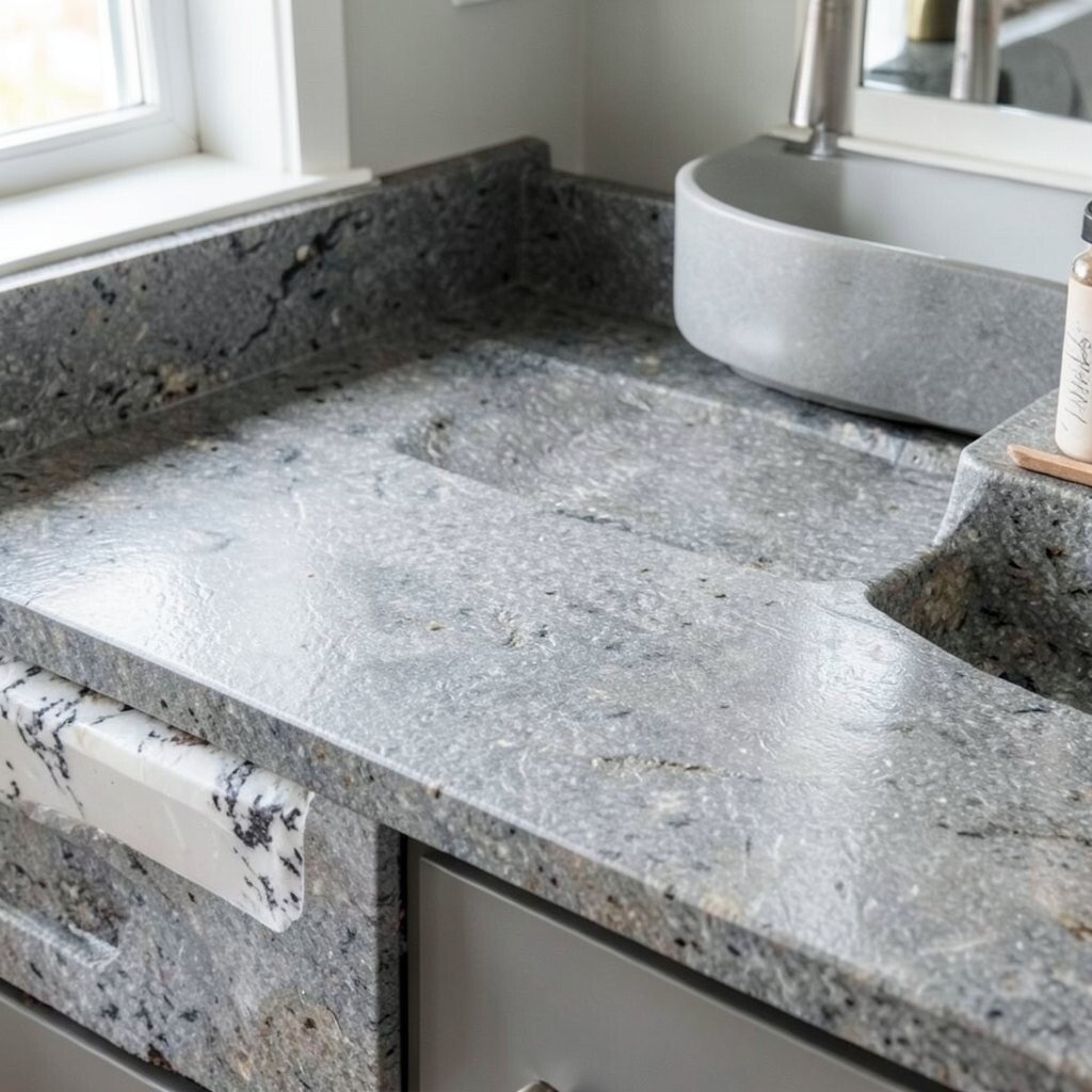
A textured matte stone look waterfall countertop feels modern and calm. Instead of high gloss, the surface catches light softly, which helps the room stay bright without glare.
This style stands out because it’s forgiving day-to-day, showing fewer fingerprints than polished finishes. Benefits include an easy visual match with matte cabinet hardware and textured wall finishes. For practical considerations, choose a finish rated for stain resistance and plan a simple cleaning routine that supports the texture.
Cost depends on the material, but matte stone-look options can be more affordable than premium slabs while still giving a high-end feel. Personalize by coordinating the waterfall edge thickness with your cabinet style so the proportions feel balanced. Current trends emphasize comfort and low-glare spaces, making matte finishes a strong choice.
16. Minimal Solid Surface With Seamless Corners
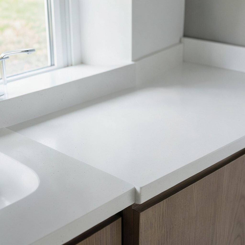
A minimal solid surface waterfall countertop creates a clean, almost seamless look. When the corners are executed precisely, the vertical face feels like one continuous plane.
This idea is unique because the beauty is in the restraint—no busy veining, no complicated pattern, just smooth geometry. For practical tips, ask your installer about seam placement and how the waterfall face transitions at corners so you get a flawless visual flow. Cost can vary depending on thickness, color availability, and fabrication complexity, but this design often avoids expensive slab matching.
To personalize, pick a tone that complements your room’s dominant color: soft white for airy brightness, light gray for modern neutrality, or a pastel for subtle personality. Trend-wise, homeowners keep gravitating toward “quiet luxury” materials that look expensive without needing loud details. If you want the waterfall look to truly brighten your space, pair it with light walls and simple, reflective hardware so the countertop stays visually crisp.