Sunlight on sand has a way of making everything feel possible. A good color mix can bring that airy feeling to your everyday life.
Here are beachy color palettes you can use right away for home decor, outfits, branding, and art. Each one includes a quick visual picture, why it works, what makes it special, and easy tips for making it yours. You’ll also see cost-friendly ideas so you can get the look without overspending.
-
1) Sea Glass Calm (Mint + Soft Blue + Warm Sand)
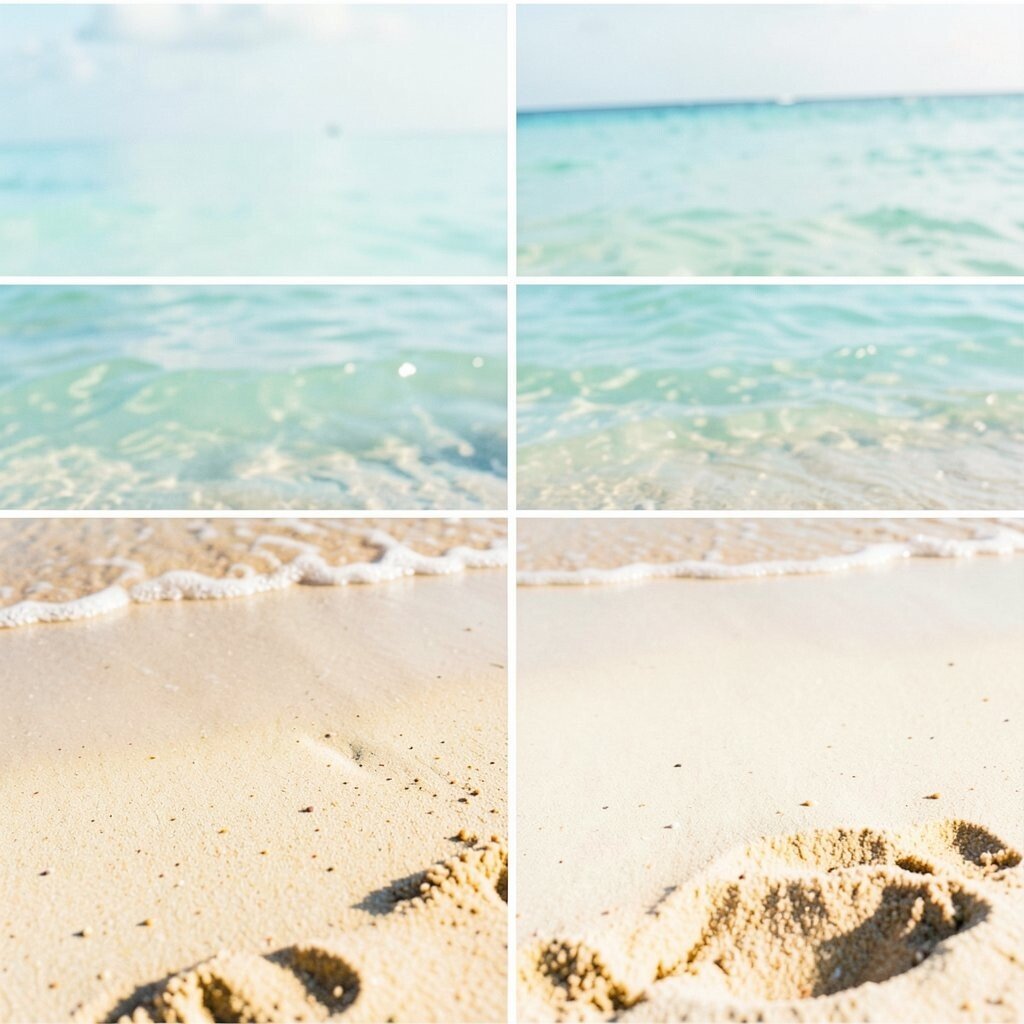
) Sea Glass Calm (Mint + Soft Blue + Warm Sand) Imagine walking past a shoreline and picking up smooth pieces of sea glass. The mint feels fresh, the soft blue feels light, and warm sand keeps it cozy.
This palette is great for bedrooms, bathrooms, and calm workspaces. It makes rooms look cleaner and more open, especially in small spaces. For a unique touch, add one muted coral or tiny gold dots to mimic sunset warmth.
Try it by painting just one wall in the soft blue and using mint accents in towels or plant pots. If you’re styling a shelf, mix woven baskets with ceramic pieces to keep the texture natural. For personalization, match the sand tone to the color of your favorite rug or blanket so everything feels connected.
For cost, start with affordable swaps: curtains, throw pillows, and wall art printouts. Paint can be a bigger upgrade, but it’s still cheaper than replacing furniture. A trend you’ll notice is “soft coastal” interiors, where colors look gentle instead of loud.
-
2) Sunbleached Linen (Ivory + Pale Dune + Light Coral)
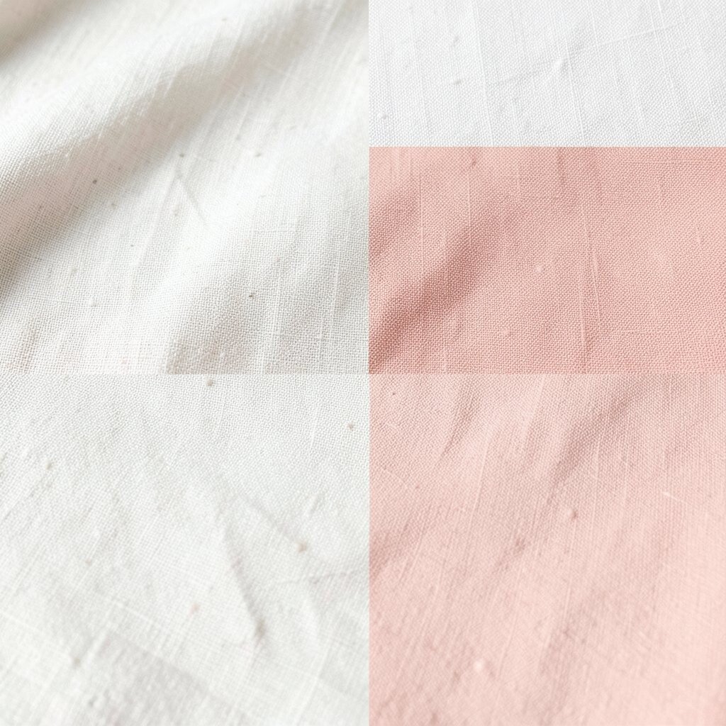
) Sunbleached Linen (Ivory + Pale Dune + Light Coral) Think of fabric left in the sun for a few hours, then brought back inside. Ivory and pale dune feel like a blank canvas, while light coral brings a warm glow.
This palette works like a friendly reset for kitchens, reading corners, and entryways. It helps colors feel balanced, so your decor won’t look too busy. The uniqueness is in the “sun-warmed” look, which feels relaxed but still neat.
Use it by choosing ivory for larger items like walls or bedding, then add light coral through accents like candles, vases, or a single chair cushion. For tips, keep the coral tone small and intentional so it pops in the right places. Personalize it by repeating the coral in two or three spots, such as a throw pillow and one piece of wall art.
If you’re watching your budget, look for off-white and beige tones at thrift stores and discount home shops. A simple trick is to reuse plain frames and switch only the mats and prints. Current trends lean toward airy neutrals with a single warm accent, and this palette fits right in.
When you pair it with natural materials like wood and rattan, the whole space looks sunlit even on cloudy days. That’s why this is such an easy “everyday beach” option.
-
3) Ocean Depth Teal (Deep Teal + Seafoam + Driftwood Gray)
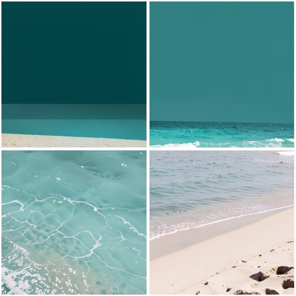
) Ocean Depth Teal (Deep Teal + Seafoam + Driftwood Gray) Picture the ocean getting darker farther out, yet still sparkling near the edges. Deep teal feels bold, seafoam keeps it playful, and driftwood gray adds a grounded touch.
This palette is perfect for living rooms and creative studios where you want energy. It also looks amazing in media areas because the gray helps everything feel organized. What makes it stand out is the mix of deep and airy tones, which creates an elegant coast vibe.
Try a “two-tone” approach: deep teal for bigger surfaces like a feature wall or large art canvas, and seafoam for smaller items like coasters or a light rug. For personalization, bring in a natural wood tone so the gray looks like real driftwood, not just paint. Add plants in ceramic pots to make the teal feel even more ocean-like.
If you’re cost-conscious, start with paint samples and test on your wall in daylight. Then shop for cheaper accent items like throw blankets, tableware, and shower curtains. A current trend is “moody coastal,” and this palette is that trend in a stylish, wearable way.
You can also use the palette in clothing by pairing a deep teal top with seafoam accessories. It’s a beachy look that still feels grown-up.
-
4) Coastal Sunset Peach (Coral Peach + Buttery Cream + Soft Navy)
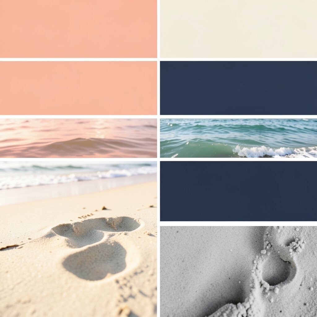
) Coastal Sunset Peach (Coral Peach + Buttery Cream + Soft Navy) Imagine a sunset that turns the sky into peachy stripes over the water. Coral peach looks lively, buttery cream feels smooth and welcoming, and soft navy keeps the palette from getting too sweet.
This combo is great for dining rooms, entryways, and statement outfits. It adds warmth without looking messy, and navy acts like a strong anchor. For uniqueness, use navy in small details like trim, picture frames, or a feature pillow.
To make it work, keep cream as your main background and let coral peach show up in two or three focal areas. For tips, try a peach rug runner or coral throw on a cream sofa. Personalize it by picking a coral shade that matches your favorite beach memory—some people love brighter coral, while others like softer peach.
Cost-wise, navy can be easy to find in fabrics, paint, and household goods. If you want the look fast, start with navy accents and swap in peach through accessories. This palette also matches a popular current trend: warm color pops paired with calm neutrals.
-
5) Sea Salt White + Shell Beige (Clean White + Oyster Beige + Warm Taupe)
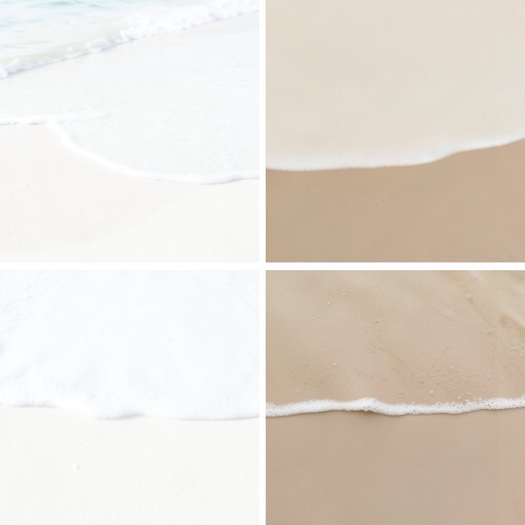
) Sea Salt White + Shell Beige (Clean White + Oyster Beige + Warm Taupe) This one is like rinsing the day away with fresh air. Clean white feels crisp, oyster beige looks soft like shells, and warm taupe adds a gentle, earthy balance.
Use it for minimalist beach vibes in bathrooms, bedrooms, and small apartments. It helps surfaces feel airy and bright, which is a big benefit when you want a simple home. The uniqueness is in how the neutrals still feel “coastal” because they echo sand and shells.
Try it by choosing white for walls or bedding and adding beige and taupe through textures like linen, woven baskets, and stone-like decor. For personalization, look at your current wood color and match the taupe to it so the room feels natural. If you like patterns, choose subtle shell outlines or tiny stripes in beige tones.
For cost considerations, this palette is friendly because it works with many budget-friendly neutrals. You can refresh the look with new curtains or a different set of towels instead of buying new furniture. A trend right now is “quiet coastal,” and this is exactly that.
-
6) Tropical Lagoon (Bright Aqua + Lime Leaf + Coconut Cream)
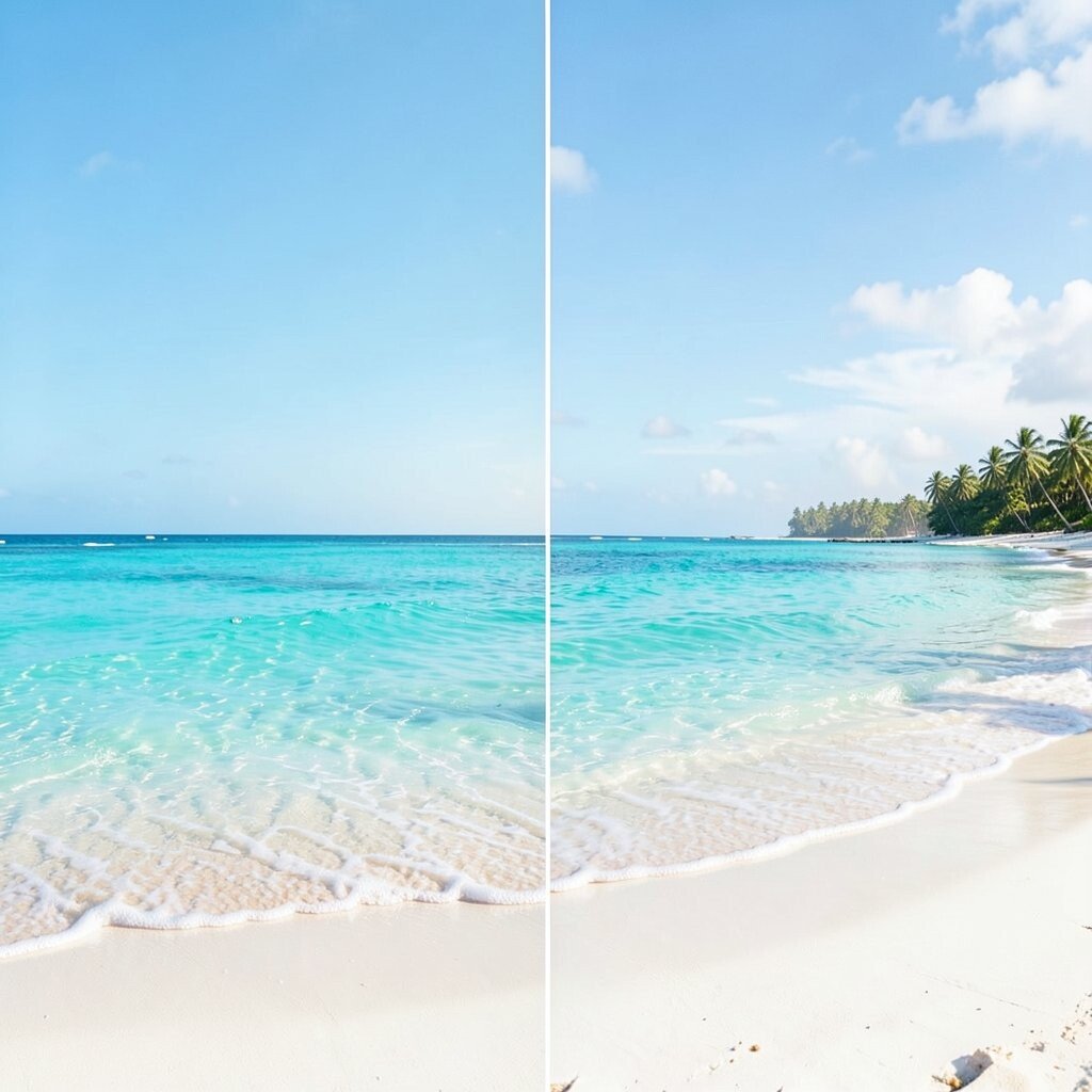
) Tropical Lagoon (Bright Aqua + Lime Leaf + Coconut Cream) Picture a lagoon where the water looks neon-blue but still gentle. Bright aqua brings the party, lime leaf adds playful energy, and coconut cream softens everything like a cool breeze.
This palette is fun for kitchens, kids’ spaces, and lively offices. It gives your room a cheerful mood and can even make boring corners feel exciting. The unique twist is the creamy coconut tone, which helps the brighter colors stay friendly instead of overwhelming.
Try it with bright aqua on smaller surfaces like a cabinet door, a backsplash tile, or a wall decal. Then add lime leaf through plants, art prints, or patterned pillows. For personalization, choose a lime shade that matches your favorite leaf plant so it feels natural and not too neon.
If you want to stay within budget, use removable wallpaper or peel-and-stick tiles for the aqua look. You can also find affordable aqua-labeled decor items like trays and planters. Current trends are leaning more colorful in “tropical modern” styling, and this palette fits that vibe.
To keep it balanced, limit bright lime leaf to one or two main areas so it stays like a highlight, not a constant shout.
-
7) Dune Night (Deep Sand + Fog Gray + Ocean Blue Accent)
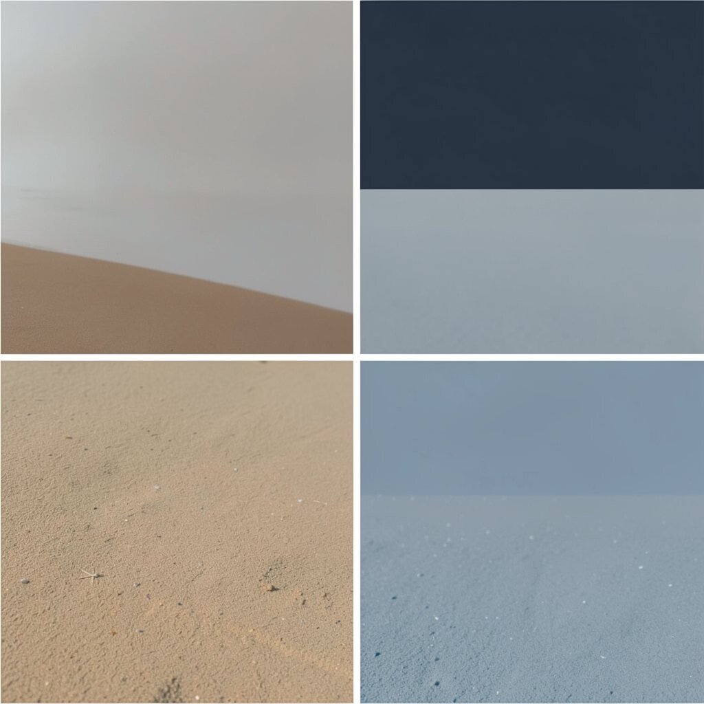
) Dune Night (Deep Sand + Fog Gray + Ocean Blue Accent) Think of late evening on the shore when the sand looks darker and the air feels cool. Deep sand looks earthy, fog gray looks soft and calm, and ocean blue adds a tiny shimmer-like accent.
This palette is ideal for cozy bedrooms and lounges where you want calm but still beach connection. It’s also great for styling because the gray helps everything look tidy. What makes it unique is the “night shore” mood—serene, not sleepy.
Start with fog gray for walls or large decor, then use deep sand in bedding, curtains, or rugs. Add the ocean blue as a small highlight, like a throw blanket edge or artwork detail. For personalization, choose a blue shade that matches the ocean color you’d want to see at dusk.
For cost considerations, neutrals like sand and fog gray are often widely available and easy to match. You can build the look gradually by swapping textiles first, then adding paint only if you want a bigger change. A trend you’ll see is “earthy coastal,” which mixes beach tones with muted night colors.
This palette also photographs beautifully, which is handy if you like social media styling or photo backdrops.
-
8) Seashell Rose (Soft Blush + Shell Pink + Oyster Cream)
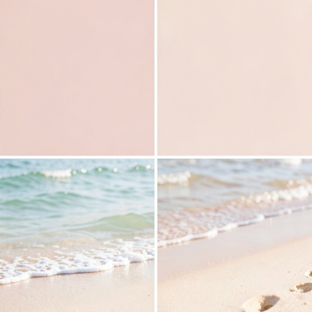
) Seashell Rose (Soft Blush + Shell Pink + Oyster Cream) This palette feels like seashells warmed by gentle sunlight. Soft blush is airy and friendly, shell pink brings a little romance, and oyster cream keeps the look fresh.
It’s a sweet option for nurseries, dressing rooms, and cozy corners where you want softness. The benefits are that it looks comforting and it makes skin tones look great in photos. It’s unique because the cream base keeps the pink from feeling too loud.
Try it by painting a wall in oyster cream and using blush and pink in small decor items. Add rose-colored candles, a blush vase, or a pink patterned pillow for quick impact. Personalize it by mixing in one “in-between” color, like taupe or light gray, to match your existing furniture.
To manage cost, start with fabrics—pillow covers and throw blankets are often the easiest upgrade. You can also find many blush and cream tones in budget-friendly paint lines and basic home goods. A current trend is soft feminine color schemes that still feel natural, and this fits perfectly.
-
9) Harbor Green (Sage Green + Weathered Wood Brown + Sky Gray)
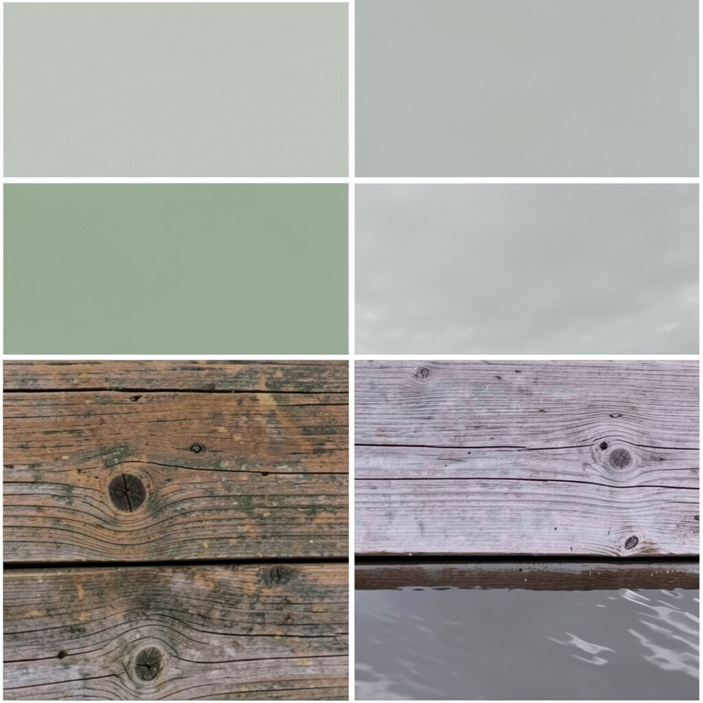
) Harbor Green (Sage Green + Weathered Wood Brown + Sky Gray) Imagine a small harbor where boats sit near weathered docks. Sage green feels calm, weathered wood brown adds history, and sky gray brings an easy, clean background.
This palette works well for home offices, kitchens, and any space that needs a practical vibe. It benefits from the calm green that doesn’t fight with other colors, even when you mix in decor. The uniqueness is the “worked wood” feeling, which makes the color story feel real and lived-in.
To use it, choose sky gray for the walls or larger textiles, then add sage green through storage bins, curtain panels, or chairs. Add weathered wood brown in accessories like a wood tray, a frame, or a woven basket. For personalization, match the wood tone to your actual flooring or the color of your favorite table.
Cost-wise, you can bring this look in without major spending by leaning on wood textures and sage-green accents you may already own. Thrifted frames and gently used furniture can become part of the palette with a simple refresh like a new stain or paint touch-up. A current trend is “heritage coastal,” which values natural materials and calm greens over bright colors.
If you want a modern twist, pair the harbor greens with sleek black metal hardware in small amounts.
-
10) Sea Breeze Blue (Soft Powder Blue + White + Light Sand)
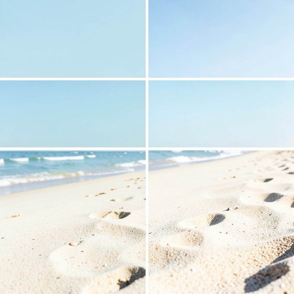
) Sea Breeze Blue (Soft Powder Blue + White + Light Sand) Picture a windy beach day where the air feels cool and crisp. Soft powder blue gives the breezy feeling, white keeps things clean, and light sand adds gentle warmth.
This palette is a great pick for bedrooms, bathrooms, and laundry areas because it feels fresh and simple. It also makes small rooms look larger, which is a big benefit. The uniqueness comes from the soft “powder” shade that looks light but not washed out.
Try it with powder blue for trim, doors, or one accent wall, and keep the rest mostly white. Add light sand via rugs, baskets, or the color of your bath mats. For personalization, match the sand tone to the undertone of your wood furniture—some woods lean yellow, and some lean neutral.
For cost considerations, paint samples are a smart first step because powder blue can look different in different lighting. After that, you can refresh cheaply with towels, shower curtains, and wall art. A trend that’s popular is “bright-and-soft” spaces where the colors feel calm but not boring.
-
11) Kelp & Stone (Moss Green + Charcoal Gray + Off-White)
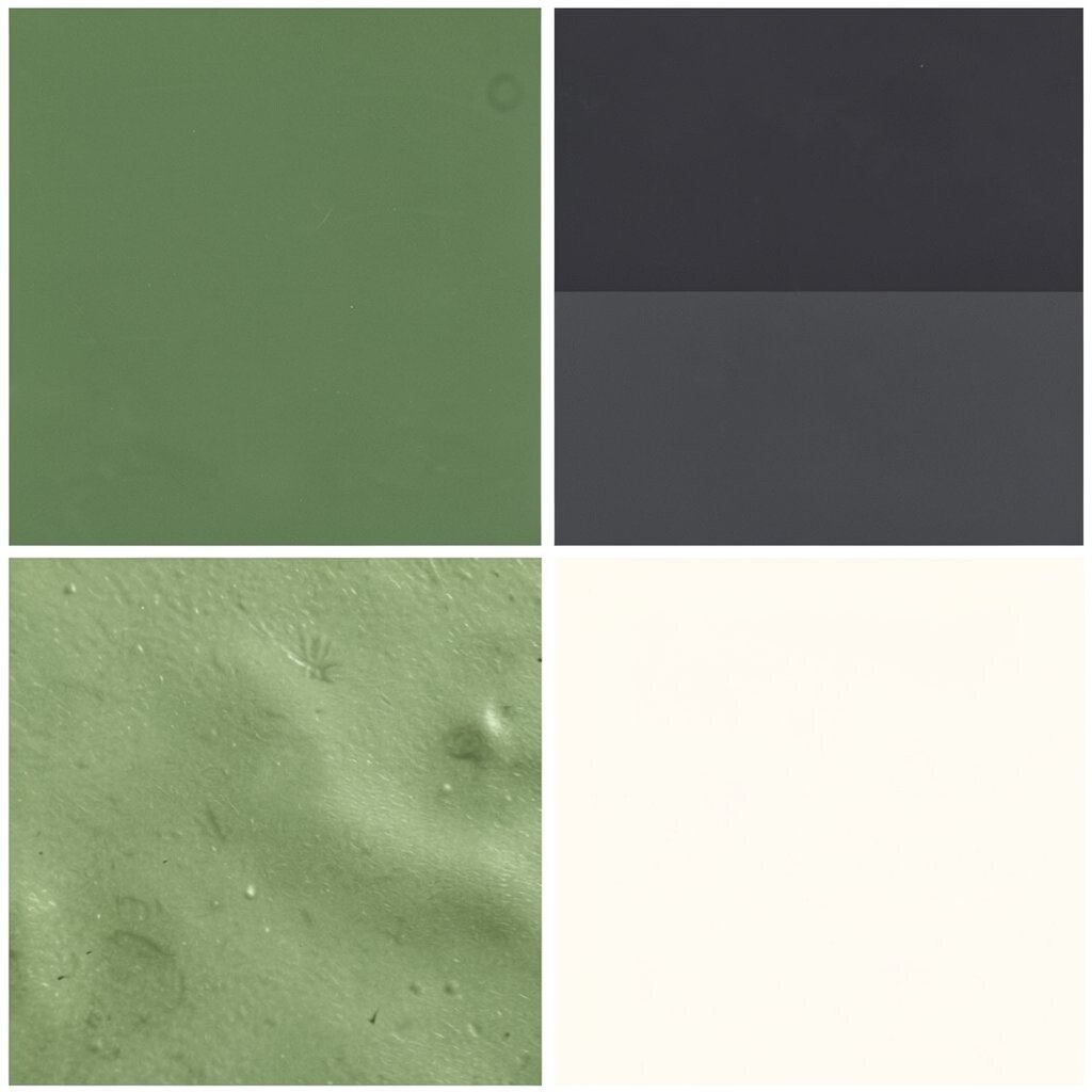
) Kelp & Stone (Moss Green + Charcoal Gray + Off-White) Imagine tide pools where green kelp clings to stones. Moss green feels organic, charcoal gray adds depth, and off-white keeps the whole look bright enough to breathe.
This palette gives a more artistic vibe, which is great for galleries, creative studios, and bold living rooms. The benefit is that charcoal helps hide stains and marks compared to bright whites. It’s unique because it blends beach nature colors with a more modern, urban edge.
Use off-white for the main wall or large textiles, then add moss green through larger decor like curtains or a sofa throw. Bring charcoal in through frames, vases, or hardware. For personalization, choose a moss tone that’s either more yellow-green or more blue-green based on the mood you want.
If you want to keep costs low, consider washable paint and durable fabrics, especially if you have kids or pets. Shopping for charcoal accessories is often easier than finding exact “sea” greens. A current trend is natural contrast palettes, and this one delivers that look with confidence.
-
12) Marigold Beach Walk (Warm Gold + Chalk White + Soft Aqua)
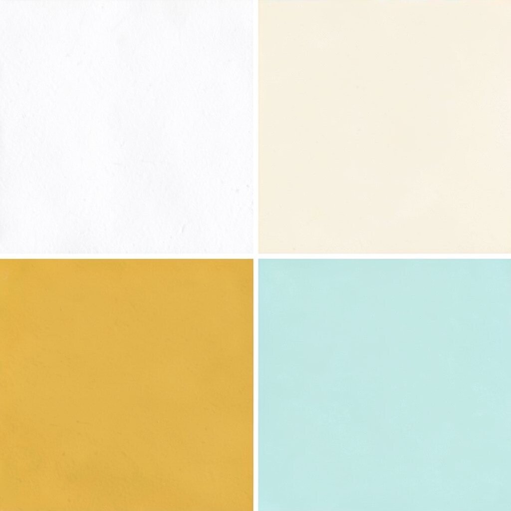
) Marigold Beach Walk (Warm Gold + Chalk White + Soft Aqua) Think of late-afternoon sunlight hitting sand, almost like the whole beach is glowing. Warm gold feels joyful, chalk white feels smooth and airy, and soft aqua adds the water link.
This palette is wonderful for kitchens, dining spaces, and bright entryways where you want happy energy. The benefit is that gold can make everything look warmer without adding clutter. It’s unique because gold is often used in beach decor sparingly, but here it becomes a main character.
Try it with chalk white as the background and use warm gold through picture frames, light fixtures, or bar cart accents. Add soft aqua as a small contrast in ceramics, towels, or a single statement artwork. For personalization, decide how “sunny” you want the room—use more gold for high energy, or keep it minimal for a calmer feel.
Cost considerations are friendly because small gold accessories can be affordable, especially if you choose painted finishes. You can also use gold spray paint on thrift finds to match the tone. A trend you’ll notice is “sunlit neutrals,” and this palette fits the vibe without needing a full makeover.
If you’re styling an outfit, pair a soft aqua top with warm gold jewelry for a beachy yet polished look.
-
13) Coastal Monochrome Sand (Sand Taupe + Pale Beige + Warm Off-White)
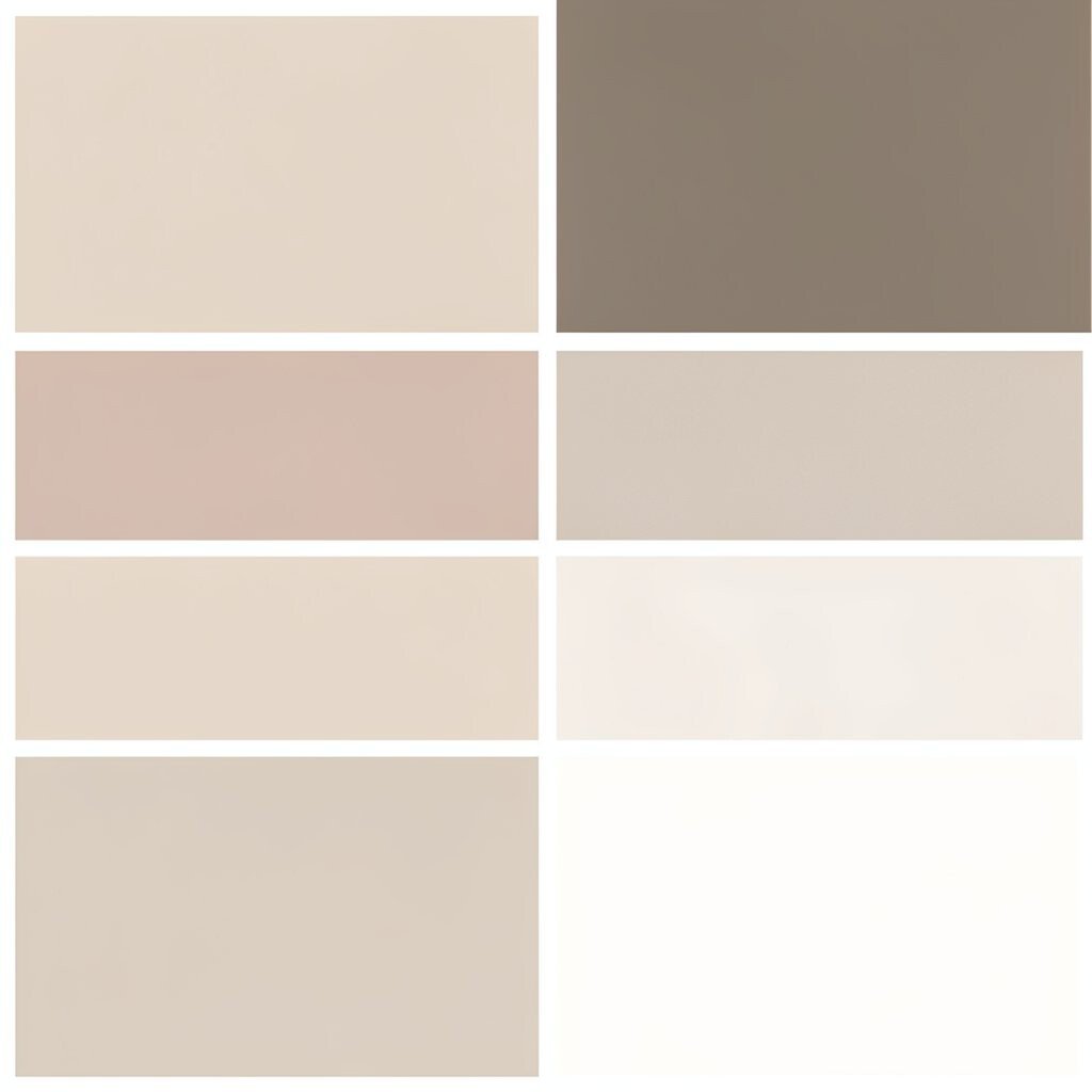
) Coastal Monochrome Sand (Sand Taupe + Pale Beige + Warm Off-White) This palette is calm on purpose, like a beach blanket laid down for a long rest. Sand taupe is the main base, pale beige adds softness, and warm off-white keeps everything light.
It’s excellent for people who love beach vibes but want a quieter style. The benefits are that it’s easy to mix with almost any furniture color and it never feels too loud. The uniqueness is how “monochrome” still looks interesting because textures do the work.
Try it by using different materials—linen, cotton, woven jute, and ceramic—to create depth. For tips, pick one slightly deeper taupe for contrast, like a rug or a larger cushion. Personalize it by adding a subtle pattern, such as thin stripes in beige tones, so it feels woven into your daily life.
Cost-wise, this palette is great because you can shop from many neutral categories without hunting for exact matches. Buying a few texture upgrades can feel like a full redesign. A current trend is texture-forward decor, and monochrome sand is a top way to follow that trend.
-
14) Waves in Pink (Coral Red + Dusty Rose + Seafoam)
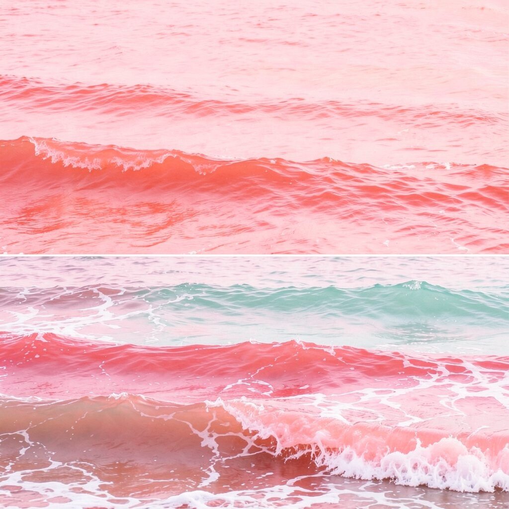
) Waves in Pink (Coral Red + Dusty Rose + Seafoam) Imagine waves made visible through color—like the ocean is painting the shore. Coral red feels bold and playful, dusty rose softens the mood, and seafoam makes it feel fresh and light.
This palette shines in bedrooms, wardrobes, and creative projects like posters or branding. The benefit is that you get a beachy punch without needing blue for the theme to feel ocean-like. It’s unique because coral red adds a “warm wave” energy that looks modern.
Use seafoam as the light background, then bring in dusty rose through linens or wall art. Add coral red in small but powerful places, like a single chair, a set of kitchen jars, or a statement accessory. For personalization, choose a coral shade that flatters your skin tone if this palette is for clothing.
For cost considerations, start with affordable upgrades like stationery, phone cases, or a bright set of throw pillows. If you want to paint, test first because coral can shift depending on lighting. A current trend is bold color accents paired with soft neutrals, and this palette nails that mix.
To keep it balanced, keep the seafoam airy and let coral be the “wave crest” you notice first.
-
15) Driftwood Ivory (Weathered Ivory + Cocoa Brown + Misty Blue)
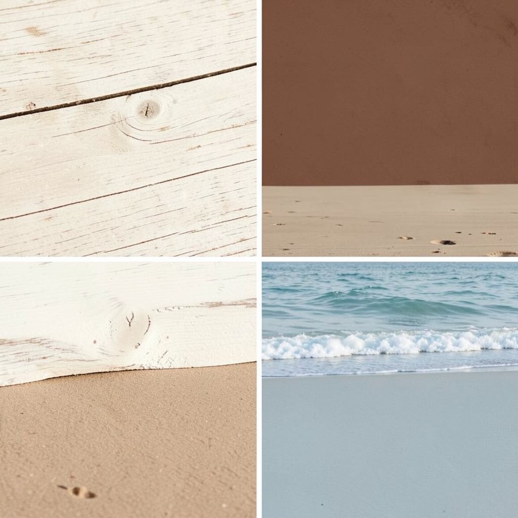
) Driftwood Ivory (Weathered Ivory + Cocoa Brown + Misty Blue) Picture driftwood on the shore, faded but full of character. Weathered ivory feels gentle and aged, cocoa brown adds depth like old wood, and misty blue brings the ocean feeling back in.
This palette is wonderful for living rooms and cozy reading corners. The benefit is that it looks stylish even with minimal decor because the tones are naturally interesting. It’s unique because the ivory is not plain white—it has that aged beach character.
Try using cocoa brown in heavier pieces like a lamp base or a coffee table tray, then add misty blue through artwork or smaller accents. Keep weathered ivory on walls or larger textile items. For personalization, match the cocoa brown tone to your existing wood and choose misty blue based on whether you prefer gray-blue or green-blue.
Cost-wise, this palette can be budget-friendly because it works well with existing furniture colors. If you need to buy new items, look for warm beige and brown tones first, then add misty blue with cheaper accessories like frames, candle holders, or paintable wood signs. A current trend is “coastal vintage,” and driftwood ivory is one of the easiest ways to capture it.
-
16) Bright Shore Lime Splash (Bright Lemon + Whitewashed Gray + Sky Blue)
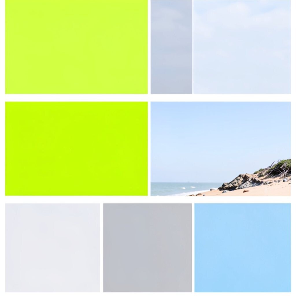
) Bright Shore Lime Splash (Bright Lemon + Whitewashed Gray + Sky Blue) Think of a beach day when you spot a neon-colored towel and it makes you smile. Bright lemon brings the splash, whitewashed gray adds a calm base, and sky blue keeps it clearly coastal.
This palette is great for fun spaces like playrooms, creative corners, and event styling. The benefit is that the colors feel cheerful and easy to notice, so your space can feel lively even with simple decor. It’s unique because it mixes bright citrus with breezy grays instead of only soft pastels.
Use whitewashed gray as your main color, then add sky blue through bigger pieces like curtains, bedding, or a large wall print. Bring in bright lemon with small decor items such as planters, vases, or a single wall shelf accent. For personalization, keep one item in lemon as a “signature piece,” like a candle or a decorative bowl, so it feels intentional.
For cost considerations, bright lemon tones are often easiest to find in accessories rather than full furniture. You can also buy a single paint color and focus it on one feature, like a chair or a small cabinet. A trend right now is “happy pop color” styling, and this palette is a great way to jump on it without going all-out.