
Warm kitchens feel like a gentle hug from the first glance. The right tone can make everyday cooking feel a little more special.
-
1) Butterscotch Cream
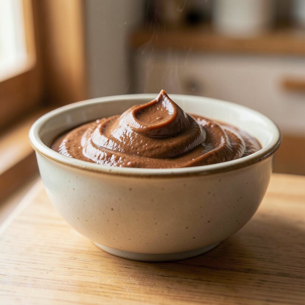
) Butterscotch Cream Butterscotch cream looks like sunlight caught in paint. It brings soft golden warmth to cabinets, walls, or upper shelving.
This tone helps the room feel brighter without turning harsh. It can make a small kitchen look wider and calmer.
To personalize it, pair it with warm wood floors and brass drawer pulls. For cost control, start with one feature wall or repaint only cabinets that get the most attention. -
2) Terracotta Clay
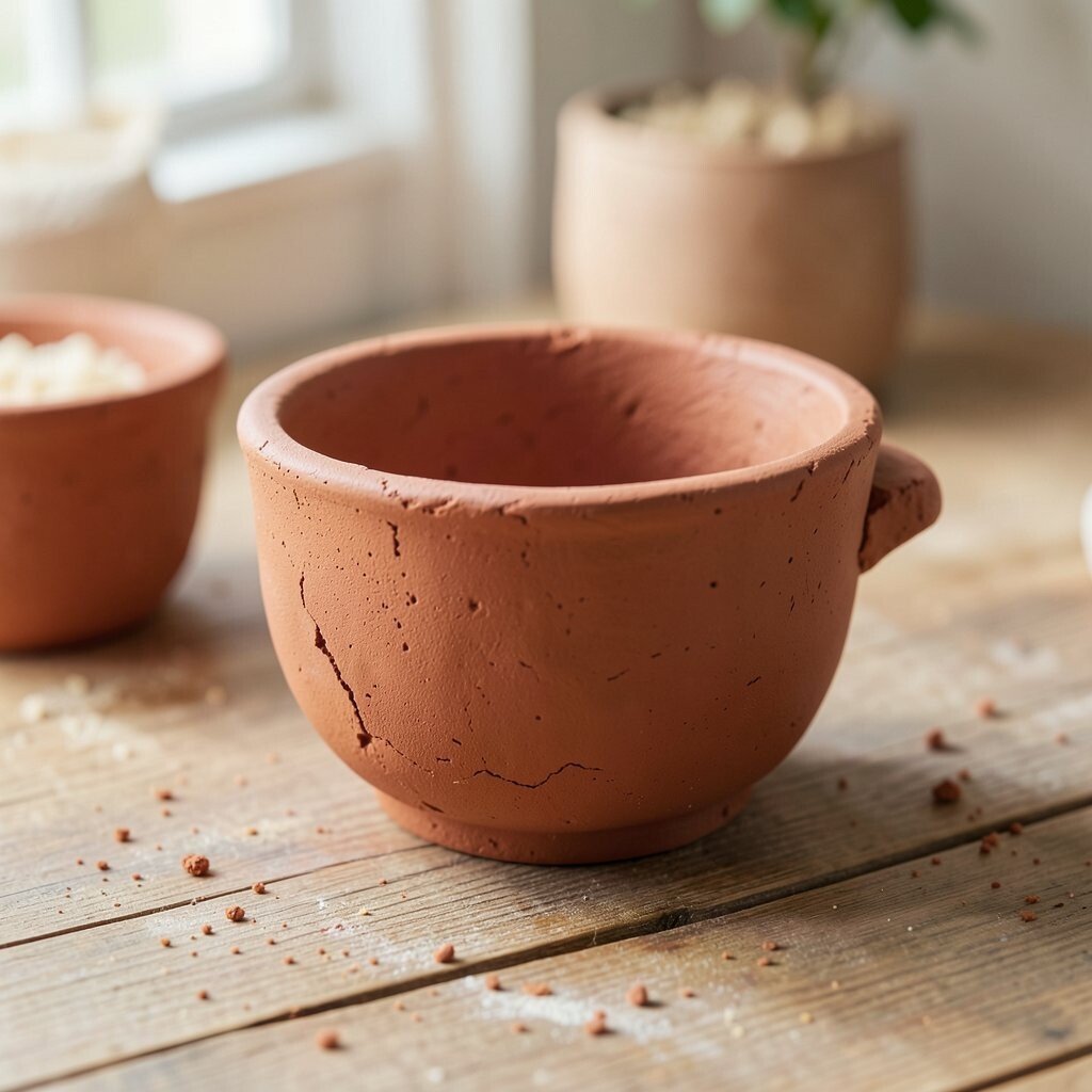
) Terracotta Clay Terracotta clay adds a cozy, earthy glow that feels grounded and friendly. Think of sun-baked pots, warm tile, and comfort food simmering.
You’ll notice how it warms up plain corners and makes the kitchen feel lived-in. It also pairs beautifully with natural textures like linen, rattan, and handmade ceramics.
Try using terracotta on a backsplash, lower cabinets, or a set of open shelves. For a trendier look, mix it with matte black hardware and warm white walls. If you’re on a budget, choose a peel-and-stick tile panel for a small area first, then expand if you love the effect.
-
3) Cinnamon Spice
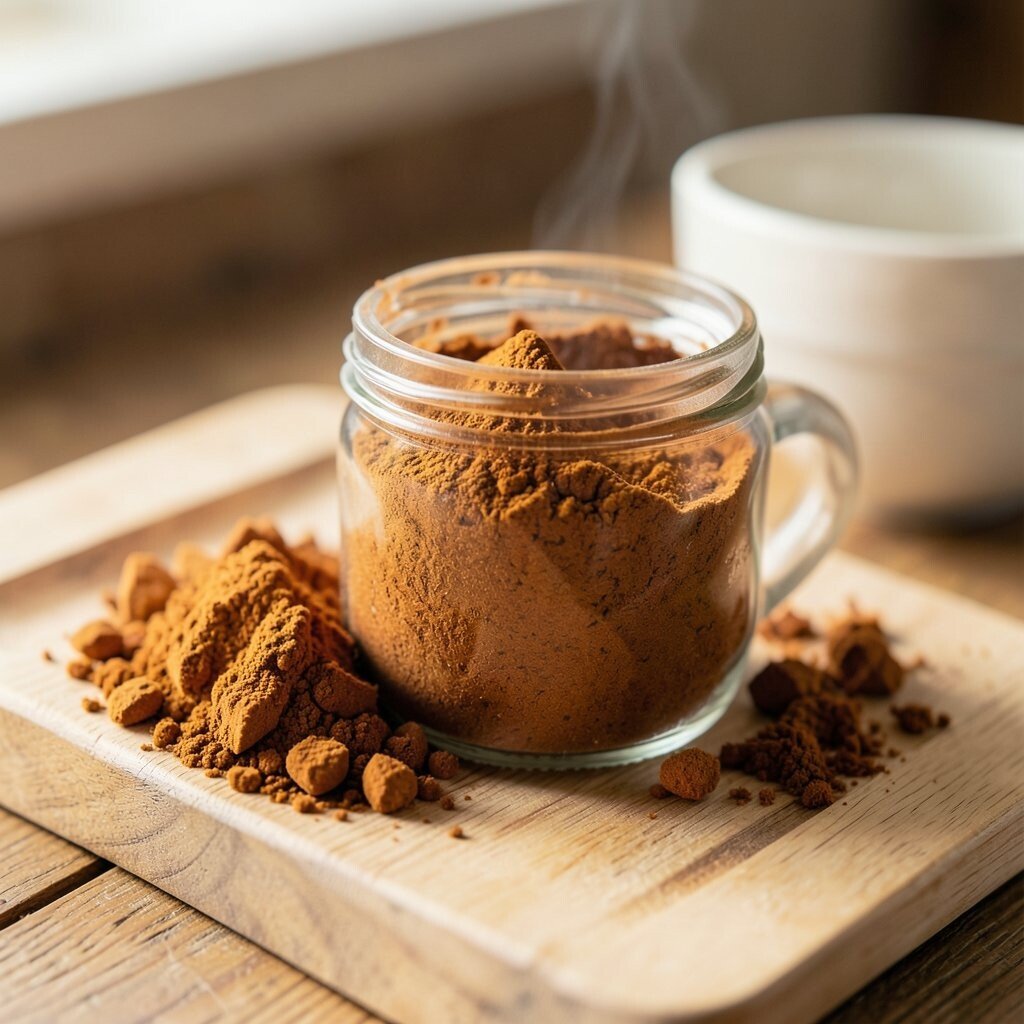
) Cinnamon Spice Cinnamon spice is a deeper warm brown that feels like a warm mug in winter. It creates a welcoming frame around countertops and cooking stations.
This tone makes it easier to layer decor, since it sits nicely between beige and caramel. It can also hide everyday scuffs better than very light colors.
Personalize by painting the island cinnamon spice and keeping the rest in creamy white. Add wooden cutting boards and copper-toned canisters for extra warmth. If cost matters, focus on the island and swap lighting for softer bulbs to boost the color’s glow.
A current style favorite is “warm neutrals with depth,” and cinnamon gives you that depth fast. Choose satin or eggshell paint for a smooth, cozy look that’s easy to wipe.
-
4) Honey Amber
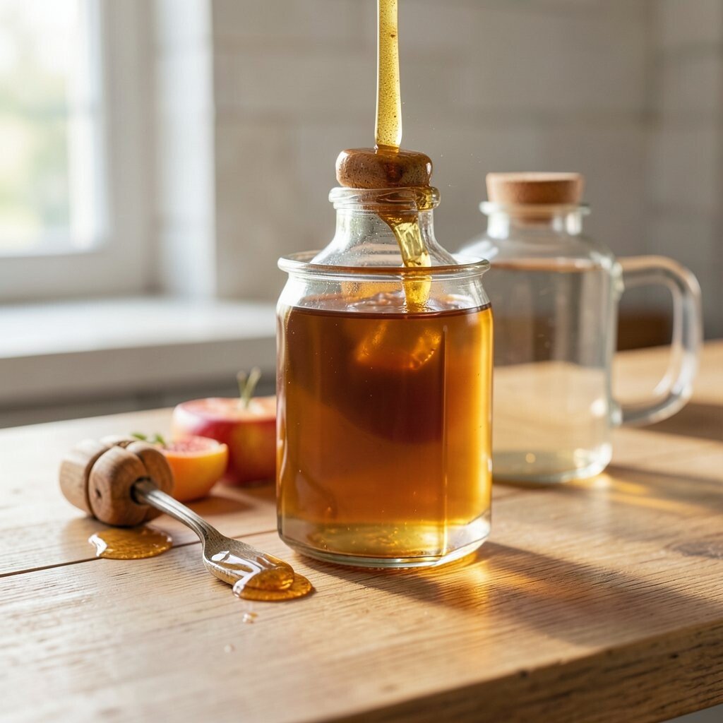
) Honey Amber Honey amber looks like golden syrup—warm, inviting, and slightly rich. It can be stunning on wood cabinets or as a painted accent with a glossy finish.
The benefit is a cheerful mood, especially in kitchens that face north or get less daylight. It also makes metal details look more golden and less cool.
If you want it without a big commitment, paint just the inside of a few upper cabinets or stain only cabinet doors. Add sheer curtains in warm white to keep the room airy and bright. -
5) Toasted Oat
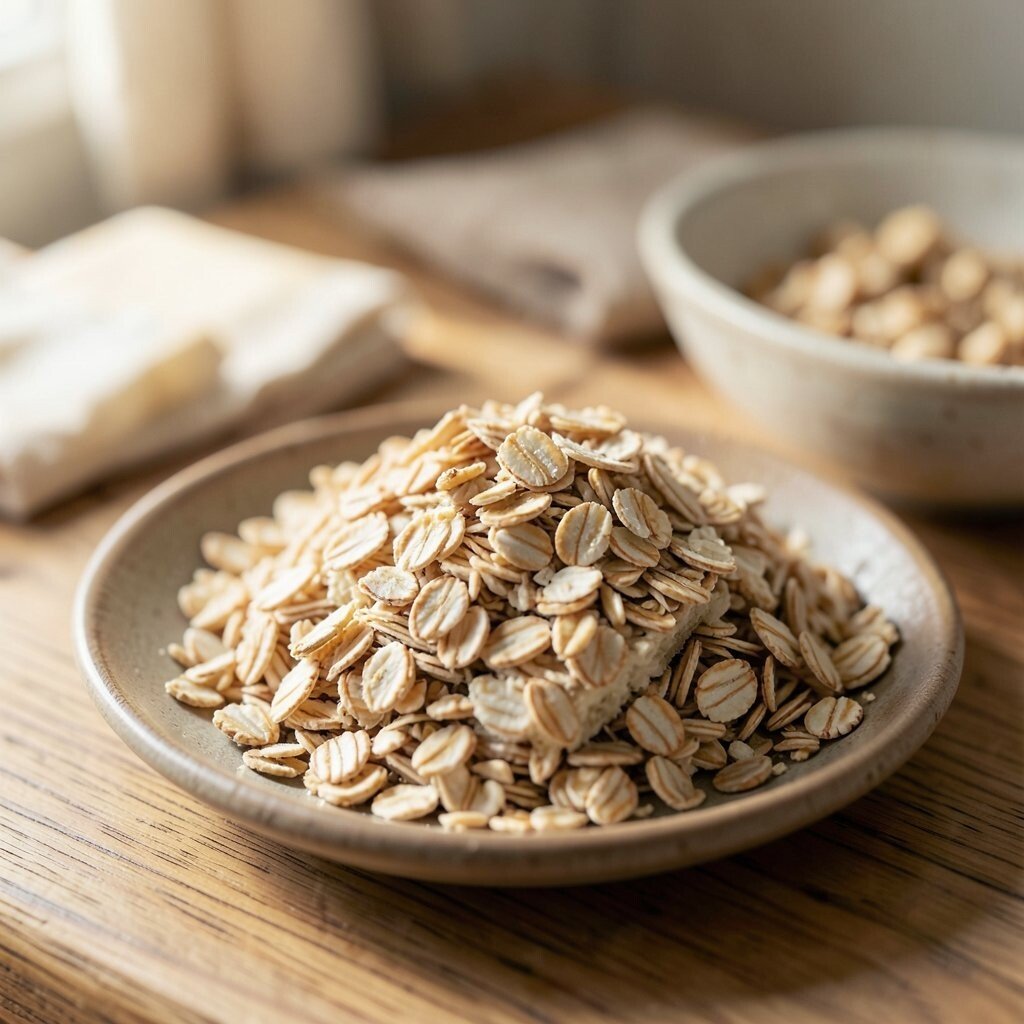
) Toasted Oat Toasted oat is a gentle beige with warm undertones. It feels cozy like a freshly baked loaf, and it’s easy to live with every day.
This tone helps your kitchen look neat and calm, even when counters are busy. It also works well with many styles, from modern to farmhouse.
Personalization idea: use toasted oat for walls and choose textiles like curtains, seat cushions, or placemats in caramel or warm gray. For a trend-forward twist, pair it with simple, rounded hardware and minimal decor. Costs can stay friendly by painting walls before investing in upgrades.
-
6) Saffron Glow
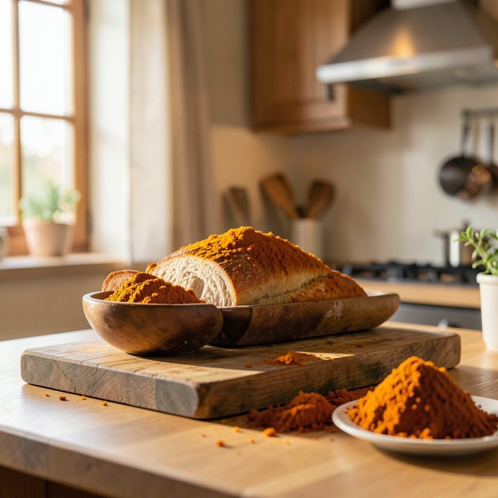
) Saffron Glow Saffron glow brings a playful warmth without being too loud. You’ll see it as a bright, cozy yellow that feels energetic and welcoming.
This color can make cooking feel fun, especially with fresh herbs, lemons, and bright produce on display. It also looks great with light countertops and natural wood.
Try it as a backsplash behind the stove or as a small wall near the breakfast nook. Add patterned dish towels and a ceramic canister set to make the tone feel intentional. If you’re budget-aware, use peel-and-stick backsplash sheets or a removable paint option for testing.
Current trend: “sunny warmth” on one focal area. Keep the rest of the kitchen neutral so saffron stays like a warm spotlight, not a wall of yellow.
-
7) Roasted Chestnut
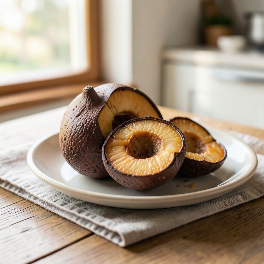
) Roasted Chestnut Roasted chestnut is a rich brown that looks elegant and cozy at the same time. It brings a comforting, autumn feeling to cabinetry or built-in shelves.
The benefit is a strong, warm base that makes everything else pop, from glass jars to colorful produce. It also hides wear well and feels timeless.
Personalize with lighter countertops like warm white quartz or creamy stone so the kitchen doesn’t feel too heavy. Pair with brushed bronze or aged gold hardware for a cohesive vibe. To manage costs, consider refinishing existing cabinets instead of replacing them.
If you love a modern look, keep the color consistent on the island and add simple pendant lights. If you love classic style, add molding details or warm wood shelving.
-
8) Warm Sand

) Warm Sand Warm sand feels light, earthy, and relaxing. It’s the color of soft beach mornings, and it makes kitchens feel calm and open.
This tone is great if you want cozy without darkness. It works beautifully with white appliances, light wood, and woven textures.
For personalization, paint walls warm sand and add a slightly deeper shade in one corner, like the area behind open shelving. Keep your decor warm-toned—think terracotta planters, amber glass, and linen napkins—to keep the look connected. Budget tip: a new rug runner and fresh hardware can make warm sand feel “new” even before any bigger projects. -
9) Golden Putty
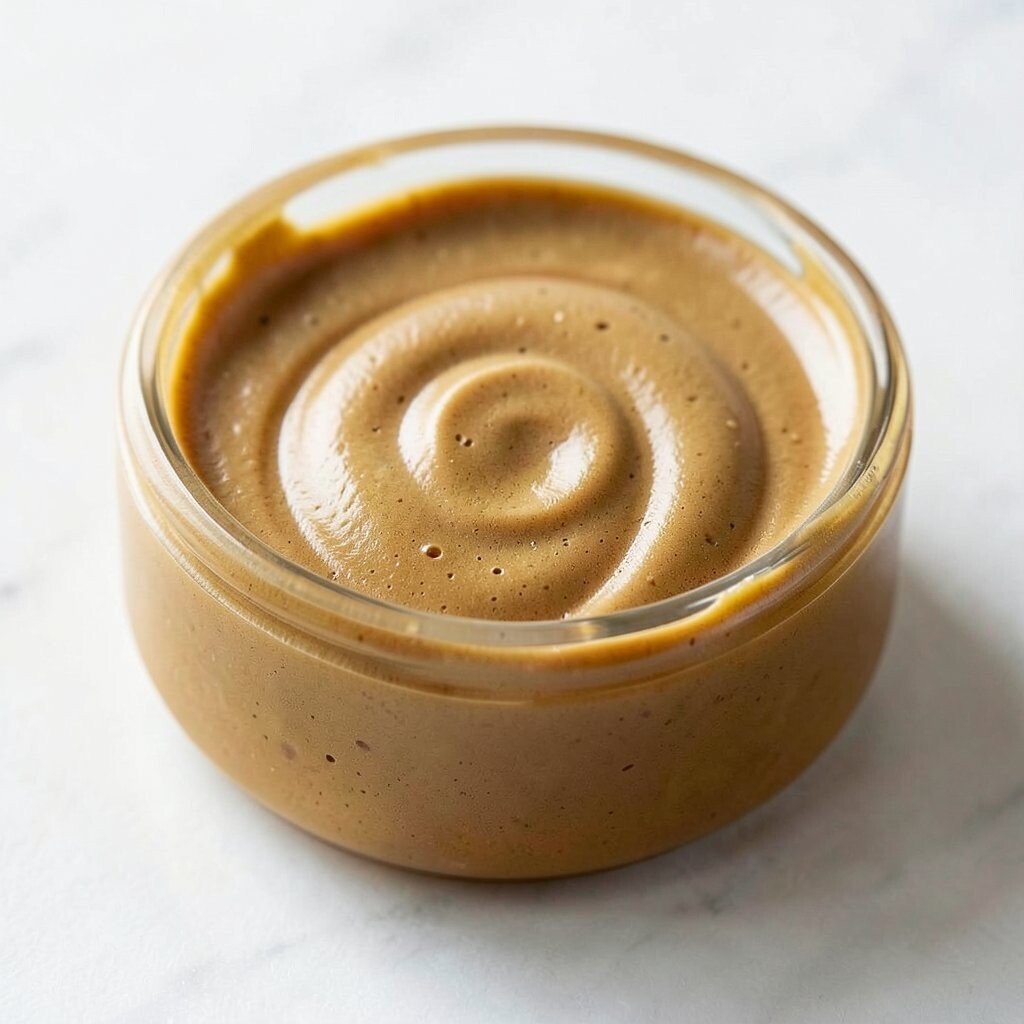
) Golden Putty Golden putty is a creamy neutral with a gentle yellow warmth. It gives a smooth, cozy glow that looks great in photos and in real life.
The benefit is flexibility: it matches warm woods, cool marbles, and almost any style. It also helps walls look clean and inviting without requiring bold color choices.
Try golden putty on cabinets and keep trim in crisp white for a bright contrast. For uniqueness, add a subtle glaze on cabinet doors so the color looks deeper in shadows. If cost is a concern, repaint only flat surfaces first and upgrade fixtures later.
-
10) Olive Brûlée
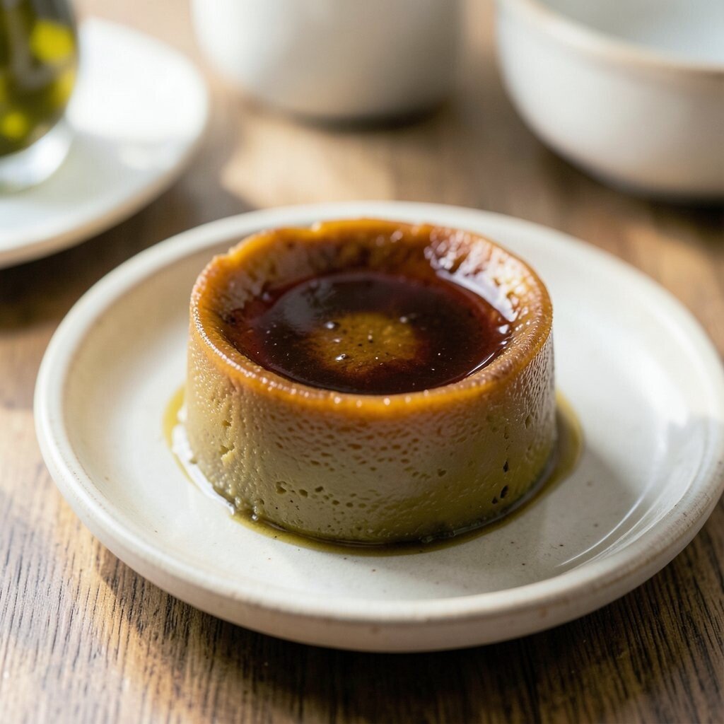
) Olive Brûlée Olive brûlée mixes warm green with a soft brown hint. It feels natural, rich, and surprisingly cozy in a kitchen setting.
It creates a calm “garden kitchen” vibe and makes plants look extra healthy. You also get a unique look that doesn’t feel like every basic beige kitchen.
Personalize it by painting the pantry door, a lower cabinet row, or one wall behind the sink. Pair with warm white countertops and natural stone textures. Cost-wise, start small with a single cabinet repaint or a door panel kit so you can test the tone before going bigger.
Current style trend: warm greens in kitchens. Use matte finishes and keep the rest of the room softly neutral for a balanced, cozy result.
-
11) Maple Roast
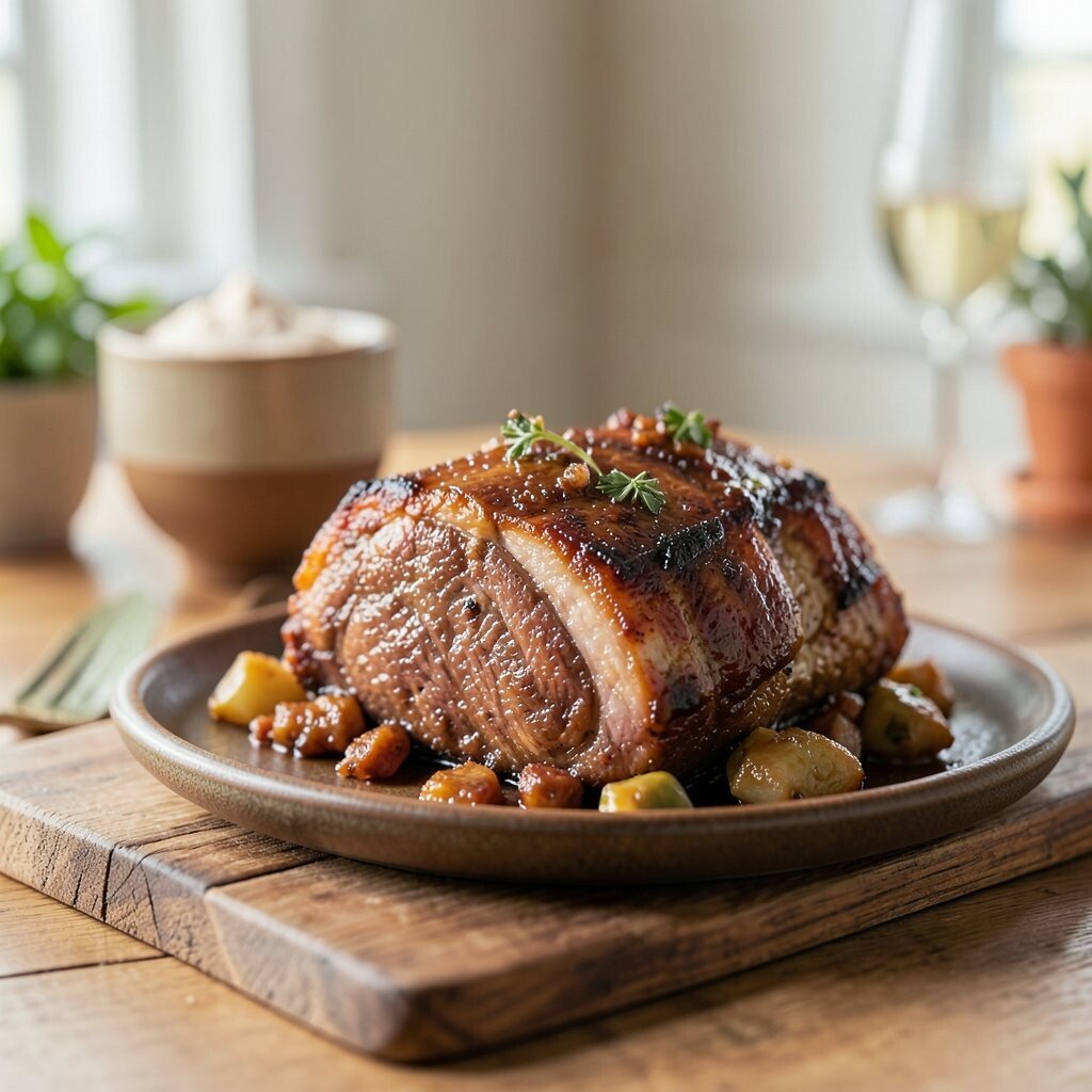
) Maple Roast Maple roast is a warm, reddish-brown tone that feels both cozy and bright. It reminds people of toasted bread, autumn leaves, and warm wood floors.
The benefit is that it warms up the whole space without needing bright yellow accents. It also looks amazing with white subway tiles and cream backsplashes.
Personalization idea: match cabinet color to your wooden cutting boards and choose warm lighting to bring out the red-brown tones. If you’re careful with costs, refinish existing wood cabinets or stain new shelves instead of replacing everything. Add copper or bronze accents for a gathered, welcoming feel.
To keep it irresistible, style open shelving with a few matching jars and a small plant. The color will do the “cozy work,” while your accessories add the personality.
-
12) Clay Rose
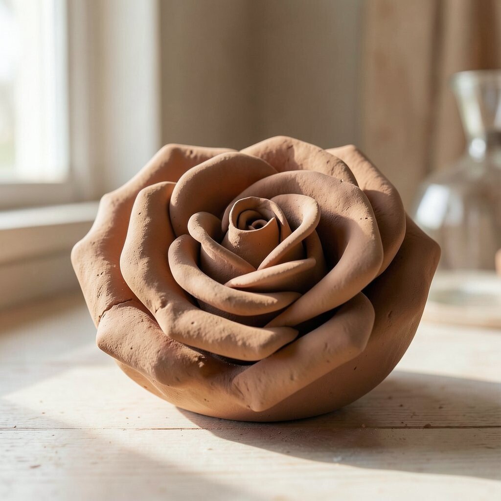
) Clay Rose Clay rose blends soft pink warmth with earthy clay. It feels romantic, cozy, and never too heavy when used the right way.
This tone can soften the whole kitchen, especially with natural light. It also makes simple decor—like flowers, ceramic bowls, and linen—look extra sweet and inviting.
Try it on a kitchen island, the edge of open shelves, or a backsplash in a small section. For personalization, combine it with warm gray counters and brass hardware so the look stays balanced. Budget tip: paint one main piece first, like the island, and upgrade hardware later if you want a bigger “wow” moment.