Some wall art makes people smile before they even order. The right piece can set the whole mood for your cafe in seconds.
-
1. Color-Block Geometric Murals
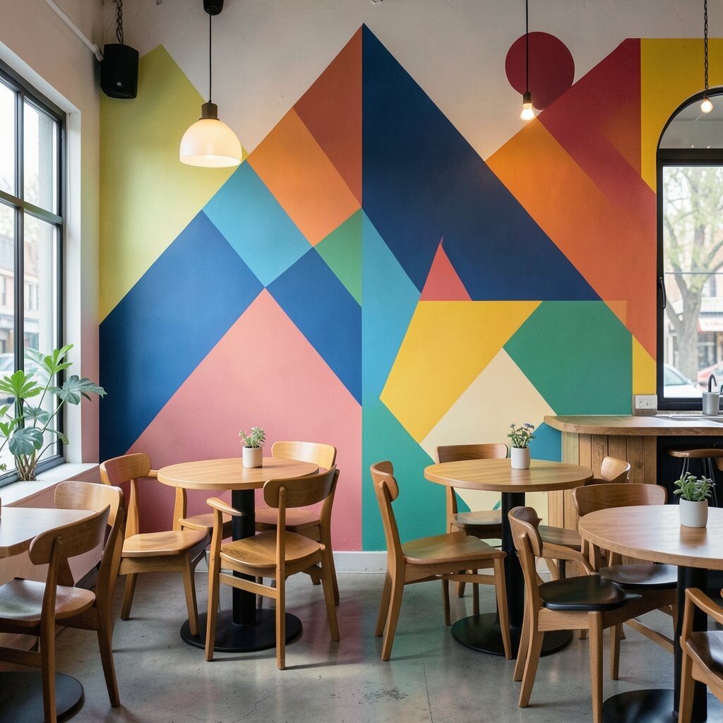
Color-Block Geometric Murals Think of big, clean shapes like squares and angles painted in punchy colors. They can frame a menu wall or run along a hallway like a visual timeline.
These murals are bold, easy to read, and they make a small space feel more alive. For a benefit, they also give your brand a clear look in photos, which helps social posts. Keep a simple tip in mind: match two colors to your logo or cups, then pick one extra “wow” color.
To keep it unique, add a hidden theme such as tiny coffee beans inside one corner shape. If you want personalization, name your signature drinks as mini labels inside the mural grid. Cost can stay reasonable if you use removable vinyl panels or hire a local artist for a focused section instead of an entire room.
-
2. Oversized Line-Art Portraits of Coffee People
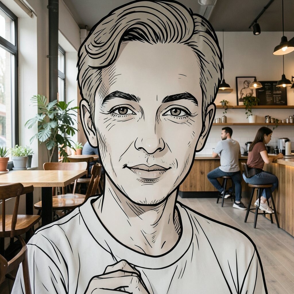
Oversized Line-Art Portraits of Coffee People Picture a giant black line drawing of a barista or a smiling customer, drawn with flowing strokes. It feels both human and modern, especially when placed near the counter.
This type of art helps customers feel welcome because it turns your space into a “story.” It also works great for ordering photos, since the line work frames faces nicely. A useful suggestion is to keep the background light so the lines stay crisp.
Make it personal by using your team’s hairstyles or signature aprons in the illustration. You can also add small icons like a kettle, spoon, or whisk next to the portrait. Cost is often flexible: you can start with a single print in a large frame, then upgrade to wall decals later.
-
3. Neon-Style Typographic Signs (No Real Neon Needed)
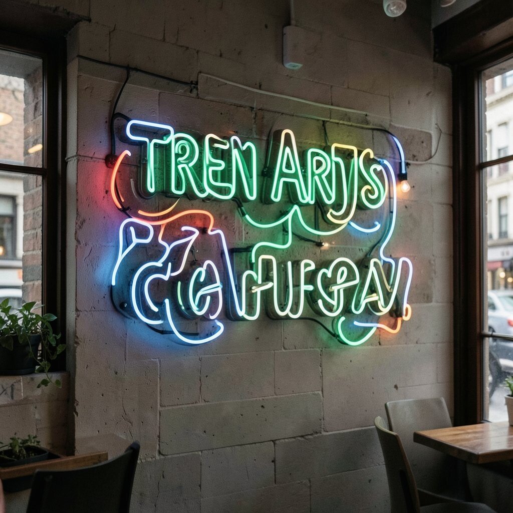
Neon-Style Typographic Signs (No Real Neon Needed) Imagine the glow look of neon, but printed in vivid gradients and glossy textures. A word like “ROAST,” “FOAM,” or “STAY BREWED” can feel energetic without being loud.
Typography art is amazing for benefits like clarity and branding. Customers can instantly remember your vibe, and staff can point guests to the sign when they take photos. Try a tip: use thick letters and strong contrast so it stands out from any wall color.
Keep it unique by mixing fonts, like a playful script for one word and a sharp block font for another. For personalization, include your cafe name and one short local phrase. On cost, printed acrylic or framed poster versions can be much cheaper than true neon, while still giving that trendy pop.
Current trend alert: many cafes are pairing bold type with soft, calm seating, so the walls “spark” while the chairs feel cozy. If your cafe is already bright, choose darker gradients; if it is calmer, go for lighter glow colors.
-
4. Vintage Recipe Cards Turned Into Wall Collage
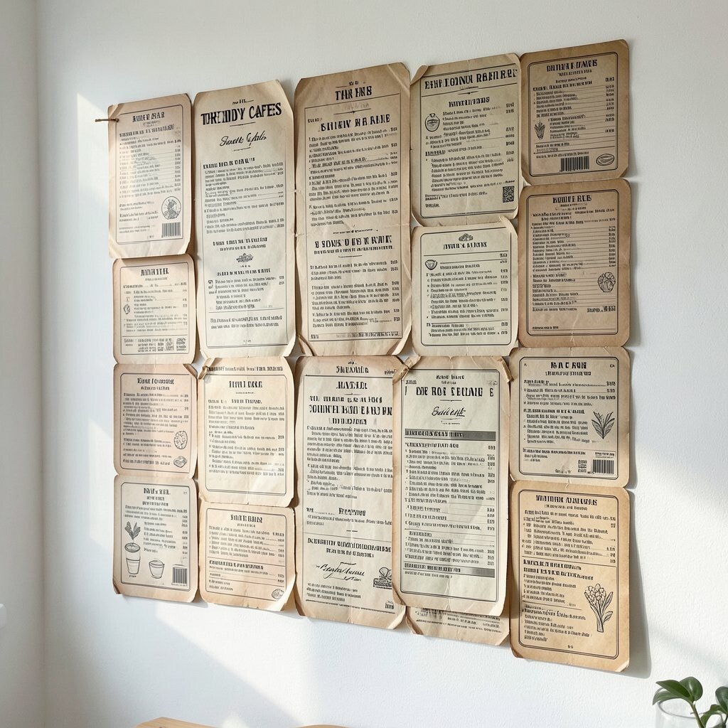
Vintage Recipe Cards Turned Into Wall Collage Visualize a wall of old-style recipe cards, but redesigned with modern fonts and coffee-themed notes. They look charming, like your cafe keeps secret family recipes in plain sight.
This collage benefits your customers because it gives them something fun to read and talk about. It also supports personalization, since you can feature real methods like “how we roast” or “our best iced latte trick.” For tips, keep each card consistent in size so the wall looks neat even when it’s playful.
-
5. Botanical Herb Line Prints With Bold Coloring
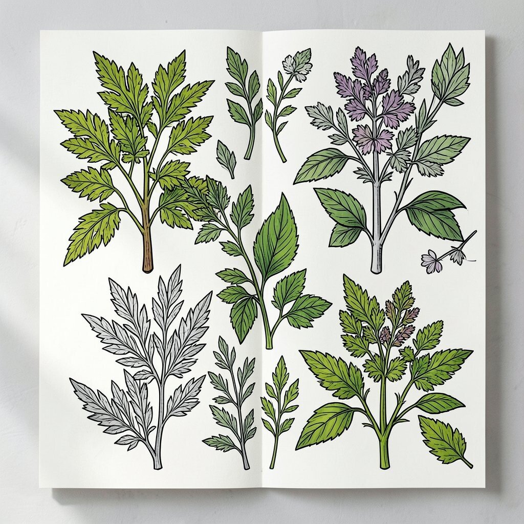
Botanical Herb Line Prints With Bold Coloring Picture herb illustrations—mint, basil, rosemary—drawn with clean lines and then filled with bold pops of teal, lime, or terracotta. It looks fresh, but still graphic and punchy.
These prints offer the benefit of natural warmth while staying modern. They also hint at flavors, so customers feel like your menu is carefully made. A great suggestion is to cluster three prints together like a mini set above a shelf.
Make it unique by turning one herb into a cafe mascot, such as a “smiling mint leaf” for your logo. For personalization, use your menu ingredients as the herb list. Cost can be kept low by using downloadable print templates and printing at a local shop, then framing them with matching mats.
-
6. Giant Fruit and Coffee-Cup Pattern Wallpapers
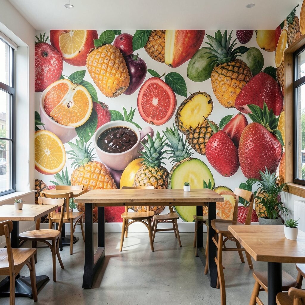
Giant Fruit and Coffee-Cup Pattern Wallpapers Imagine repeating patterns of citrus slices, berries, and coffee cups, scaled up so each repeat is noticeable. It gives a wall the energy of a fabric design.
Pattern walls benefit your cafe because they hide small scuffs and make spaces feel styled even with simple furniture. They also bring a “lively” mood that many customers love when they sit for a while. Try a tip: pick one hero color and keep other colors muted, so the room doesn’t feel chaotic.
Personalize it by choosing your actual seasonal specials as the repeated icons. If you use strawberry drinks in summer, add tiny strawberry motifs in the pattern. For cost, consider covering only one accent wall or a full panel behind the ordering spot to get maximum impact without full-room expense.
-
7. Minimalist Posters With Hidden Coffee Clues
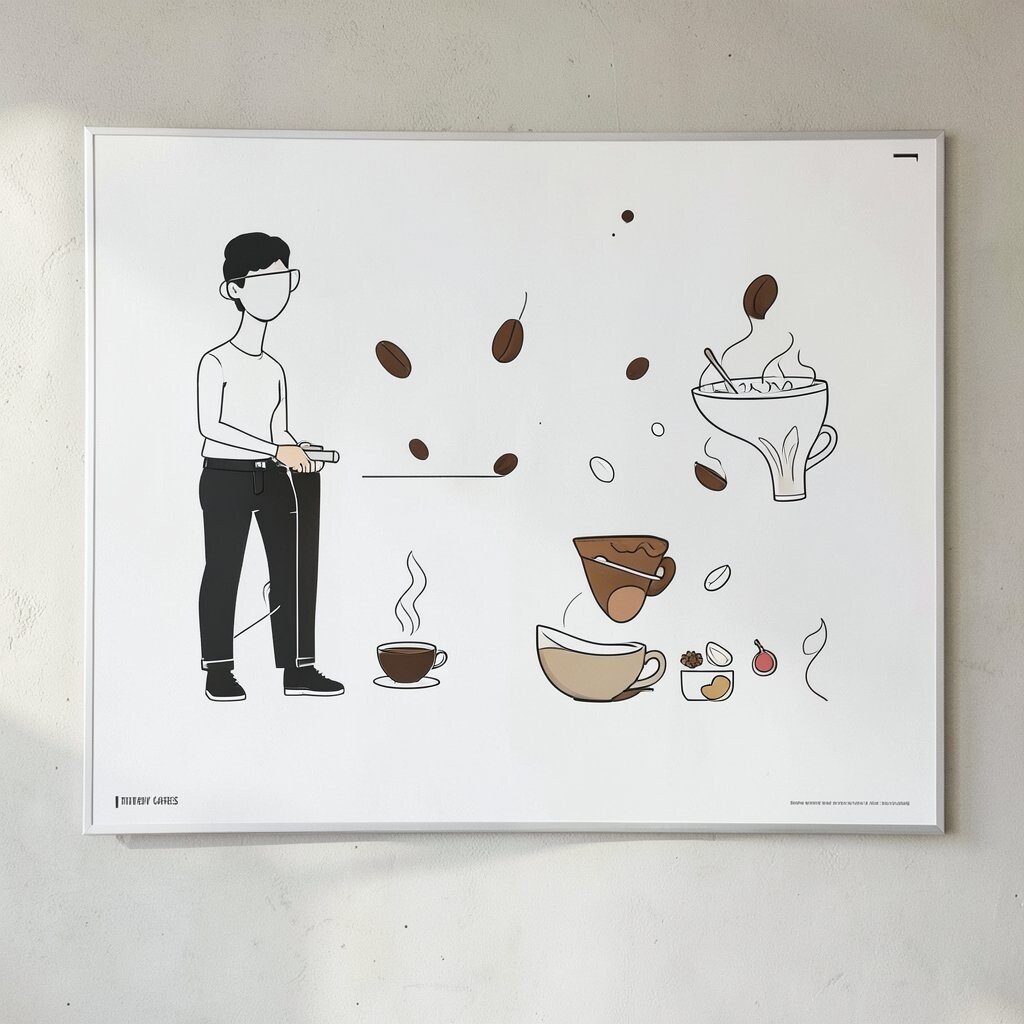
Minimalist Posters With Hidden Coffee Clues Think of clean minimalist posters with lots of space, but with small hidden details like a coffee ring shaped like a map. From far away, they look simple; up close, they tell a secret.
This kind of art benefits guests by making them pause and look longer, which builds connection. It also feels unique because you can vary the hidden clues for each wall section. A helpful tip is to keep the main layout simple while letting the “clue” details be more playful.
Personalize the clues by turning your neighborhood landmarks into tiny background marks. For personalization ideas, add “Easter egg” icons for your top drinks: swirl for caramel, dot for vanilla, and a tiny star for seasonal spice. Cost can be friendly because a few prints in good frames can look like a full gallery wall.
-
8. Pop Art Speech Bubbles for Drink Names
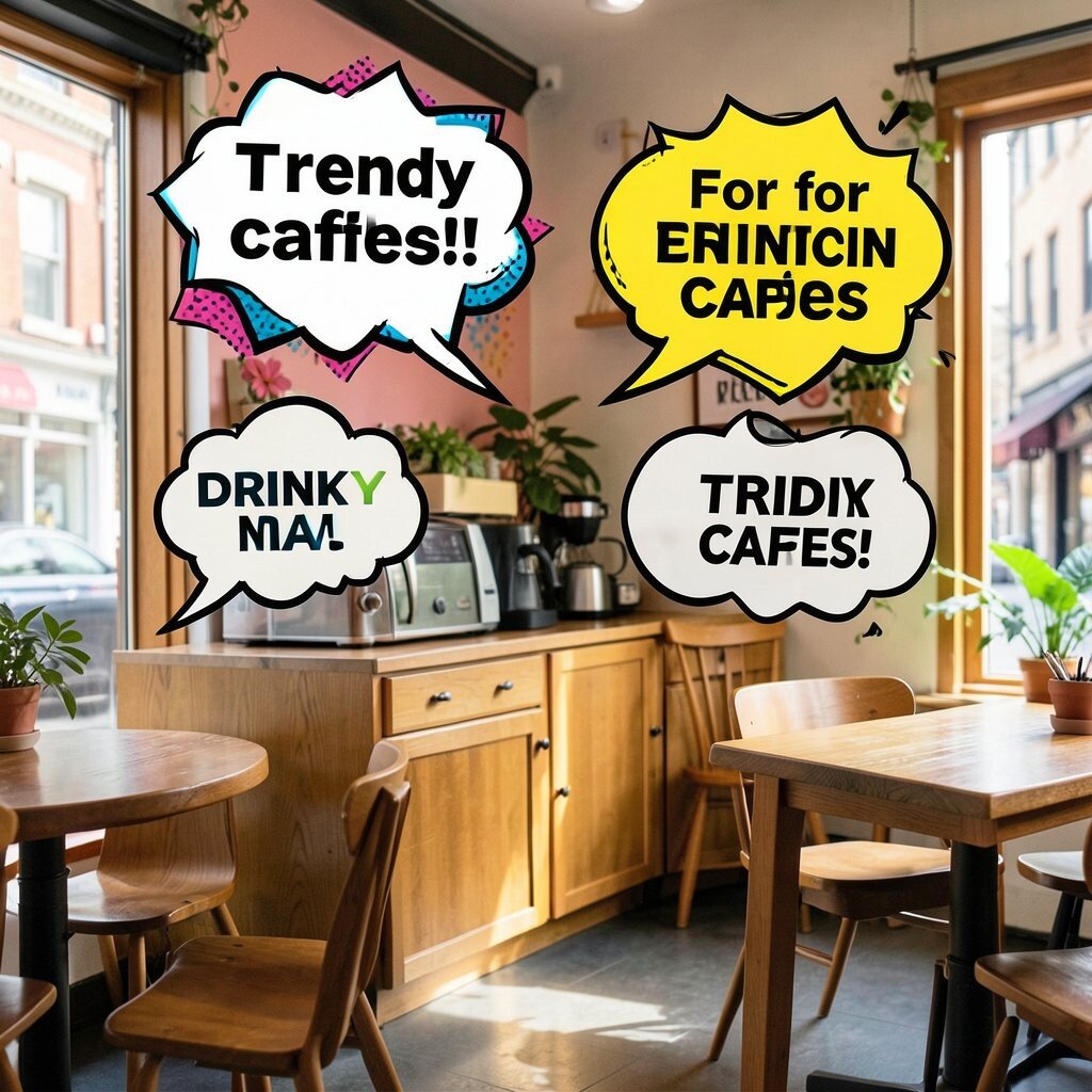
Pop Art Speech Bubbles for Drink Names Picture bright speech bubbles like a comic book, each containing a drink name or short nickname. The bubbles can float above the counter or wrap around a cafe corner.
Pop art benefits your cafe by making ordering feel playful and easy. It also helps staff because customers can quickly scan the bubbles as mini labels. Try a tip: use short phrases, big lettering, and a consistent bubble style so the wall looks organized.
Make it unique by adding small sound effects like “SIP!” or “CRUNCH!” for toppings. For personalization, include local slang or the playful names your regulars call drinks. On cost, you can use print-and-mount foam boards or removable vinyl to test different layouts without big commitments.
Current trend note: many cafes are using comic-style branding to feel modern, friendly, and shareable online. If your seating is neutral, the comic wall becomes the loudest color and the room stays balanced.
-
9. Monochrome Stamp Borders and Frames
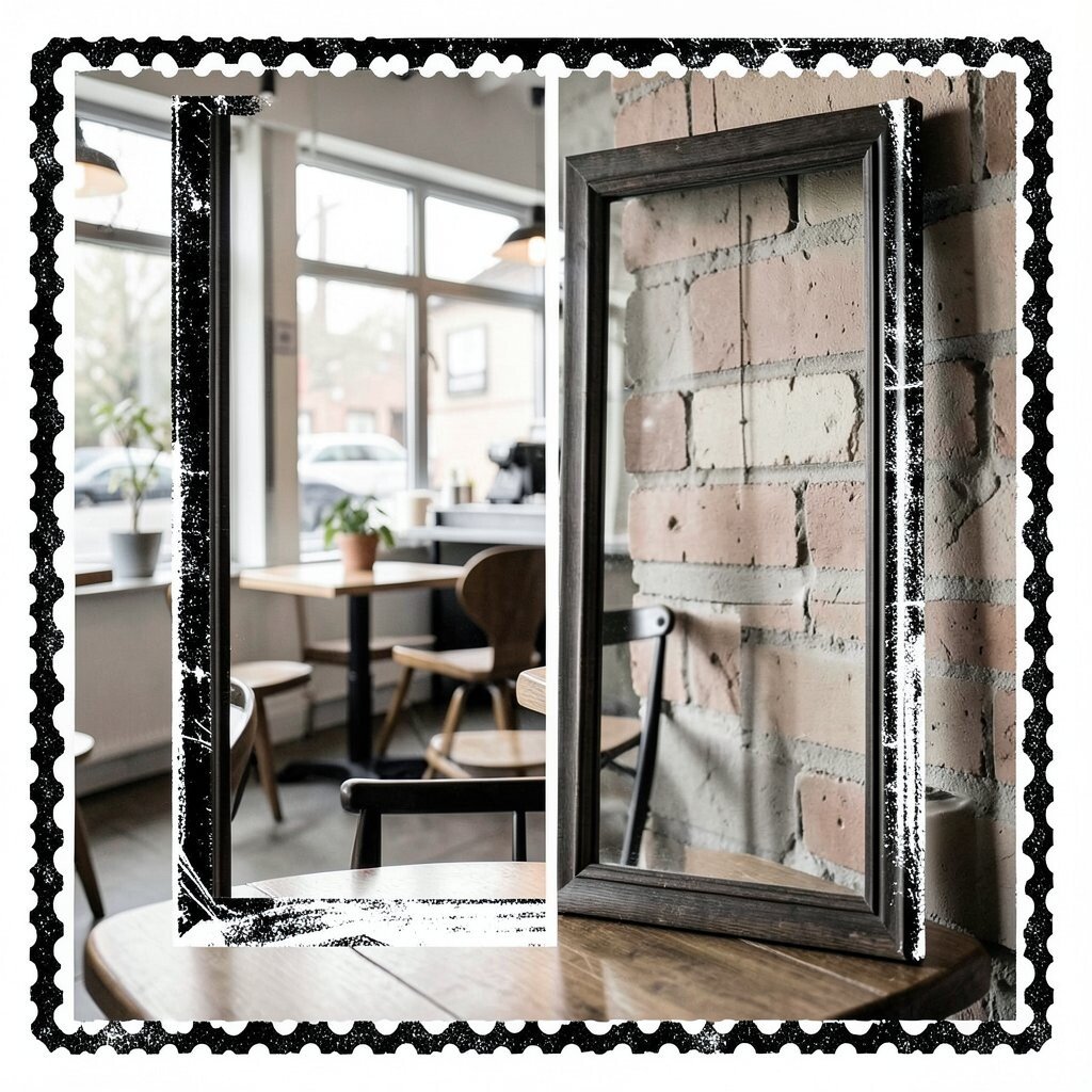
Monochrome Stamp Borders and Frames Imagine an all-black-and-white border made from “stamp” marks, like a passport page, running along your walls or around mirrors. It gives a structured, designer look with a playful wink.
This style benefits your cafe because it makes other decor feel more intentional. It also helps unify the room when you have different frame sizes or artwork. A quick tip: match stamp line thickness across the borders so the design feels crisp, not messy.
-
10. Colorful Grid Maps of the Neighborhood
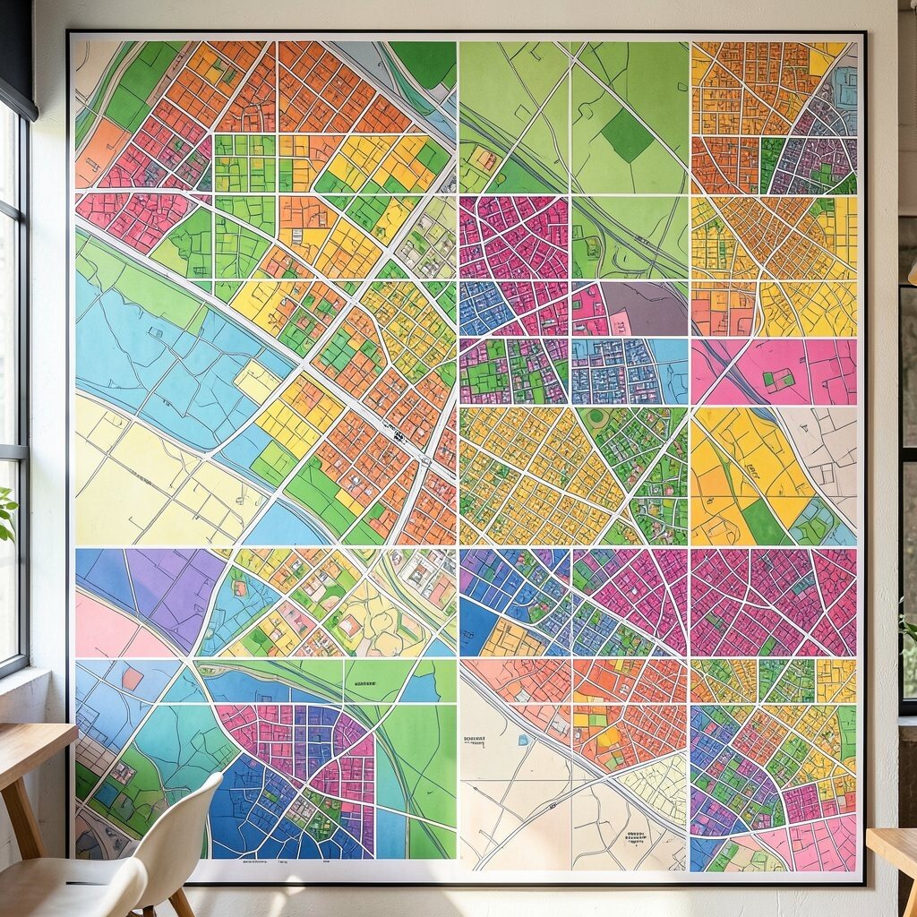
Colorful Grid Maps of the Neighborhood Picture a graphic map of your neighborhood drawn as a clean grid, with streets and spots labeled in bold type. You can highlight key places like your favorite bookstore or park.
These maps are beneficial because they make visitors feel instantly connected to your area. They also add a unique “local” identity that big chain cafes can’t easily copy. For tips, choose a limited color palette and use icons for simple readability.
Personalize it by marking your cafe’s location with a star, coffee icon, or a little “you are here” circle. You can even add directions like “walk two blocks and find the aroma.” Cost can be budget-friendly if you start with a poster-sized map and laminate it, or print on canvas and frame it.
-
11. Wavy Boarder Illustrations That Match Your Menu
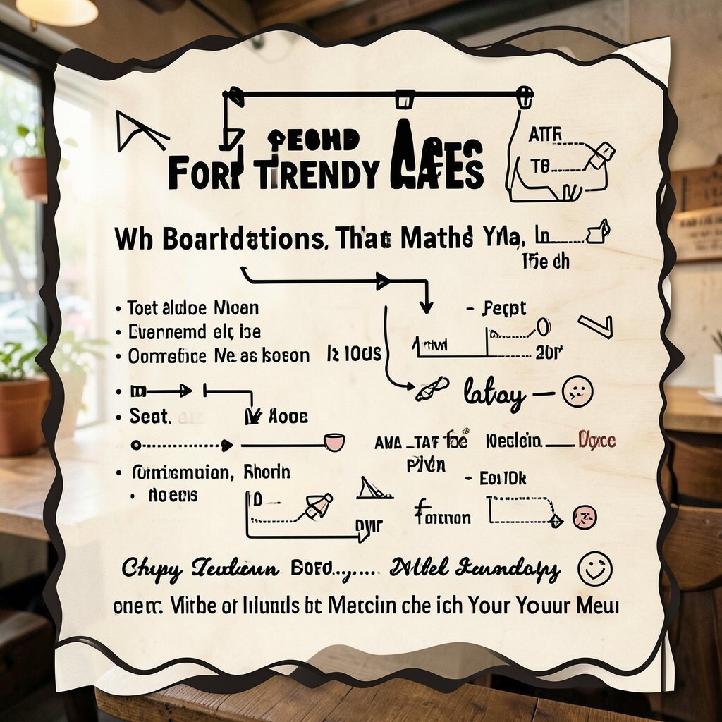
Wavy Boarder Illustrations That Match Your Menu Imagine wavy border art that looks like friendly waves, but it is filled with tiny coffee and pastry symbols. The border can sit around a menu board or frame a large window.
This helps your cafe because borders make information feel organized and branded. It also feels unique since the design can mirror the style of your menu, signage, and receipts. Try a tip: keep the border style consistent across one full wall so customers see it as one designed theme.
For personalization, weave in the shapes of your cup lids or the swirl from your logo. If your menu has sections like “cold,” “hot,” and “sweet,” you can vary border colors or icons by section. Cost is often moderate: you can use printed border decals or stencil-painted edges for a clean finish.
-
12. Oversized Halftone Posters for Drinks and Desserts
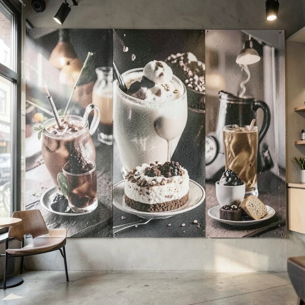
Oversized Halftone Posters for Drinks and Desserts Think of halftone dots like old magazine printing, but modern and bright. A poster of a latte, lemon tart, or a croissant can look like art even without extra styling.
Halftone art benefits customers because it looks fun from a distance and still interesting up close. It also supports uniqueness since each image can be turned into a different dot pattern. A helpful tip is to choose images with clear outlines so the dot effect stays sharp.
Personalize by using your own product photos turned into halftone art, so it feels truly yours. For cost, you can start with one statement poster and then add more prints later as your budget allows. Trend-wise, bold print effects like halftone are popular because they look retro but still feel fresh.
-
13. Gallery Wall of Mix-and-Match Cafe Icons

Gallery Wall of Mix-and-Match Cafe Icons Picture a curated wall of framed art pieces, each featuring a cafe icon like a spoon, milk pour, cookie, or steam curl. They can overlap slightly or be arranged in a neat grid, whichever fits your style.
This benefits your cafe because it creates a “collectible” feeling where customers enjoy walking through the details. It also gives you a flexible way to personalize over time by swapping prints as seasons change. Try a tip: keep frame colors consistent, even if the art changes.
Make it unique by turning one icon into a series, like steam curls that grow into a full pattern. Personalize with “regular favorites” icons, such as the exact donut your community loves. Cost can stay controlled because many icon prints can be small and inexpensive, especially if you print yourself or buy from local creators.
Current trend: many cafes are using “micro-collections” on walls to encourage repeat visits and more photo moments. This approach fits that trend nicely since you can add one new frame whenever you launch a new drink.
-
14. Large-Scale Patterned Coasters as Wall Art
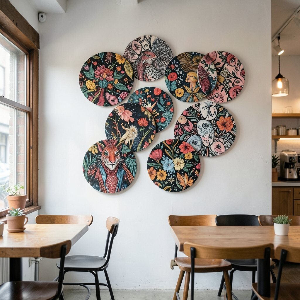
Large-Scale Patterned Coasters as Wall Art Imagine using oversized coaster-style circles mounted on the wall like a bold set of plates. Each “coaster” can have a graphic icon, bold border, or bright color ring.
This benefits your cafe because it looks playful and ties directly to the everyday customer experience. It also feels unique because it turns something small and normal into something gallery-worthy. A tip: keep spacing even and use similar thickness so the wall looks clean.
-
15. Illustrated Weather Posters for Seasonal Menus
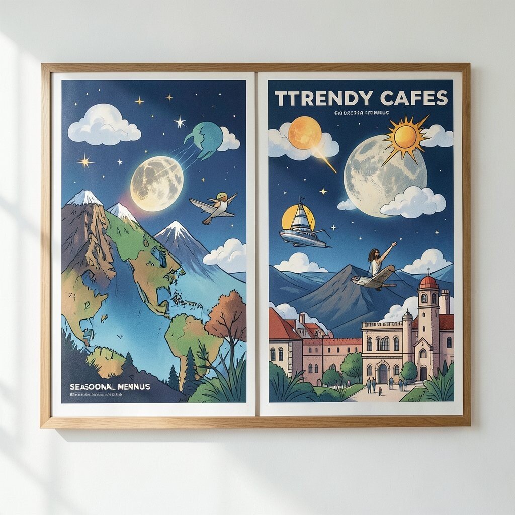
Illustrated Weather Posters for Seasonal Menus Picture weather-themed illustrations—sun, clouds, rain—paired with drink ideas for each mood. For example, “Rain day” can match a warm cocoa or a spiced latte.
This kind of art benefits your cafe by making the menu feel timely and fun. It also helps customers choose faster because the pictures guide their thoughts. Try a suggestion: use consistent icons and colors, then update the captions when seasons shift.
Make it unique by using your cafe style, like a specific art line weight or a special color scheme. For personalization, draw the local weather symbol you often see, like a clear-sky sun if your days are bright. Cost can be friendly if you print a set of posters and switch them out with frames or clip clips.
-
16. Abstract Pour Paintings Inspired by Latte Swirls
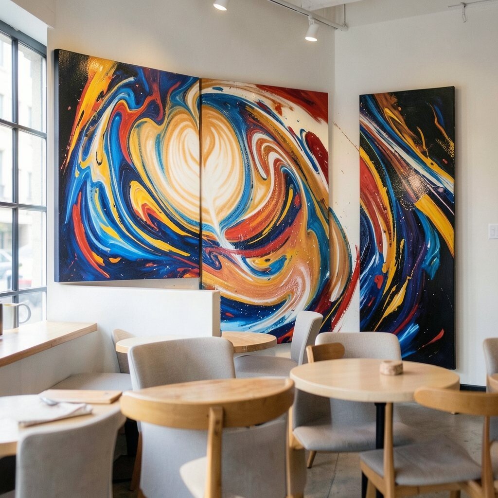
Abstract Pour Paintings Inspired by Latte Swirls Imagine abstract paintings that mimic latte art, with smooth swirls of cream, espresso, and caramel colors. Even if they are not exact replicas, the flow should feel familiar.
These paintings benefit your cafe by linking the art to the product right away. They also look unique because every pour painting can be one-of-a-kind. A good tip is to hang them near a window or light source so the colors glow softly.
Personalize by creating a small “swirl map” series where each painting matches a flavor profile. You can also label them with short names like “Vanilla Cloud” or “Cocoa River.” Cost varies: original art can be pricey, but you can find print versions, commission a local artist for one piece, or use high-quality canvas reproductions.
-
17. Comic-Panel Wall With “Before You Sip” Steps
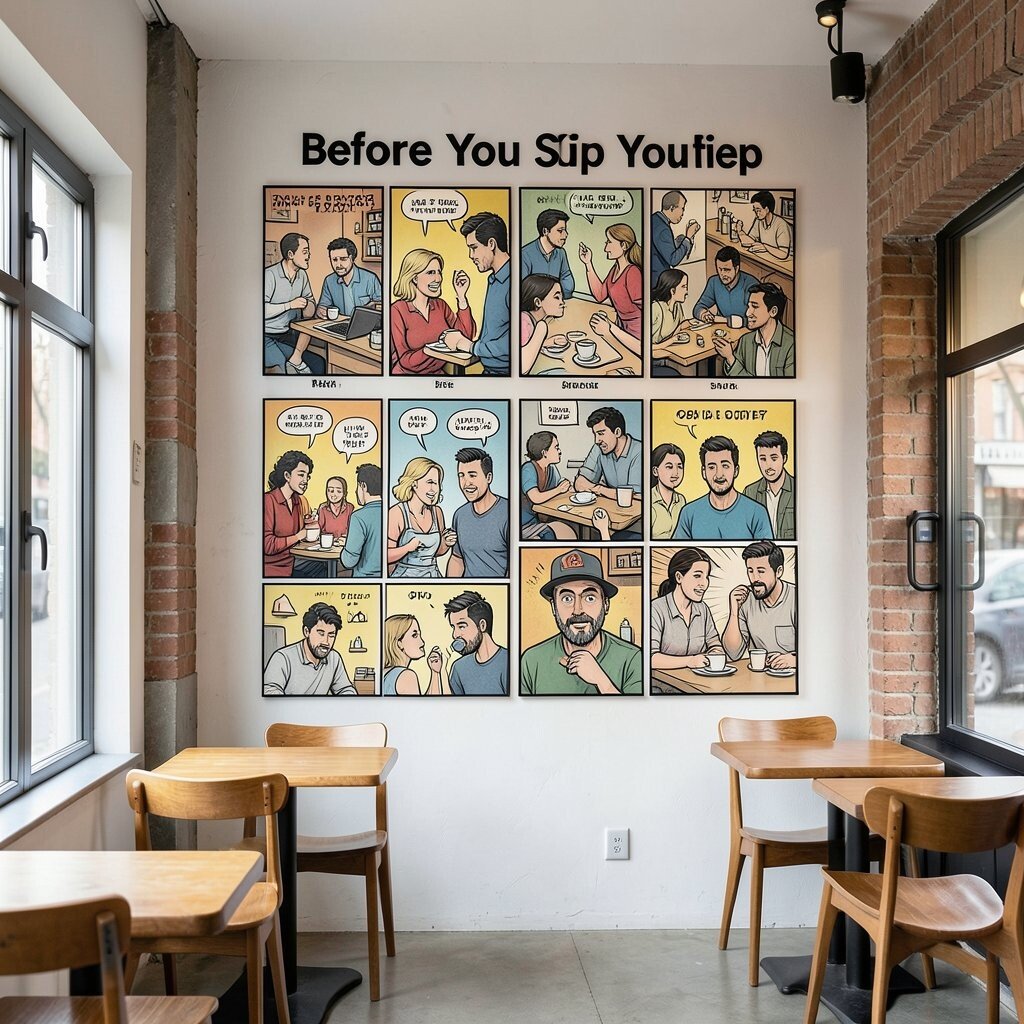
Comic-Panel Wall With “Before You Sip” Steps Picture a wall that looks like comic panels, each panel showing a step like “smell,” “sip,” “pause,” and “smile.” It turns your cafe routine into a friendly mini adventure.
This benefits customers because it adds delight, and it makes your service feel memorable. It also helps staff by giving a simple script for how to talk about drinks. For tips, keep text minimal, and use big clear drawings so anyone can understand quickly.
Make it unique by linking the steps to your menu, such as “shake the matcha” or “stir the caramel.” Personalize by adding a panel that matches your signature item, like your best iced drink ritual. Cost is often manageable because you can print panels on vinyl or laminated sheets and replace them as needed.
-
18. Bold Typographic “Wall of Small Rules”

Bold Typographic “Wall of Small Rules” Imagine a wall filled with short, bold type rules in a fun way, like “Be kind,” “Sip slowly,” and “Ask for a recommendation.” The design should feel like a playful poster series.
This benefits your cafe by creating a warm vibe that sets expectations without being serious. It also feels unique because it blends personality with branding. Try a tip: use one font family and vary the size for hierarchy, so it reads fast.
Personalize by adding rules that match your community, such as “Bring your sketchbook” or “Welcome, friends.” For personalization, rotate one rule monthly so regulars notice change. Cost can be kept low with printed posters that you swap in matching frames.
Current trend note: cafes are using “brand voice” walls to show values, not just decor. This works especially well if your cafe is cozy and you want guests to feel cared for.
-
19. Oversized Patterned Window Cling With Coffee Icons
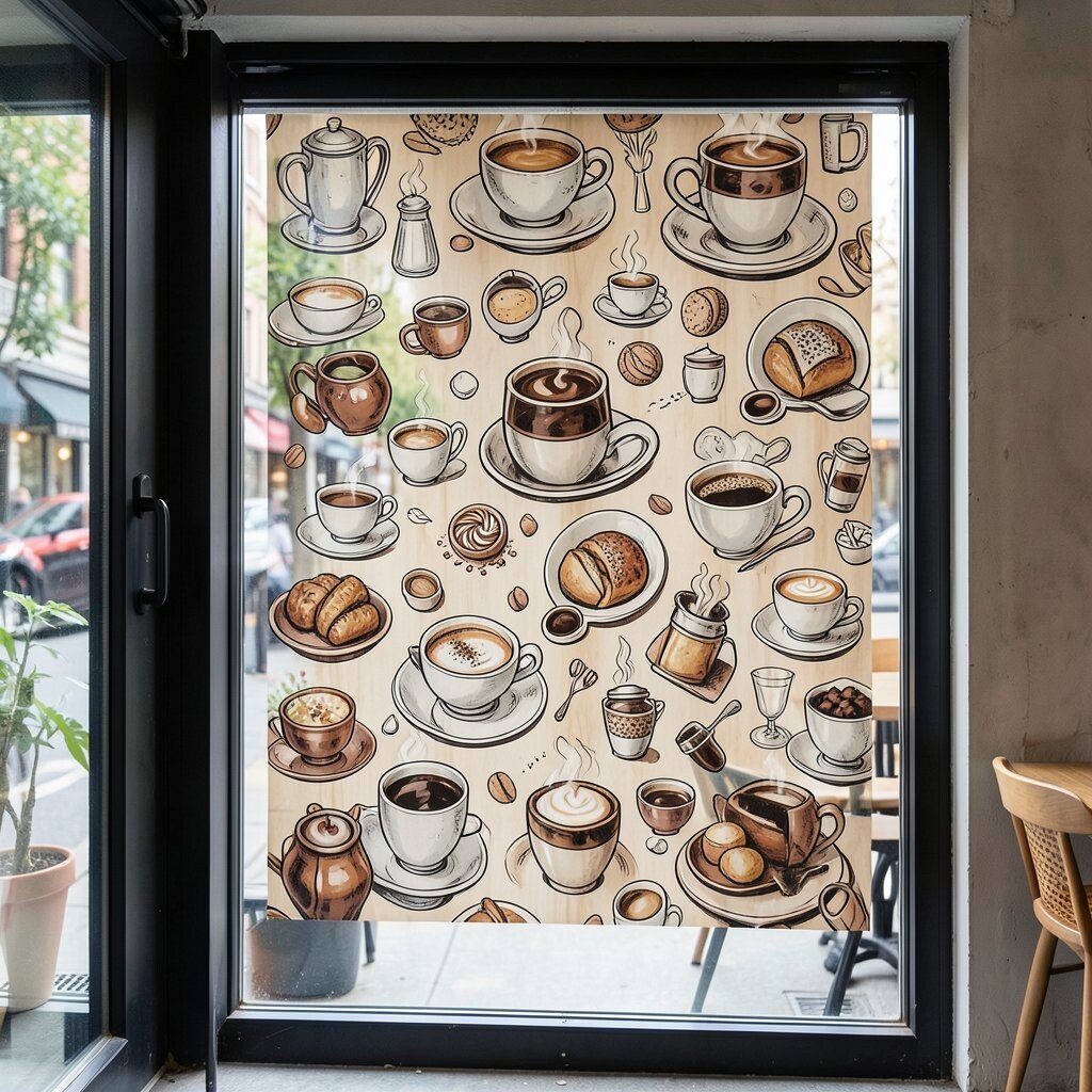
Oversized Patterned Window Cling With Coffee Icons Picture a window covered in repeating coffee icons, steam curls, and tiny pastry shapes, but in bold colors and clear outlines. It becomes your outside-to-inside bridge and makes daylight feel styled.
This benefits your cafe because it adds privacy while still looking fun and airy. It also creates a strong photo background without extra furniture. A tip: choose a cling that leaves some light visible, so the space stays bright.
-
20. Retro Ad-Style Frames With Real-World Drink Images
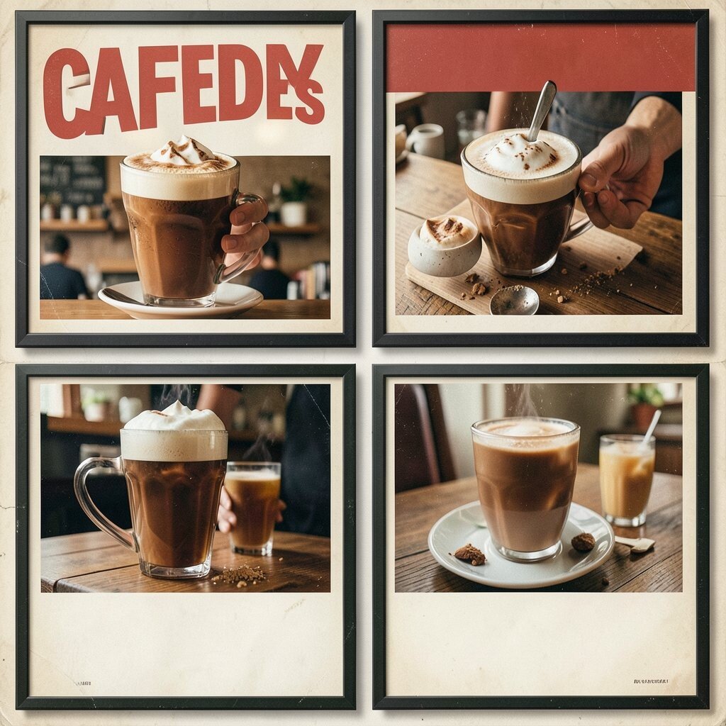
Retro Ad-Style Frames With Real-World Drink Images Imagine art that looks like a classic advertisement poster, but it showcases your actual drinks. Think vintage layout, bold borders, and a “limited” style label.
This benefits your cafe because it makes each menu item feel special and collectible. It also adds uniqueness by mixing retro design with modern flavors. Try a suggestion: use real product photos and place them inside the ad frames, so it feels authentic.
Personalize by creating a series of ads for each season, like “Summer cold brew” or “Winter hot cocoa.” For cost, start with a two-poster set, then expand when you can. Many cafes keep budgets under control by printing on matte paper and using affordable frames.
-
21. Interactive Chalk-Board Art Panels With Graphic Borders
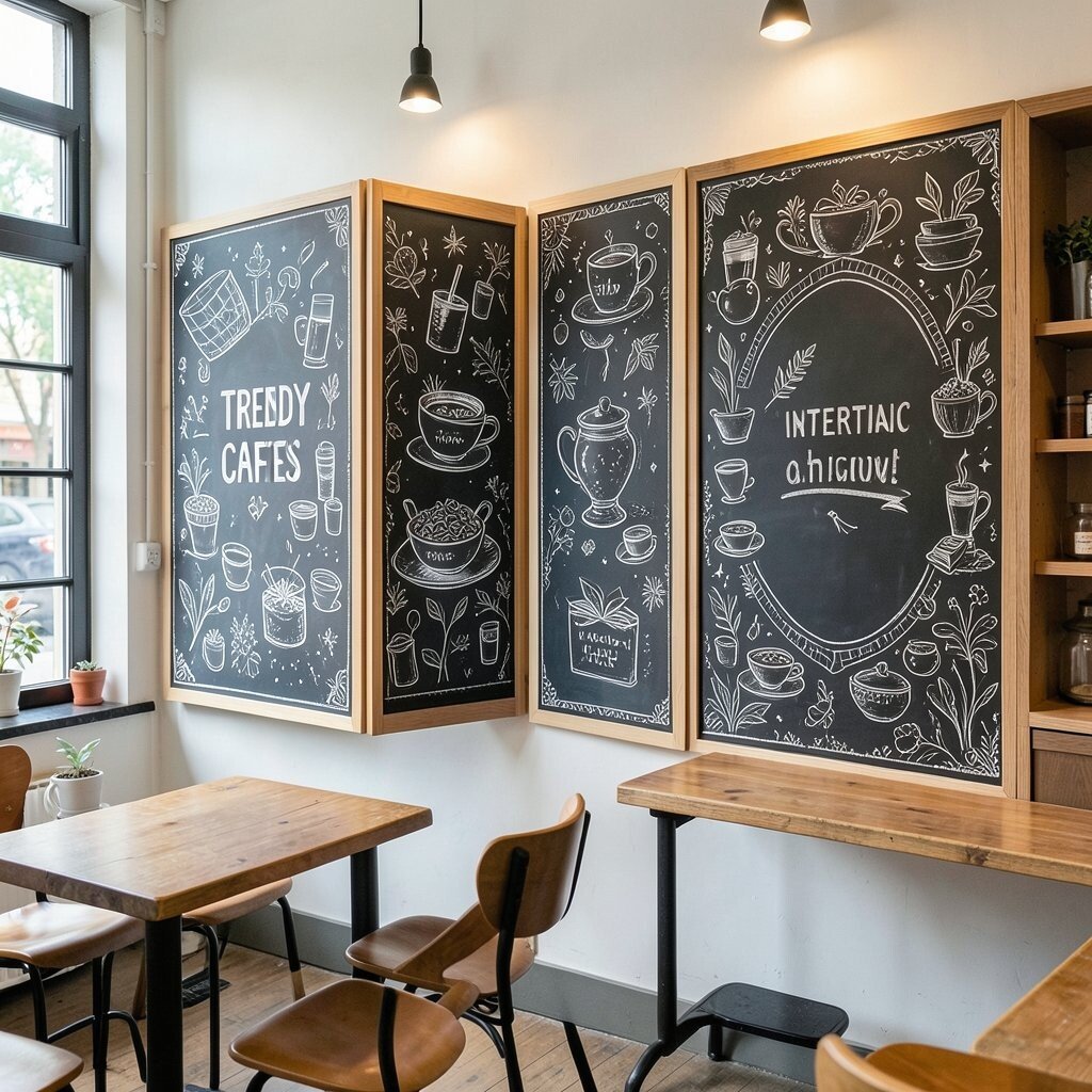
Interactive Chalk-Board Art Panels With Graphic Borders Picture a chalkboard panel drawn with thick graphic borders, like neon-like lines or comic stripes, around a clean chalk area. Guests can write a message or request a drink idea in the same style.
This benefits your cafe because it creates a living wall that updates every day. It also offers uniqueness since the writing becomes your community’s own art. A useful tip is to set gentle prompts, like “Write your favorite sip,” so it stays positive and not messy.
Personalize the borders with your logo shape, a signature steam curl, or tiny icons that match your menu. Cost is often reasonable because chalkboard panels can be repurposed and repainted. Current trend: interactive walls keep engagement high, especially when customers share their messages online.
-
22. Large-Scale “Ingredient Icons” Typography Wall
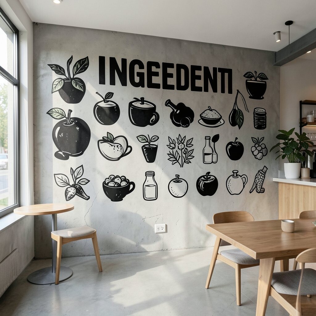
Large-Scale “Ingredient Icons” Typography Wall Picture a wall where ingredients become big typography—“VANILLA,” “ESPRESSO,” “CARDAMOM”—with each word built from icons like beans, pods, and cinnamon sticks. It feels like a poster made of flavor.
This benefits your cafe by teaching your menu visually, which helps customers feel confident ordering. It also looks unique because it turns common ingredients into bold art. Try a tip: keep the typography clean and let the icon fill be the “detail surprise.”
Personalize by using only your menu ingredients, including any local spice blends you love. You can also add a small color code that matches drink sizes or categories. Cost can be controlled by choosing a single large wall panel or two balanced sections, and printing at a local shop for high quality.