
Some colors just behave like good friends. You pick them once, and suddenly your work looks put-together.
This list is full of starter-friendly palettes that need little skill. Each one comes with easy tips, budget notes, and simple ways to make it yours.
1. Soft Sand + Warm Cream + Cacao Brown + Sage Whisper + Terracotta Accent

Picture sunlit floors, cozy coffee, and a plant leaf in the corner. This palette feels calm and stable, with warm neutrals that blend without effort.
Use it for home screens, simple posters, or beginner design projects that need comfort. Start by picking one “anchor” color, like cacao brown, then add cream and sand around it.
For uniqueness, swap the sage with a muted olive or dusty teal. If you’re cost-conscious, you can pull these shades from cheap paint swatches, old cereal box colors, or free color pickers online. Try a small terracotta accent for buttons, icons, or your signature element.
2. Ocean Teal + Seafoam + White Mist + Deep Navy + Coral Pop
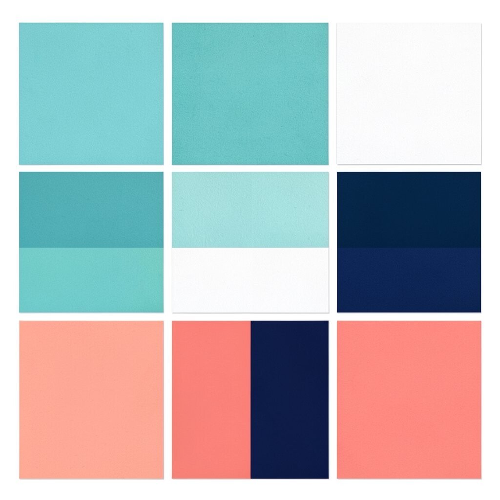
Think of waves rolling in, then a bright shell flashing near the shore. This palette looks fresh, clean, and friendly, especially for techy or hobby content.
It’s great when you want “easy to read” contrast without making everything harsh. Begin with deep navy for text, then use teal or seafoam for backgrounds.
To personalize, change coral pop to a pinky salmon or a brighter orange depending on your mood. For budget, you can match these tones with inexpensive stationery paper, themed stickers, or even phone wallpaper you already like.
3. Lilac Bloom + Soft Peach + Butter Yellow + Charcoal Ink + Dusty Rose
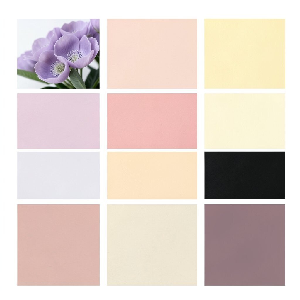
Imagine a pastel garden where flowers and warm sunlight share the same space. The colors feel playful but still organized, which is perfect for beginners.
Use lilac and peach as your main support colors, then add charcoal ink for headings or labels. Butter yellow works like a highlighter, and dusty rose makes small details feel sweet.
This palette is unique because it mixes cool and warm pastels without turning messy. Try a “2-and-1” rule: two pastels for big areas, one deeper neutral for structure. If you want it cheap, start with printed coloring pages, thrifted cards, or free palette generators.
You can also test it in one small page first, like a profile card or simple flyer. Swap the lilac for a pale blue if you want a calmer vibe.
4. Forest Pine + Honey Gold + Cream Base + Cocoa + Fern Green Accent

Picture a cabin by tall trees, with warm lantern light on wood. This set gives a grounded, earthy look that feels thoughtful and not try-hard.
It’s easy to use because it includes a cream base for breathing room. Start with cream, then add pine and cocoa for strong shapes, and finish with a fern green accent.
For uniqueness, make your honey gold slightly more orange or more muted so it fits your theme. If you need a budget shortcut, use brown paper, mustard fabric, and green leaves from a sidewalk photo as inspiration.
Current trend-wise, nature-inspired palettes keep popping up in branding and social graphics. Try using the fern green for small highlights like links, icons, or bullet points.
5. Bright Sky Blue + Pale Sky + Chalk White + Navy Lines + Tangerine Spark
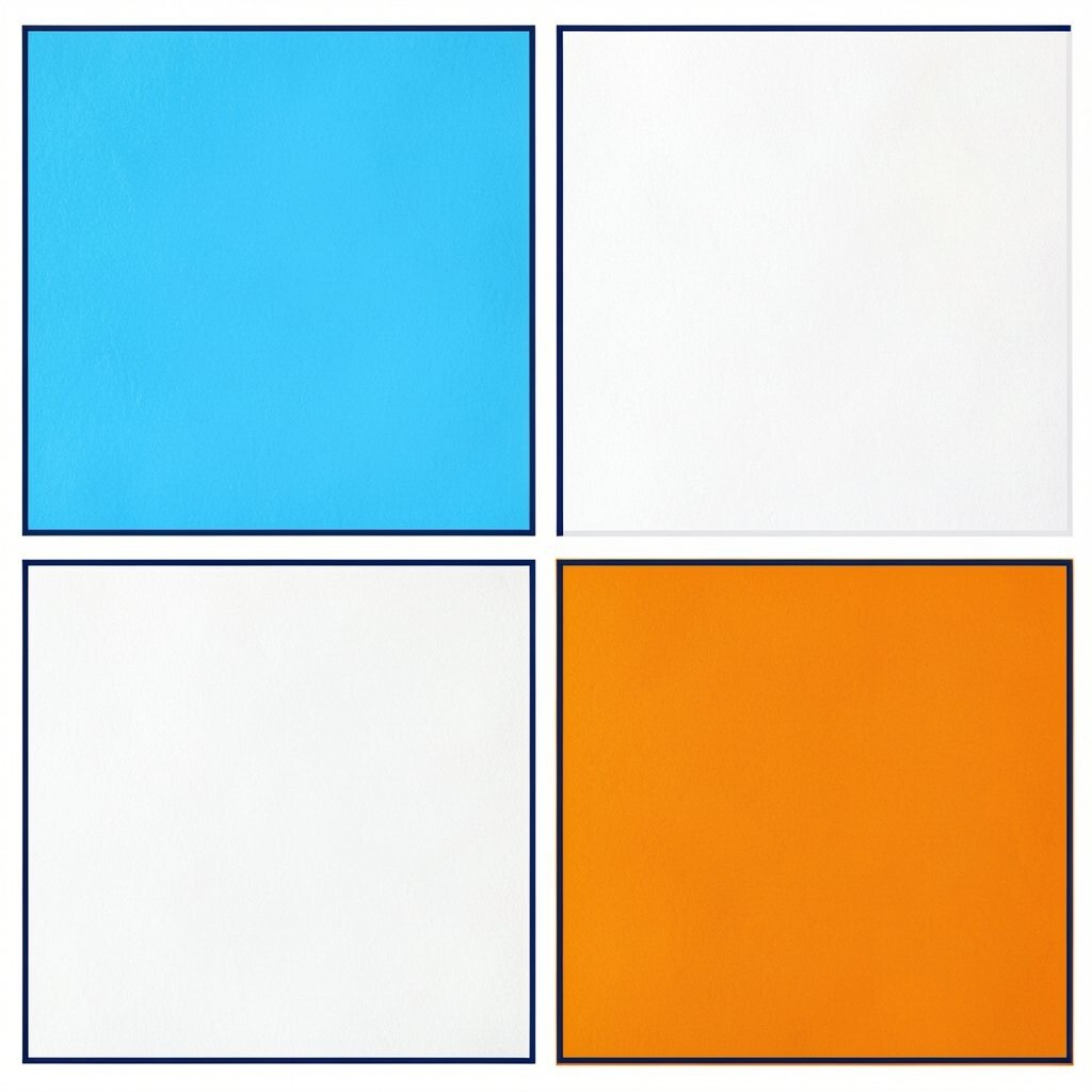
Think of clean school notes with a fun pop of energy. This palette gives you a crisp, modern look that still feels approachable.
It works well for study content, event pages, and beginner-friendly templates. Place navy lines on white or chalk backgrounds for instant readability.
Then add sky blue for sections and tangerine spark for the “tap here” parts. Personalize by choosing a softer tangerine or a bolder red-orange if you want more excitement.
6. Raspberry Jam + Rosewater + Light Gray + Deep Plum + Warm Gold

Imagine a jar of jam with soft light and a tidy label. This palette is rich, romantic, and still easy to control.
Use light gray to keep the layout calm, then bring in deep plum for text or borders. Raspberry jam becomes your star, and warm gold adds a premium-feeling touch.
To make it unique, adjust the rosewater to blush or peach and keep the plum steady. If you’re on a budget, copy these colors from fruit packaging, makeup boxes, or cheap greeting cards.
7. Mint Leaf + Soft Teal + Cloud Gray + Charcoal + Warm Sand Highlight

Picture fresh air, clean lines, and a gentle breeze. This palette feels modern and helps your content look neat without too many steps.
Cloud gray and charcoal give you contrast, so text stays readable. Mint leaf and soft teal can be used for backgrounds, cards, and easy gradients.
For personalization, add the warm sand highlight to one specific element, like a “featured” label. Trend-wise, minty colors are popular in app interfaces and wellness brands right now.
If cost matters, scan a photo from a park or kitchen tile and use a free color picker. You’ll already have the colors without buying anything new.
8. Cherry Red + Cream Off-White + Cranberry + Steel Blue + Black Ink
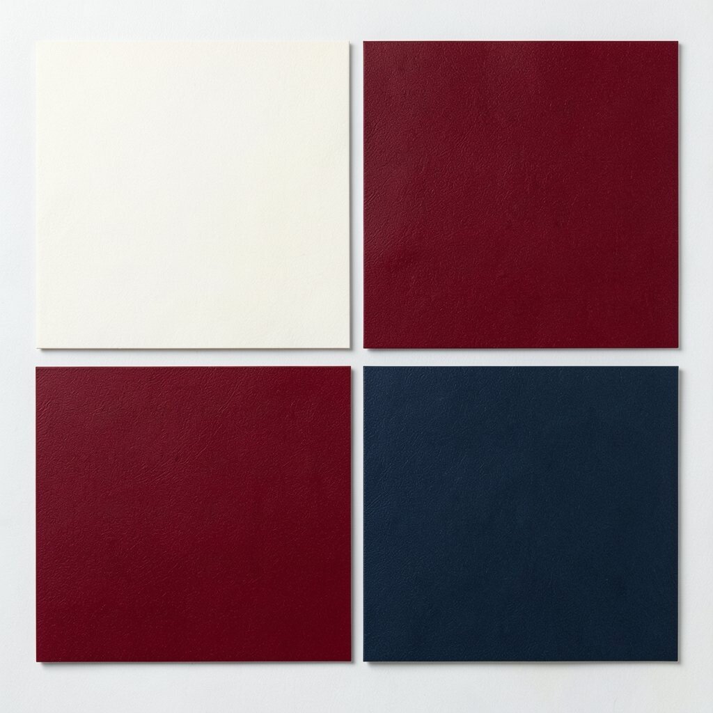
This palette looks bold like a classic diner sign. It’s high-energy, simple to use, and great for headings and punchy banners.
Use off-white as the base so the bright reds don’t feel heavy. Then use black ink for crisp text, and steel blue as a stabilizer for links or secondary areas.
Cranberry can be your “shadow” color for depth. To personalize, choose cherry red that leans darker or lighter depending on your brand.
For budget, you can match these tones from soda labels, old movie posters, or even a ketchup bottle label. Keep it irresistible by using red sparingly and letting off-white do most of the work.
9. Sky Teal + Sea Glass + White + Deep Slate + Lemon Mustard
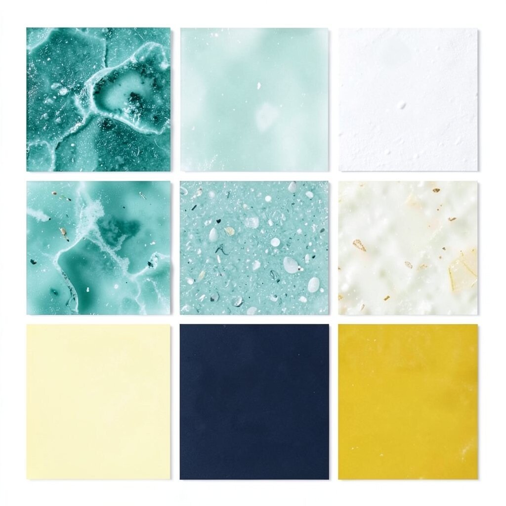
Think of ocean glass polished smooth by time. This palette gives a gentle “wow” that feels clean and creative.
Use white as your main canvas, then add deep slate for the structure. Sea glass and sky teal are perfect for card backgrounds and soft icons.
Lemon mustard is your spark for small highlights like dividers and callouts. Personalize by making mustard more muted if you want a softer look.
10. Plum Grape + Soft Lilac + Warm Gray + Espresso Brown + Pale Gold

Picture a night garden where purple flowers glow under a lamp. This palette feels cozy, a bit mysterious, and very beginner-friendly.
Warm gray helps your layout breathe, while espresso brown keeps everything grounded. Use soft lilac as a background or “section” color, and plum grape for buttons or headers.
Pale gold adds a special detail, like a thin underline or a badge border. If you’re watching costs, pick colors from a scarf, curtain fabric, or a thrifted mug design—photos work great.
11. Coral Reef + Peachy Nude + Eggshell White + Navy + Sandstone Tan
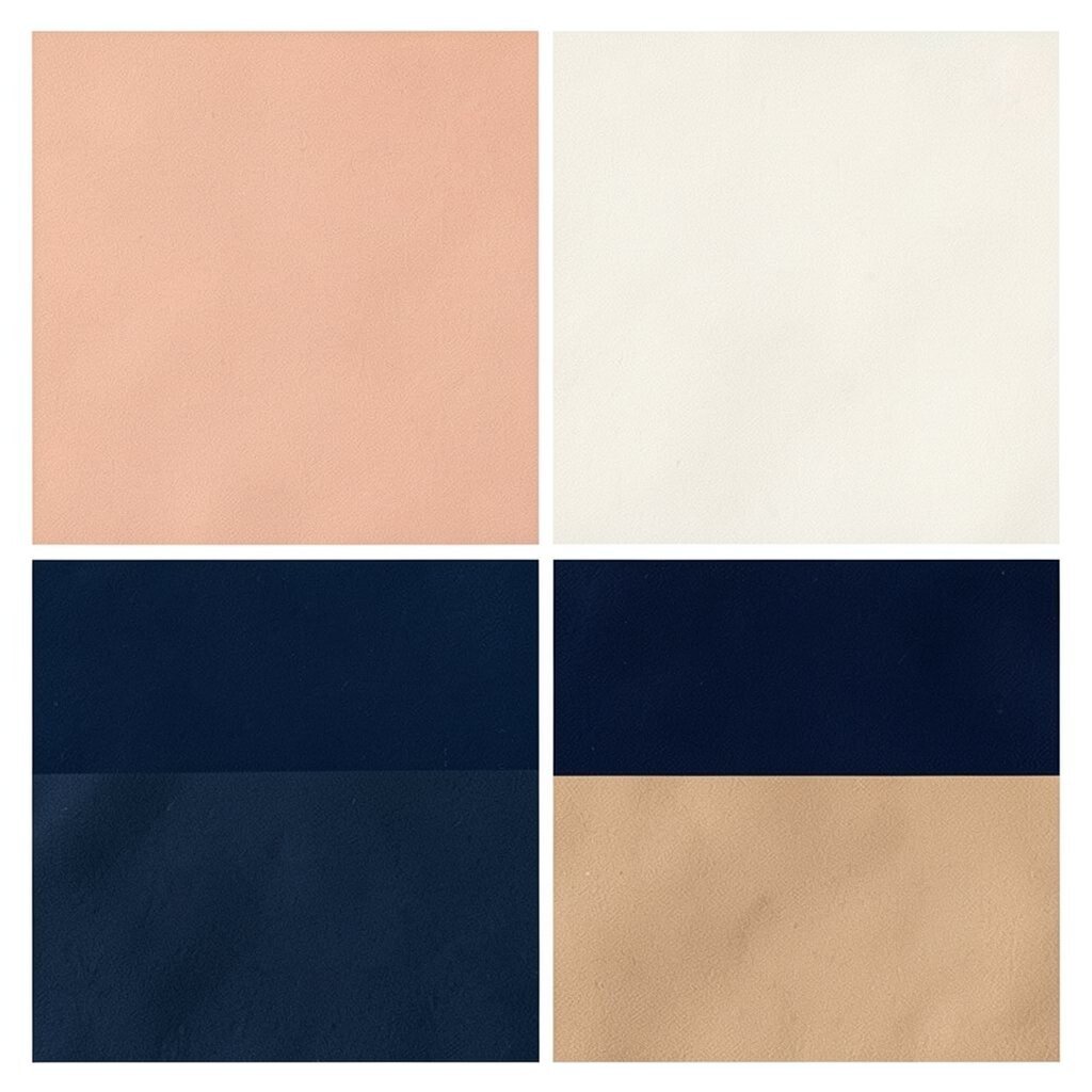
This palette looks like a warm beach day that never gets too hot. Coral reef is playful, and eggshell keeps the whole thing calm.
Navy gives you strong contrast, which makes text easier to read on screens. Use peachy nude for bigger blocks and coral reef for standout elements like headings.
For uniqueness, try a slightly dustier coral or a more peachy nude so it feels personal. Cost considerations are easy here: you can steal these colors from beach photos, travel postcards, or free palette tools.
12. Cool Blue + Ice White + Lavender Mist + Slate Gray + Mint Tint
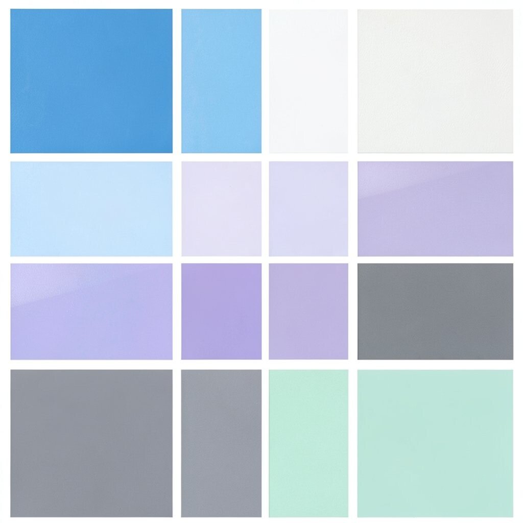
Imagine a winter morning where everything looks bright and quiet. This palette is crisp, organized, and great for modern layouts.
Start with ice white for backgrounds and slate gray for text. Cool blue and lavender mist create gentle variety without causing chaos.
Mint tint is your “surprise” color for small icons and highlights. Personalize by shifting lavender toward periwinkle or toward pale pink depending on your style.
Current trends often favor icy tones for wellness, design studios, and event graphics. To stay budget-friendly, test the palette in a single template first, then reuse it everywhere.
13. Olive Grove + Oat Cream + Muted Orange + Charcoal + Forest Teal
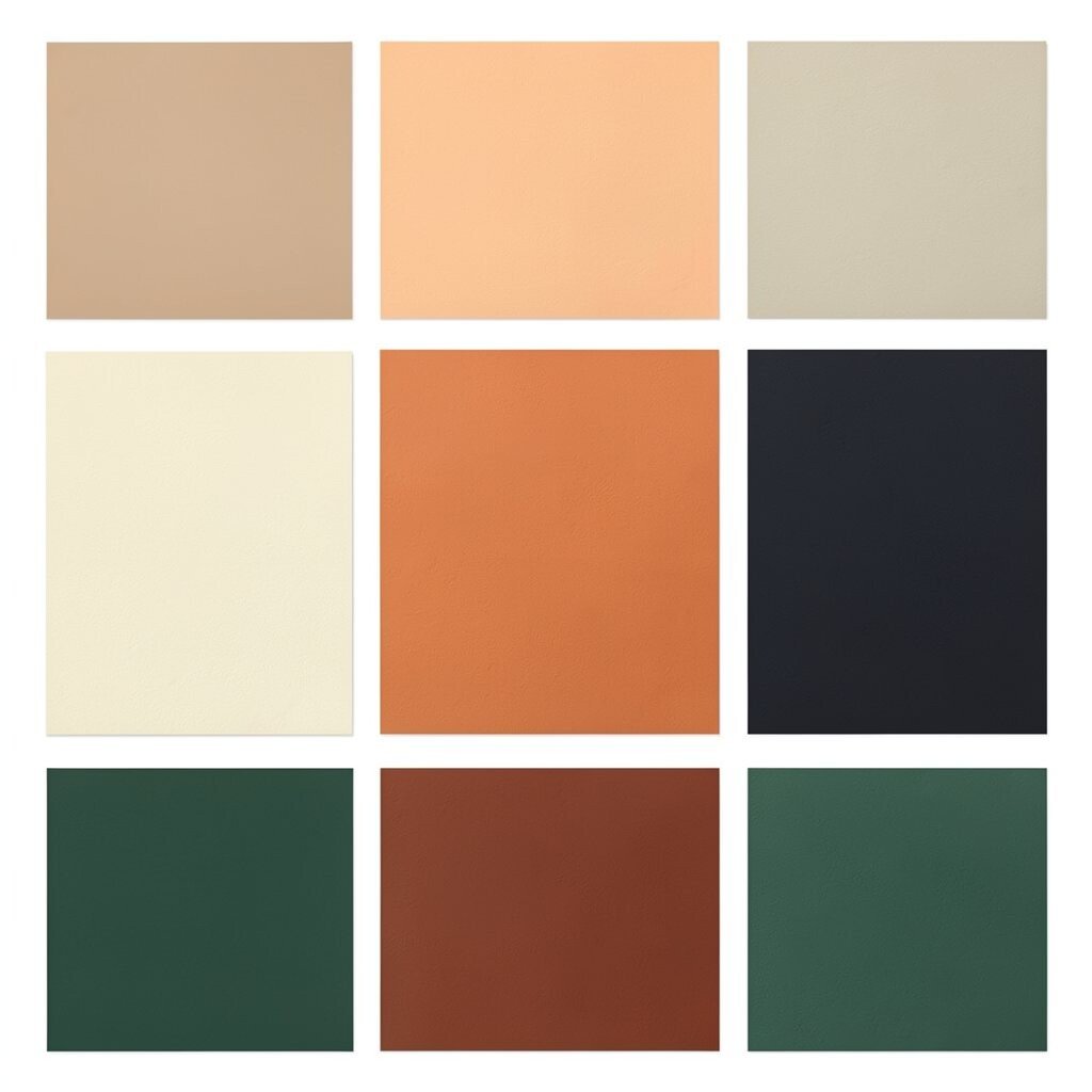
This palette feels like handmade goods and thoughtful recipes. Olive grove adds maturity, while oat cream makes it welcoming.
Muted orange gives just enough energy for calls to action. Use charcoal for text and borders so the look stays clear and not confusing.
For uniqueness, make the olive more yellow or more green depending on your theme. If you’re on a budget, use brown kraft paper tones, bottle labels, or snack packaging to pull these colors quickly.
Try applying forest teal only to one or two places, like links and icons. That restraint makes the whole palette look intentional.
14. Tropical Green + Aqua + Soft White + Chocolate Brown + Mango Accent
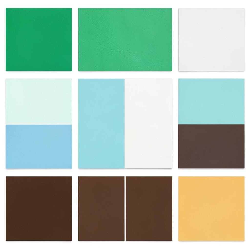
Picture palm leaves, clear water, and a bright fruit bowl on a table. This palette feels lively and energetic while still being easy to arrange.
Chocolate brown makes strong headings and gives structure. Soft white provides clean space, while aqua and tropical green create the main visual rhythm.
Mango accent should be used lightly for badges, “new” markers, and buttons. Personalize by swapping mango with a peachy orange if you want a gentler mood.
Cost-wise, you can match these colors from nature photos you already have. Trend-wise, tropical accents keep showing up in summer graphics, product pages, and playful branding.
15. Burgundy Wine + Soft Beige + Light Sand + Dark Teal + Rosewood
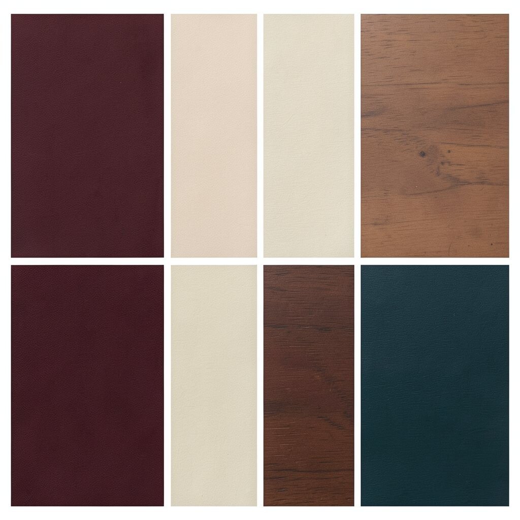
Think of warm reading lamps, leather covers, and quiet confidence. This palette feels elegant and beginner-proof.
Soft beige and light sand keep everything easy on the eyes. Dark teal adds a modern twist, and burgundy wine makes your headings feel important.
Rosewood works as a subtle second accent for icons and smaller text. To personalize, choose a burgundy that’s closer to brick or closer to deep wine based on your brand.
If you need to keep costs down, pull these shades from a notebook cover, a thrift-store book, or a fabric print. Then reuse the palette in one place first, like a banner or card set.
16. Pastel Blue + Blush Pink + Cream White + Charcoal + Goldenrod

This palette is like a greeting card that also wants to be professional. The blend of soft colors with one strong neutral makes it super easy to place.
Use cream white as your base, charcoal for text, and pastel blue for main sections. Blush pink should be for gentle highlights like small backgrounds or dividers.
Goldenrod makes your palette feel warm and “finished.” For uniqueness, adjust the blush to a dusty rose or a lighter peach so it matches your vibe.
17. Dark Forest + Warm Taupe + Pale Mint + Oat Milk + Copper Accent

This one looks like a calm studio with plants and good lighting. It’s mature without being boring, and it works for lots of content types.
Warm taupe and oat milk act like a friendly neutral background. Use dark forest for headings, and pale mint for secondary blocks that need softness.
Copper accent adds a creative shine that feels handmade. Personalize by choosing a more reddish copper or a more muted bronze depending on the tone you want.
Cost considerations are great here because you can find these shades in cork items, leather look products, and earthy paint swatches. Current trend-wise, “warm minimal” palettes stay popular for brand identities and clean websites.
18. Royal Purple + Periwinkle + Soft Gray + Pure White + Soft Gold
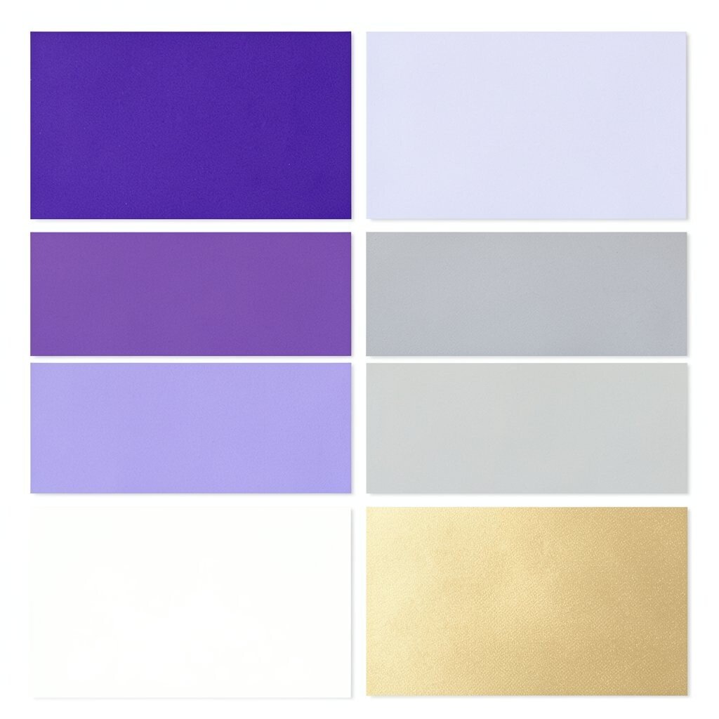
Imagine a stage light shining on a confident brand. This palette feels bold, polished, and surprisingly simple to apply.
Pure white gives instant clarity, and soft gray helps you separate sections. Use royal purple for headings and periwinkle for supportive backgrounds.
Soft gold should be used like seasoning, not the whole meal. Personalize by adjusting periwinkle toward a calmer blue or toward lavender depending on your project.
19. Smoky Teal + Sea Salt Gray + Warm White + Deep Brown + Peach Cream
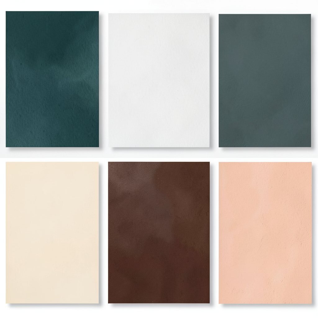
This palette looks like foggy mornings and cozy cabins. The smoky teal keeps it interesting, while warm white makes it safe and readable.
Deep brown is perfect for text, icons, and borders because it stands out. Sea salt gray can be your layout “glue,” helping everything line up visually.
Use peach cream for subtle warmth in highlights, chips, and small labels. For uniqueness, shift the peach cream toward apricot if you want a brighter feel.
Budget tips: copy these colors from a coffee shop menu, a postcard from a beach, or a simple outfit photo. Then test it on one screen and make sure the text contrast feels comfy for your eyes.
20. Charcoal + Off-White + Electric Blue + Lime Zing + Coral Advice

This palette brings instant “modern energy” without needing fancy design skills. Charcoal and off-white form a clean base, while electric blue keeps things techy.
Lime zing adds a fun pop, and coral advice makes small elements feel warm and human. Use this palette like a spotlight system: mostly neutrals, with color bursts where attention should go.