Checkerboard floors add instant charm and a confident style. They also work in ways that feel practical, not fussy.
1. Classic Black-and-White Checkerboard Entryway
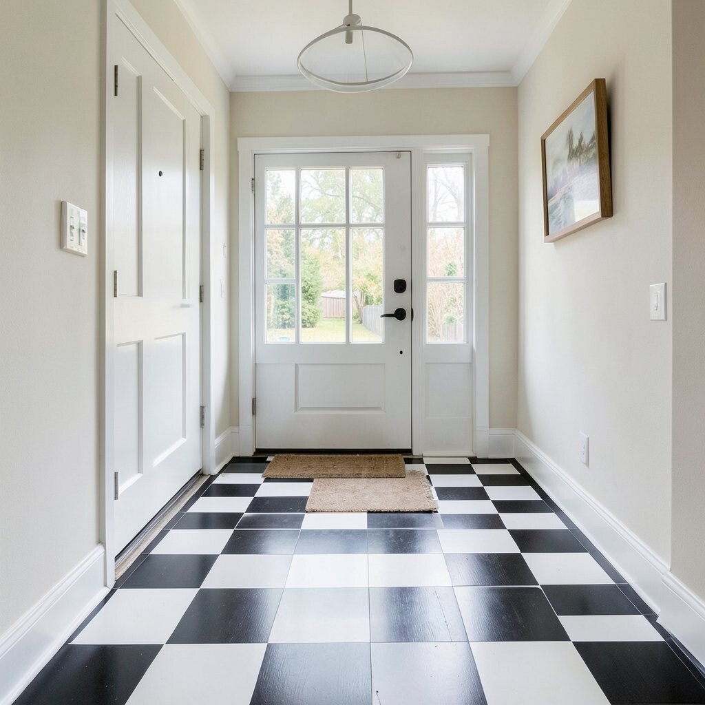
A black-and-white checkerboard at the front door greets guests with bold clarity. It also hides small scuffs better than a solid finish.
To keep it looking sharp, use porcelain tiles with a matte or satin glaze for better traction. Choose grout in a matching light or dark tone so the pattern stays crisp from day to day. For cost control, buy standard sizes like 12×12 and plan a simple border so you do less cutting.
2. Warm Wood-Effect Checkerboard in the Kitchen
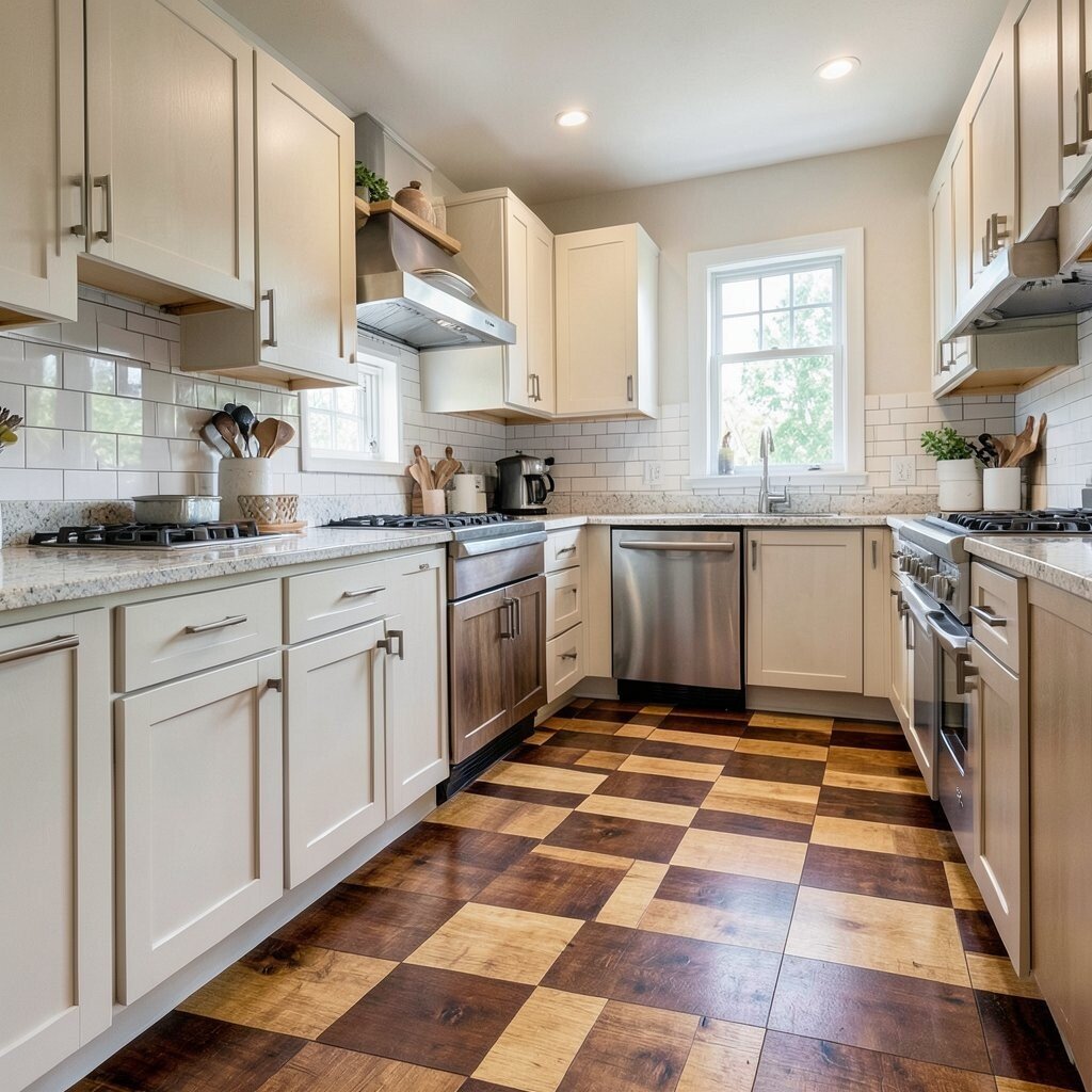
Pairing light tan and medium walnut-toned tiles gives a checkerboard floor a cozy, kitchen-ready feel. It brings warmth underfoot while still reading as graphic and clean.
Because wood-effect tiles resist stains and are easy to wipe, they’re a smart choice for spills and busy meal prep. Lay the tiles in a flat, consistent grid, then seal grout if your product recommends it. If you want personalization, add a small “runner” section in the same pattern leading to the sink area.
For budget planning, estimate for extra tiles around cabinet edges, and consider a half-height border with a contrasting color to reduce tile use. Current trends favor natural tones and subtle movement, so look for tiles with slight grain variation instead of perfectly uniform “planks.”
3. Navy and Cream Checkerboard Bathroom Floor
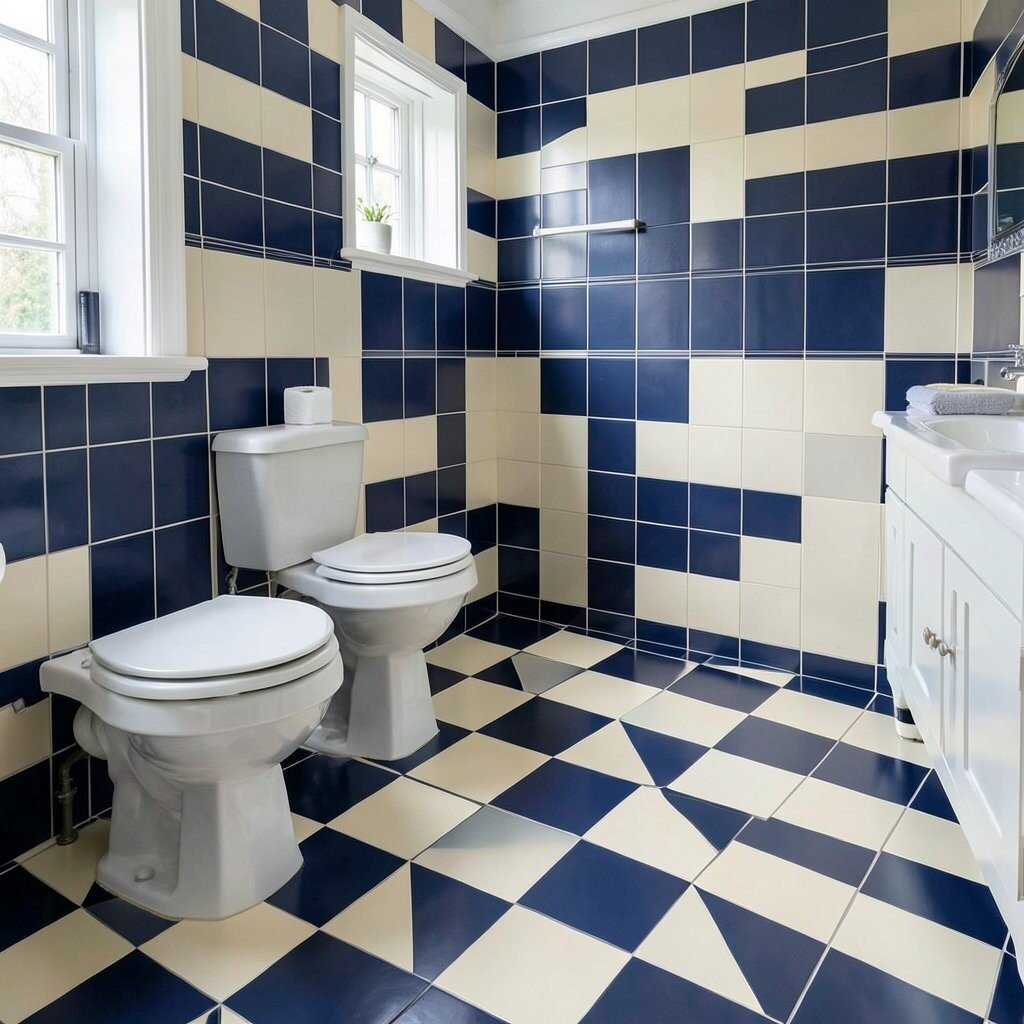
Navy and cream create a fresh, coastal-calm look that still feels stylish. The contrast makes the bathroom feel taller and brighter.
Use tiles with a slip-resistant rating, especially if the bathroom gets wet often. A practical tip is to pick grout that matches the cream tiles so hairline dirt shows less. If you want a unique touch, add a thin solid band along the vanity line to break up the pattern visually.
Cost can be kept in check by choosing fewer specialty accents and focusing the premium look on the checker field. A trend right now is pairing deep colors with simple fixtures like brushed nickel or matte black. That mix keeps the floor the star without overwhelming the room.
Keep the pattern aligned by snapping chalk lines before you start, then dry-lay a few rows to confirm spacing. When grouting, don’t rush—clean the surface right away so the pattern stays crisp.
4. Small-Scale Checkerboard for a Cozy Hallway
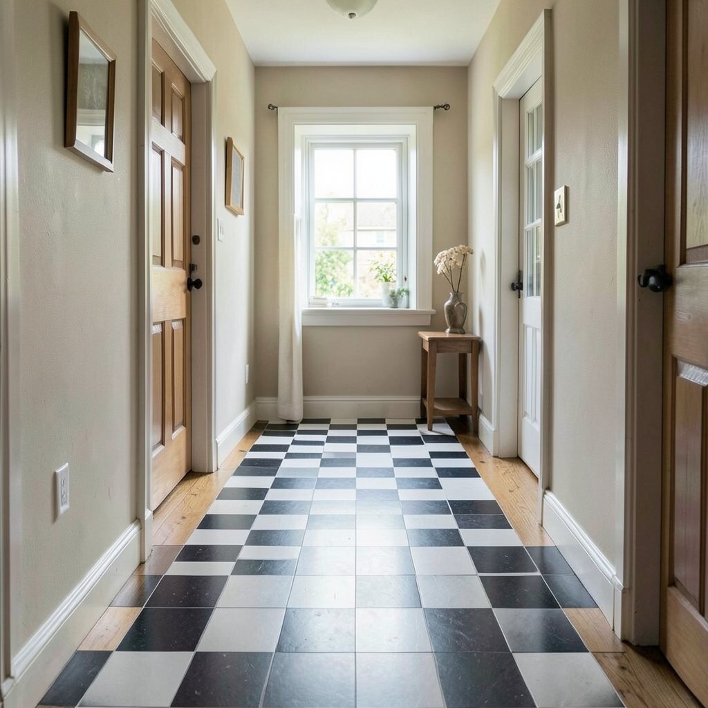
A smaller checkerboard pattern can make a narrow hallway feel lively instead of tight. It also draws the eye forward, which helps the space feel longer.
Choose tiles around 2×2 or 2.5×2.5 inches to keep the rhythm tight and easy to install. Use a light grout to keep the look airy, and plan for transitions at doorways so the pattern doesn’t get cut off awkwardly. If you want personalization, add a single corner tile in a textured or glossy finish to create a subtle focal point.
5. Color-Pop Checkerboard with Terracotta and White
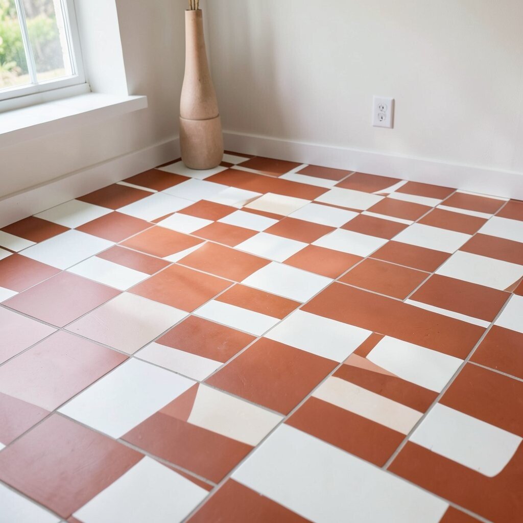
Terracotta and white checkers bring a sun-baked, inviting vibe that feels grounded. The earthy color works especially well with warm lighting and natural materials.
For practical benefits, terracotta-toned floors can mask everyday dust and minor marks more easily than very pale options. Seal your tiles if they’re porous, and choose a grout that’s stain-resistant for easier cleaning. To customize, consider switching the “white” to a creamy off-white so the pattern feels softer.
When budgeting, look for tile lines that come in pre-set color groups so you don’t have to hunt for matching grout. Today’s trends lean into handmade looks, so try tiles with slight tonal variation rather than perfect uniformity. That choice makes the floor feel curated instead of overly manufactured.
6. Monochrome Grey Checkerboard for Modern Living Rooms

Grey checkerboard flooring gives modern spaces a sleek, architectural feel. It’s bold without requiring bright colors, so it works with almost any decor style.
To keep it from feeling cold, pair the floor with warm wood furniture or soft textiles. A useful tip is to choose a grout shade that’s close to the tile color so the checker lines stay elegant rather than high-contrast. If you want a unique twist, consider large-format grey tiles with narrow checker spacing for a calmer look.
Cost varies based on tile thickness and finish, so compare installation needs too, not just the sticker price. A trend right now is “quiet luxury,” which means fewer accessories and more attention to texture. Matte finishes, large planks nearby, and minimalist wall colors help the checkerboard look intentional.
Plan the layout so the pattern centers under the main seating area, since asymmetry can feel accidental in a living room.
7. Penny-Round + Checkerboard Hybrid Entry Style
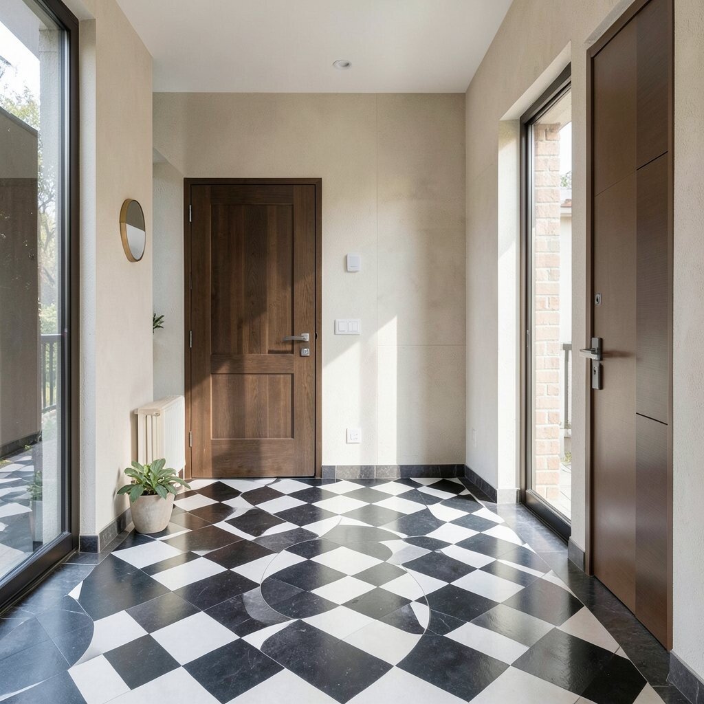
A penny-round border around a checkerboard field adds movement while still keeping the classic check pattern. The mix feels artisanal and gives you a clear “frame” for the entry.
This hybrid design is useful because it can define traffic paths, especially in homes where everyone enters through the same route. Use slip-resistant penny-round tiles in the border to improve safety and reduce glare. For a personalization idea, choose a border color slightly warmer than your checkerboard so it feels like a warm welcome.
Budget-wise, mix-and-match helps: you can keep the checkerboard as your main area and use pricier specialty tile only at the edges. Current trends favor textured surfaces, so this combo fits right in. Keep the grout consistent across both tile types so the whole floor feels like one design.
Before installing, dry-lay a small section to confirm the curves match the grid lines, then adjust spacing early to avoid last-minute surprises.
8. Retro Pink and Black Checkerboard Dining Space
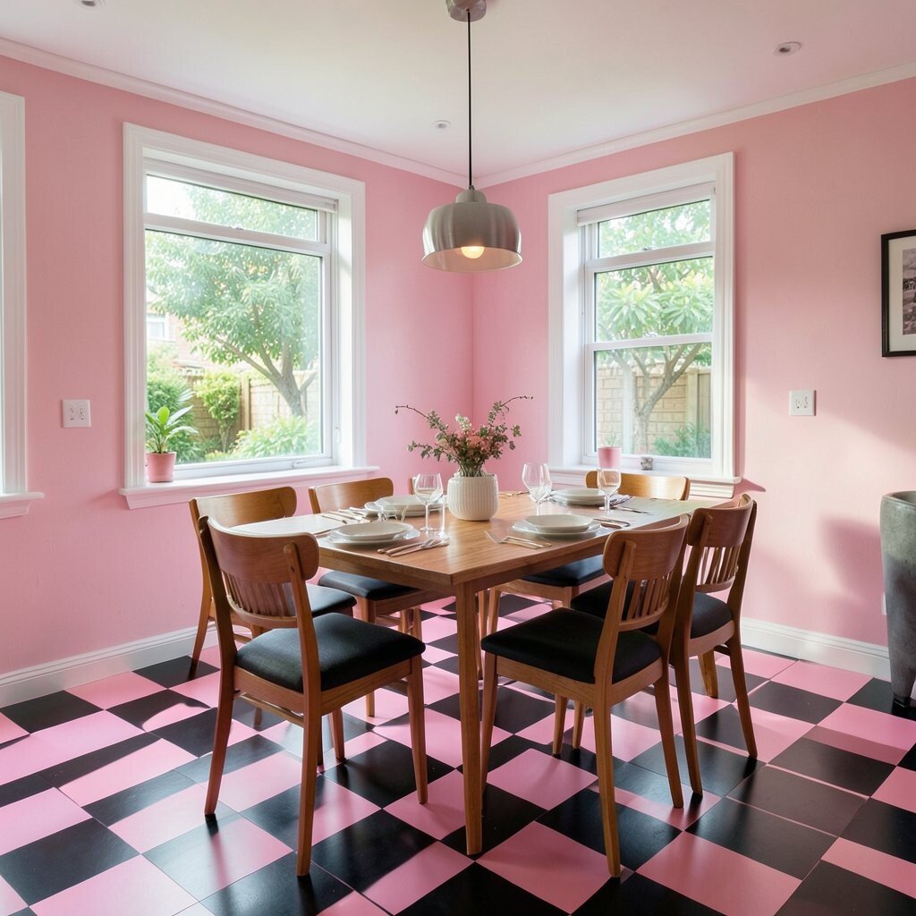
Retro pink and black checkers can turn a dining room into a fun place people want to linger. The bold contrast makes the table feel even more inviting.
To keep it from feeling too loud, balance the floor with neutral walls and simple chair styles. Practical care tip: use a grout cleaner that’s safe for your grout type, and wipe spills quickly to prevent staining. For uniqueness, place a slightly darker “anchor” checker near the center where the chandelier hangs or where the table sits.
If you’re thinking about cost, look for quality vinyl underlayment or thinset guidance so the subfloor stays level and the tiles bond well. Trends today often bring retro color back in a controlled way, so stick to two main colors and add texture through wall art or lighting. That approach makes the floor feel cohesive instead of chaotic.
When laying out rows, mark your centerline and keep the pattern perfectly squared to the door and window so it looks intentional, not random.
9. Oversized Checkerboard in a Loft-Style Studio
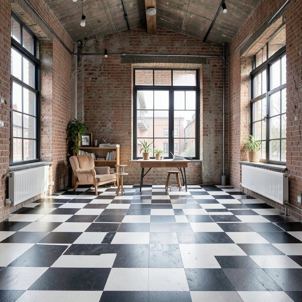
Big checkerboard tiles create a dramatic, graphic look that suits open loft layouts. From a distance, the floor reads as one strong design block.
With fewer grout lines, oversized tiles can also be easier to clean. For best results, use a level subfloor and follow the installer’s guidance, because large tiles show lippage quickly. Personalize it by choosing a satin finish that softens the contrast while still keeping the pattern visible.
Cost considerations include both the tile price and labor time, since large tiles often require careful handling and precise leveling. A trend right now is statement flooring that replaces decor, so pair this floor with plain walls and minimal styling. If you love contrast, use darker grout; if you want softer visuals, use lighter grout to blur the grid edges.
For a unique touch, extend the checker pattern under part of a kitchen island or coffee bar, but stop before it crowds walkways.
10. Bright White Checkerboard with Natural Stone Look
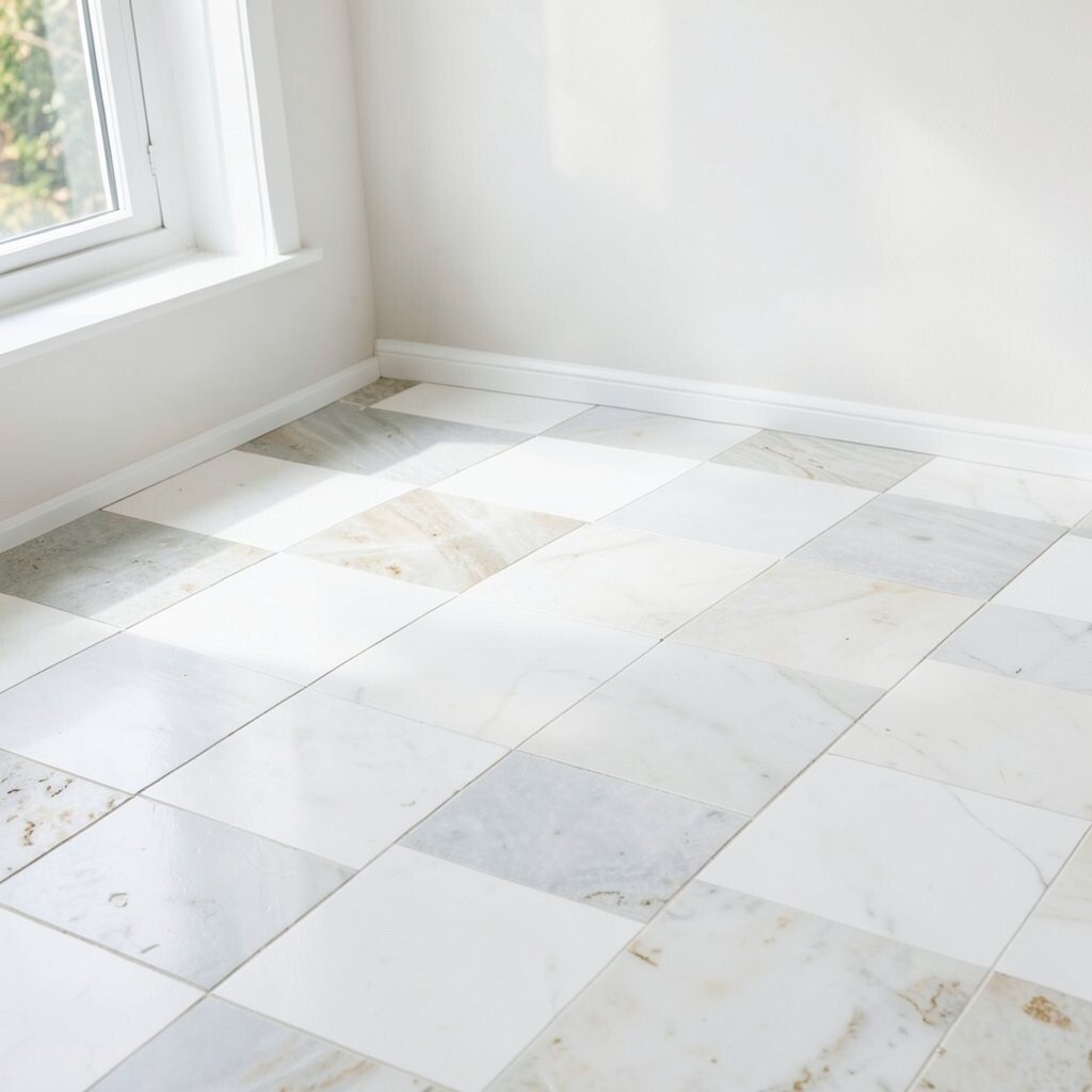
White checkerboard flooring with a natural stone look feels clean, airy, and timeless. The design gives a classic rhythm without making the room feel heavy.
Choose tiles with subtle veining so the floor doesn’t look flat, especially under daylight. For practical tips, seal if recommended and keep a pH-balanced cleaner on hand for regular maintenance. If you want personalization, add a thin line of a contrasting material at the doorway transition, like a brass strip or narrow dark grout band.
Budget-wise, natural-stone-effect tiles can be a smart compromise—less cost than real stone but with a similar vibe. Current trends show people leaning into light floors again, particularly in modern homes that use warm neutrals. Keep the rest of the room in soft tones so the checker pattern doesn’t fight your furnishings.
11. Black-and-Copper Checkerboard for a Glam Powder Room
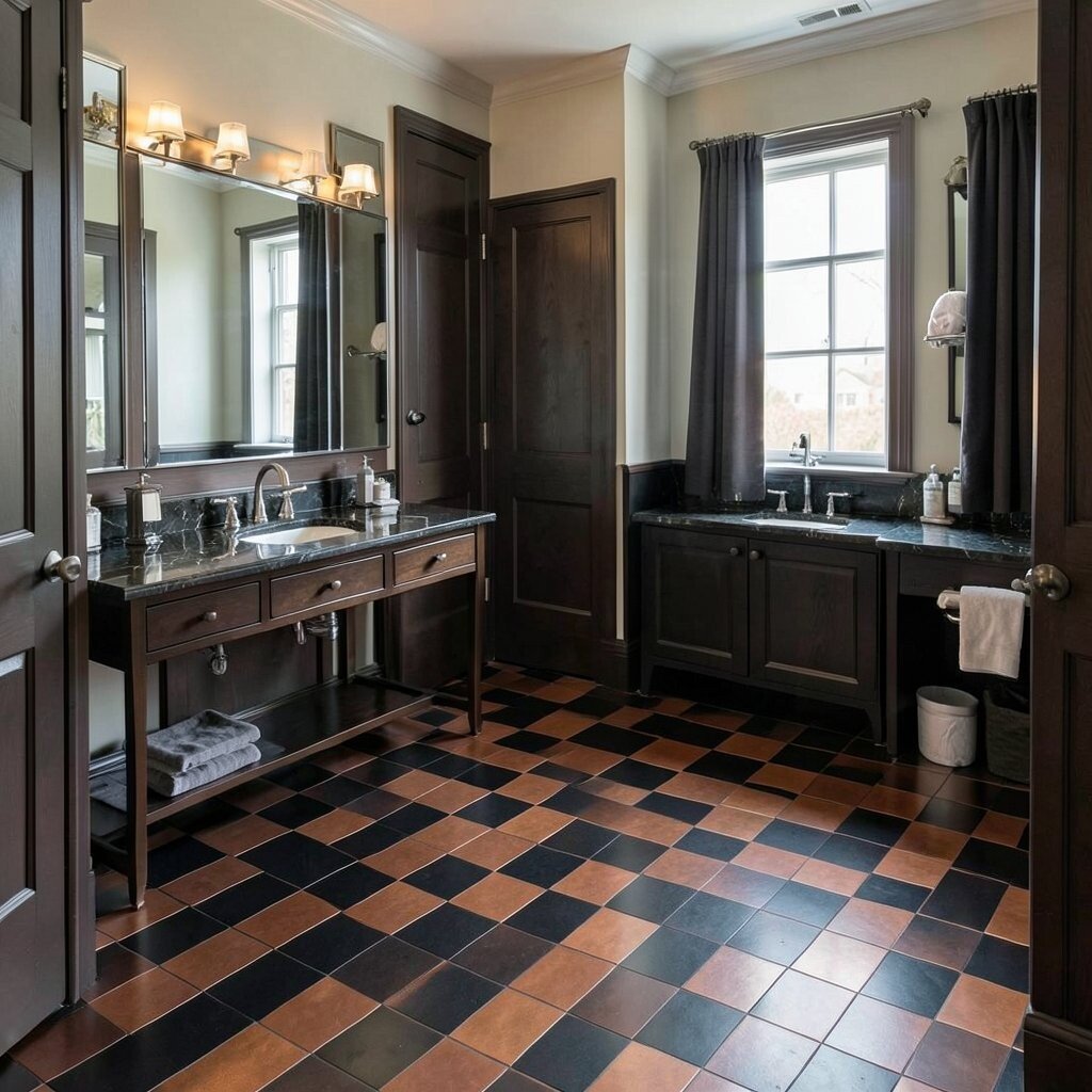
Black and copper checkers add a glam, evening-style glow that feels special. The metallic accent catches light and makes the room feel more upscale.
Use copper-toned tiles sparingly if you want a balanced look, or choose a full checker grid if you want maximum impact. Practical care matters here, so use cleaners that won’t dull metallic finishes. For personalization, pair the floor with warm brass faucets and a mirror with a subtle frame, so the copper note feels intentional.
Cost considerations can be higher with metallic or specialty finishes, so plan your measurements carefully to avoid extra waste. A trend that fits this style is “dark walls, bright details,” which makes the powder room feel like a design moment. Keep the wall color in a matte finish and avoid shiny surfaces that compete with the floor shimmer.
When installing, check tile batch numbers for consistent coloring, and dry-fit first to confirm the copper aligns nicely with your grout lines.
12. Sage Green Checkerboard for a Calm, Nature-Inspired Home
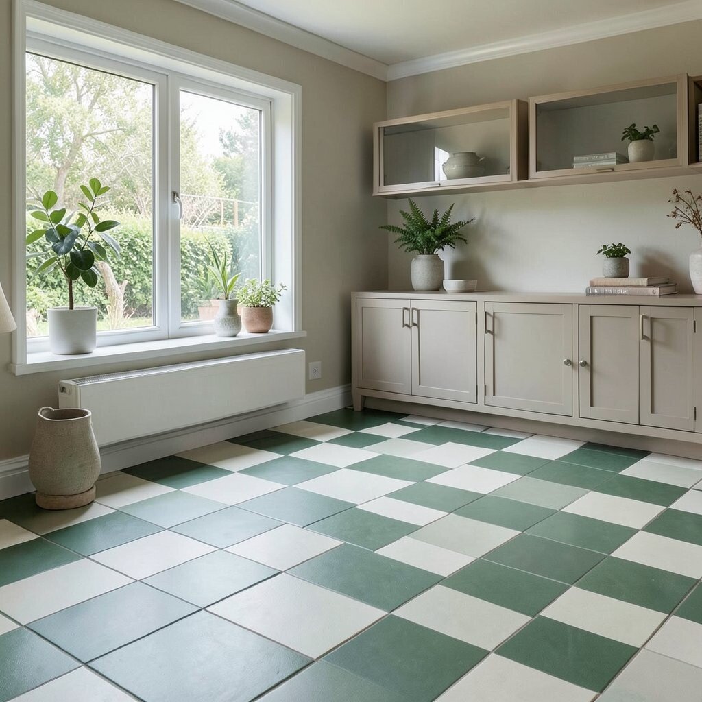
Sage green checkerboard floors bring a gentle, nature-friendly mood into everyday life. They work beautifully in spaces where you want calm energy rather than high drama.
Pair sage with warm whites or light beige grout to keep the pattern soft. For practical tips, choose slip-resistant tiles and keep grout sealed if your grout type benefits from it. Personalize it by selecting tiles with a slight speckle or natural texture so the floor looks like it belongs to the outdoors.
13. Checkerboard Tile Stair Runner Concept
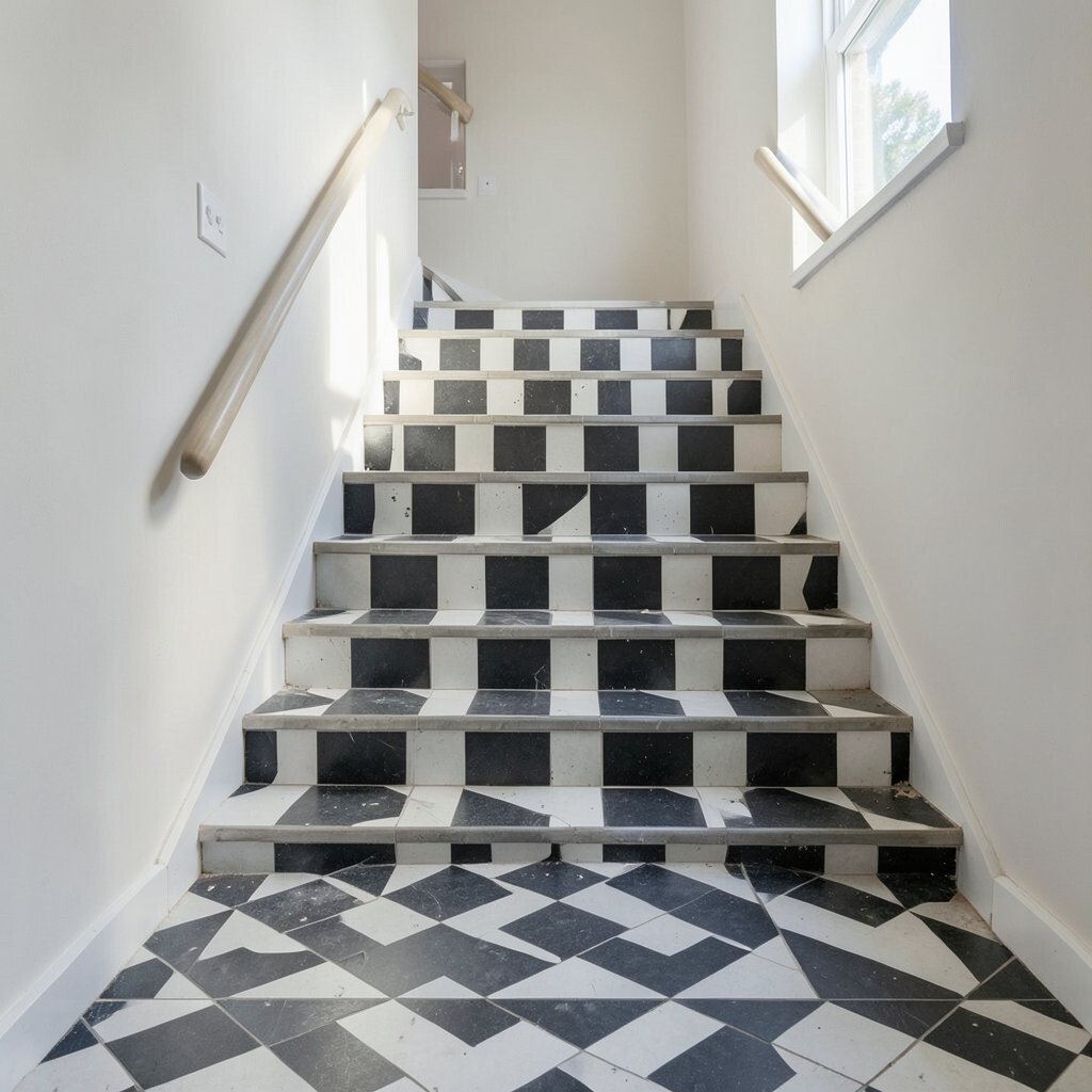
Adding a checkerboard stair runner brings visual rhythm up the staircase. It’s a great way to make stairs feel like a designed feature instead of just a walkway.
This idea is unique because you don’t need to tile the whole floor—just the treads or a runner section. Use stair-nosing kits for safety and clean edges, and prioritize traction so feet stay secure. For personalization, you can match the runner colors to your entryway floor for a consistent flow through the home.
Cost depends on how many steps you cover and whether you’re using full tile treads or trim pieces. A trend right now is using bold flooring on vertical paths like stairs to create a gallery-like feel. If you’re working within a budget, cover only the top few steps where the most foot traffic and viewing happens.
Plan the pattern so the checkers align across steps, or intentionally offset them for a playful look.
14. Classic Checkerboard with a Decorative Border Tile
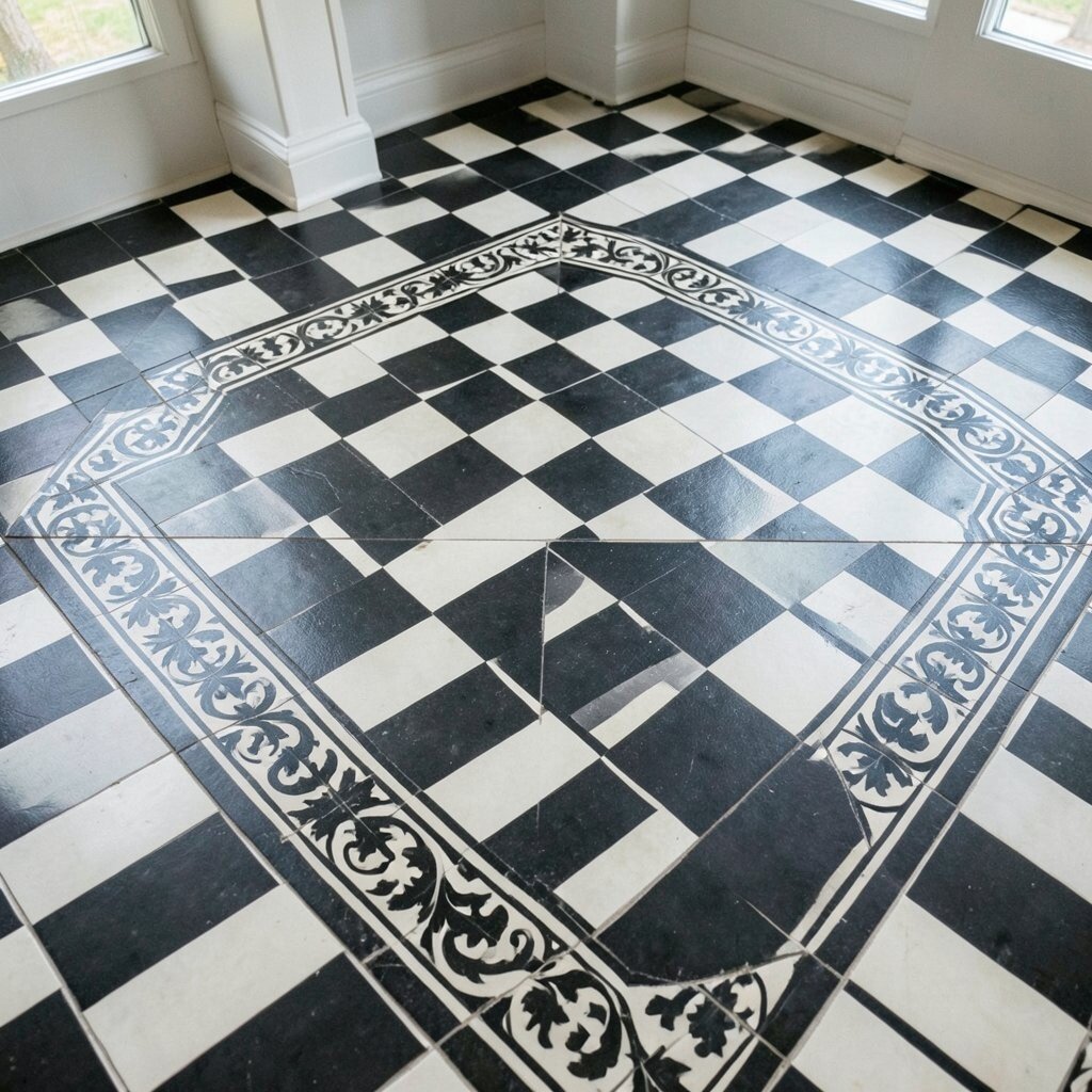
A decorative border around a checkerboard field makes the floor feel finished and custom. It can turn a simple room into something that looks designed by a pro.
Pick a border pattern that matches your home style—subtle geometry for modern homes, or scrolling motifs for traditional rooms. For practical tips, create a detailed tile map so you know exactly how many border pieces you need. Budget-wise, borders can be cost-effective because you use specialty tiles in a narrow band instead of covering the entire floor.
15. Coastal Checkerboard with Light Blue Accents
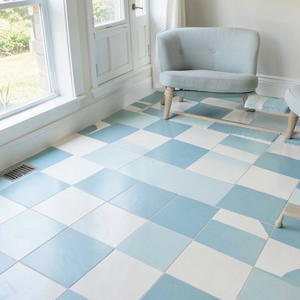
Light blue checkerboard tiles bring a breezy, coastal feel without going full “beach theme.” The subtle color adds calm and freshness to kitchens and bathrooms.
Use the blue as one of the two main check colors, and keep the other color crisp white or soft ivory. For practical guidance, choose water-friendly grout and consider sealing for added protection. Personalize it by using a textured tile finish so it resembles sea glass when light hits it.
Cost considerations: plain ceramic checker tiles are usually budget-friendly, while specialty textured finishes can cost more. Current trends include coastal touches that feel sophisticated, so pair the floor with natural fibers, white cabinetry, and simple hardware. If you want a unique twist, add matching blue checkers as a small inset near a doorway.
Maintain the look by wiping with gentle cleaner and avoiding harsh acids that can weaken grout over time.
16. Terracotta-Look Checkerboard with Woven Mat Placement
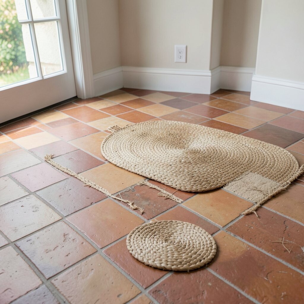
A terracotta-look checkerboard creates warmth and personality even before you add decor. The pattern pairs nicely with earthy textiles like woven rugs and natural baskets.
One practical tip is to plan where rugs will sit so your checkers still show the main design area. If you place mats strategically, you can protect high-traffic spots without hiding the entire pattern. For personalization, use a rug color that echoes the “white” check shade so everything feels coordinated.
Cost-wise, terracotta-look tiles can be a great middle option compared to true clay, and they’re often easier to clean. Today’s trend emphasizes layering textures, so let the floor be a warm base and add comfort on top with soft seating and textiles. Keep grout in a complementary shade so the check pattern doesn’t feel too stark.
17. Monochrome Checkerboard with Textured Tile for Depth
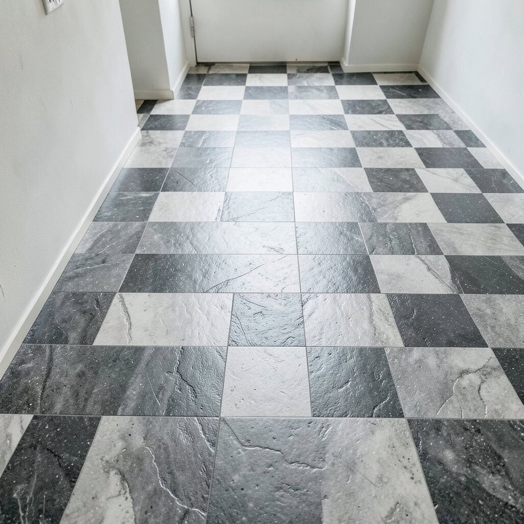
A monochrome checkerboard becomes more interesting when the tiles have texture. Even with only one color family, the floor looks dimensional and rich.
Look for tiles with a subtle relief, like a lightly mottled surface or gentle patterning within the glaze. Practical benefits include a bit of slip resistance and less visible foot prints, depending on the finish. For personalization, combine a slightly glossy tile in every few squares with the matte ones for a quiet sparkle.
Cost considerations depend on the texture level, since premium textures can raise the price. A current trend is tactile flooring—people want floors that look and feel better, not just “pretty in photos.” Pair textured checker tiles with smooth walls and simple trim to avoid visual overload.
18. Oversized Classic Checkerboard in an Open-Plan Space
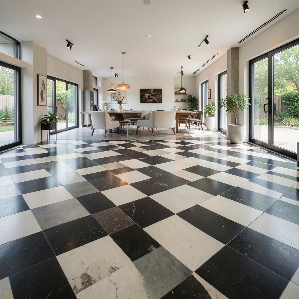
Oversized checkerboard flooring can anchor an open-plan living or kitchen area like an artistic foundation. The wide squares make the design feel bold and modern.
To keep it practical, use larger tiles with consistent thickness so the installation stays smooth across the room. Plan transitions with flooring in adjacent spaces, and decide whether the checker pattern should stop at the kitchen edge or continue for a seamless flow. For a unique touch, align the largest check squares with the center of a dining table or kitchen island so the look feels perfectly planned.
19. Seasonal-Ready Checkerboard with Removable Peel-and-Stick Tiles
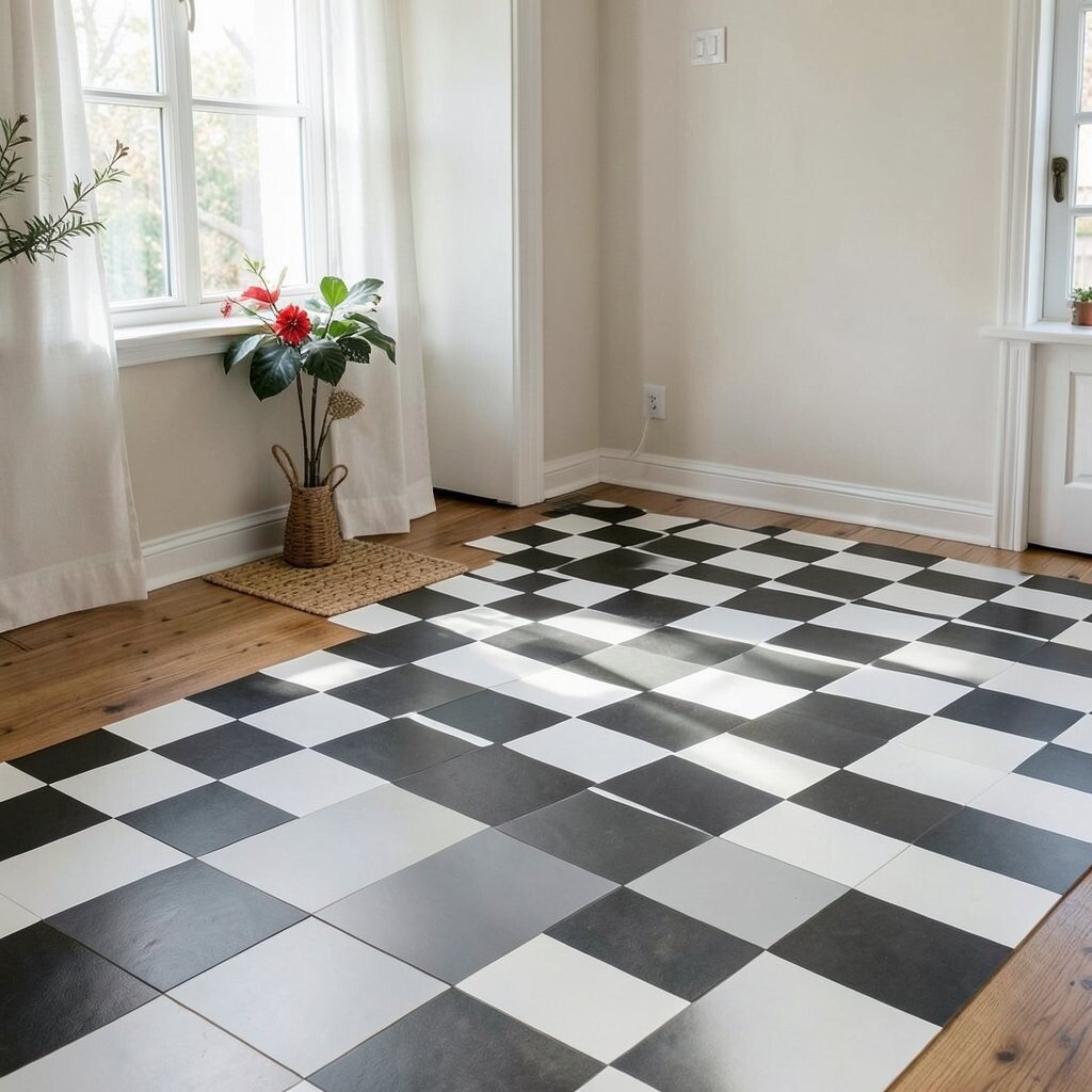
If you like changing your style, consider peel-and-stick checker tiles for an easy update. They let you try a bold look without a long remodeling project.
This unique approach is especially helpful for renters or anyone testing a new color direction. Practical tips include cleaning the surface thoroughly, choosing tiles made for your floor type, and pressing firmly to prevent lifting at edges. For personalization, you can build a checker pattern that matches the colors of your seasonal decor, like spring greens or winter neutrals.
Cost considerations are usually lower upfront, but you may need replacement after a longer period of heavy wear. Current trends show people embracing “style experiments,” and peel-and-stick checker floors fit that mindset well. When you’re ready to refresh again, remove them carefully and keep the area prepared for your next design move.