Colors can act like a quiet soundtrack for your design. The right palette makes people feel calm, excited, or focused in a single glance.
1. Sunlit Honey + Cream + Espresso
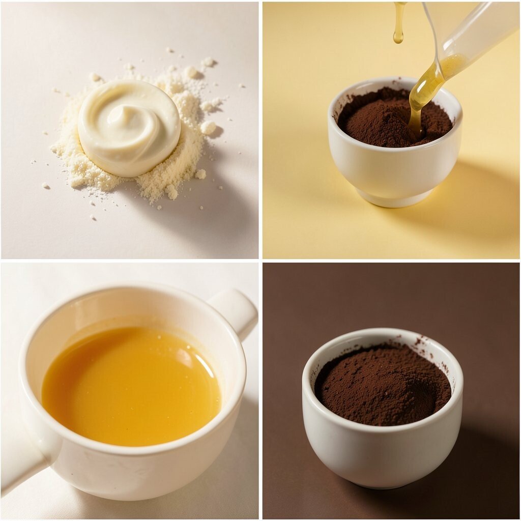
Sunlit Honey glows like warm bread at breakfast, while cream keeps everything soft and friendly. A touch of espresso adds grounded contrast that helps text and buttons feel confident.
This combo is perfect for food brands, cafés, and cozy product pages because it feels welcoming and real. Use honey for highlights like badges, cream for backgrounds, and espresso for headings so the hierarchy stays clear. If you want a more modern look, keep the espresso mostly for text and outlines, not for huge blocks.
For personalization, try swapping honey for a lighter golden yellow or a slightly more orange amber. If you’re designing on a budget, sample these colors from free palette tools and test them in a plain layout first. A current trend is warm “editorial” UI, where cream spaces feel airy and buttons look like gentle stickers.
2. Ocean Mist + Soft Teal + Deep Navy
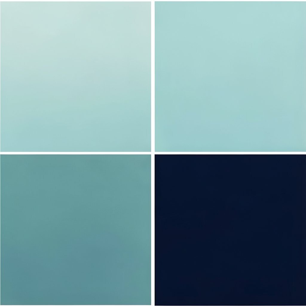
Ocean mist looks like cloudy water in early morning, and it makes your layout feel calm. Soft teal adds a fresh splash, while deep navy keeps everything sharp and readable.
This palette works great for apps about wellness, learning, and travel because it feels clean and safe. Try teal for icons and links, mist for card backgrounds, and navy for headings and navigation. You’ll get a strong benefit: less eye strain, since mist and teal create smoother contrast.
To make it unique, add a tiny accent of silver-gray for dividers or form borders. Cost-wise, it’s easy to print well because teal and navy usually convert nicely to ink. The trend right now is “cool calm” interfaces with lots of breathing room and rounded shapes.
3. Rose Blush + Warm Sand + Charcoal
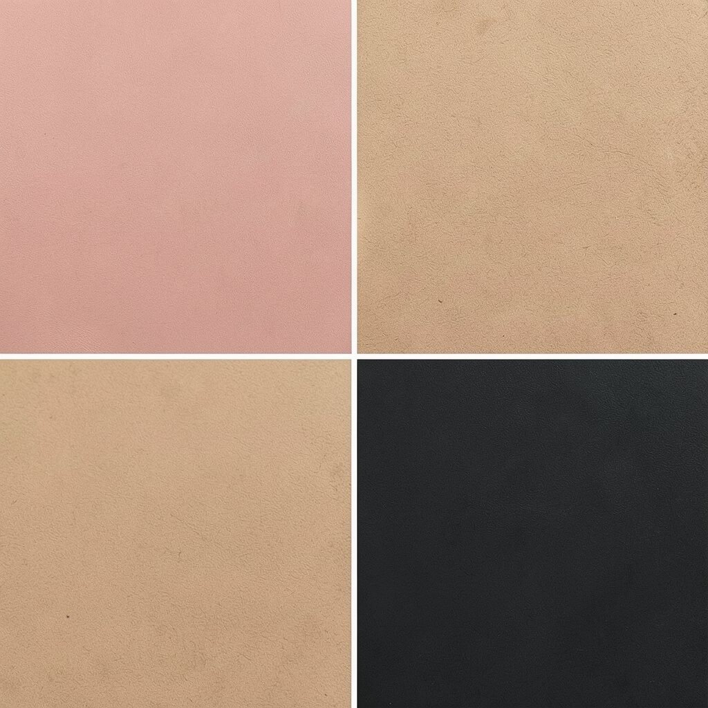
Rose blush brings a gentle, sweet mood that feels romantic without looking too loud. Warm sand grounds it with a natural, beachy calm, and charcoal adds strong structure for type.
This is a great choice for beauty sites, handmade shops, and lifestyle blogs. Use blush for hero areas and focus states, sand for backgrounds, and charcoal for body text. The benefit is a “premium soft” look that still stays readable.
Make it personal by choosing a blush that matches your brand story: pink-peach for playful vibes, or dusty rose for mature elegance. If you need a low-cost setup, use one blush and one sand, then rely on charcoal and white for everything else. A helpful trend is pairing blush tones with clean typography and minimal icons.
4. Forest Pine + Sage Gray + Off-White
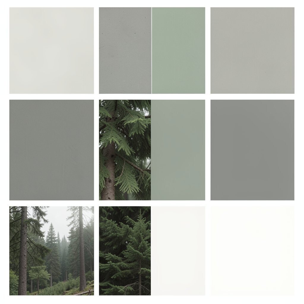
Forest pine feels like walking through tall trees, crisp and energizing. Sage gray softens the mood, and off-white keeps the whole design airy and bright.
This palette suits eco brands, outdoor gear, and home decor because it signals nature and trust. Pine is best for headlines, sage can be your secondary text color, and off-white works for pages and sections. A key benefit is that green and gray tones look natural together, which helps your page feel balanced.
5. Berry Jam + Creamy Vanilla + Ink Black
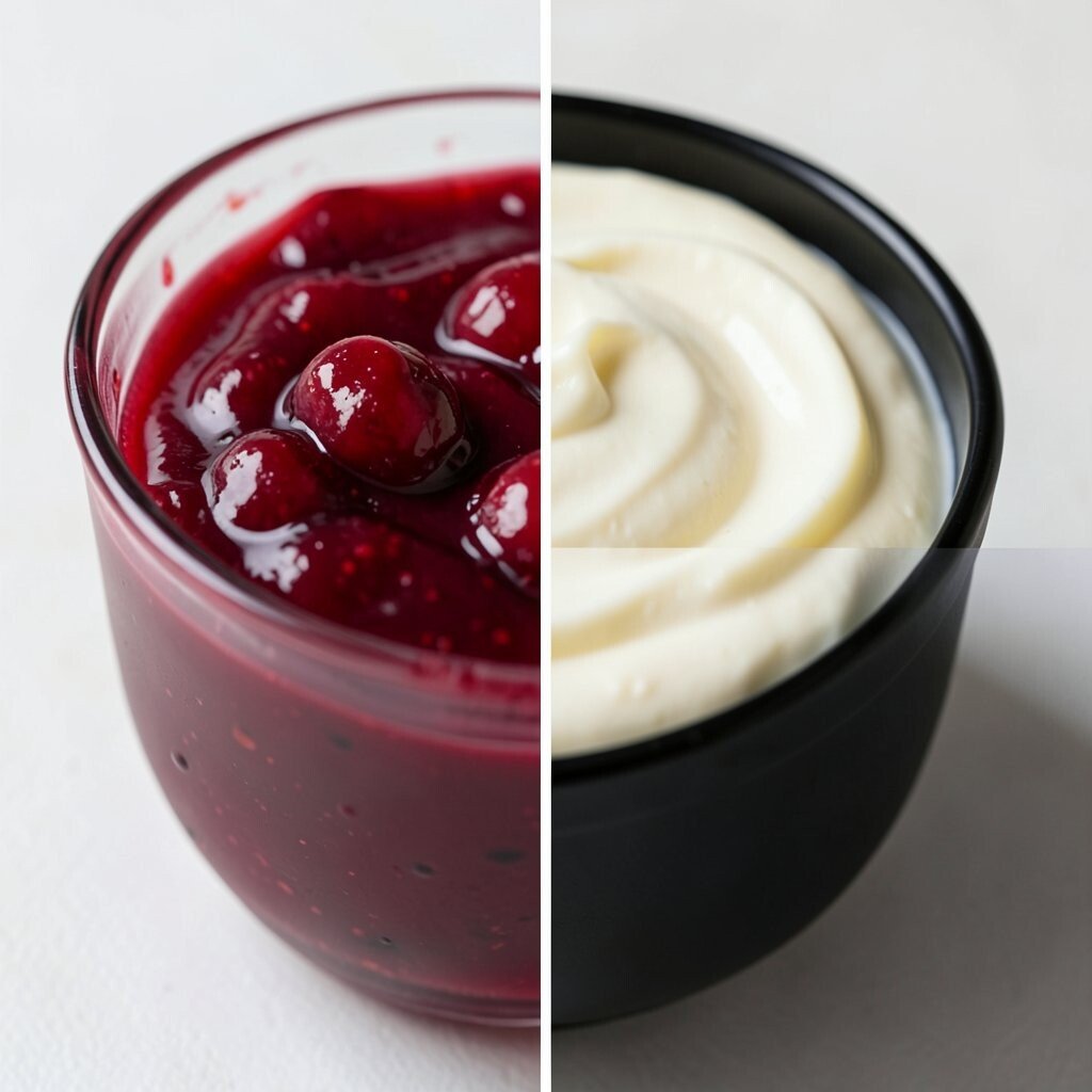
Berry jam looks bold and juicy, like a colorful label on a glass jar. Vanilla cream keeps things smooth, while ink black makes accents pop and text stay crisp.
Use this palette for campaigns, posters, and product drops when you want attention fast. Berry jam is perfect for buttons and highlights, vanilla for backgrounds, and ink black for navigation and strong headings. It gives a clear benefit: strong contrast that helps users move quickly through your content.
To personalize, choose a berry that matches your vibe: magenta for playful energy, or deep purple-berry for elegant drama. For cost, black and cream are easy to reproduce across screens and print. A current trend is “bold jam” branding, where one rich accent color leads everything.
6. Citrus Lime + Light Aqua + Cocoa Brown
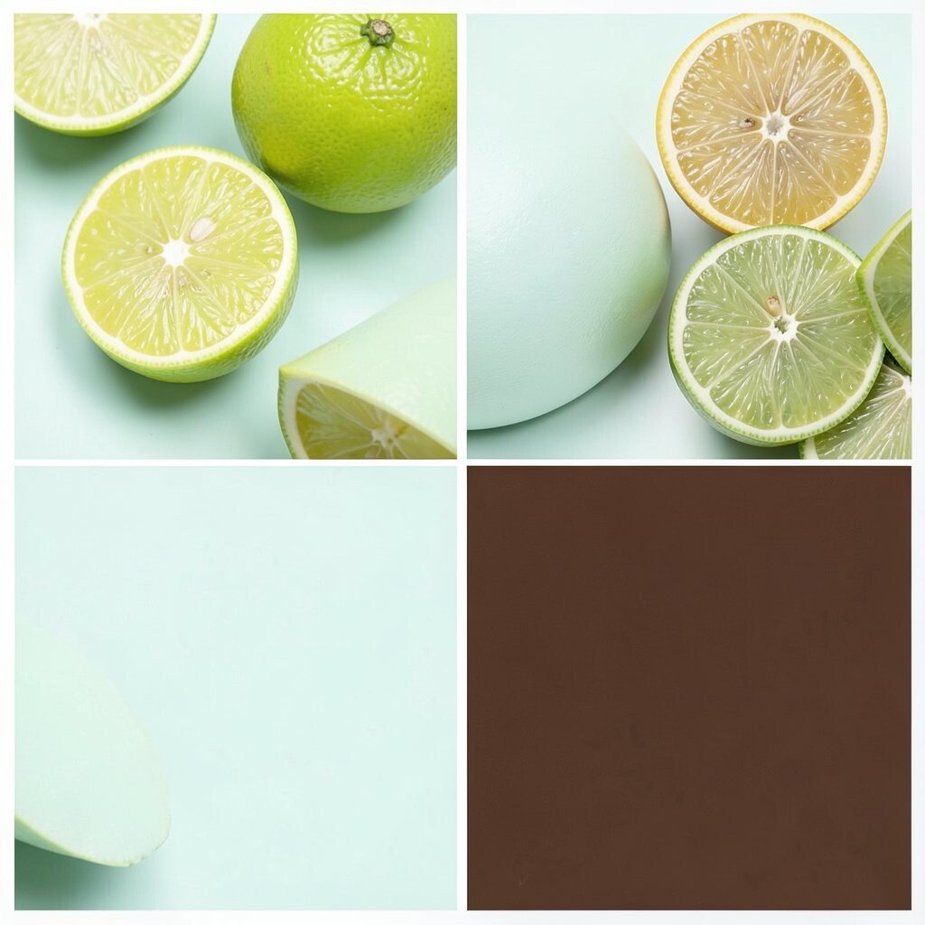
Citrus lime feels like fresh fruit and instant motivation. Light aqua cools the energy, and cocoa brown adds a warm, grounded layer for depth.
This palette is fantastic for fitness, kids’ products, and casual food brands. Lime works best as a highlight color for badges and calls-to-action, aqua can be your soft card background, and cocoa can be your text and borders. The benefit is a friendly pop that still stays easy to read.
For uniqueness, pair lime with slightly muted aqua instead of bright cyan. If you’re cost-conscious, keep the color count low: one bright accent, one supportive light shade, and one grounded neutral. A trend you’ll see often is “fun contrast,” where a punchy color meets a calm pastel.
7. Lavender Air + Pearl Gray + Deep Plum
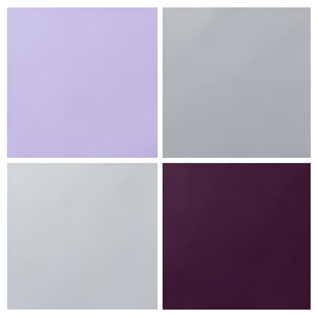
Lavender air feels light and dreamy, like soft clouds over rooftops. Pearl gray adds elegance, and deep plum brings a touch of mystery to your layout.
This combination is ideal for creative portfolios, event pages, and modern stationery. Use lavender for section headers, pearl for cards and sidebars, and deep plum for links and buttons. You’ll gain a benefit: your interface feels artistic but still structured.
Personalization idea: adjust the plum toward burgundy for a warmer feel, or toward indigo for a cooler mood. If you’re printing, test one version first because lavender can vary a bit across printers. A trend right now is “soft luxury,” where gentle purples and grays make everything feel polished.
Want extra polish without extra cost? Add subtle gradients only in small places, like a button hover or a thin banner strip. That tiny change can make the palette look custom-made.
8. Modern Coral + Pale Peach + Slate
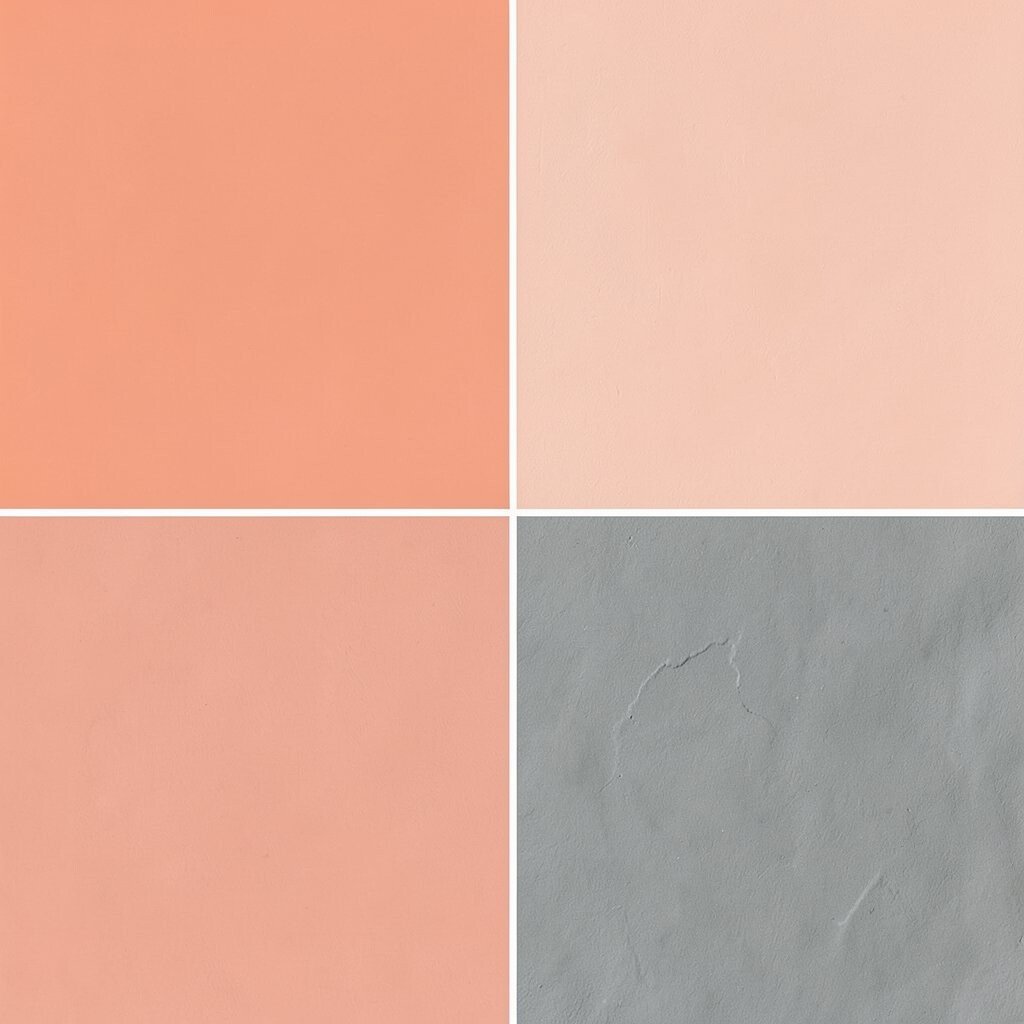
Modern coral is lively and warm, like a sunrise you can wear. Pale peach makes the design feel gentle, and slate keeps it modern and calm.
Use this for community sites, fashion pages, and product landing pages that need friendly energy. Coral shines in call-to-action buttons and icons, while pale peach creates soft space around the content. Slate is a smart choice for body text and form fields because it helps users read comfortably.
9. Sapphire Sky + Powder Blue + Charcoal Gray
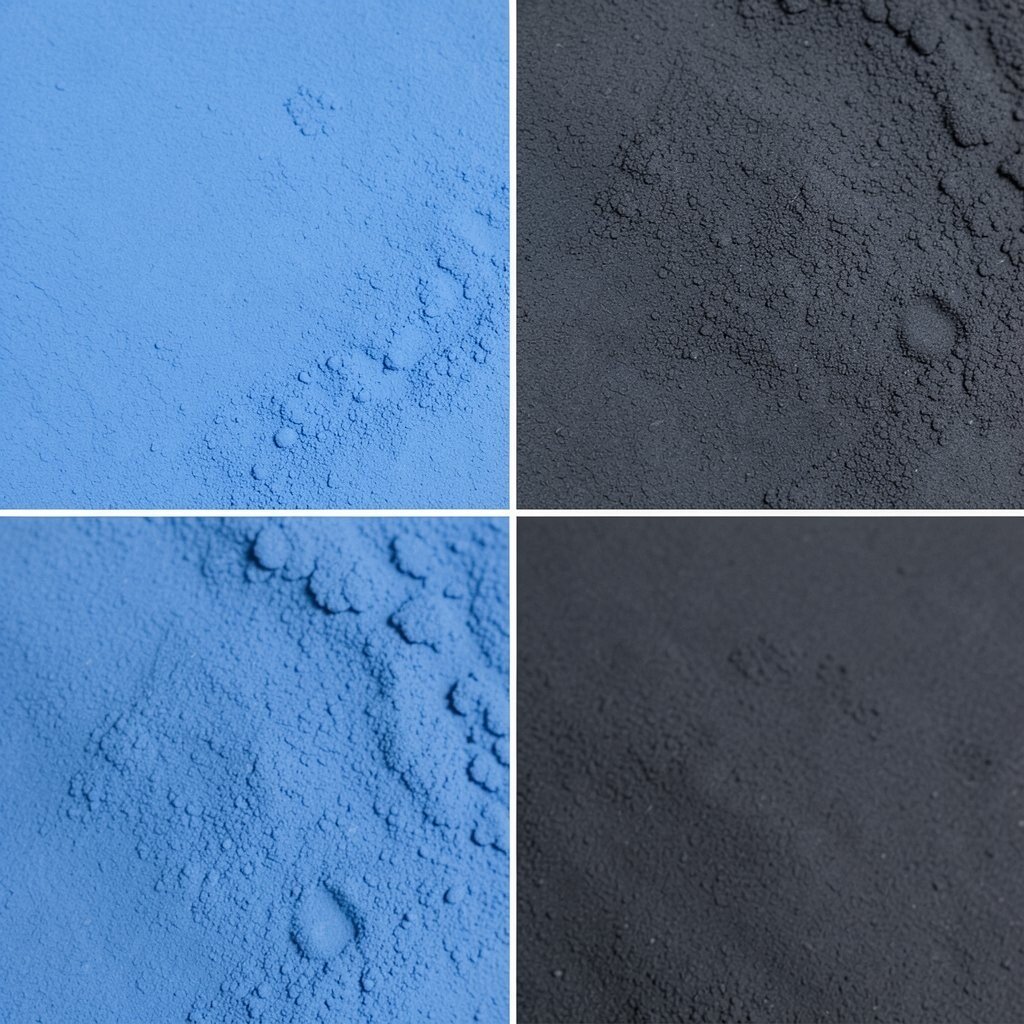
Sapphire sky feels bold and trustworthy, like a clear promise in the top corner of a website. Powder blue makes everything feel open, and charcoal gray makes the whole layout tidy.
This palette works well for SaaS tools, finance explainers, and education dashboards. Sapphire can lead as your primary button color, powder blue is great for panels, and charcoal helps with readable paragraphs. A strong benefit here is clarity: the layout feels organized even when it’s busy.
For personalization, try a slightly lighter sapphire to soften the tone, or add a thin white border to increase “air.” Cost-wise, blue-gray systems are common in design templates, so you can build faster. A current trend is “clean enterprise,” where blue accents feel crisp and friendly instead of cold.
10. Earth Clay + Linen Beige + Deep Olive
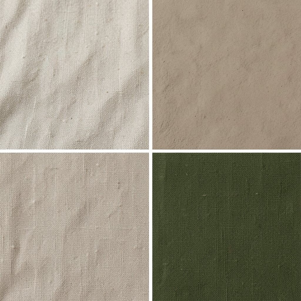
Earth clay looks handmade and warm, like pottery with a matte finish. Linen beige gives calm breathing space, and deep olive adds a grounded, earthy punch.
Choose this palette for craft brands, cooking tools, and sustainable product pages. Clay can be used for headings and highlights, linen for backgrounds, and olive for links and icons. The benefit is a natural feel that makes your product seem real and well cared for.
Personalization idea: if clay feels too bold, mix it with a lighter terracotta tone for a softer landing. If you’re working with print, earthy colors often look great, but test your darkest shade to avoid heavy ink coverage. A trend is “heritage minimal,” where earthy tones pair with lots of texture and simple layouts.
11. Mint Leaf + Soft Gray + Dark Chocolate
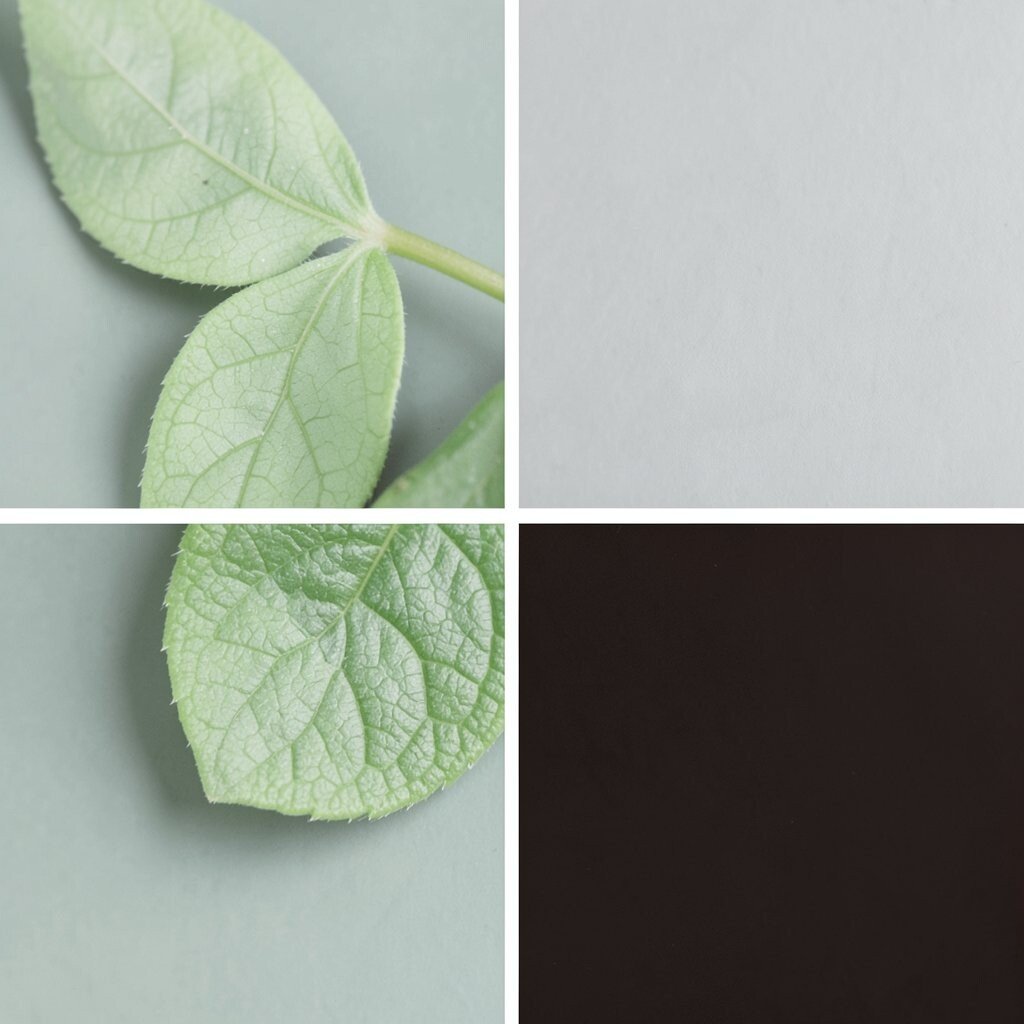
Mint leaf feels refreshing, like cool air after rain. Soft gray keeps the design quiet, and dark chocolate gives it a cozy finish.
This palette is great for wellness apps, skincare, and friendly tech products. Use mint for icons and highlights, gray for backgrounds and secondary text, and chocolate for primary text and buttons. You get the benefit of a soothing look that still feels strong.
To make it unique, add tiny “leaf” accents using mint gradients only on hover states. If you want to save money, stick to web-safe friendly shades and avoid too many fancy effects. A current trend is “cool comfort,” where mint and chocolate create a modern warm-cool balance.
Personalize further by matching your mint to your brand scent: brighter mint for energetic “morning,” muted mint for “evening calm.”
12. Electric Teal + Ivory + Near-Black
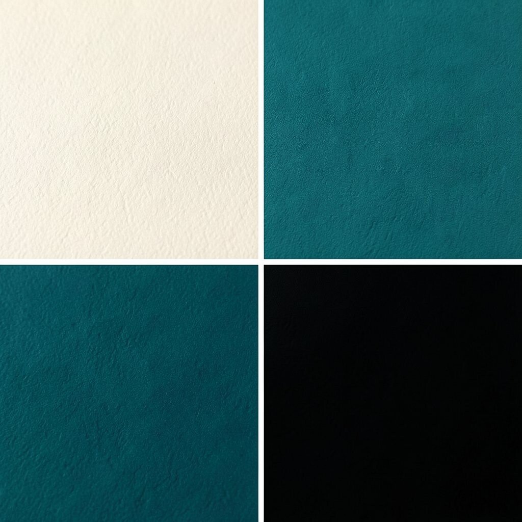
Electric teal is like a signal light that grabs attention instantly. Ivory keeps the layout clean, and near-black sharpens everything into a sleek, modern look.
This palette is perfect for modern startups, music events, and tech landing pages. Use electric teal for primary buttons and key links, ivory for the main background, and near-black for text and navigation. The benefit is high readability plus a bold brand voice.
13. Sunset Orange + Creamy Beige + Storm Blue
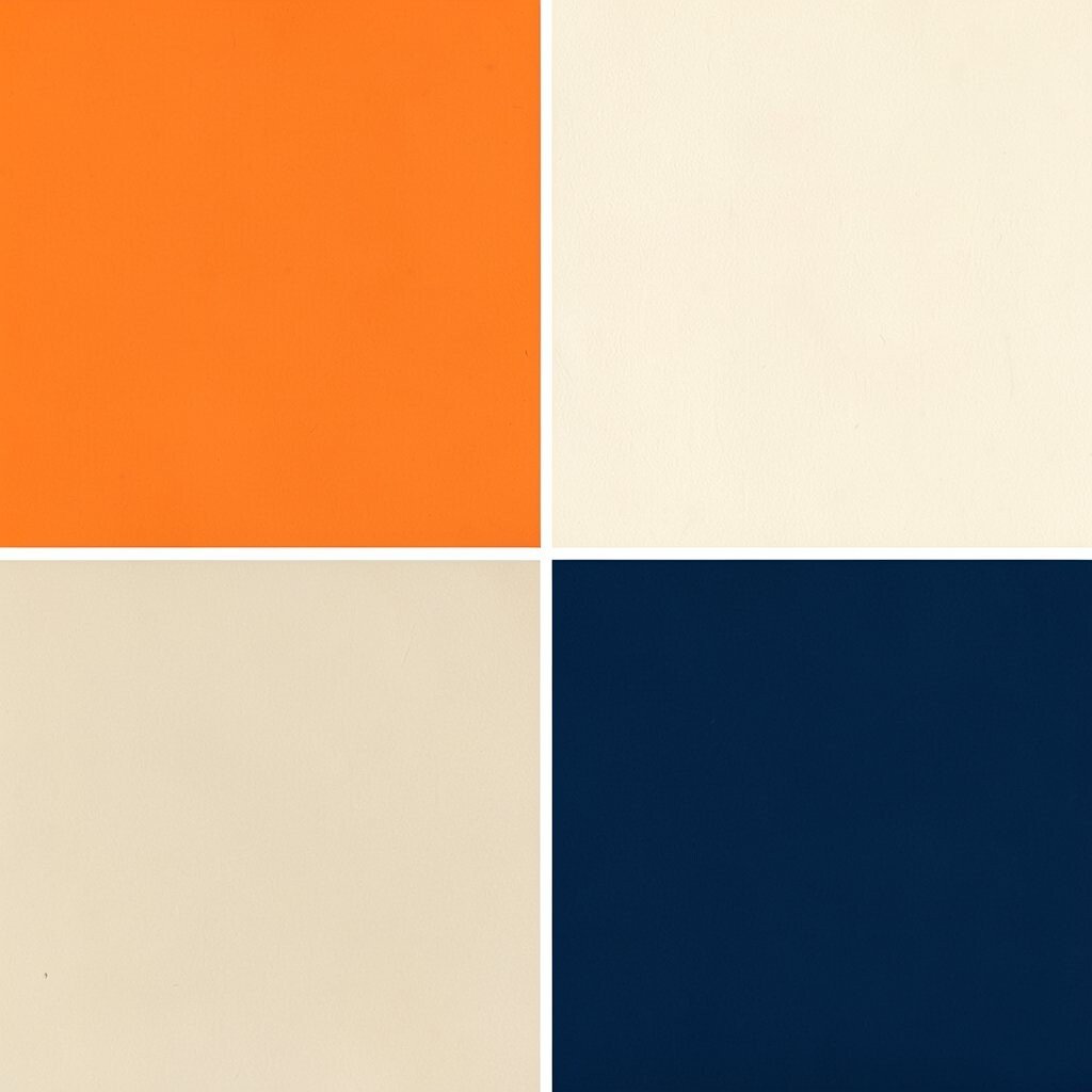
Sunset orange glows with energy, like a warm light fading into evening. Creamy beige brings softness, and storm blue adds a cool contrast that feels balanced.
This combo works well for creative services, travel guides, and lifestyle brands that want a “warm-cool” vibe. Orange is great for highlights and callouts, beige is the calming base, and storm blue can handle headings and links. A key benefit is visual balance: the warm and cool tones make pages feel lively without chaos.
Personalization idea: adjust the orange toward peach if you want a gentler feel, or toward tangerine for a louder look. Cost considerations are easy here because beige and blue are widely supported in templates. A trend you’ll see is “sunset UI,” where orange accents feel like glowing highlights.
14. Rosewood Pink + Dusty Rose + Deep Charcoal
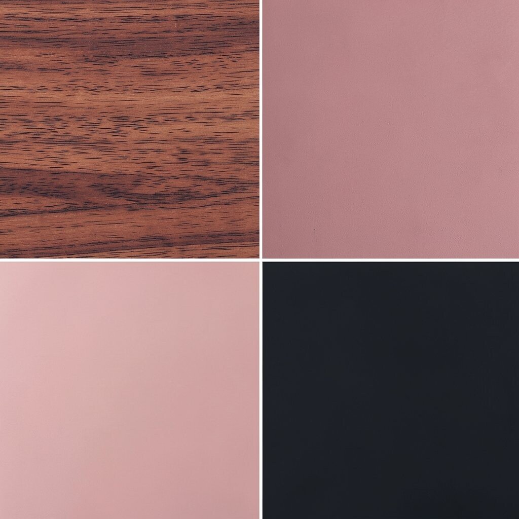
Rosewood pink has a sophisticated warmth, not a childish brightness. Dusty rose smooths it into a muted background, and deep charcoal keeps the design grown-up and readable.
Use this palette for boutique brands, wedding invitations, and lifestyle product pages. Rosewood can lead buttons and headings, dusty rose can be used for cards and section blocks, and charcoal should handle most text. The benefit is a “soft drama” look that feels elegant rather than loud.
15. Calm Sky Gray + Soft Blue + Bright White
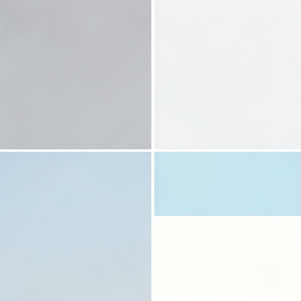
Calm sky gray feels like quiet pavement after rain. Soft blue adds a gentle hint of freshness, and bright white makes the layout feel crisp and modern.
This palette is excellent for dashboards, product documentation, and healthcare-friendly designs. Use sky gray for panels, soft blue for links and icons, and bright white for large spaces. You get a benefit that many people love: it looks clean and easy to scan.
Personalize by adding one accent color only in special moments, like a warning badge or a “new” label. For cost, keeping a mostly neutral system can reduce development time because it works across many components. A current trend is “minimal airy UI,” where gray-blue tones and white space do the heavy lifting.
16. Scarlet Red + Cream + Graphite
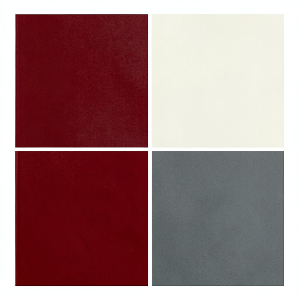
Scarlet red is bold and direct, great for grabbing attention fast. Cream softens it, and graphite keeps borders and text looking professional.
This palette suits food brands, sports sites, and event promotions that need energy. Red should be your main highlight for buttons, icons, and sale tags, while cream provides a stable background. Graphite helps keep reading comfortable and prevents the design from feeling too harsh.
To personalize, use different red shades for different roles: one red for “primary action,” a slightly darker one for “danger” or “alerts.” Cost-wise, a simple three-color system is easy to implement and easy to test for accessibility. A trend is “high-contrast punch,” especially for promotional landing pages.
17. Golden Sun + Pale Olive + Charcoal Brown
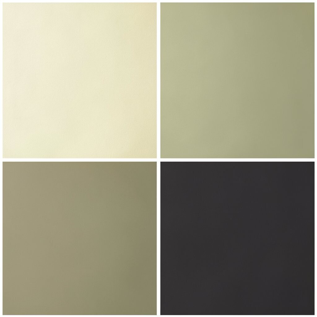
Golden sun feels joyful and bright, like a gentle spotlight. Pale olive brings a soft natural touch, and charcoal brown adds a warm, readable base.
This palette works beautifully for outdoor brands, agriculture-themed stories, and cozy home products. Golden sun is best for headings, pale olive can be used for backgrounds or subtle gradients, and charcoal brown can handle text and navigation. The benefit is warmth without clutter, because the olive tones calm the brightness.
For uniqueness, add a small pattern or texture behind sections using a slightly lighter olive. If you’re mindful of cost, focus on using fewer tones and let spacing and typography do the rest. A current trend is “warm natural marketing,” where sun-like yellows pair with muted greens.
Personalize by matching your golden sun to your product material: honey-gold for soft items, deeper amber for richer, heavier products.
18. Lime Zest + Mist White + Navy Ink
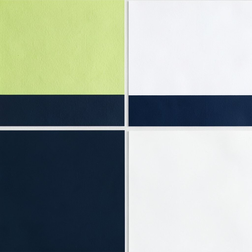
Lime zest is sharp, fresh, and full of energy. Mist white gives it space to breathe, and navy ink adds a strong, clean finish.
This palette is a great match for dashboards, creative tools, and modern learning experiences. Lime should be used for key interactive elements like toggles and highlight lines, while mist white keeps the background calm and bright. Navy ink is your anchor for text, so the benefit is clear navigation and easy reading.
19. Seafoam Teal + Butter Cream + Soft Black
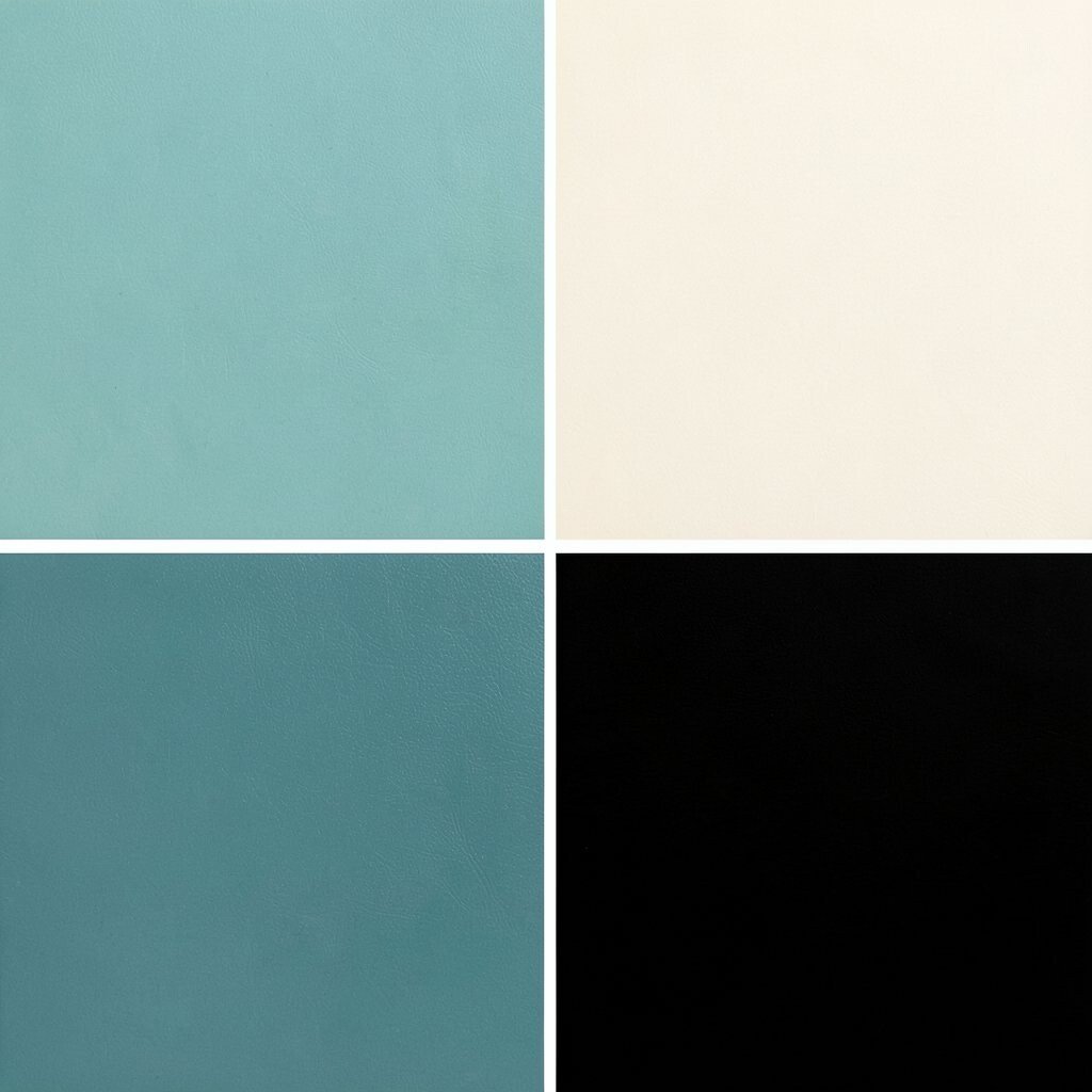
Seafoam teal looks light and airy, like bubbles on a calm tide. Butter cream softens it into something cozy, and soft black keeps the design crisp without feeling too harsh.
This palette fits coffee menus, lifestyle newsletters, and friendly community platforms. Teal is perfect for icons and headers, butter cream can be your main background, and soft black works well for body text and buttons. The benefit is that it feels welcoming yet organized, so users don’t feel lost.
Personalization idea: add a tiny contrast accent like coral for “new” labels to make the page feel more playful. Cost considerations are friendly since cream and soft black are common and stable in most templates. A trend is “gentle contrast,” where teal and cream keep the vibe calm while black provides clarity.
20. Plum Velvet + Light Lilac + Cool Gray
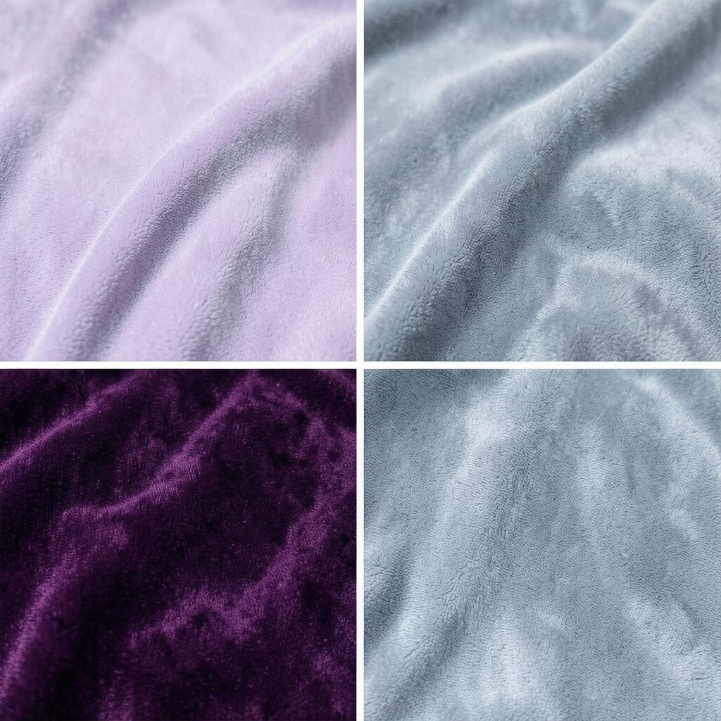
Plum velvet feels rich and stylish, like a favorite jacket. Light lilac adds a dreamy cushion, and cool gray makes everything feel balanced and modern.
Use this palette for creative portfolios, cinema pages, and premium beauty brands. Plum velvet is great for main actions and strong headings, lilac works well for cards and section backgrounds, and cool gray helps paragraphs feel easy to read. The benefit is a “high-end” mood without sacrificing usability.
To personalize, choose whether the plum leans more pink or more blue. If you’re printing, test light lilac carefully because very pale tones can look washed out depending on paper. A current trend is “mood color” design, where rich accents and soft lilac backgrounds create an emotional feel.
21. Charcoal Stone + Pale Peach + Warm Umber
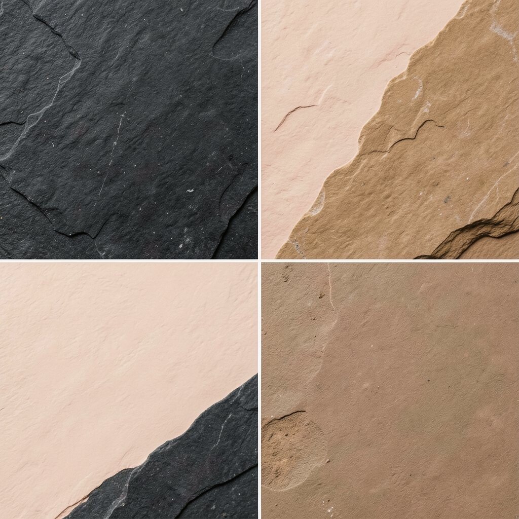
Charcoal stone is sturdy and grounded, like a sleek countertop. Pale peach brings gentle warmth, and warm umber adds depth that feels earthy and calm.
This palette is ideal for architecture sites, handmade furniture brands, and calm product pages. Charcoal can handle text and strong UI lines, pale peach can be your highlight background, and umber can be used for icons, links, and small decorations. The benefit is that the page feels stable and comforting, which helps customers trust what they see.
For uniqueness, use umber for hover effects and create subtle shading under cards. Cost is usually low because earthy neutrals are easy to match and look good on many screens. A trend is “cozy modern,” where warm umbers pair with pale peach for a home-like premium vibe.
22. Pure White + Royal Purple + Gold Accent
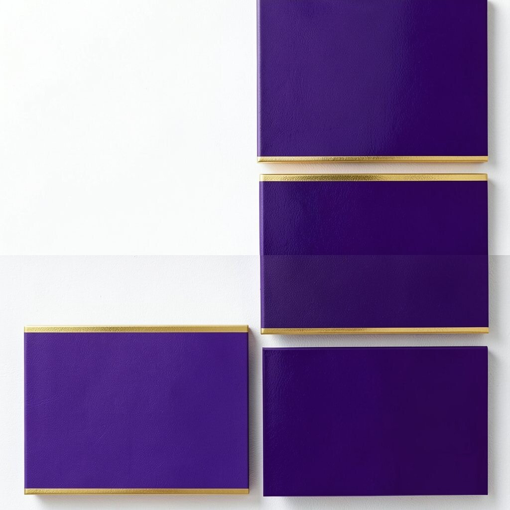
Pure white gives you a clean canvas that makes every element look sharp. Royal purple adds drama and confidence, and gold brings a finishing glow that feels special.
This palette is perfect for luxury brands, awards pages, and “featured product” sections. Use white for the majority of the layout, purple for key headings and major buttons, and gold for tiny highlights like separators, icons, or badge outlines. The benefit is wow-factor: it looks elegant quickly and clearly.
Personalization idea: try a softer purple for a friendly luxury tone, or keep royal purple for a bold, high-impact look. Cost considerations: using gold as a small accent keeps printing and theming simpler, so you don’t need many shades. A current trend is “heritage highlights,” where rich purple and gold appear like classic editorial details.