Every photo can be a little stage with a story you can almost hear. When you plan the layout, you can make your ideas feel real.
-
1. The Window Frame Story
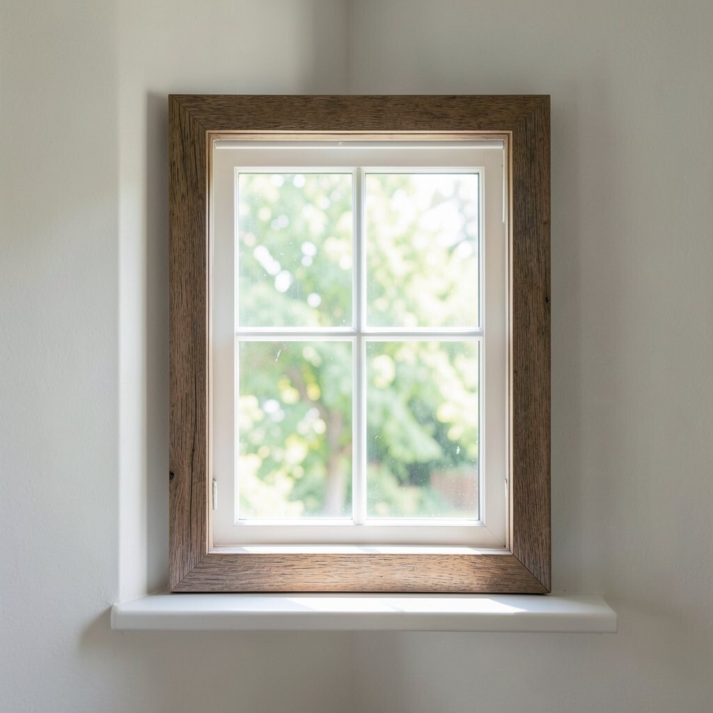
The Window Frame Story Set your scene like you are looking through a window that only exists in your photo. Arrange objects so they sit on the “glass” side and the background sits behind it.
Use tape or a thin picture frame to block off a rectangle, then place your subject inside it. Add a simple light source from the side to make the layout feel cozy and real. Try using sheer curtains or a sheer fabric sheet to create a soft layer that adds mystery.
Benefit: you get clean lines and a clear focal point, which helps your viewer feel guided. Keep it unique by choosing unexpected “window characters,” like kitchen tools or dried flowers. For personalization, swap the frame size to change the mood from calm to dramatic. If you are on a budget, use cardboard or picture frames from a thrift store.
-
2. Shadow-First Composition
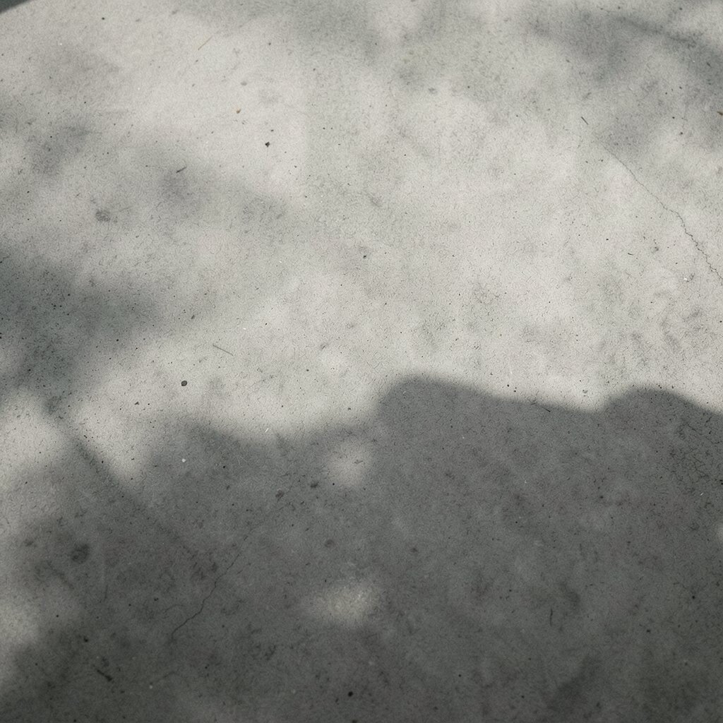
Shadow-First Composition Start with shadows before you place the objects. Move your lights until the shadow shape looks like a character, symbol, or path.
Place your subject so the shadow becomes the main image, not just a side effect. A desk lamp, phone flashlight, or even early morning sun can create strong shapes. Then add small props that match the shadow theme, like tiny arrows, scattered dots, or mini “roads.”
This layout helps you learn how light makes meaning, which is great for beginners. It also saves time because you can adjust the pose quickly by shifting the light. Make it personal by choosing a theme tied to your life, like school, sports, or music. For trends, many creators are using bold, high-contrast shadow looks and simple, graphic silhouettes.
-
3. Monochrome Food City
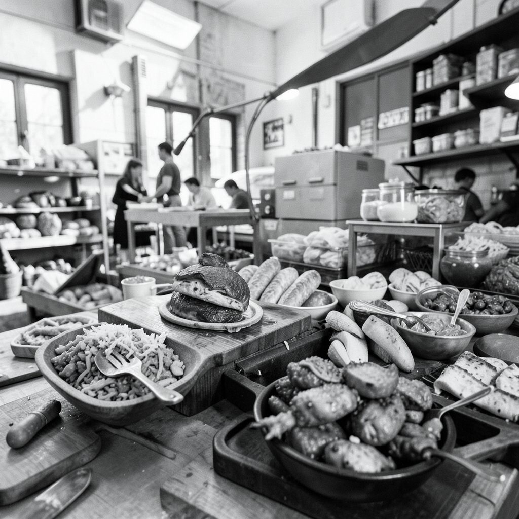
Monochrome Food City Pick one color and build a “city” out of food items in that color family. Think stacks, blocks, and little street shapes, all arranged neatly like a miniature town.
Use one base tone such as black sesame, dark cocoa, or pale cream, then add contrast using different textures. Place ingredients like crackers as sidewalks and sauces as “lanes.” A top-down angle makes the layout crisp, but try a slight tilt for a more cinematic feel.
Benefits include easy styling and strong visual order, which helps your images look professional fast. It is unique because food becomes architecture, not just a plate. Keep it actionable: plan your shapes first on paper, then set up your camera while you build. For cost, use affordable items like rice cakes, oats, and spices you already have.
To personalize, name the city after a place you love, then add a tiny “landmark” like a piece of fruit shaped like a tower. Current trends often show clean, minimal “flat lay” styles with bold texture, so aim for simple backgrounds and sharp focus. If you do use sauces, test your lighting so it does not look too shiny.
-
4. Paper Cut Layout With Real Depth
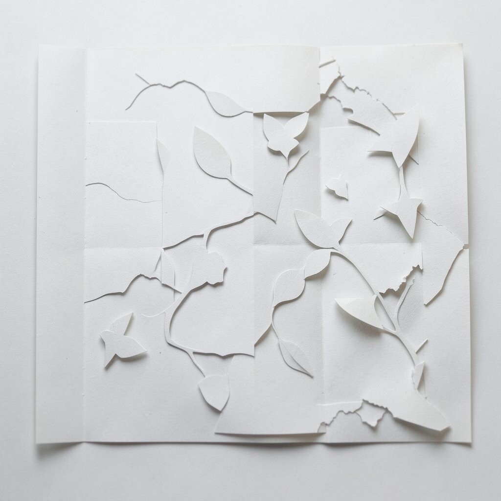
Paper Cut Layout With Real Depth Layer paper shapes in the foreground, middle, and background to create real depth in a flat layout. Cut silhouettes, then place them on top of one another like a collage you can photograph.
Use craft foam, small scraps of paper, or folded corners to lift the front layer so it casts gentle separation. Put your light at a low angle to highlight the edges and make the scene feel hands-on. Choose a simple background color so your paper shapes look sharp instead of messy.
Benefit: you can control everything, and that means your concept stays clear. This is unique because you are mixing graphic design with photography. To personalize, match the shapes to your interests, like animals, constellations, or city maps. Costs can stay low by using old magazines, packaging, and scissors you already own.
-
5. The Object Constellation Grid
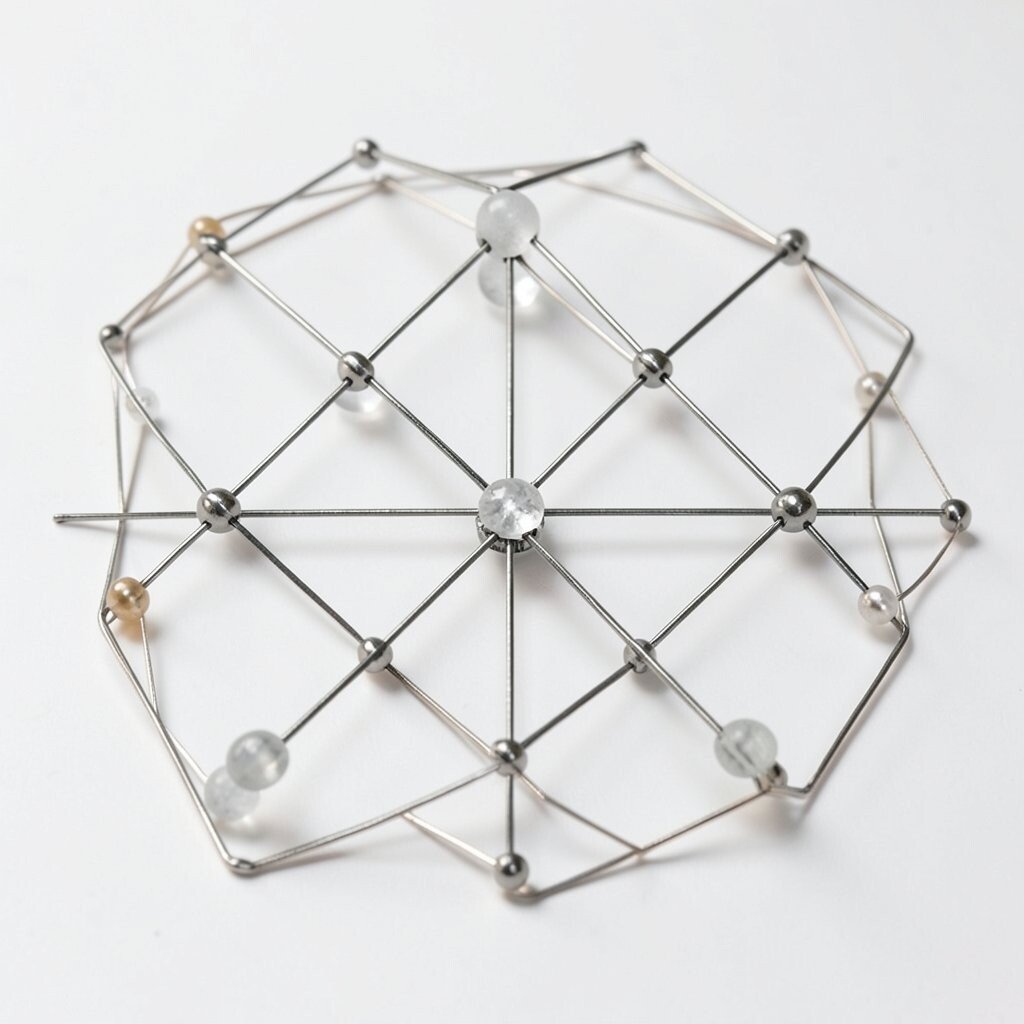
The Object Constellation Grid Arrange small items like beads, buttons, seeds, or LEGO pieces in a grid that feels like a constellation map. Keep spacing intentional so your layout reads clearly, even from a distance.
Use a plain surface and place a soft light from the side so each tiny object shows texture. If you want a dreamy vibe, use a shallow depth of field so the nearest pieces are crisp and the rest blur. Then add a “story marker,” like one standout object in a different color.
This concept helps you practice repetition, pattern, and spacing, which are key skills for concept photography. It is unique because your subject becomes both art and map. Personalize by mapping something real, like the stars on a memorable night, or by arranging items to spell a word in your own style. Trend-wise, creators love neat “micro-world” details, so shoot close and keep the background simple to match.
-
6. Mirror Maze Portrait Setup
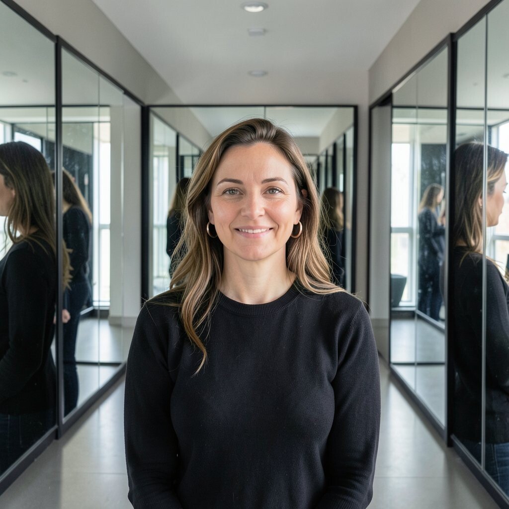
Mirror Maze Portrait Setup Build a portrait layout using mirrors to repeat your face or your hands in a maze pattern. Position mirrors so they reflect your subject into interesting angles.
Choose one “main” mirror and one or two side mirrors, then adjust until you see a satisfying pattern. Wear a simple outfit with fewer busy details, so the reflections stand out. For best results, use a clean background and keep the camera steady.
This gives you a cool, concept feel without needing fancy props. It is unique because your layout changes as the reflections shift. Personalize it by using themed accessories like a hat, scarf, or gloves to match your mood. Costs are manageable because you can use thrift mirrors or even acrylic mirrors made for crafts.
Tip: cover shiny clutter behind the camera, because extra reflections can steal attention. If you want a trend look, aim for high clarity and symmetrical rhythm, which many creators now do for bold “pattern portraits.”
-
7. The Subway Platform Moment
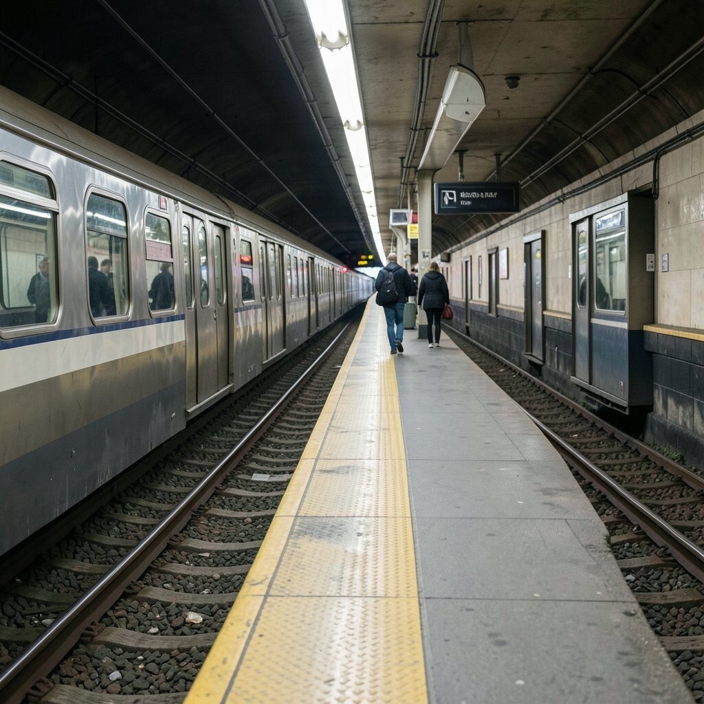
The Subway Platform Moment Arrange objects like tickets, bottles, and small signs to mimic a subway platform scene. Make “tracks” with strips of tape or two parallel lines drawn on paper.
Place your subject at one end, then add wayfinding details like arrows made from paper and small label tags. Use a background that looks like station walls, such as textured fabric or a printed pattern you tape up. Shoot from a low angle so your “platform” stretches into the scene.
This layout creates instant story energy, even if the scene is simple. It is unique because you are turning everyday objects into a travel world. Personalize it by using language from your hometown, like a station name written in your own handwriting.
For cost, print free map images or use cardboard sign boards instead of buying props. Current trends often lean toward cinematic mini narratives, so add one dramatic light source like a single overhead bulb look. Keep your color palette consistent so the photo feels clean and planned.
-
8. Fabric Wave Still Life
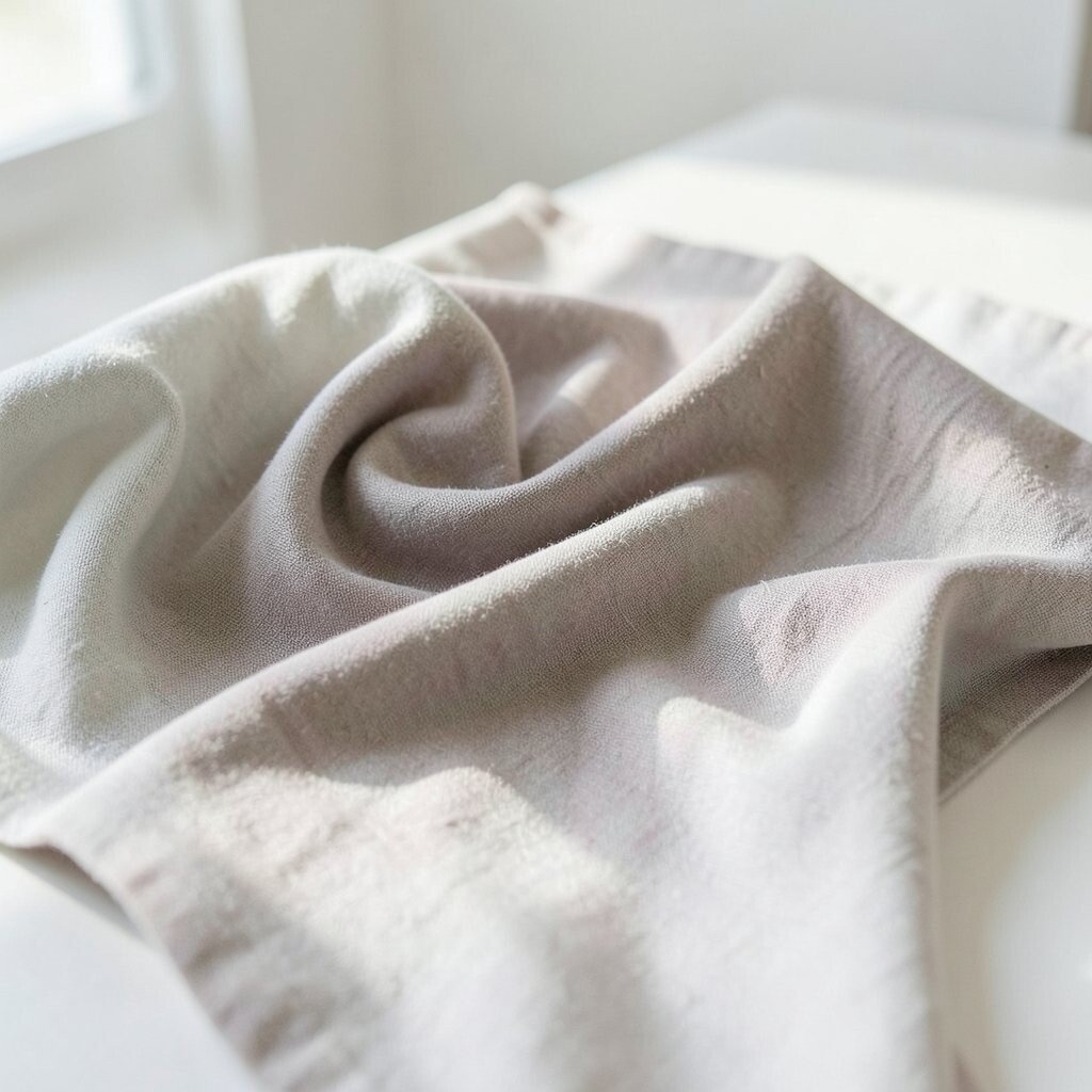
Fabric Wave Still Life Drape fabric like waves, then photograph it as if it is a sea captured in motion. Use one color family and let the folds guide the viewer’s eyes.
Place the fabric over a flat surface and shape it with your hands until it looks smooth and balanced. Add a few matching props, like shells, stones, or beads, but keep them limited so the fabric stays the star. Try window light for soft highlights, or use a lamp to create stronger contrast.
This idea is powerful because fabric textures make your layout feel rich without complicated tools. It is unique since the “subject” is the motion of cloth, not a single object. To personalize, choose fabric patterns that match your mood, like floral for gentle vibes or black fabric for dramatic waves.
Costs can be near zero if you use old scarves or curtains you already have. If you want a current trend feel, aim for clean backgrounds and slow, painterly fabric movement. Shoot with steady framing so the waves look intentional, not random.
-
9. Family Photo Memory Ladder
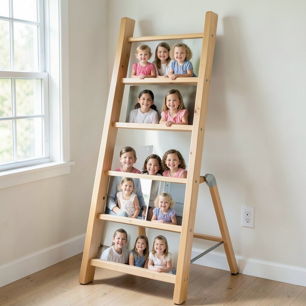
Family Photo Memory Ladder Use objects to build a “ladder” of memories, with each step showing a different time in your life. Arrange small frames, printed photos, or even handwritten notes as rungs.
Start with a simple baseline, then place your items up and across so it forms a ladder shape. Use the same spacing between rungs so it feels structured. Add a small object that represents the present at the top, like keys, a current hobby item, or a favorite book.
This layout turns personal history into a clear visual story. It is unique because it feels emotional, not just decorative. Personalize it with a theme such as “firsts,” “favorite places,” or “people who shaped you.” For cost, print a few photos at home and use cardboard or scrap wood as the ladder base.
Tip: keep the text readable in the photo by using larger handwriting and not too many pieces. If you like trends, many creators are leaning into heartfelt, documentary-like concept work that still looks artful.
-
10. Circular Portal Plate
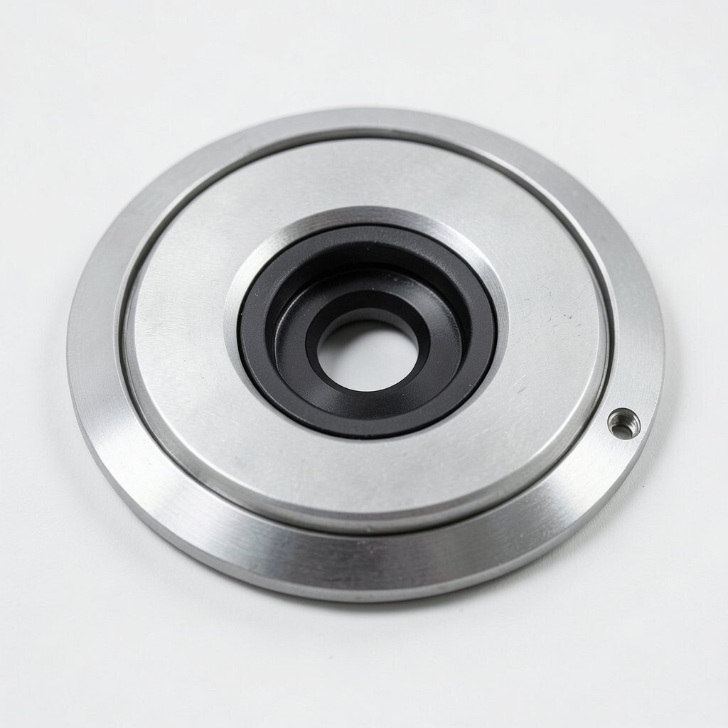
Circular Portal Plate Create a portal look by arranging objects in a circle, then pushing the center slightly forward. Think of it like a tiny opening into another world.
Use a plate or ring-shaped tray as your anchor and place items around it evenly. For the center, use a deeper color background or a small clear cup with liquid. Light it from behind or from the side to help the circle feel like depth.
This concept is super actionable because circles naturally guide the eye. It is unique because you can make a portal with almost anything: tea, paint, spices, or colored paper. Personalize it by using items that match your “other world,” like ocean tones, galaxy confetti, or warm desert colors.
Cost considerations are friendly here since you can use everyday kitchen tools and low-cost craft items. For a current trend, try vibrant color pops against a neutral background, which is common in modern concept photography. Keep your spacing steady so the circle feels intentional, not accidental.
-
11. The Bathroom Chemistry Lab
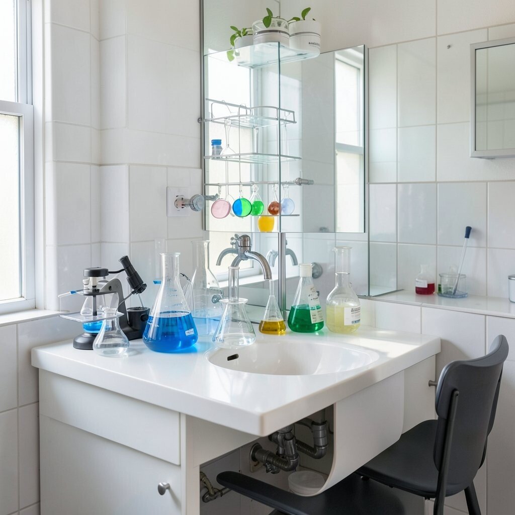
The Bathroom Chemistry Lab Turn your sink or countertop into a “chemistry lab” scene using safe, everyday items. Arrange bottles, labels, and colored liquids to look like experiments.
Use small containers like jars or cups, then add paper labels with simple names. Create a “reaction” area by placing one color near another color and photographing them with a crisp focus line. Make the layout feel like a lab by adding simple tools such as cotton pads, teaspoons, or plastic pipettes.
This helps you practice concept storytelling with lighting and arrangement. It is unique because the setting feels familiar, but the theme feels new. Personalize it by naming your experiments like “Morning Sparkle” or “Rainy Day Mix,” based on your mood.
Cost stays low because you can use what you already have, but always keep things safe. Current trends show lots of graphic labeling and clean “setup” visuals, so try neat typography and consistent bottle sizes. Tip: keep your camera angle straight down or slightly angled for a tidy lab look.
-
12. Road Trip Map Fold
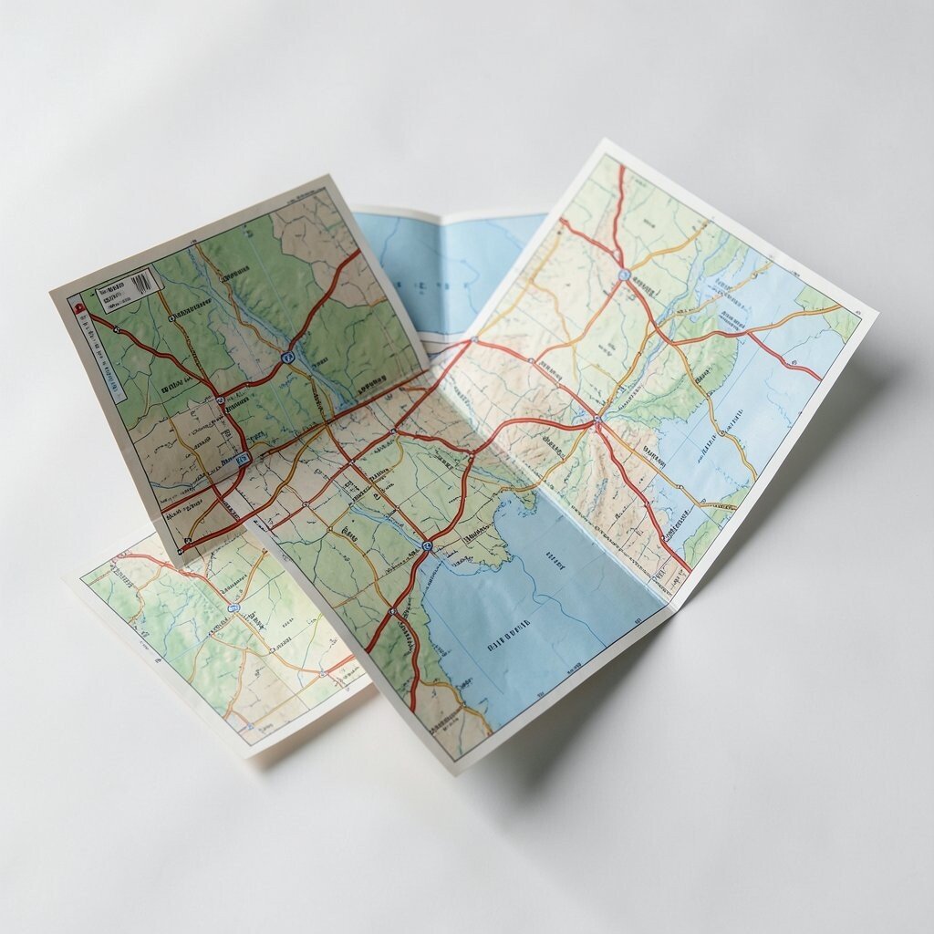
Road Trip Map Fold Build a road trip layout using folded maps, ticket stubs, and small items that represent stops. Fold your map into sections and place objects on top like markers on a travel route.
Use a top-down view for accuracy, then add a gentle curve with tape to show the “driving path.” Choose one color accent, like red for stops, so your layout has one clear style. Light from the side helps paper textures look crisp.
This layout is great for anyone who likes planning and storytelling. It is unique because it uses paper structure, not just objects on a flat surface. Personalize by using places that matter to you and writing short notes next to each stop.
For cost, printed maps can be free online, and ticket stubs can be replaced by homemade paper shapes. Trend-wise, many creators are using “memory collage” styles with handwritten details. Tip: keep the background clean so the map stays readable in your final photo.
-
13. Bookshelf Character Cameos
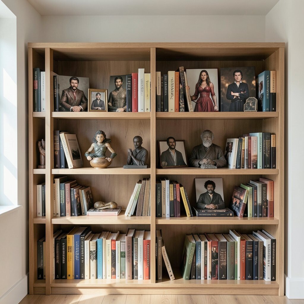
Bookshelf Character Cameos Choose a small group of books and turn them into characters by placing tiny props on the “shelves.” Arrange your books by height, then add little items that show personality.
For example, a tiny toy on one book can be the “coach,” and a plant-looking shape can be the “wisdom” character. Add a simple light that makes the shelf shadows look soft. Use a slow camera move or keep the frame steady so the scene feels composed.
This idea builds concept from your own interests, which makes it naturally personal. It is unique because you are creating drama using everyday reading material. Personalize by matching character traits to book genres you love.
Cost is usually low because you already have books at home, and props can be anything small and safe. Current trends include cozy, lifestyle-themed sets, so choose warm tones and let the textures show. Tip: avoid too many colors, or the scene will look crowded and less story-like.
-
14. Time Box With Mini Clocks
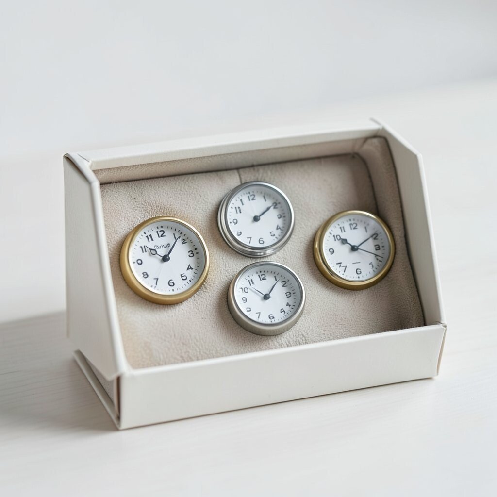
Time Box With Mini Clocks Make a “time box” layout using a small container and mini clock visuals around it. The box becomes the future or past, while the surrounding items show time passing.
Use printed clock faces, clock stickers, or even drawn circles on paper to form a halo around the box. Arrange them so the angles point in one direction, like a timeline. Place one bright object inside the box to represent “now.”
This concept is unique because it turns a simple idea into a clear visual structure. It also helps you practice clean composition and planning. Personalize it by choosing what time means to you, like “study time,” “game time,” or “family time.”
For cost, use recycled boxes and printables from your printer. If you want a trend look, try minimal styling with one bold accent color, which is very popular right now. Tip: shoot with a simple background and keep your camera exposure steady so colors do not shift.
-
15. Sticker Spell Glyph Layout
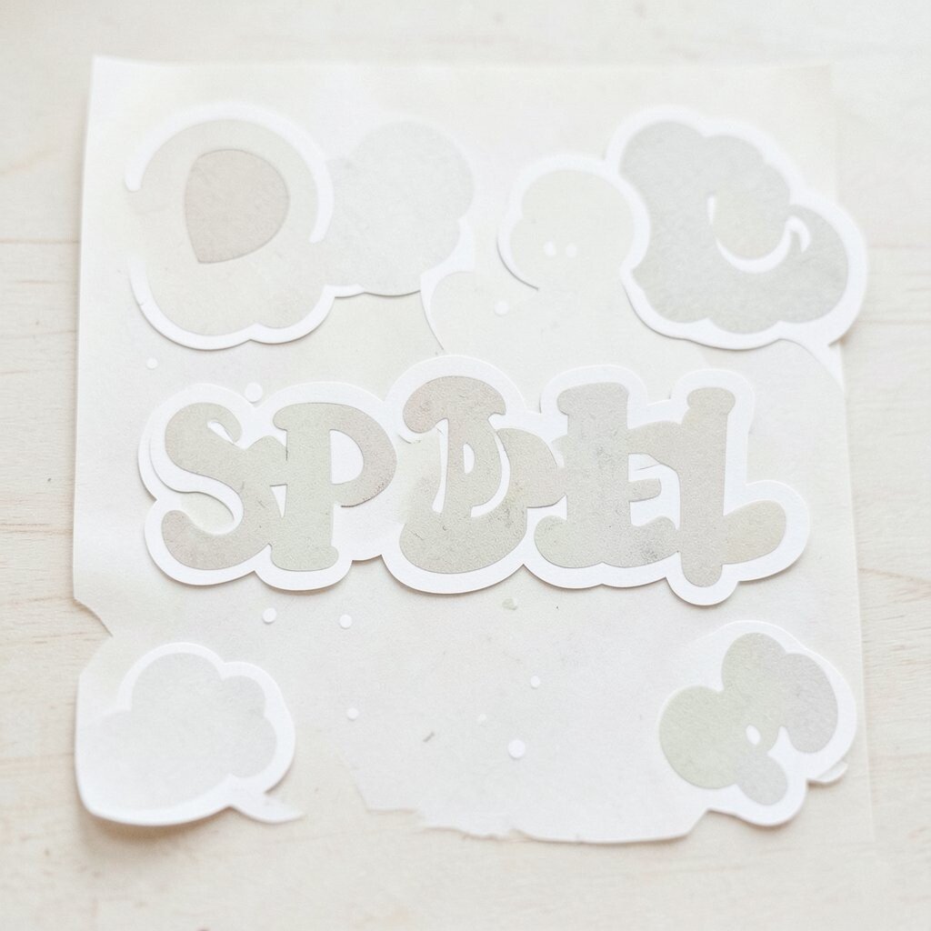
Sticker Spell Glyph Layout Use stickers or cut-out shapes to create a spell glyph layout on paper or a craft board. Arrange the shapes into a symbol that feels magical but still neat.
Build your glyph in layers so the center looks darker and the outer rings look lighter. Add small dots like “sparkles” and a border line to frame the spell. Light it from above or slightly from the side so the sticker texture shows.
This is an easy way to make concept photos with a playful vibe. It is unique because the layout feels like art from a sketchbook, but the photo makes it feel official. Personalize it by writing a short “spell name” in your own handwriting next to the glyph.
Cost considerations are great since stickers are often affordable, and you can also cut shapes from old packaging. Current trends include graphic, sticker-style compositions and bold minimal backgrounds, so keep your colors strong and simple. Tip: use a matte surface so reflections do not ruin the textures.
-
16. The One-Color Gradient Stage
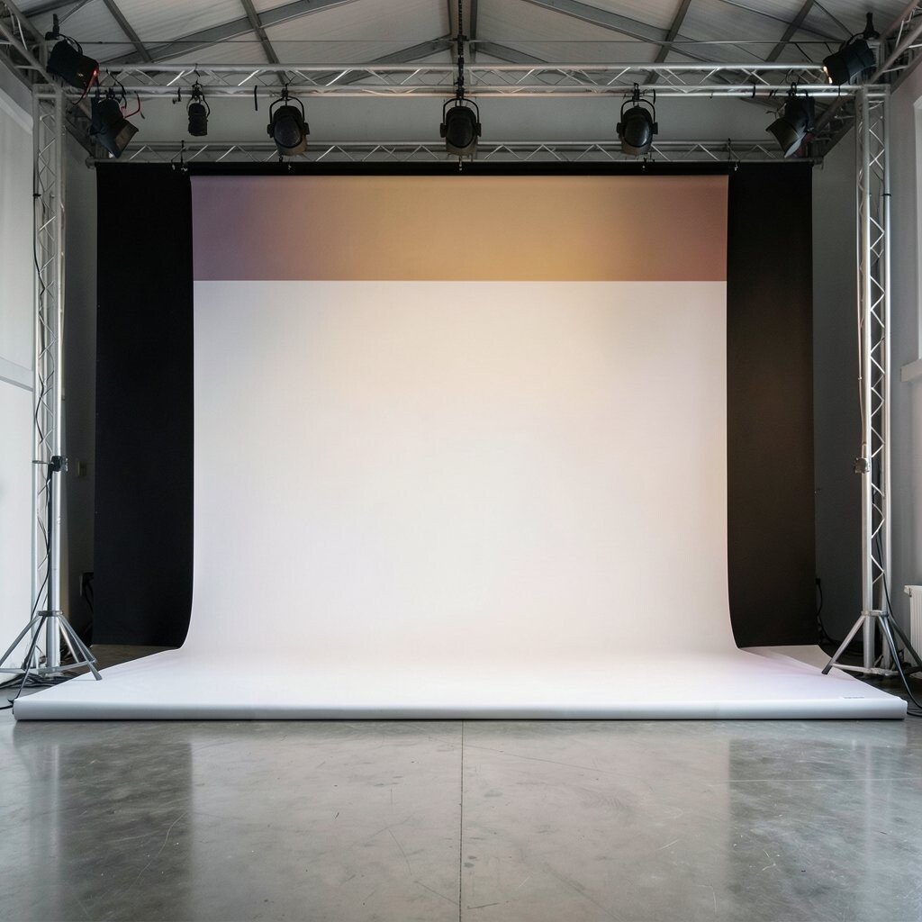
The One-Color Gradient Stage Create a stage that shifts from one color to another by using fabric, paper, or paint-like backgrounds. Arrange your main subject so it stands out at one end of the gradient.
For example, make a background from light to dark blue, then place a contrasting object in the darkest zone. Use one or two props that match the gradient tones, so the whole layout feels unified. Try photographing with a slightly higher angle for a clean “runway” feel.
This layout is unique because it uses color movement as the concept, not just objects. It also helps your images feel modern because gradients look smooth and stylish. Personalize it by choosing colors that match your room, your favorite season, or an emotion you want to show.
Cost is flexible: you can use colored paper sheets, fabric layers, or even a DIY gradient created with watercolor paper and soft blending. Trend-wise, clean gradient backgrounds and bold subject placement are very common in concept and product-style photography. Tip: test your white balance so your colors look true, then keep your styling minimal so the gradient remains the hero.