Colors have a funny way of changing how a room feels the moment you walk in. The right palette can make your home look brighter, calmer, and more like you.
1. Sunlit White, Soft Yellow, and Warm Sand
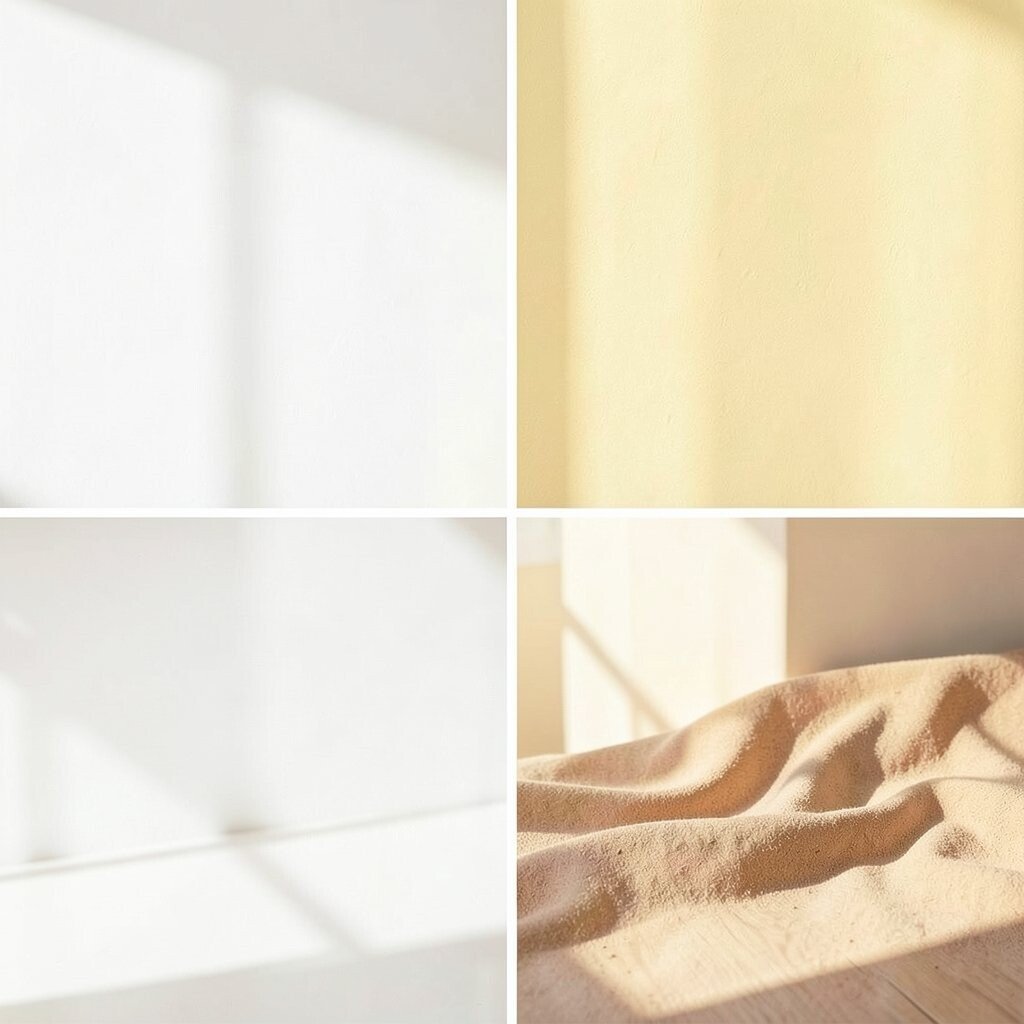
Think of morning light bouncing off creamy walls. Add soft yellow accents and warm sand tones in rugs or curtains to make the whole space feel inviting.
This palette works especially well in kitchens and dining rooms. It helps rooms look cleaner and more open, even when square footage is tight. For an easy update, paint one feature wall or swap in light-colored textiles.
2. Ocean Blue, Seafoam Green, and Crisp White
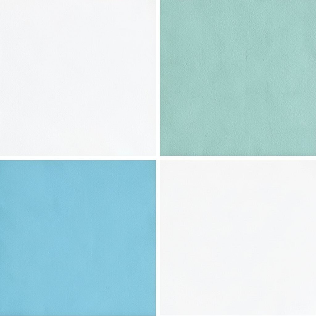
Picture calm water colors: ocean blue paired with a gentle seafoam glow. Crisp white keeps everything feeling fresh and airy, like a window left open.
Blue-green shades can make your home feel cooler and more restful. Use this palette in a bedroom or bathroom for a soothing mood. Try adding a seafoam throw blanket and ocean-blue pillows for instant balance.
For personalization, pick one blue tone as your hero and repeat it in two or three places. If you’re on a budget, focus on accessories first: wall art, linens, and a washable rug. This look is also trending in coastal-inspired spaces, so it pairs nicely with natural wood.
3. Blush Pink, Greige, and Brassy Gold
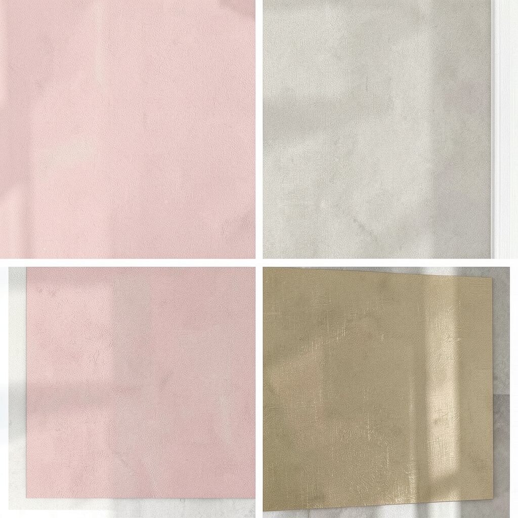
Blush pink brings a gentle warmth without feeling loud. Greige grounds the softness, while brassy gold adds a little glow.
This combination can make living rooms feel cozy and polished. It also looks great with velvet, boucle, and smooth ceramics. To get the “designer” vibe, place gold accents where light catches them—think lamps, frames, and cabinet hardware.
Personalize by choosing blush that matches your style: rosy, dusty, or even coral-leaning. If you want lower cost changes, replace curtains or add a pink-toned gallery wall instead of redoing walls. Right now, warm metallics mixed with soft neutrals are a big trend, especially in modern homes.
4. Sage Green, Cream, and Natural Walnut
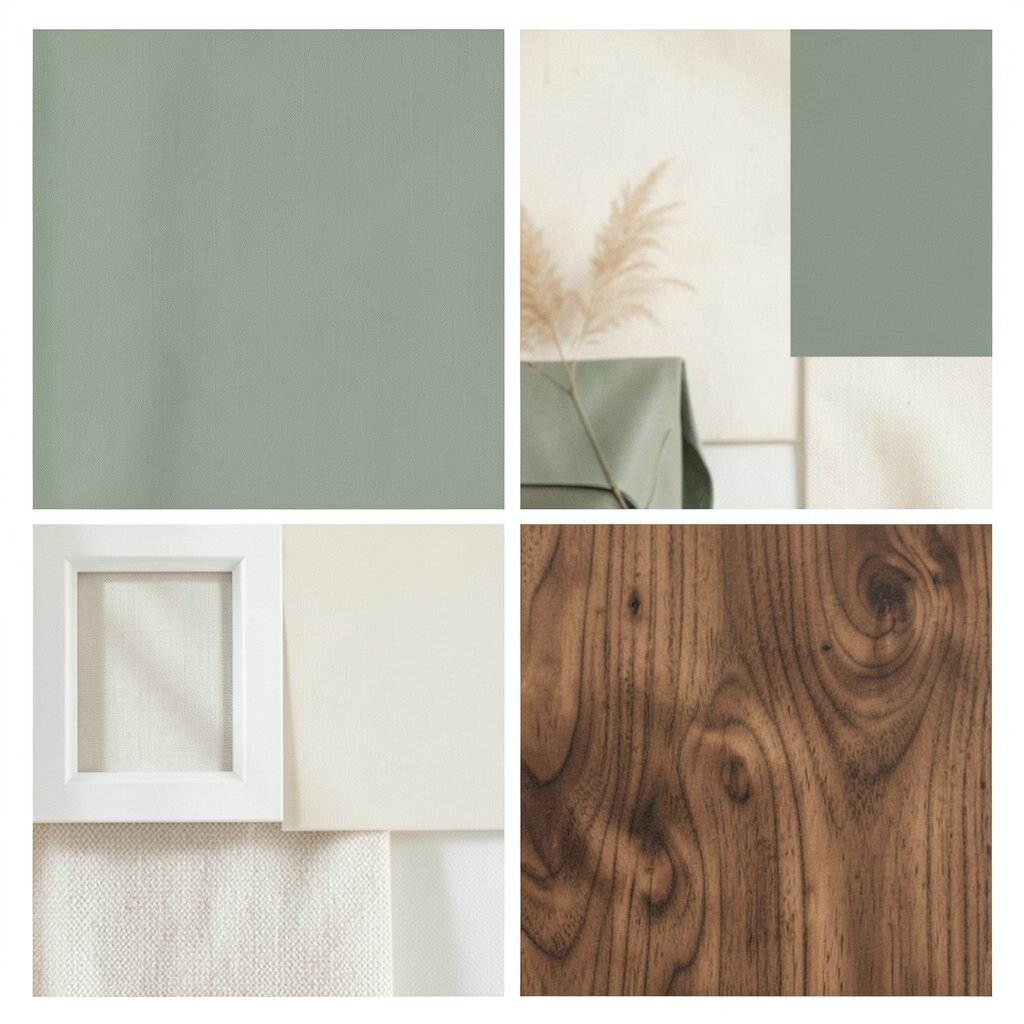
Sage green feels like a breath of fresh air. Cream keeps it bright, and natural walnut adds depth and comfort.
This palette helps rooms feel grounded and healthy, especially in spaces that need calm energy. It’s perfect for offices, reading nooks, and bedrooms. For tips, paint shelves in cream and style walnut frames with books or plants.
5. Charcoal, Off-White, and Tangerine Pop
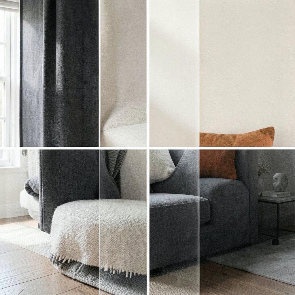
Charcoal makes a room feel bold, like a stylish jacket. Off-white softens it, and a bright tangerine pop brings happy energy.
This palette is great when you want your decor to look modern and confident. It also helps you focus attention on art, mirrors, or statement furniture. Start small by using tangerine in pillows, vases, or a lamp shade.
For personalization, keep the tangerine color consistent across two or three items. If cost is a concern, use removable wallpaper decals or peel-and-stick accents. This palette aligns with a current trend: strong dark neutrals paired with one cheerful accent.
6. Terracotta, Light Linen, and Olive Highlights
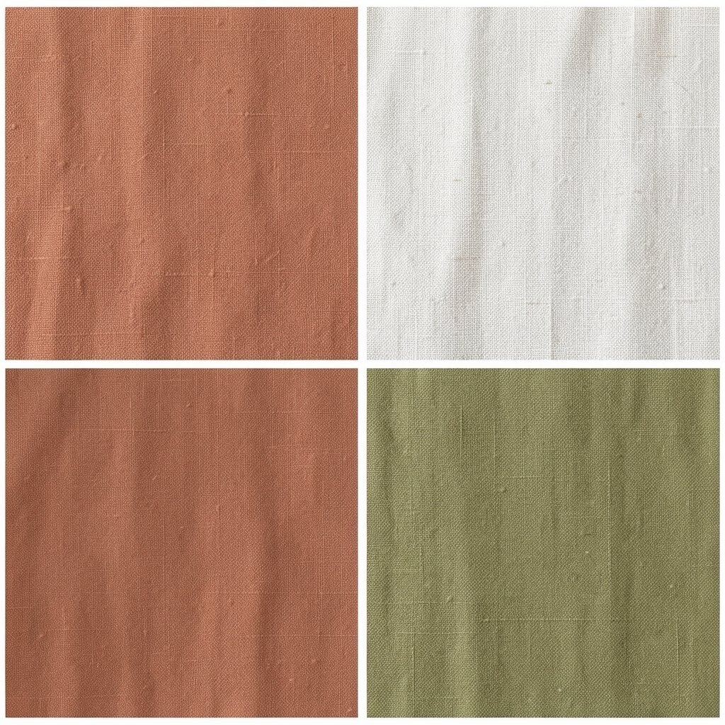
Terracotta looks like warm clay warmed by sun. Light linen tones make it airy, and olive adds a grounded, earthy touch.
This set of colors works beautifully in spaces that need warmth. It can make your living room feel welcoming and full of character. Try terracotta on pottery, olive on cushions, and linen on curtains for an effortless layered look.
Personalize it by going more dusty or more saturated with terracotta. To keep it budget-friendly, choose a textured area rug or swap out throw blankets rather than painting. Earth-tone palettes are still trending, especially in boho-modern and Mediterranean-inspired rooms.
7. Lavender, Soft Gray, and White-Washed Wood
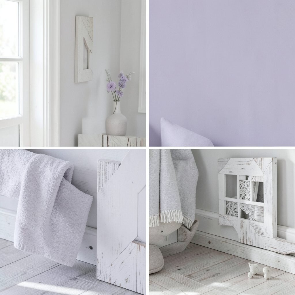
Lavender adds a dreamy vibe without needing neon. Soft gray keeps it modern, and white-washed wood makes everything feel light.
This palette can make bedrooms and hallways feel calm and a little magical. It also looks lovely with glass, rattan, and matte finishes. Use lavender in bedding or curtains, then repeat soft gray in frames or a side table.
For personalization, choose lavender that leans more blue or more pink depending on your mood. If you want a low-cost start, try adding lavender art prints and a throw pillow set. Trend-wise, muted pastels like lavender are popular because they feel gentle, not childish.
8. Emerald Green, Ivory, and Blackened Bronze
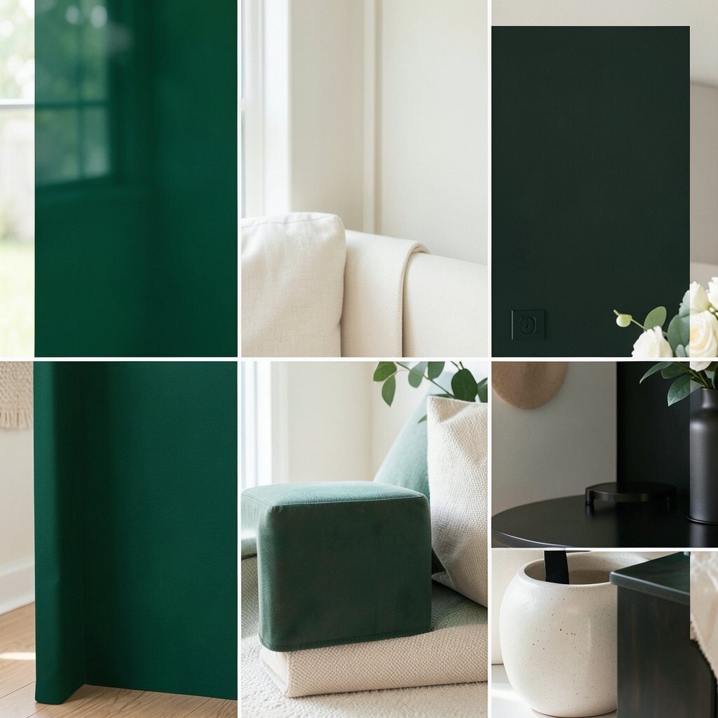
Emerald green looks rich and elegant right away. Ivory gives brightness, and blackened bronze adds a dramatic glow.
This palette is perfect for entryways and dining rooms where you want a wow moment. It can also make dark wood furniture look even more expensive. Tip: keep the walls light, then add emerald in upholstery, drapes, or a statement rug.
9. Sky Blue, Pale Yellow, and Cool White
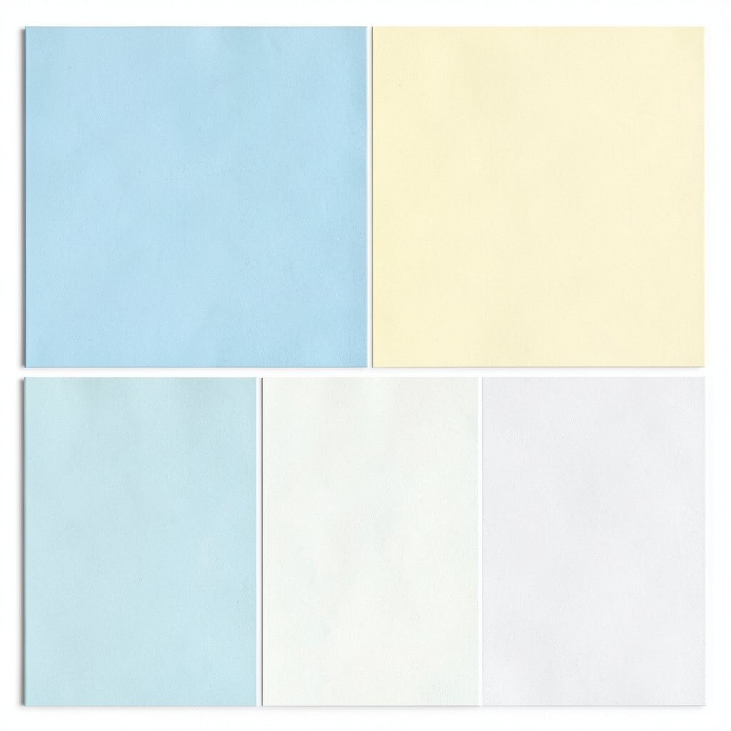
Sky blue feels cheerful, like a clear day. Pale yellow adds sunshine warmth, while cool white keeps the palette crisp.
This combination helps small rooms feel brighter and more cheerful. It’s also a great fit for kids’ rooms and breakfast corners. Start by painting one wall or choosing bedding that already includes both sky blue and pale yellow.
Personalize with patterns: try a subtle stripe in cool white and a tiny dotted accent in pale yellow. For budget planning, swap art prints and add a bright throw instead of major furniture changes. This “bright but soft” look is trending because it feels uplifting while staying calm.
10. Warm Beige, Chocolate Brown, and Creamy Gold
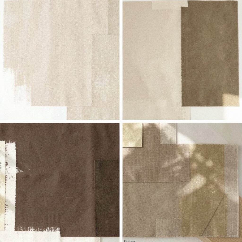
Warm beige makes a room feel calm and steady. Chocolate brown adds a deep, cozy contrast, and creamy gold brings a gentle glow.
This palette works in nearly every space because it’s flexible. It can look elegant with curtains and lighting, or casual with woven textures. A simple trick: repeat the chocolate tone in at least two places so it feels intentional.
11. Ruby Red, Soft Rose, and Light Gray
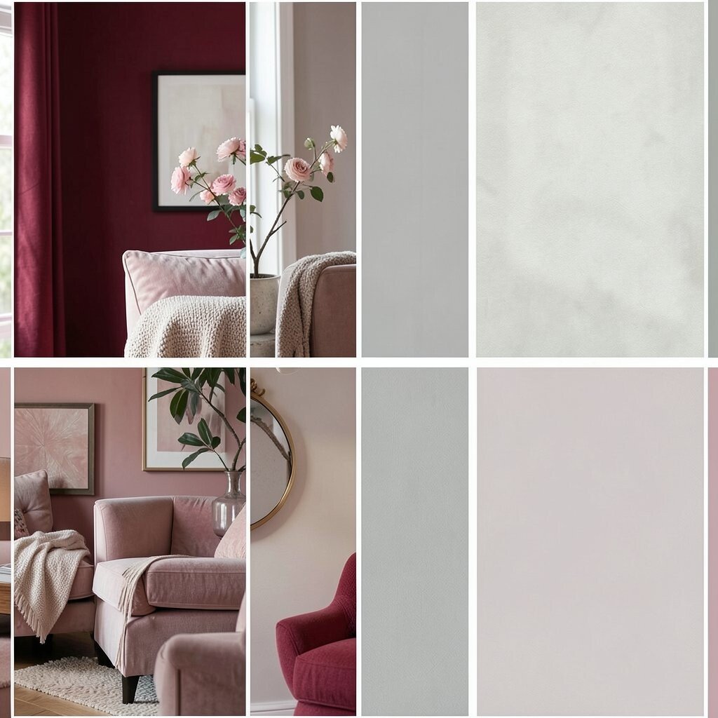
Ruby red is bold and lively, like a favorite sweater. Soft rose helps it feel softer, and light gray keeps the whole room modern.
This palette is ideal for spaces where you want energy, like a home office or living room. It can also make plain furniture look more exciting. Use ruby red in one statement element—like a chair or large artwork—then add soft rose in smaller items.
For personalization, choose whether you want ruby to feel more warm (brick-like) or more cool (berry-like). If you’re watching costs, focus on removable options: cushion covers, rugs, and decorative trays. This type of rich accent color remains popular because it gives personality without requiring full repainting.
12. Cool Teal, Oyster White, and Mid-Century Walnut
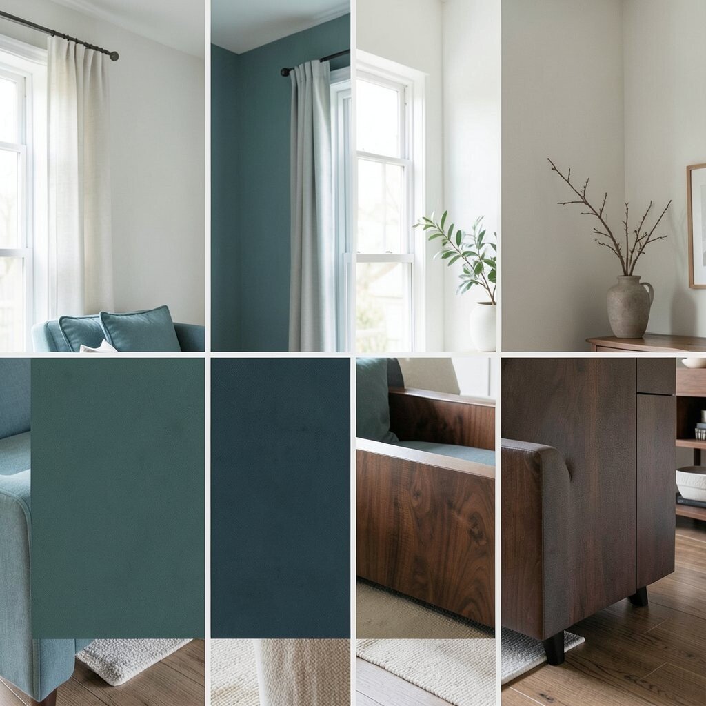
Teal feels lively and calm at the same time. Oyster white makes it feel soft, while walnut gives it a mid-century style twist.
This palette is great for living rooms and dining areas that need both warmth and freshness. It also pairs well with curved furniture and clean lines. Tip: use teal as an accent on chairs or wall art, then keep walls oyster white.
Personalize by mixing textures: smooth ceramic, linen curtains, and a wood sideboard. For cost considerations, try swapping cabinet pulls or adding a teal runner in the kitchen. Current trends favor mid-century shapes, so this palette blends easily with that look.
13. Powder Blue, Butter Yellow, and Crisp White
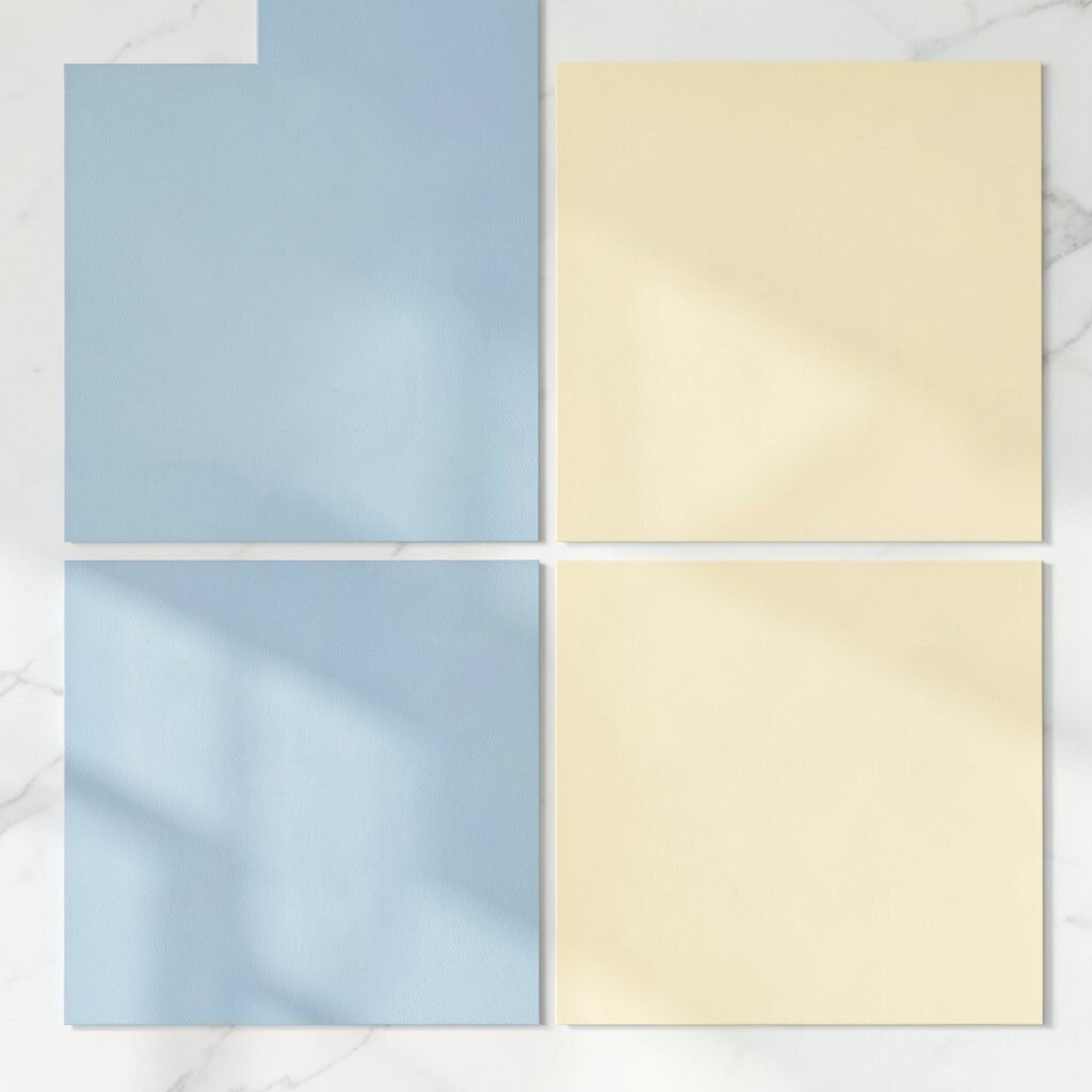
Powder blue brings a light, friendly mood. Butter yellow adds a playful glow, and crisp white keeps the palette bright.
This color combo can make a room feel like sunshine without being too intense. It looks great in kitchens, bathrooms, and sunny living rooms. To start, choose one main wall color or one large rug that carries both powder blue and butter yellow.
14. Black, Milk White, and Neon-Lime Details
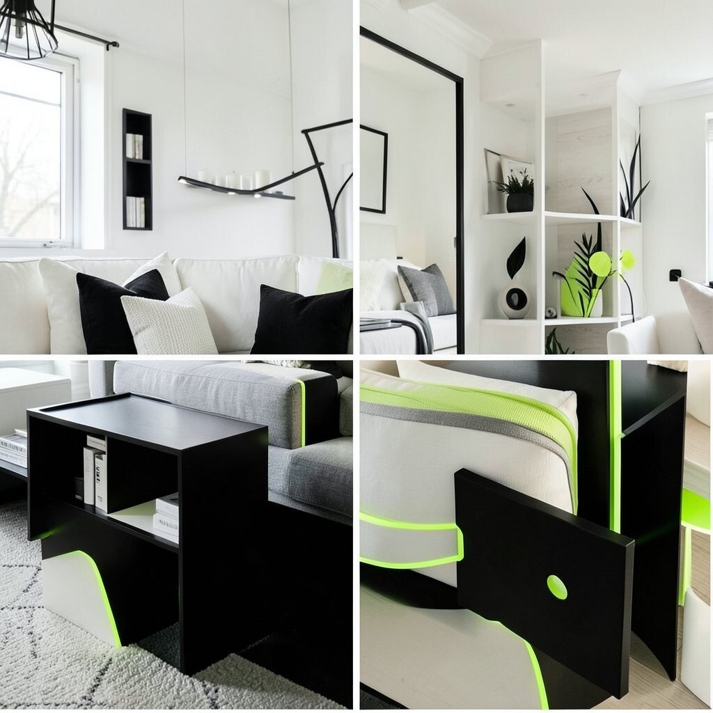
Black and milk white create a sharp, graphic look. Neon-lime details add a surprising spark that feels fun and fresh.
This palette is perfect for modern spaces where you like bold design. It also helps your decor stand out, like artwork and sculptural lamps. Keep lime pieces small: think a vase, a clock, or a single chair throw.
For personalization, choose lime that leans more yellow-green or more chartreuse. If you want to keep costs down, use small accessories and replace old frames with ones that match. This high-contrast style is a current trend, especially in creative studios and contemporary apartments.
15. Royal Blue, Tan, and Pale Cream
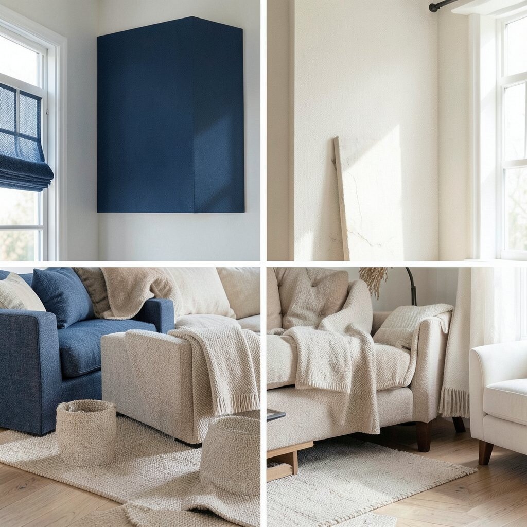
Royal blue feels confident and classy. Tan softens the look, and pale cream makes it bright and cozy.
This palette works nicely in family rooms because it balances energy with comfort. It can also make neutral furniture look richer. Tip: pair blue with textured fabrics like cotton, tweed, or chunky knit throws for a warm finish.
Personalize by choosing tan that fits your flooring, like golden tan or cooler taupe. If you’re on a budget, update what people touch most—pillows, curtains, and throw blankets. Royal blue accents are still popular because they feel timeless and easy to style.
16. Pastel Green, Warm White, and Natural Rattan
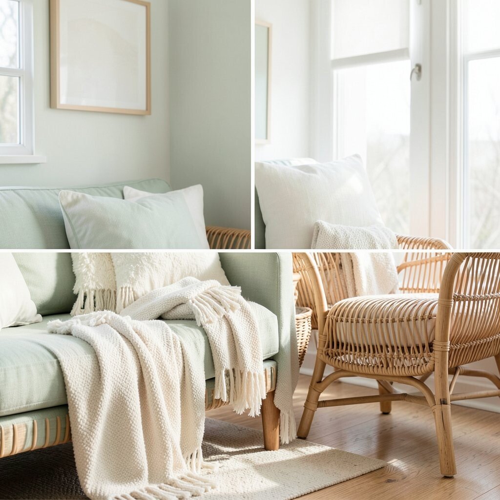
Pastel green looks gentle and fresh, like spring leaves. Warm white keeps everything soft, and rattan adds a natural, airy texture.
This combination can make a space feel light and uncluttered. It’s especially good for sunrooms, breakfast nooks, and cozy corners. Try a warm white wall, a pastel green rug, and rattan baskets for storage.
17. Mustard Gold, Deep Teal, and Linen Off-White
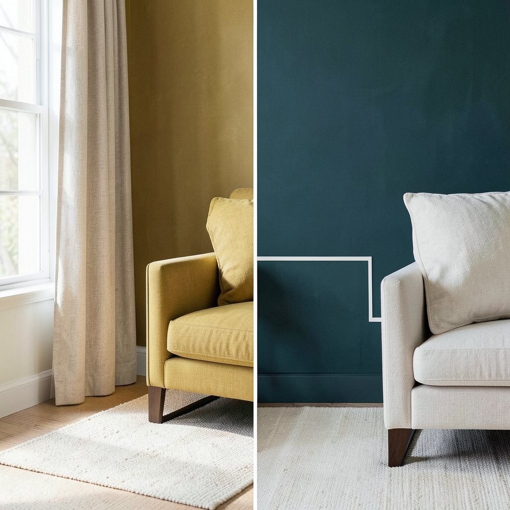
Mustard gold is warm and inviting, like late-afternoon light. Deep teal adds contrast, and linen off-white ties it together with a relaxed feel.
This palette is a great choice for living rooms that need character. It can also add a vintage touch while still feeling modern. Start by using deep teal on curtains or a large piece of upholstery, then add mustard in cushions or decorative ceramics.
For personalization, repeat mustard through small items: photo frames, books, and a throw blanket. If cost is a concern, choose one larger investment like a rug, then keep everything else light and affordable. This warm-gold-and-deep-color trend keeps showing up because it looks cozy and stylish at once.
18. Coral, Light Gray, and White Marble Accents
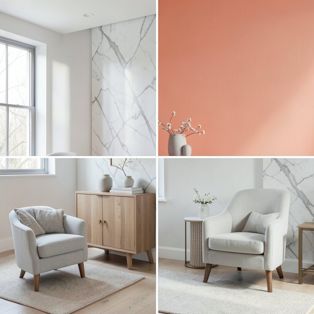
Coral adds a lively pop that feels friendly and warm. Light gray keeps it from getting too playful, and marble-like accents feel clean and fresh.
This palette is wonderful for bathrooms, entryways, and breakfast areas. It can also make small rooms look more polished. Tip: choose coral in towels, decor, and small furniture, then let gray and “marble” tones do the quiet work.
19. Charcoal Blue, Sand Beige, and Bright White
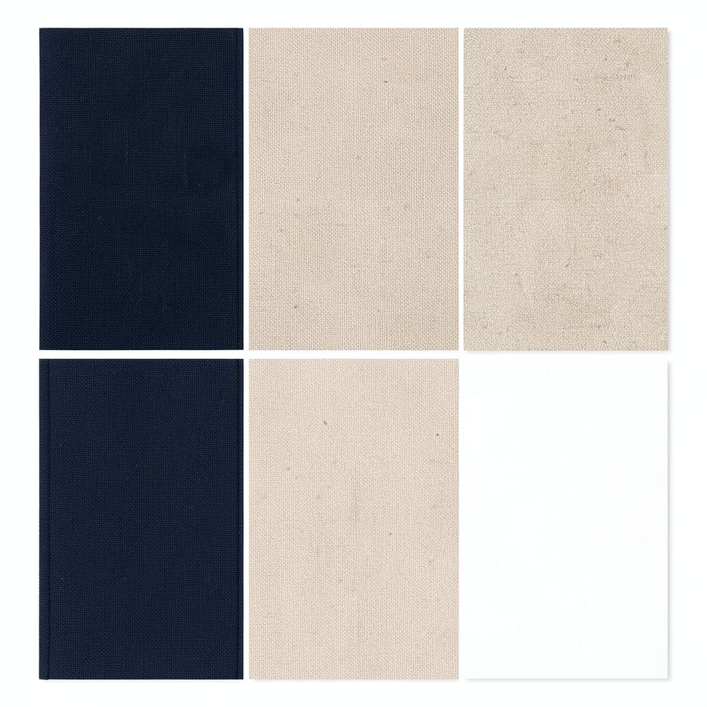
Charcoal blue is like a darker, moodier version of navy. Sand beige brings softness, and bright white adds clarity.
This palette feels modern and calm, which is great for bedrooms and home offices. It helps you avoid starkness while still keeping the room bright. Try painting walls a sand beige and adding charcoal blue in bedding, curtains, or an accent chair.
Personalize by adding natural fibers like jute or sisal to echo the sand tone. For budget considerations, update lighting—swap in a new lamp and shade to change the whole vibe. Darker blues paired with warm neutrals are trending because they feel grown-up but not boring.
20. Neutral Taupe, Soft Cream, and Copper Highlights
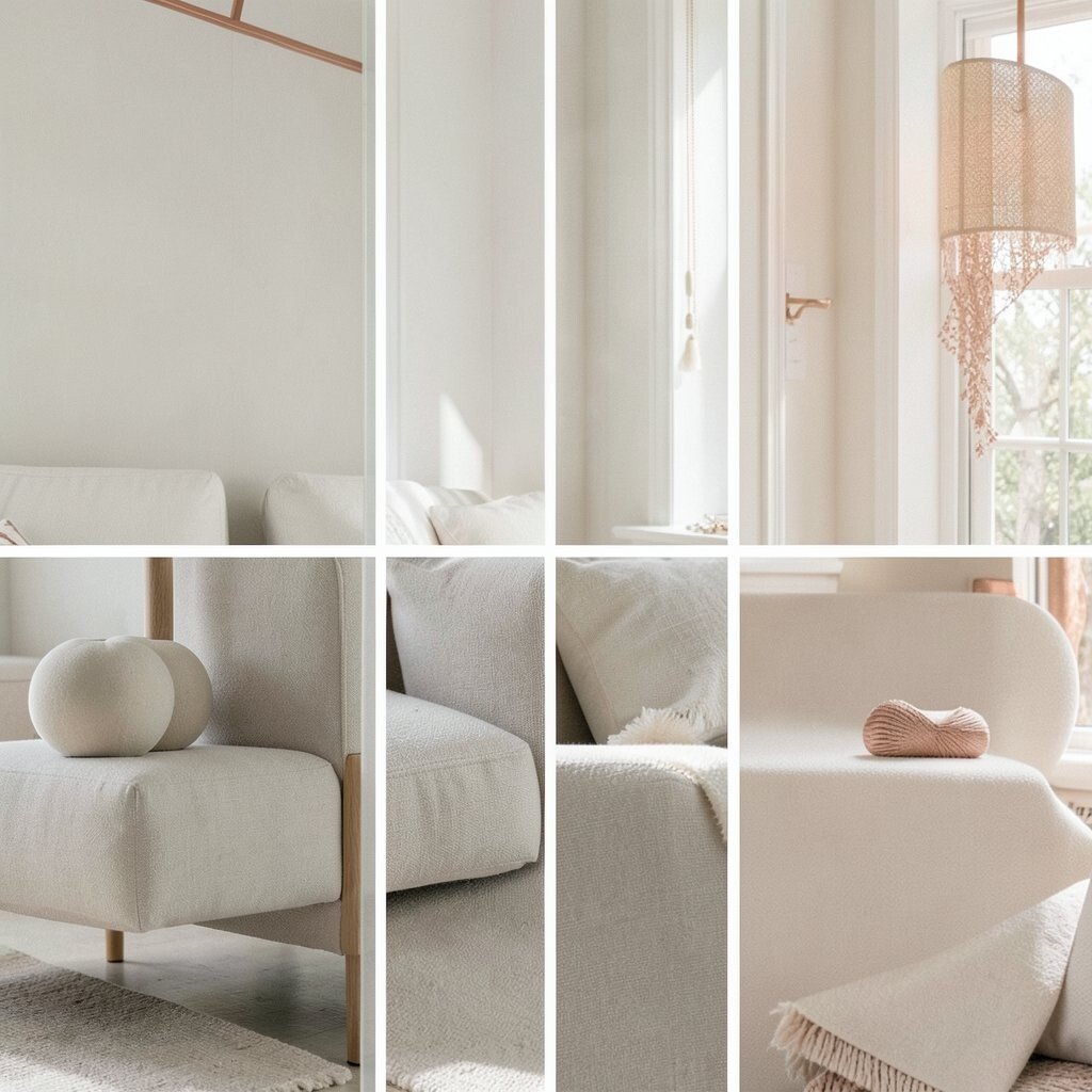
Taupe is cozy, and soft cream keeps it welcoming. Copper highlights bring a gentle shimmer that looks amazing in warm lighting.
This palette is perfect for people who love calm spaces but still want style. It also works well with natural wood and stone finishes. Tip: use copper in picture frames, cabinet pulls, or a tabletop tray.
21. Monochrome Greens, Light Wood, and White
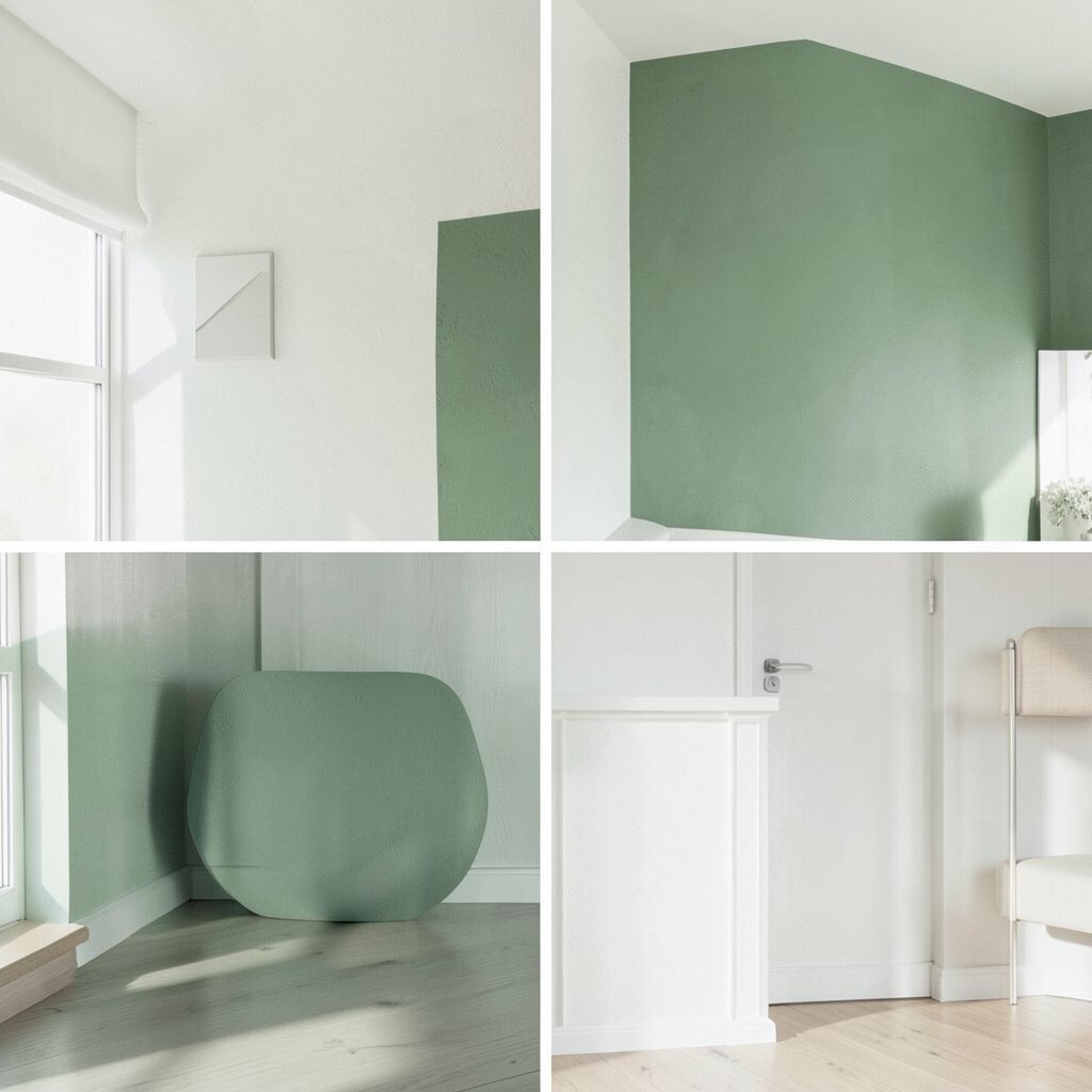
Monochrome greens mean you use different shades of green together. Light wood and white keep it fresh and prevent the look from feeling heavy.
This palette feels like living inside a garden, even when it’s just one plant on the shelf. It also helps your decor look coordinated without matching everything exactly. Try layering sage, moss, and olive in textiles, then let white walls brighten the space.
Personalize by choosing green tones that match your favorite plant colors. If cost is a concern, focus on greenery: planters, leaves prints, and fabric patterns that include green. This nature-inspired color trend is still strong, especially with plant-friendly, cozy decor styles.
22. Warm White, Soft Peach, and Stone Gray
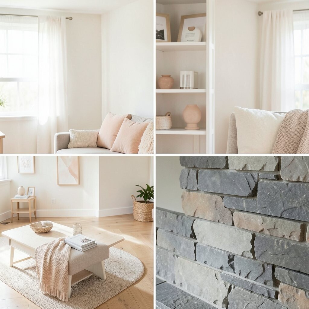
Warm white creates a glowing base, and soft peach adds a friendly blush. Stone gray adds structure so the palette stays balanced.
This combination can make your home feel welcoming and calm, like a comfortable hug. It works well in bedrooms, living rooms, and dining spaces where you want “warm and bright” at the same time. Tip: use peach in art, pillows, and ceramics, then keep the biggest surfaces warm white for brightness.
For personalization, decide if peach should feel more coral-like or more dusty and subtle. On a budget, start with a peach-toned rug or an accent wall using removable paint samples to test undertones. Soft peach and warm neutrals continue to trend because they pair well with modern furniture and classic textures.