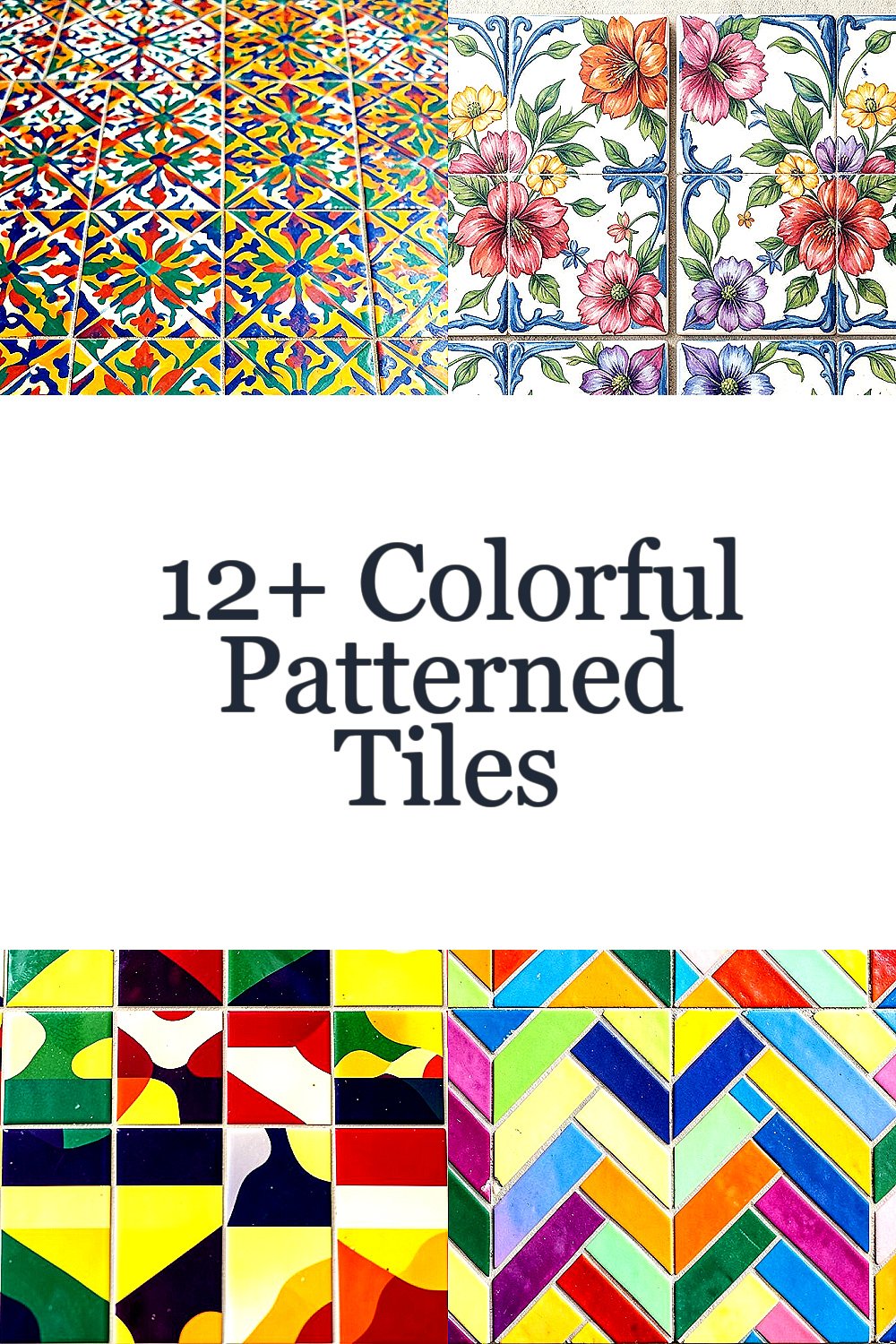
Color can hit like sunshine, even on ordinary walls. Patterned tiles turn small areas into instant eye-catchers.
From playful repeat designs to bold statement layouts, these tile styles bring joy and personality without needing a big makeover. Pick what feels like you, and your space will start telling a brighter story.
-
Moroccan-Style Zellige Tiles

Moroccan-Style Zellige Tiles Zellige tiles have a handmade look, with tiny chips and slightly uneven edges that catch the light. You’ll often see rich greens, warm oranges, or deep blues arranged in geometric patterns.
They add a cozy, artisan feeling and can make a kitchen backsplash look like a bazaar. Because the glaze has depth, they hide minor wear better than flat-looking prints. For personalization, choose one accent color (like teal) and let the rest of your room echo it in towels, art, or a plant pot.
-
Hand-Painted Look Floral Tiles

Hand-Painted Look Floral Tiles Imagine flowers in bright bursts, painted with visible brush marks and soft color blending. Even when the pattern is small, it feels lively because the details feel human.
This style brings a gentle “garden window” vibe, which is great for bathrooms, breakfast nooks, and entryways. It also works well with light walls because the colors pop without needing heavy furniture.
To keep it balanced, use floral tiles as a border strip or on one wall panel instead of everywhere. Pair them with simple cabinet fronts, plain grout, and neutral floors so the flowers stay the star. Budget-wise, hand-painted pieces can cost more, so consider buying a smaller amount for a feature area or using a high-quality printed alternative that still looks textured.
-
Bold Retro Checkerboard
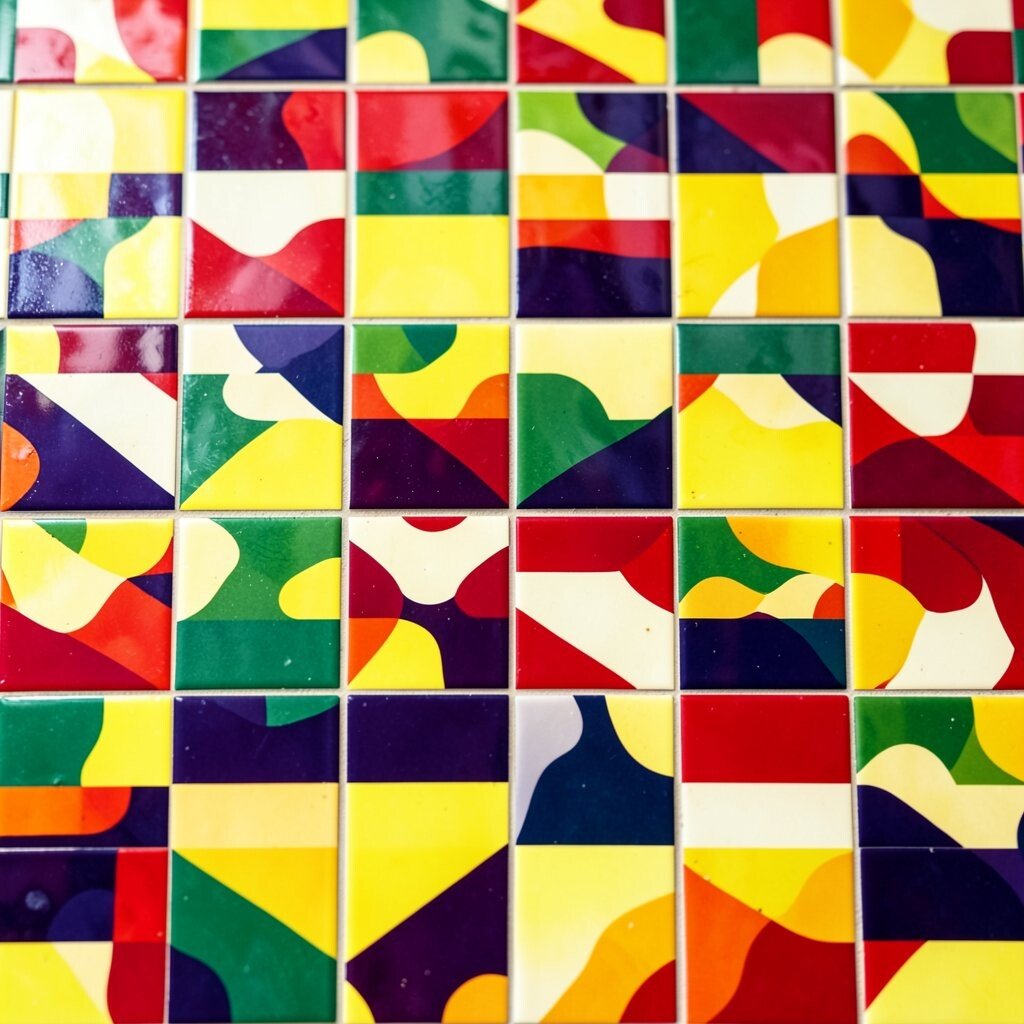
Bold Retro Checkerboard Checkerboard tiles can look like a vintage postcard, especially when the colors are saturated. Think black and cream with a flash of red, or cobalt with sunny yellow.
They create instant rhythm, which makes spaces feel organized and energetic at the same time. In a small room, the strong grid can also help your layout feel more “planned.” For a personalized twist, choose two colors you already love and match them to your throw pillows or a painted cabinet.
When installing, pay attention to grout lines because thin lines feel crisp and thicker lines feel softer. If you’re worried about going too bold, try a checker pattern on the floor in a limited area like a foyer landing or behind a vanity.
Costs vary a lot, so compare per-square-foot pricing and ask about dye quality and durability. The trend right now is mixing retro tiles with modern fixtures, like brushed nickel faucets and clean-lined lighting.
-
Herringbone in Bright Tones
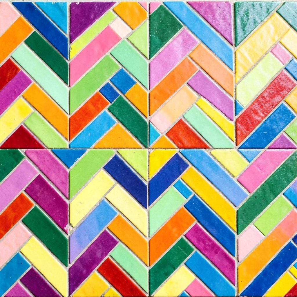
Herringbone in Bright Tones Herringbone usually looks neat and stylish, but bright-toned versions feel playful. Picture warm terracotta, sunny mustard, or sea-glass green arranged in a zigzag that looks like movement.
This pattern adds texture even when the room is simple. It’s also forgiving, because the zigzag lines can hide small imperfections and make grout maintenance feel easier than you’d expect.
To personalize, pick a main color and use a second shade only for small “moves,” like a thin border strip or a corner accent. If you’re watching costs, consider using the brightest tiles only in the center or as a band, while keeping the rest in a more budget-friendly complementary color.
-
Art Deco Geometric Stars

Art Deco Geometric Stars Art Deco tiles bring glam energy with fans, rays, and star-like shapes that feel ready for a celebration. Colors often include emerald, gold, black, and cream for a dramatic look.
They can make your entryway feel fancy without needing fancy furniture. Plus, the repeating symmetry gives your space a clear, eye-friendly layout.
For tips, keep surrounding walls simple and choose one metal finish that matches your fixtures. If the tiles feel too intense for a full wall, install them behind a mirror or around a fireplace surround for a strong focal point.
-
Azulejo-Inspired Blue and White

Azulejo-Inspired Blue and White Blue and white patterned tiles can feel like a calm ocean, even when the design is busy. Many Azulejo-inspired styles include wave-like swirls, tiny scenes, or layered medallions.
They bring a classic heritage look and pair beautifully with warm wood, crisp white trim, and dark countertops. The cool palette also helps smaller rooms feel airy. For personalization, choose a version with one small surprise color, like a hint of yellow in the accents, and then echo it in a lamp shade or art frame.
-
Rainbow Stripe Accent Tiles
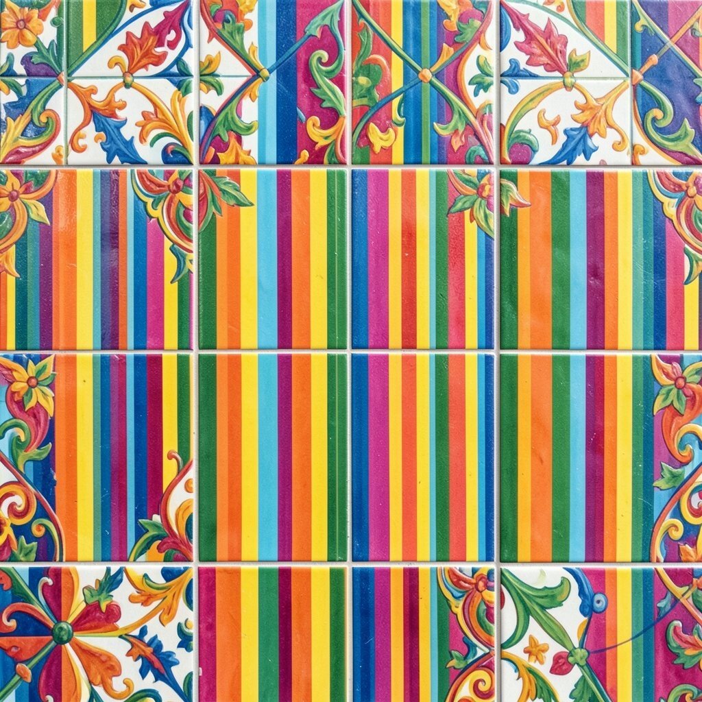
Rainbow Stripe Accent Tiles If you love color but don’t want chaos, rainbow stripe tiles are a friendly middle path. The lines can look bold and clean, or soft and pastel depending on the finish.
Stripes give you direction, which can visually lengthen a hallway or highlight a shower niche. They also help you coordinate multiple colors because they’re organized in a simple order.
To make it feel intentional, limit stripes to an accent band about the height of a mirror or towel rail. For cost considerations, striped sheets or pre-matched sets can save time and reduce waste compared to mixing individual tiles. Right now, mixed-surface designs—where stripes meet matte solids—are trending because they look layered and modern.
-
Patchwork Tiles With Coordinated Patterns
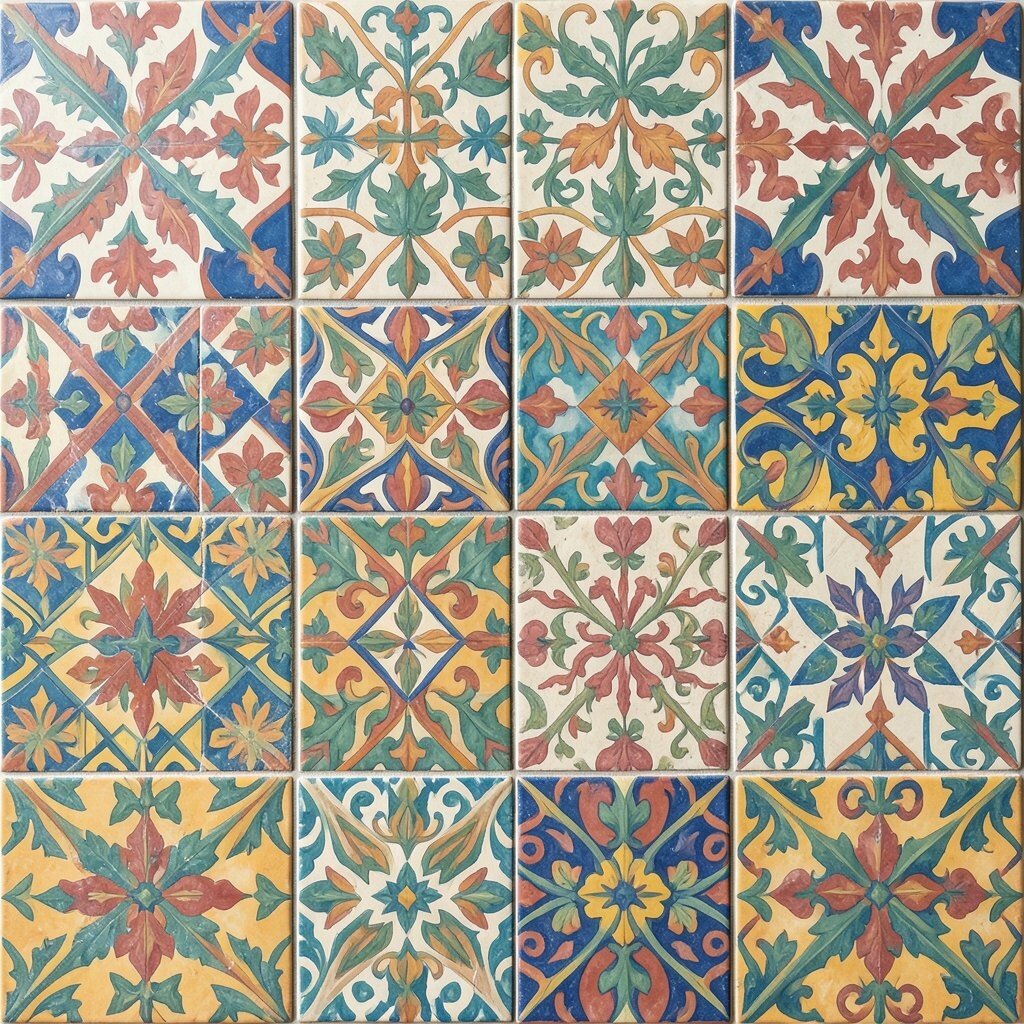
Patchwork Tiles With Coordinated Patterns Patchwork tiles let you mix multiple patterns like a comfy quilt. You might see florals, tiny geometrics, and brushy stripes all in one set with colors that match.
This style is unique because no two sections feel exactly the same, but the palette keeps everything calm. It’s great for a kitchen floor, a laundry room, or a cozy reading corner wall. If you want personalization, choose a patchwork set that includes one pattern you love most and let it anchor the color story.
For tips, test a small layout before you commit so you understand how the patterns land. Use consistent grout color so the different designs feel like they belong together.
Regarding cost, patchwork often comes as pre-designed sets, which can reduce labor and confusion. A budget-friendly move is to cover only the “traffic zone” on the floor, then keep the rest of the room in a simple tile.
-
Playful Polka Dots in Matte Color
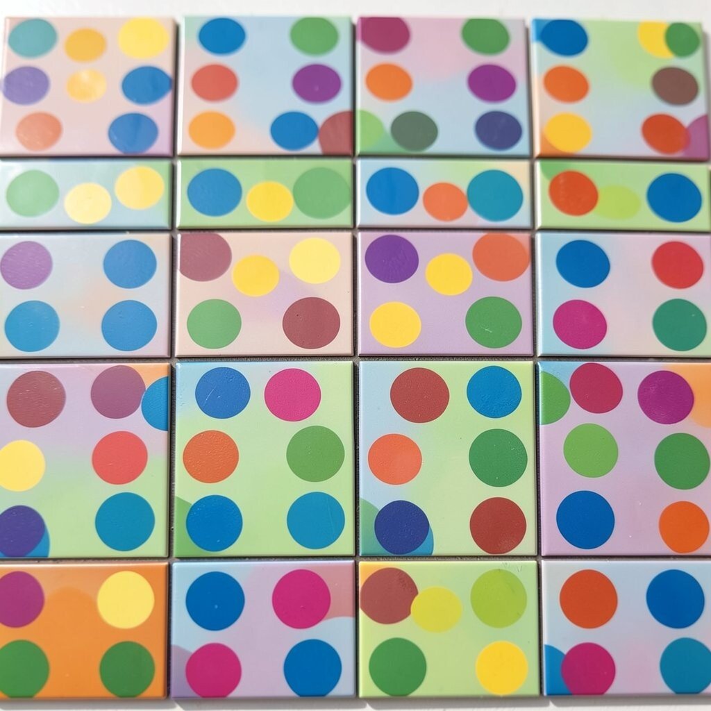
Playful Polka Dots in Matte Color Polka dot tiles bring instant fun, especially when they’re done in matte finishes. The dots can be crisp and round, or slightly imperfect for a handmade vibe.
They work wonderfully in kids’ bathrooms, small powder rooms, and sunny breakfast kitchens. The bold circles also make surfaces feel cheerful, even when the room furniture is simple.
To personalize, choose dot sizes that match your space: smaller dots feel busy in a good way, while larger dots feel like bold artwork. For cost control, place dots only on a half-wall, around a sink, or on the shower surround while using a solid neutral tile everywhere else.
If you want to follow the trend, pair polka dots with warm white walls and sleek, simple fixtures for a clean modern twist.
-
Terrazzo-Look Pattern With Color Flecks
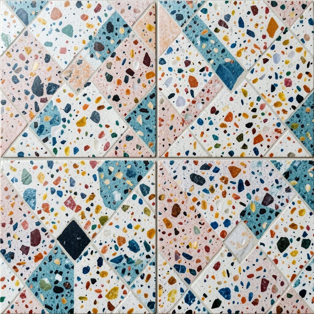
Terrazzo-Look Pattern With Color Flecks Terrazzo-look tiles are speckled, with little flecks that look like stone mixed with paint. You might spot flecks of pink, teal, gray, and cream scattered across a smooth base.
This pattern is visually interesting without being too busy, which helps it feel wearable in many styles. It also helps hide stains and everyday scuffs, making it smart for high-use areas.
To personalize, pick a base tone that matches your flooring and use flecks that echo your accessories. If you’re worried about cost, terrazzo looks can be available in a wide price range, so compare quality and look for options with good slip resistance for wet spaces.
-
Geometric Hexagons With Mixed Finishes
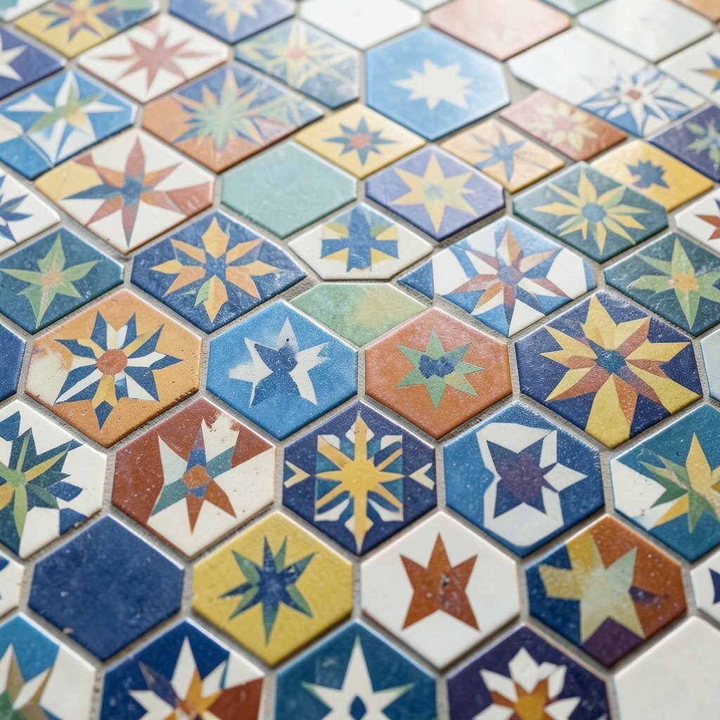
Geometric Hexagons With Mixed Finishes Hexagon patterned tiles look like modern honeycomb art, especially when the colors and finishes differ. Some tiles may be glossy while others are matte, creating a subtle shimmer.
They add a clean, modern vibe and help corners feel more lively. The shape also creates natural movement, which can make a bathroom or kitchen feel more “designed.” For personalization, choose a limited color range—like sage, cream, and black—so the hexagons stay sharp, not loud.
-
Moroccan Lattice in Warm Earthy Colors
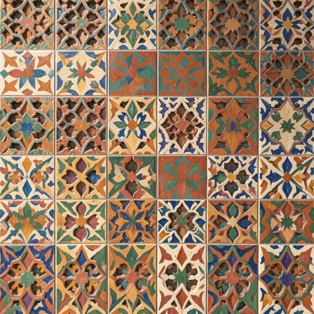
Moroccan Lattice in Warm Earthy Colors Moroccan lattice tiles create a web-like effect that looks both ornate and structured. Warm earthy palettes—like spice orange, cinnamon brown, and soft olive—make them extra inviting.
This style adds depth because the lines feel layered, even on flat surfaces. It’s perfect for shower floors, backsplashes, and feature walls that need character.
To keep it actionable, use lattice tiles as a frame around a solid tile field, then add matching accessories like baskets or patterned textiles. On cost, look for durable options meant for floors if you’re using them in entryways. Right now, lattice patterns are trending again because they give a “crafted” feel while still fitting modern homes.
-
Colorful Watercolor Tile Murals

Colorful Watercolor Tile Murals Watercolor tile murals look like paint spreading across paper, but in a crisp tiled form. Colors blend gently—like lilac fading into teal, or sunny yellow softening into peach.
They feel truly unique because they can act like art, not just flooring. When used in a bathroom, they can make your daily routine feel calmer and brighter at the same time. For personalization, match the mural palette to your wall color and pick one echo color for a toothbrush holder or a vase.
For tips, plan the placement carefully so the mural sits at eye level where you’ll notice it. If you’re using it on a backsplash, keep the rest of the kitchen hardware simple so the art stays readable.
Cost considerations matter here because murals are often more expensive, but buying a smaller mural panel can still give you a big impact. If budget is tight, look for tile brands that offer mural-style prints on sheets for an easier, faster install.